Zabi Hair Welcome Email Trust Concept

Emmanuel Aina


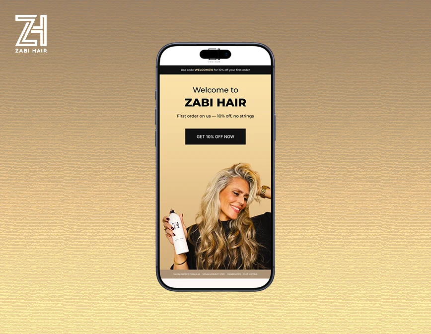
Zabi Hair — Welcome Email Concept
A Welcome Email Built Around Trust, Not a Discount
Overview
Designed a welcome email concept for Zabi Hair, built with no brief and no pre-selected assets — just the brand, their live welcome email, and a blank page. The goal was to show what a welcome flow could look like if it earned the sale instead of just asking for it.
Context
Zabi Hair's existing welcome send followed a Discount → Discount → Buy structure, with a flat hierarchy and no real narrative. That wasn't the problem to fix — it was the starting point for a different question: what would this email look like if it led with trust instead of a price cut?
The Challenge
Typical discount-led welcome emails tend to:
Lead with the offer before the reader has any reason to care about the brand
Repeat the same message across multiple sections instead of building toward something
Treat the founder or brand story as an afterthought, if it appears at all
For Zabi, the challenge was to design an email that:
Moved past a discount-led structure without simply removing the discount
Built a sequence that earns the sale rather than asking for it outright
Introduced the founder in a way that felt natural, not like a non-sequitur
Caught and fixed repetition a first pass would likely miss
Strategic Approach
The existing send followed Discount → Discount → Buy. I replaced it with a deliberate arc:
Curiosity → Trust → Purchase
Design Approach
Purpose: Earn the subscriber's trust before asking for the sale, instead of leading with the offer.
The hero headline, subhead, and CTA sit in their own whitespace above the product photography, never overlaid on it, so there's no contrast battle. The founder photo and a real quote follow right after the hero, with a bridging line so the shift from offer to founder story lands naturally. On self-review, I caught a bestseller product repeating across two consecutive sections and cut it, since no two sections should feel visually identical.

Zabi Hair welcome email featuring a 10% first-order offer, brand story, product benefits, bestselling haircare products, customer testimonial, and shop-now call-to-actions.
Design System
9-section, mobile-first, Outlook-safe, production-ready build
Hero typography kept clear of product photography
Founder section placed deliberately, not as an afterthought
No repeated product treatments across sections
Conversion Thinking
Curiosity opens the email instead of a discount
Founder story builds trust before the ask
Attention, trust sequencing, and scroll momentum are designed, not assumed
The CTA path moves from Curiosity → Trust → Purchase
Outcome
A complete welcome email concept that replaces a discount-led opening with a trust-building sequence, showing what the brand's first impression could look like with a deliberate structure behind it.
Role & Tools
Role: Email Designer
Project Type: Welcome email concept
Tools: Figma
Like this project
Posted Oct 2, 2026
A welcome email concept for Zabi Hair, replacing a discount-led structure with a Curiosity → Trust → Purchase sequence built with no brief.