Dark Mode Audit & Welcome Email Redesign for OLIPOP

Emmanuel Aina


Dark Mode Audit & Welcome Email Redesign for OLIPOP
A Cold Audit That Found a Rendering Failure in Every Send, and the Redesign That Fixes It
Overview
After subscribing to OLIPOP's email list, I found a dark mode rendering failure running through their entire email program. I documented it as a cold audit, then redesigned their welcome email to solve it and to match the brand's visual identity.
Context
OLIPOP is a vibrant probiotic soda brand with a strong visual identity, and that identity is exactly what a rendering failure damages most. On dark mode devices, black gaps opened up between every section of their emails.

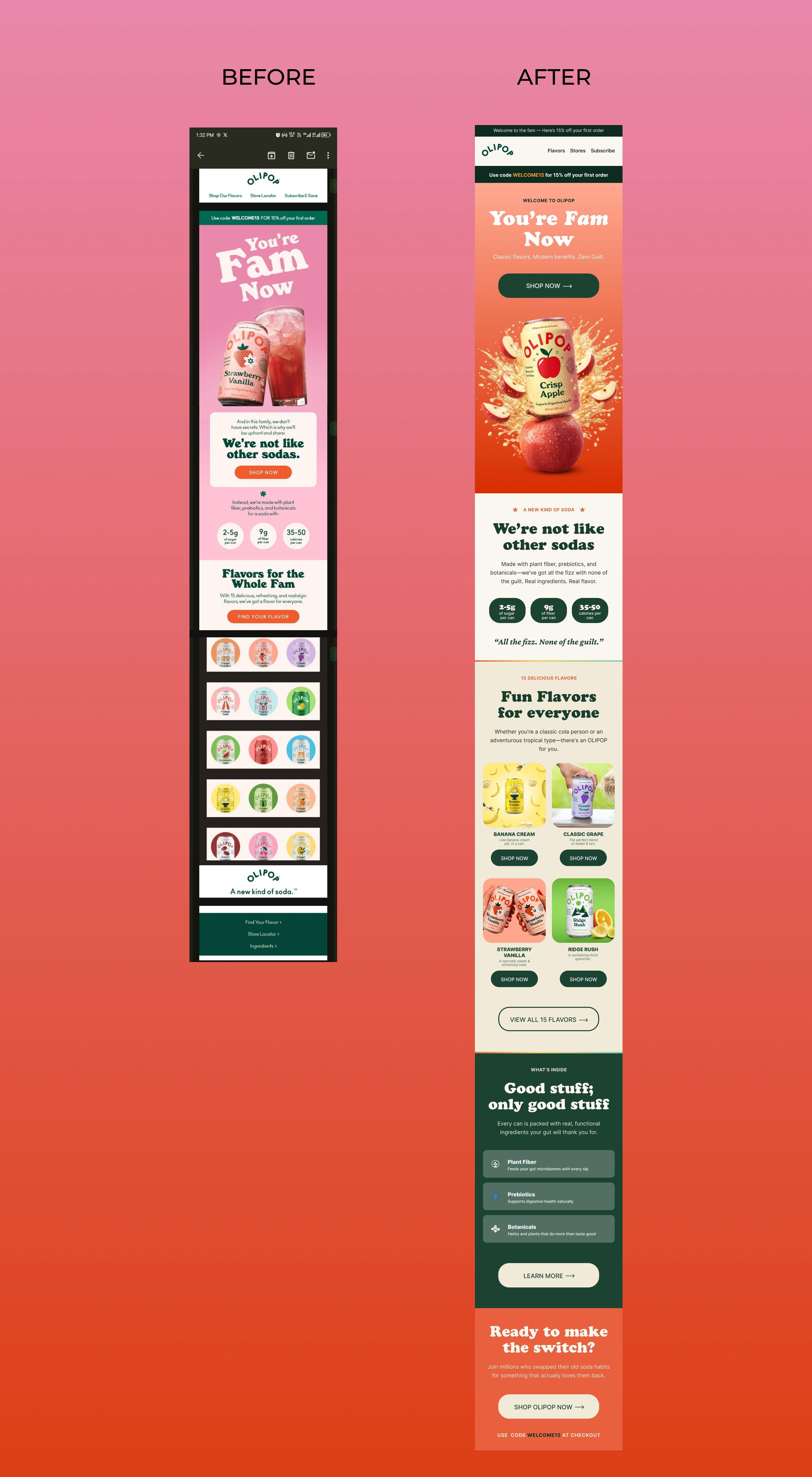
Full-length screenshot of OLIPOP's original email in dark mode, with black gaps showing between every section where no background colour was declared.
The problem was structural, not a one-off. It appeared in welcome, promotional, and product emails alike.
It affected majority of mobile opens.
The root cause was that no explicit background colours were declared on section containers or spacer rows.
The Challenge
Dark mode failures are easy to miss from the sender's side, because the email looks fine in a standard preview. For OLIPOP, the redesign had to:
Eliminate the rendering gaps at the root, not patch them
Keep the "You're Fam Now" voice intact
Raise the design to match the brand's premium identity while fixing the technical problem
Strategic Approach
The audit and the redesign work as a single argument:
Find the failure → Document it → Show the fix
I chose the welcome email because it's the first email new subscribers receive. Fixing it there also demonstrates the fix for every other send.
Design Approach
Purpose: Solve the dark mode problem and strengthen the brand experience in a single redesign.
Every section background is explicitly declared, so there are zero transparent rows and zero gaps in any mode. The flavour card system was rebuilt for consistency, with the same proportions, treatment, and buttons across every card. The headline and voice stayed as they were, and only the layout changed.

Full-length redesign of OLIPOP's welcome email with the "You're Fam Now" headline, consistent flavour cards, and a dark green ingredients section, with no gaps between sections in dark mode.
Design System
Explicit background colours on every section container and spacer row
Consistent flavour cards with matching proportions and buttons
An ingredients section on dark green, a contrast moment that signals real brand substance
Brand voice preserved, layout elevated
Conversion Thinking
A reliable rendering builds trust from the first email a subscriber opens.
Consistent flavour cards make choosing easier and browsing smoother.
The dark green ingredients section builds credibility at the moment a reader is deciding.
Outcome
The redesign was tested on a dark canvas in Figma with zero rendering gaps. It solves the technical problem and delivers a stronger brand experience at once. The audit and the redesign were built as a cold pitch.
Role & Tools
Role: Email Designer
Project Type: Cold audit and welcome email redesign
Tools: Figma, Adobe Photoshop, Klaviyo
Like this project
Posted Sep 28, 2026
Redesigned OLIPOP's welcome email to fix dark mode rendering issues.