Purely Prep Skincare Website Concept

Samson Bojesomo


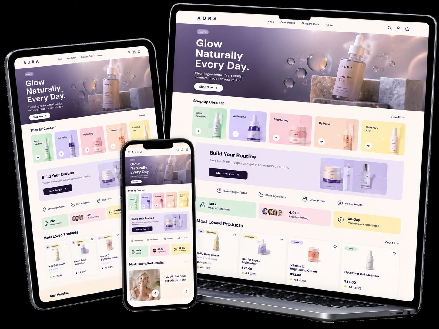
Purely Prep — Premium Skincare Website Concept
Project Type: Speculative Shopify UI/UX Design & CRO Framework
Industry: Beauty & Skincare
Tools: Lovable, UI/UX Design, Shopify Design Planning
Status: Interactive Concept — Not Yet Implemented on Shopify
Designed by: WhizwayDigit
Project Overview
Purely Prep is an emerging skincare brand focused on making skincare gentle, simple, and approachable for younger customers.
I came across the brand's website design brief and saw an opportunity to demonstrate how thoughtful design, product education, and conversion-focused UX could bring its vision to life.
Rather than simply submitting a proposal, I independently created an interactive website concept to explore what a premium, Gen Z-focused Purely Prep storefront could look like.
The goal was to develop a strong visual and structural foundation that could eventually be adapted to the brand's official identity, product photography, and Shopify store.
Explore the interactive concept:
https://purelyprep-by-whizwaydigit.lovable.app
The Design Challenge
How do you make a new skincare brand feel premium, approachable, and trustworthy while giving first-time visitors the confidence to shop?
My concept focused on three priorities:
Visual appeal: A playful yet elevated design that feels relevant to a younger skincare audience.
Customer confidence: Clear product education, routine guidance, review placements, and accessible shopping information.
Conversion-focused UX: Helping visitors move naturally from discovering products to exploring details and adding items to their cart.
My Design Approach
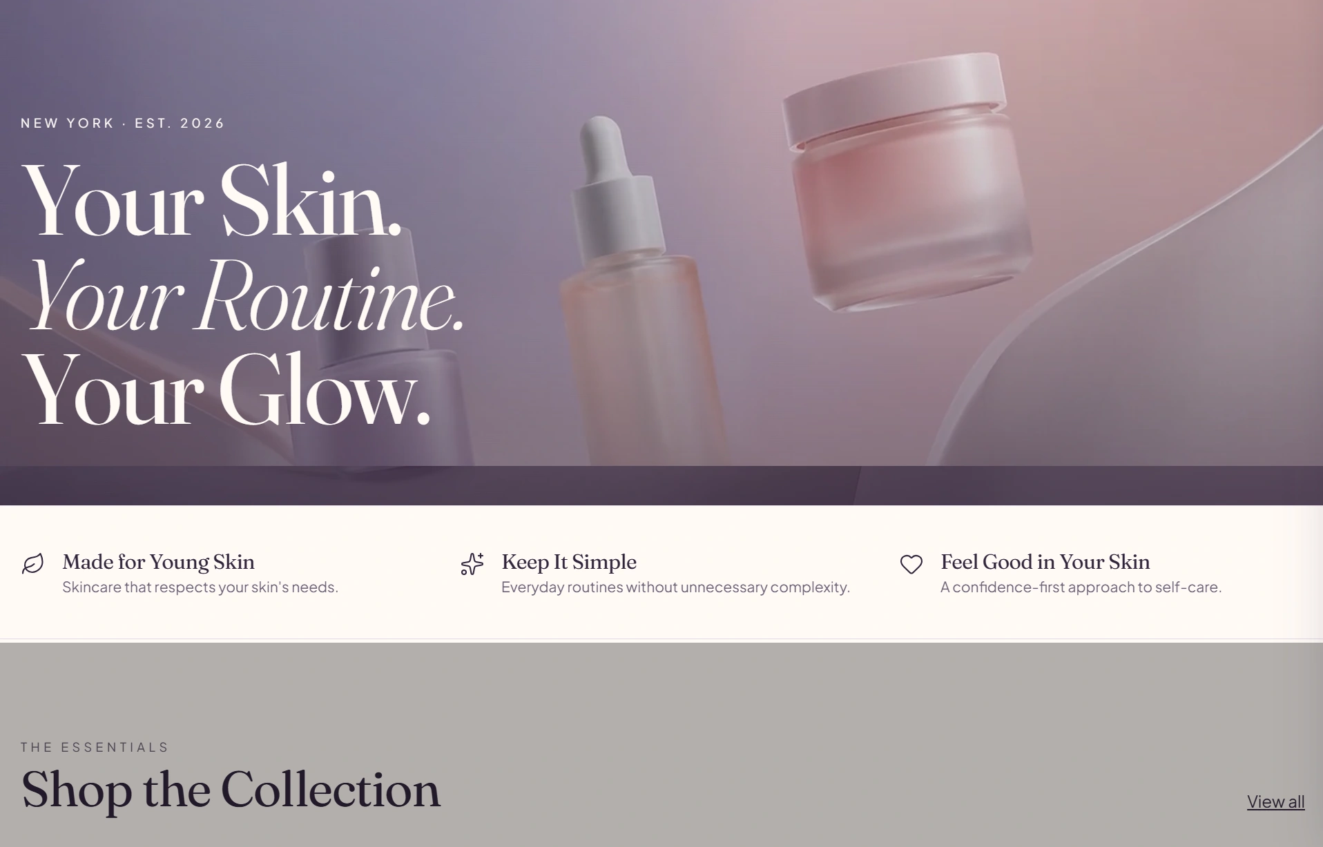
01. A Strong First Impression
I created a soft, editorial hero design with floating skincare product visuals, expressive typography, and a clear shopping CTA.
The lavender, blush, mint, and cream color palette gives the concept a youthful personality while maintaining a premium appearance.
The hero was designed to communicate the brand's direction immediately, without overwhelming visitors with information.
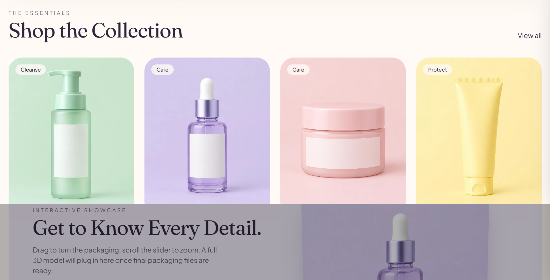
02. Product Discovery & Quick Shopping
I designed a four-product collection layout with clean product cards, clear pricing areas, and accessible shopping actions.
The framework includes product discovery, a featured product showcase, and opportunities for Quick Shop and streamlined cart interactions.
The objective is to reduce unnecessary steps between browsing and purchasing.
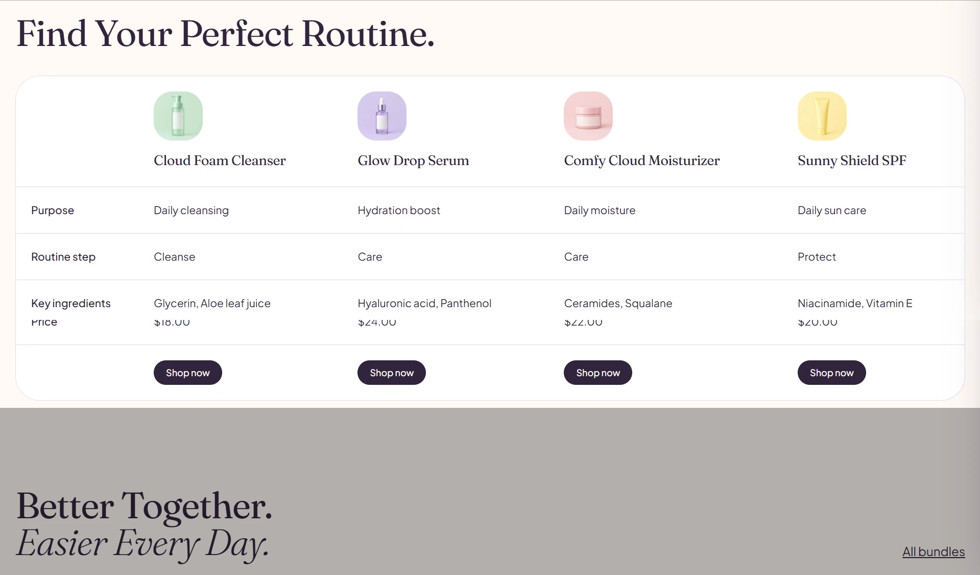
03. Product Education & Routine Building
Skincare customers often need guidance before choosing a product.
To address this, I designed an interactive routine section, product comparison layout, and educational product content.
These sections are intended to help visitors understand product differences and explore suitable routines using verified information once the official catalog is available.
04. Building Trust Through Social Proof
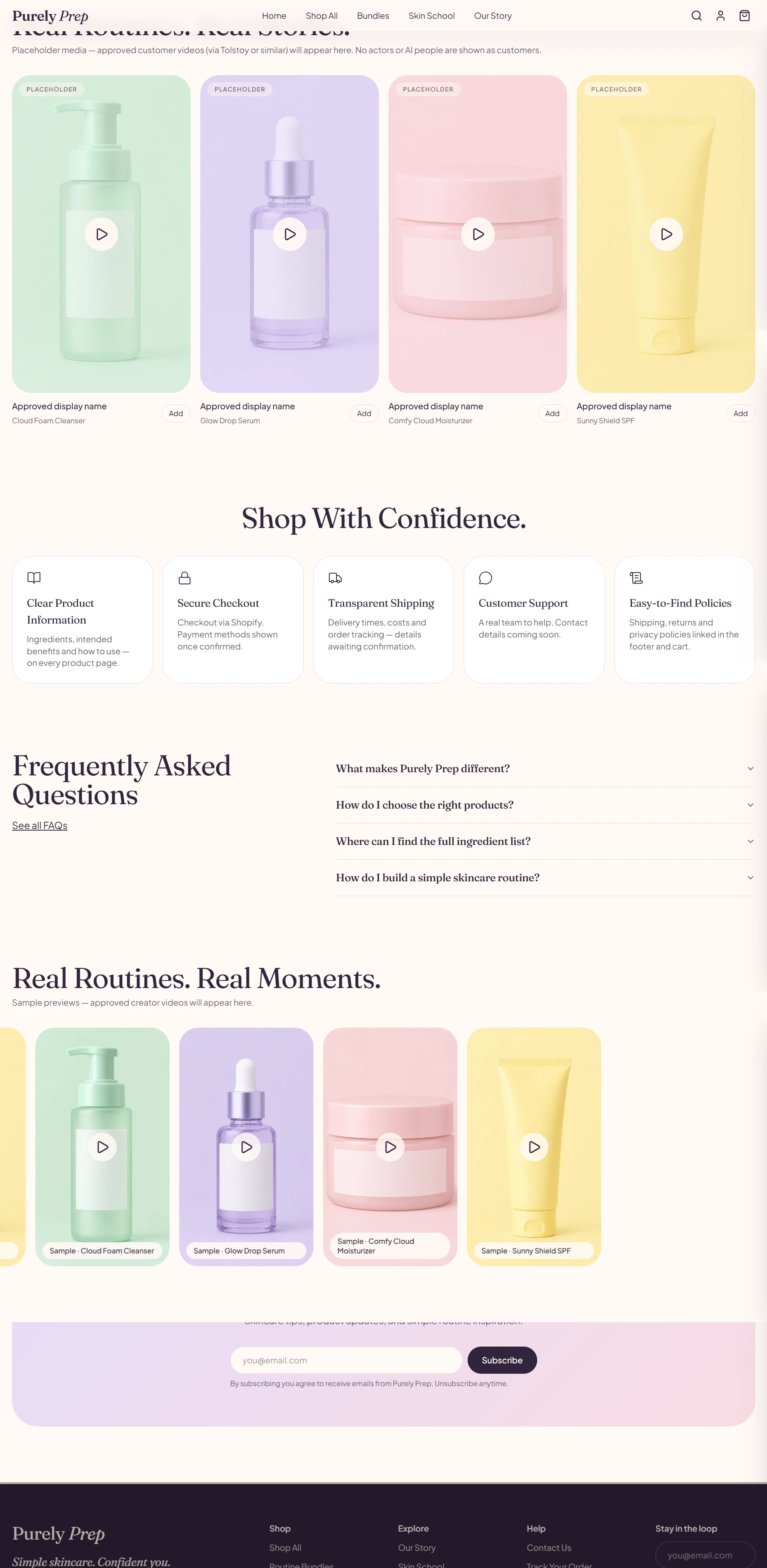
I incorporated dedicated layouts for customer reviews, product experiences, video testimonials, and shoppable content.
These sections are designed to support authentic customer feedback once the brand has approved reviews and media available.
No demonstration content is presented as verified customer feedback.
05. Purchase Reassurance
I added a Shop With Confidence section and accessible FAQs to provide space for important information such as product details, shipping, customer support, and store policies.
The goal is to answer common questions before they become reasons to leave the website.
06. Mobile-First Shopping Experience
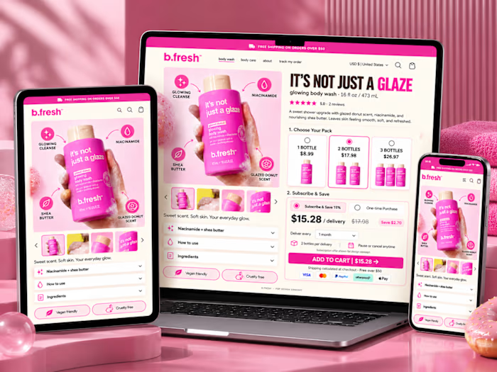
The layout was designed to remain clear, responsive, and easy to navigate on smaller screens.
I focused on readable typography, accessible product cards, touch-friendly shopping controls, and consistent spacing.
The intended Shopify implementation would prioritize lightweight interactions, optimized imagery, and fast page loading.
Proposed Shopify Implementation
This concept was developed as a framework for a future Shopify Online Store 2.0 storefront.
The proposed implementation would use a premium theme such as Prestige, with appropriate customization and compatible Shopify integrations.
Potential features include Quick Shop, sticky Add to Cart, a slide-out cart, product reviews, shoppable UGC, bundles, SEO, analytics, and supported sales-channel integrations.
These are proposed implementation features, not claims that the live Shopify functionality has already been delivered.
Project Outcome
The result is an interactive skincare website concept that demonstrates how Purely Prep's online shopping experience could combine premium design, product education, and conversion-focused structure.
At this stage, the website uses conceptual products and visual assets. Official brand products, final photography, Shopify development, payment processing, and third-party integrations remain outside the completed concept.
This is a design exploration rather than a launched client store, so no sales uplift or conversion results are claimed.

My takeaway: A beautiful eCommerce website should do more than attract attention. Every section should have a purpose: explain the product, build trust, simplify decisions, or help customers take the next step.
Designed by WhizwayDigit
https://whizwaydigit.com
Like this project
Posted Oct 9, 2026
Created a premium skincare concept website for Gen Z customers.