Landing Page Design for Saptarshi Prakash
vaishnavi mal
Goal
The goal is to create a “start here” page that aggregates Sapta’s info on the web and best work in one place. To do this, research was done to determine what type of content Sapta puts out, as well as what his branding looks like. This research was then used to create an information architecture for the page, which was then designed in Figma, with colors from Sapta's existing branding.
Here's the video of the Landing Page I came up with
My Process
My journey of making this landing page can be divided into 7 broad categories of tasks:
Non-linear process
Research
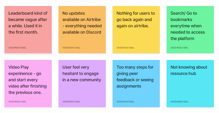
As part of my research, I started devouring Saptarshi’s social media platforms.
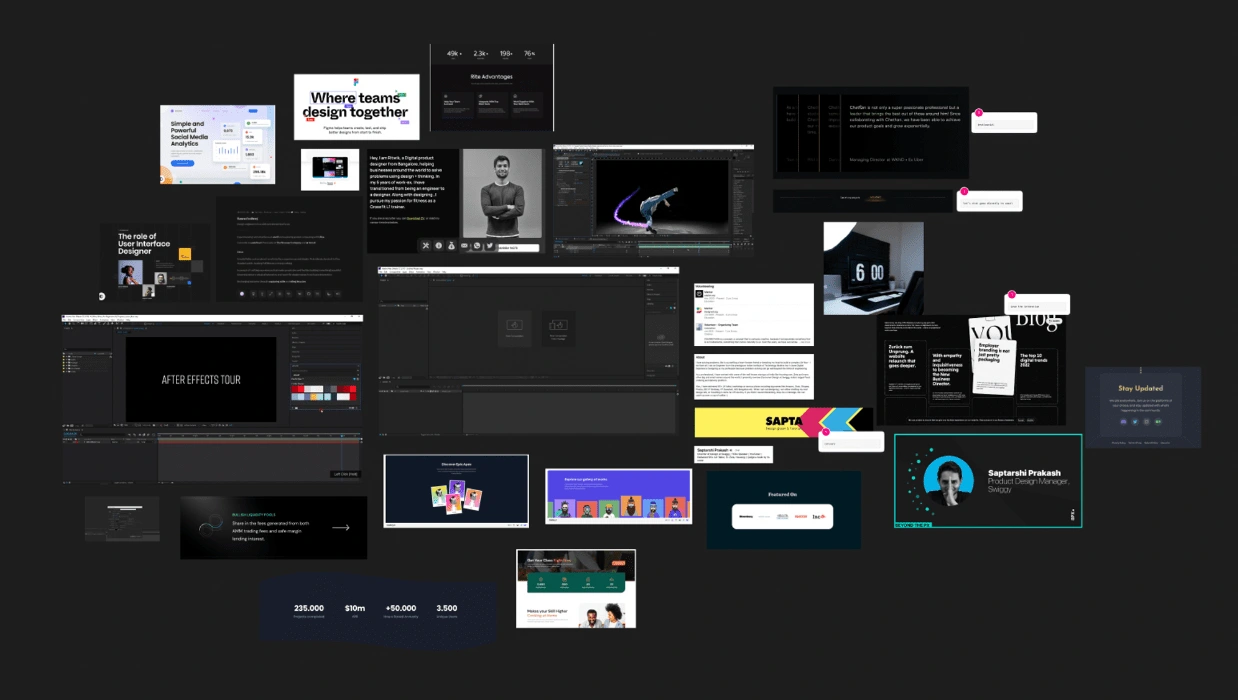
Research and moodboarding for the website
In his day Saptarshi,
Is Director @swiggy - Previously worked at Zeta, Housing.com
Does content on Instagram
Is a linkedIn creator
Has a Youtube channel
ADP list mentor
UI course at growth school
Talks at various events
1:1 sessions
My aim is to show as many things as I can so that his audience doesn't miss out on anything.
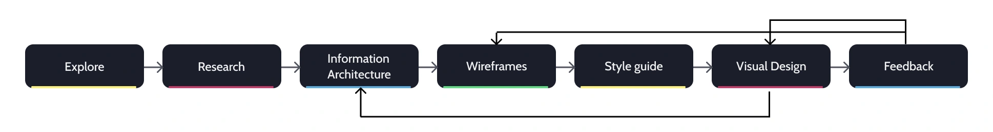
Information Architecture
Now that the goals of the landing page were understood, the next task was to decide the information that the landing page will contain. Generally, a landing page should answer the following questions:
“What is this?”
“Is this for me?”
“How can I trust this?”
“Why should I buy this?”
Screenshot of the super page Sapta currently uses
Design Language
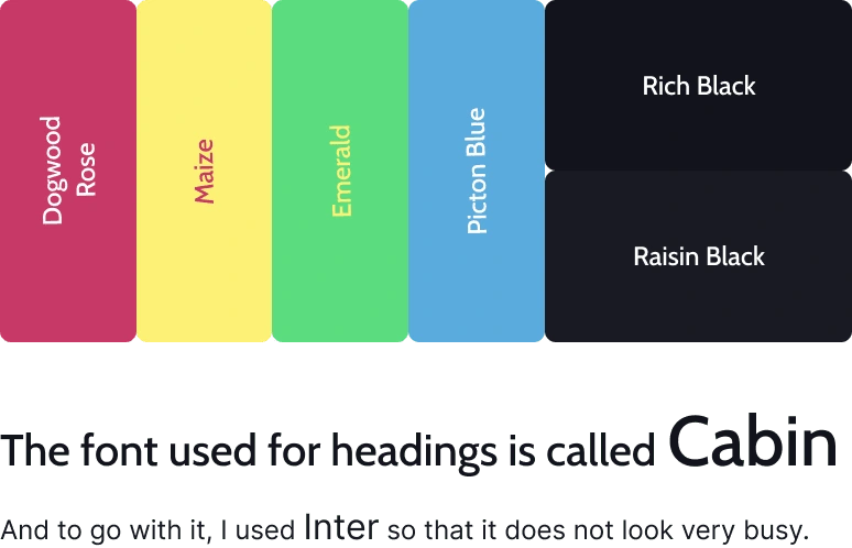
I wanted the personality of Sapta to show through the website. I incorporated blacks and solids and also the existing color theme that Sapta has for his youtube channel for a more cohesive brand representation. I have designed the website with a dark theme to reflect Sapta's solid color personality. This choice was made to showcase his personality through the website. Additionally, I wanted the website to have a premium look, and a dark theme worked best to achieve this.
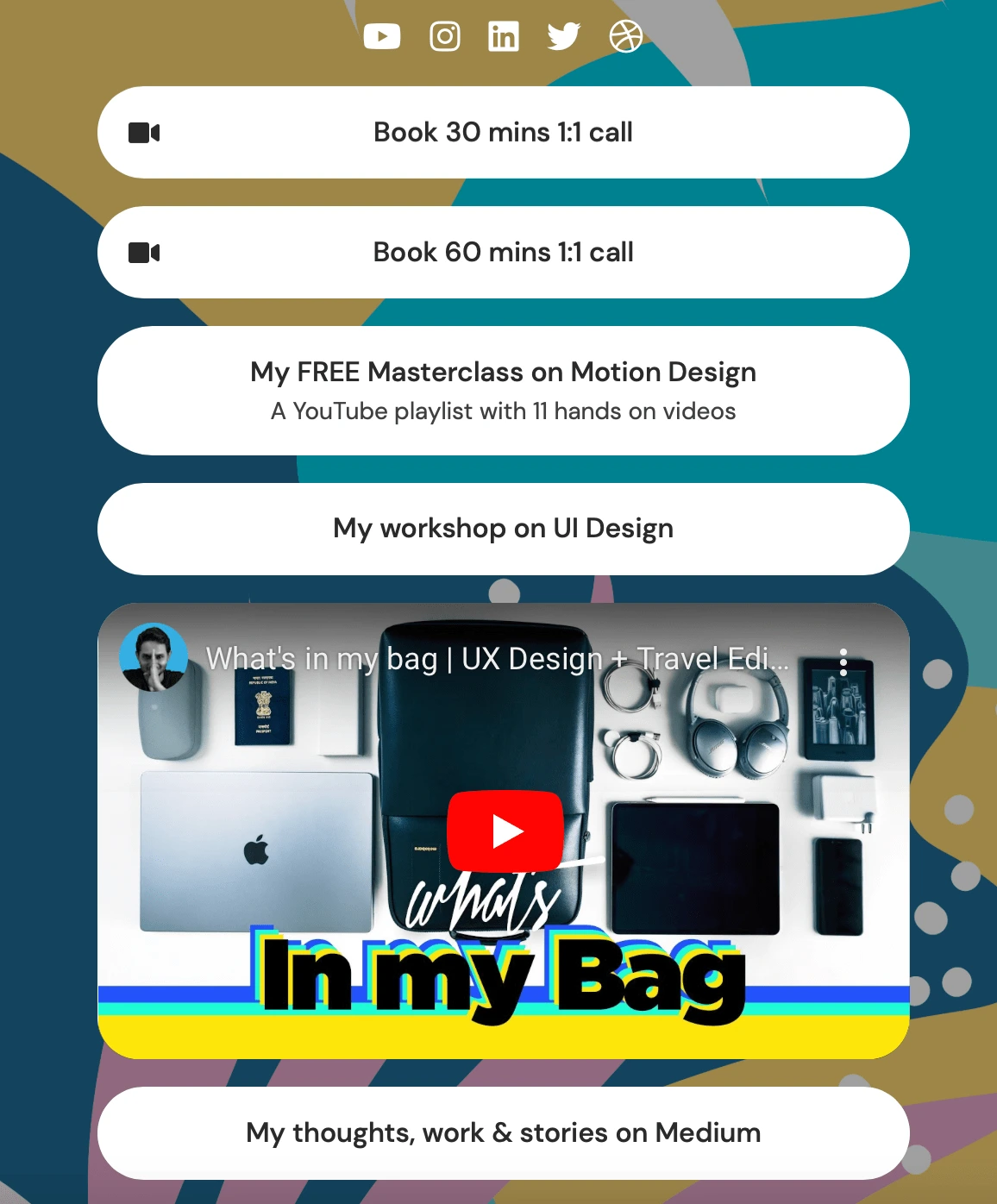
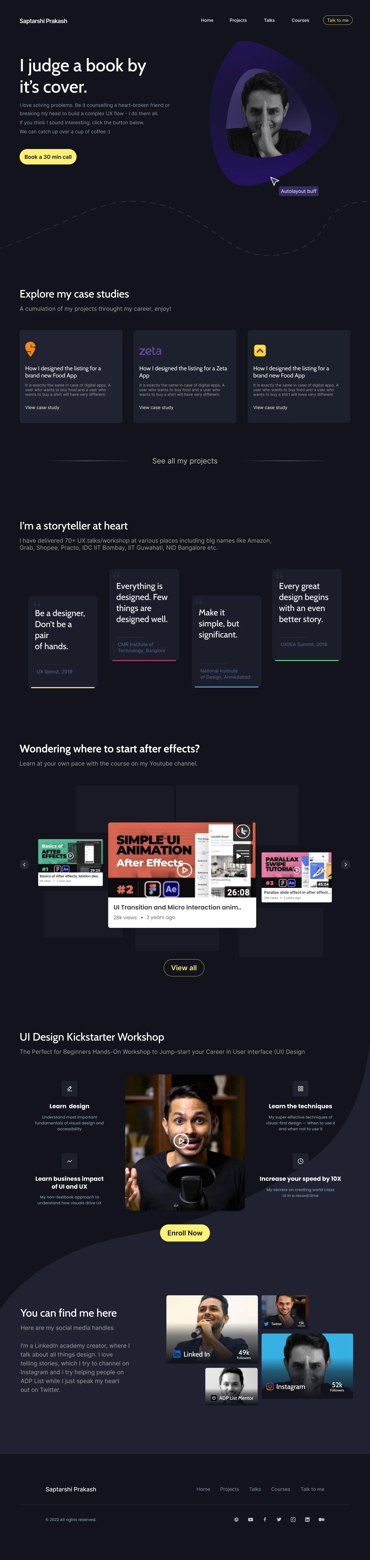
Hero Section
In the hero section, I wanted the face of the creator to instantly identify and induce a feeling of trust at the first sight. The copy chosen is one of their most famous quotes that instantly catches attention and hooks the audience. The CTA chosen is given the highest importance as per his super page.
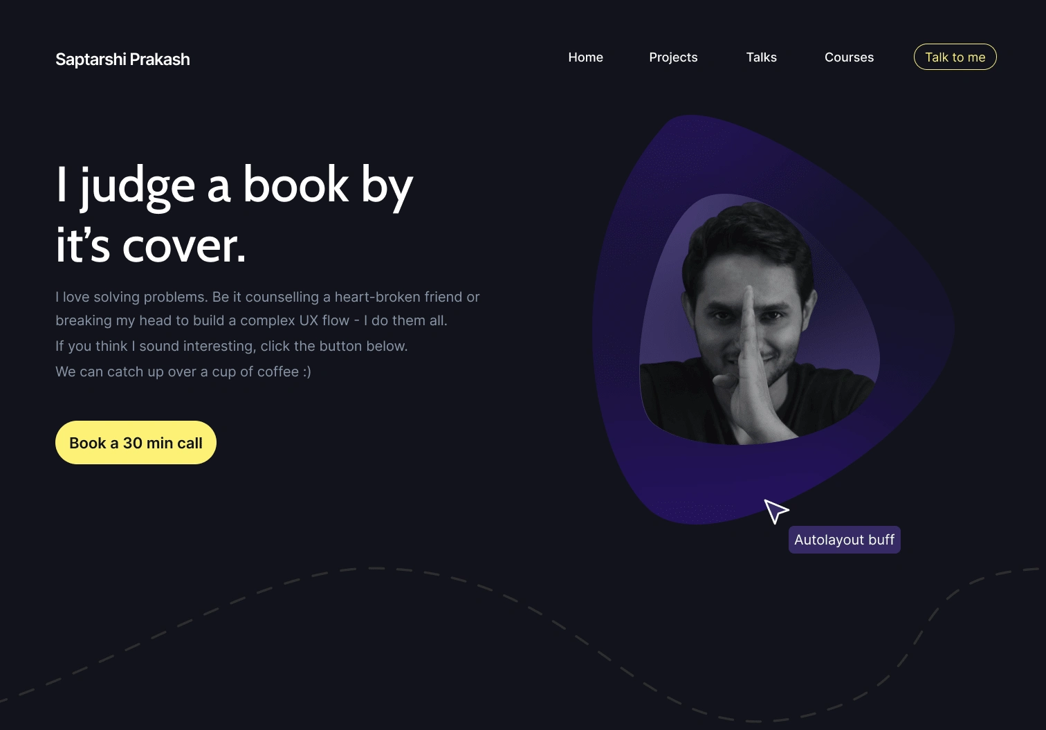
Added a few quirky elements like figma cursor to truly show his personality
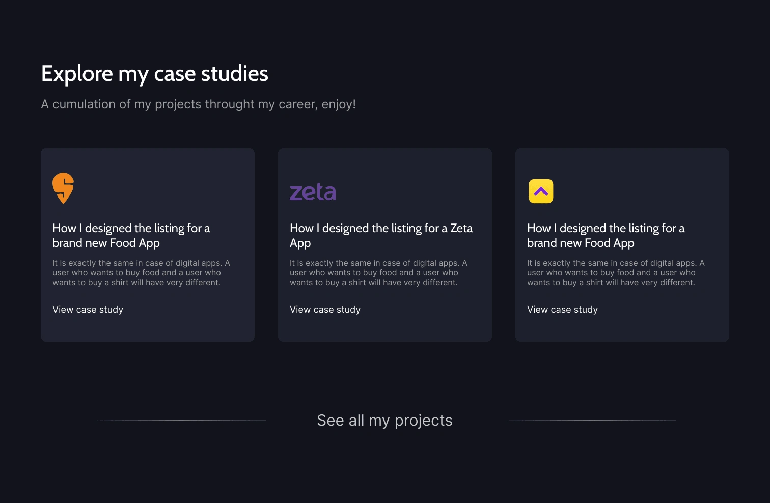
Case Studies
The question “How can I trust this?” is answered by this section. Showing work builds trust as well as credibility.
Speeches and Talks
Sapta is a storyteller and I wanted it to have special attention. This shows the event organizers that he's interested in this domain and avidly pursues it, hence creating more opportunities for him.
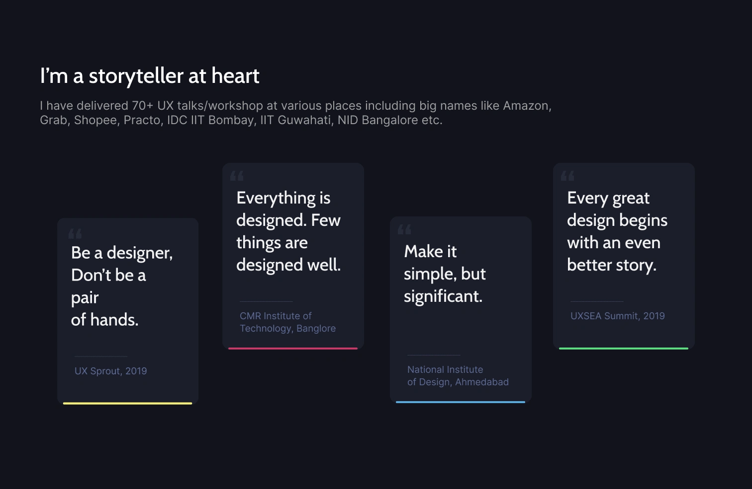
The interaction of the cards truly stands out here, refer to the loom video to see it
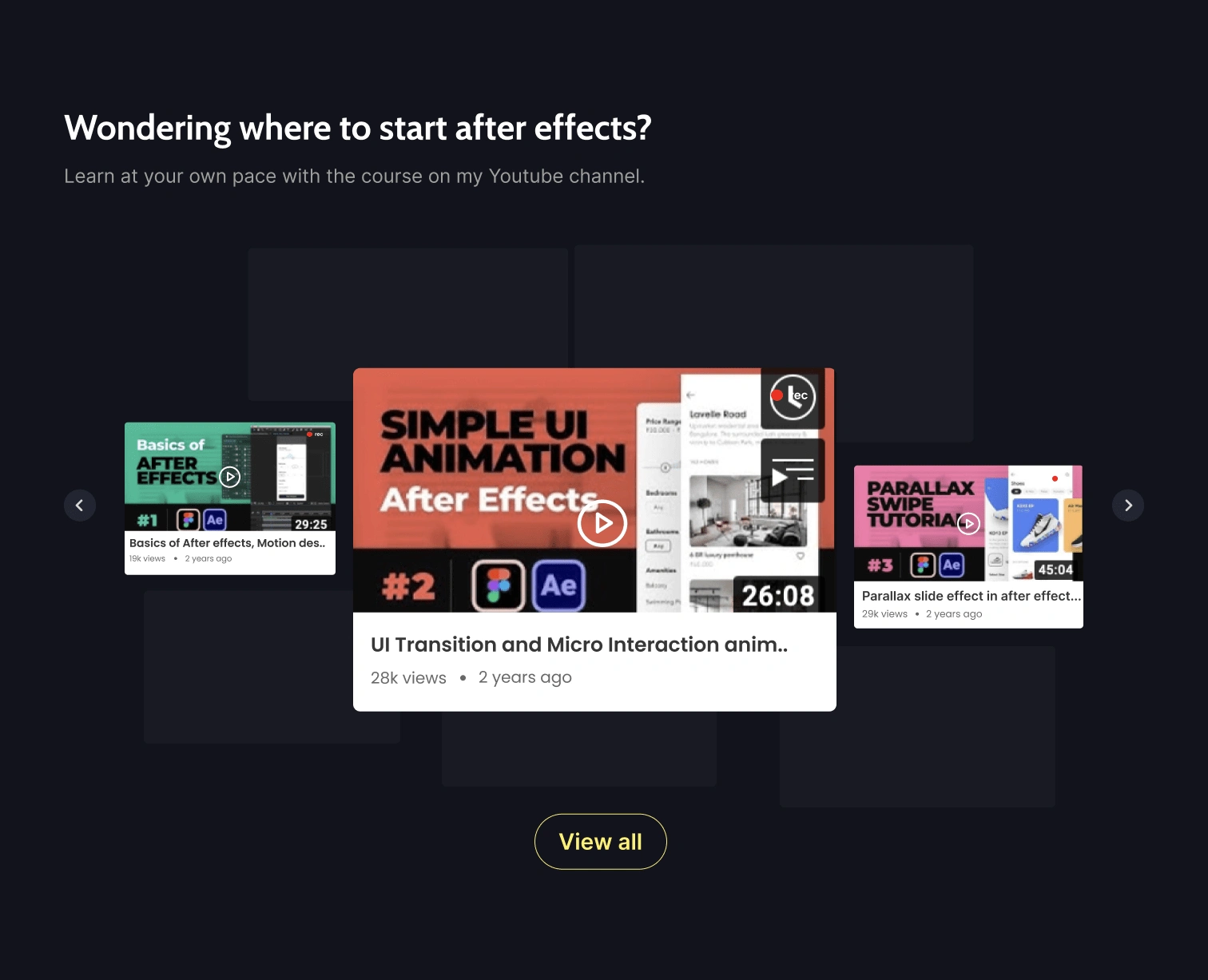
Youtube
Sapta rose to fame in the design community and in the audiences when the After Effect series blew up. So this acts as a good segway to his Youtube channel, increasing his audience on Youtube.
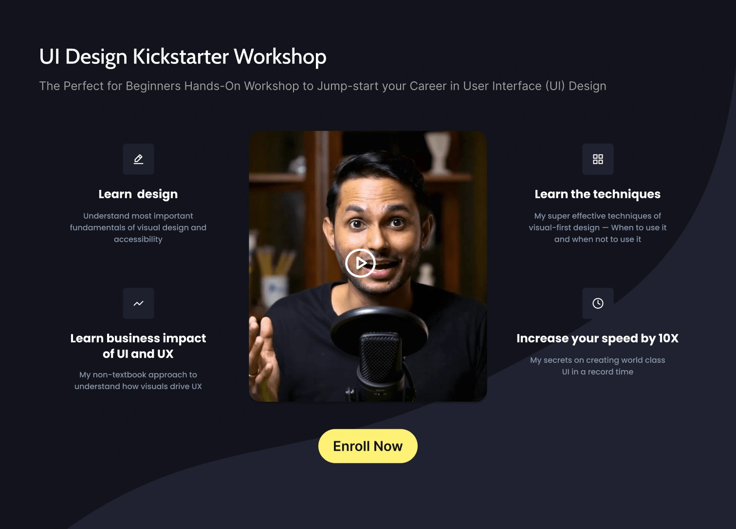
UI Design Workshop
Sapta has curated a UI design workshop in partnership with GrowthSchool which is one of the most talked workshop in the design community.
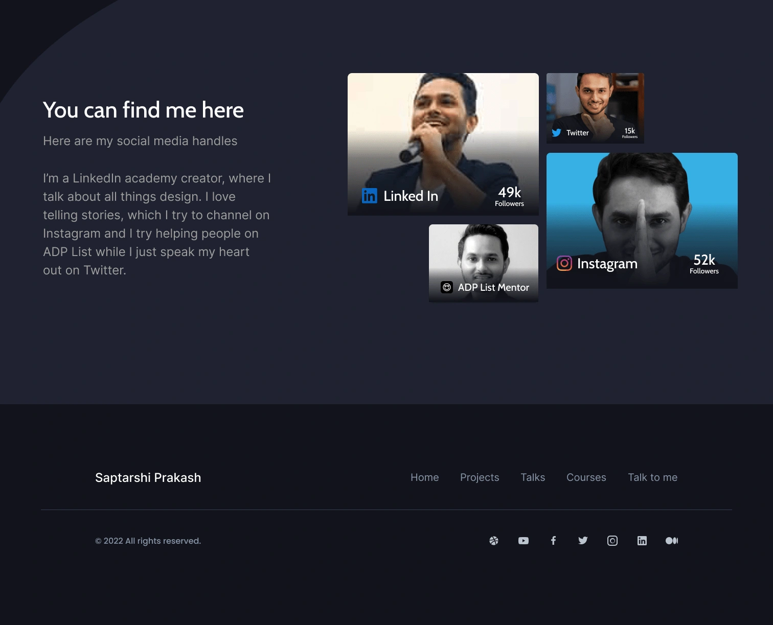
Social Media and Footer
Sapta is quite active on all the social media platforms, hence a very vital element in a start here page.
Here's the full landing page.
Like this project
Posted Mar 9, 2023
A start here landing page for a content creator, Saptarshi Prakash - Director of design at Swiggy. The aim of the page is to have all the things at one place.
Likes
0
Views
52