Mashiso| Retro Korean Restaurant
Leslie A
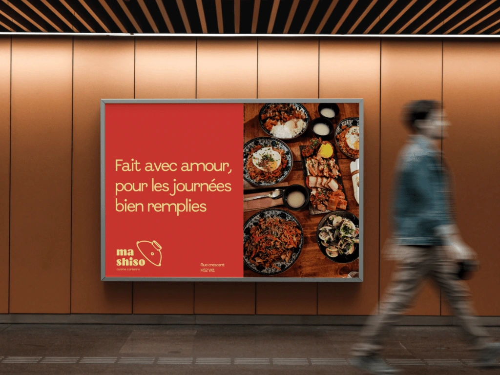
About concept
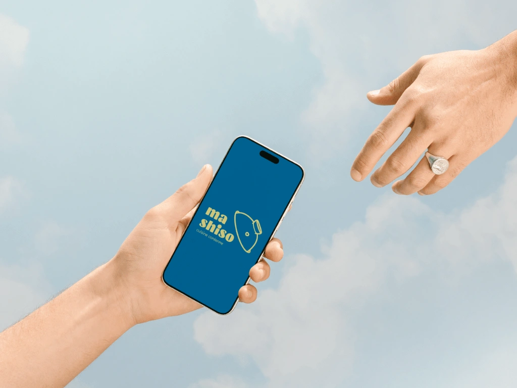
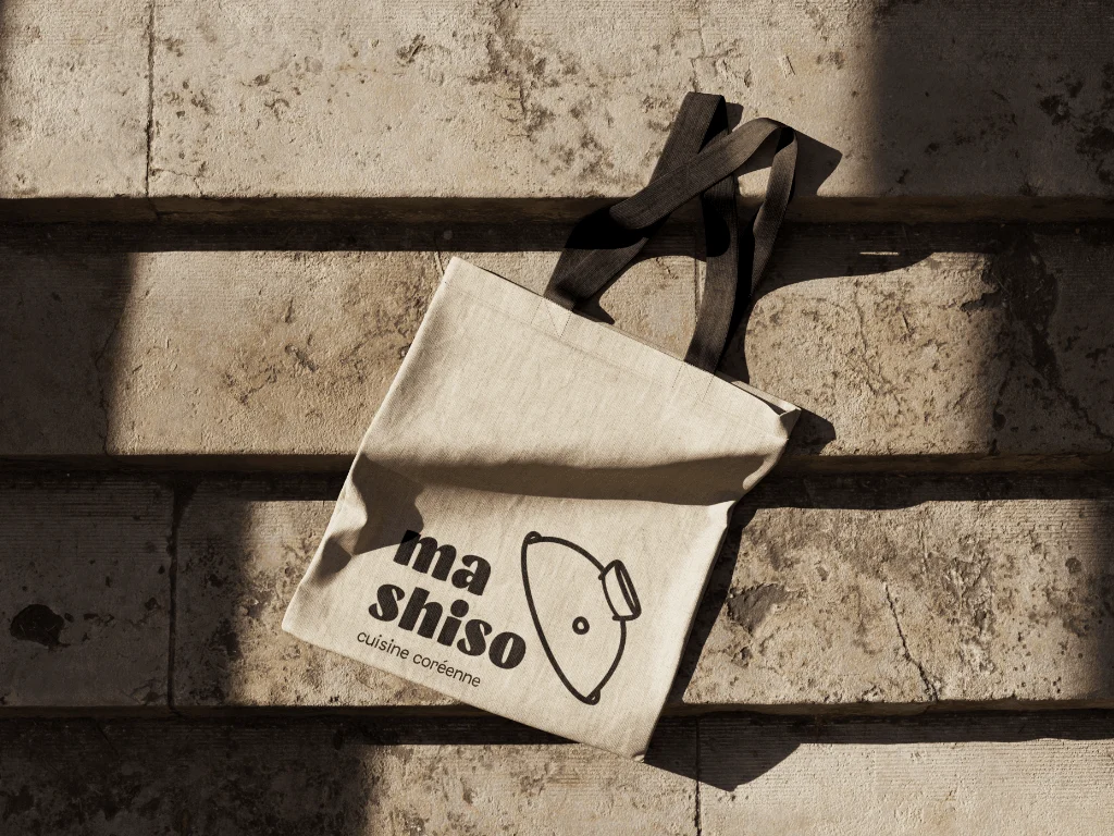
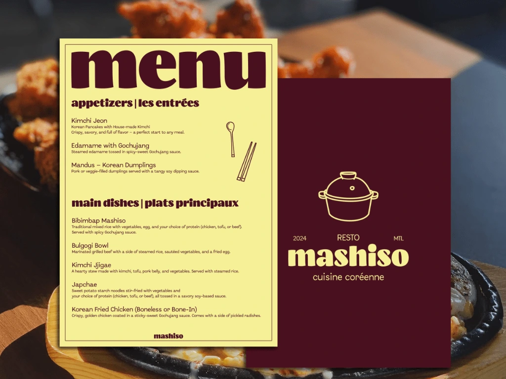
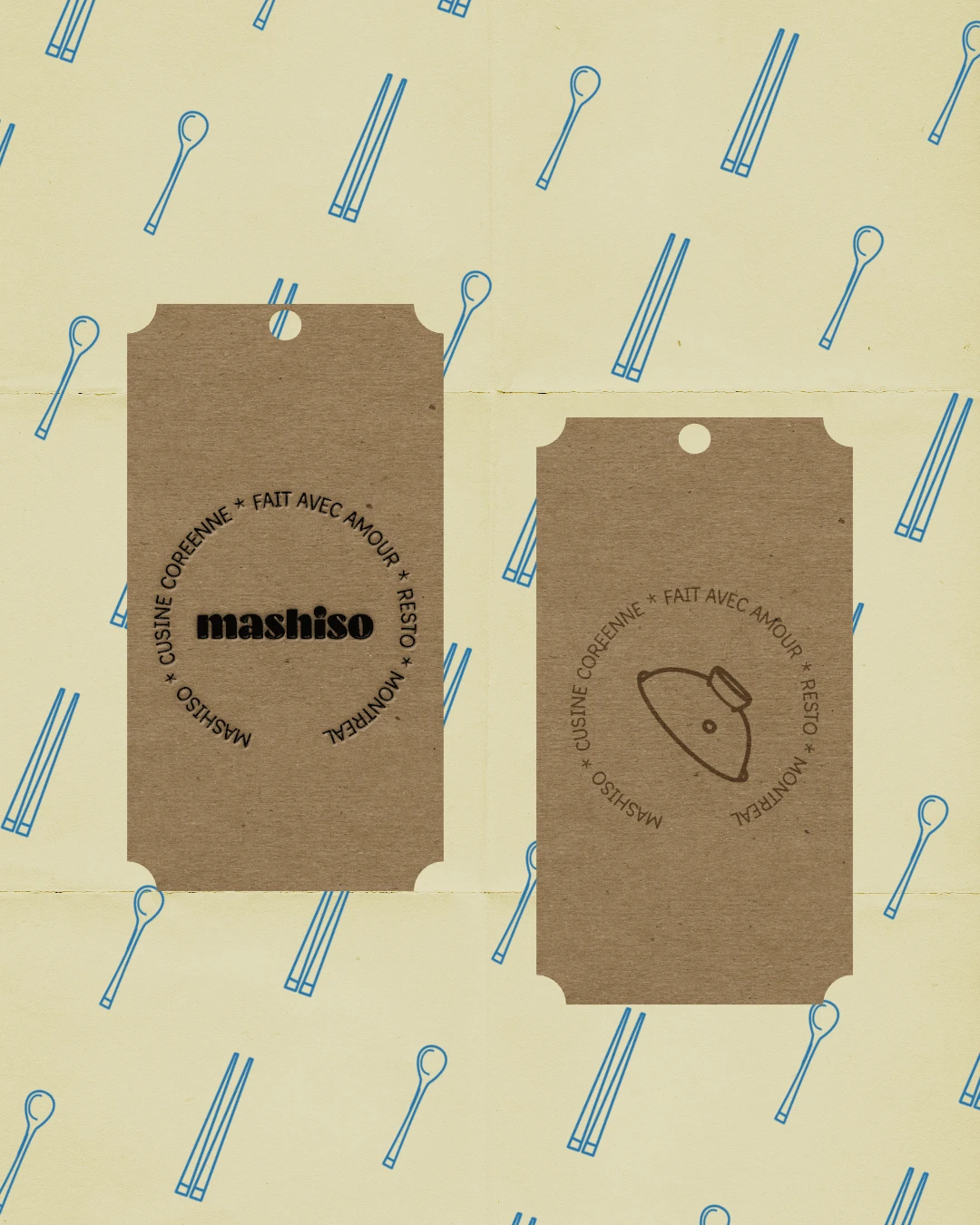
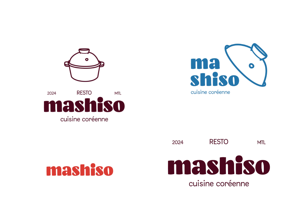
This project was a passion one and the focus was retro, bold, welcoming and authentic. Using the iconic stone bowl as part of the logo, I paired it with a bold typeface to bring a touch of modernity. I constantly thought franchise, merch, utensils and many more while building the logo suite.
Behind the concept
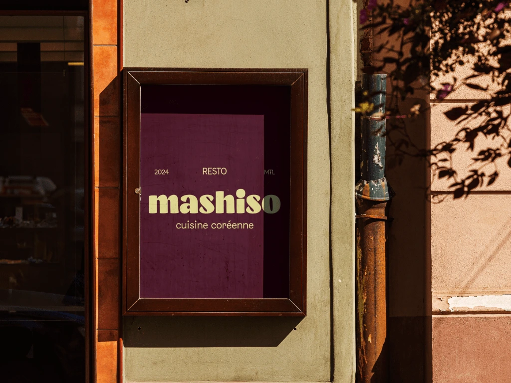
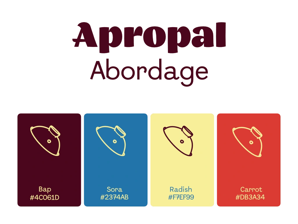
With the color selection, I started with what came to mind when I thought of retro cantine. When I saw the shade of burgundy, it reminded me so much of Korean purple rice (Heukmi Bap | 흑미밥). In the end the colors fit the vision!
Like this project
Posted Apr 6, 2025
Crafting a retro, bold and vibrant brand identity for a cantine style restaurant
Likes
40
Views
239