SURMOUNT™ – Brand Identity & Strategic Consolidation
Ken Shew
SURMOUNT®
One brand for Brokerage, Advisory, Capital, Development, and Principal Investments.
Project Snapshot
Client: SURMOUNT® – unified holding company for NNN Pro, STNL Advisors, United Global Development, and sister entities
Role: Brand Designer (co-led with Hayden Commans)
Duration: Jan 2024 – Apr 2025
Deliverables:
Brand architecture, comprehensive identity system, 40-page brand guidelines, website prototype and design, groundbreaking digital WebOM platform, motion toolkit, launch collateral, branded merchandise, and strategic implementation support.
Project Overview
SURMOUNT® is a premier full-service commercial real estate platform, specializing in net-lease solutions and partnering strategically with growth-oriented real estate firms nationwide. Previously operating as separate entities—including NNN Pro, STNL Advisors, and UGDC—our key challenge was consolidating these respected but fragmented brands into one powerful, cohesive identity. This ambitious rebrand was aimed not only at clarifying the market’s perception but also positioning SURMOUNT as the definitive leader in integrated commercial real estate solutions.
Our branding strategy needed to honor the robust legacy of NNN Pro—already highly respected in the industry—while innovatively signaling the company’s fresh and unified future. To achieve this, we developed an identity rooted in symbolism and strategic storytelling, designed to resonate across multiple channels and client touchpoints.
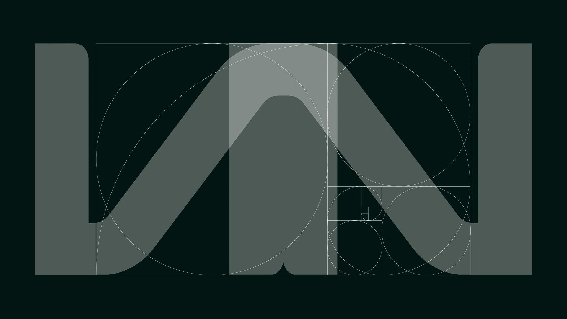
Design Strategy & Symbolism
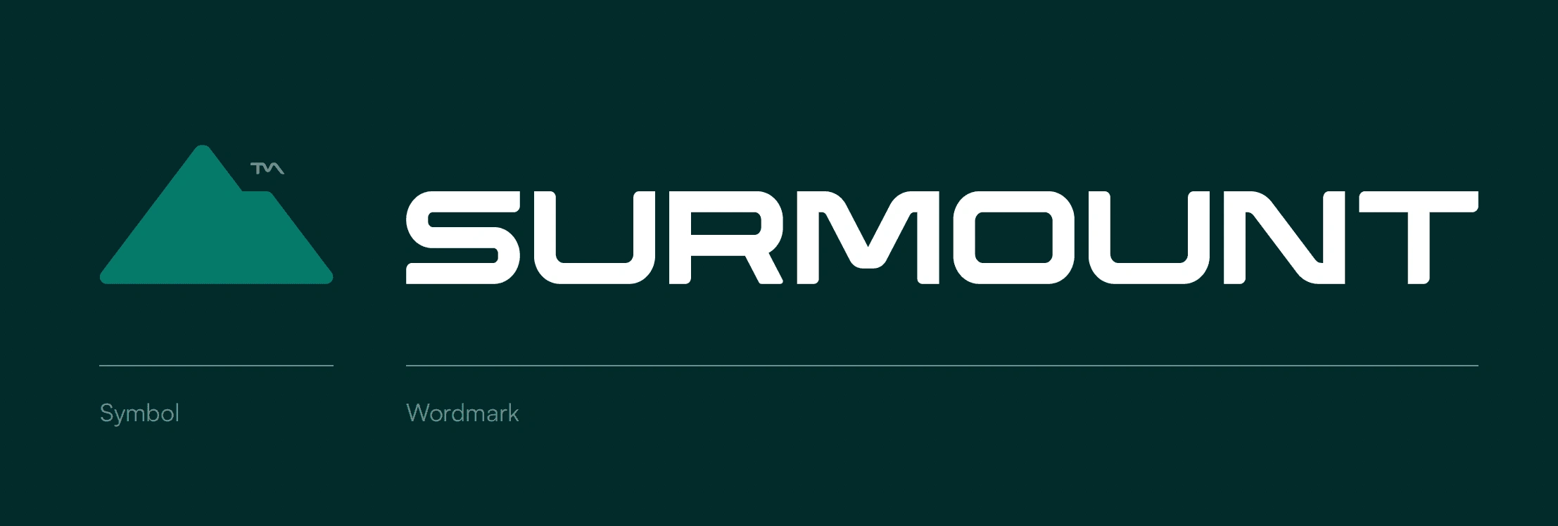
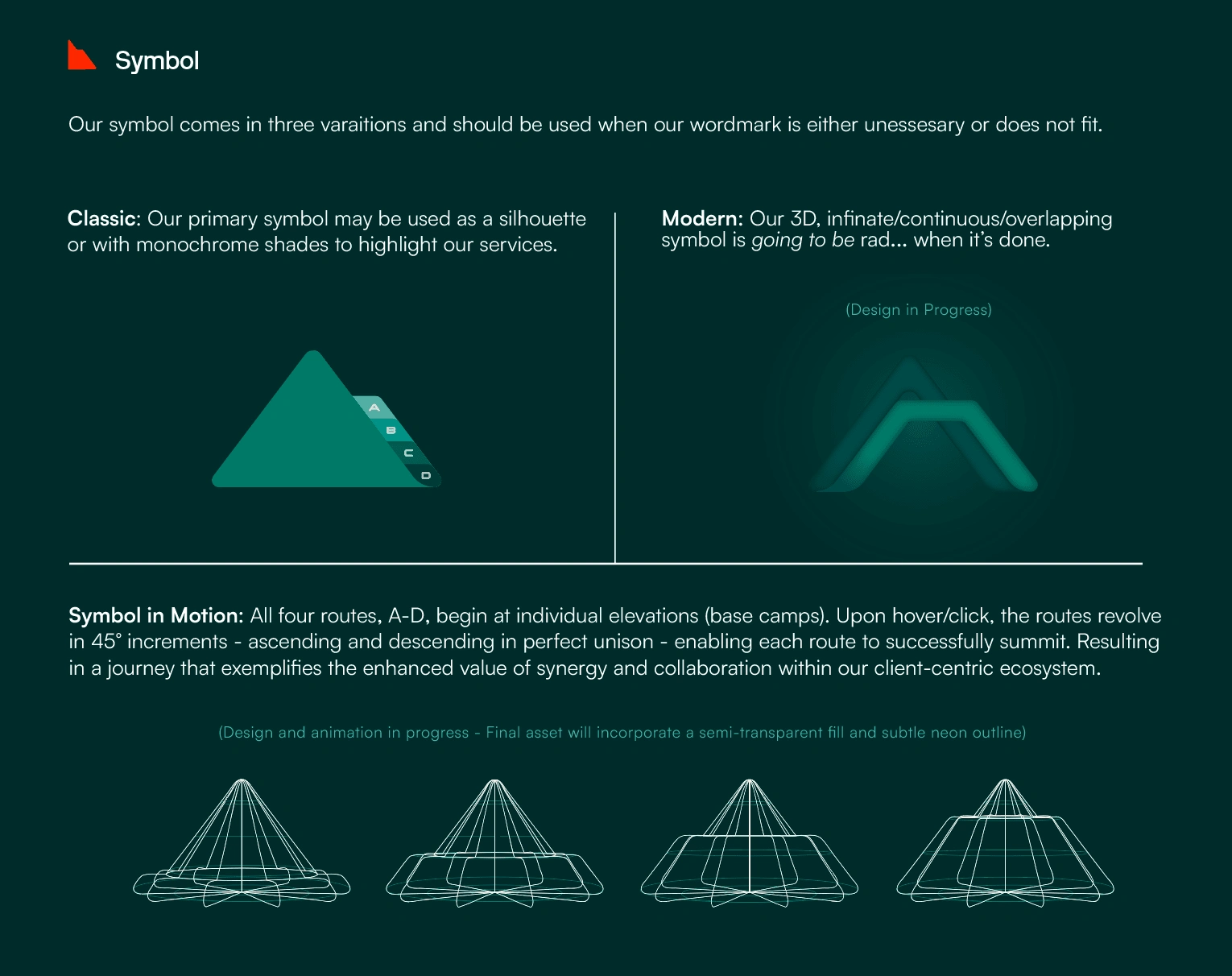
The SURMOUNT visual identity is anchored by a carefully crafted logo, creatively transforming the iconic triple-“N” from the NNN Pro legacy into a stylized mountain peak. This symbolic evolution was intentional—"surmount" means to overcome—and visually communicates our core philosophy of guiding clients and partners over complex industry challenges.
Each design choice was purposeful:
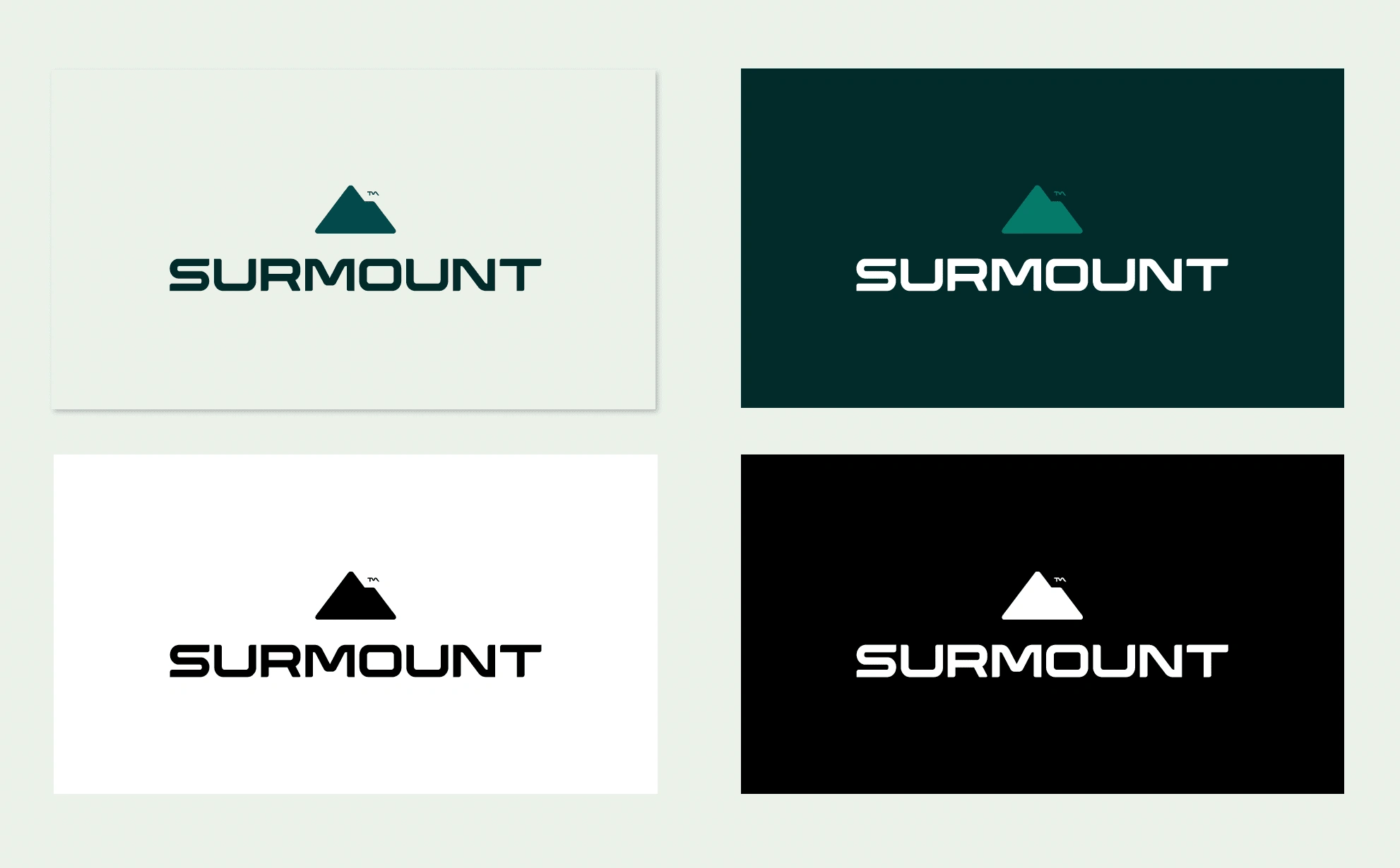
Color Palette: Our colors weren’t arbitrary; each hue holds encoded meaning. The primary deep green symbolizes trust and stability, connecting directly to the established legacy of NNN Pro, while vibrant purples and strategic accent colors were chosen to represent innovation, collaboration, and the dynamism of multiple service lines working cohesively. (HEX codes themselves subtly reference brand heritage.)
Typography & Layout: We selected a bold yet accessible typography system to reinforce clarity and professionalism, optimized for readability across digital platforms, print collateral, and large-scale signage.
Brand Architecture
SURMOUNT offers comprehensive, net-lease-focused real estate solutions globally. Our architecture clearly defines specialized sub-brands within our unified system, distinguishing yet harmonizing Brokerage, Advisory, Capital, Development, and Principal Investments. This structure enhances clarity for clients and empowers internal teams with a cohesive visual language and clear, consistent communication standards.
Clients and partners span private investors, institutional REITs, private equity, family offices, multi-unit franchise operators, major business tenants, developers, and lenders. The design intentionally communicates stability, reliability, and comprehensive expertise—qualities highly valued by our sophisticated, professional clientele.
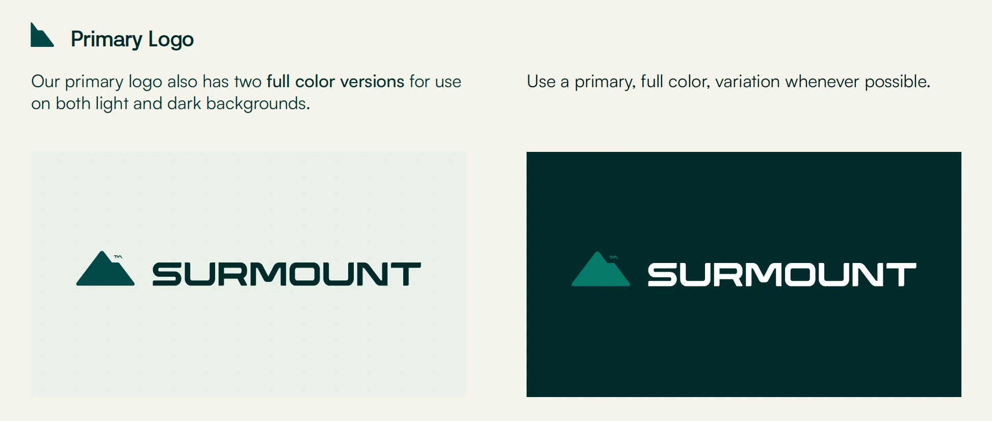
Primary Logo
Secondary Logo
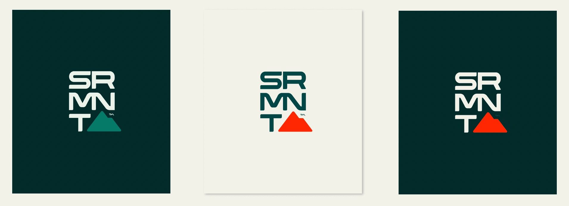
Submarks
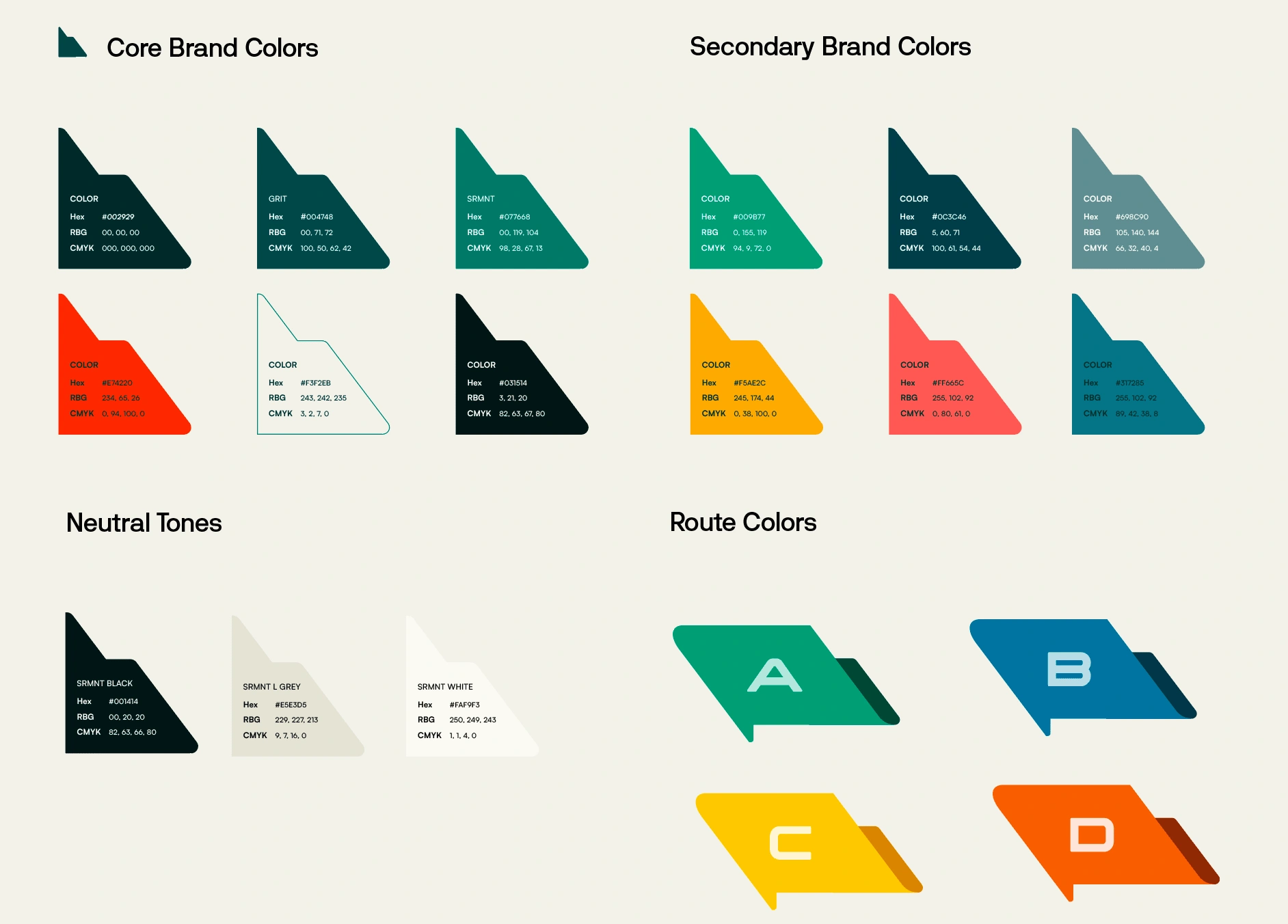
Color Palette
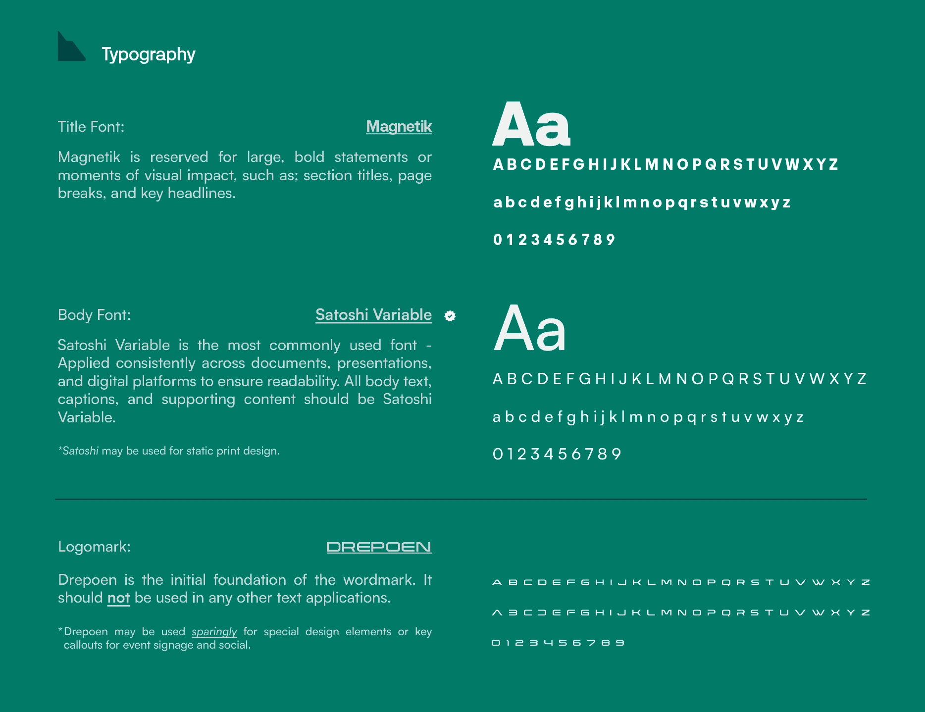
Typography
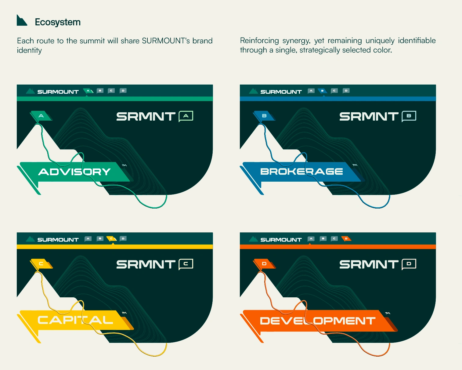
Ecosystem
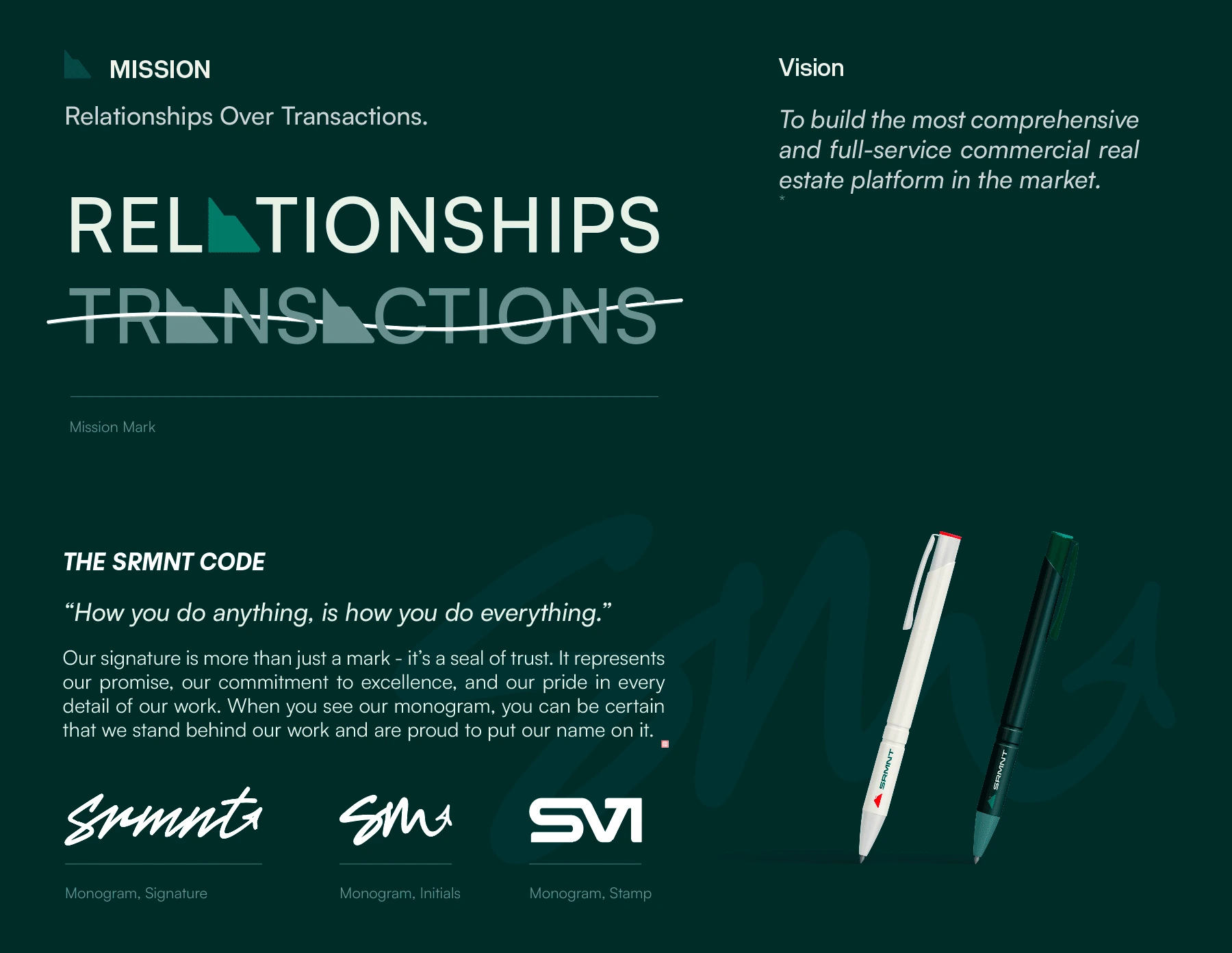
Mission
Website & Social Media
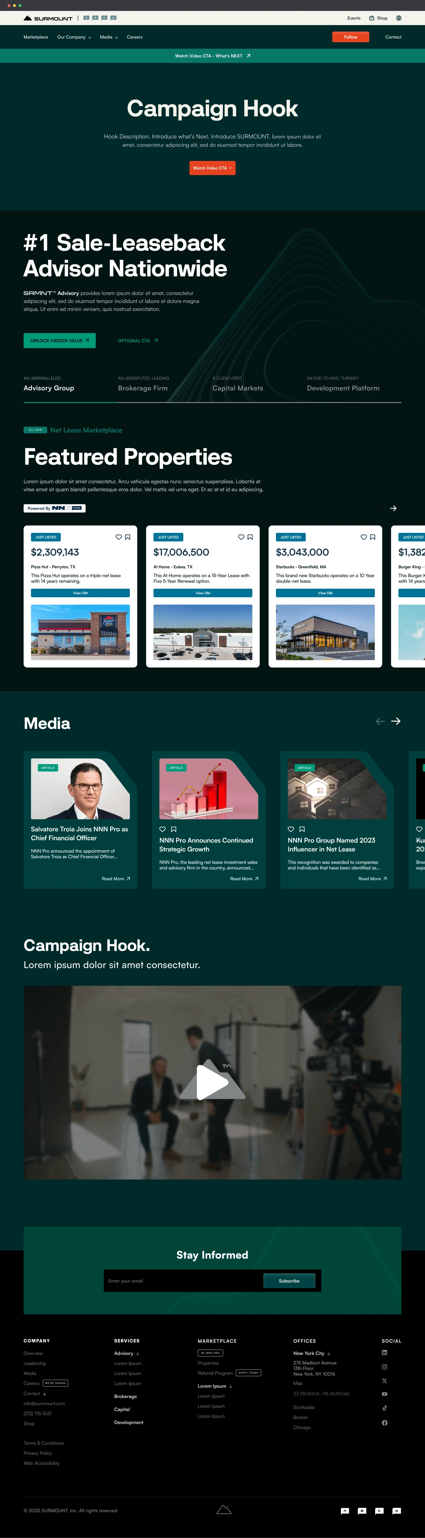
Homepage Prototype
Digital Innovation: Introducing WebOM
A key digital breakthrough was the launch of the innovative WebOM platform, marking a significant departure from traditional printed or static emailed PDFs. This pioneering digital offering transforms the standard Offering Memorandum (OM) into dedicated, interactive online mini-sites. Each WebOM provides clients seamless access to detailed property data, visual content, and financial insights, significantly enhancing user engagement and transaction efficiency.
WebOM not only positions SURMOUNT as digitally forward-thinking—it fundamentally shifts industry expectations, providing a clear competitive advantage through improved client interactions and elevated deal presentation.
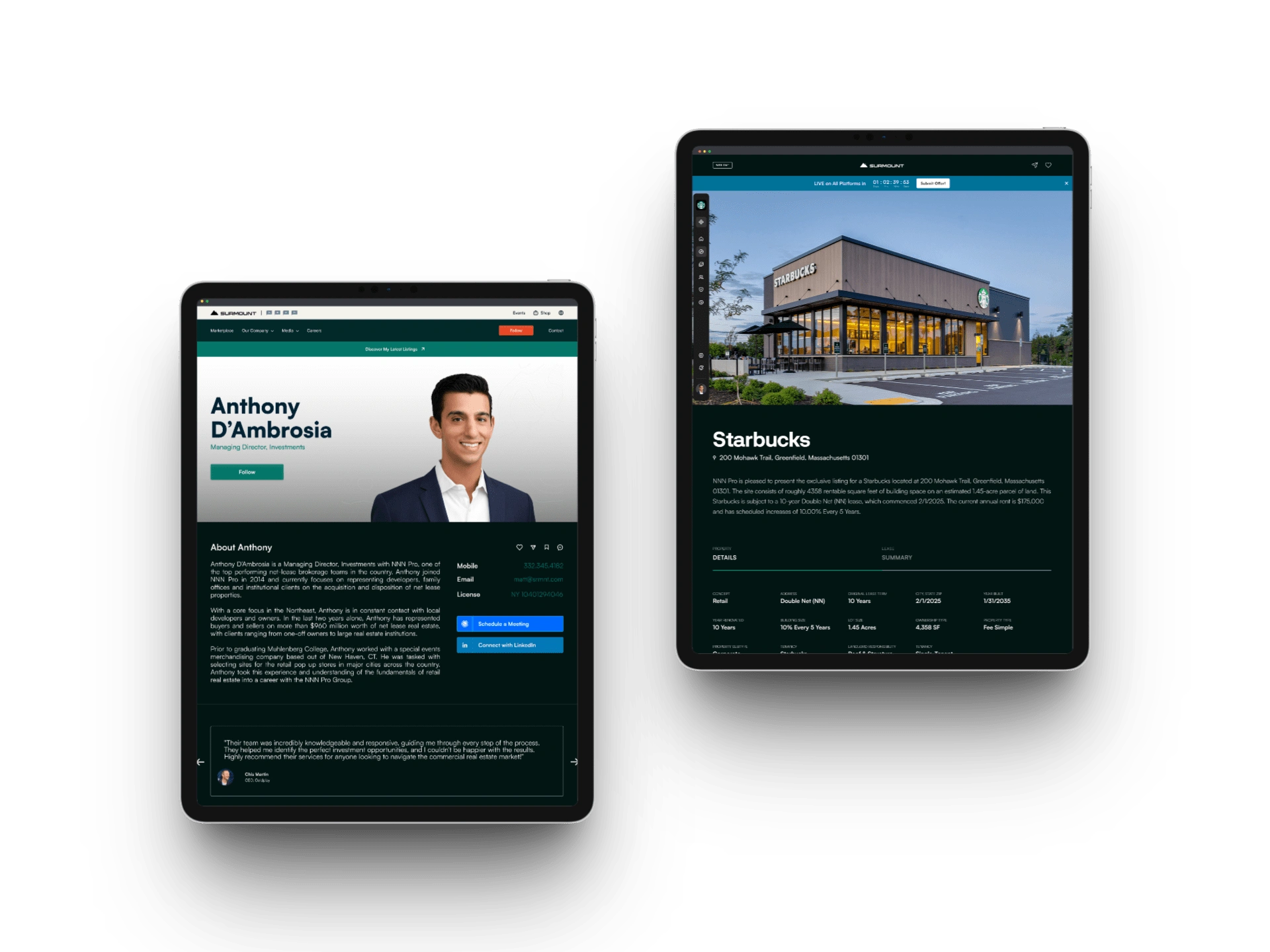
Agent Profile & WebOM
Impact & Recognition
The rebrand generated immediate industry recognition and extensive press coverage, prominently featured by Commercial Observer, Yahoo Finance, Franchise Times, Crexi, ConnectCRE, Citybiz, Business Wire, and others. Internally, the new brand was enthusiastically received by leadership and employees alike, clarifying organizational identity and enhancing cohesion across our national teams.
Early client responses were equally positive. Partners consistently praised the unified brand approach for simplifying engagement, affirming our initial strategy and execution. This overwhelmingly favorable reception underscores SURMOUNT™’s new position as a clear market leader, redefining brand excellence in commercial real estate.
Visual Identity in Action
Website & Social Media
The unified identity system seamlessly scales across digital platforms, from our comprehensive corporate website prototype to social media content strategies, ensuring brand consistency and maximum audience impact.
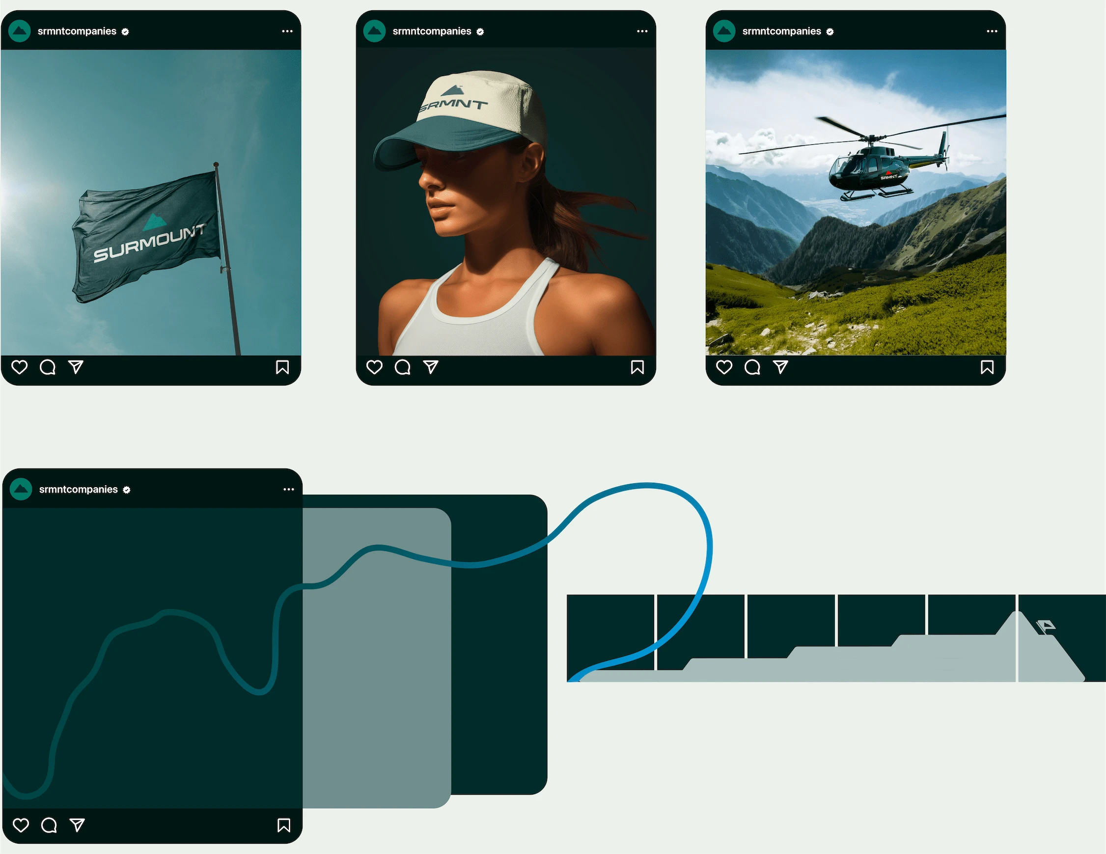
Social Media
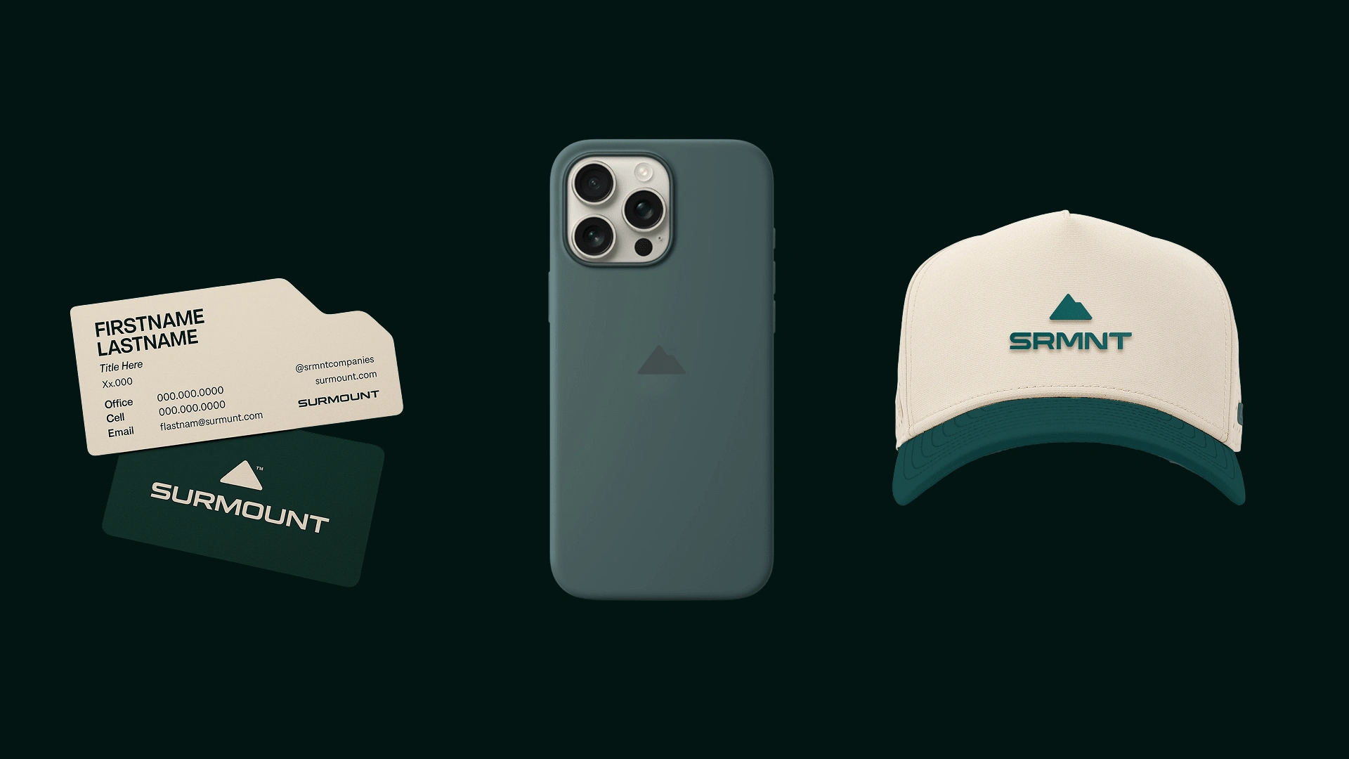
Real-World Implementation (IRL)
SURMOUNT’s cohesive visual language smoothly extends into physical environments—from branded merchandise to signage, printed materials, and event collateral. Consistent, impactful brand experiences enhance client perceptions and internal pride.
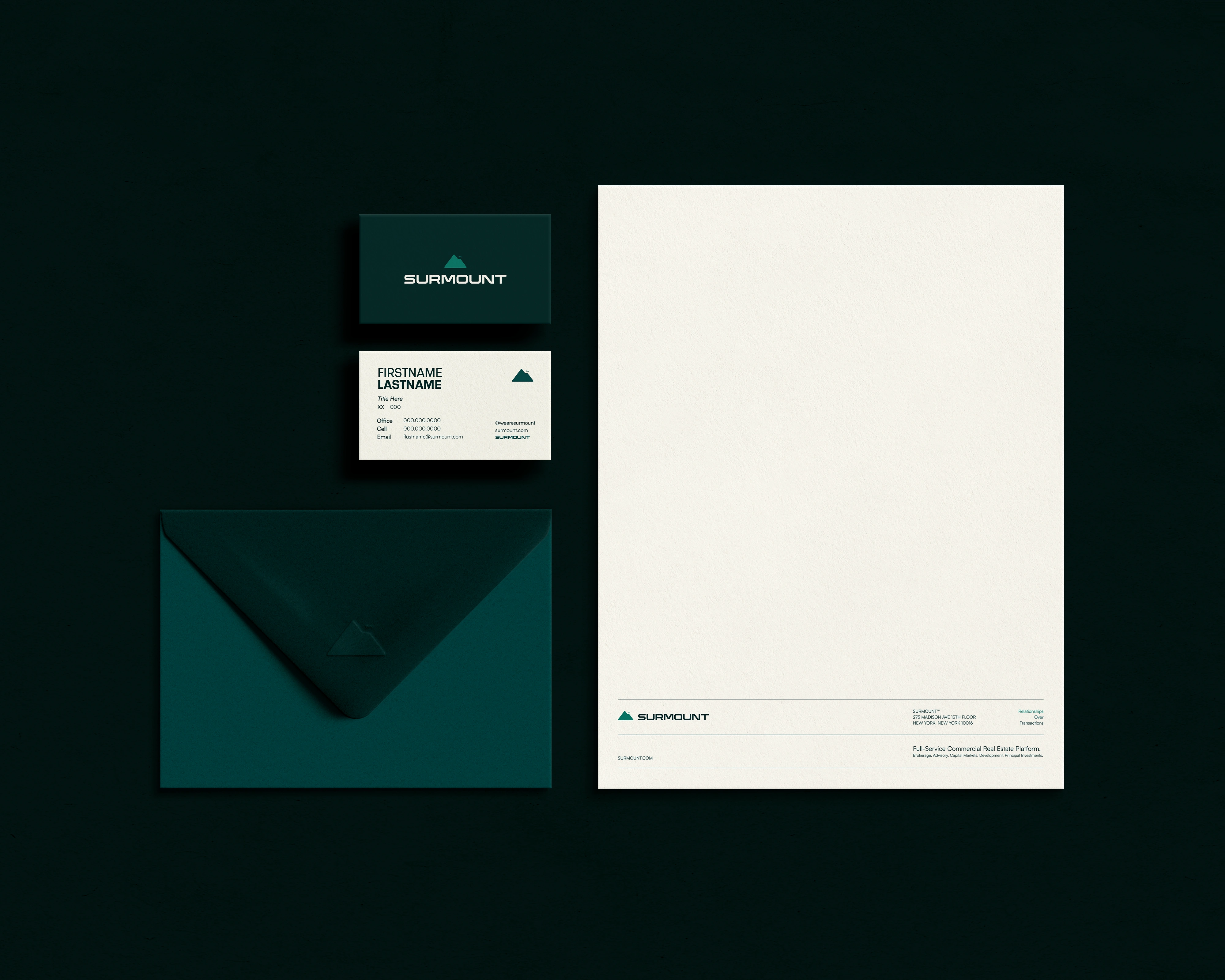
Print Collateral
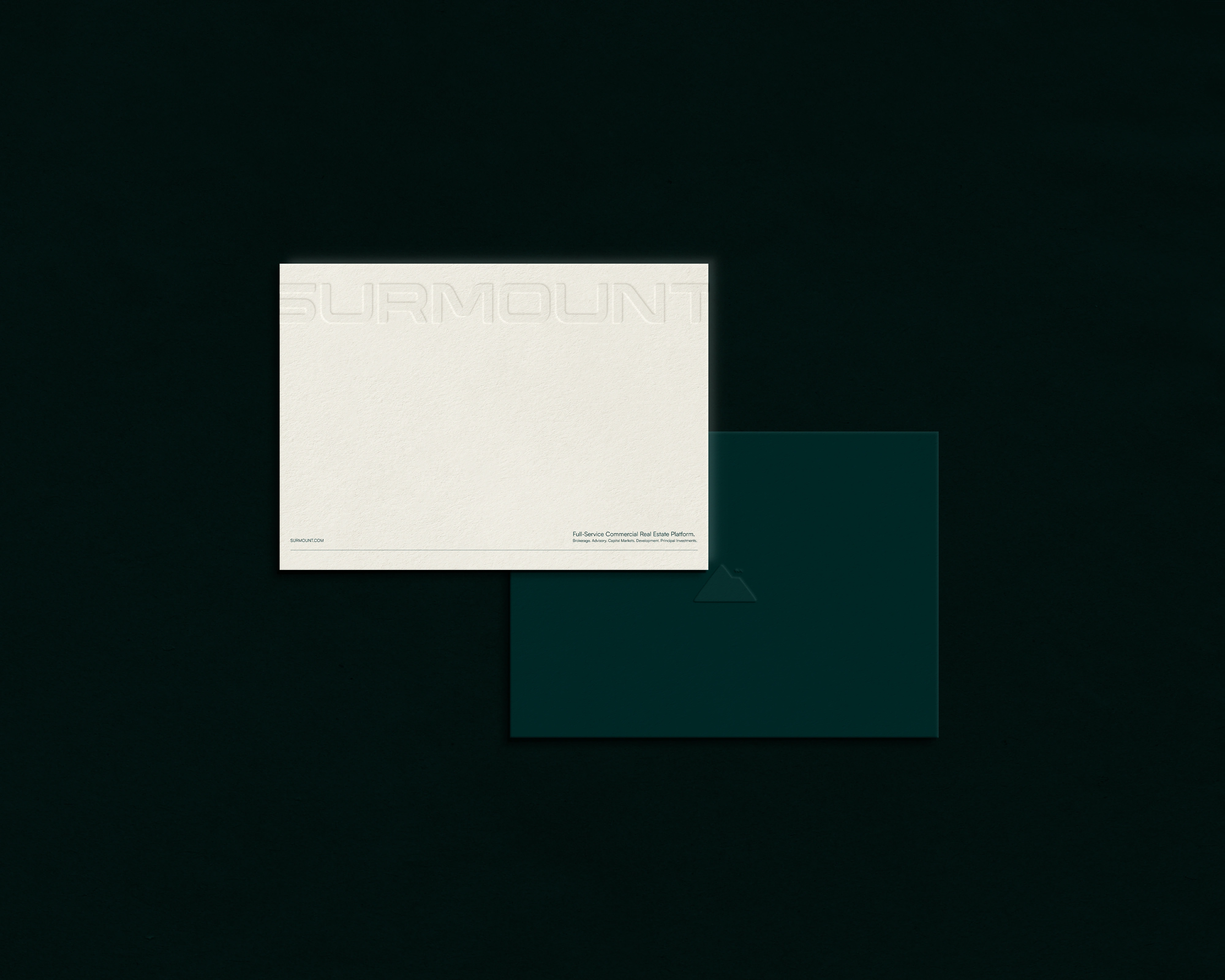
Stationary
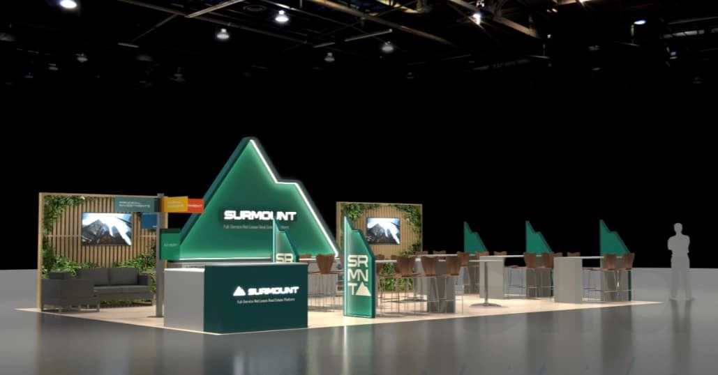
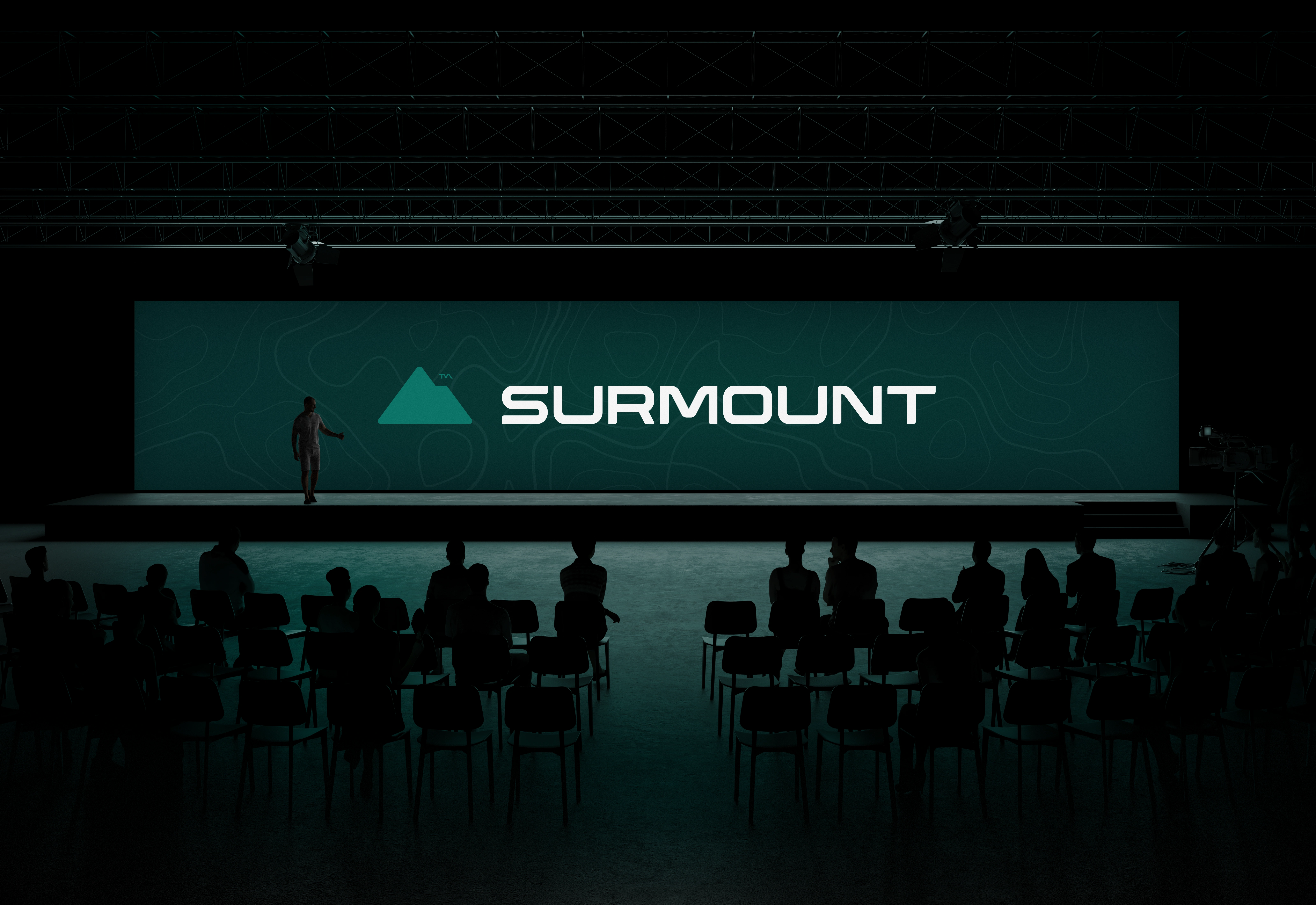
Booth at ICSC 2025
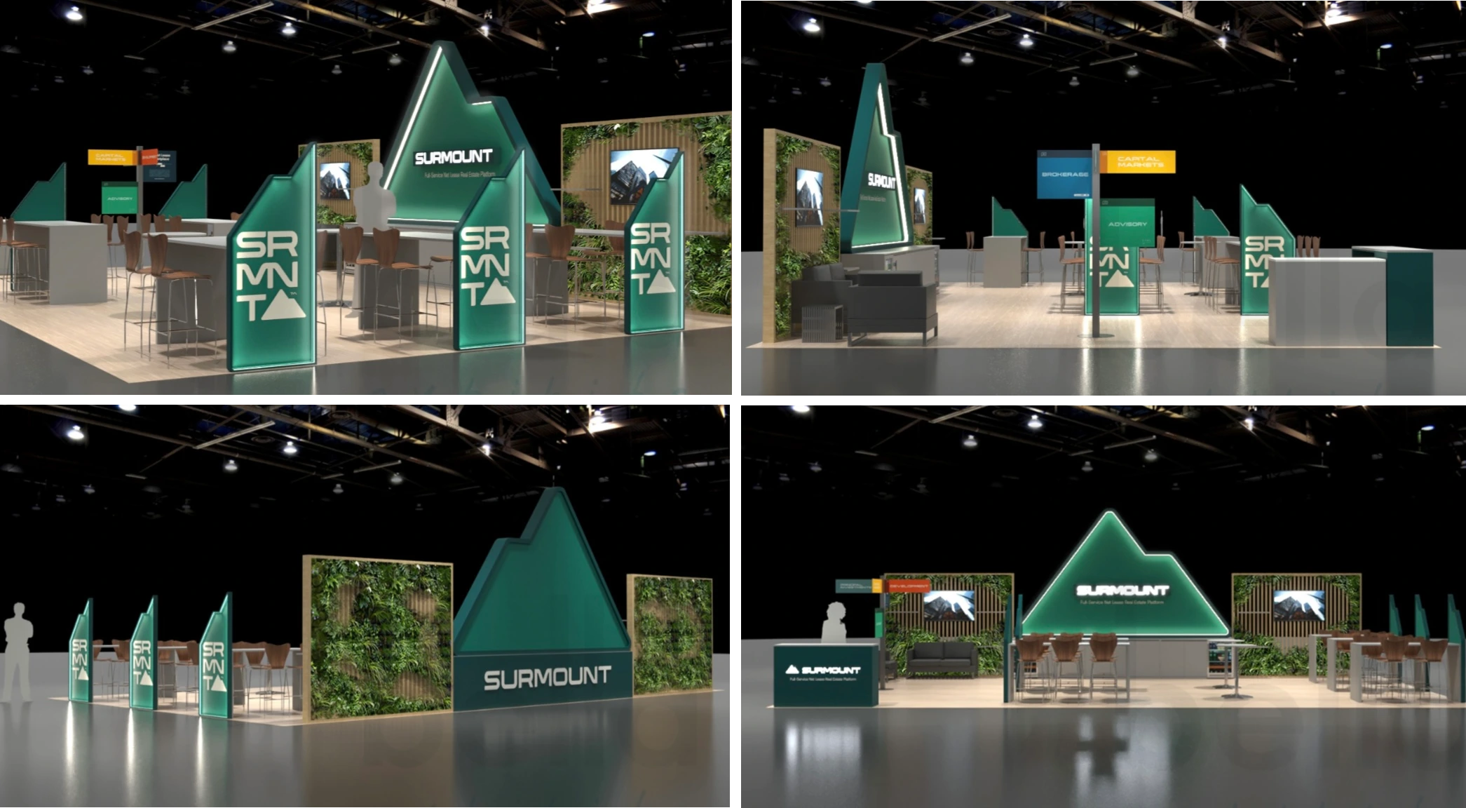
Booth at ICSC 2025 - Brand Activation
Project Credits & Team
Brand Design & Strategy: Hayden Commans & Ken Shew
Logo Reveal & Videography: Mo Martin
Web Development & Digital Strategy: Michael Paccone, Ken Shew, Hayden Commans
Explore More
Results & Takeaways
The SURMOUNT rebrand was a masterclass in strategic consolidation, demonstrating how thoughtful brand design, symbolism, and digital innovation can profoundly impact business growth, client engagement, and market positioning. Through carefully considered creative strategy, the rebrand achieved precisely what was envisioned—clarifying market presence, honoring legacy, and boldly stepping into the future.
This comprehensive branding project not only reinforced SURMOUNT™’s leadership position but also set new benchmarks for excellence in real estate branding—raising expectations for how integrated brand identity can drive tangible business outcomes.
Like this project
Posted May 7, 2025
Unified NNN Pro and partner entities under SURMOUNT: created a cohesive identity, brand architecture, guidelines, digital innovation, and launch assets.
Likes
18
Views
357
Timeline
Jan 31, 2024 - Apr 29, 2025