Designing for a new generation of learners

Jenna Patrick


Designing for a new generation of learners
Exploring how product design could make theory test revision feel more engaging for a generation raised on mobile-first experiences.
Learning to drive is a milestone for many young people, but theory revision often feels repetitive, uninspiring and easy to abandon.
I explored how product design, brand and interaction design could create a revision experience that felt more approachable, rewarding and engaging for a younger audience. Rather than borrowing from traditional educational products, the concept drew inspiration from the products this audience already enjoyed using mobile-first experiences that balanced progress, personality and positive reinforcement.
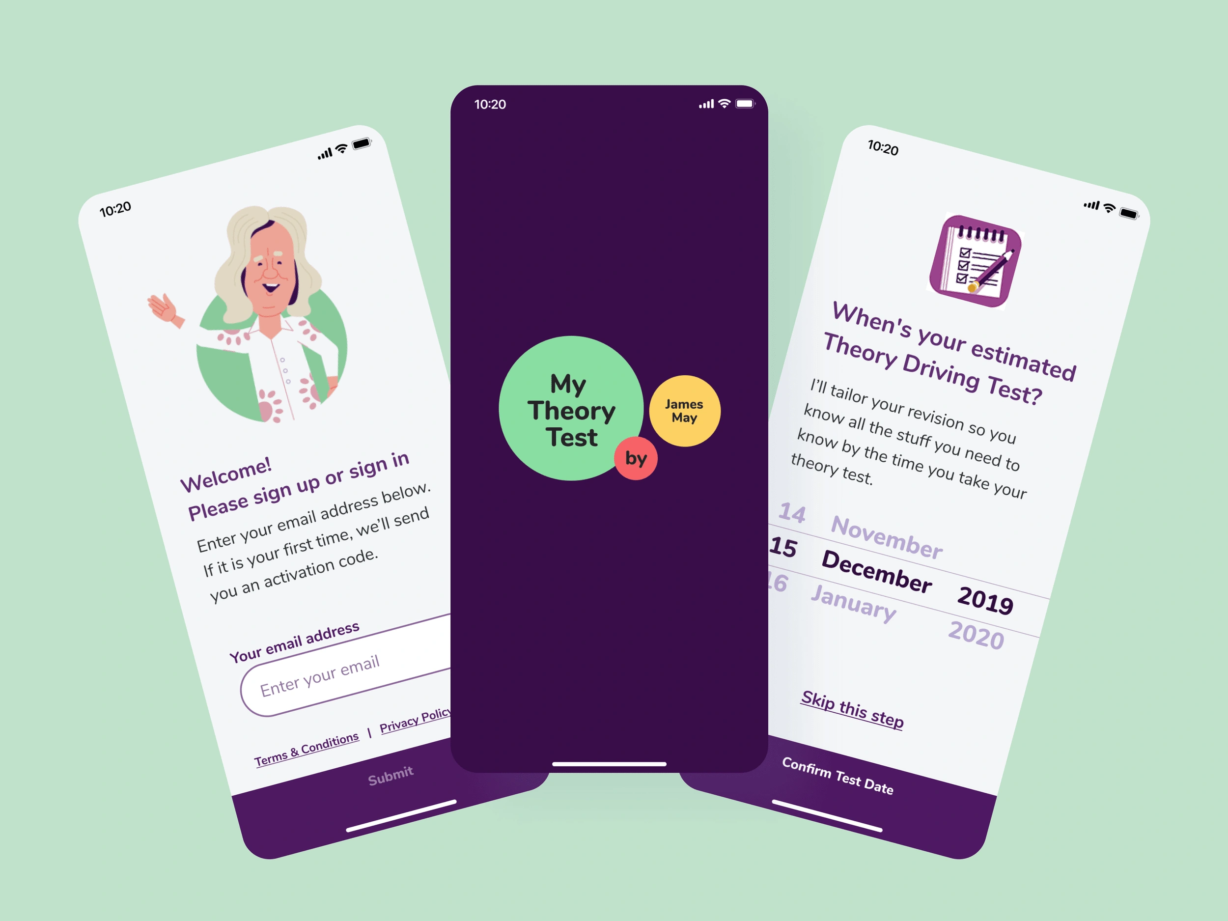
Understanding the audience
The primary audience was made up of mid-to-late teenagers preparing for one of their first significant milestones. Their expectations had been shaped by mobile-first products, short-form content and highly polished digital experiences, making engagement just as important as educational content.
Personas, user journeys and early concepts helped define not only what the product needed to do, but how it needed to feel.
Designing for engagement
The challenge wasn’t making revision entertaining, it was making it easier to return to. Early concepts explored how progress, motivation and positive reinforcement could be introduced naturally throughout the experience without distracting from the core objective of helping users prepare for their theory test.
Every interaction was considered through the lens of encouraging consistency rather than simply increasing time spent in the app.
Creating a visual language
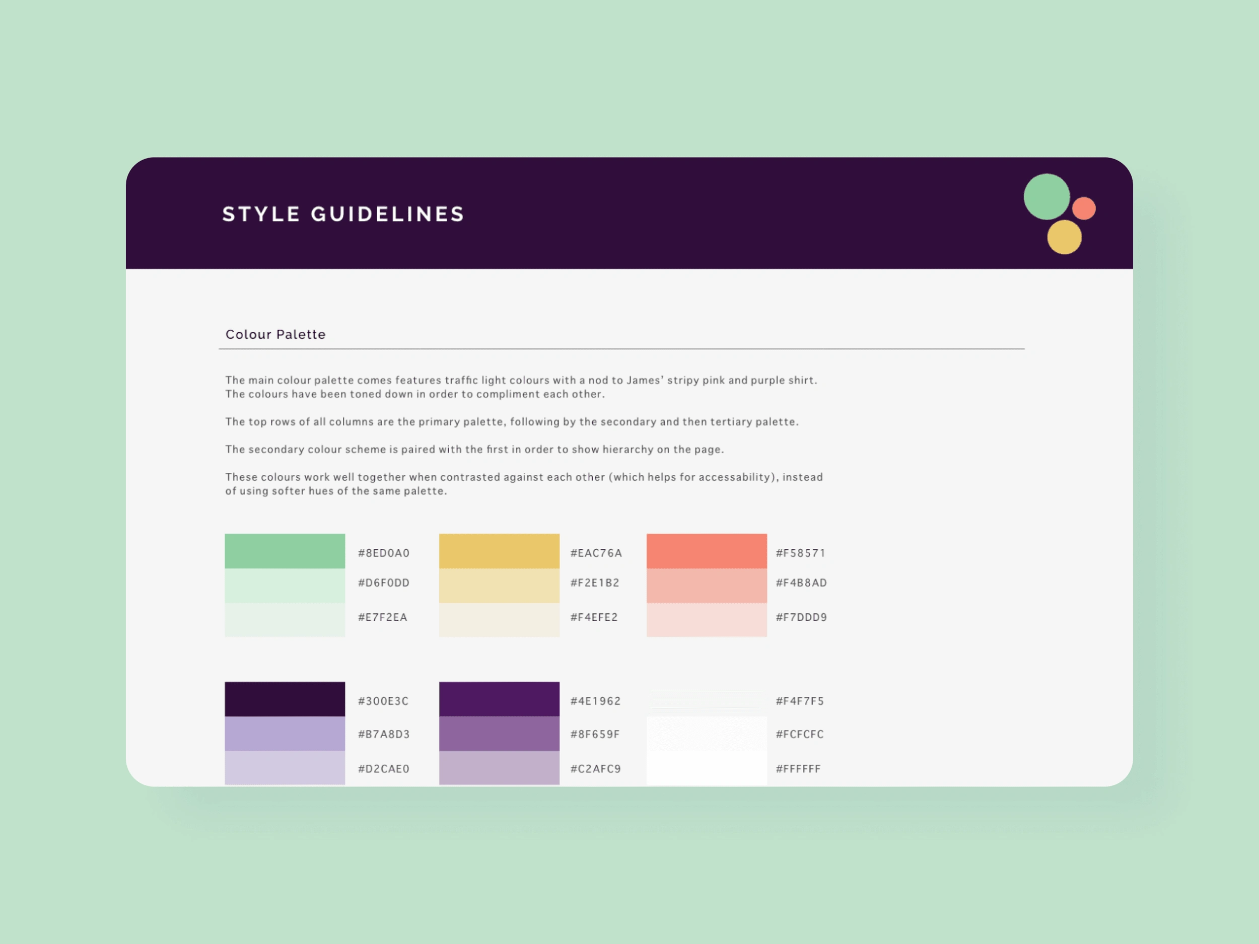
The visual identity deliberately moved away from the polished, corporate aesthetic often associated with educational products.
Instead, the experience embraced brighter colours, playful illustration and approachable interactions that reflected the expectations of a younger audience while maintaining clarity and accessibility.
The goal wasn’t to imitate social media or gamification, it was to create an experience that felt like it belonged alongside the apps this audience already chose to spend time with. Early stages we utilised focus groups to sense-check our branding direction and this group served us well for having a continuous audience to test and learn from before the product was fully shipped.
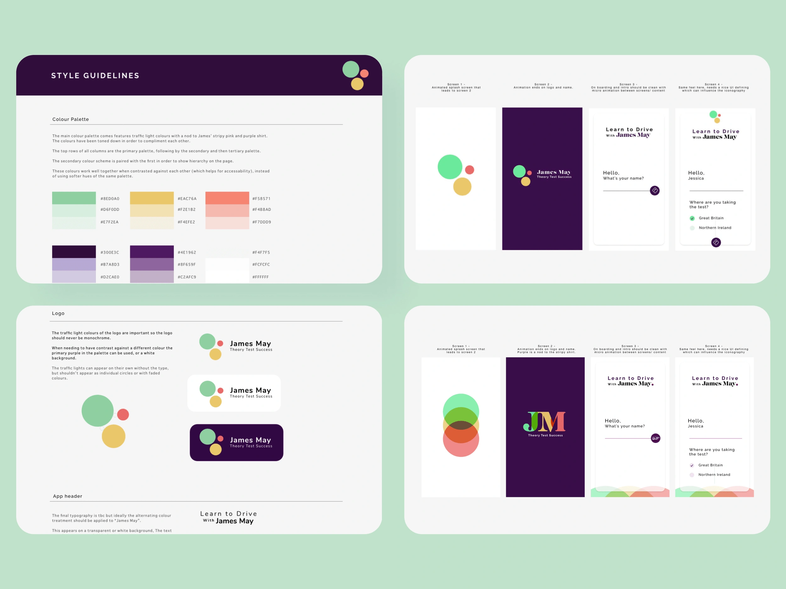
Exploring how visual design could create familiarity, personality and approachability.
Bringing the experience together
With the product direction and visual language established, the final concepts combined learning, interaction and branding into a cohesive mobile experience.
From onboarding through to revision sessions and progress tracking, every element aimed to make theory test preparation feel less like a chore and more like a product users would genuinely want to return to.
Bringing product thinking, interaction design and visual identity together into a cohesive learning experience.
Evolving the proposition after launch
Following the initial launch, we returned to the product to assess how the market had evolved and where the experience could offer more lasting value.
The first release had focused on helping learners prepare for a single milestone. The next challenge was understanding how the product could support a longer-term relationship with users rather than ending once they passed their test.
This led us to explore a subscription-based direction, considering how refreshed content, additional learning experiences and continued support could create a stronger reason to return. The work expanded beyond improving the interface into reassessing the proposition, commercial model and future role of the product.
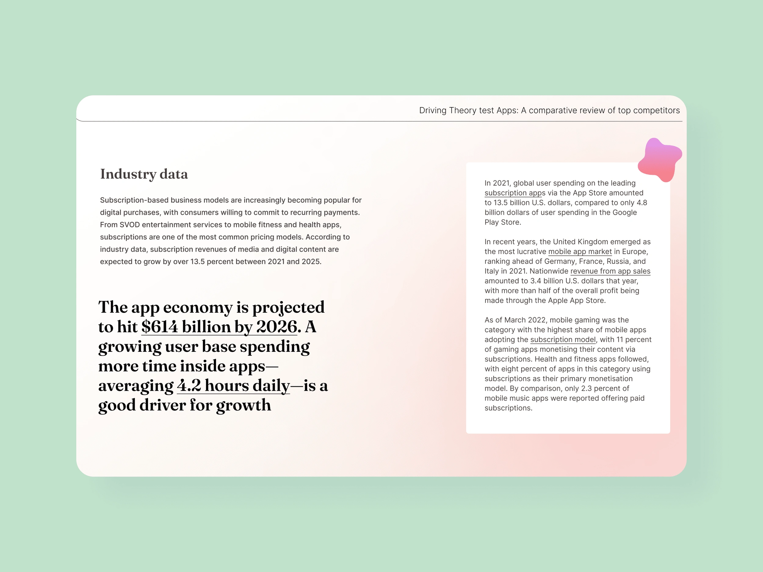
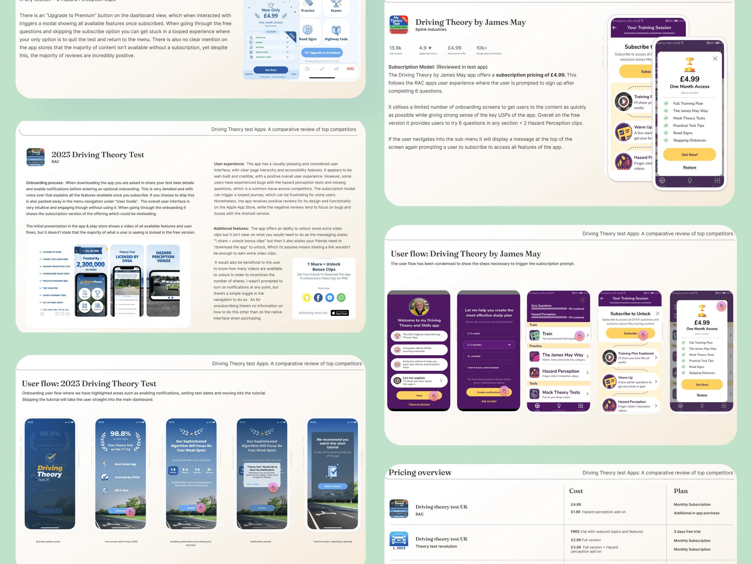
Reassessing the market and exploring how the product could evolve from a one-off purchase into an ongoing subscription experience.
Reflection
First, educational products need to meet learners within the digital world they already understand. For this audience, that meant creating an experience with the energy, personality and immediacy of the apps already competing for their attention.
Second, launching a product is not the end of the design process. Returning to the proposition after launch meant looking beyond the original experience and asking whether the business model still supported the value we wanted to create. The move towards subscription showed how product design can shape not only an interface, but the longer-term relationship between a product, its users and the business behind it.
Agency: Splink, Product & Creative design: Jenna Patrick https://www.jamesmaytheorytest.com/
Product Design | UX Research | Learning Experience Design | Brand Identity | UI Design | Art Direction
Like this project
Posted Sep 14, 2023
Role: Design Lead // Focus: UX Research, Learning Experience Design, UX/UI Design, Brand Identity & Art Direction