Website Redesign for Vida Care
Vida Care UK
Vida Care UK mission is to empower the elderly to stay in their homes longer by using innovative technology to help monitor their wellbeing while providing proficient carers to help take care of the rest.
The Problem
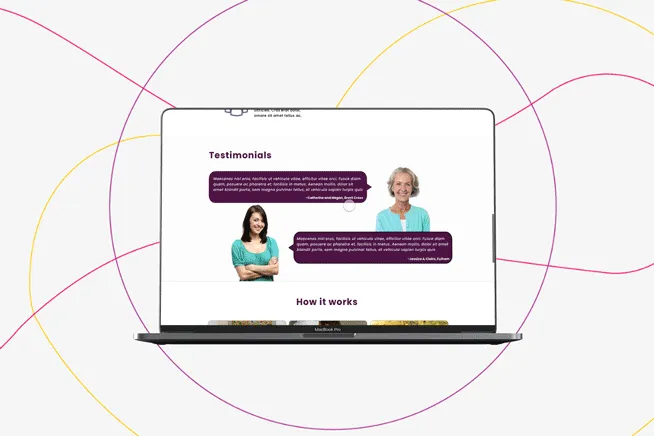
Vida noticed that the design and layout of their website did not fit with the new direction of the company.
Vida Care had just won two funding grants to help them build innovative health monitoring systems for the elderly to help detect if they may be showing symptoms for easily managed health conditions. With this grant Vida was centring their future around the technology they could provide and felt that the website didn’t reflect this new direction yet, Vida didn’t want to take away from their overall message of caring for the elderly.
Vida also noticed that many potential carers were emailing them about job vaccines as they were struggling to find the job applications online. This needed to change, so they hired me to help solve these problems.
Project Details:

The Solutions
The redesign of Vida's main website had many high-level problems. Featured down below are a few of the main solutions I created to make Vida's website fit for their new journey.
1. Navigation
Problem: Navigation was a pain point for the previous version of the website. Most users stated that they struggled to find important information quickly and caregivers struggled to apply for jobs.

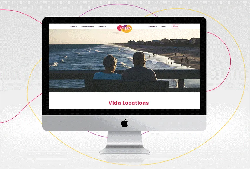
Solution: To fix these problems I added navigation with sub-menus so users can quickly find information. I also added a careers section specifically for easy access for caregivers.
2. Career Pages
Problem: A big problem specifically for the caregivers and Vida was that potential employees were struggling to find caregiver role on the old website.
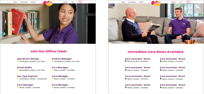
Solution: To fix this problem I added careers to the navigation bar and put two different sub-categories for Caregiver roles and in-office roles. Since at the time Vida was growing rapidly, breaking up the career page helped direct caregivers to the correct application page.
3. Technology Page
Problem: The last main pain point addressed is to tie Vida's goal of featuring the technology they currently use to help the elderly. Vida’s previous website geared towards caregivers only and had a hard time finding out about their innovative technology.
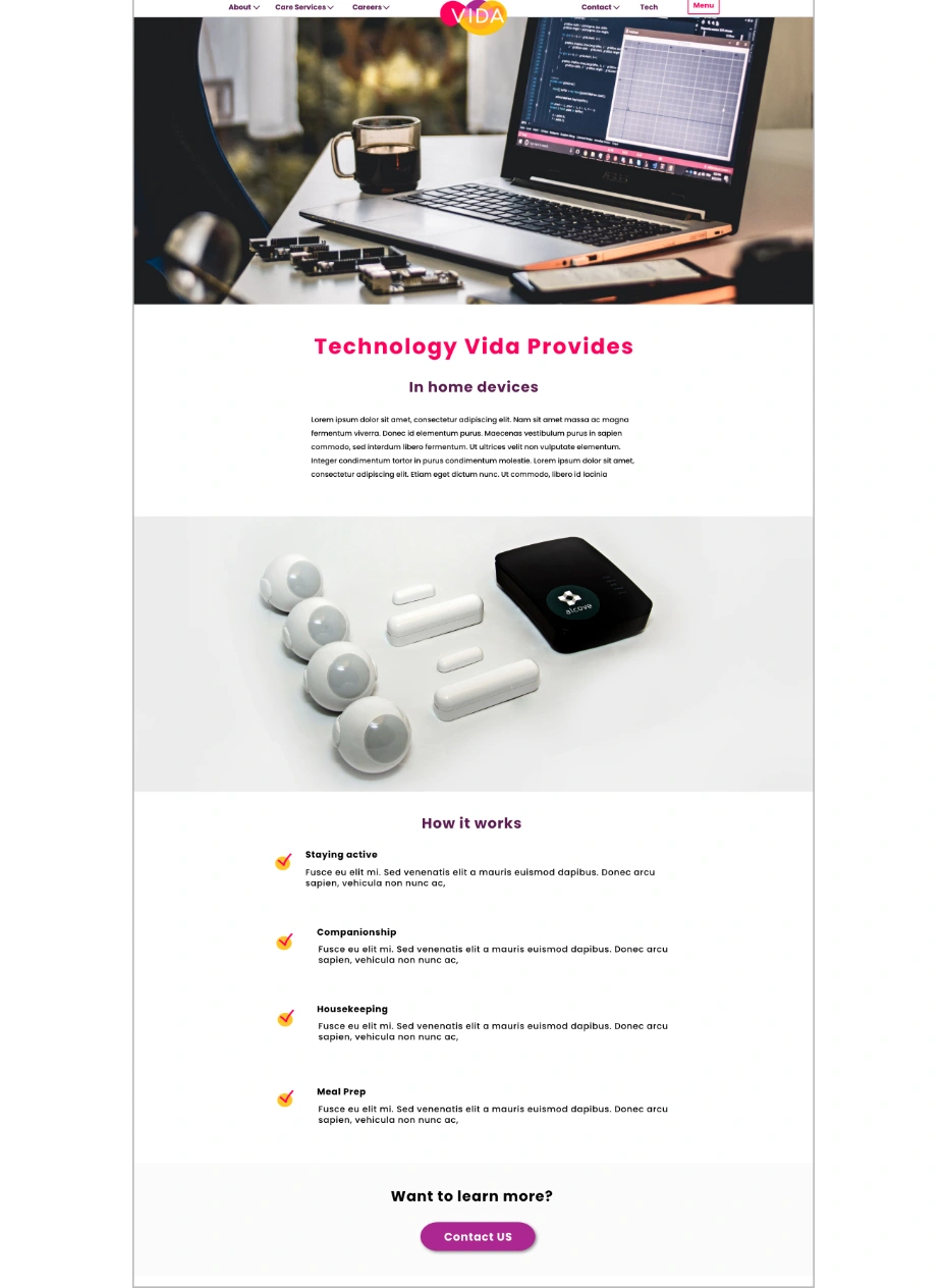
Solution: To fix this problem I added a tech page to the navigation bar. This page explains how the technology Vida uses works and how to partner with them.
The Outcome:
Since the redesign of Vida Cares main website Vida has gained 20 new caregivers through the new career portals. Vidas bounce rate has improved by an average of 20% and Vida was able to gain another main investor who found their technology through their technology page.
Like this project
Posted Apr 27, 2021
Likes
0
Views
49
Clients
Digital Home Visits Group

