MELOTEA - Branding & Packaging
MELOTEA
MELOTEA is a tea product that aims to combat dehydration and throat soreness, specifically targeting singers and those in vocally-intensive roles (teachers, podcasters, speakers, etc.).
Did you know that women should have about 2 litres (8 cups) of fluids a day, and men about 2.6 litres (10 cups)? Singers should be aiming to exceed this amount, daily. By keeping hydrated, the vocal folds become lubricated which makes it easier for them to move, which results in a smooth tone, improved vocal stamina, and an overall better performance.
The product was pitched by a Sydney vocal coach who noticed their students were not hydrating themselves enough, leading to poorer performances and a concern for long-term vocal damage. Upon consulting them, I set out to create a brand identity and packaging for it.
The client made it clear that they wanted the product to stand out on a supermarket shelf, so the packaging and branding needed to be unique and attention-grabbing.
Brandmark
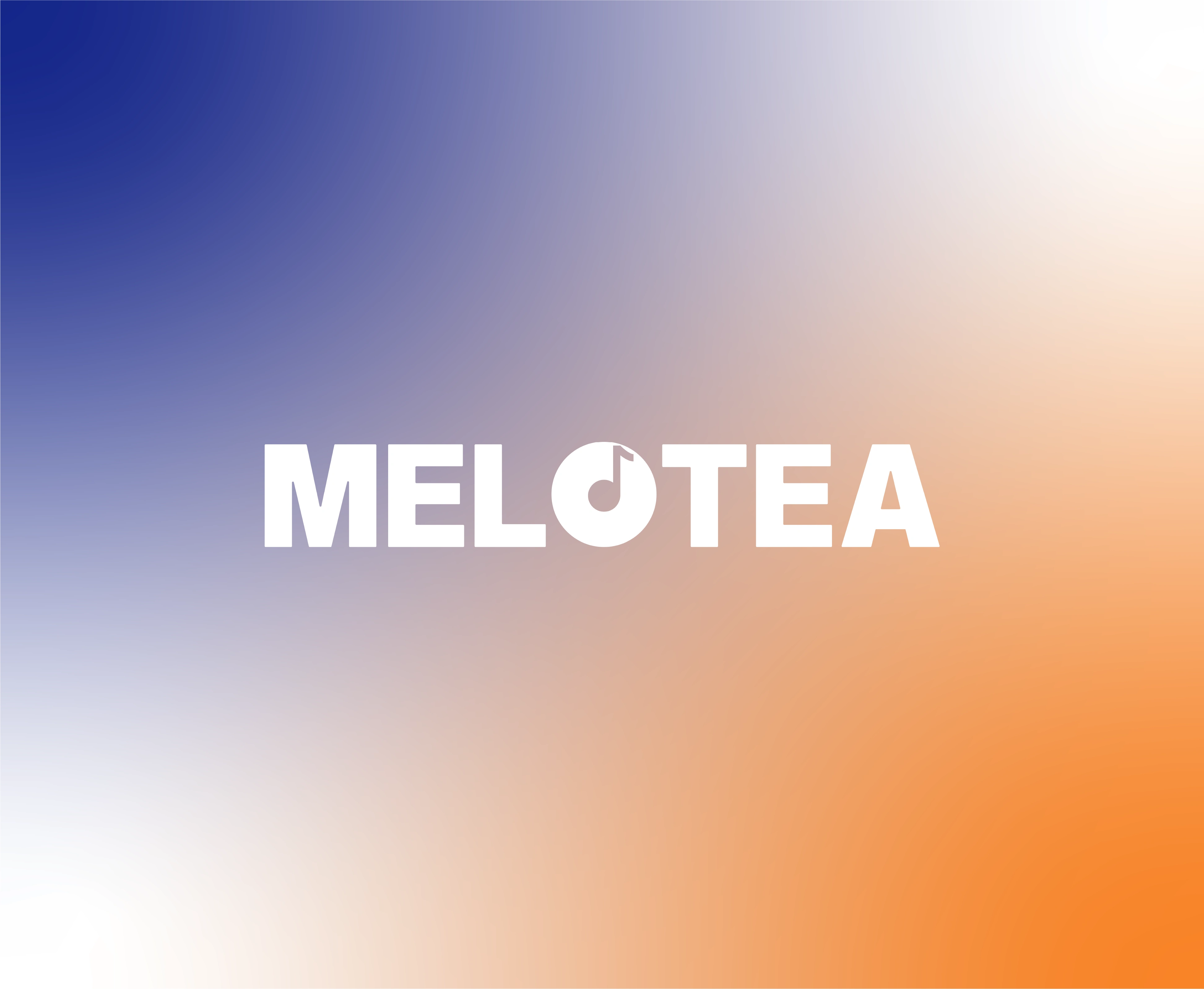
MELOTEA brandmark
I chose to use a music note in the "O" of MELOTEA, along with a playful product name ("melody"/"melotea"). These work together to clearly portray the music-based founding of the product. A bold font is used to evoke a confident presence, which aligns with the goal of a vocalist.
Submark



MELOTEA music note submark
I created a variety of submarks by pulling the o/music note from the brandmark. This provided the client with a way to easily signify the brand and its products. By repeating the simple yet memorable submark across merchandise (such as coasters), it makes it easier to create a sense of familiarity within the customer.
A submark like this also diversifies the brand identity's use, as it can be used across social media (which usually displays circular profile pictures), uniforms, etc., as an alternative to the full brandmark.
Packaging
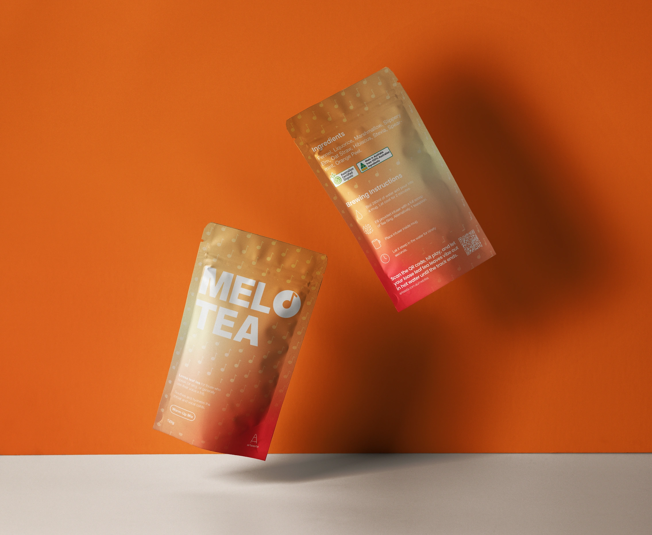
MELOTEA Warm-Up Mix - pouch
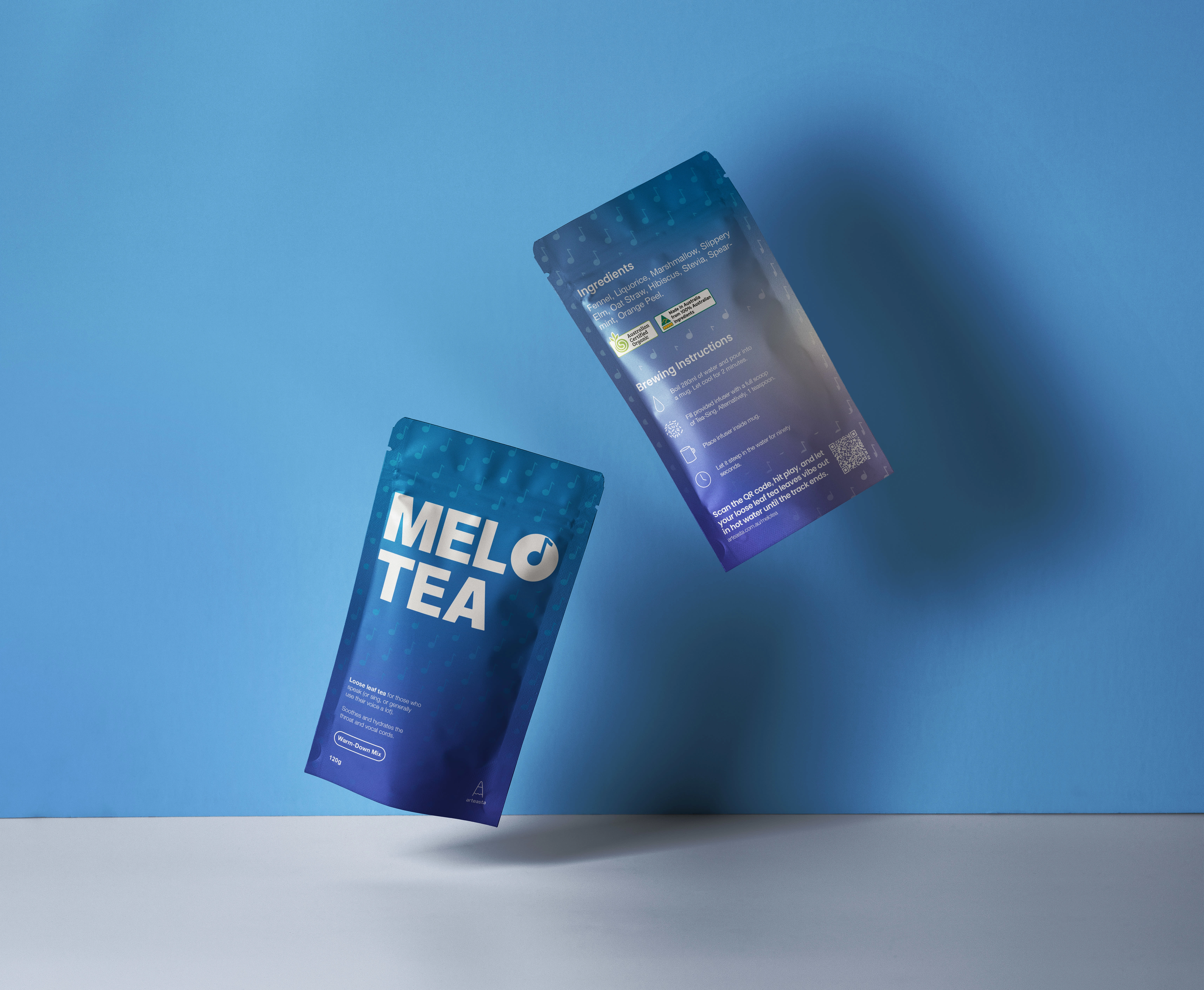
MELOTEA Warm-Down Mix - pouch
The vocal coach decided on two flavours - one for pre-performance/everyday and one for post-performance to assist in recovery. To carry the music theme throughout the packaging, I branded each blend as its own "mix".
By using an exciting orange gradient, the warm-up mix's packaging creates a sense of anticipation, while the somber blue gradient used for the warm-down mix, brings calmness and stillness. This, again, differentiates the two, not only from each other, but on the shelf.
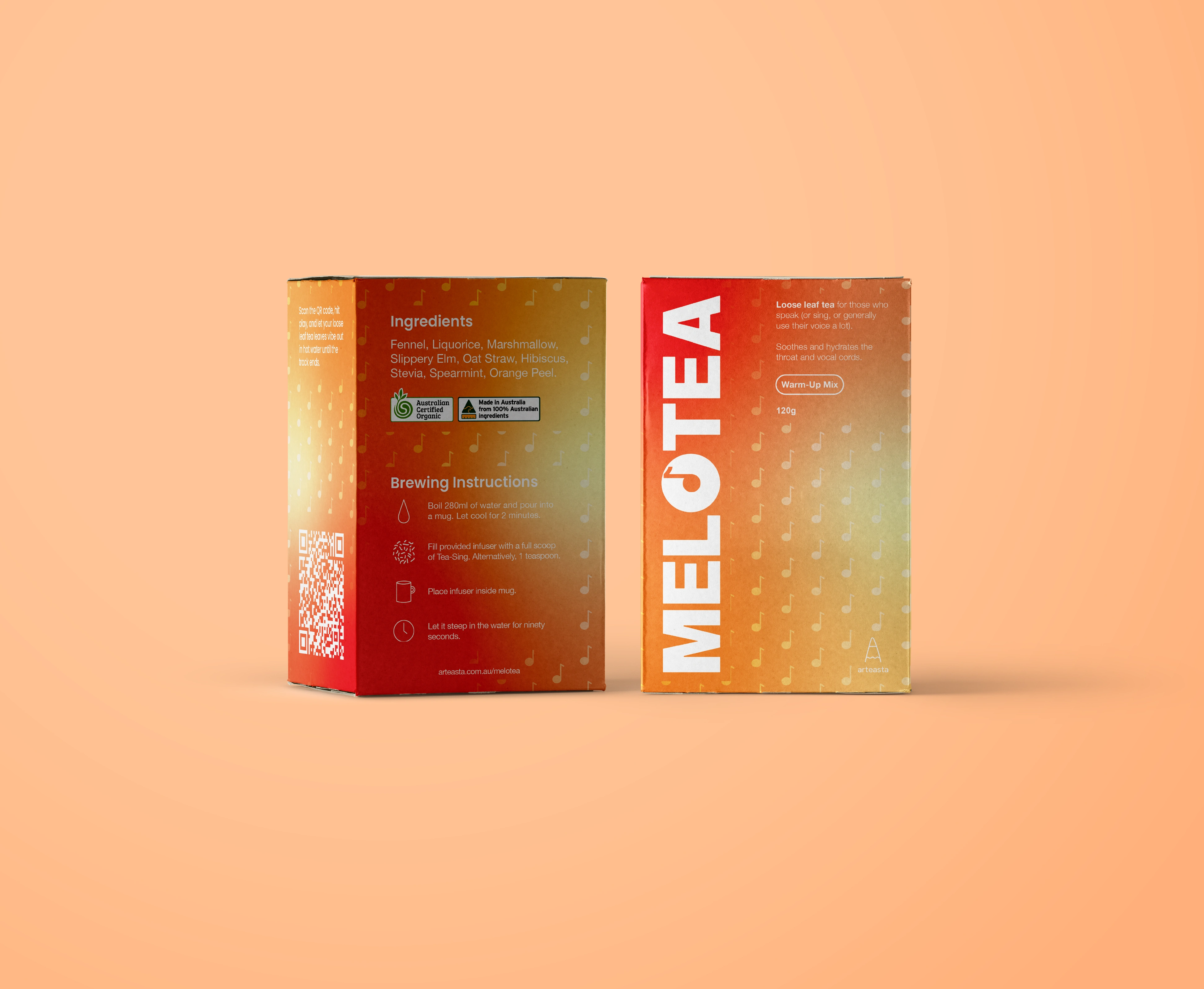
MELOTEA Warm-Up Mix - box
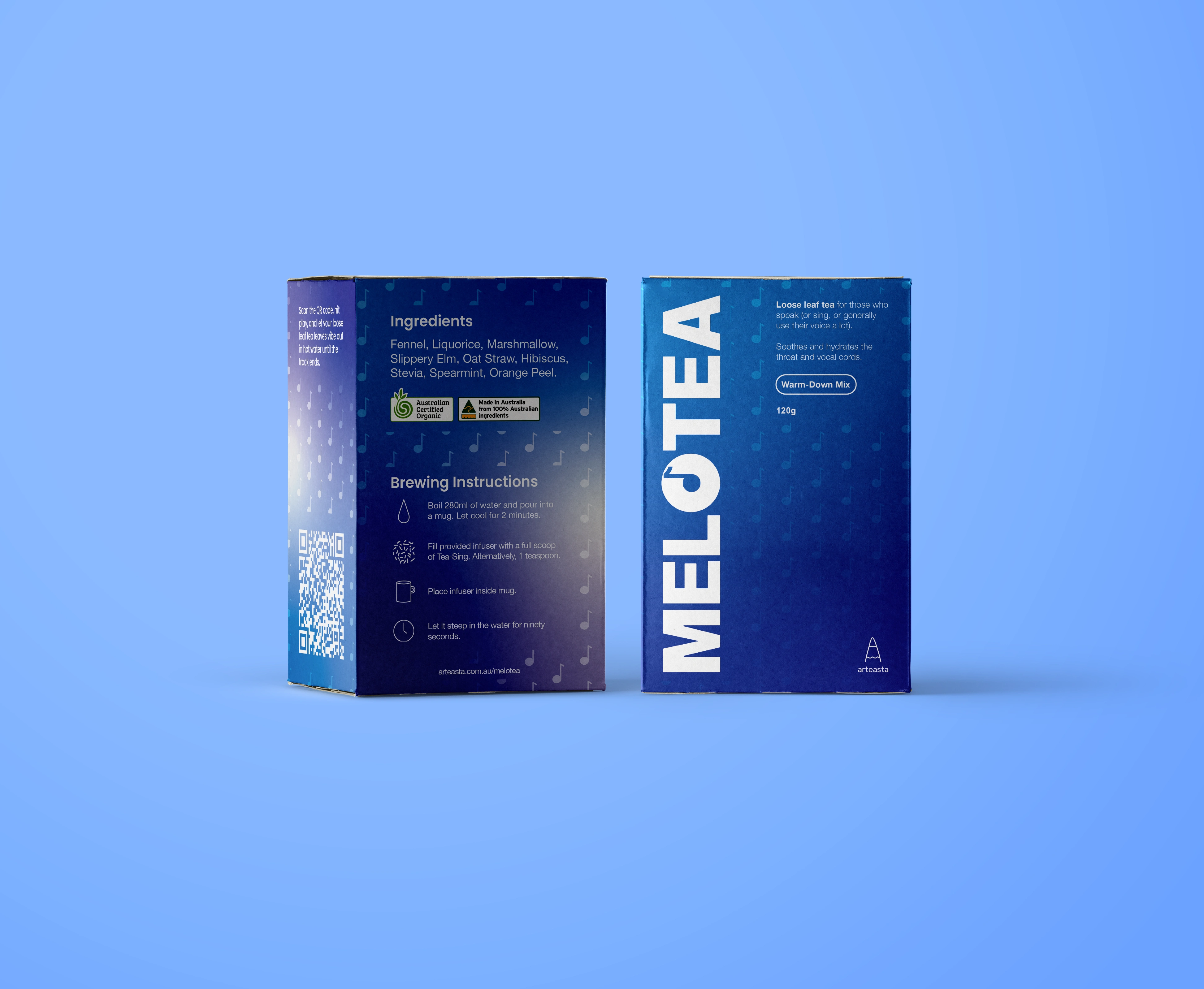
MELOTEA Warm-Down Mix - box
Along with pouches, a variation was created that used cardboard containers. The client was unsure at this stage about how they wanted the product to be shipped, so I provided them with a visualisation for both options to make the decision easier for them.
I also chose to incorporate a music note pattern to add to the uniqueness of the packaging and to reinforce the submark use of it.
As a suggestion to the client, I pitched the idea of a having a QR code on the side of the packaging (pictured above) that holds a link to a snippet of a local artist's music - this link could be changed once a week to constantly be showcasing a variety of artists. This creates a fun and interactive way for the user to know how long to steep the tea mix in water (alternative to observing the time listed on the box), once again differentiating the product and increasing the brand's memorability.
Like this project
Posted Apr 1, 2024
I created fun and memorable branding and packaging for a loose leaf tea product, targeted towards singers and those in vocally-intensive roles.


