
The result: a completely new look for adbuddy.in, with 85 pages checked against a saved snapshot of the old site. Only three headings changed, and I changed them on purpose.
Live preview: adbuddy.in. The redesign is live, so you can click through it yourself.
This is a redesign of our own agency website: a new look, six animated service concepts and a public brand page, built in Next.js. It is my own project, not client work.
My role: web designer, front-end developer, brand designer
Scope: home, 18 service pages, work, about, contact, brand page, blog and tools
Timeline: November 2026, built in four stages and checked after each one
1. The challenge
The old site already ranked and already had pages that worked. A redesign can easily break that: a new address, a changed heading or a lost page can cost search ranking.
The ask was a full redesign without losing Google ranking or any data.
2. Goals
Look new, lose nothing. Keep the same URLs, text and headings.
Explain itself. A visitor should understand what we do for them just by scrolling.
Make it one system. One look across every page, written down in a public brand page.
3. Approach
I changed one thing at a time and proved nothing broke before moving on.
Baseline. I saved a snapshot of all 85 live pages: title, description, canonical, robots, headings, schema, internal links and word count. Every stage had to pass it.
Trial. I drew the home page first as one static HTML file, without touching the live site.
Four build stages in Next.js. Core styles and home hero; the service template and six concepts; blog and work; then about, contact and the remaining pages. After each stage the full comparison ran again.
4. Design
4.1 The idea: one site, one browser window
The whole site is drawn as one browser window. The tab bar is the menu, the address bar shows the page you are on, and the window buttons are real.
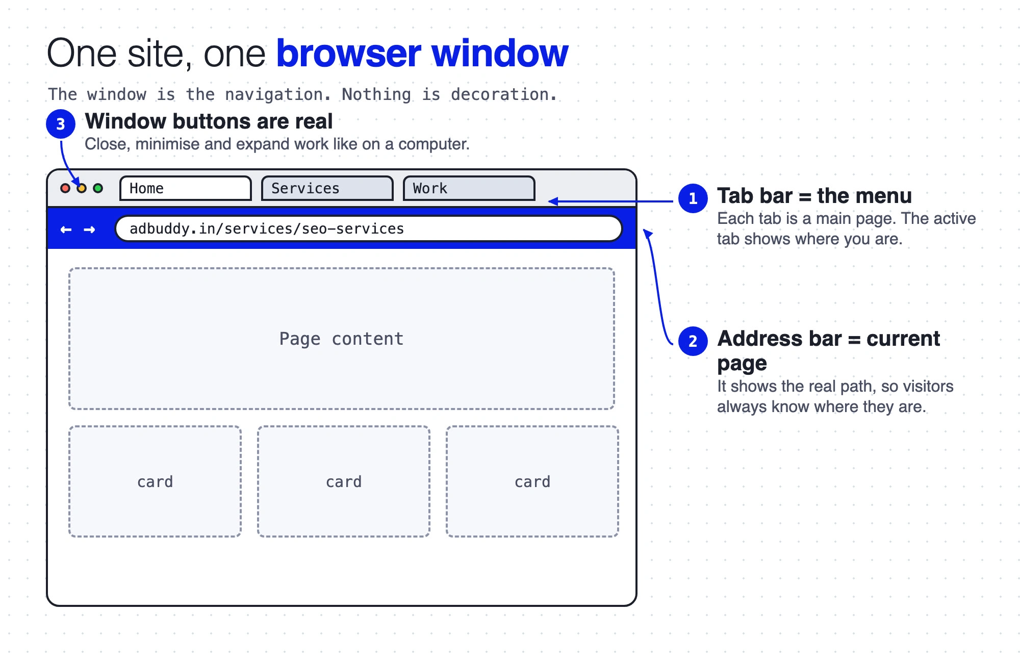
Wireframe of the browser-window navigation, with arrows to the tab bar, address bar and window buttons
4.2 Home page structure
The home page has twelve sections, top to bottom, and each one answers one question for the visitor. Each arrow links a numbered note to its section.
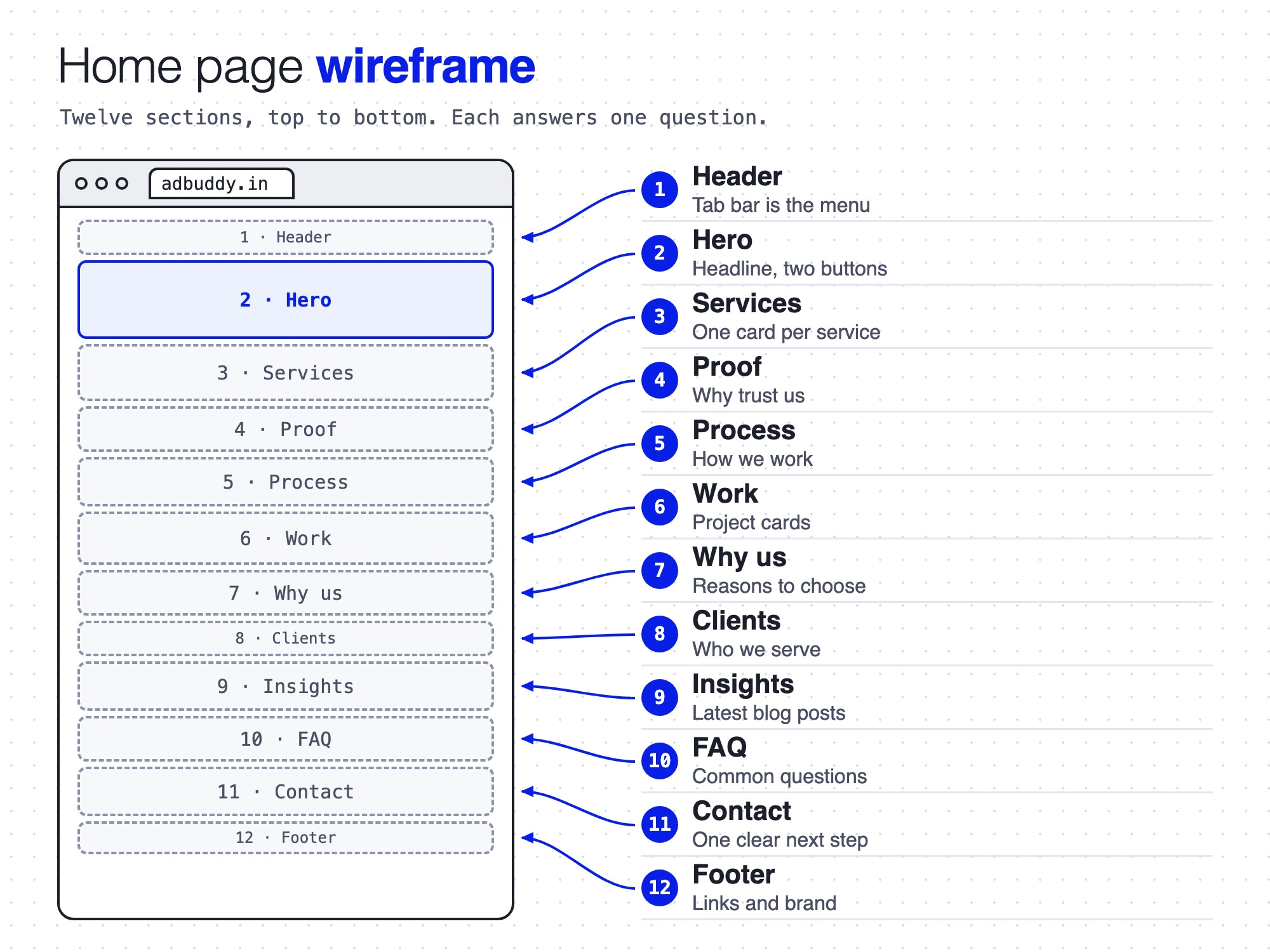
Home page wireframe: twelve sections, with arrows from each note to its section
4.3 On a phone
The same system folds down. The tab bar becomes a Menu button, the address bar stays as a thin strip, and the cards stack into one column with no sideways scroll.
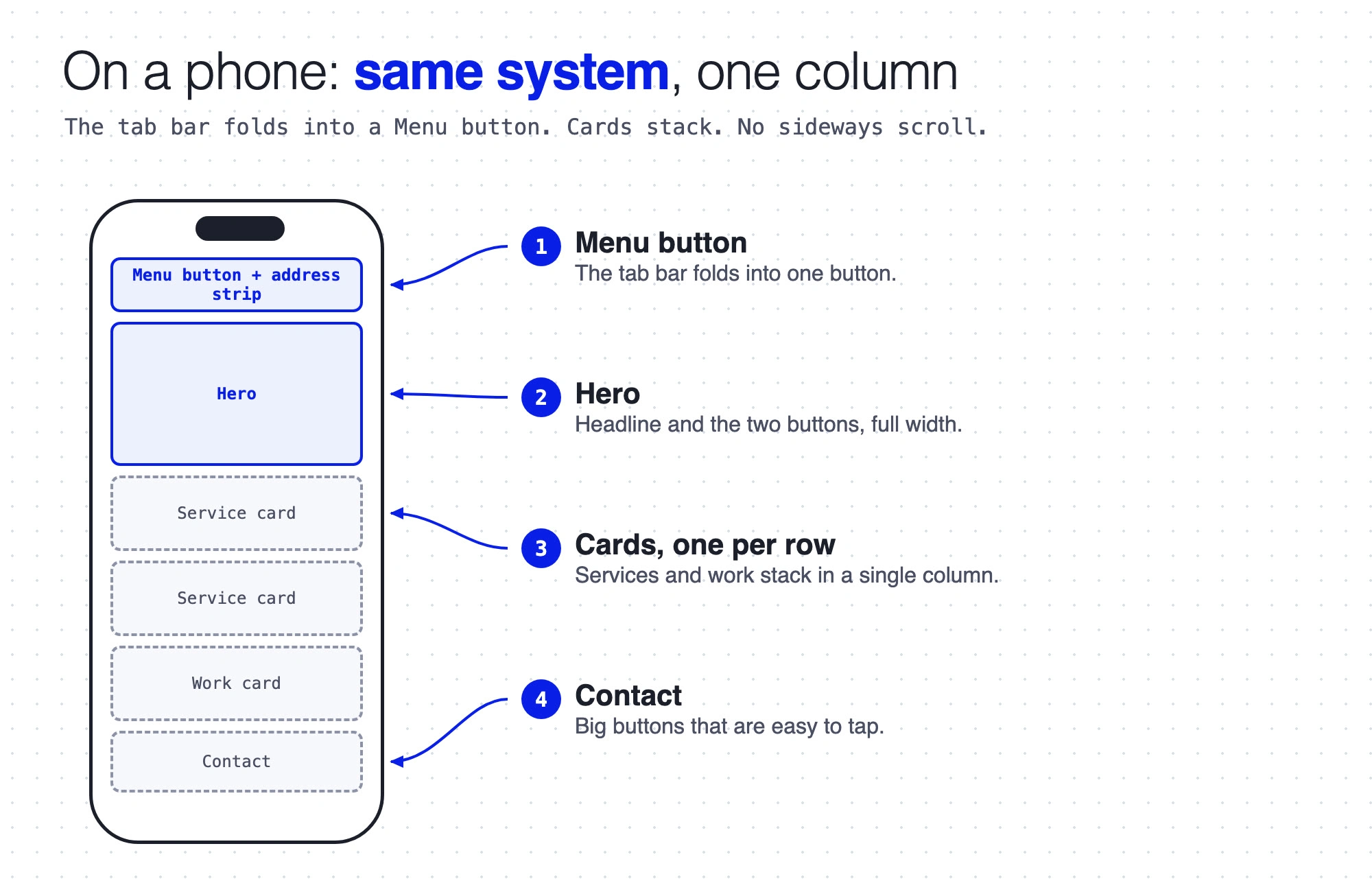
Phone wireframe: menu button, hero, stacked cards and contact
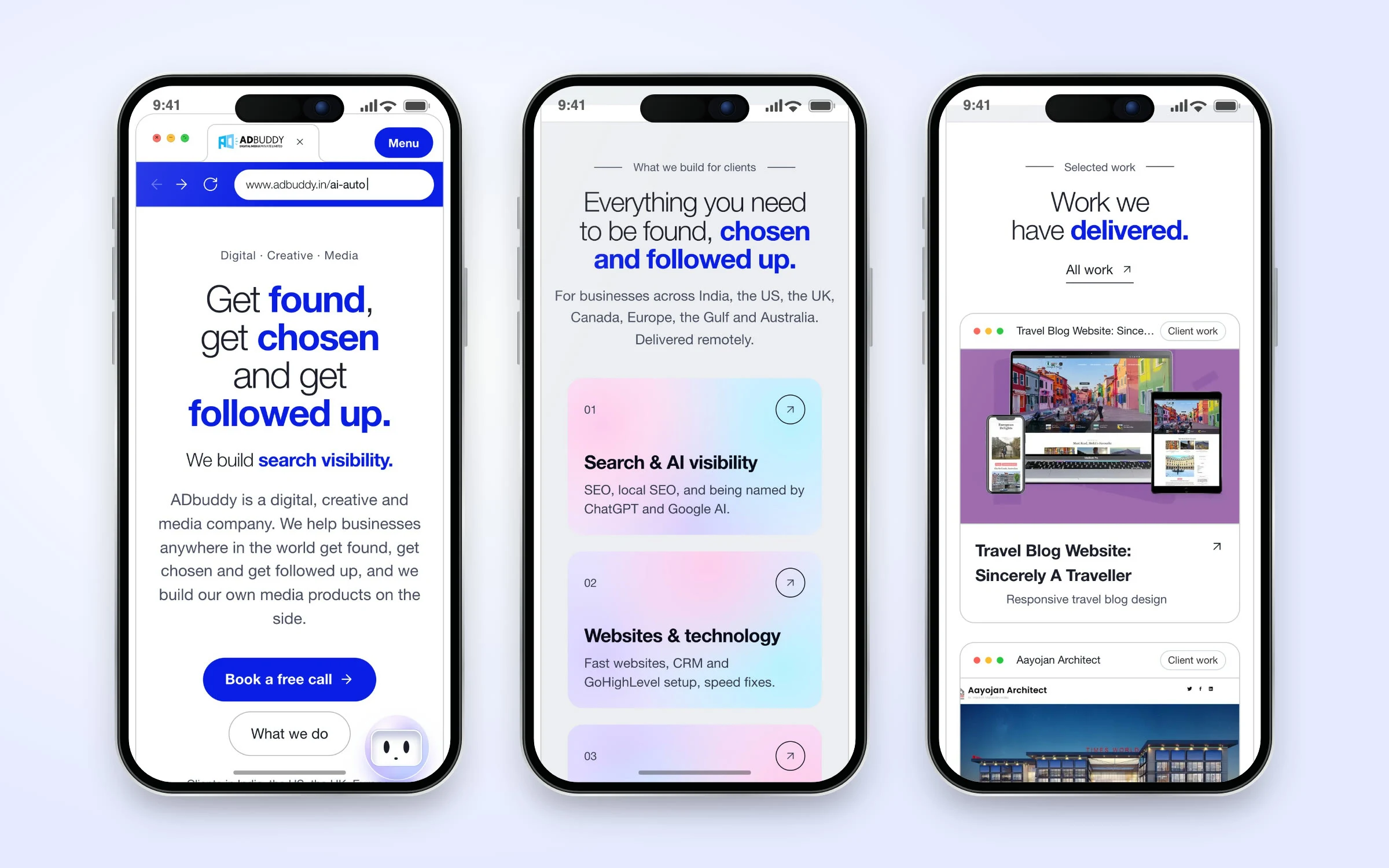
Mobile mockups of the finished site: home, services and work
4.4 Colour and type
White page, one blue, one lime button. I chose the palette, logo and type from side-by-side mock-ups, then wrote them into a public brand page.
Colour: white page, light grey bands, ink headlines, soft grey body text, ADbuddy blue for key words and buttons, lime for buttons only.
Type: Helvetica Neue Light with bold blue key words for headlines, and JetBrains Mono only for tiny labels and numbers.
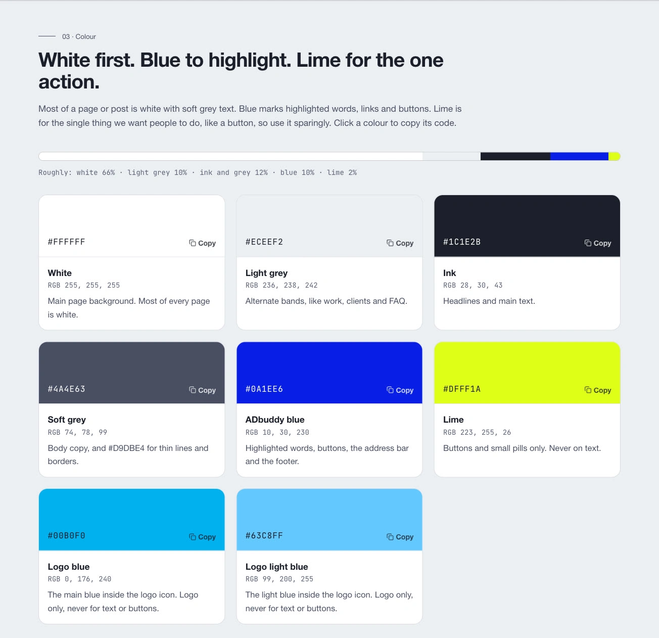
Brand page: colour palette with copy buttons
4.5 Service pages that show the service
Instead of a block of text, each service page shows its idea as a small scroll animation. The stage stays pinned while you scroll, a list of steps lights up one by one, and the picture changes with it. Three of the six concepts, each live to try:
SEO: a fake results page where our listing climbs from number 9 to number 1 across four steps. The page says plainly it is an illustration, because nobody can promise a position. Try it live
Websites: a small website builds itself in four steps, from planning the pages to going live. Try it live
CRM: a sales board with leads moving between columns while four steps explain the setup. Try it live
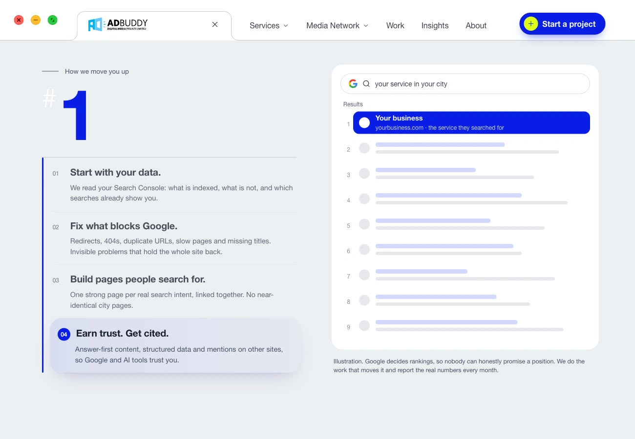
SEO concept at the last step: our listing has climbed to number 1
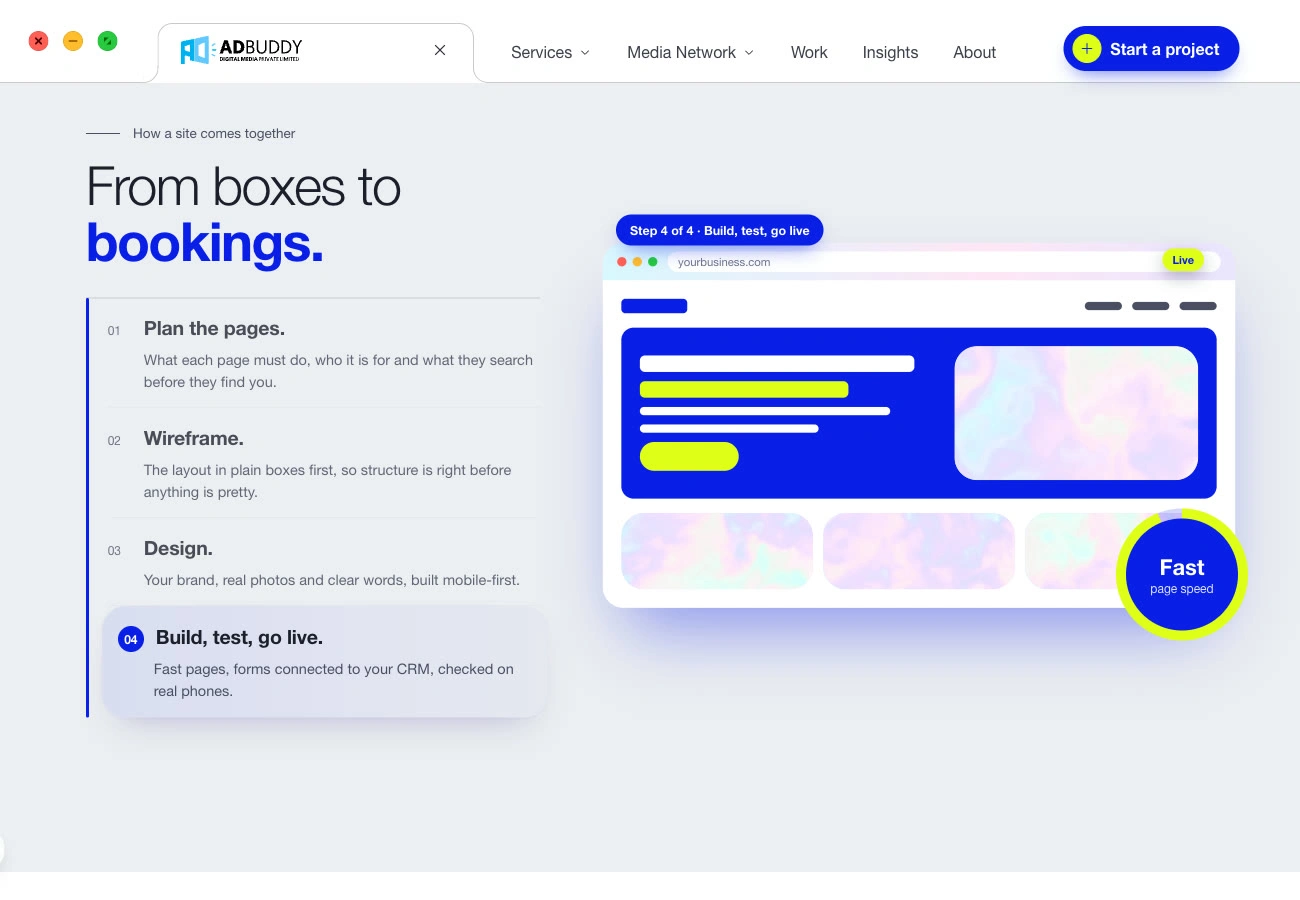
Websites concept, step 4: build, test, go live
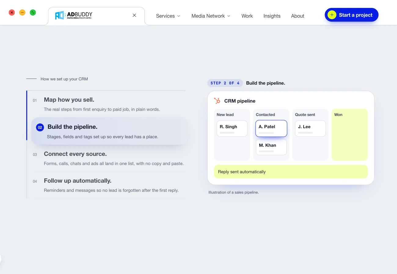
CRM concept, step 2: build the pipeline
Service cards also got a liquid hologram drawn in WebGL: one shared render loop, half resolution, only visible cards drawn, and a plain gradient where WebGL is missing.
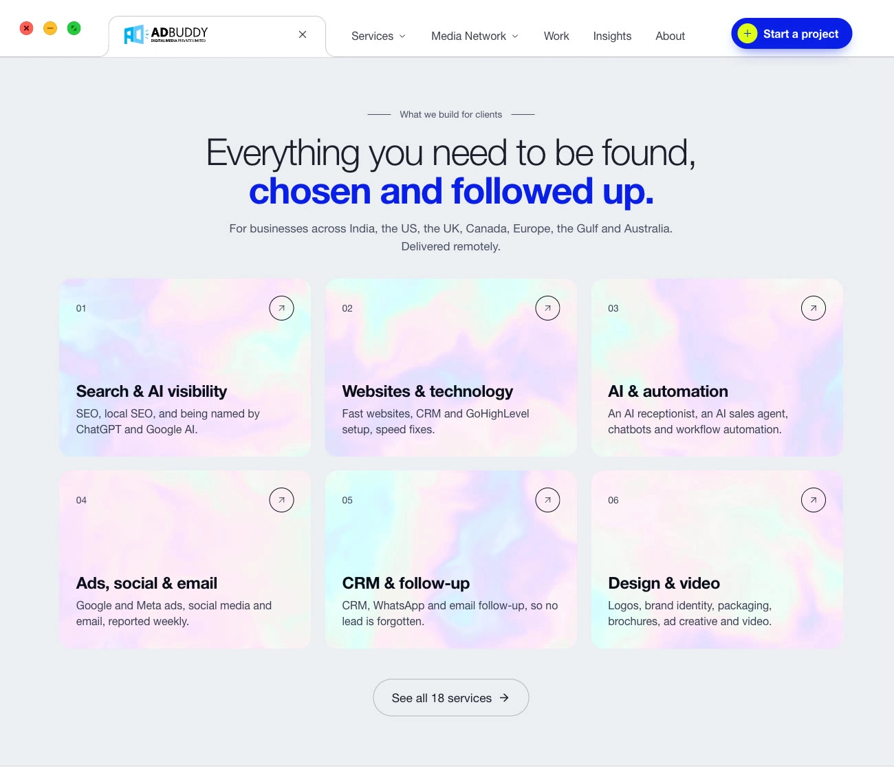
Services section on the home page, with the hologram cards
5. Build and launch
After the first three stages I switched the site from blue to a white theme, raised body text to 17.5 px and scanned every page for low-contrast text. Then I compared the production build against the baseline snapshot, deployed to Cloudflare and cleared the page cache.
6. Results
Search safety. 85 pages tracked. Only the home page H1 and two brand-page headings were changed on purpose. Titles, descriptions, canonicals, schema, internal links and word counts matched everywhere else, checked on a copy of the production build before launch.
What this does not claim. There are no traffic or ranking numbers yet. The site is new and the aim was to lose nothing, so I will check that in Search Console before saying anything about results.
Page speed. Lighthouse lab results on the live home page, 12 November 2026, not real visitor data:
Desktop: Performance 100, Accessibility 100, Best practices 77, SEO 100.
Mobile: Performance 78, Accessibility 97, Best practices 77, SEO 100. Blocking time is 940 ms on the simulated phone, mostly from one large script bundle. That is the known cause, and fixing it is the first item below.
7. What I took from it
Save the old site first. The snapshot of 85 pages turned "did anything break?" into a check I could run after every stage.
Show the idea, not a paragraph. A small animation can carry what a block of text would, and it makes the service easy to follow while scrolling.
Measure phone speed during the build. The mobile score is held back by one large script bundle, so I would check it after each stage, not only at launch.
8. What is next
Split the largest script bundle to cut mobile blocking time.
Review third-party cookies and browser issues holding Best practices at 77.
Compare Search Console clicks and impressions after a few weeks of data.
Built with
Next.js 16, React 19, Tailwind CSS 4, a hand-written WebGL shader, Lenis smooth scroll and Cloudflare Workers, with Claude Code.
Need a redesign that keeps the search ranking you already have? Send me a message on Contra and tell me what you sell and where you want to be found.
0 likes · 2 views · Nov 21, 2026
Our own agency site, redesigned: new look, animated service pages, and every URL and heading kept so Google still recognises it.


