Motorola Smartwatch
Market segment
Smart wear technology
Responsibilities
UX + UI Design
Duration
5 months
Live Project
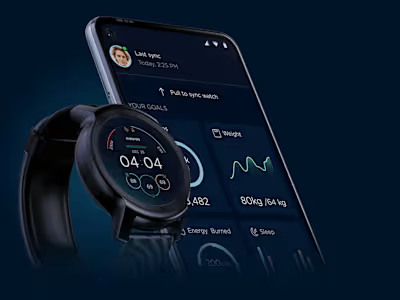
Moto Watch is optimised to help you feel your rhythm with a streamlined experience focused on health and routine, designed to work with the Moto Watch series of wearables. Get detailed stats, goals, and biometric data so you can track all areas of your wellbeing within the Moto Watch app.
The requirement is to design watchfaces and watch UI for their entry level smartwatch called Motowatch 100 which is currently on sale and available in the Canada and USA market. Planning to launch very soon in India.
Project Scope
10 watch face designs.
The design variation should be mixed of all like classic, modern, analogue, etc.
The design language of the new smartwatch can be added in their style guide.
Watch UIs like inner screens should be in circle and dark mode in the background to reduce the usage of battery.
New activity features should be implemented.
The process
Based on their requirements, we took into consideration for the implementation all the scopes and design a smartwatch in such a way that it will run smoothly in the entry level model. So I started with rough sketches and collecting reference all possible way in order to get insights and inspirations from the convergence and divergence perspective, so that I can come up with the design solution that has current design trend and also maintaining the Motorola legacy design language.
Rough Sketches
I first started with the rough sketches for the watch face to get some idea about the layout and further design insights. Some of the sketches were to focus on all the activity information while showing the date and time and informations.
Collecting references
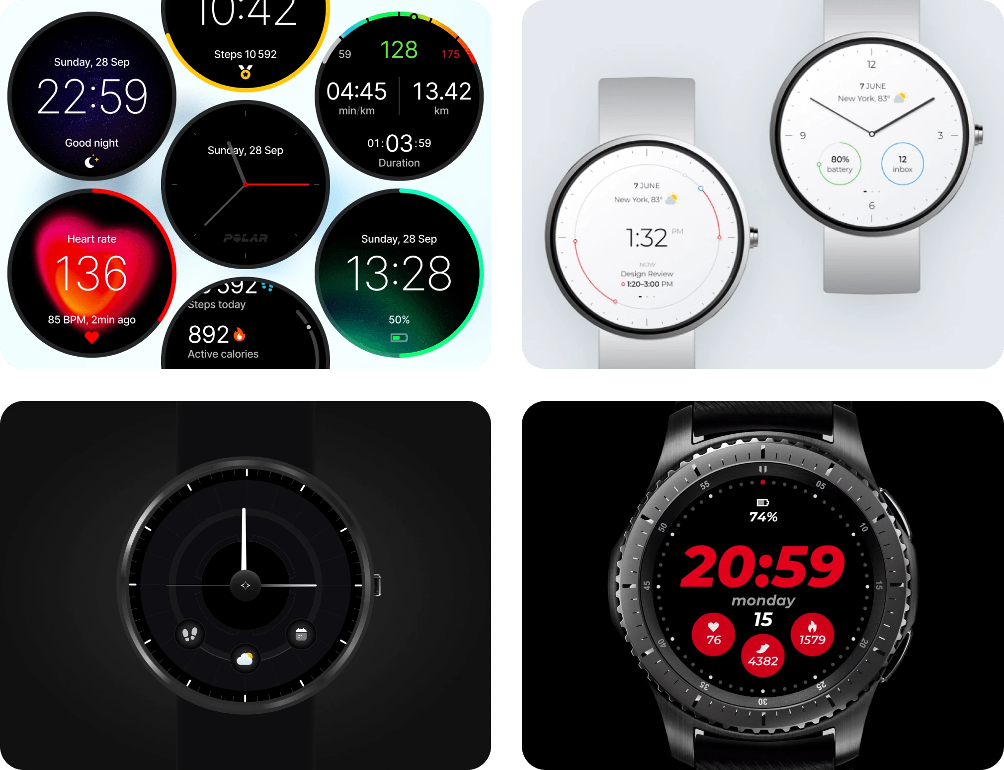
The more reference I collect, the more design ideas I can generate. I use Dribbble and Pinterest extensively as a tool for finding inspirations. I look for inspiration that comes from the small elements like buttons, number, etc. Sharing a few which I benchmarked, out of 80+ collections.
Design direction
Setting up a design directions for a smartwatch was a tedious process when compares to other platforms. Since the dial frame is circular which is something unique and the layout for the design should always be structured with a high precision in detail because of the very small screen.
On every design iteration, we tested with real smartwatch from the Motorola team in order to align all the design elements fits perfectly and better visibility while maintaining consistency. This went a long process mostly in the iconography phase. But the direction is to make more consistent and easy to use by keeping the target audience in mind.
So I came up with a theme as a skin that blends all watch faces to the UI designs. Since this model doesn’t have an amoled screen, so does the battery usage will affect when using lighter shades dominantly. So I decided to use dark theme and all the colours and legibility blends with much more contrast and to maintain typical watch design language for ease of use.
Color palettes
Colours are the crucial part when designing for smartwatch. I defined visual aesthetics that makes associates to other elements. All the colors in the palette are visually clear and maintain balance and good contrast value. So I took some colors as a primary palette from the brand guidelines and tried blending with other design elements.

Primary colors: that used to across all the screens.

Accents colors : that accentuates playfulness.
Typography
Typography plays an important role in the watch screen as it dominates the most of the areas in the screens. When it comes to smartwatch, numbers also shares the same level of priority for activities and KPIs. It should be legible, crisp and clear even from little far distance. So I decided to use Gotham as the font family across all the screens including mobile application. Motorola guidelines also use the same typography which is actually good to maintain consistency.

Iconography
Icon shares an immense role in a dial screen where user can identify the use activities by looking at the icons after the typography. Legible and clear icons gives an ability to reduct the contents. It also improved usability. User can keep engaged when you create an attractive icons.

UI Designs
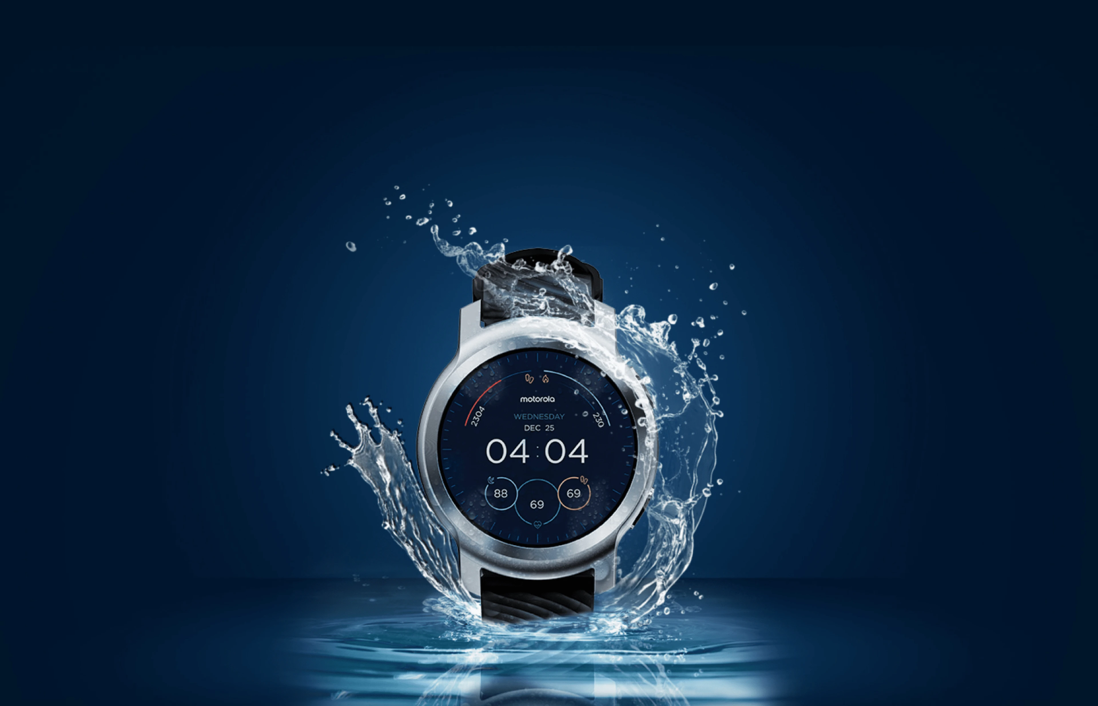
Finally I blended altogether to create a mood as a visual direction and that goes well with all the screens and all the design elements. Every screens has done with curated visual elements, legible font size, crisp icons, playful color, etc to make the design stands out in the market.
Watch faces UI
As per the requirement, the watch face should have 10 options or as a skins. All the designs should match the UI design language. Classical and modern looks are the major role of combination in the design. Every skin has a unique with unique features added to make the user choose as per their needs.

Watch faces design
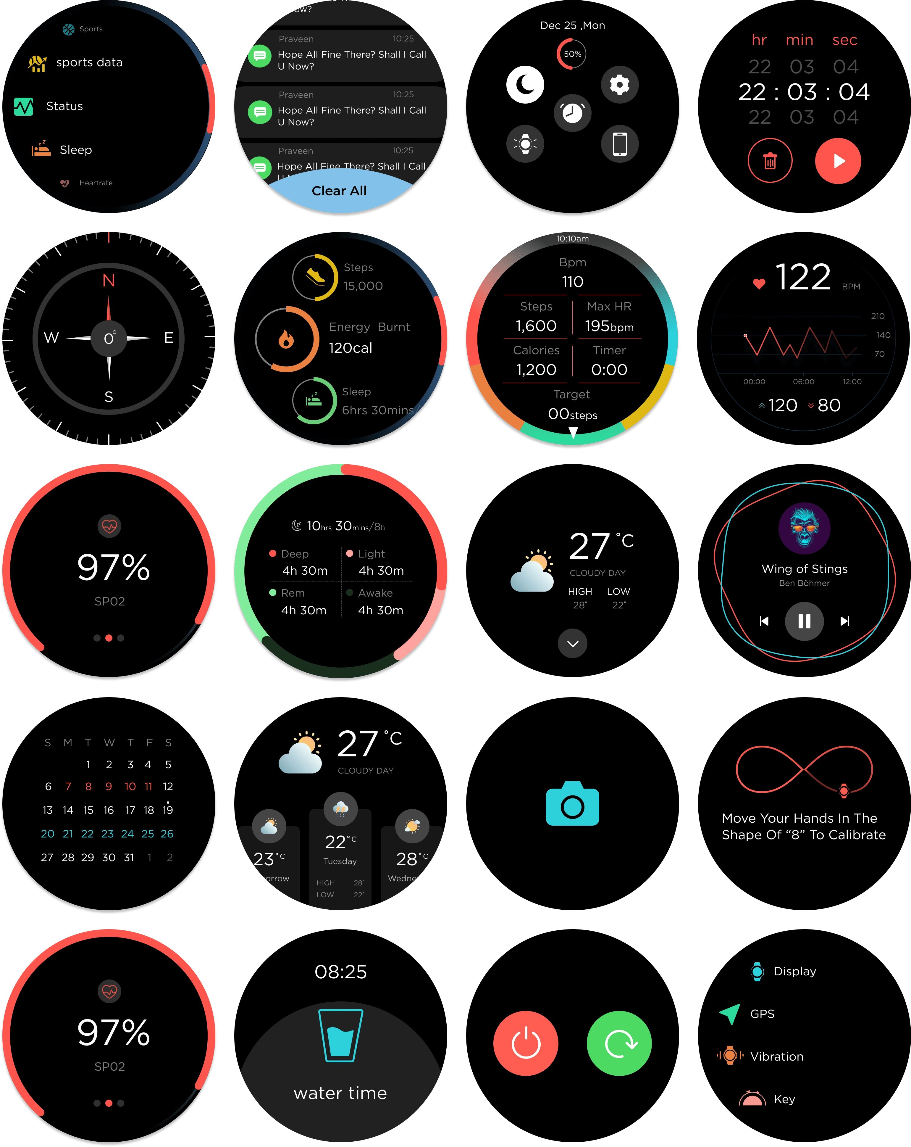
After the watch faces design, I went ahead to design the rest of other inner pages where we can actually see the design direction. Every screen has implemented with design language that suits the smartwatch interaction. Every interaction is simplified with the latest update. Sharing few glimpse of the inner screens below.
Thank you!
Like this project
Posted Mar 30, 2024
The requirement is to design watchfaces and watch UI for their entry level smartwatch called Motowatch 100.

