Zudio
Mobile first experience for affordable fashion
Market segment
Fashion E-commerce
Responsibilities
UX (wireframe) + UI Design
Duration
3 months
Zudio has established a reputation for providing a diverse range of stylish clothing and accessories to suit every taste and occasion. Their inventory is updated frequently, ensuring that customers have access to the most up-to-date styles and fashion trends.
With a focus on affordability, Zudio's merchandise is priced competitively, allowing customers to update their wardrobe without breaking the bank. The company's commitment to value extends beyond just pricing, as they also prioritise quality and comfort in their products.
Zudio's foray into e-commerce will enable them to reach a wider audience, offering the same exceptional value and quality to customers online. With the convenience of online shopping, customers can browse Zudio's collection from the comfort of their homes and have their purchases delivered directly to their doorstep.
Overall, Zudio's dedication to providing the latest fashion trends at great value, combined with their commitment to quality and convenience, make them a go-to destination for fashion-conscious shoppers.
Project Scope
The website is designed with a mobile-first approach, recognising that the target audience, primarily millennials, tend to use their mobile phones more frequently than desktops for browsing and accessing online content.
Due to Zudio's limited discount offerings, the website should prioritize presenting compelling numbers that capture the user's attention.
The design should adhere to the established brand guidelines to ensure consistency.
The website can be created using the Shopify tool. However, since there are design limitations, all designs and interactions must be technically feasible within the
Shopify platform.
Competitive analysis
To begin, we conducted a thorough analysis of our competitors, carefully examining their features and identifying their pain points. Based on this evaluation, we selected the following competitors.

Onboarding User flow
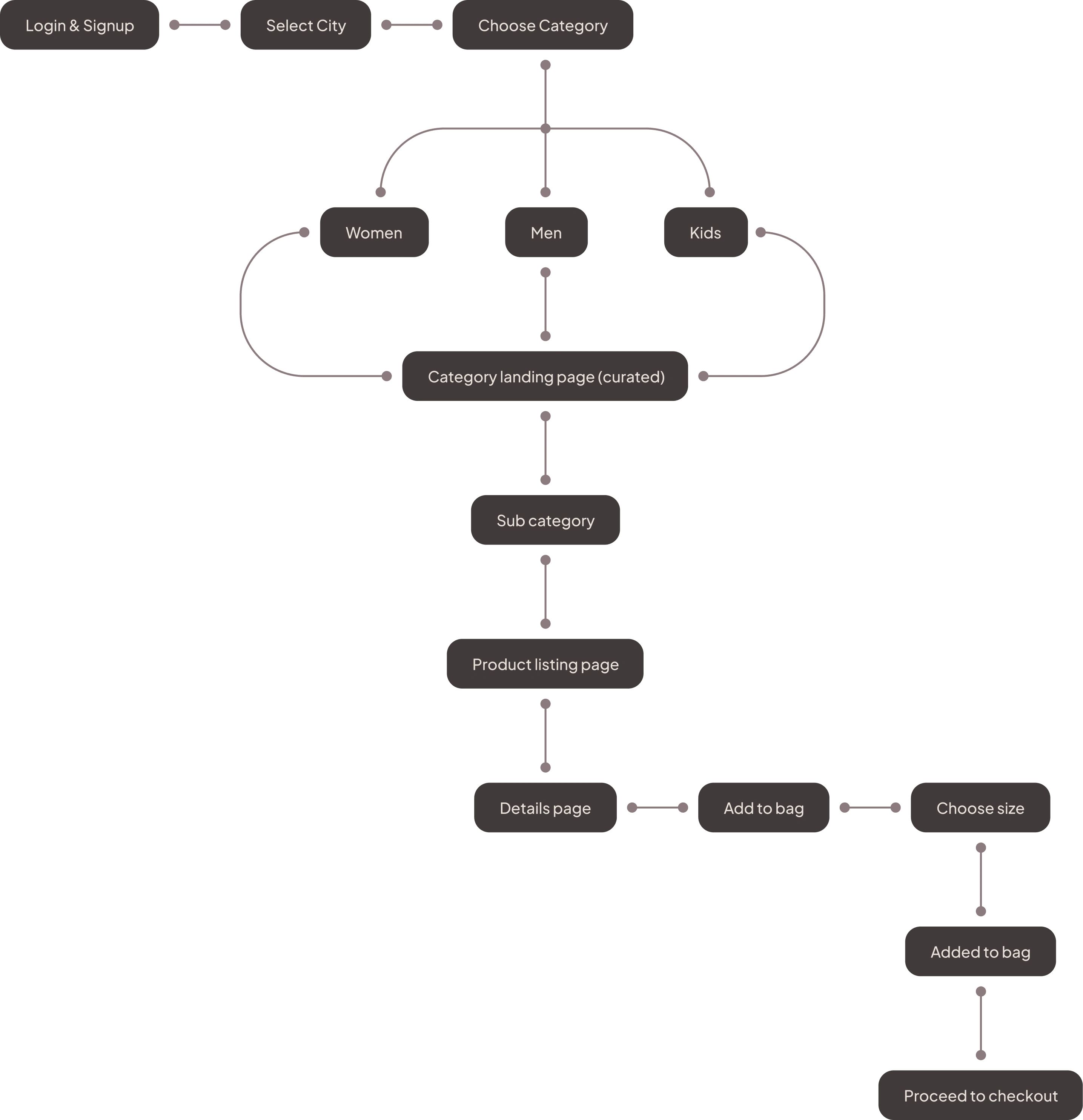
After gathering insights for competitive analysis, the research team then conducted a design audit to gain a deeper understanding of our competitors' strengths and weaknesses. With this information in hand, I began working on the user flow to ensure seamless interaction throughout the process.

Wireframes
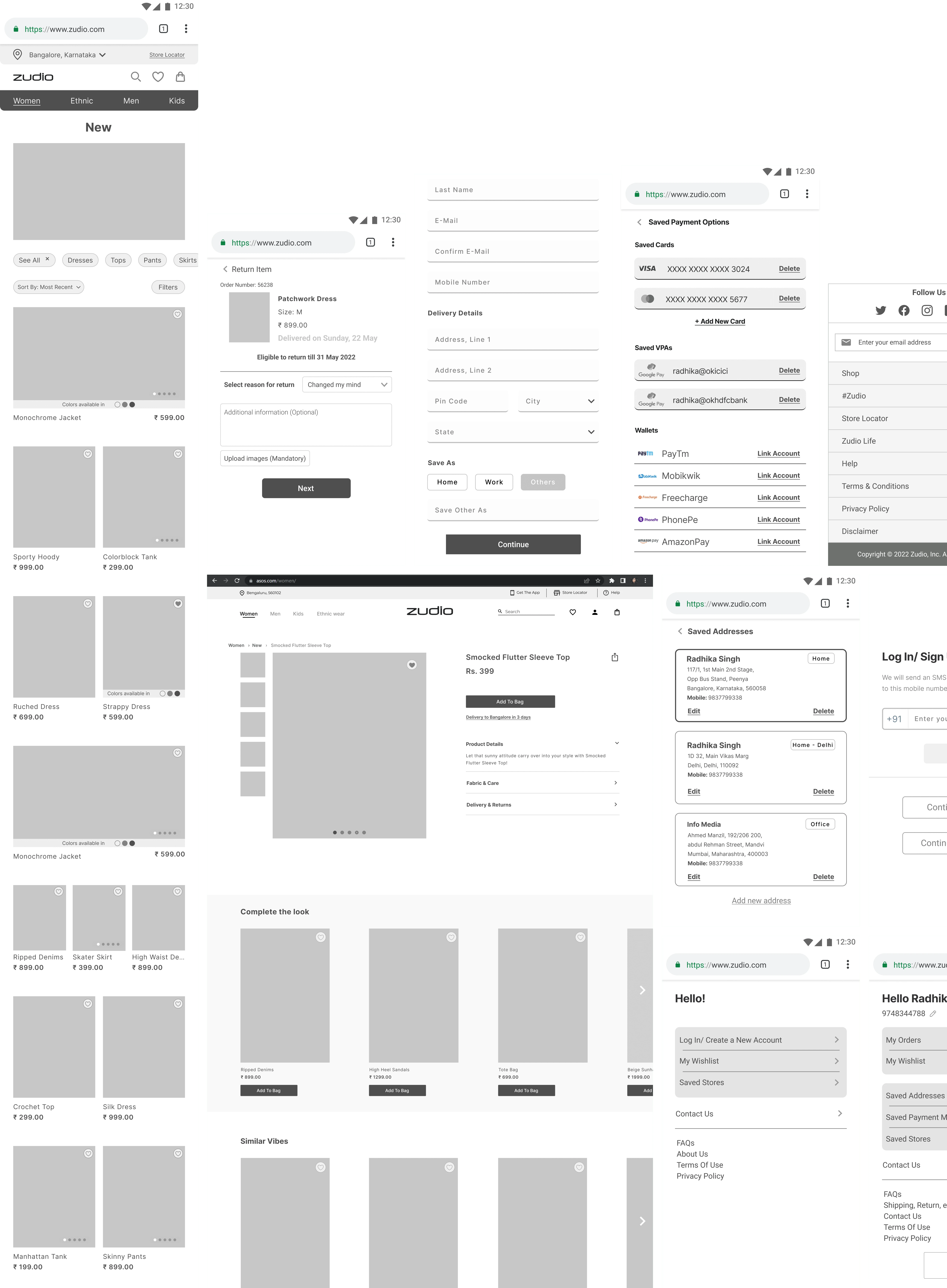
After creating the information architecture, my focus shifted to designing screens for all the flows while ensuring that the interactions and flows were technically feasible for implementation in Shopify, which was a crucial factor.

Design Direction
After completing the UX process, my next step was to develop a design direction for the brand that aligns with their existing brand guidelines, ensuring consistency throughout.

Developing in Shopify
During the process of creating a design direction for Zudio, the main requirement was for it to be minimalistic and clean. To achieve this, the website's dominant colour was white, as the product has subtle colours. This ensured a balanced contrast value between the design and the product. The design process primarily focused on elements such as colours, typography, iconography, and image style.
Inspirations
I heavily rely on Dribbble and Pinterest to find inspiration in small design elements like buttons and numbers. I've selected a few benchmarks out of 100+ collections, and for this brand, I'm inspired by classical and clean-looking UI to create a cohesive mood between all design elements.
Color Palette
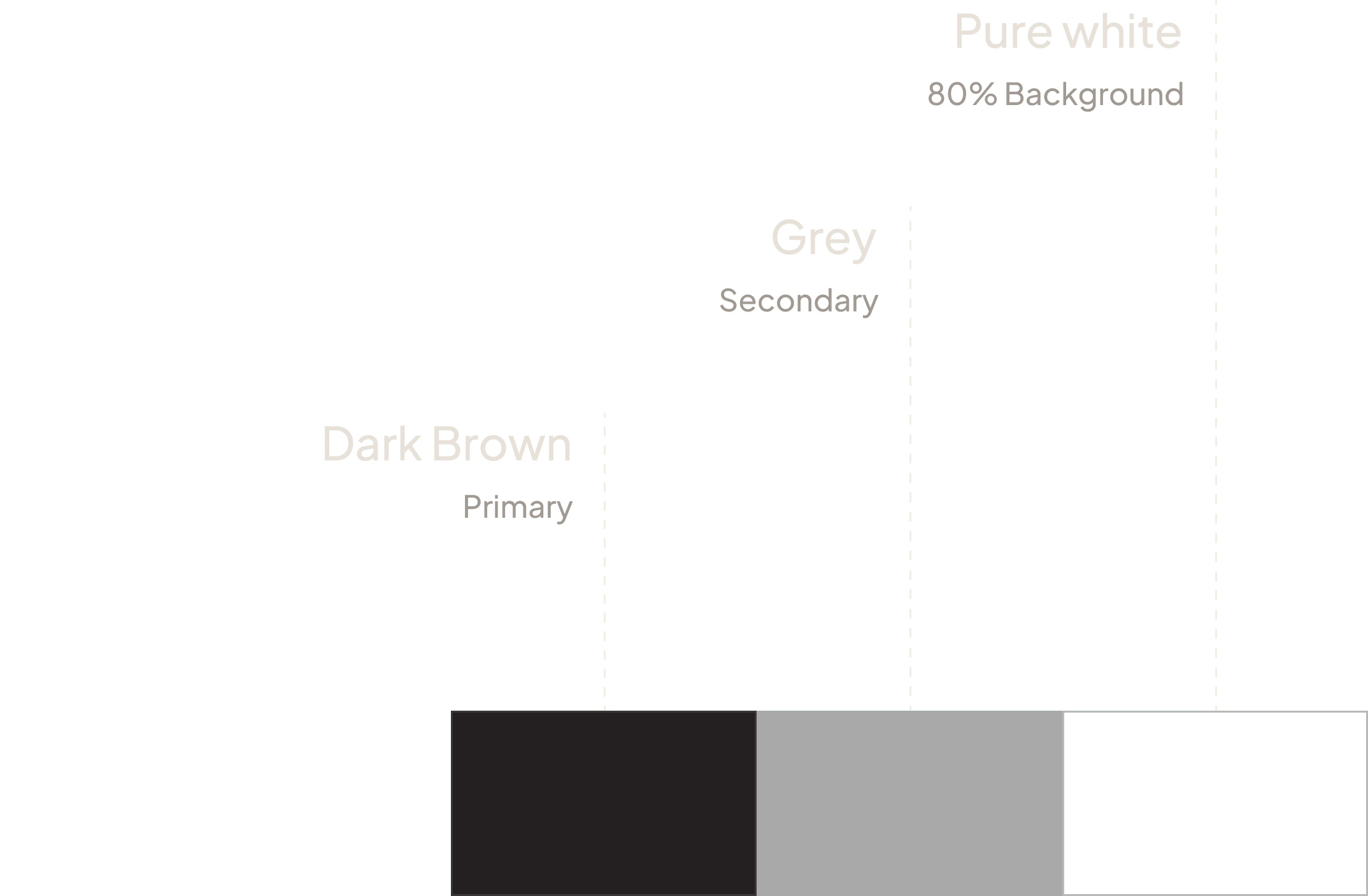
Zudio's existing guidelines limit the colour palette to dark brown, which was also required for the website. Grey was added as a complementary colour, and white was used as an additional colour to ensure consistency across all pages.

Typography
Zudio has a font named Futura Medium for typography, which I incorporated into the design towards the end of the process following multiple typography iterations.
Iconography
Fashion brands prioritise images, but sometimes an appropriate icon is necessary. Filled icons embody a minimal and clean aesthetic, complementing the overall direction.

Image style
Fashion brands offer colourful products, but it's important that the clothes and their colours don't detract from the focus on the product. To achieve this, I chose a subtle grey background that allows the products to stand out and create the main contrast value.

UI Design
Ultimately, I integrated all design elements to develop a cohesive visual direction that enhanced every screen and element. Each screen was thoughtfully designed with carefully selected visual elements, legible font sizes, icons, subtle colours, and other features, ensuring that the design was optimised for mobile responsiveness and delivered a seamless user experience.

Thank you
Like this project
Posted Mar 30, 2024
The website is designed with a mobile-first approach, recognising that the target audience, primarily millennials.
Likes
0
Views
283


