BRONZA — Specialty Coffee Roasters Brand Identity & Packaging

Akshay Arul


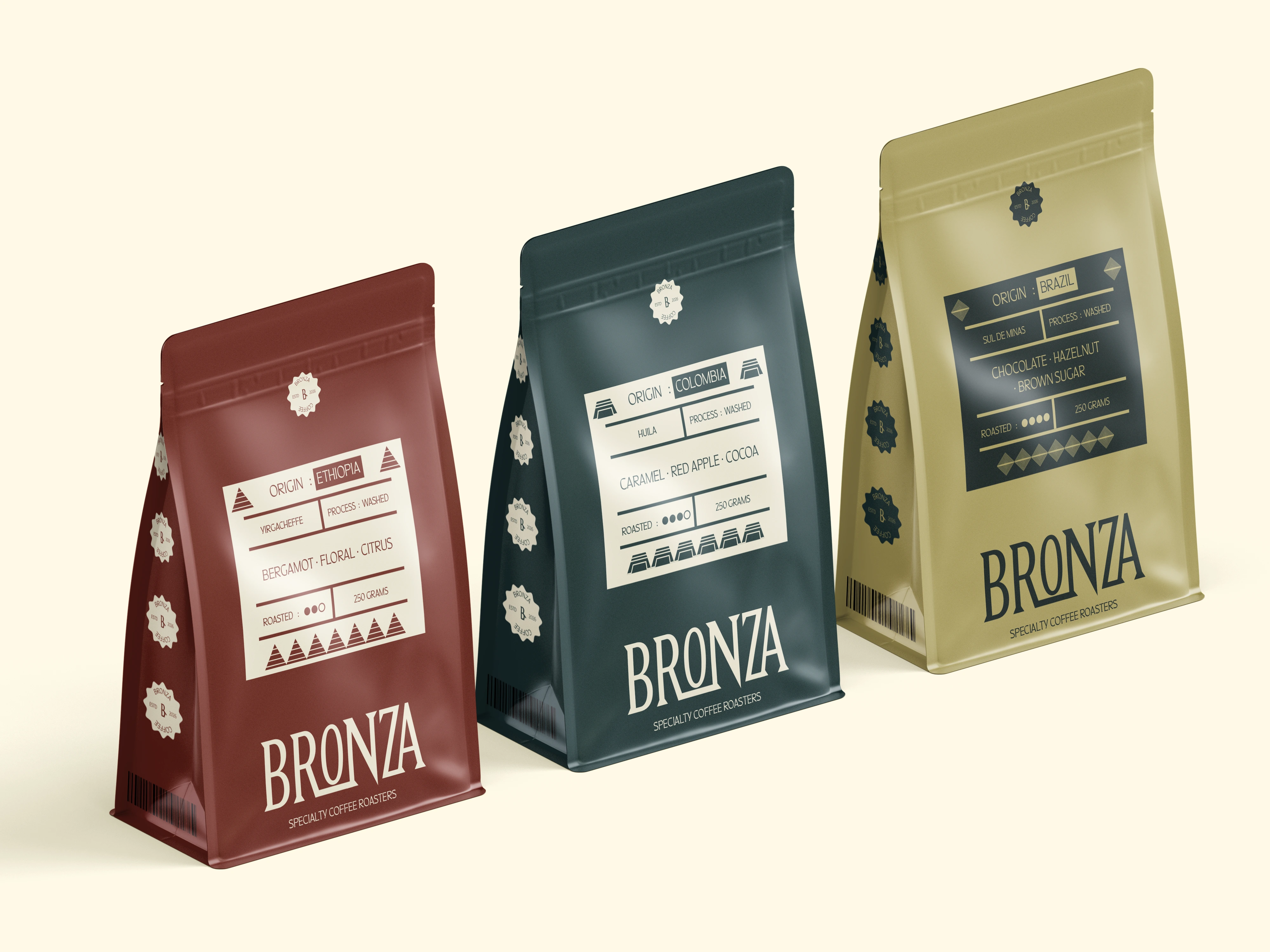
BRONZA — Specialty Coffee Roasters Brand
Brand Identity + Packaging Design
Keywords: Warm, Authentic, Grounded, Refined
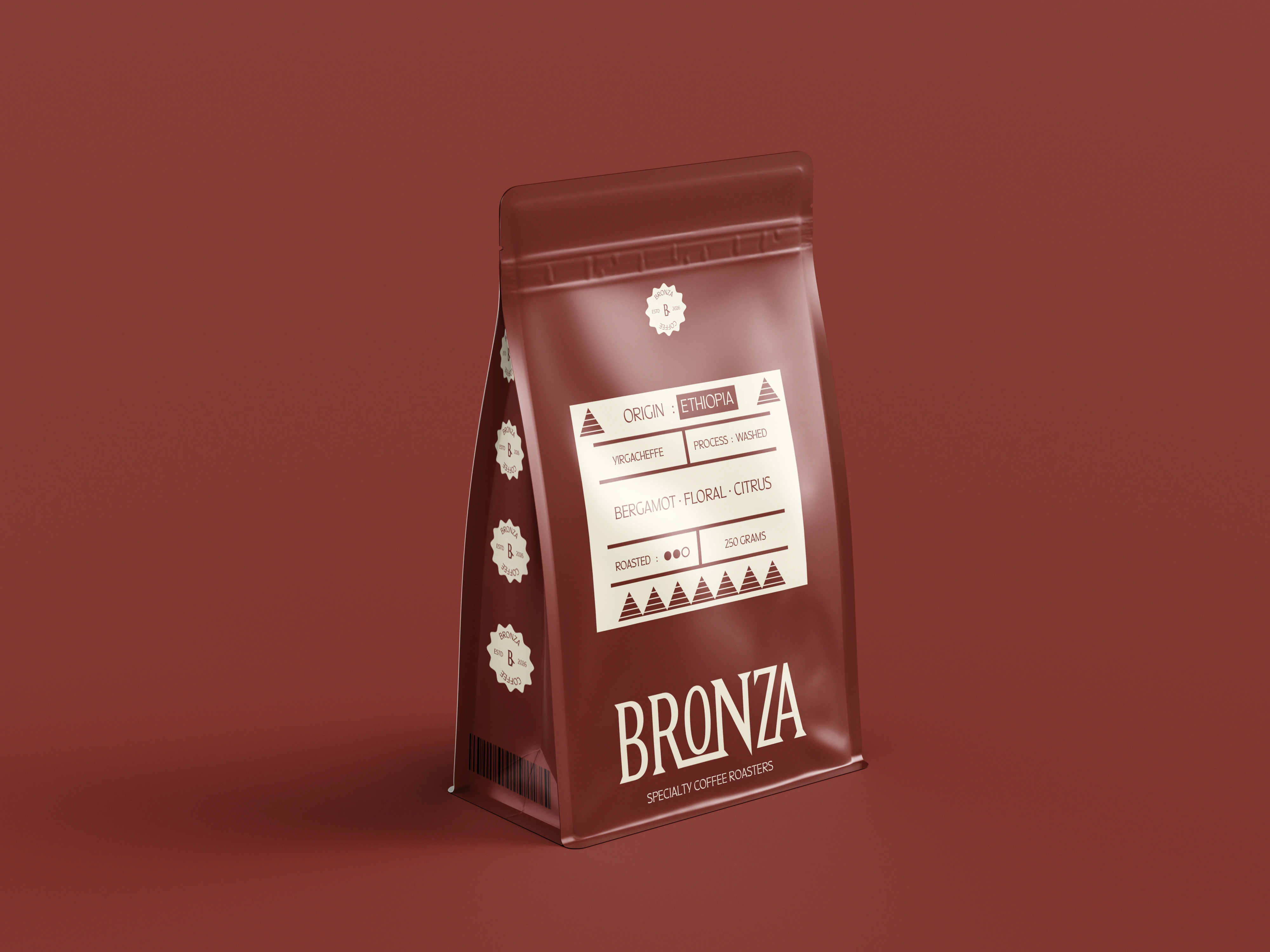
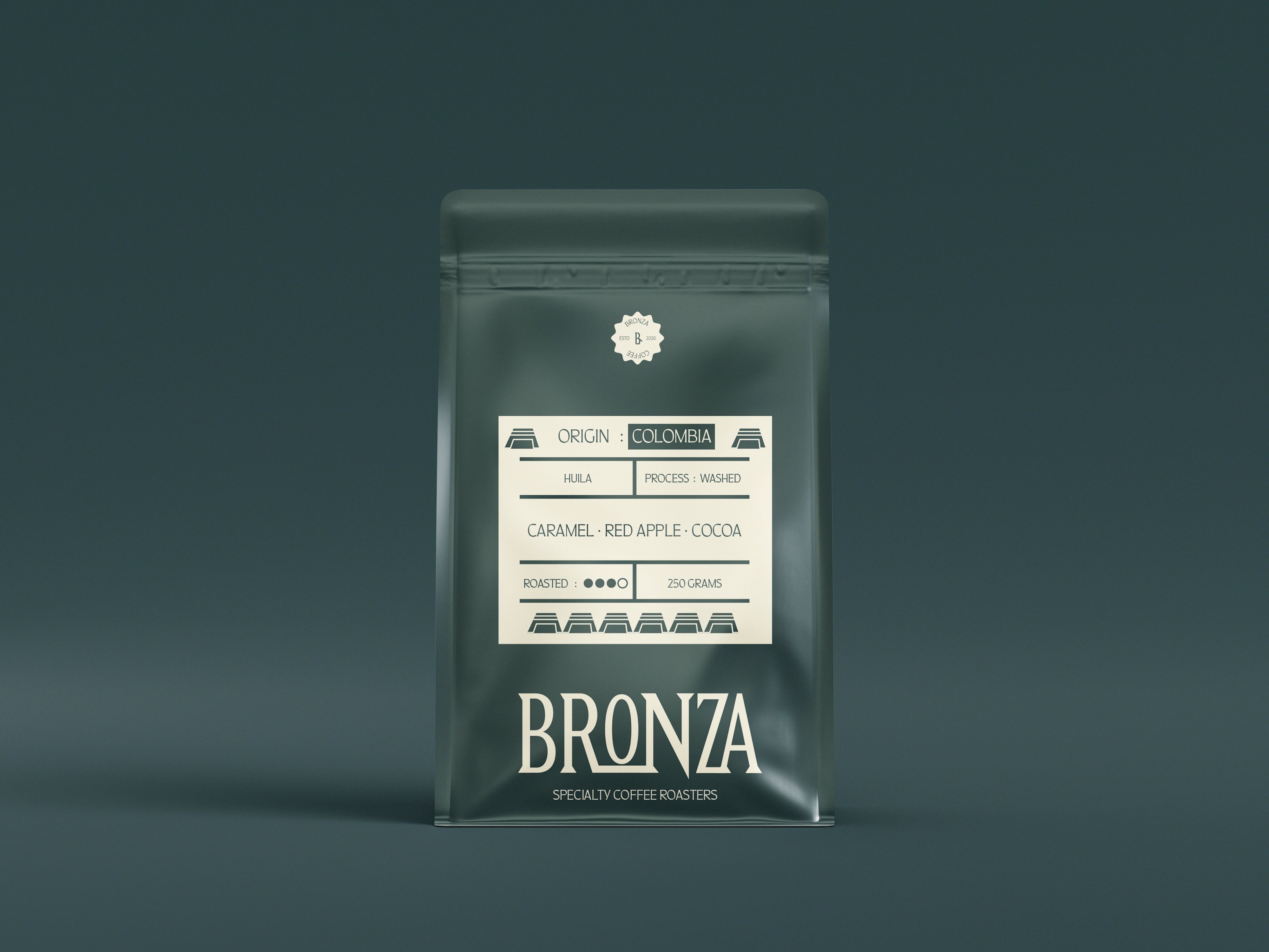
BRONZA is a conceptual speciality coffee roasters brand built around material richness, warmth, and authenticity. Inspired by the natural depth and character of bronze surfaces, the brand combines rich tones with subtle expressive elements to create a bold yet grounded identity.
The Challenge
The challenge was to create a premium identity that felt rich and distinctive without relying on excessive decoration or conventional luxury aesthetics.
BRONZA needed to communicate quality and sophistication while retaining a sense of warmth, authenticity, and human character.
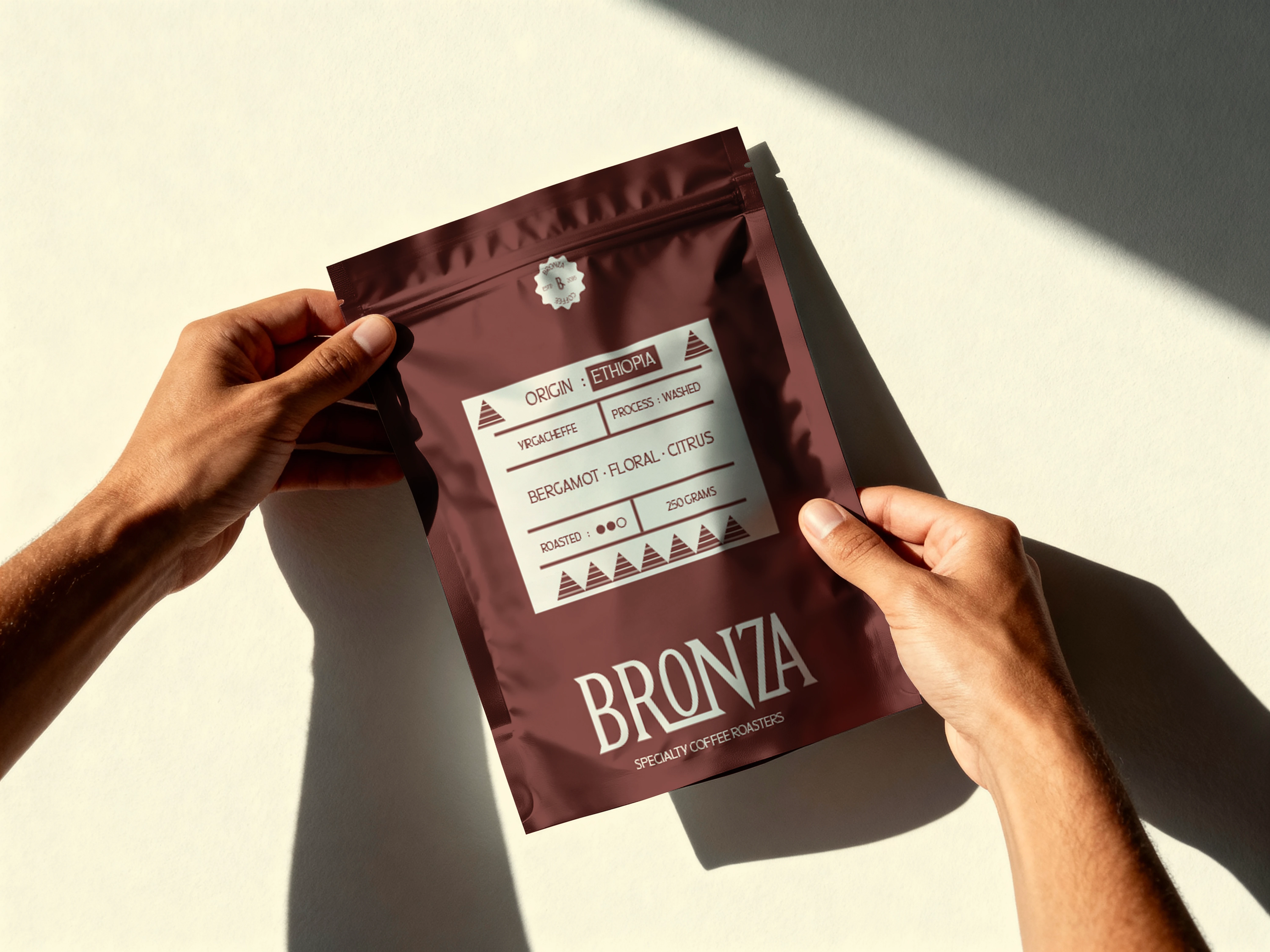
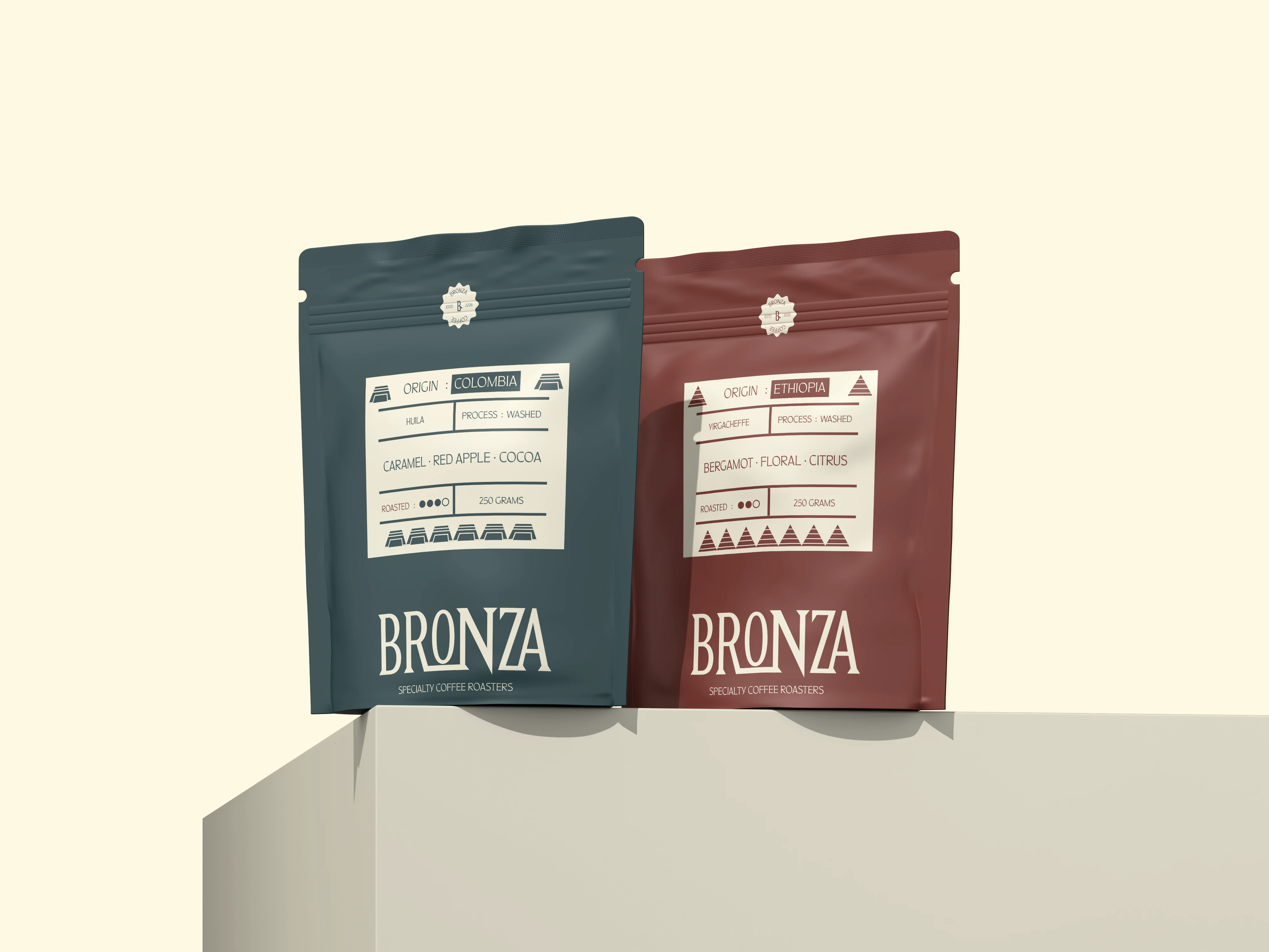
The Concept
The core concept behind BRONZA is material richness and crafted authenticity, drawing inspiration from the depth, texture, and natural variation of bronze surfaces.
Rather than expressing luxury through excess, the identity embraces a grounded approach where texture, tone, and crafted imperfections become part of the brand language.
This creates a balance between bold structure and refined restraint, allowing the identity to feel premium while remaining approachable and authentic.
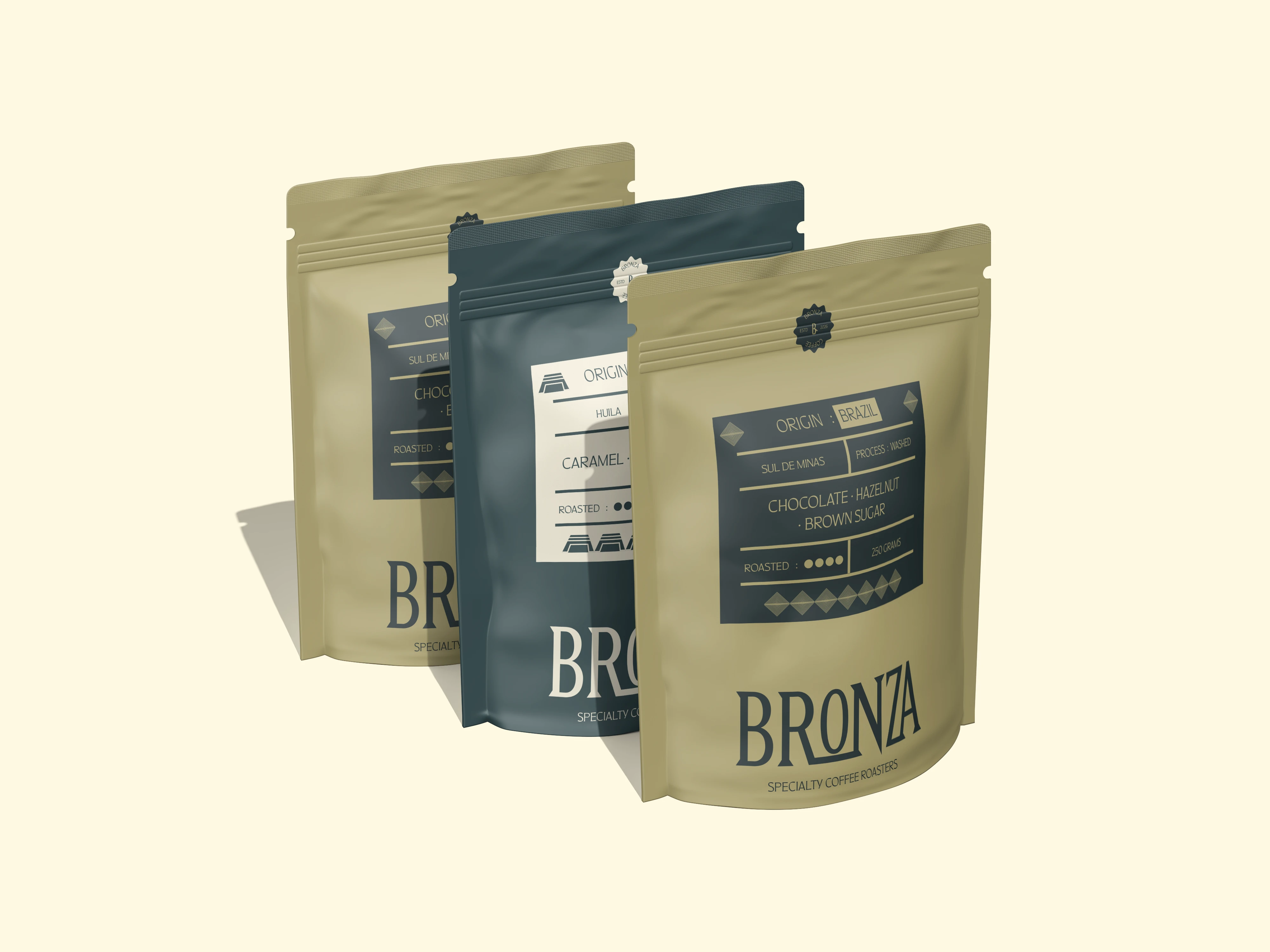
Visual Identity
The identity is built around strong typography, intentional spacing, and a restrained visual structure.
Bold typographic forms create a confident and recognizable presence, while subtle graphic elements introduce a sense of human touch and natural variation.
Inspired by material flow, surface irregularities, and handcrafted imperfections, these elements are used sparingly to soften the structured system and add depth without overwhelming it.
The colour palette is anchored in warm bronze-inspired hues, supported by deep neutrals and soft tonal variations that evoke aged metals, natural patinas, and tactile surfaces.
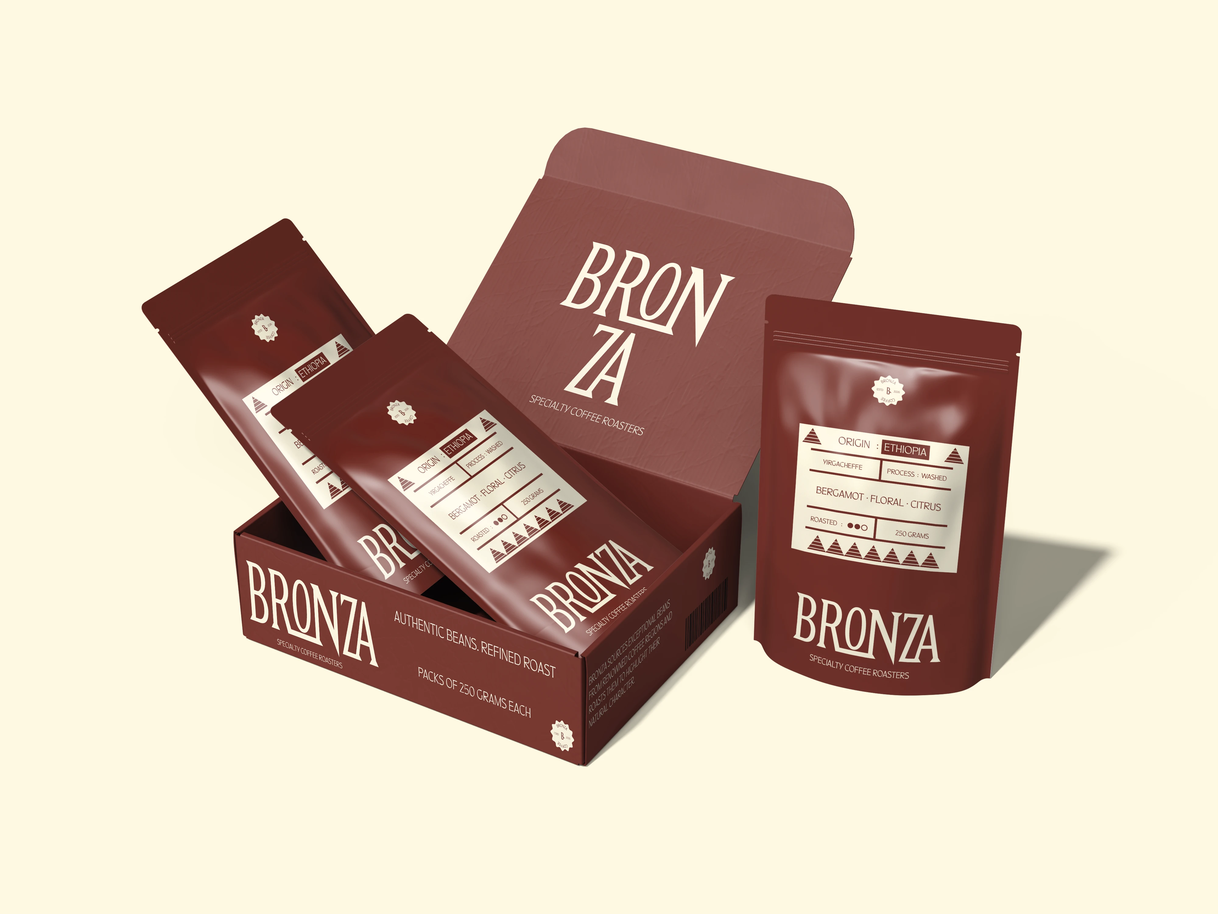
Packaging System
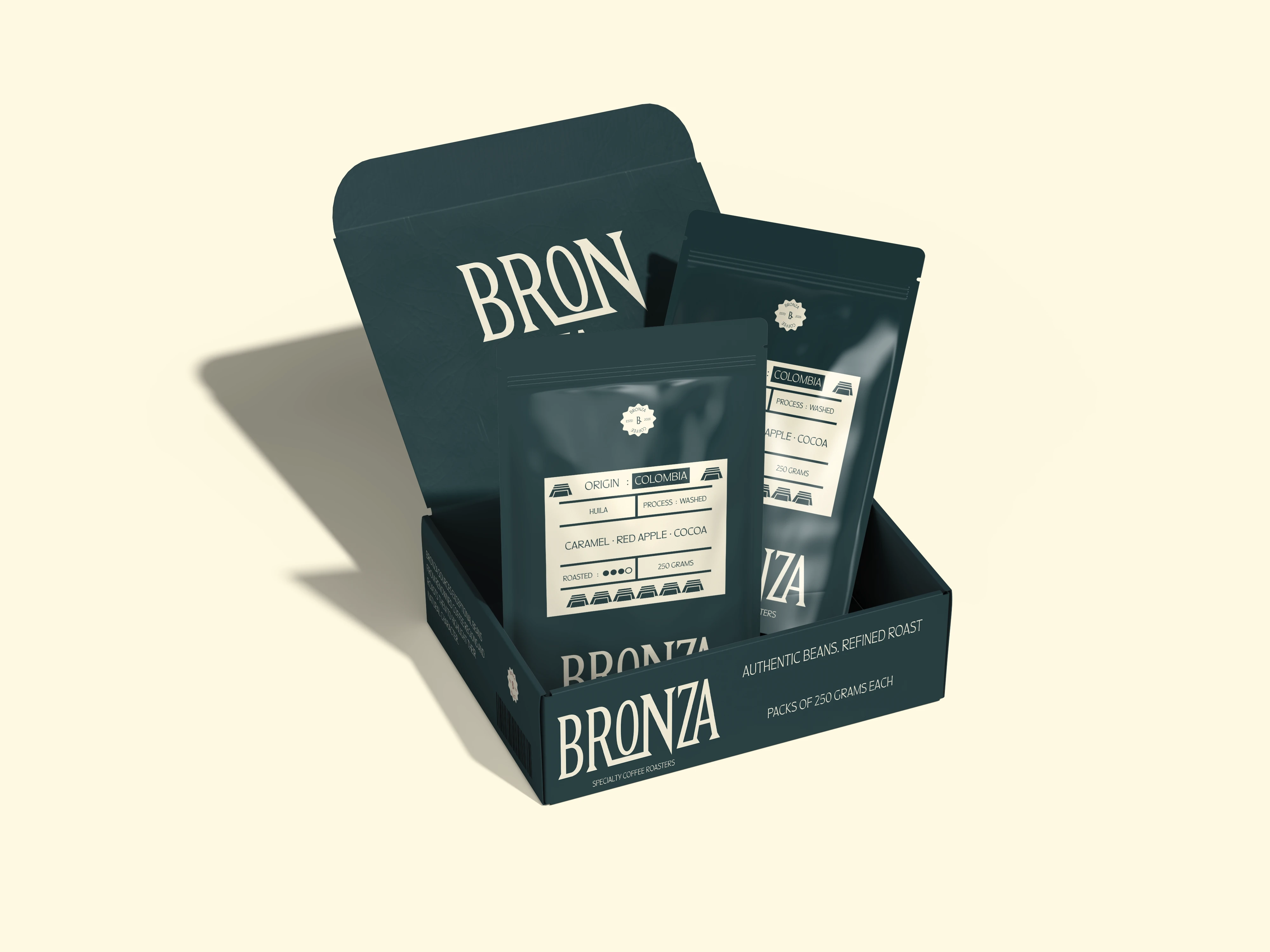
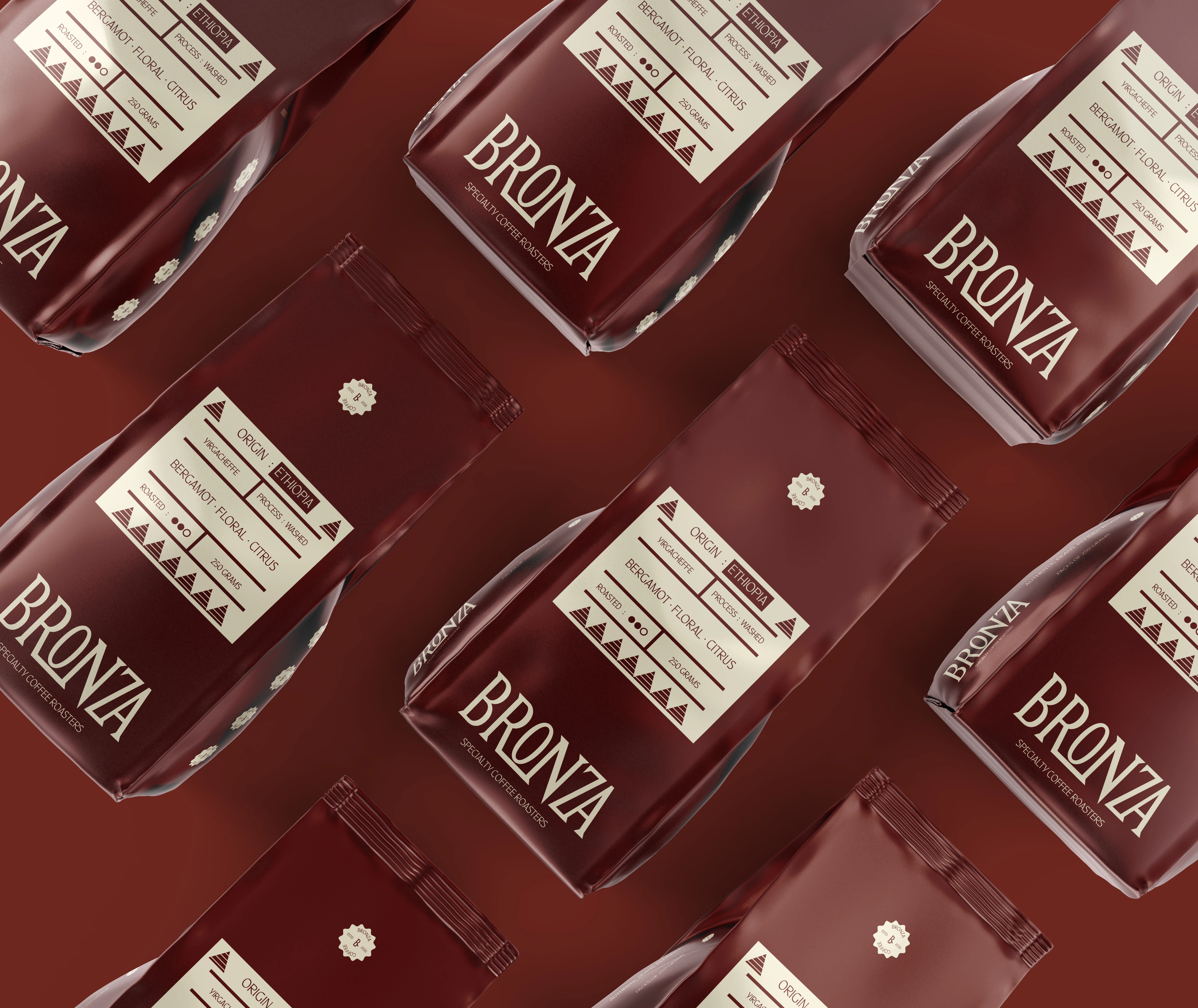
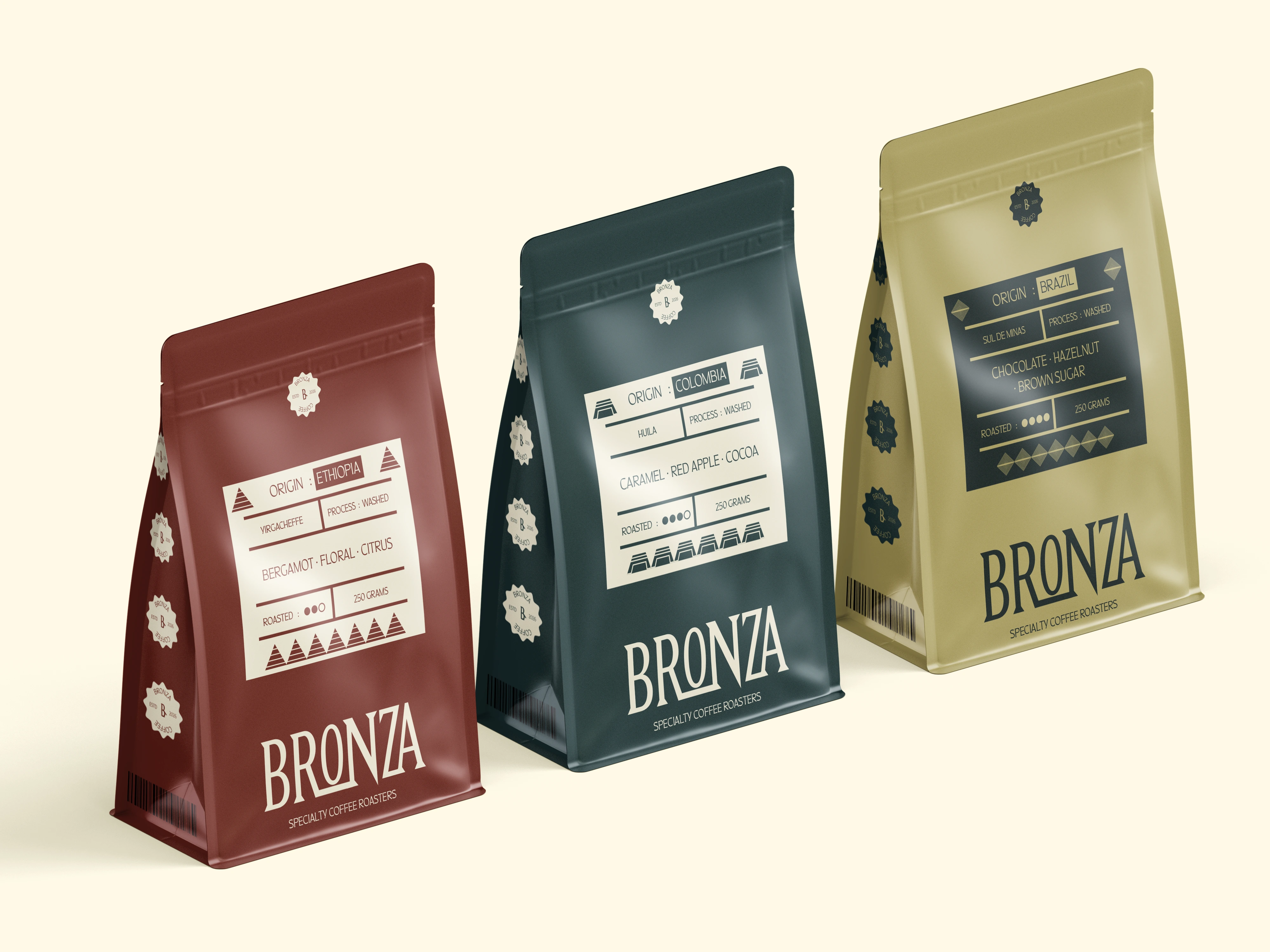
The packaging system translates BRONZA's material-driven identity across different product formats and variants.
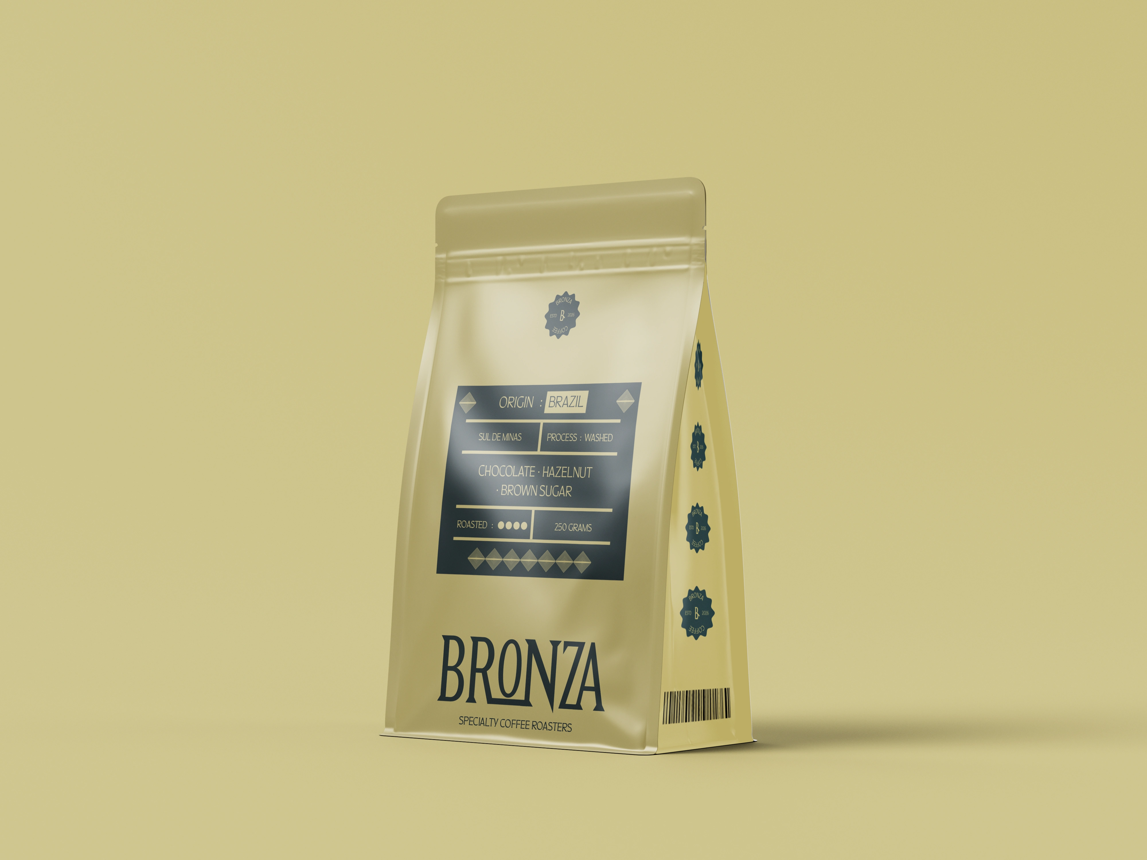
A consistent typographic hierarchy, warm colour palette, and expressive graphic elements create cohesion across the range, while individual colourways allow each product to maintain its own character.
The system balances structure with subtle variation, creating packaging that feels crafted, premium, and recognizable as part of the same brand family.
Brand Applications
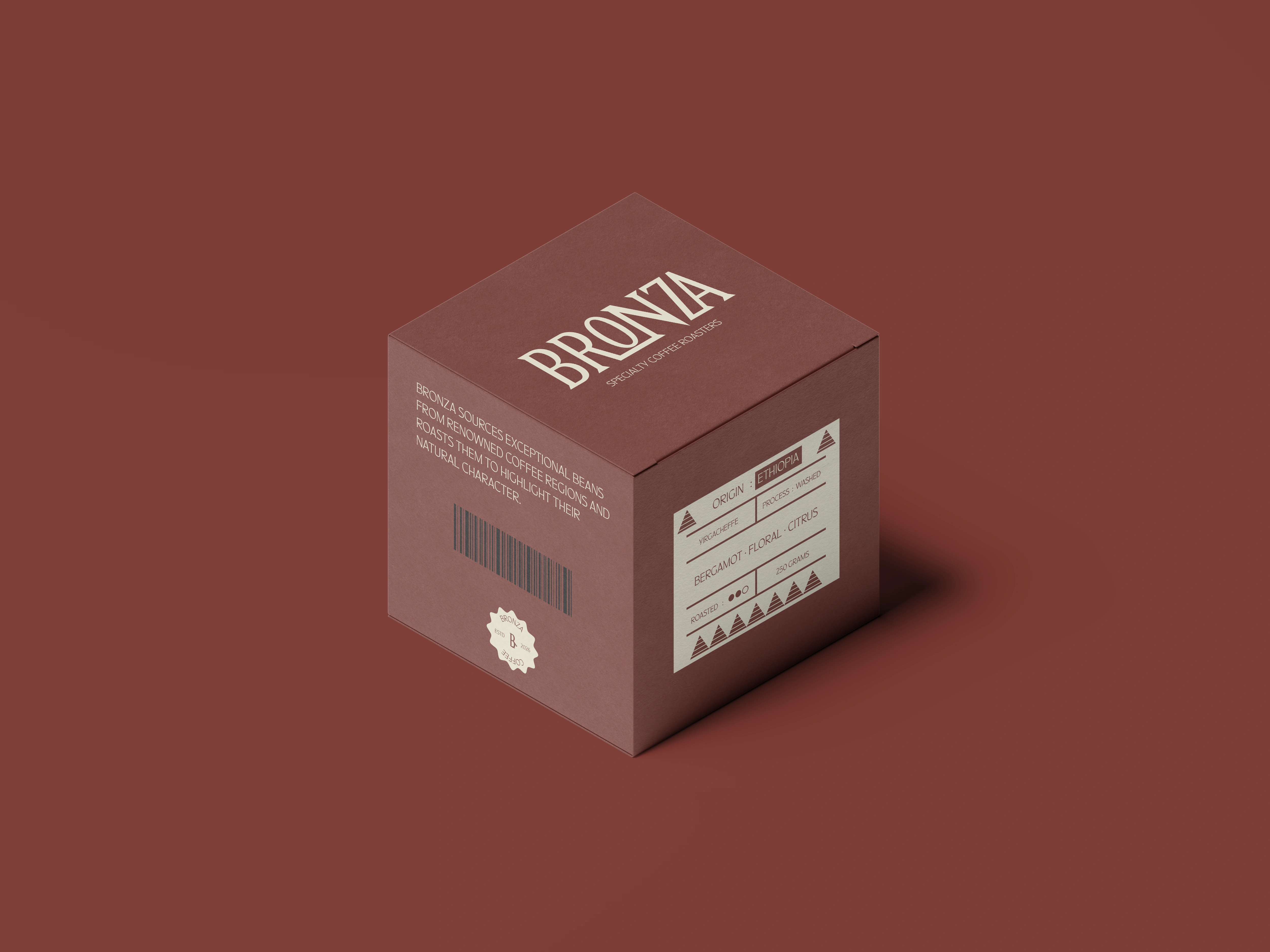
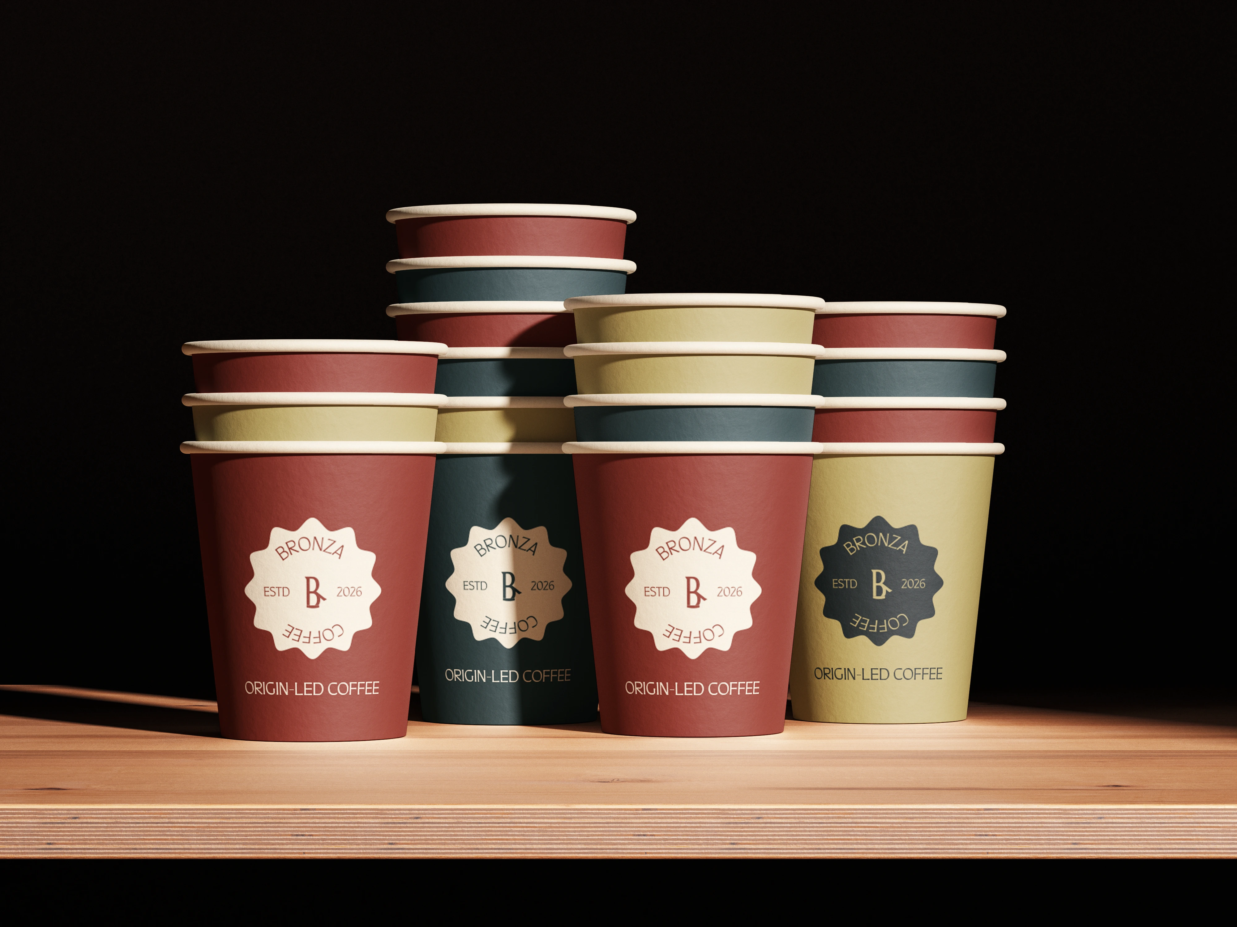
The BRONZA identity extends across packaging, product formats, takeaway cups, boxes, shopping bags, and other brand touchpoints.
Across each application, the same combination of bold typography, warm tones, expressive graphics, and structured layouts maintains a consistent visual language.
The result is a flexible identity that carries the brand's sense of material warmth and authenticity across both product and lifestyle applications.
The Outcome
BRONZA achieves a refined balance between premium expression and authentic character, translating the warmth of bronze, crafted detail, and natural material variation into a cohesive visual system.
The result is a bold yet grounded identity that feels rich, tactile, and quietly luxurious without relying on excessive visual embellishment.
Want to create something distinctive?
If you're building a brand and need a thoughtful visual identity or packaging system, I'd love to hear about it.
Let's work together.
Like this project
Posted Sep 19, 2026
Developed a warm, authentic brand identity and packaging system for BRONZA, a specialty coffee roasters brand.