SUMO_ Logo Design
Crafting digital experiences
Sumo began as a partnership between different production companies, each specializing in a different area of the digital realm. When they decided to band together under the same brand, a unifying identity was required. That's where I came in.

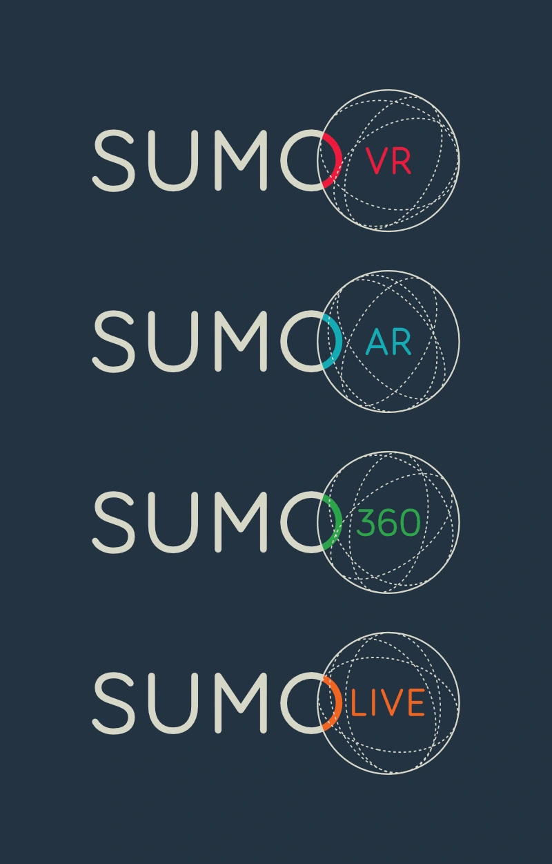
Sumo has several divisions, specializing in different areas of digital experiences development. The logo is a perfect example of a dynamic mark, adapting to each area while maintaining consistency in the simplest way.
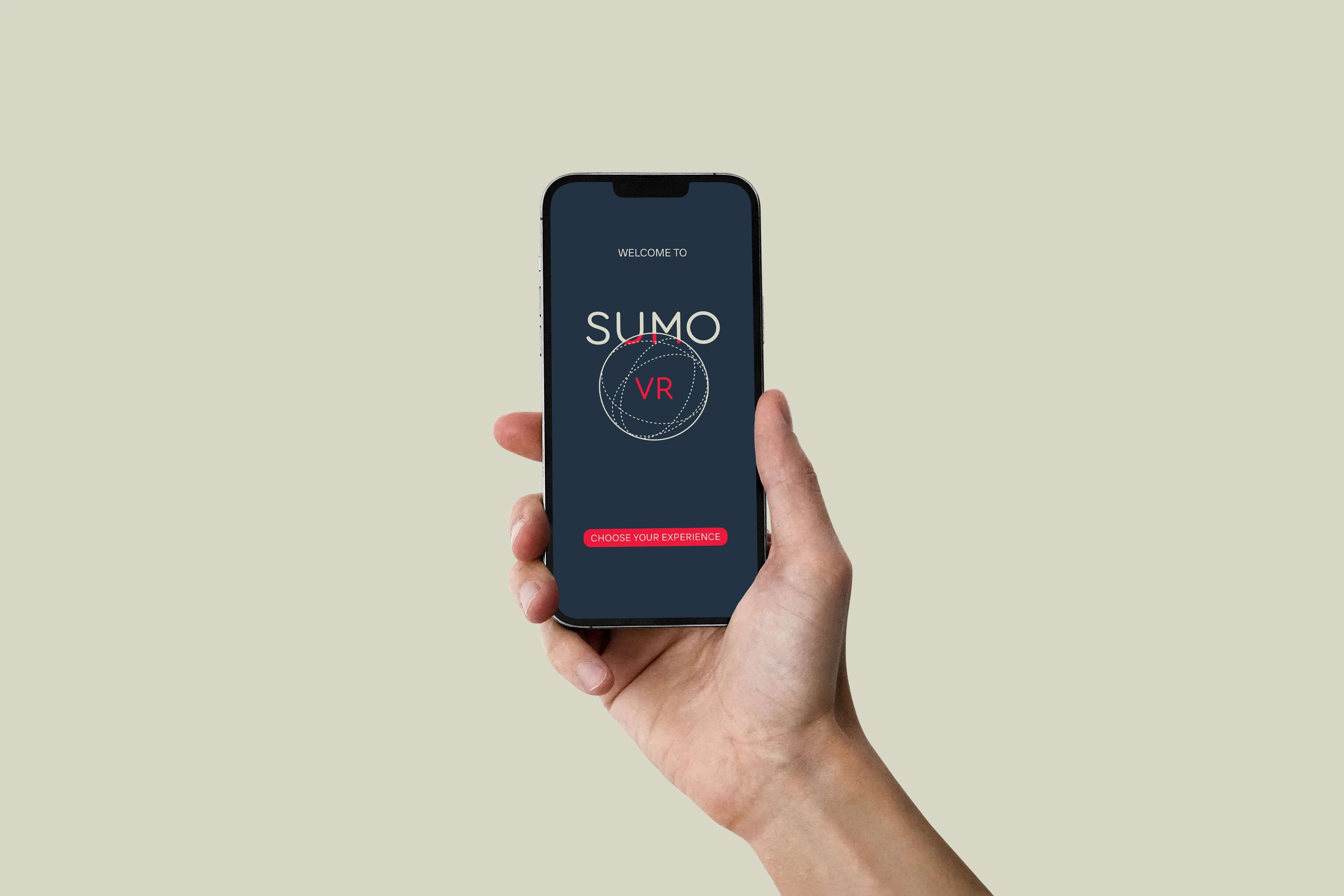
Different lockups of the logo were designed for vertical or horizontal application.


A simplified version was also designed for easier reproduction.
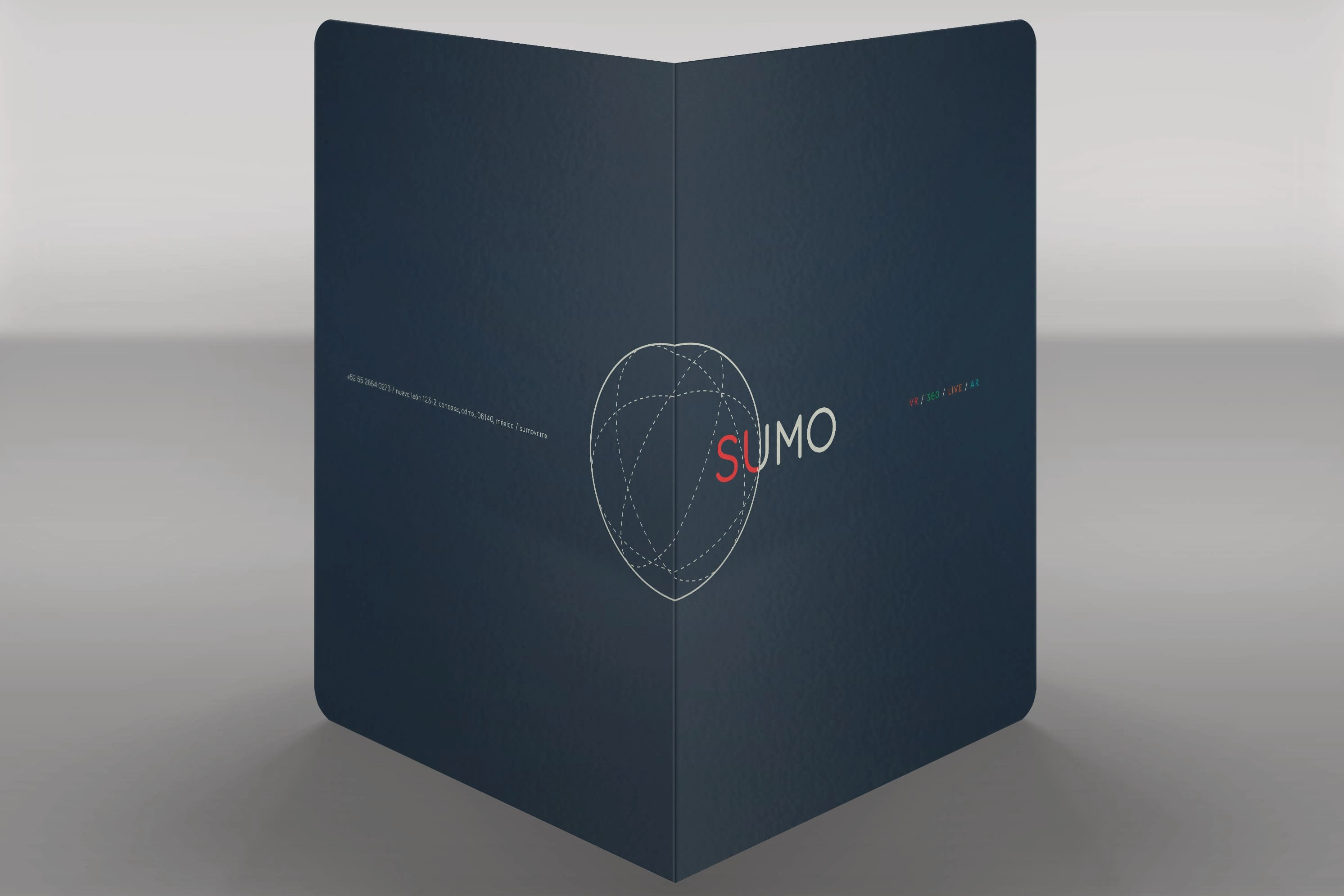
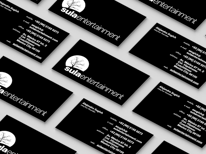
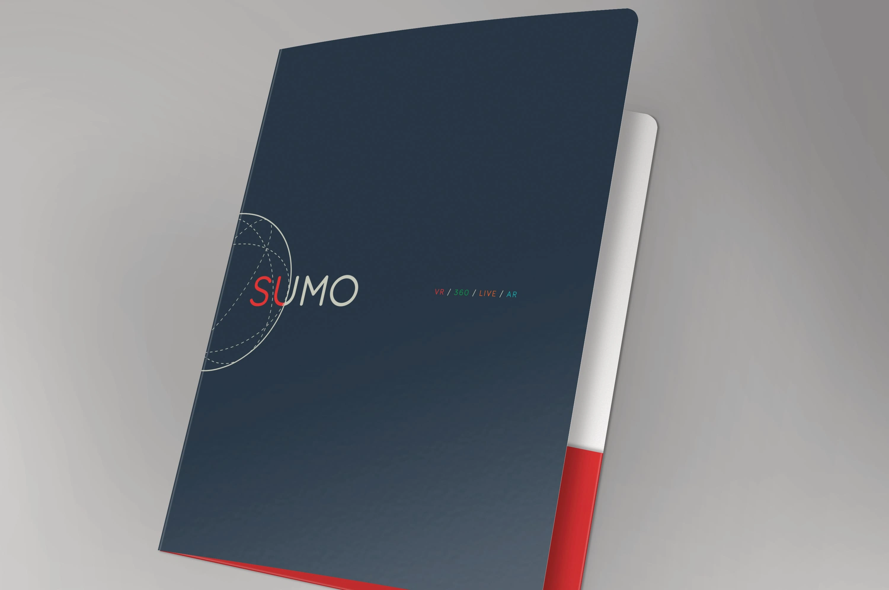
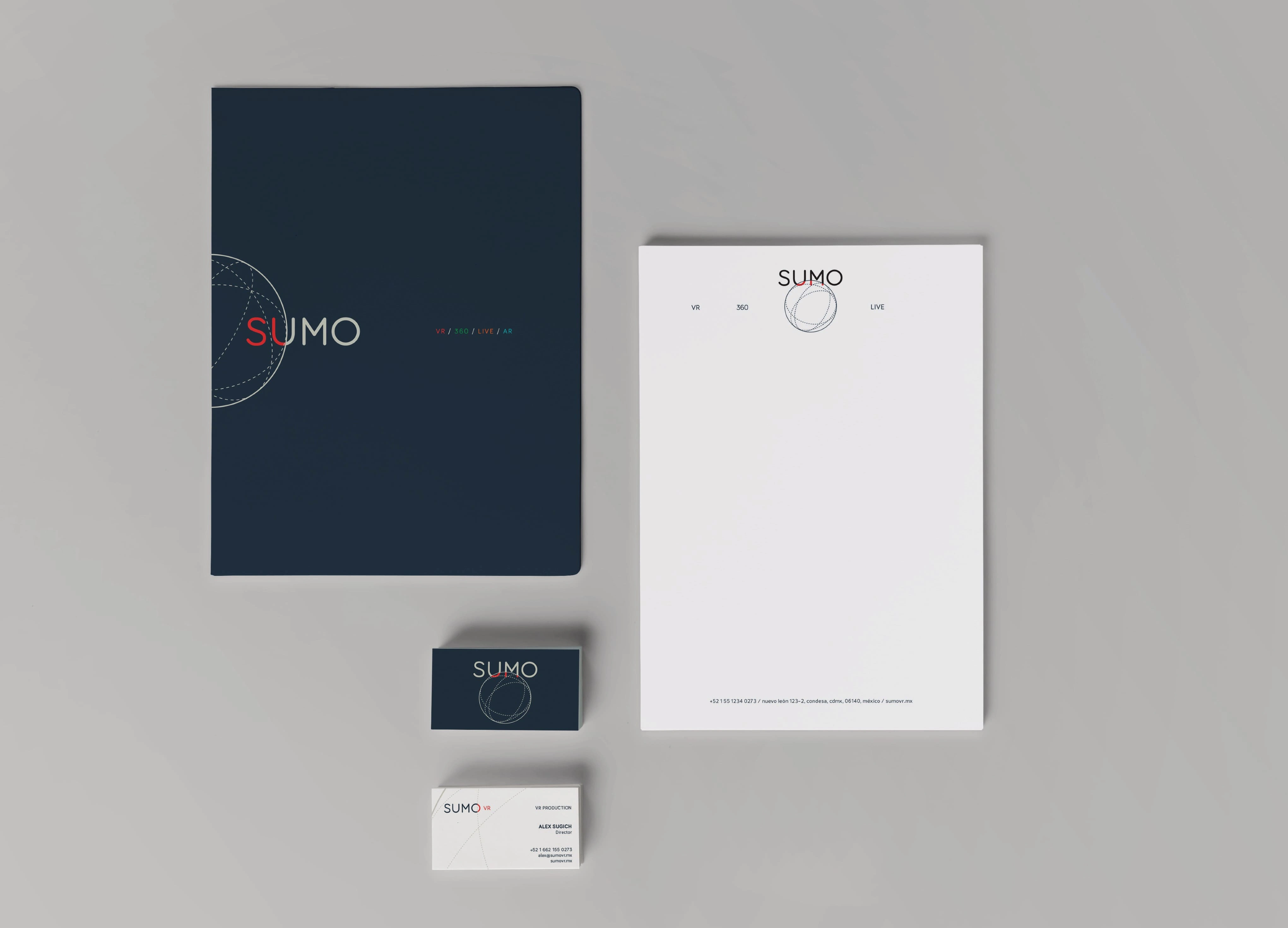
Besides the needed digital applications, a set of stationery was also created, where it's evident that the logo is not a static mark and can be moved, scaled and placed in different positions, maintaining consistency throughout.
Like this project
Posted Nov 21, 2024
Identity design for digital experiences production company.
Likes
0
Views
13

