Korbank - Inteligent Financial Platform
Max Gatica
Korbank
It is an intelligent financial platform based on technology, dedicated to providing modern and accessible financial solutions for individuals and businesses. It aims to stand out as an innovative and user-friendly platform in the digital financial services market.
Category: Branding / UX UI Design.
Client: Korbank, US.
Year: 2025.
Overview
Korbank is a financial platform meticulously designed to set a benchmark in the field of digital financial services, where the main objective is to offer smart and contemporary financial solutions, leveraging the power of artificial intelligence to provide accessibility and convenience to both individuals and businesses, tailoring solutions based on their interests and how their profiles align with credits, loans and much more.
Identity and Differentiation.
User-Centered Design Strategy.
Innovation and Technology.
Accessibility and Scalability.
Challenge
The main challenge in designing Korbank was to create a visual identity and digital experience that communicated trust, accessibility and innovation within the financial sector. The brand had to stand out in a competitive market, ensuring a harmonious integration between its visual identity and user interface.
Every element, from the choice of name to the construction of the logo and the navigation within the platform, had to be precisely designed to ensure consistency and clarity in the user experience.
User Centered Interface.
Representative and Versatile Symbol.
Cohesion between Branding and UX/UI.
Documentation and Presentation of the Process.
Made with Jitter
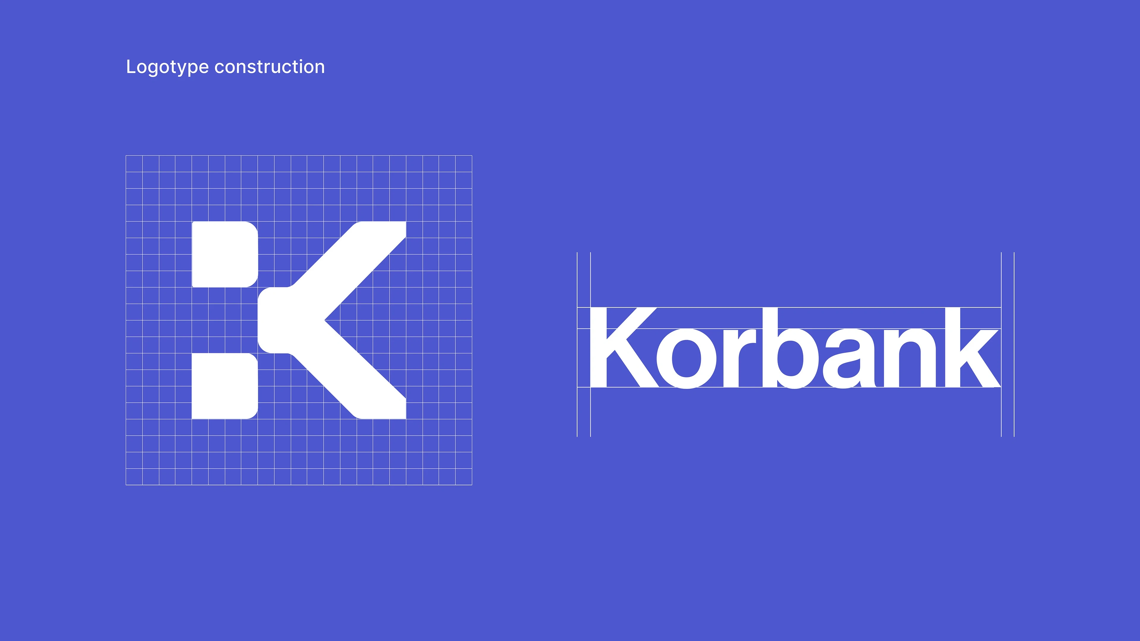
Isotype
Was designed under the concept of a “financial puzzle” and was selected as the central element of the logo due to its ability to effectively communicate the essence of the intelligent finance platform. Each piece of the puzzle represents a key aspect of financial management, and by fitting together perfectly, it symbolizes the harmonious integration of these elements.
I found interesting to take the letter “K” to generate some cuts and rounded edges with the idea of reaching a good synthesis of a puzzle piece that in turn transmits rigidity, modernity and youth. For the logotype, some kerning adjustments were made to improve readability, visual balance and overall brand perception.
Design Decisions
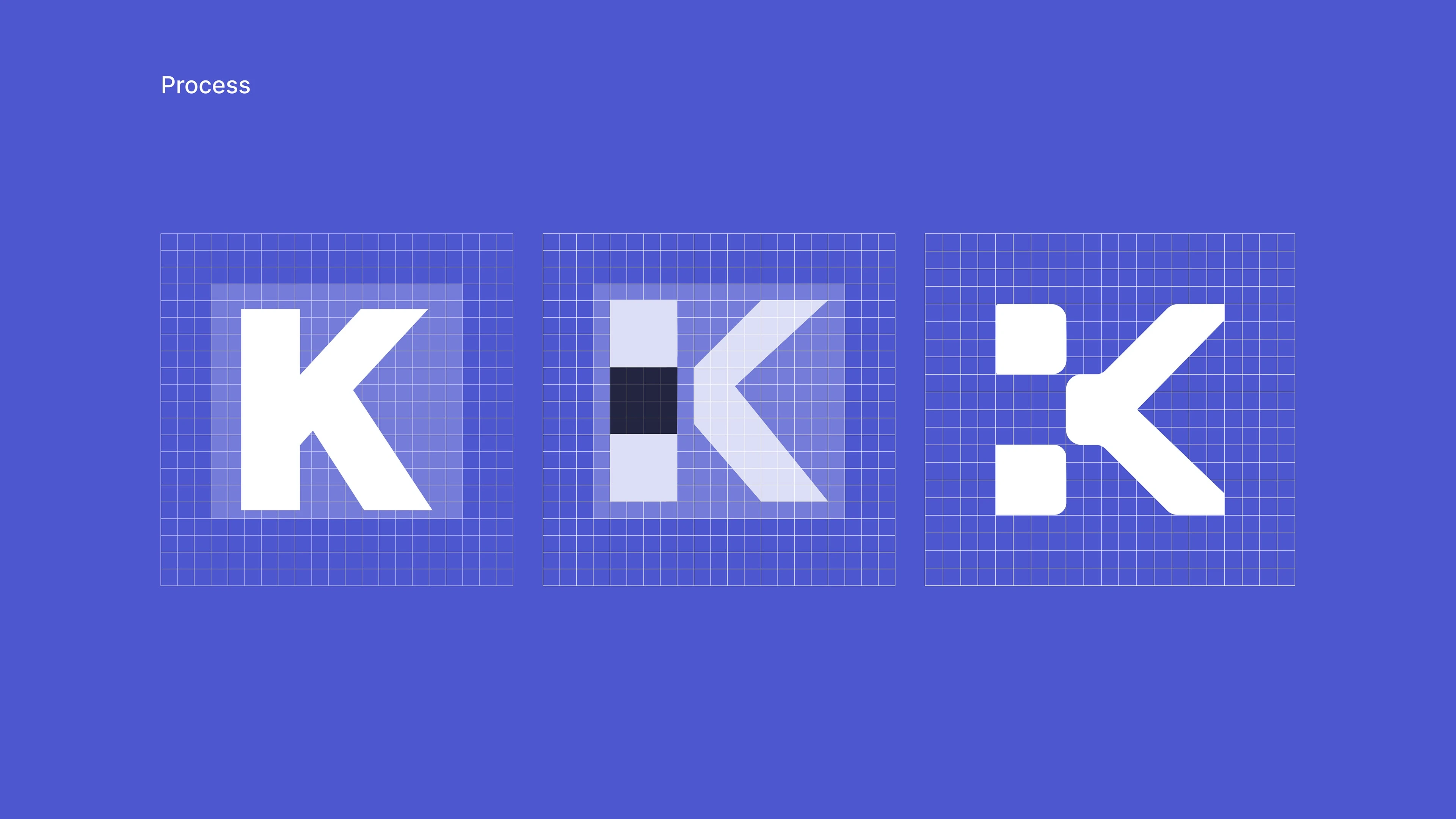
Part of the Isotype design process, where the first step was the creation of a grid or reticle where the letter “K” can be adapted. After being able to adjust it to the grid, I tested where the cuts could be generated without stopping the K from being read. Finally, it was thought about which parts of the shapes could be rounded to generate a unique style, and that could get closer to the desired concept.
Visual Balance
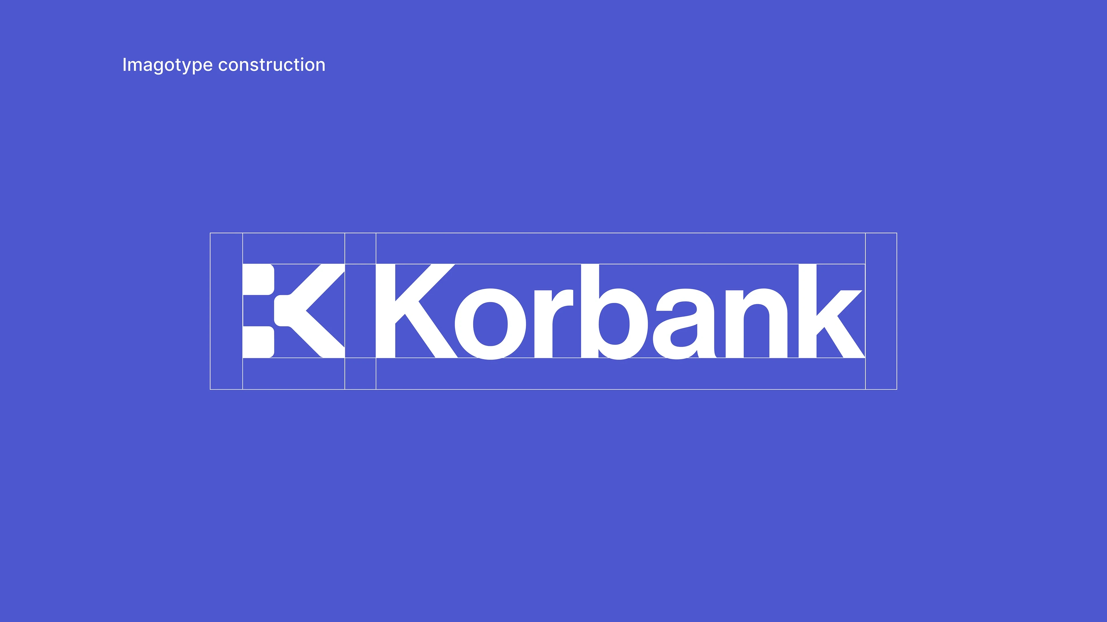
The relationship between the elements is clear. The isotype complement and reinforces the shapes and typography of the logotype. This visual harmony is not only pleasing to the eye, but also contributes significantly to effective communication.
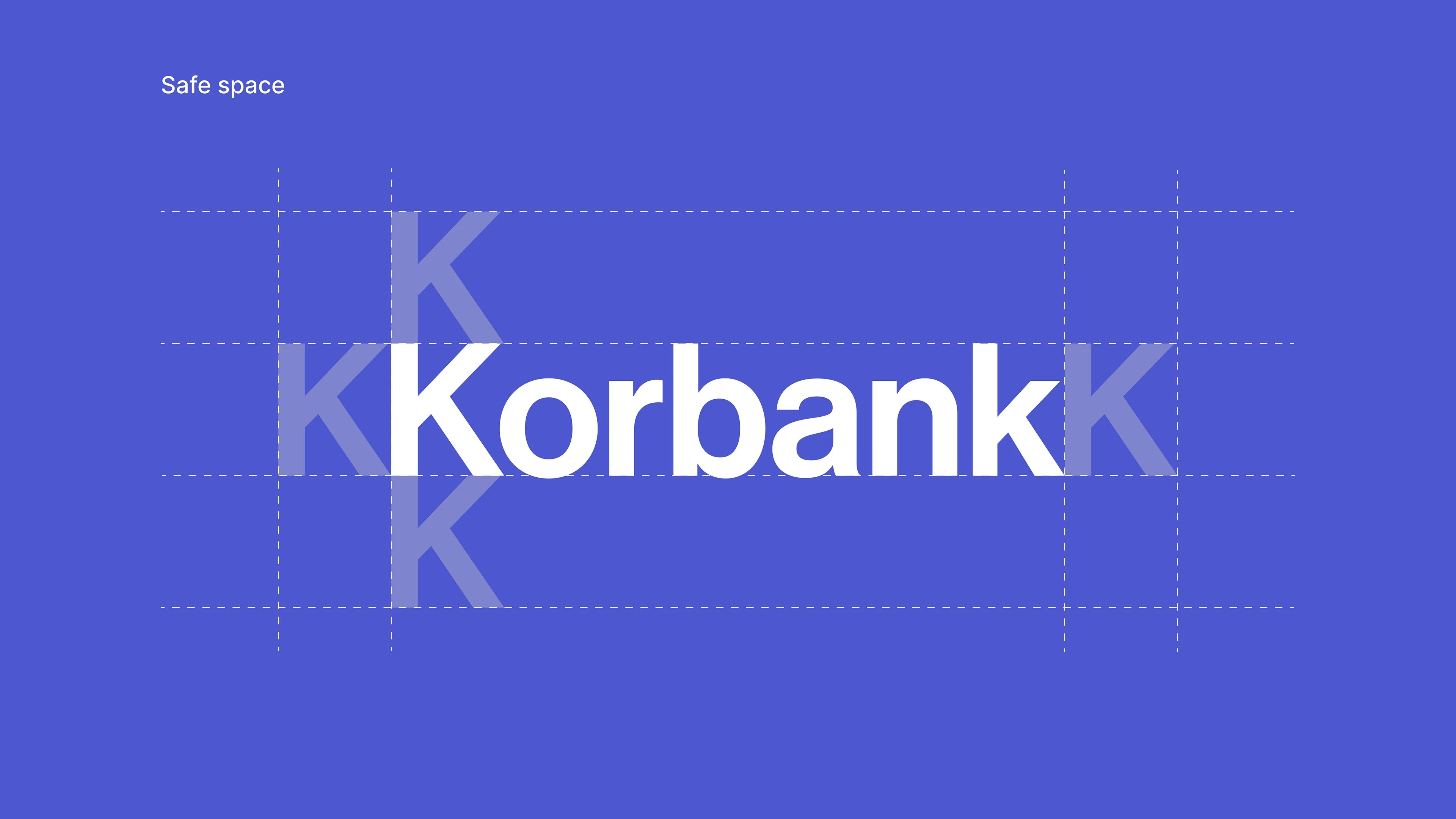
Safety zone
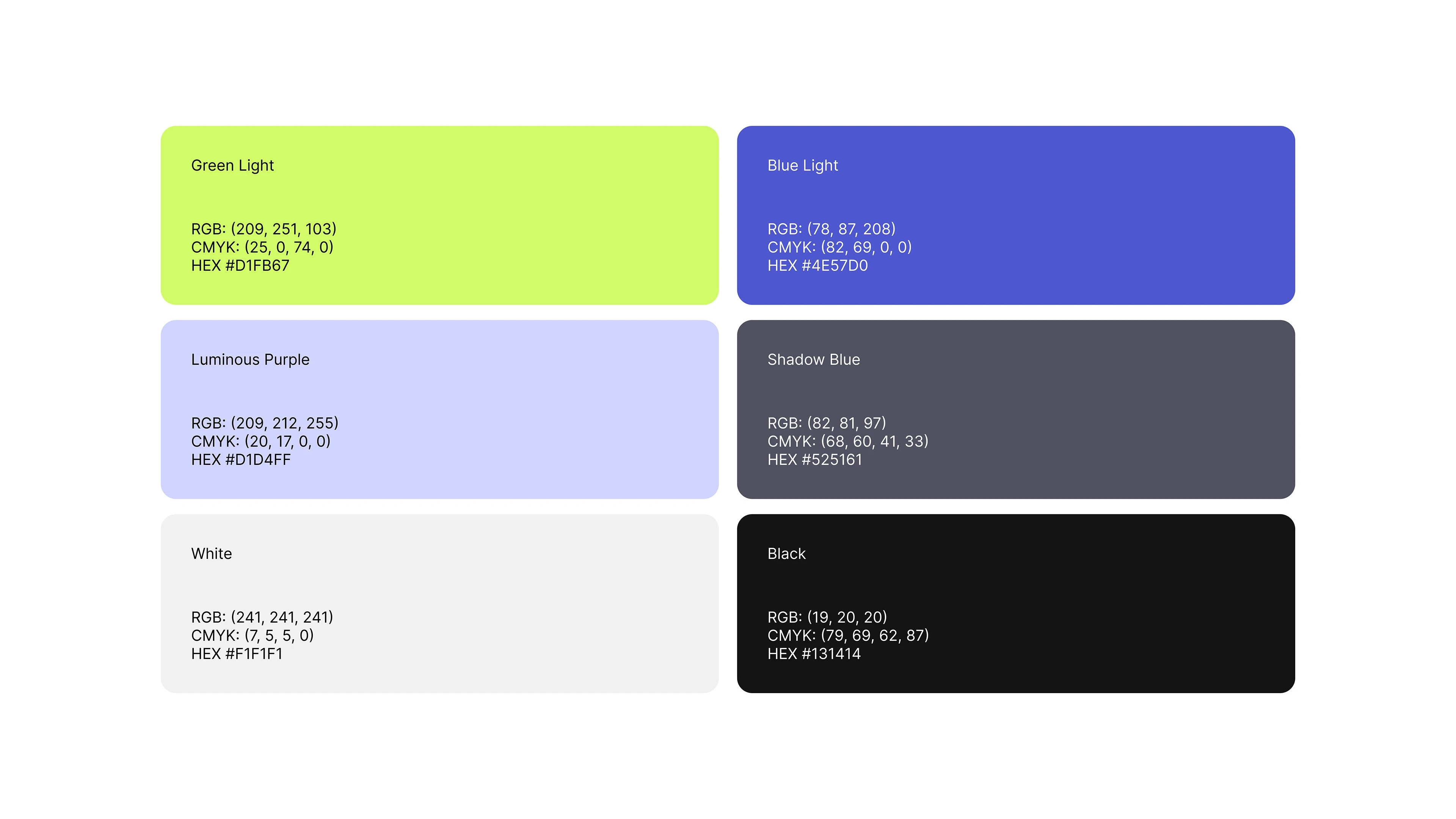
Color Palette
The combination of this palette was strategically selected to reflect the innovation of the platform, while maintaining a friendly and accessible environment.
The bright color palette conveys a feeling of openness and ease of use, while the dark tones add depth and sophistication. Together, the palette seeks to create a balanced and engaging visual experience that engages strongly with the audience.
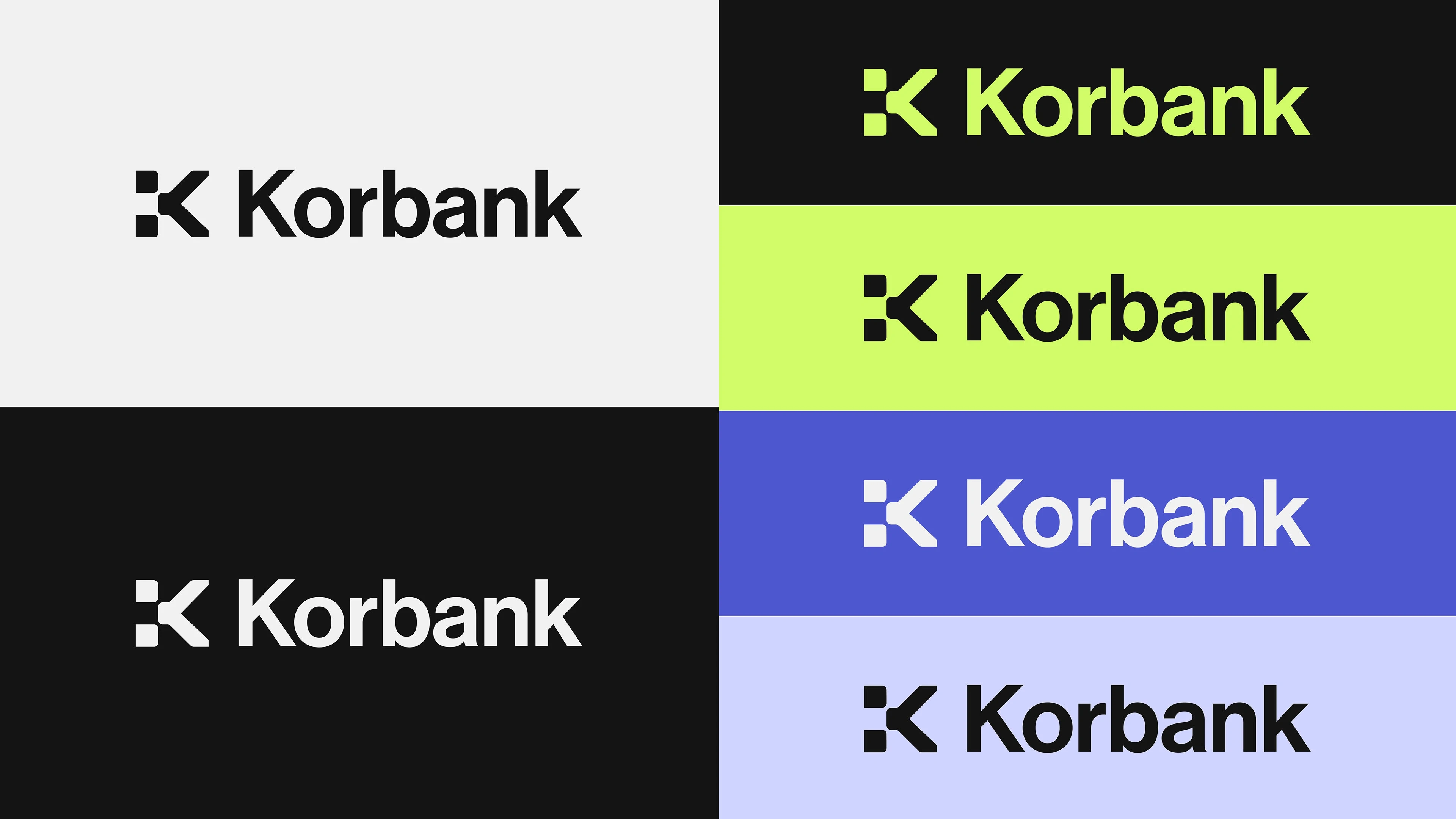
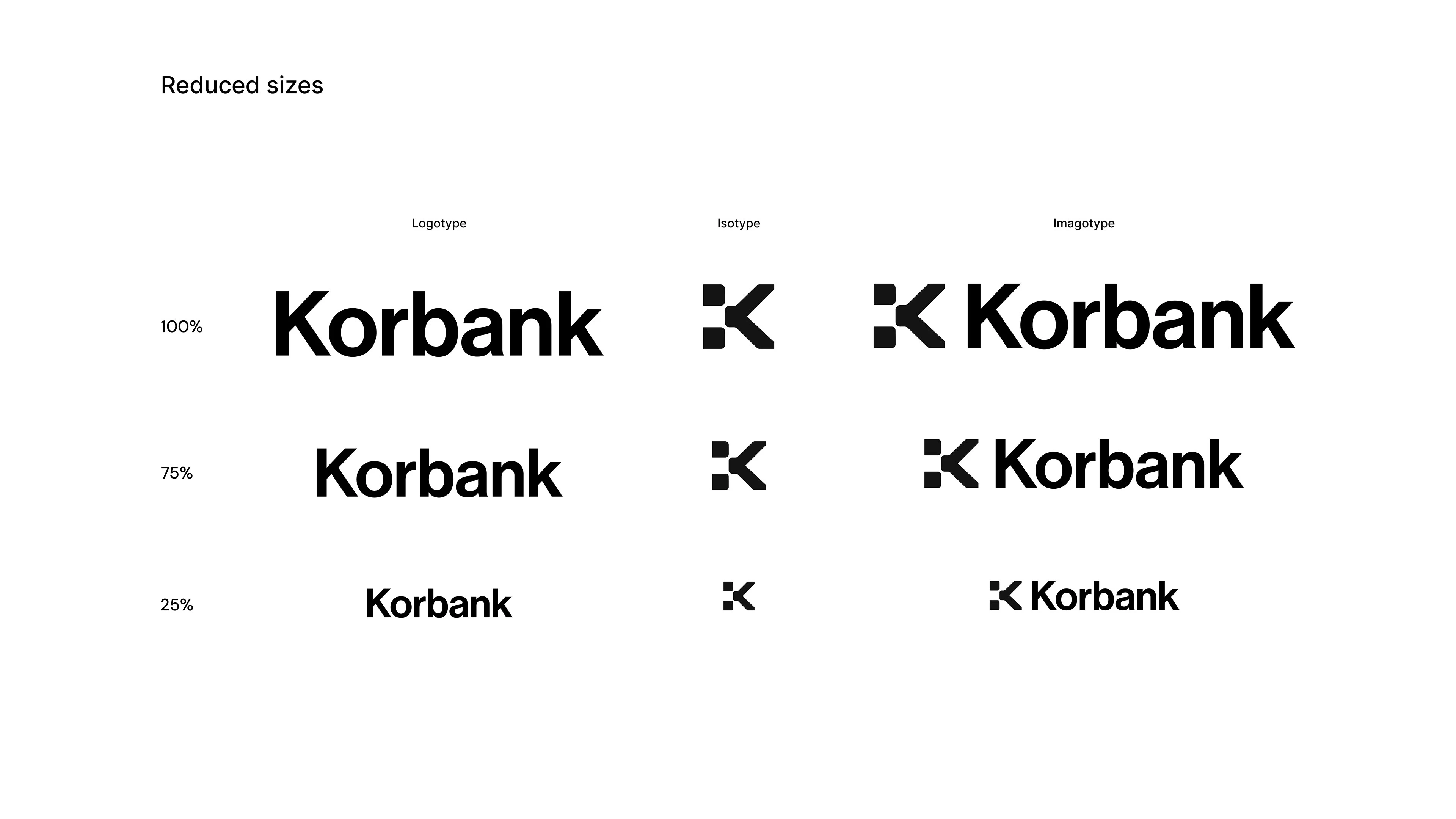
Correct application of the brand
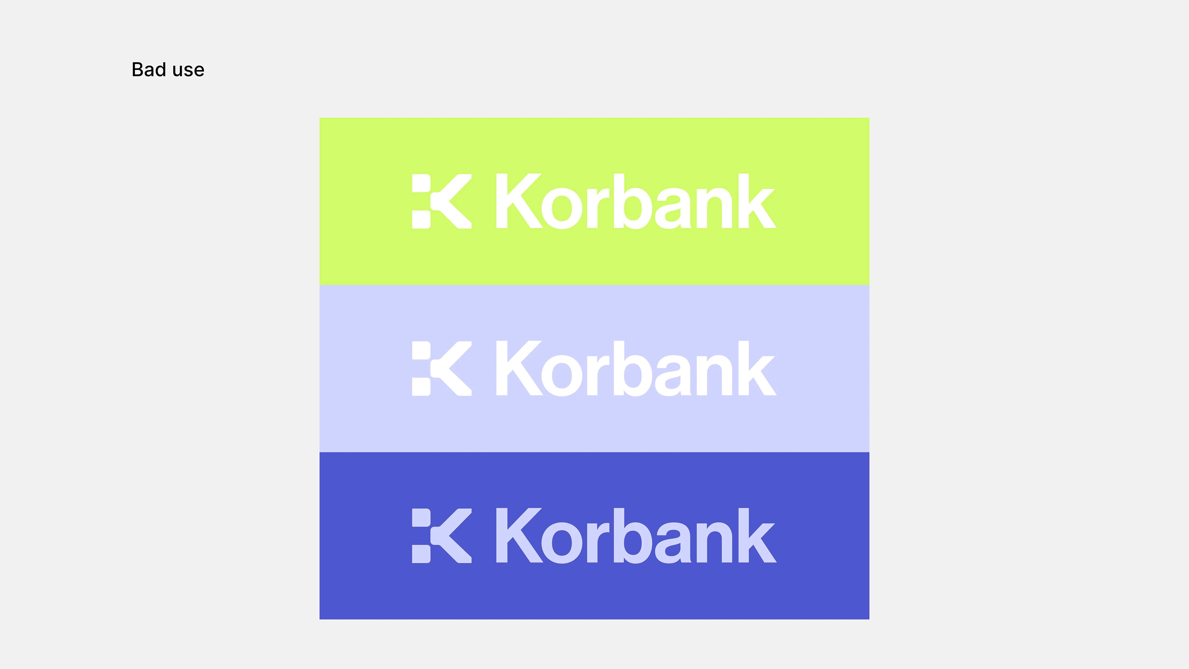
Incorrect application or use of the trademark
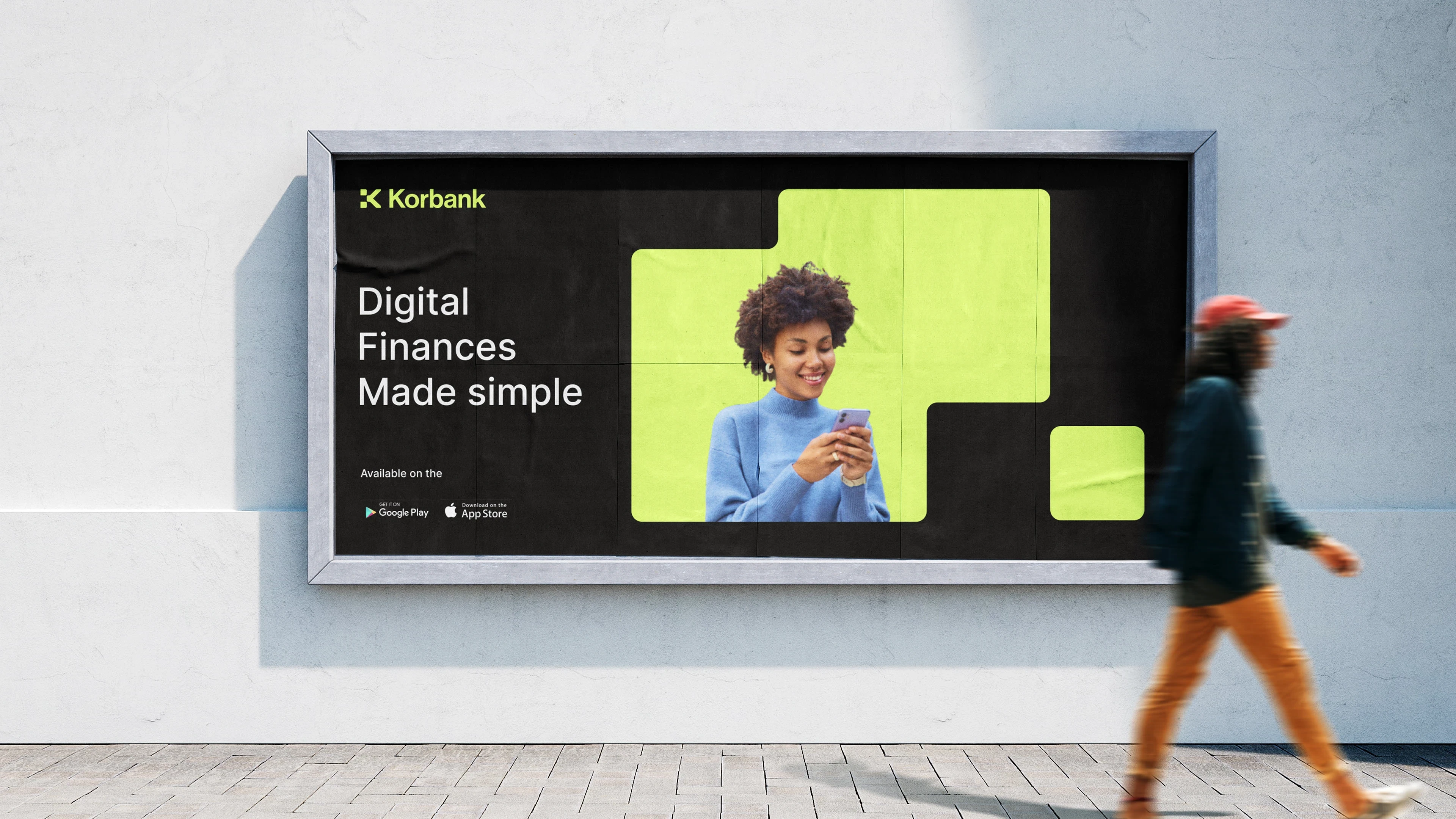
Street Poster
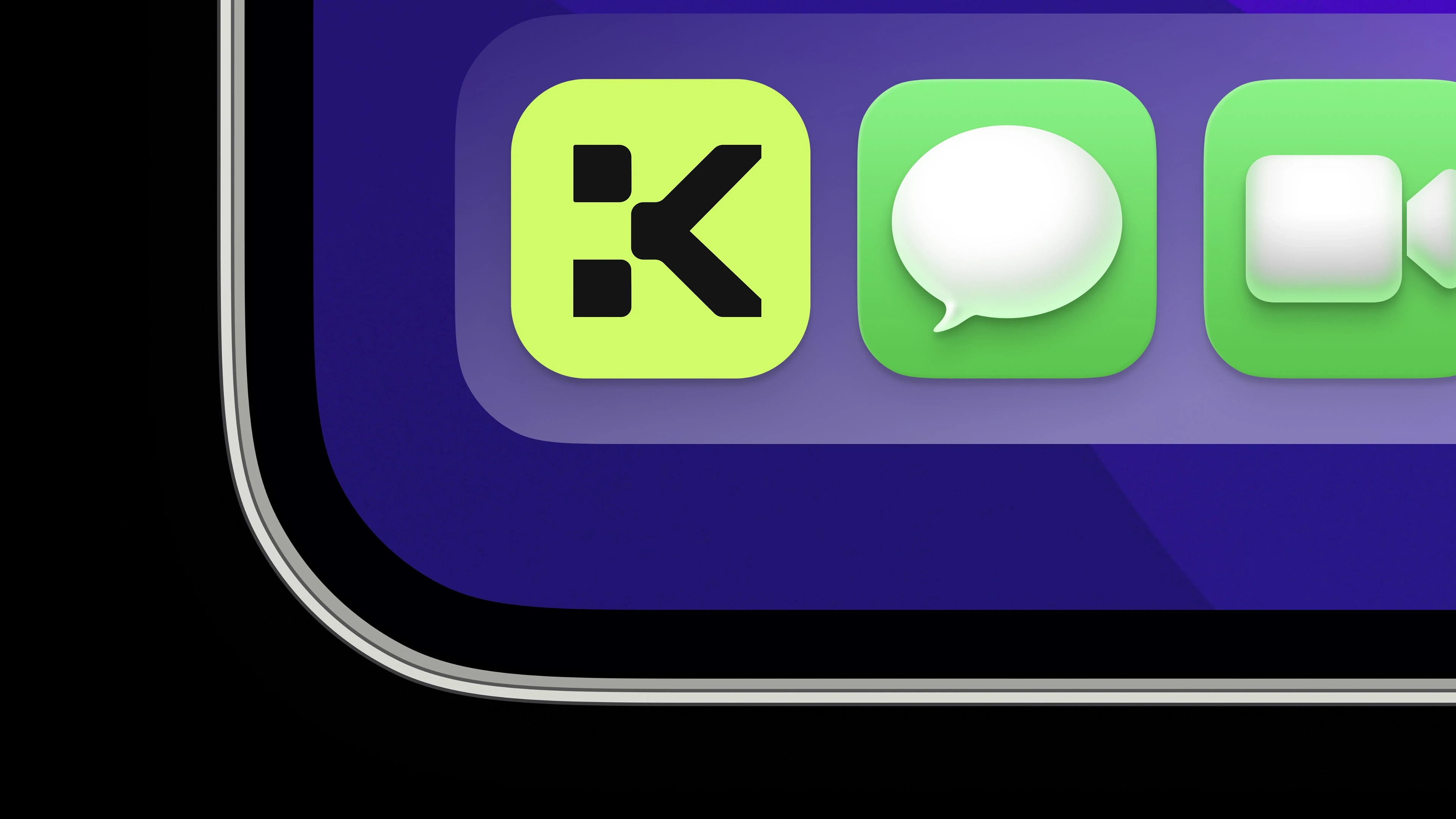
App Icon
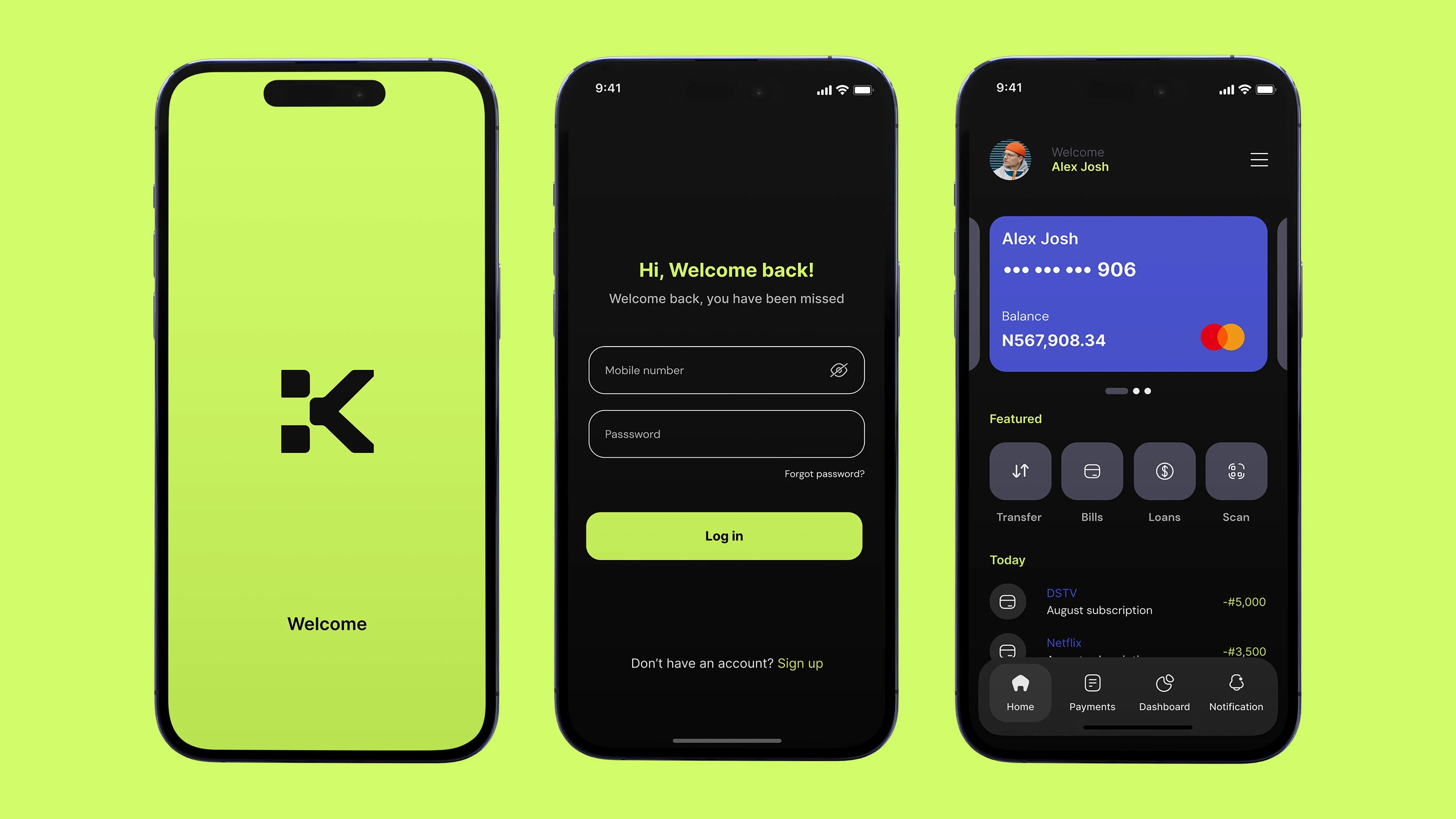
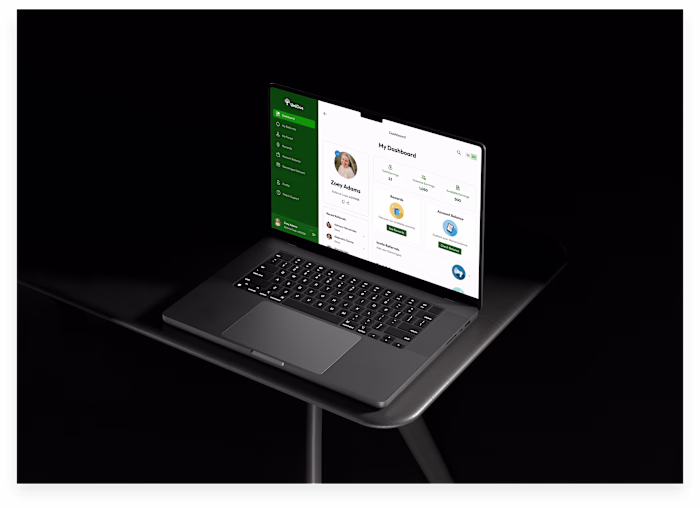
App Interface
Results
Korbank's design achieved a strong visual identity and intuitive user experience that reflects innovation, accessibility and trust in the digital financial sector. The harmonious integration of the branding with the user interface created a coherent and attractive platform, optimizing navigation and facilitating access to financial services in an efficient manner.
The platform was designed with an intuitive and accessible interface, ensuring that both individuals and businesses could navigate and manage their finances without friction.
Every design element, from typography to color palette, was strategically aligned with the digital experience to strengthen user confidence.
Detailed materials were presented that demonstrated the evolution of the design, facilitating strategic decision making and ensuring effective visual and functional execution.
Like this project
Posted Jan 6, 2026
It is an intelligent financial platform based on technology, dedicated to providing modern and accessible financial solutions for individuals and businesses.
Likes
1
Views
7
Timeline
Jan 6, 2025 - Ongoing