Solcyber App Redesign & Experience
Max Gatica
SolCyber App - Security Dashboard UX/UI Redesign
SolCyber App is a cybersecurity operations platform designed to help security teams monitor, triage, and manage security incidents across multiple detection sources. The application handles complex, data-dense workflows where speed, clarity, and accuracy are essential for effective decision-making.
This project focused on improving the user experience and interface of SolCyber’s dashboard by enhancing information hierarchy, component consistency, and layout structure. The goal was to create a more intuitive, scalable, and analyst-friendly experience without compromising technical depth.
Client: SolCyber - Dallas, TX.
Year: 2025.
Overview
The SolCyber platform is used daily by security analysts who must quickly assess alerts, identify critical incidents, and take action under time-sensitive conditions. While the existing application provided all necessary data, the interface did not fully support how users process and prioritize information.
As a UX/UI Designer, my role was to evaluate the existing dashboard experience and redesign key areas of the product to improve usability, clarity, and visual coherence. The work centered on organizing complex data, defining reusable design patterns, and establishing a strong visual hierarchy that could scale with future product growth.
Challenge
Designing for cybersecurity products presents unique challenges due to the volume, complexity, and critical nature of the information displayed. The main challenge was not the lack of data, but how that data was presented and consumed by users.
Key Challenge
High cognitive load caused by dense tables and competing visual elements.
Limited visual hierarchy between critical and secondary information.
Inconsistent component usage across similar screens.
Layouts that were difficult to scale as data and features grew.
Interfaces that communicated data but did not actively support decision-making.
Research & Audit
Before starting the redesign, I conducted a focused UX and UI audit to better understand existing patterns, inconsistencies, and friction points within the dashboard. The goal was to identify opportunities for improvement based on real usage scenarios rather than purely visual changes.
Audit Focus áreas
Information hierarchy and prioritization.
Component consistency and reusability.
Layout structure and spacing behavior.
Navigation clarity across related screens.
Cognitive load in data-heavy views.
Key findings
Similar data was presented differently across screens, creating confusion.
Severity and status indicators lacked consistent visual treatment.
Tables contained too many competing elements with equal visual weight.
The interface did not clearly guide users toward the most critical actions.
These insights informed all subsequent design decisions and helped establish a clear foundation for a scalable and consistent UI system.
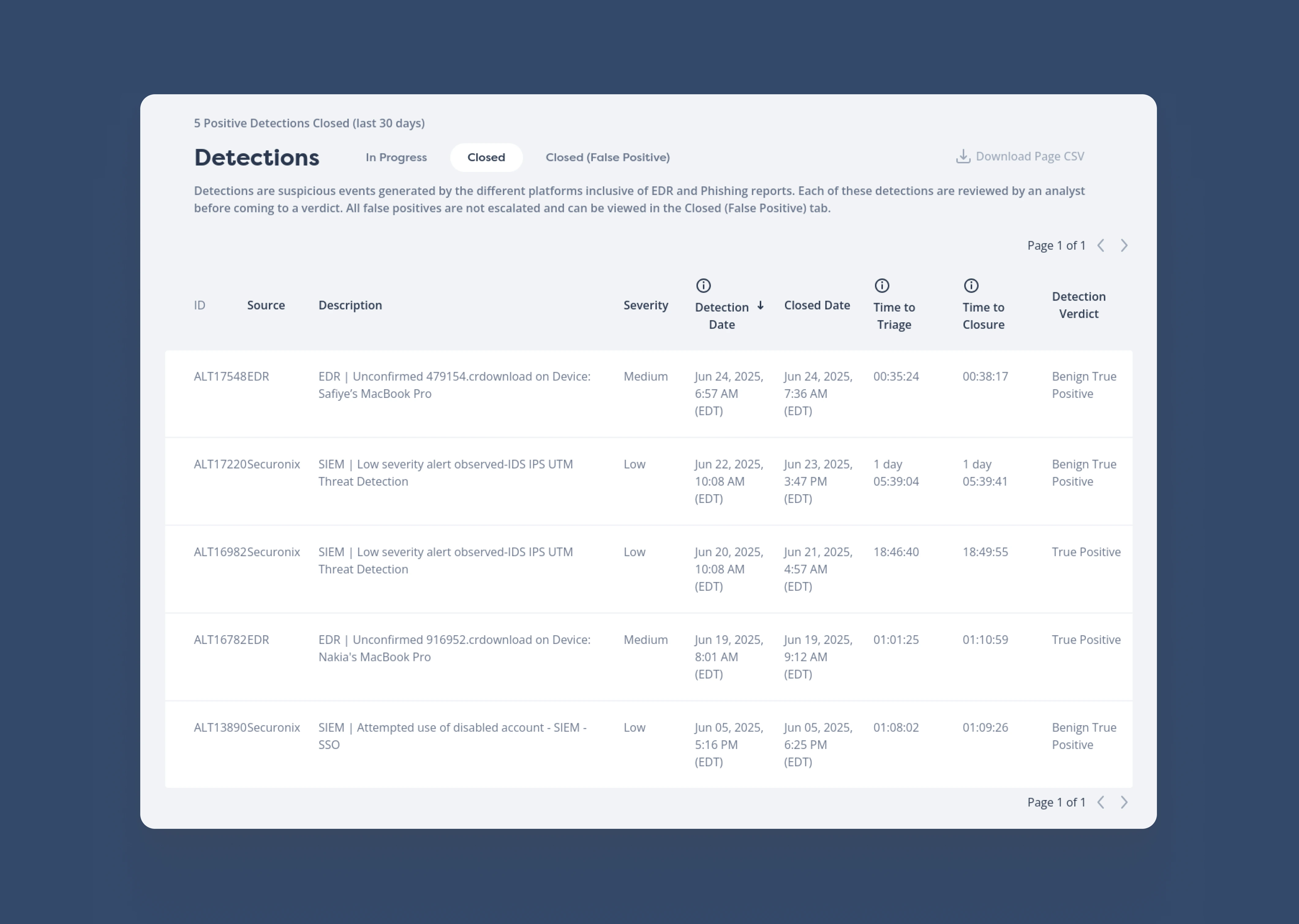
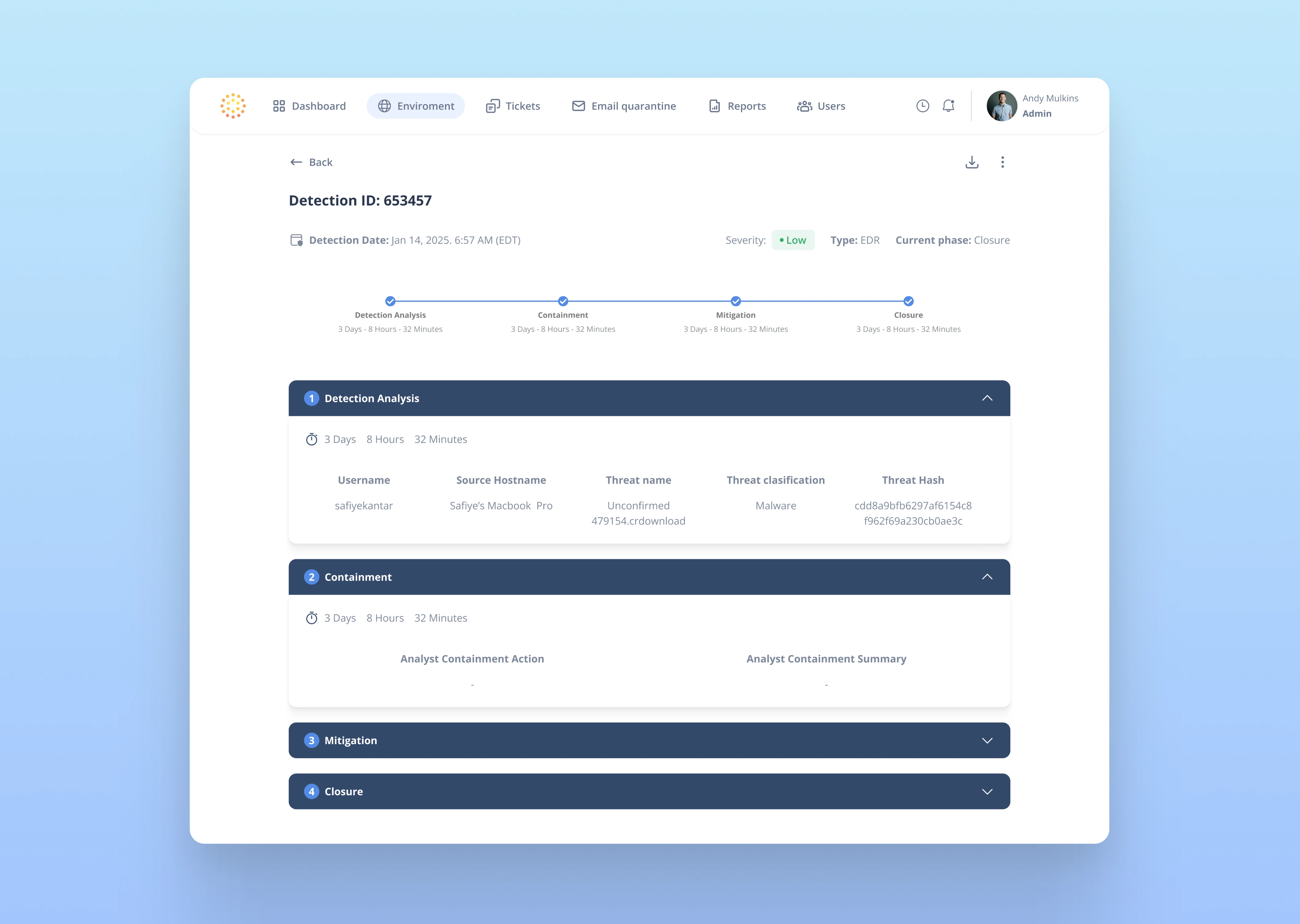
This is what the detection screen interface looked like.
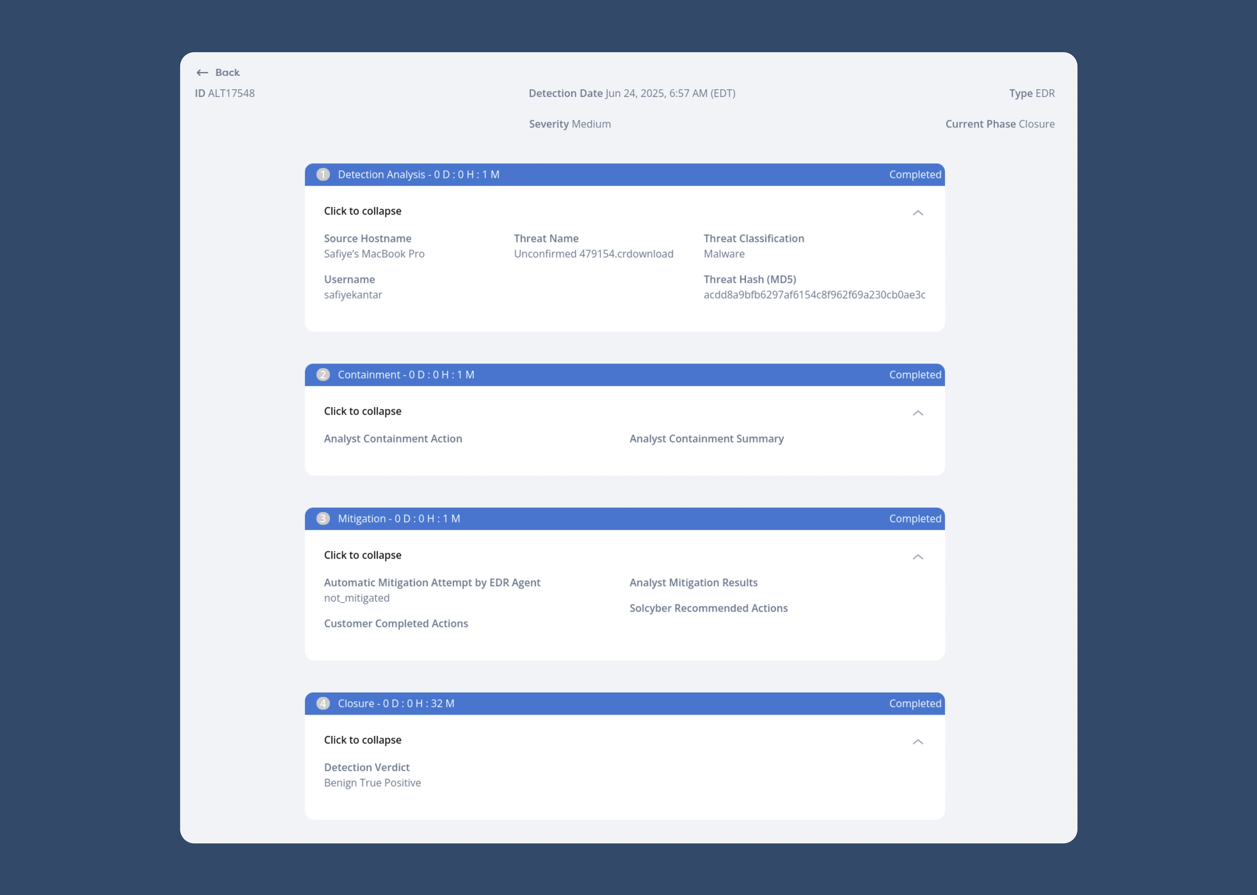
This is what the details or breakdown of a selected accident looked like.
Results
The redesigned dashboard delivers a clearer and more structured experience that supports analysts in understanding, prioritizing, and acting on security incidents more efficiently. The interface now emphasizes clarity, consistency, and usability while maintaining the depth required for cybersecurity operations.
Key results
Improved scannability of complex, data-rich tables
Faster identification of high-priority incidents through clearer hierarchy.
More consistent and predictable component behavior across the platform.
Reduced visual noise, allowing users to focus on critical information.
A scalable UI foundation that supports future features and growth.
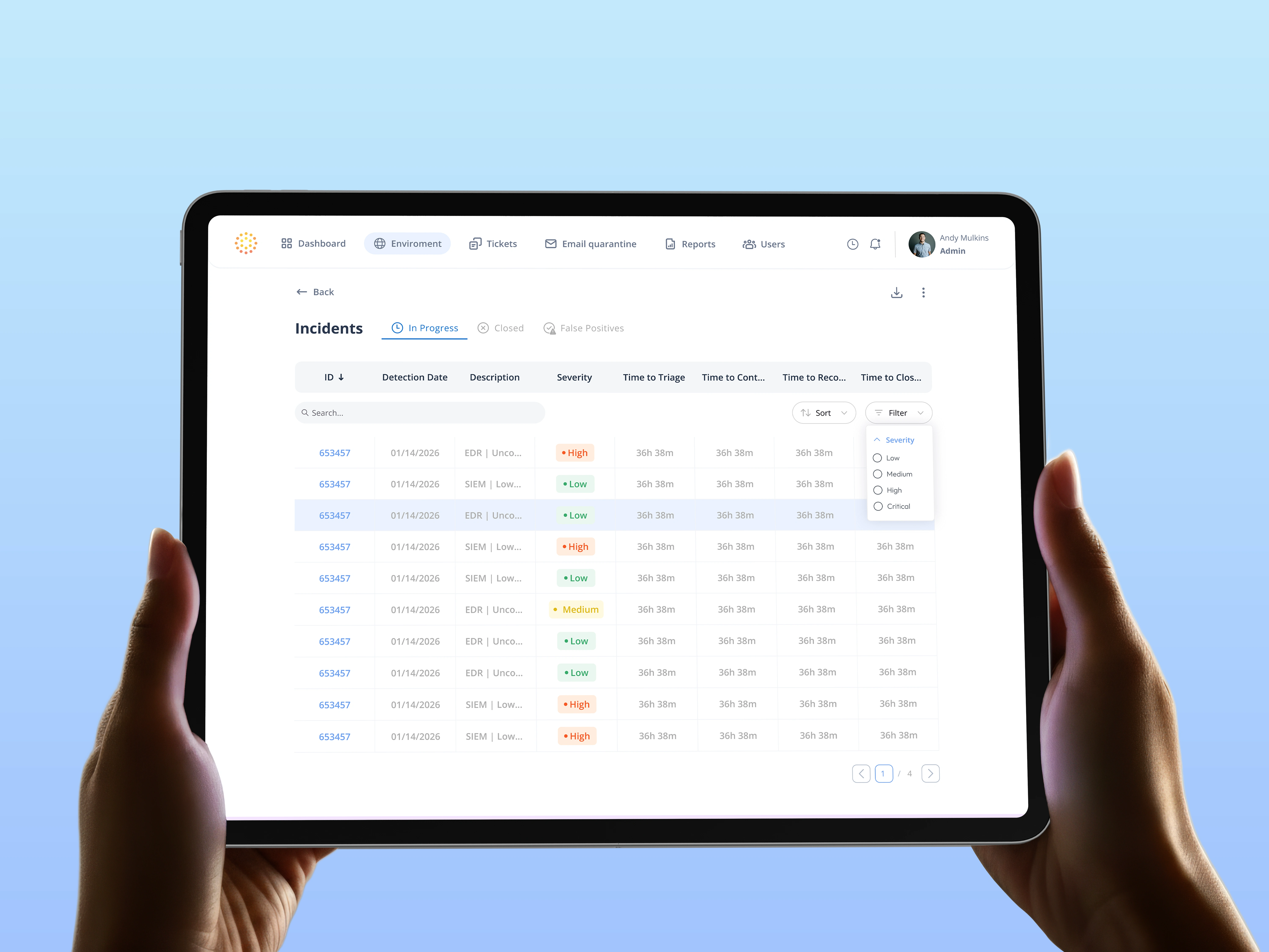
Detections to > Incidents redesign interface.
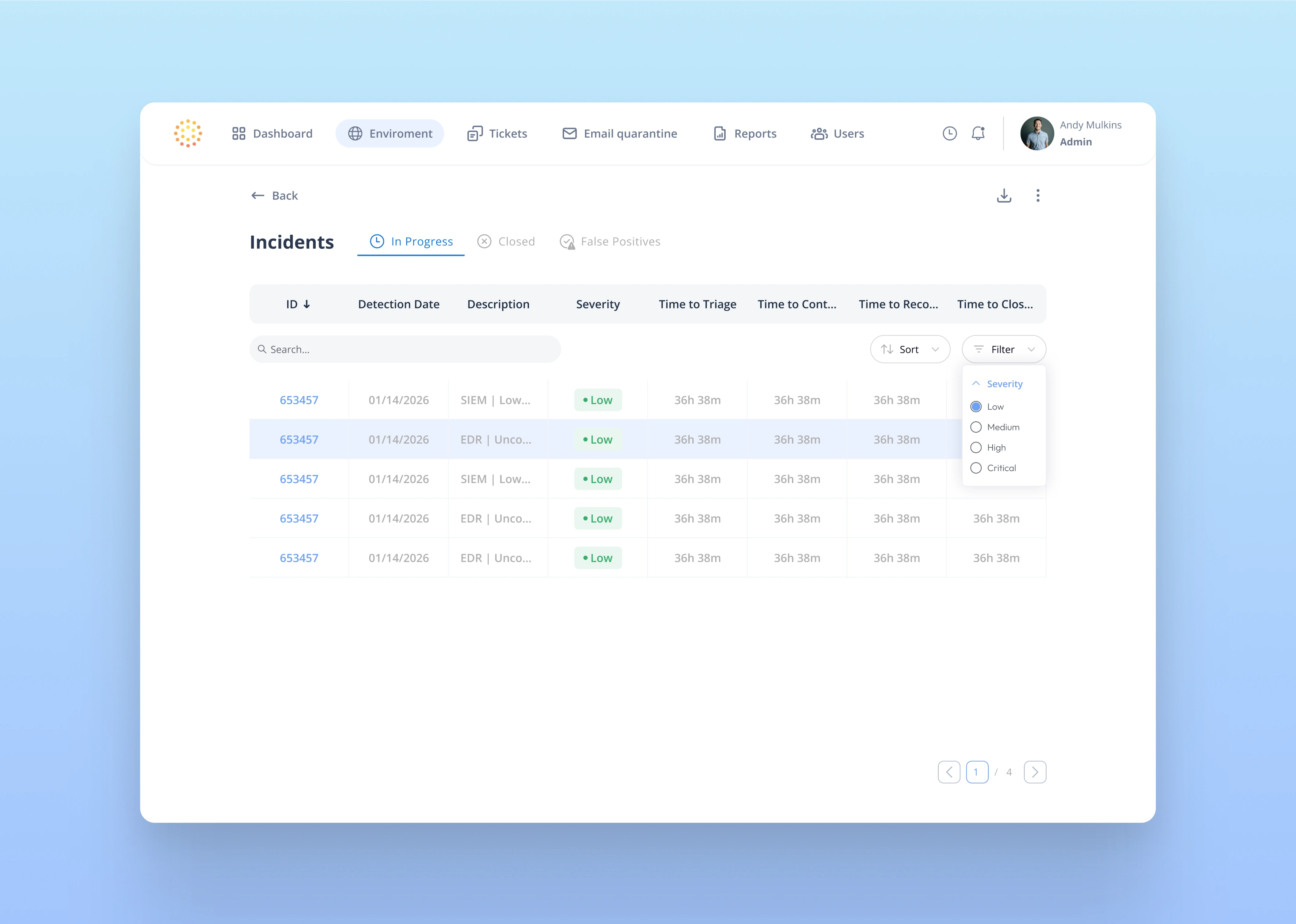
Filter by severity, clean interface.
Incident selected.
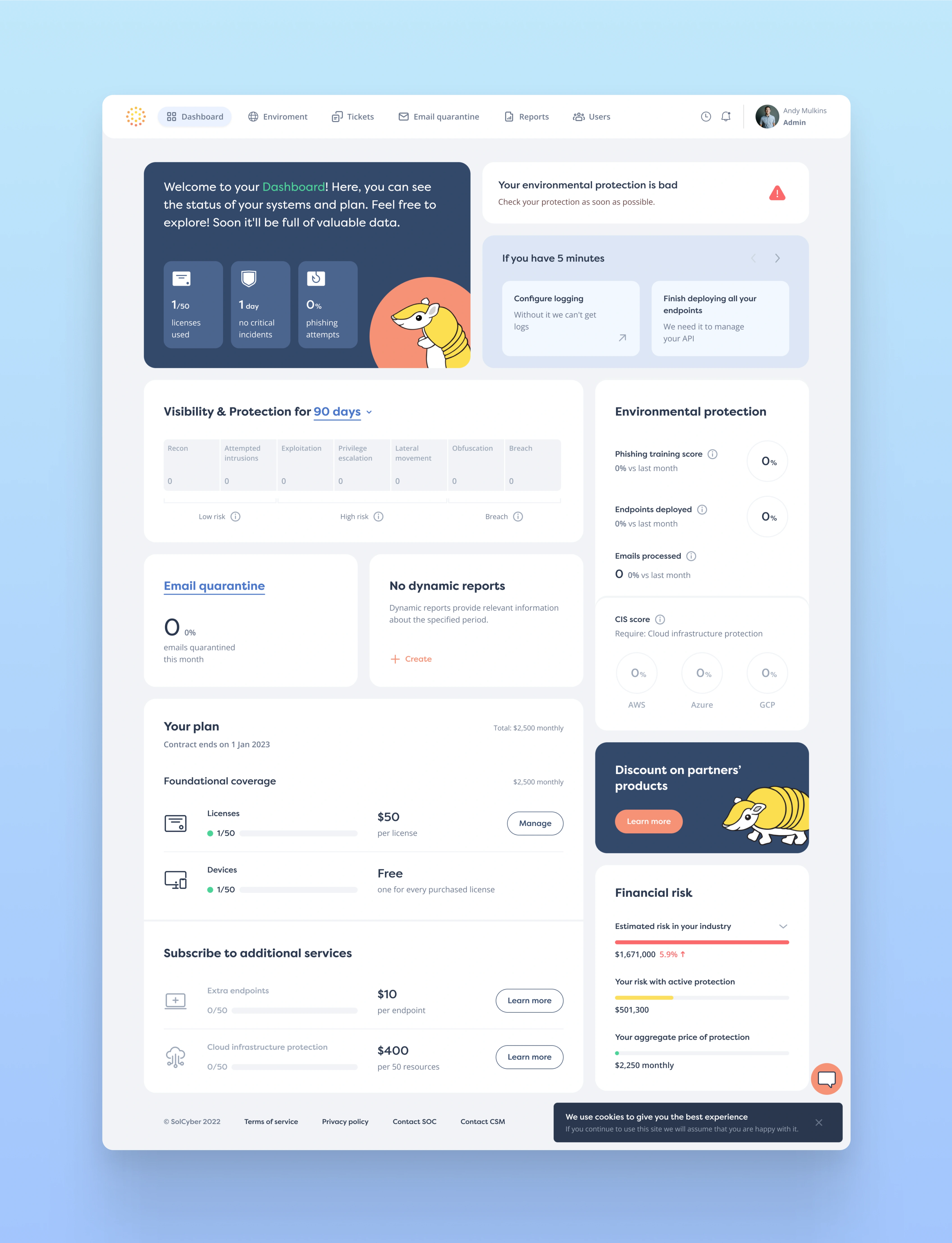
Dashboard visual.
This project highlights my approach to designing complex dashboards: starting with research and audit, prioritizing clarity over decoration, and building systems that scale. The SolCyber redesign demonstrates how thoughtful UX and UI decisions can significantly improve usability in high-pressure, data-intensive environments.
Like this project
Posted Jan 22, 2026
Redesigned SolCyber's Security App
Likes
1
Views
7
Timeline
Aug 1, 2025 - Dec 30, 2025
Clients
SolCyber