ADBONDZ - Creative Tech Agency | Website Template

Mohammad Rafat


ADBONDZ — Creative Tech Agency | Figma Version
Minimalist—High-Converting—Component-Based—Framer-Ready
Dual Mode (Dark/Light) UI Experience
1. Project Overview
This project is the complete design and high-fidelity prototype for ADBONDZ, a premium, scalable website template for creative tech agencies. I built this concept from zero in Figma, ensuring every component, layout, and interaction is "Framer-ready" for rapid development and marketplace launch.
Role: Sole Product Designer (UX/UI, Strategy, Prototyping)
Tools: Figma (Design, Prototyping, Design System)
Duration: 3 days Sprint (Concept, Design, Prototype)
Purpose: To create a top-tier portfolio piece for the Contra #ShareYourWork challenge and to build a market-ready, component-based template for the Framer Marketplace.
This isn't just a static design; it's a fully interactive, theme-aware, and responsive system built for conversion.
2. Challenge & Problem Statement
The Framer template market is growing, but many agency templates are generic. They often fail to build immediate trust or strategically guide users toward conversion.
My challenge was three-fold:
Aesthetics: How to create a design that feels 100% custom, premium, and trustworthy, avoiding the "template" look.
Conversion: How to design a user flow that actively funnels potential clients from casual visitor to "booked call" with zero friction.
Scalability: How to build the entire Figma file as a "developer-ready" system using Auto Layout and Variants, ensuring a 1:1 translation to a live Framer site.
My goal: a showcase template that any agency, solopreneur, or creative studio can use to look established and convert clients from day one.
3. Research & Insights
Market & Competitive Audit
I audited top-performing agency websites (like Locomotive, AKQA) and the most popular templates on the Framer Marketplace.
What Worked: Clean typography, strong calls-to-action (CTAs), dark-mode options, and clear sections for "Services," "Work," and "Process."
What Failed: Cluttered layouts, weak or confusing CTAs, poor mobile experiences, and no clear "Why us?" value proposition.
Target Audience
My ideal user for this template is:
The Solopreneur/Small Agency: Needs to look polished, professional, and trustworthy fast to compete with larger studios.
The Framer Developer: Wants a clean, well-organized Figma file to build their next template on, or to use for a client project.
Key Insight: The audience isn't just buying a "look"; they are buying "trust." The design must communicate authority, expertise, and a clear process.
4. Creative Direction & Visual Language
I anchored on a visual axis of "Premium Minimalism" and "Tech-Forward Clarity."
Color Palette: A simple, high-contrast palette. A deep, near-black for dark mode, a clean white for light mode, and a single, vibrant "Creative Tech Green" as the primary accent for CTAs and highlights.
Typography: A modern, geometric Sans-Serif (similar to Inter or Manrope) used in various weights. Strong, bold headlines establish hierarchy, while clean, legible body copy ensures readability.
Shapes & Layout: A strict, 12-column grid. The layout is modular, built entirely with "cards" and "stacks." This creates a clean, organized, and scannable experience that is also easy to customize.
Interaction Language: All interactions are designed to be subtle, fast, and purposeful: gentle fades, button hovers, and smooth modal pop-ups. No distracting or "gimmicky" animations.
5. UX Strategy & IA
Sitemap & Flow
Sitemap
The Information Architecture is simple and mirrors a client's discovery journey: Home (Hero, Services, Portfolio, Process, CTA) → About (Our Story, Mission, Values) → Services (Detailed Service Cards) → Expertise (Tech Stack, Specializations) → Portfolio (Full Case Study Grid) → Process (In-Depth 5-Step Plan) → Contact (Embedded in CTA)
User Flow
The entire site is a funnel.
Arrive on Home: Immediately see the Value Prop ("Transform Ideas Into Digital Masterpieces"), Social Proof (150+ Projects), and the Primary CTA ("Book a Call").
Scroll to Build Trust: Scannable sections for Services, Portfolio, and Process answer all key questions.
Convert: A persistent "Work With Us" button in the sticky nav and a large CTA section at the footer both lead to the exact same conversion-optimized modal.
My aim: The user is never more than one click away from booking a call.
6. UI Design Breakdown (Section by Section)
Below is the rationale for each key section seen in the video prototype:
i. Global: Sticky Nav & Theme Toggle (0:02-0:04)
The navigation is persistent, holding key links, the main "Work With Us" CTA, and a theme-toggle icon. The toggle instantly switches the entire site between light and dark modes, demonstrating the power of the design system's color variables.
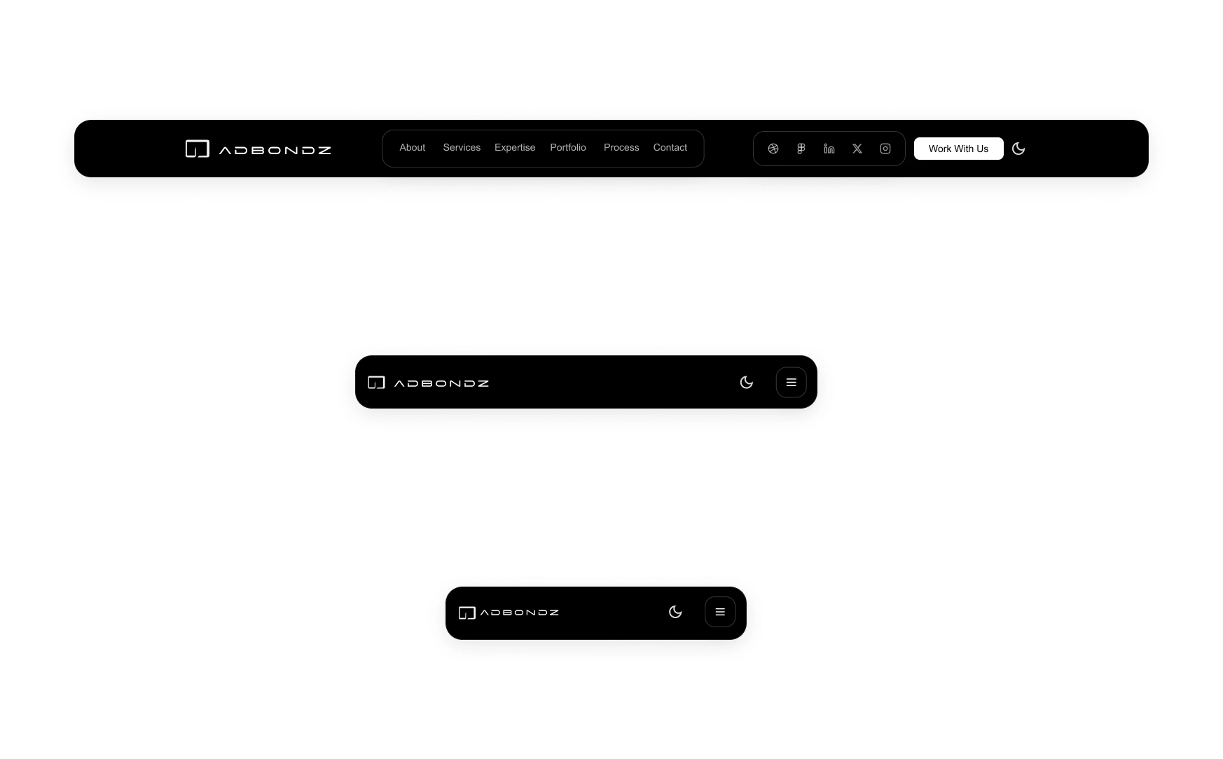
Responsive Navbars - Dark
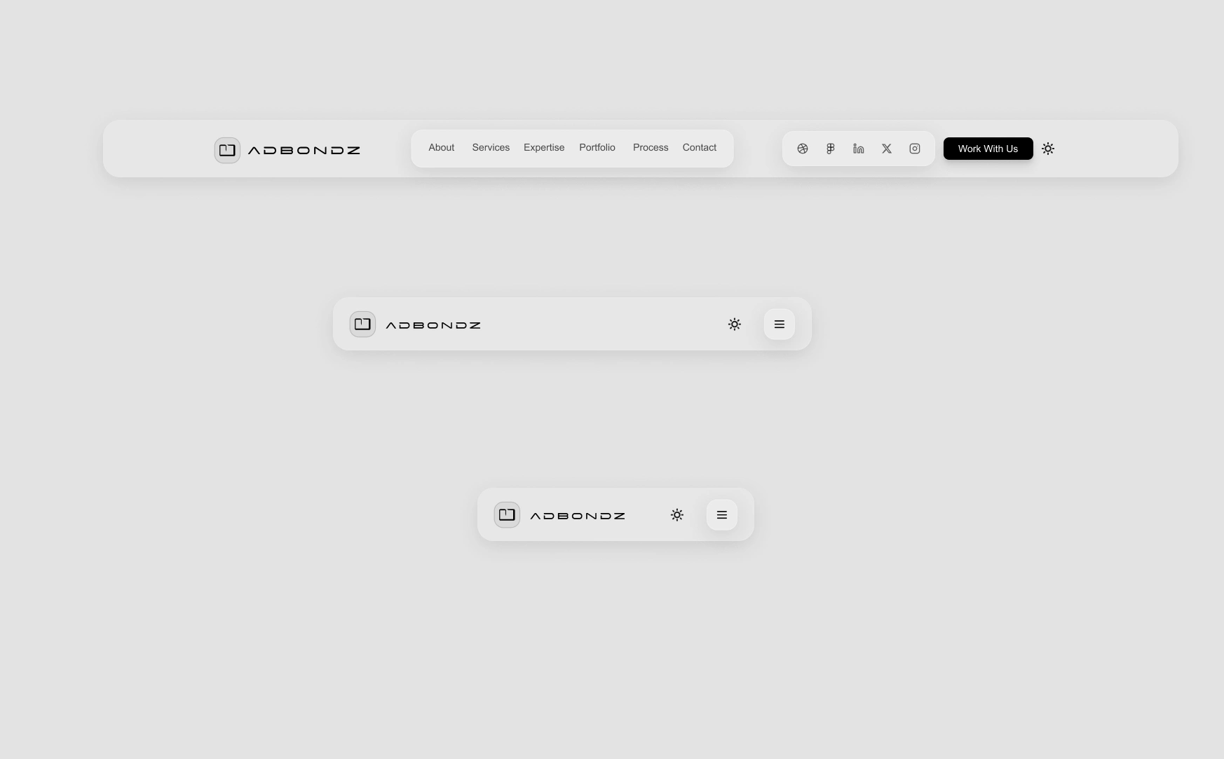
Responsive Navbars - Light
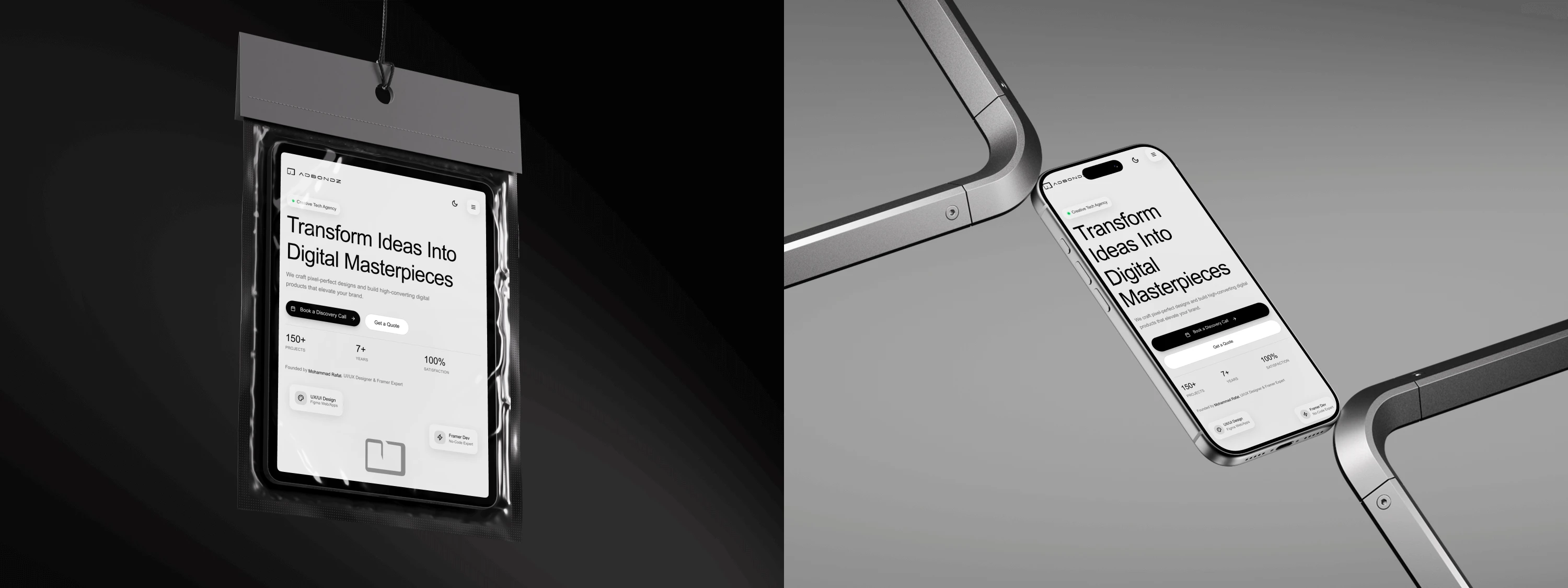
ii. Global: Responsive Tab/Mobile Design (0:06-0:16)
With one click (or screen resize), the layout fluidly adapts to a tab/mobile breakpoint. The mobile navigation (0:14) is a clean, full-screen overlay, providing all links, social icons, and the theme toggle in a thumb-friendly layout.
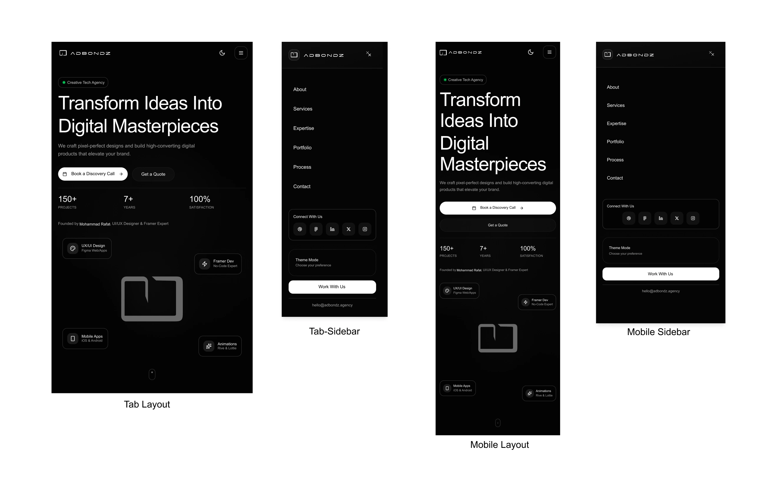
Responsive Tab/Mobile Designs - Dark
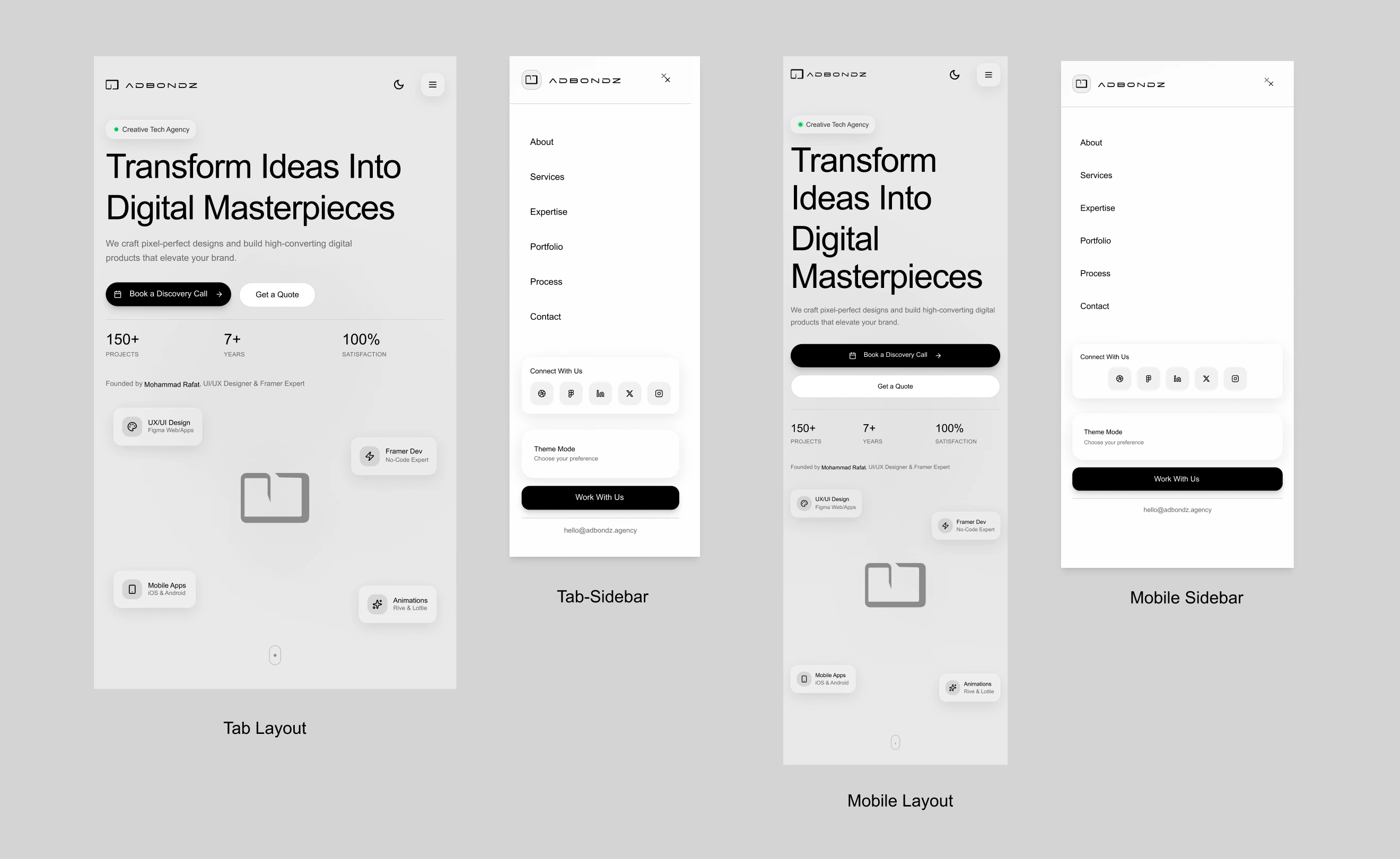
Responsive Tab/Mobile Designs - Light
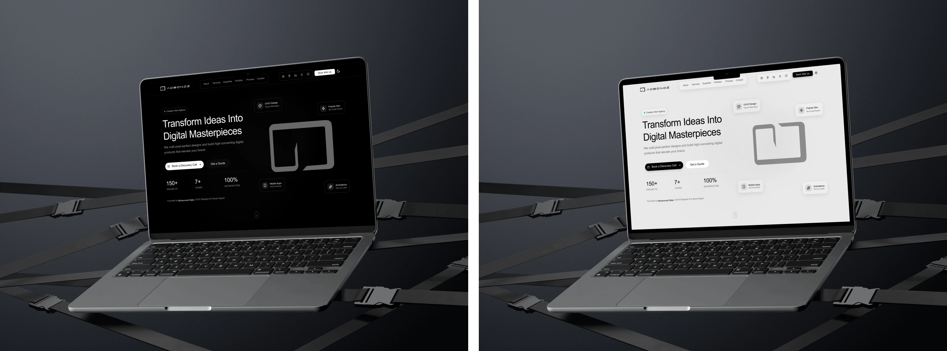
Desk view - Dark/Light Mode
Tab Mobile Dark - Mockup
Tab Mobile Light - Mockup
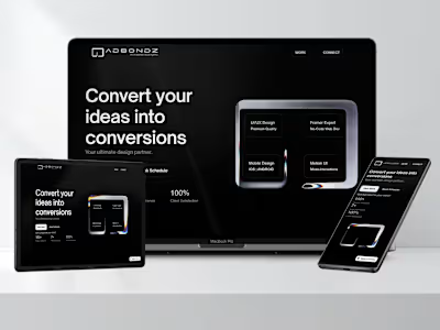
iii. Home: Hero Section (0:01)
The first screen a user sees. It clearly states the Value Prop, provides immediate Social Proof (150+ Projects, 7+ Years, 100% Satisfaction), and presents the two primary Conversion Actions: "Book a Discovery Call" (for high-intent leads) and "Get a Quote" (for project-specific leads).
iv. About: Our Story & Values (0:18-0:20)
Builds trust and empathy. The "Crafting Digital Excellence" section tells the brand's story. This is supported by three modular cards for "Our Vision," "Our Mission," and "Our Values," which are scannable and establish professionalism.
v. Services & Expertise (0:21-0:24)
Answers "What do you do?" and "How well do you do it?"
Services (0:21): A grid of 4 cards (UI/UX, Framer, Mobile, Motion) details the "What's Included" for each, managing client expectations.
Expertise (0:23): A 3-card grid (Figma, Framer, iOS/Android) showcases deep specialization and builds technical authority.
vi. Portfolio: "Portfolio Excellence" (0:26-0:30)
This is the core "proof." The portfolio cards (e.g., "NEXUS Analytics," "BONDZ FINTECH") are not just images. They include project descriptions and, most importantly, Measurable Impact stats (e.g., "+340% increase in data comprehension"). This speaks directly to B2B clients who want ROI, not just pretty designs.
vii. Process: "Our Process" (0:31-0:32)
Demystifies the engagement and builds trust. This 5-step visual timeline (Research, Design, Prototype, Build, Launch) shows clients exactly what to expect, making the "Book a Call" CTA feel like a safe, logical next step.
viii. Conversion: The Booking Modal (0:33-0:38)
This is the strategic heart of the site.
The "Ready to Transform" section funnels the user to click "Book a Discovery Call."
A modal pops up, not a new page, keeping the user in context.
It offers two clear tabs:
"Schedule Instantly" (0:34): For high-intent leads who are ready to book now. This is designed for a direct Calendly embed.
"Request Call" (0:36): A simple, clean form for leads who have project details to share. This captures all other lead types.

7. Prototype & Interactions
The prototype you see in the video is a high-fidelity, fully functional simulation of the final website.
Figma Native: Built entirely in Figma, using its native prototyping tools.
Interactive Components: The theme toggle, navigation, and buttons are all built as components with interactive variants.
Overlay Modals: The booking modal and mobile menu are prototyped as overlays for a realistic, app-like feel.
Responsive Validation: I built out the mobile, tablet, and desktop breakpoints to test and validate that the Auto Layout settings were correct and the UX was seamless on all devices.
EXPLORE FIGMA DESIGN CANVAS
8. Development Preparation (for Framer)
This file is not just a "design"—it's a "blueprint."
Component-Based: Every element is a component.
Auto Layout: The entire site is built with Auto Layout (Stacks in Framer). This means it's already 100% responsive. A developer can just copy-paste the structure.
Figma Variables: All colors (for light/dark mode), spacing, and corner radii are set up as Figma Variables. This maps 1:1 to Framer's Style variables, allowing for instant global theme changes.
Clean Naming: All layers are logically named (e.g., nav-container, cta-button, hero-section) for a clean, professional handoff.
9. Results & Learnings
Outcomes
A premium, market-ready Framer template concept.
A high-impact, interactive portfolio piece for the Contra #ShareYourWork challenge.
A validated design system that can be reused for future projects.
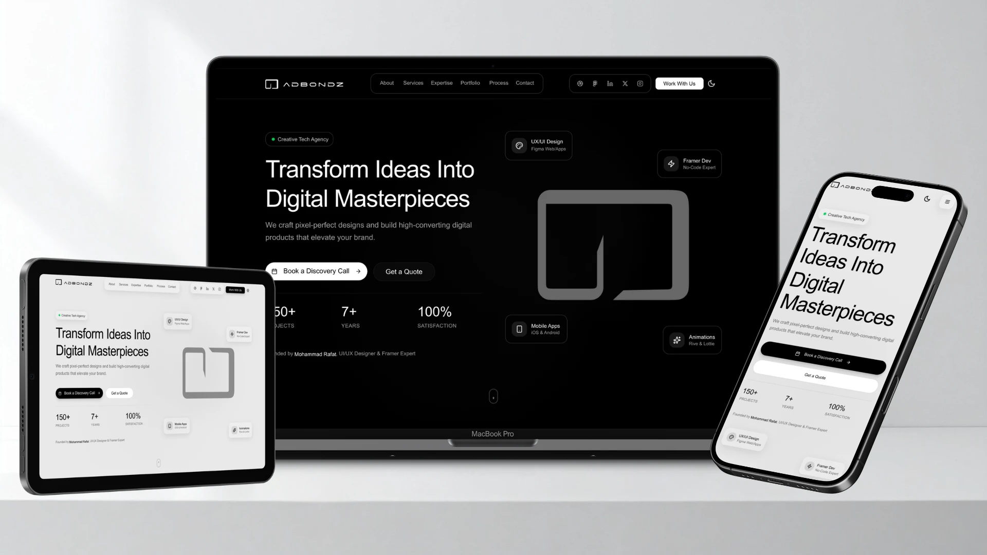
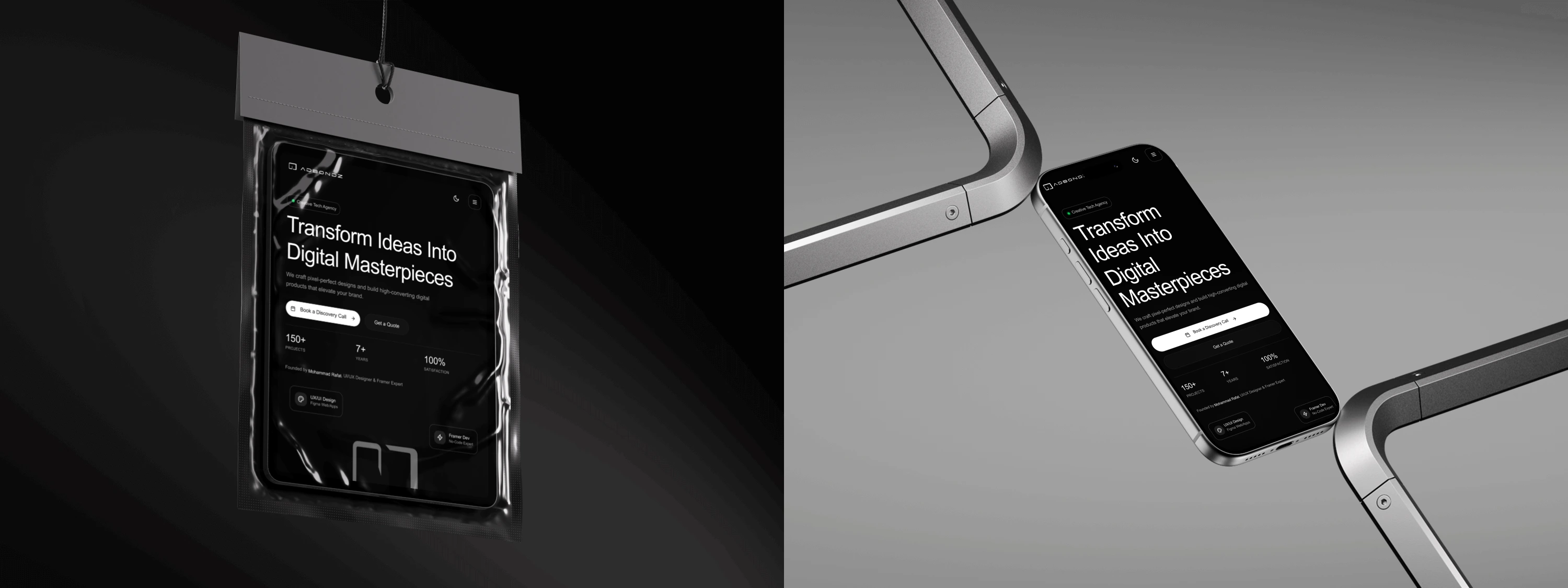
Laptop-Tab-Mobile View Mockup
What I Learned
System-First = Speed: Building with Auto Layout and Variants from Day 1 is 10x faster. It feels slow for the first hour, then saves you days of work.
Prototype the Money: Prototyping the booking modal (the conversion flow) revealed the most friction. Adding the two-tab ("Schedule" vs. "Request") solution was a direct result of testing this flow.
Text Matters: Writing the actual copy (like the "Measurable Impact" stats) instead of using "Lorem Ipsum" completely changes the design process and makes the final product feel real.
Future Plans
Build this 1:1 in Framer and release it on the Framer Marketplace.
Expand the system with more page templates (e.g., Blog, Pricing, full Case Study page).
Pre-made Framer version Home: Hero Section
Framer Version : Home | Hero Section - Dark Mode
Designed & built entirely in Figma and Ready to Build With Framer— no code, full interaction
Project by Mohammad Rafat
Hello There!
Impression unforgettable — clean, confident, and conversion-driven.
💡 GOT A PROJECT IN MIND?
or want to collab?
LET'S DO IT TOGETHER!!

www.mdrafat.com
Like this project
Posted Oct 18, 2025
Designed a premium, scalable Figma template for tech agencies, built to convert as Framer agency template for Marketplace. Fully customizable & easy to update.