Lasagna — One Page Business Landing Website
Mohammad Rafat
Lasagna — One Page Business Landing Website
Full UX Case Study:
Lasagna — One Page Business Landing Website
1. Project Overview
Project Name & Type: Lasagna — Cinematic Editorial Website
Design Tools: Figma (UI/UX, Prototyping, Design System)
Architecture: Primed for Framer Development
Core Goals: To translate a high-concept, A24-inspired brief into a tangible digital identity within the Figma ecosystem, while ensuring the entire design was architected for a rapid, pixel-perfect build in Framer.
Live Prototype (Figma Build): https://people-italic-73186779.figma.site
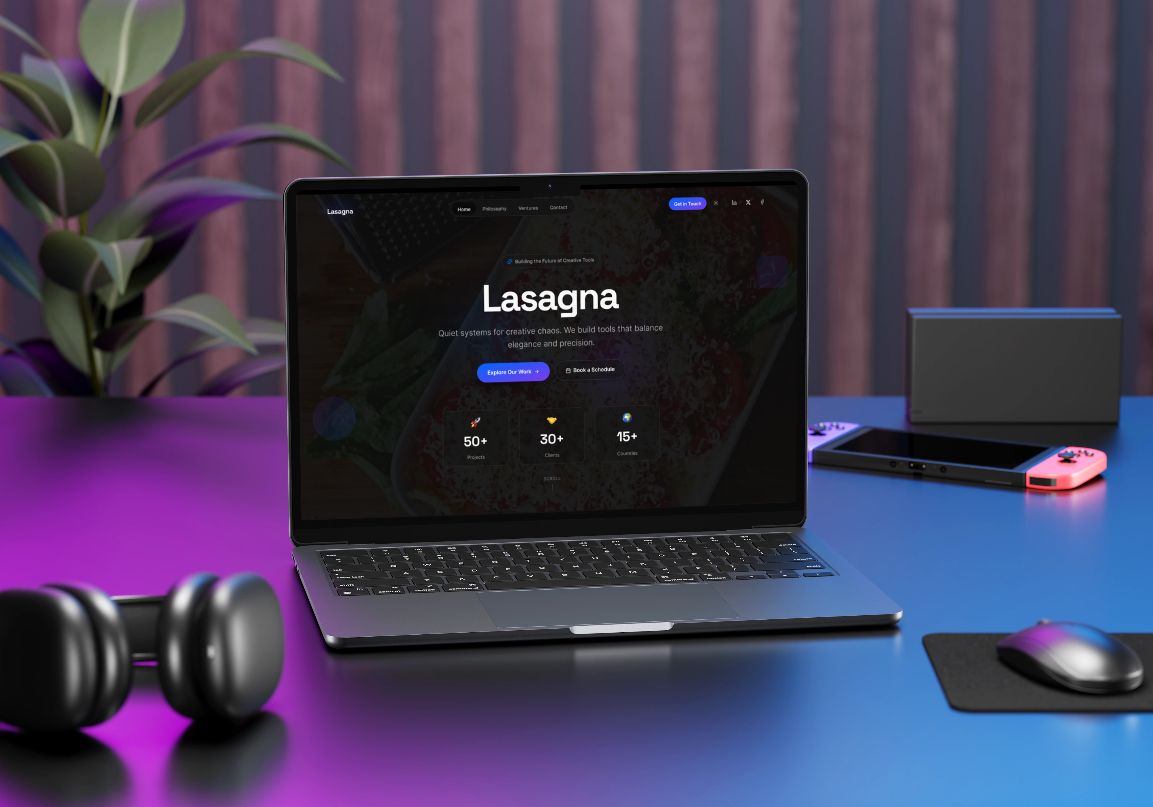
Laptop View - Dark Mode
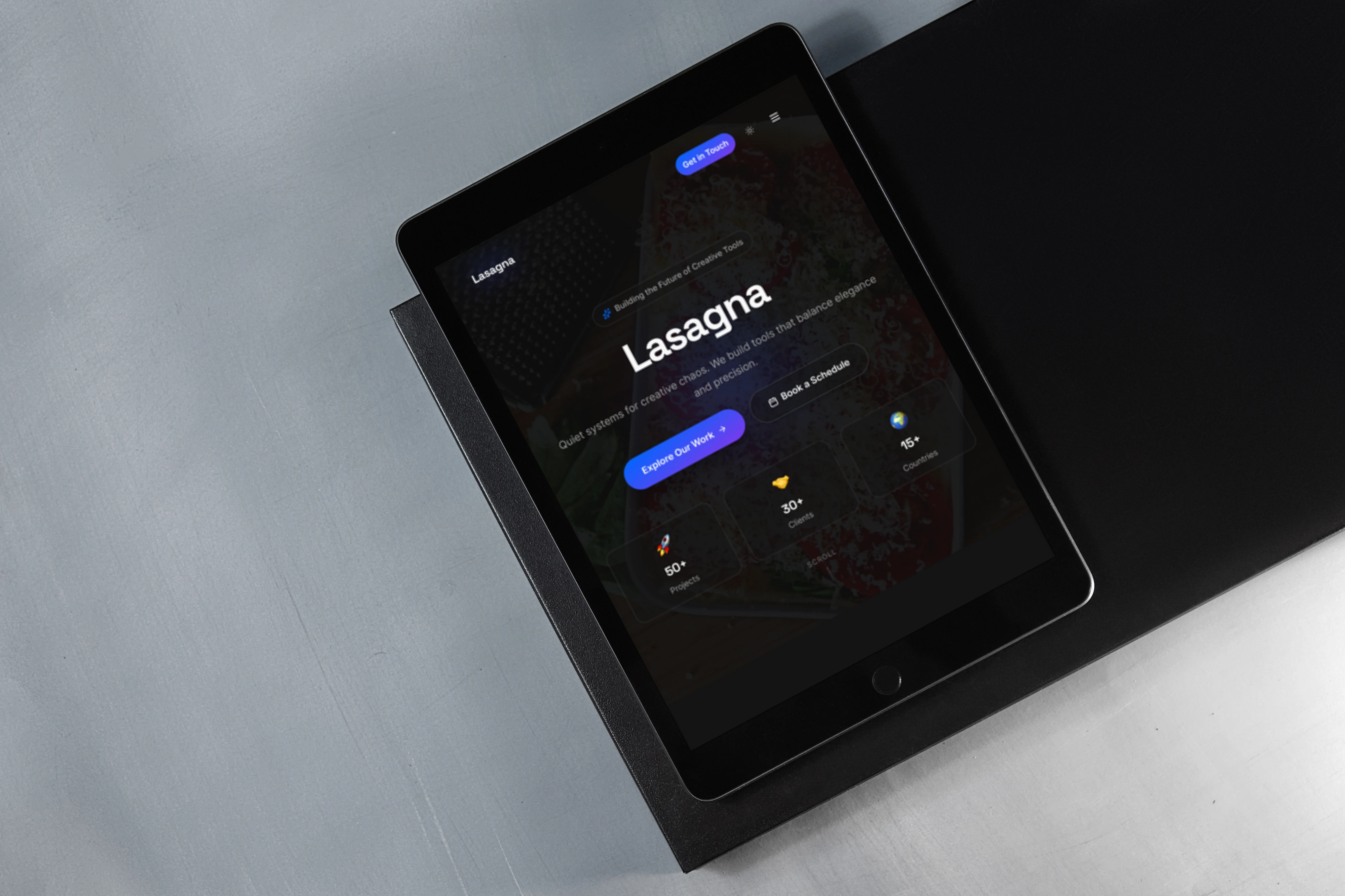
Tab View
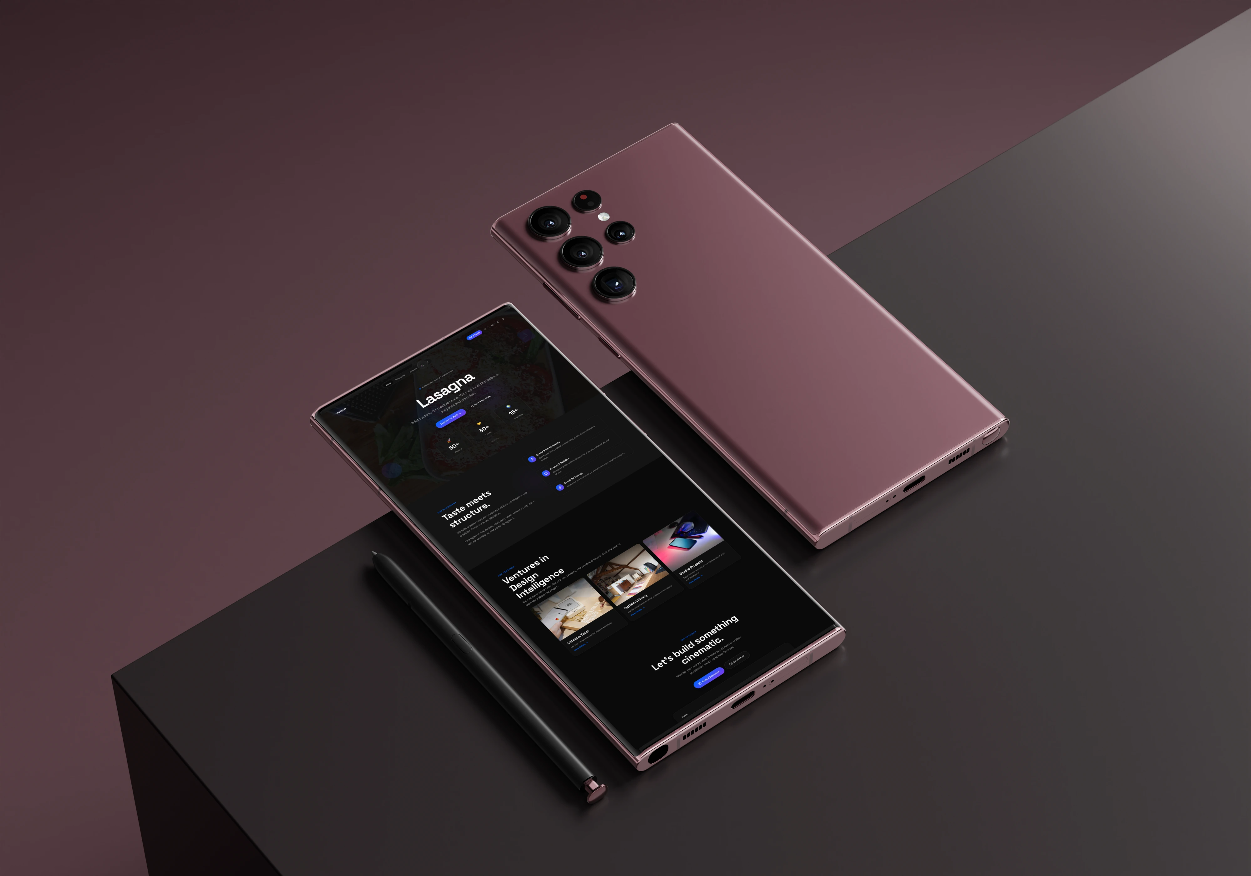
Mobile View
2. The Problem Statement
A new brand, Lasagna, existed only as a sophisticated idea. The core challenge was to build its foundational digital presence within Figma, but to do so with the foresight and rigor of a final production build. The project needed to result in a deliverable that was not only a beautiful prototype but also a structurally sound blueprint for immediate Framer development.
3. The Process: Strategic Design in Figma
The entire project was executed within the Figma ecosystem, but with a key strategic consideration: every design decision was made to ensure a seamless, one-to-one migration to Framer for final production.
Ideation & Wireframing: I established the narrative flow and architectural grid, focusing on a structure that would translate perfectly to Framer's responsive layout system.
Systematic Design in Figma: This was the core of the process. I didn't just design pages; I built a production-minded system using rigorous Auto Layout, modular components that mirror Framer's logic, and a tokenized design system with Figma Variables.
Prototyping in Figma Sites: The final design was deployed as a high-fidelity prototype using Figma Sites. This allowed for immediate interaction testing and served as the definitive, client-approved blueprint.
4. Design Sense: A Narrative Walkthrough
The Lasagna website is designed as a narrative journey, with each section serving as a chapter in the brand's story, orchestrated to evoke the core principles of "Bold, Quiet, and Intelligent."
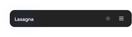
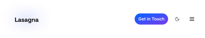
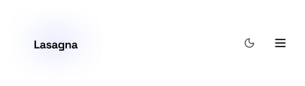
The Navbar: The Guiding Compass
The Goal: To provide intuitive navigation without breaking the cinematic immersion. It must be a helpful guide, not a disruptive header.
The Design Sense: It begins transparent to give the Hero section full impact. On scroll, it intelligently transitions to a "glassmorphism" element, providing function without clutter. Purposeful micro-interactions on links and the logo provide satisfying, tactile feedback, reinforcing the brand's craftsmanship.

Desktop Navbar Dark
Tab Navbar Dark
Mobile Navbar Dark

Desktop Navbar Light
Tab Navbar Light
Mobile Navbar Light
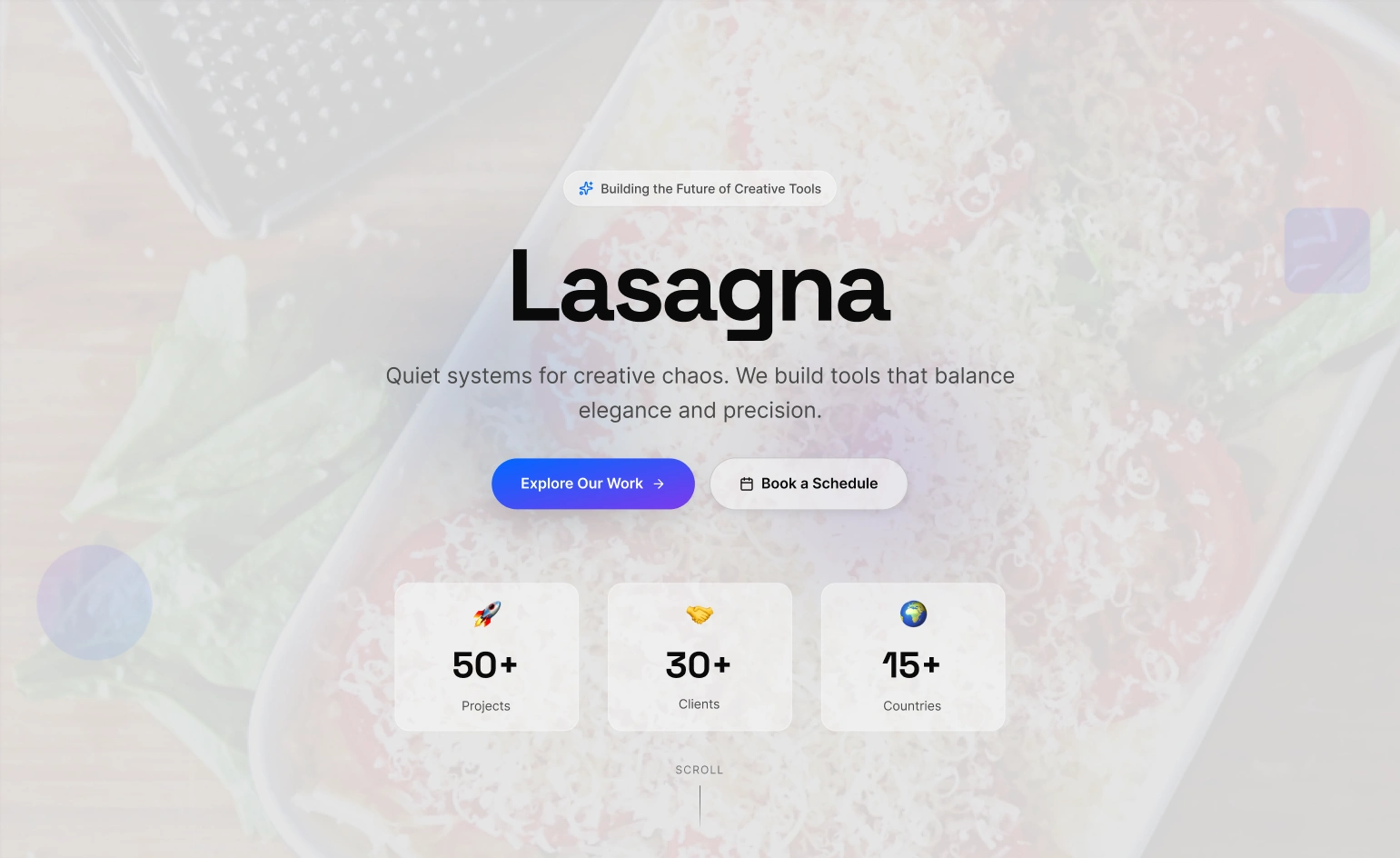
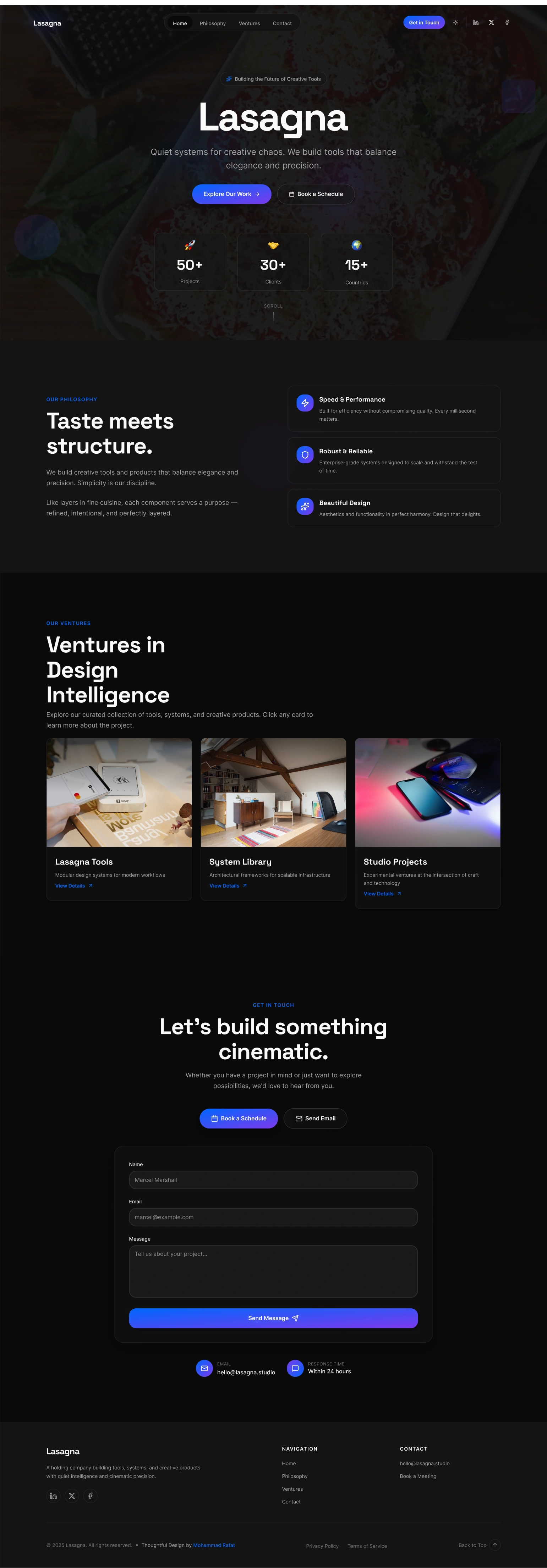
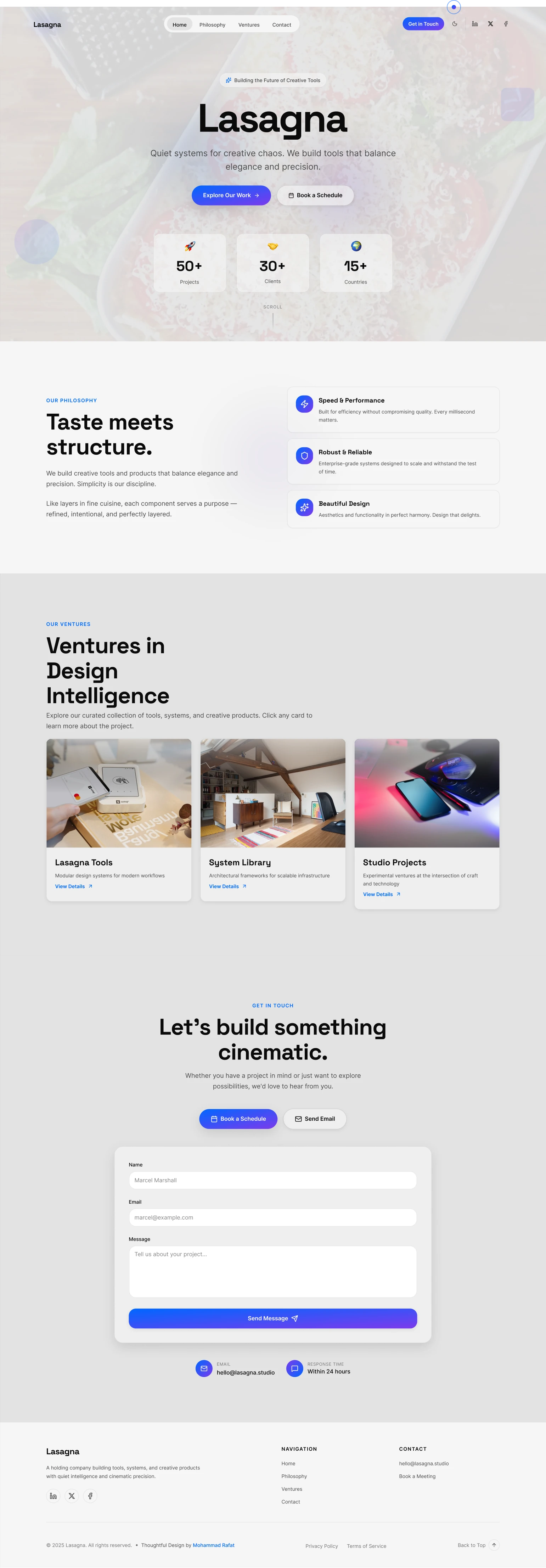
The Hero Section: The Cinematic Opening
The Goal: To immediately establish the brand's atmosphere and quiet confidence. This is the opening shot of the film.
The Design Sense: An immersive, full-screen image with a moody, atmospheric tone creates intrigue. The bold, elegant serif typography makes a confident first impression, while the slow, deliberate entry animation reinforces the brand's "Quiet" nature.
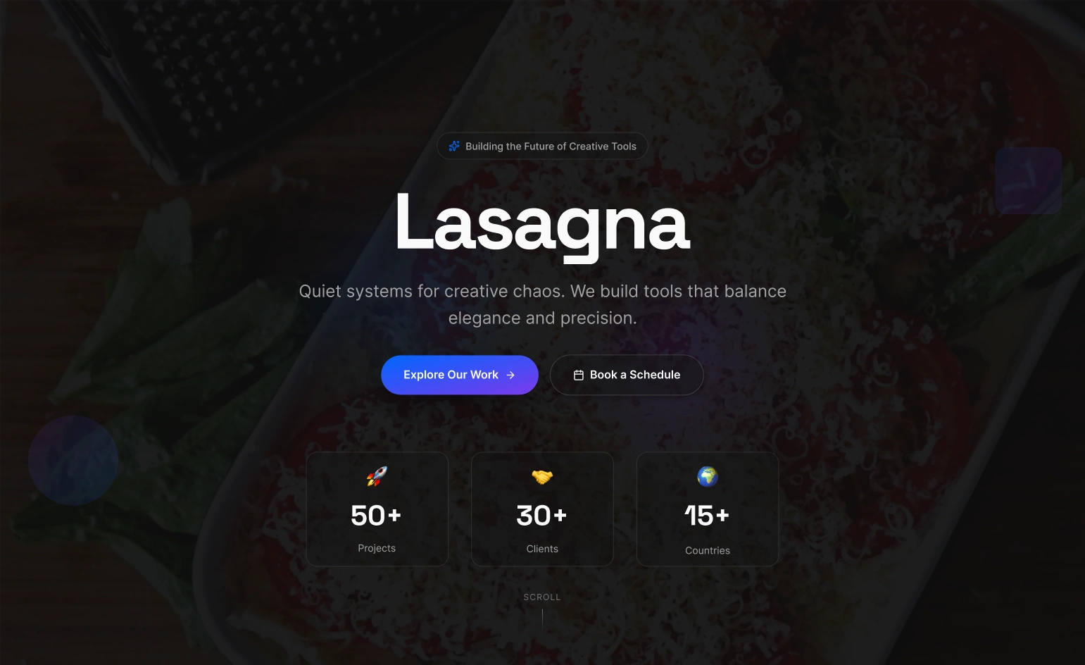
Hero Dark
Hero Light
The Philosophy Section: The Manifesto
The Goal: To articulate the brand's vision in a thoughtful, structured, and considered manner.
The Design Sense: A classic two-column editorial grid mirrors a high-end magazine spread. Generous whitespace gives the words weight and importance, visually communicating the "Intelligent" principle. The focus is on a perfect typographic rhythm for a comfortable reading experience.
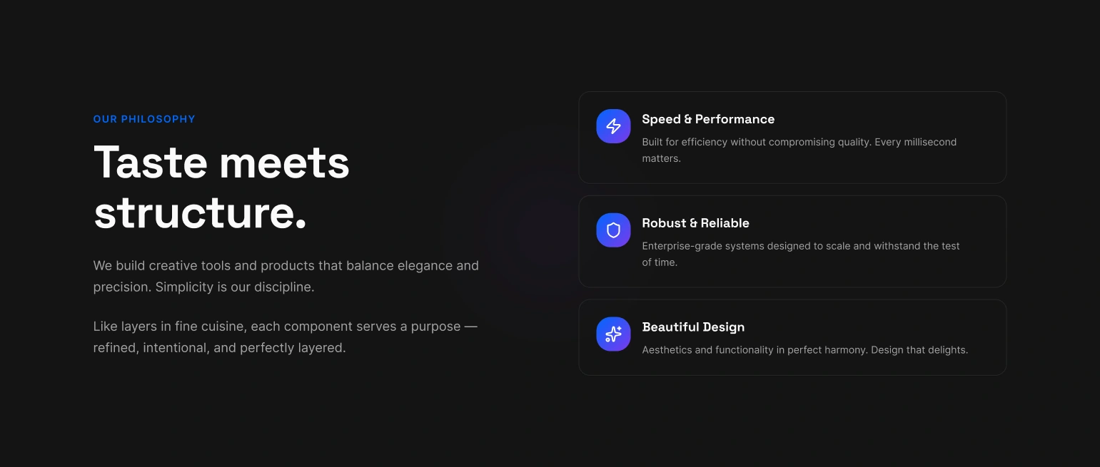
Philosophy Section
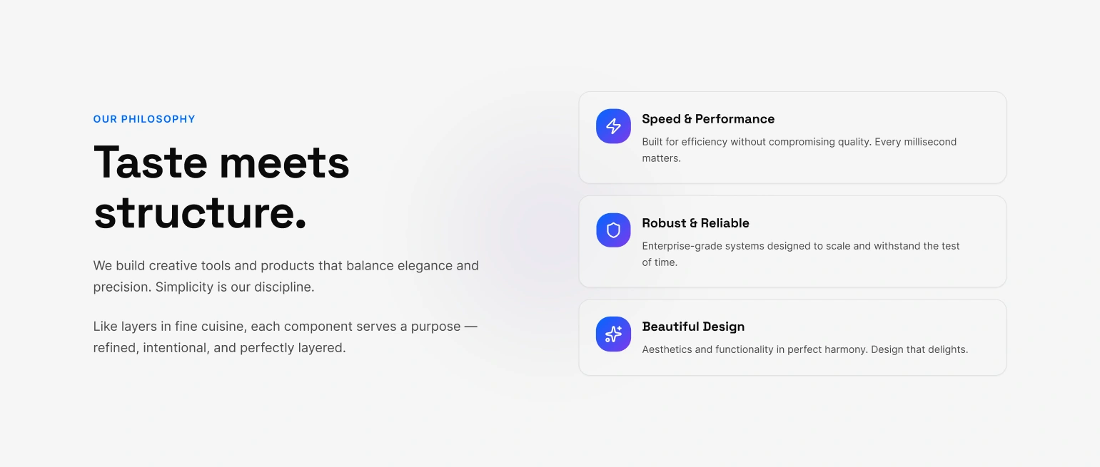
Philosophy Section
The Ventures Section: The Showcase
The Goal: To display the brand's work in a way that feels curated and premium.
The Design Sense: A clean, structured grid provides order. The interactive cards use glassmorphism and subtle, physics-based hover animations to provide satisfying feedback and communicate a high level of polish and craftsmanship.
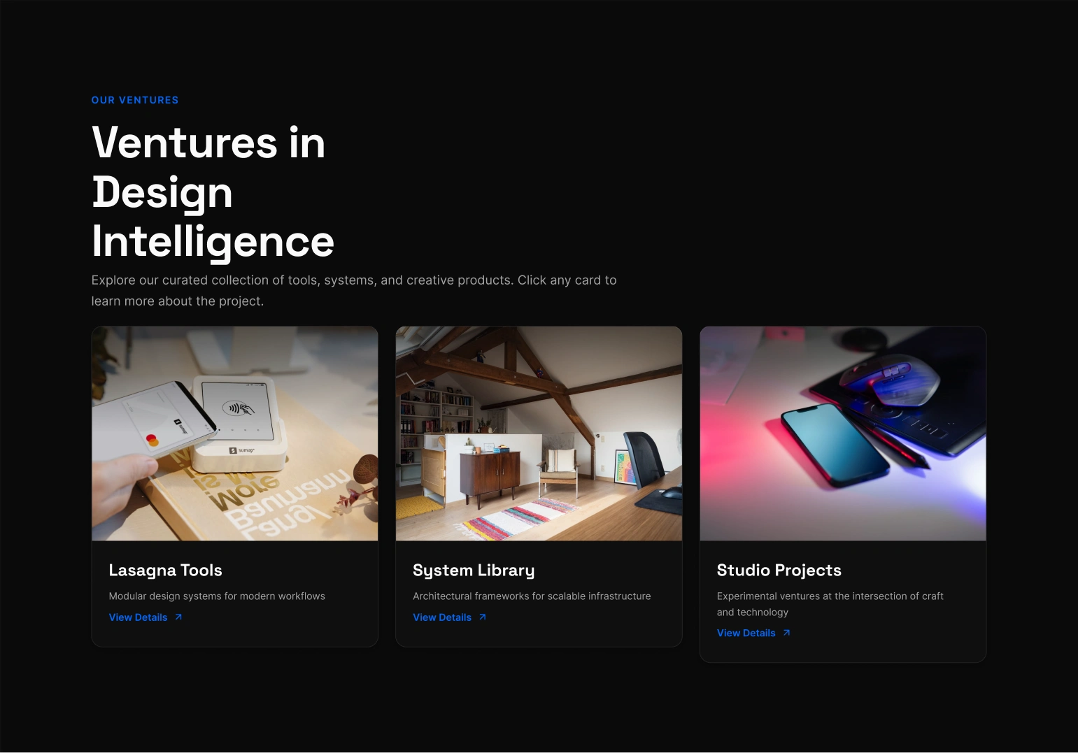
Venture Section
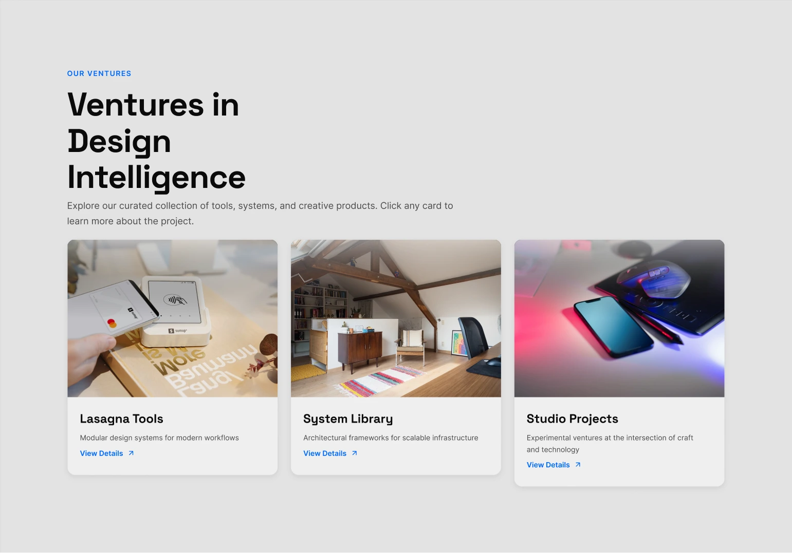
Venture Section
The Contact Section: The Denouement
The Goal: To provide a simple, elegant, and frictionless way to connect, ending the story on a high note.
The Design Sense: The design is stripped back to its essential elements. The on-brand copy ("Let's build something cinematic") and a final, delightful micro-interaction on the "Send" button leave the user with a lasting impression of quality.
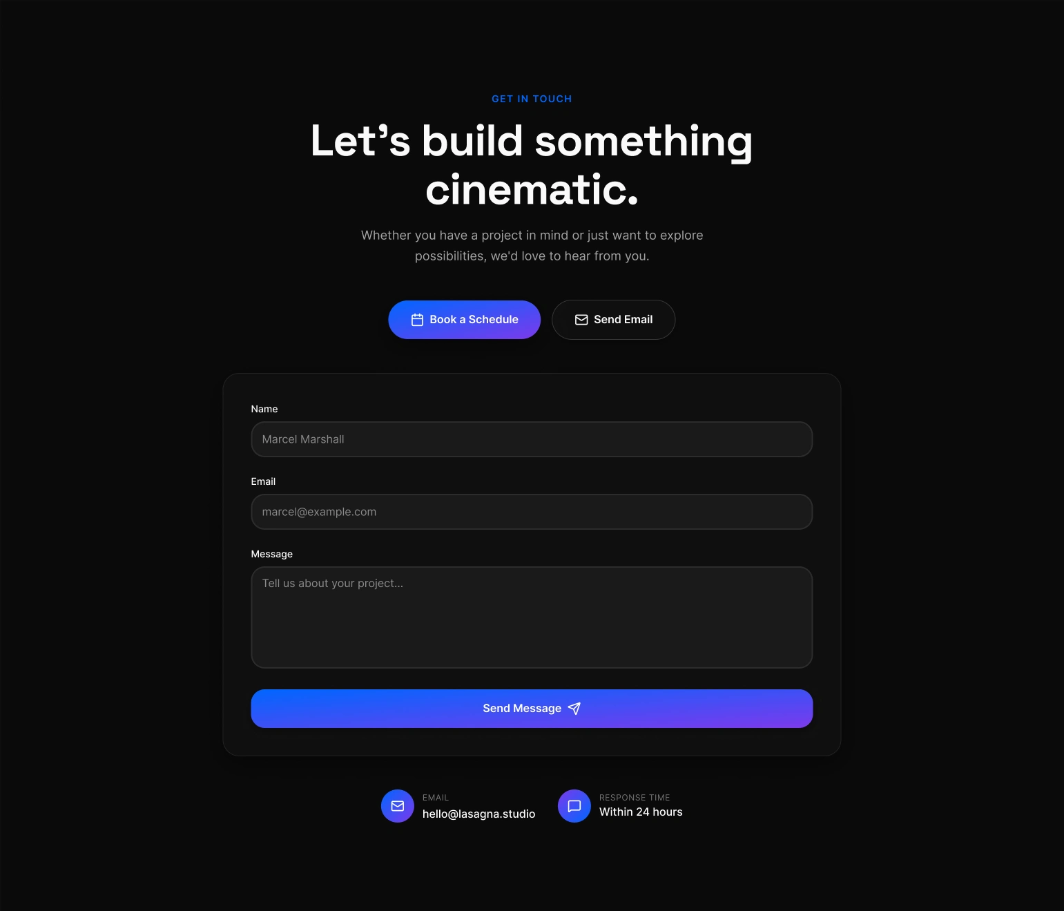
Contact Section
Contact Section
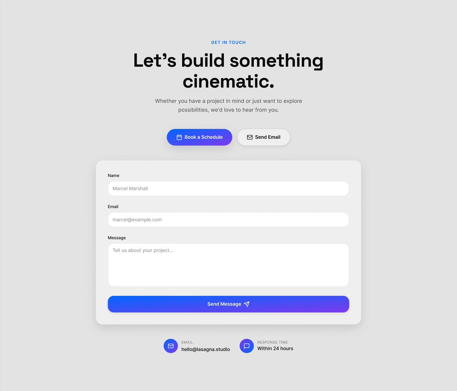
The Footer: The End Credits
The Goal: To act as the "end credits" of the digital experience. It must provide essential utility (navigation, legal, social links) and a final impression of professionalism and quality, all while maintaining the site's sophisticated, cinematic tone.
The Design Sense:
Structured Finality: The footer uses a clean, multi-column grid to organize information logically. This separates primary navigation, social channels, and legal notices into distinct, easy-to-scan zones. This architectural approach avoids the cluttered "junk drawer" feel of typical footers and reinforces the brand's "Intelligent" and systemic nature.
Typographic Hierarchy: The typography is intentionally understated. It uses smaller sizes and a clear hierarchy to signal that this is secondary, utilitarian information. This respects the user's journey, providing closure rather than demanding more attention.
A Signature of Craftsmanship: The designer credit is included as a subtle, confident signature, akin to a director's credit at the end of a film. The interactive social media icons use the same polished hover effects found throughout the site, ensuring the brand's commitment to quality is carried through to the very last pixel.
Thoughtful Convenience: The inclusion of a "Back to Top" button is a key piece of user-centric design. It acknowledges the user has completed their narrative journey and offers a simple, elegant way to return to the beginning. It’s a final, thoughtful gesture that enhances the overall user experience.
Footer
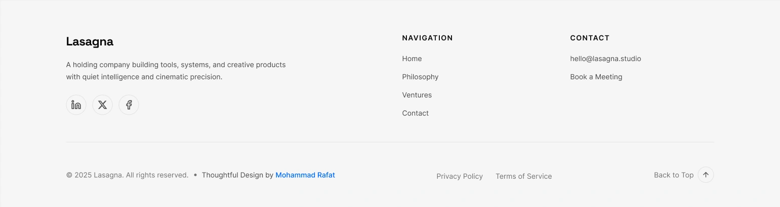
Footer
5. Visual Identity & Design System
The project is built on a robust and scalable design system, defined in Figma and ready for implementation in Framer.
Color Palette: A dual-mode system using Figma Variables for a soft, editorial light mode and a cinematic dark mode.
Typography: A three-tier hierarchy using Cormorant Garamond, Inter, and Space Grotesk.
Components: A complete library of reusable components, architected to be rebuilt quickly and efficiently in Framer.
6. Framer-Ready Architecture: The Key Differentiator
This project's intelligence lies in its preparation for the final build.
1:1 Component Mapping: The Figma components are structured so logically that they can be recreated in Framer in a fraction of the usual time.
Responsive Logic: All responsive behavior is handled by Auto Layout, not fixed constraints, which is exactly how Framer works.
Interaction Blueprint: The design includes clear specifications for advanced Framer-powered interactions like spring physics and scroll transforms.
7. Final Outcome
The final deliverable is a high-fidelity, interactive prototype built entirely in Figma Sites. It is a complete, standalone product that perfectly captures the brand's vision.
Crucially, this prototype also serves as the architectural blueprint for a swift, pixel-perfect build in Framer. The groundwork is so thoroughly laid that the transition to a high-performance, live Framer site would be an efficient final step, not a new phase of development.
8. Learnings & Takeaways
Design with the End in Mind: The biggest takeaway was reinforcing the power of designing with the final development environment in mind. This strategic foresight is what separates a good design file from a truly valuable project asset.
Figma as a Blueprint: This project proved how effectively Figma can be used to create not just visuals, but a comprehensive, production-ready blueprint that dramatically accelerates final development in tools like Framer.
Complete UI - Dark
Complete UI - Dark
Designed & built entirely in Figma and Ready to Build With Framer— no code, full interaction
Project by Mohammad Rafat
Hello There!
Impression unforgettable — clean, confident, and conversion-driven.
💡 GOT A PROJECT IN MIND?
or want to collab?
LET'S DO IT TOGETHER!!

www.mdrafat.com
Like this project
Posted Oct 13, 2025
A strategic site built to establish premium brand trust. Architected in Figma as a production-ready blueprint for a seamless, high-performance Framer build.
Likes
0
Views
8