BONDZ SHOP | Digital E-com | Figma Build
BONDZ SHOP - PREMIUM DIGITAL ASSETS
Project Overview
A conceptual SaaS-style e-commerce platform for UI/UX designers, developers, and content creators — designed to feel like a curated gallery, not a cluttered marketplace. Fully crafted in Figma Design → Figma Make, featuring responsive layouts, dark/light mode toggle, interactive product grid, and user flow simulation — all without writing a single line of code.
Case Study
The Challenge
Digital asset marketplaces are saturated — but most suffer from:
Overwhelming choice → decision paralysis
Generic layouts → no brand identity
Poor trust signals → unclear licenses, no reviews, hidden pricing
No emotional connection → feels transactional, not inspirational
BONDZ SHOP needed to stand out by:
Creating a gallery-like browsing experience — clean, editorial, inspiring
Communicating premium quality through visual hierarchy and micro-interactions
Building trust via social proof, clear licensing, and lifetime updates
Catering to modern creators — who value speed, quality, and scalability
The Goal
Build a responsive UI for digital product marketplaces
Deliver a scalable design system using Figma Components + Variables
Ensure usability across devices (desktop, tablet, mobile)
Deploy the prototype in Figma Make for live interactions (hover states, filters, modals, theme toggle)
My Process
1. Ideation & Inspiration
Researched top digital asset stores (Creative Market, Envato, UI8)
Collected mood boards for color, typography, layout
Defined core user persona: “The Modern Creator” — values efficiency, quality, and professional-grade tools
2. Wireframing in Figma
Initial low-fidelity wireframes for hero, product grid, bundle, FAQ
Mapped user flows: homepage → browse → filter → purchase → free resources
Defined section hierarchy: Hero → Products → Bundle → Trust Signals → Testimonials → Free → FAQ
3. UI Design in Figma
Responsive layouts for desktop, tablet, mobile
Light & dark mode system using Figma Variables (color, text, border)
Micro-interactions & hover states (scale-up + shadow on product cards)
Typography system: Inter (clean) + Space Mono (tech accent)
4. Deploying Prototype with Figma Make
Exported designs into Figma Make as a public prototype
Enabled dark/light mode toggle (via Variables)
Added interactive elements: hover states, filter tabs, accordion FAQ, modal popups
Simulated user flow: login form → dashboard redirect
The Solution
BONDZ SHOP solves the challenge with both Dark/Light Version:
Hero Section: Split layout + bold headline + dual CTAs (“Explore Collection”, “Watch Demo”) → instant clarity
Product Grid: 9 cards with thumbnails, prices, ratings, filter tabs → scannable, benefit-driven
Bundle Section: Strikethrough pricing ($249 → $149) + “Save 40%” badge → conversion engine
Trust Signals: 6-feature cards (“Commercial License”, “Lifetime Updates”, etc.) → builds credibility
Testimonials: 4.9★ rating + realistic quotes → social proof
Free Resources: Lead magnet funnel (icons, wireframes, color palettes) → captures email
FAQ Section: Accordion-style questions → reduces friction
All built with:
Consistent spacing and typography
Custom monochrome icons (no fills, no gradients)
Auto Layout + Constraints for scalability
Component-based architecture for easy maintenance
Visual Showcase
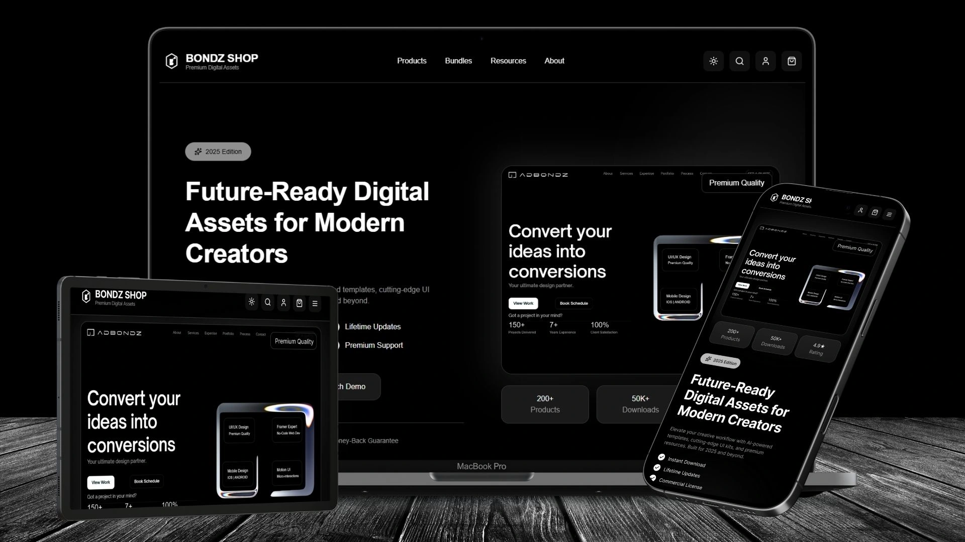
Desktop Dark Mode — deep black background, white text, glowing cyan highlights
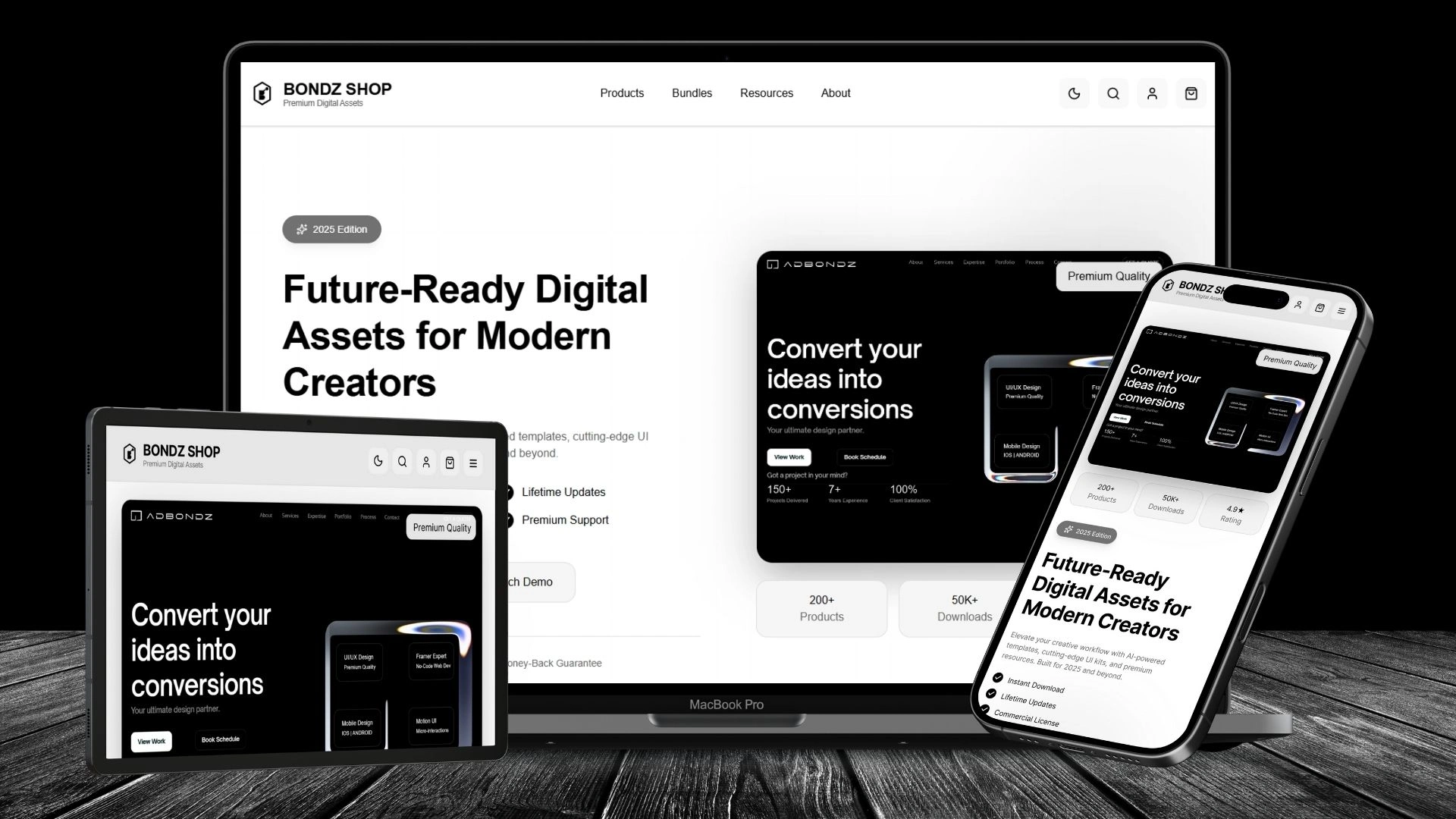
Desktop Light Mode — clean white background, black text, electric cyan accents
Tablet/Mobile Dark Mode — same as desktop, optimized for thumb-friendly touch targets
Tablet/Mobile Light Mode — collapsed product grid, swipeable filters

Any device responsive UI design - Dark Version

Any device responsive UI design - Light Version
Key Highlights
✅ Fully responsive UI — scales seamlessly from desktop to mobile
✅ Dual light/dark system — built with Figma Variables for dynamic theming
✅ Clean visual hierarchy — typography, spacing, and iconography guide the eye
✅ Scalable design tokens — components, colors, typography styles ready for growth
✅ Interactive prototype — hover states, filters, modals, theme toggle — all with Figma Make
Tools Used
Figma (Design) — Components, Auto Layout, Prototyping, Variables, Dark/Light Mode Toggle, Logo
Figma Make — Deployment & Live Prototype Interactions (hover, filters, modals, theme switch)
Outcome & Impact
Delivered a world-class responsive website prototype — entirely in Figma
Demonstrated ability to build complete projects end-to-end — from ideation to live prototype — without writing code
Enhanced client confidence in design + prototype delivery — especially for SaaS, e-commerce, and digital product projects
Positioned myself as a Figma Product Designer — not just a visual designer, but someone who can own the full journey
BONDZ SHOP - DARK MODE

Dark UI
BONDZ SHOP - LIGHT MODE

Light UI
🌐 Experience the Future of Digital Assets Designed & built entirely in Figma Design → Figma Make — no code, full interaction, dark/light mode, user flow simulation.
👉 View full functional live site as prototype here : BONDZ SHOP - Premium Digital Assets
Open for SaaS, e-commerce, and digital product design projects. Let’s build something premium.
Like this project
Posted Oct 4, 2025
BONDZ SHOP — Figma-built e-commerce site with clean layout, intuitive nav & product focus. Designed to boost conversions while reflecting brand identity.

