Where Brands Begin: Custom Logo Designs
Shoaib Raza
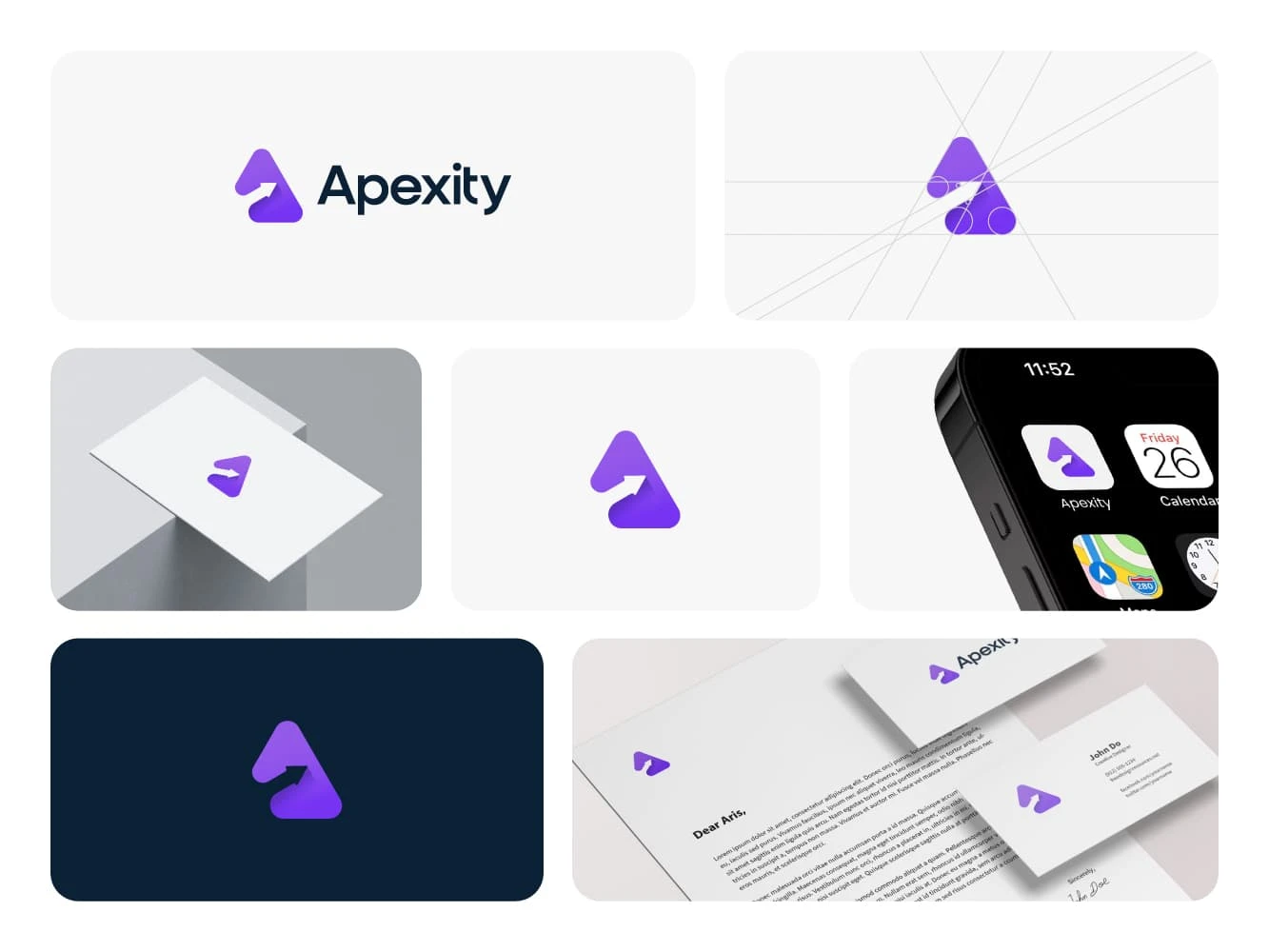
Apexity
Smart, sleek, and strategically designed, the Appexity logo captures the essence of modern IT excellence from the very first glance. With a refined blend of purple and white, the visual identity radiates innovation, reliability, and professionalism, key traits for any forward-thinking tech brand. The crisp lines and balanced typography bring clarity and structure, reflecting Appexity’s mission to deliver seamless, cutting-edge managed IT services. More than just a logo, it’s a confident symbol of a brand built to empower and elevate businesses through technology.
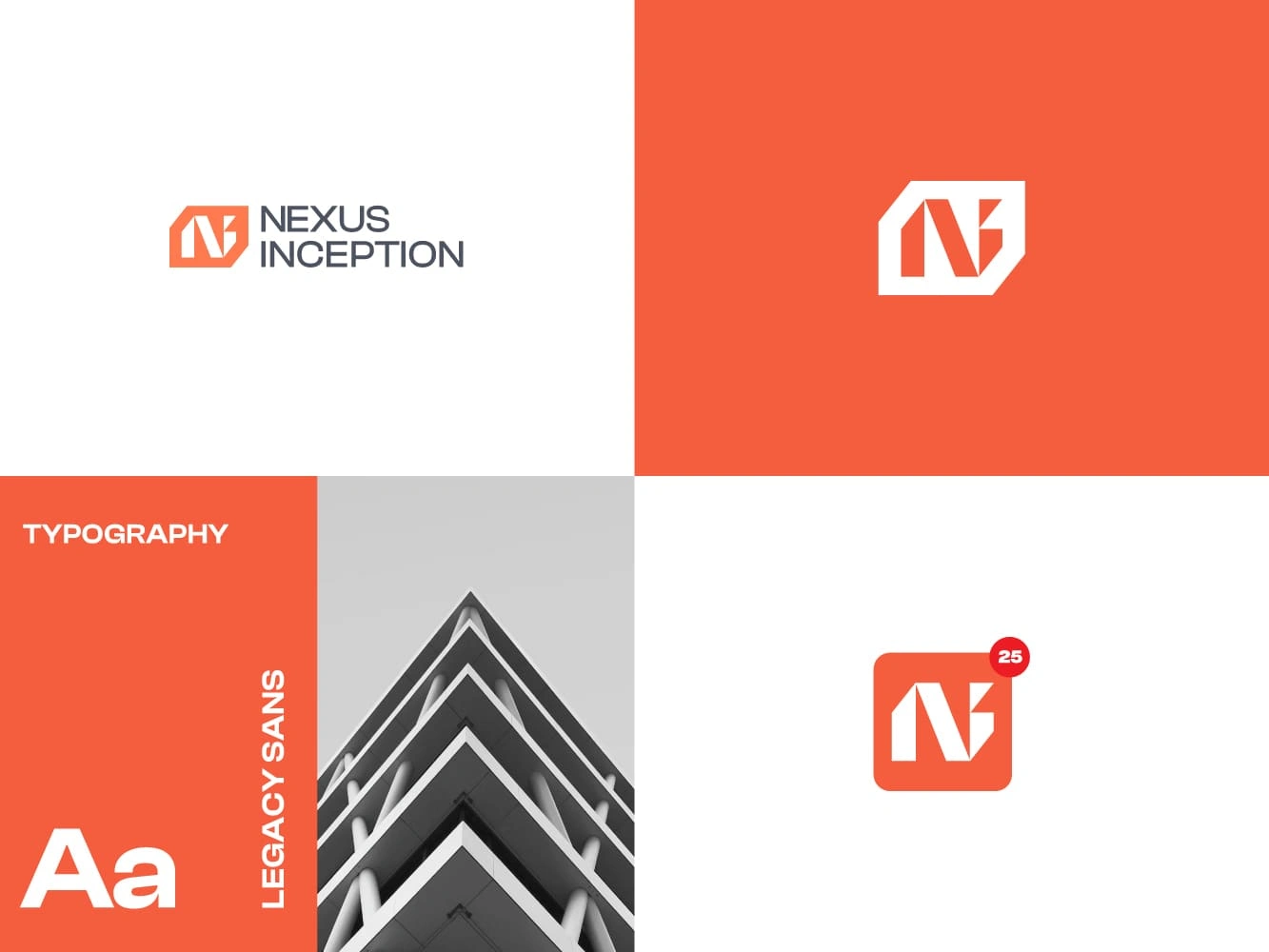
Nexus Inception
Bold, bright, and built to impress—Nexus Inception’s logo instantly commands attention with its vibrant orange and clean white palette, symbolizing innovation, energy, and trust. Designed for a forward-thinking construction company, the logo pairs the sleek "Legacy Sans" font with striking contrast and modern simplicity, delivering a visual identity that’s as strong and reliable as the structures they build. It’s a powerful emblem of Nexus Inception’s commitment to pushing boundaries while staying grounded in solid, dependable values—an impactful mark that elevates their presence in the construction industry.
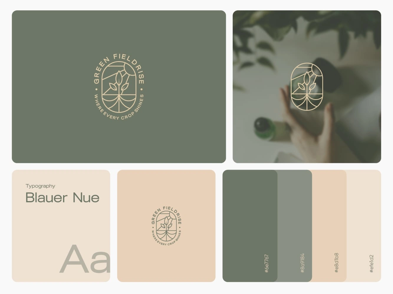
Green Fild Rise
Rooted in nature and glowing with promise, the logo for Green Fielder Rise captures the spirit of agricultural excellence with an elegant illustration of three leaves thriving under the golden sun. Paired with the inspiring tagline, "Where every crop shines," the design speaks to the brand’s mission of cultivating vibrant, flourishing harvests. The refined "Blauer Neue" font and a soothing palette of muted greens and warm earth tones evoke harmony, sustainability, and care, perfectly embodying the brand’s commitment to nurturing growth from the ground up.
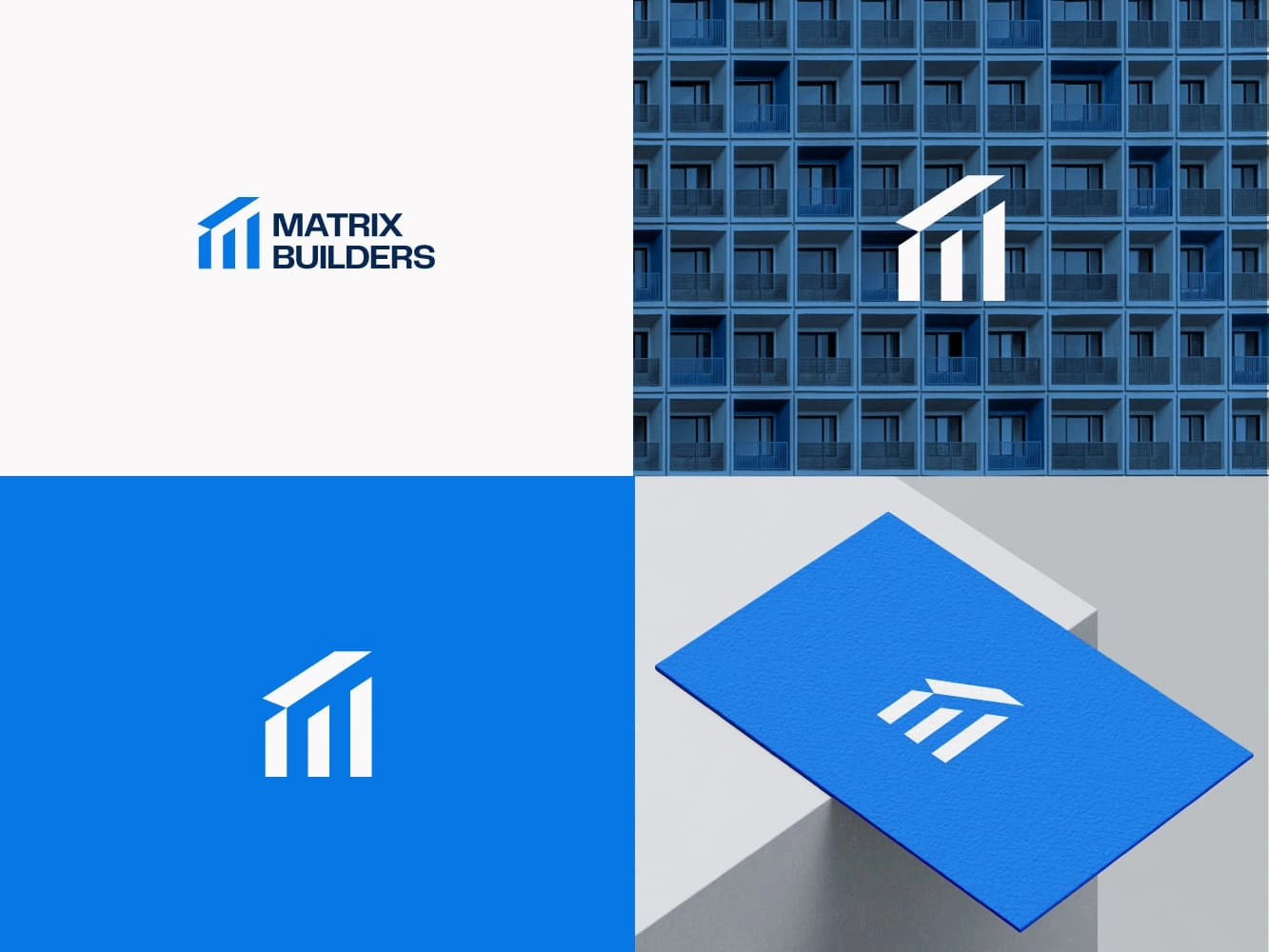
Matrix Builders
At the heart of every great structure lies a foundation of strength, and the Matrix Builder logo captures this essence perfectly. Featuring three robust pillars supporting a fourth resting securely atop them, the design powerfully symbolizes stability, reliability, and unwavering support. Rendered in a clean, professional palette of blue and white, the logo exudes trust, expertise, and precision—core values that define Matrix Builder’s approach to construction. Its minimalist yet striking design reflects a modern vision while emphasizing the durability and structural excellence that clients can always count on.
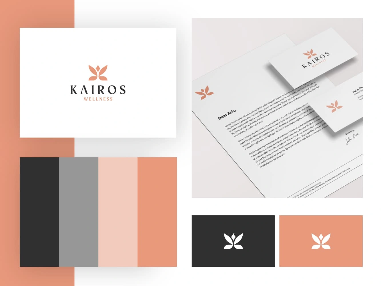
Kairos Wellness
Transformation takes flight with the Kairos Wellness logo, a graceful butterfly that beautifully symbolizes balance, renewal, and growth. Rendered in a calming palette of soft greys and gentle skin tones, the design invites a sense of peace, healing, and holistic well-being. Its delicate lines and soothing colors reflect the center’s commitment to nurturing personal transformation and harmony. Elegant and serene, this logo perfectly captures the essence of Kairos Wellness’s mission to guide individuals on their journey toward lasting rejuvenation and inner balance.
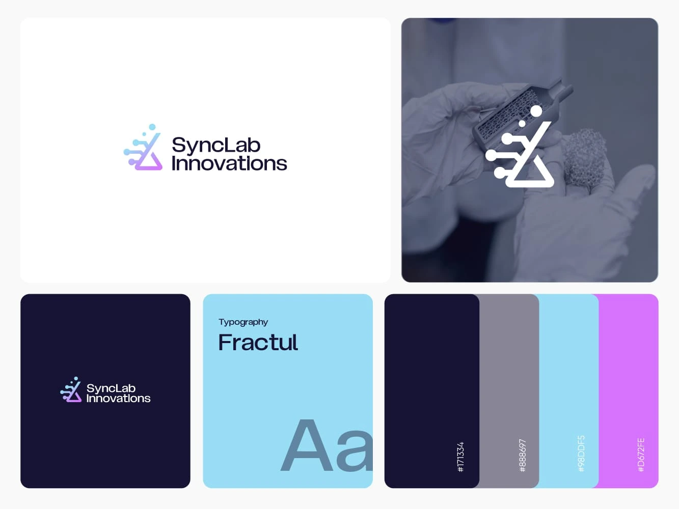
SyncLab Innovations
Innovation meets imagination in the logo for SyncLab Innovations, where a sleek flask icon takes center stage, symbolizing experimentation, discovery, and breakthrough ideas. Paired with the futuristic "Fractul" font and a striking palette of deep navy, cool gray, sky blue, and vibrant violet, the design exudes creativity and forward-thinking energy. Every element works in harmony to reflect SyncLab’s mission to lead in tech and scientific advancement. Bold yet refined, the logo captures the essence of a brand driven by curiosity, precision, and limitless innovation.
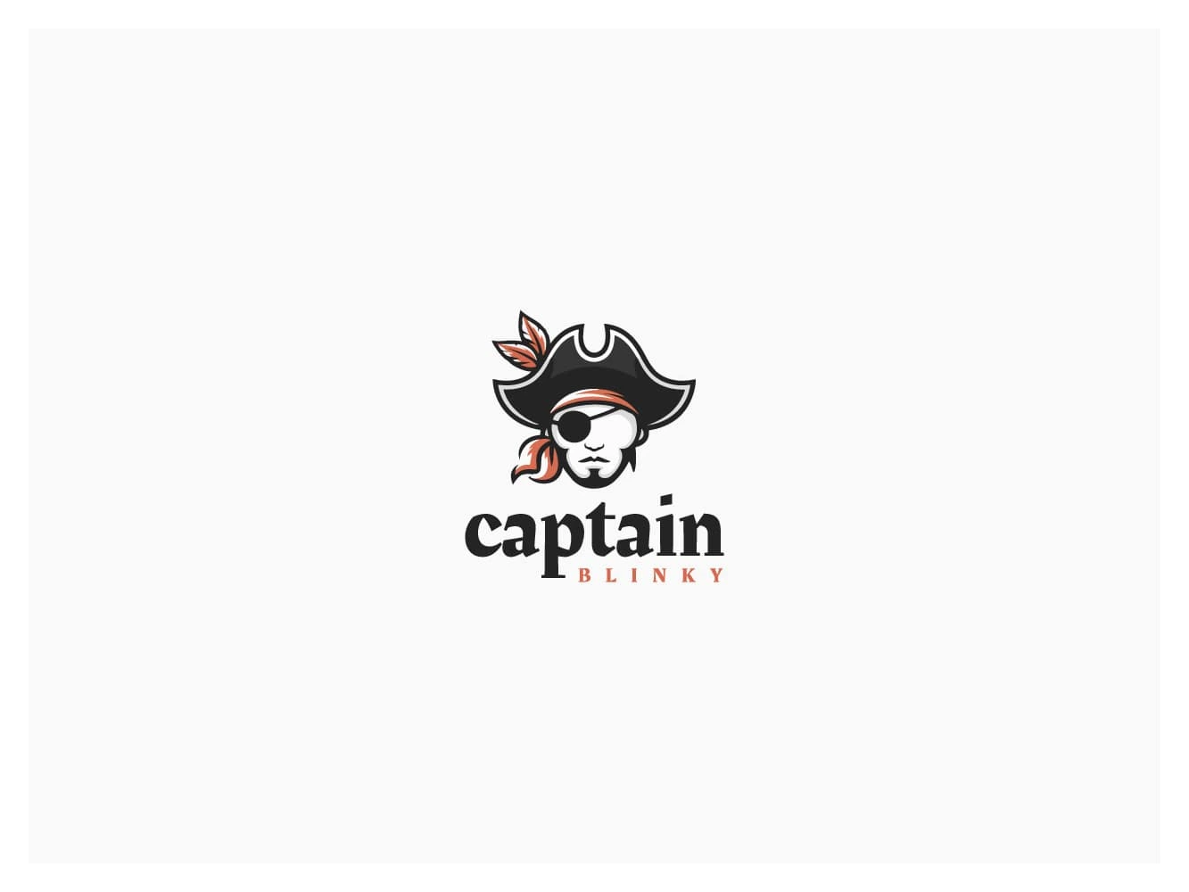
Captain Blinky
Set sail with the unforgettable logo for Captain Blinky—a bold and playful pirate character that instantly grabs attention. Featuring a distinctive eyepatch and classic pirate cap, this design perfectly captures the brand’s adventurous spirit and fearless personality. It blends fun and charisma with a strong, memorable identity, evoking themes of exploration and daring. Striking the ideal balance between whimsy and professionalism, the logo makes Captain Blinky stand out as a brand that’s both approachable and boldly unique, leaving a lasting impression on every audience it reaches.
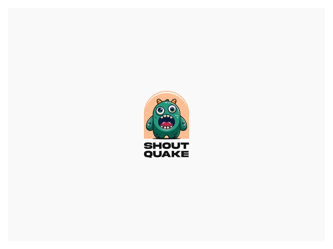
Shout Quake
Get ready to make some noise with the electrifying logo for Shout Quake! This dynamic design draws inspiration from the iconic "Among Us" style, featuring a vibrant green alien bursting with personality. Its wide-open mouth, caught mid-shout, and playful horns give the character an energetic and unforgettable presence. This logo perfectly captures the brand’s bold spirit and infectious excitement, making it impossible to ignore. With its fun, modern twist, the design connects instantly with audiences seeking something fresh, memorable, and full of life. Shout Quake’s perfect visual voice.
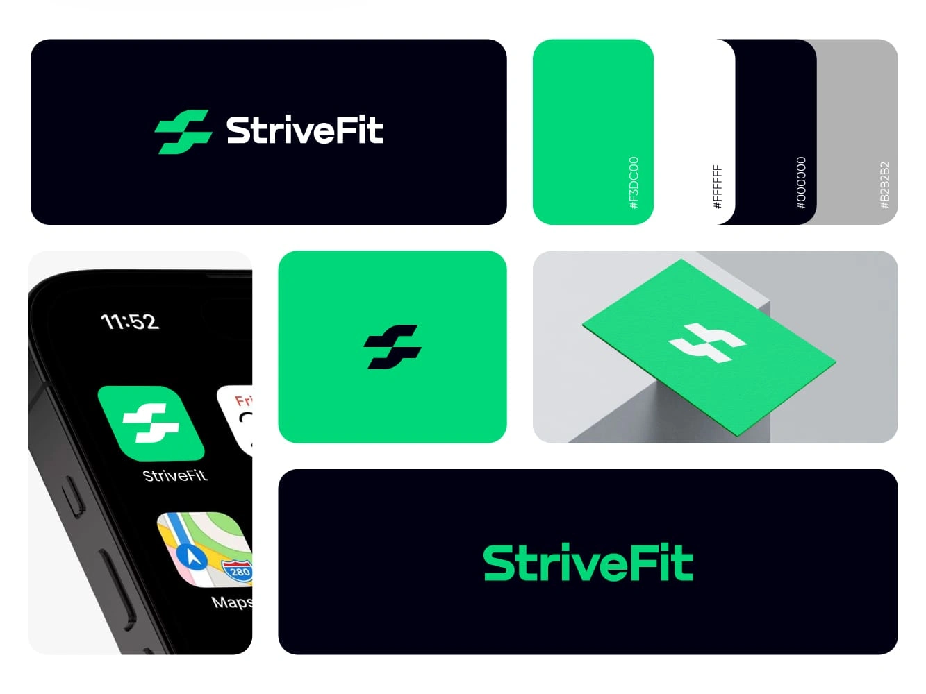
StriveFit
Ignite your drive with the striking logo for StriveFit, a fitness tracking app designed to inspire and motivate. This bold design combines sleek black and white with a vibrant green accent that pulses with energy and vitality. The green symbolizes growth and progress, while the contrasting monochrome elements bring clarity and modern sophistication. Together, they create a powerful visual that embodies strength, determination, and the relentless pursuit of improvement. StriveFit’s logo isn’t just a mark; it’s a call to action, encouraging users to stay focused and committed on their path to better health and fitness.
Like this project
Posted May 22, 2025
Every unforgettable brand begins with a powerful story, and it all starts with a custom logo designed to captivate, resonate, and make a lasting impression.