Branding Collection: Crafting Stories Through Design
Shoaib Raza
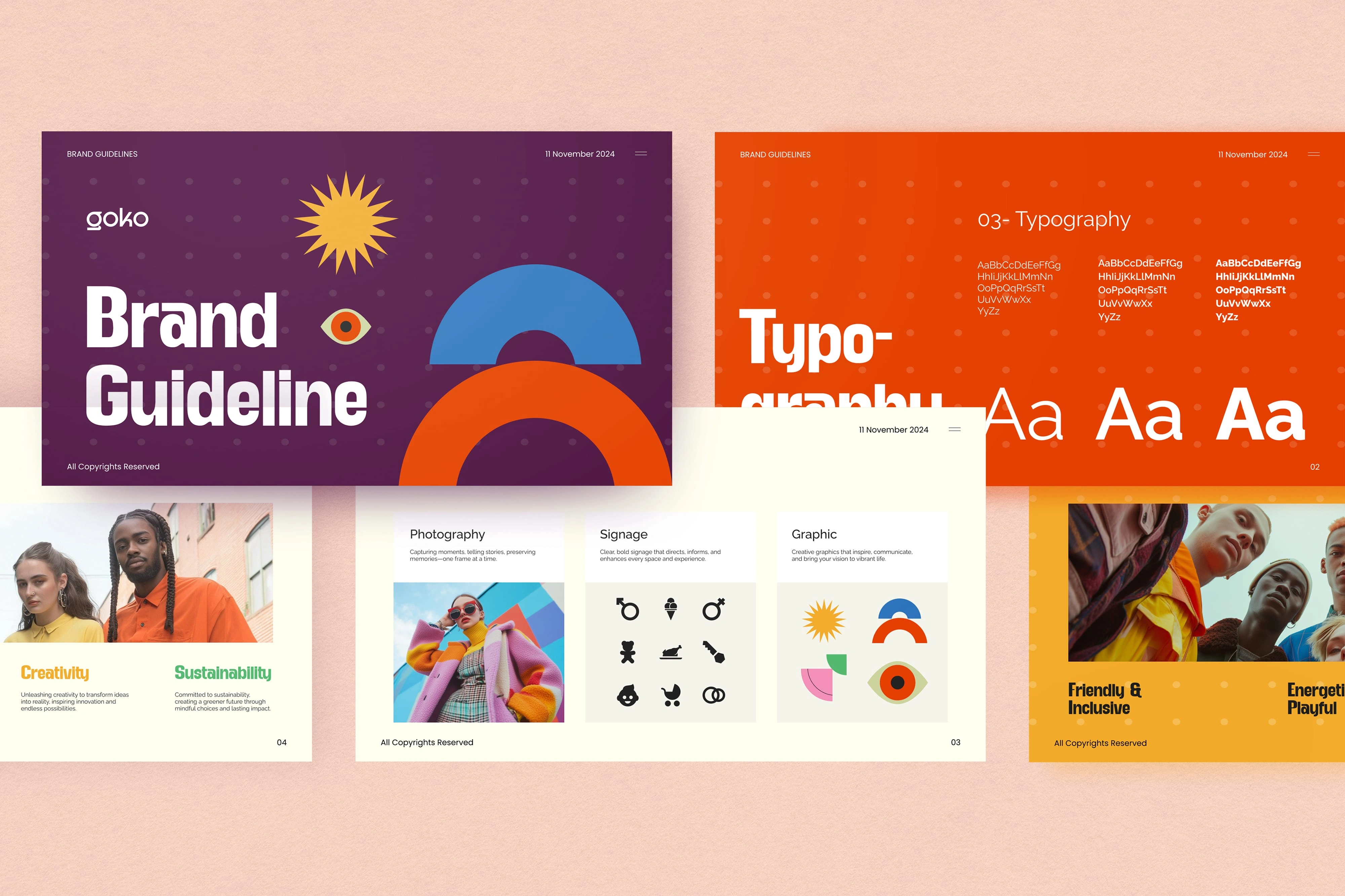
Brand Guidelines For An Apparel Brand
Bursting with energy and personality, the brand guidelines for this fun, youth-driven apparel brand are designed to reflect the bold, carefree spirit of its audience—people in their 20s who crave self-expression through style. From vibrant splashes of orange, yellow, and electric blue to playful typography and lively visuals, every element is crafted to grab attention and spark joy.
These guidelines ensure brand consistency across all touchpoints—whether it’s on a website, packaging, or social media—while leaving room for creative flair. The tone is upbeat and cheeky, the visuals are bold and expressive, and the overall aesthetic is unapologetically fun. It’s more than just a look—it’s a lifestyle, a statement, and a celebration of individuality through color, design, and fashion.
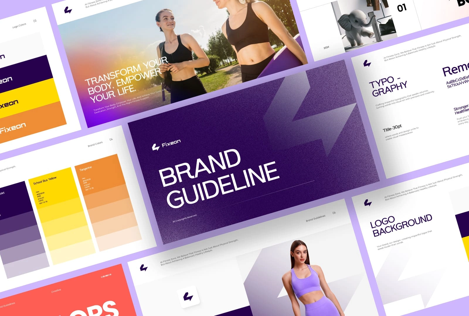
Fixeon Brand Guidelines
Designed to energize and empower, the brand guidelines for Fixeon capture the bold essence of a fitness lifestyle built on strength, movement, and motivation. With a striking palette of yellow, orange, and purple, the brand radiates confidence and determination, reflecting the passion and intensity of those who wear it.
Fixeon’s visual identity is a balance of power and style: bold typography, clean layouts, and high-impact imagery come together to create a dynamic and recognizable look. These guidelines ensure every piece of content—from product tags to social media campaigns—stays cohesive, inspiring, and unmistakably Fixeon. It’s not just about activewear—it’s about fueling a mindset, pushing limits, and owning your grind with a brand that’s as driven as you are.
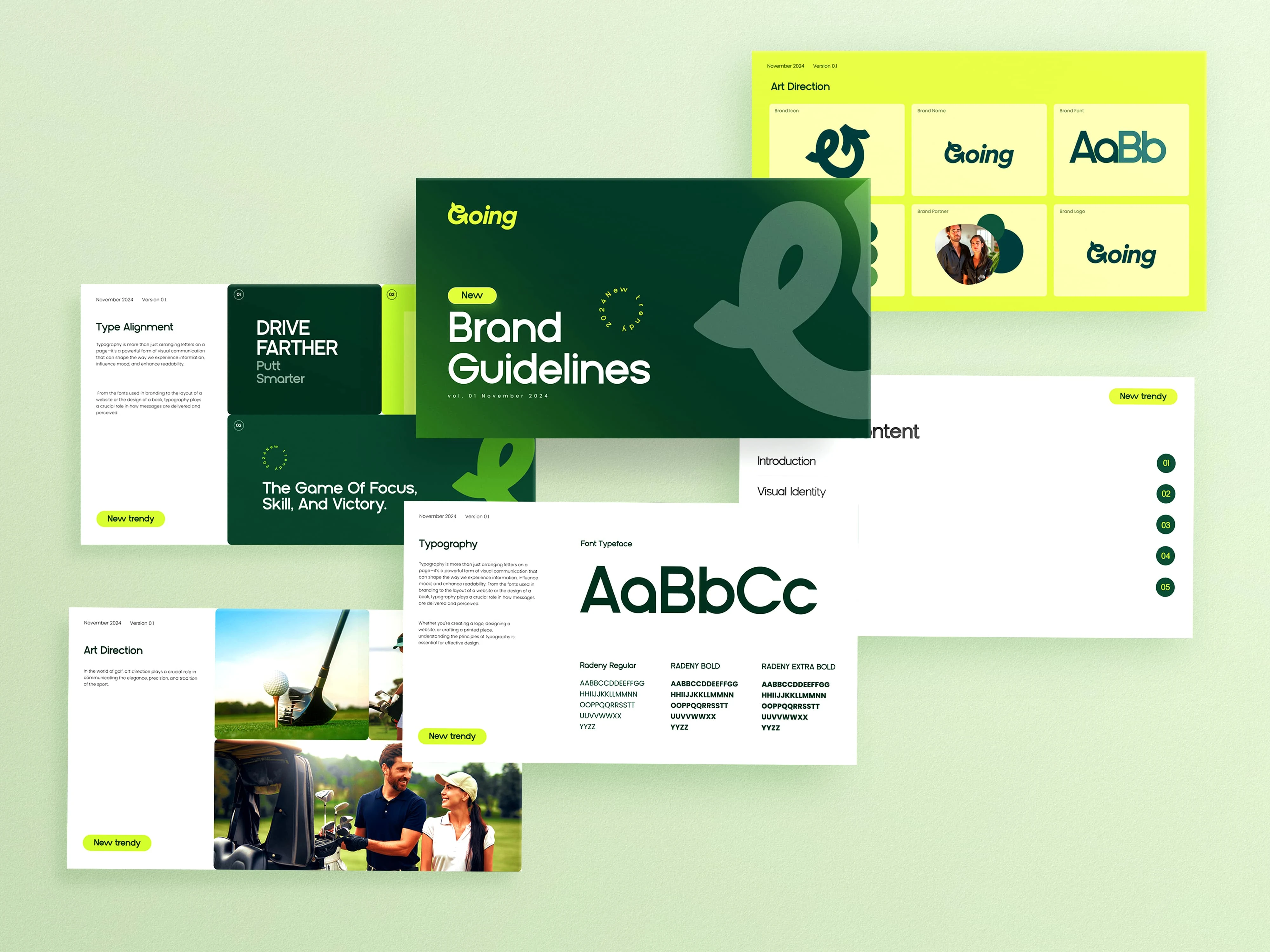
Branding For Golf Cart Company
Sleek, smart, and effortlessly refined—Going redefines the spirit of modern mobility with a brand identity that feels as elevated as the ride itself. Rooted in the outdoors and inspired by movement, the brand guidelines for Going blend shades of deep green, vibrant yellow, and fresh green accents to evoke reliability, sophistication, and energy.
From logo placement to typography, every detail in Going’s visual system is crafted to reflect its mission: offering high-quality, stylish golf carts that deliver performance with personality. The green palette connects to nature and leisure, while the yellow introduces a spark of innovation and friendliness. These brand guidelines ensure consistency across every touchpoint—web, print, and on the course—creating a strong, recognizable identity that positions Going as more than a ride, but a lifestyle in motion.
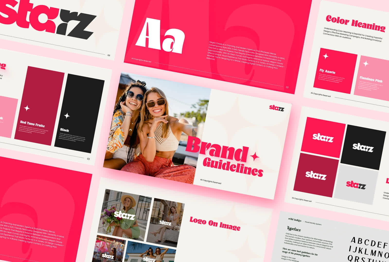
Starz Brand Guidelines
Bold, expressive, and unapologetically modern—Starz is a lifestyle brand that celebrates individuality and everyday confidence. Its brand guidelines are designed to reflect this spirit with a striking visual identity centered around a deep, luxurious pink paired with refined shades of grey. This color combination creates a powerful contrast that’s both sophisticated and full of personality, making the brand instantly recognizable and emotionally resonant.
From typography to imagery and layout principles, every element is curated to embody Starz’s commitment to style, empowerment, and bold self-expression. The dark pink brings energy and flair, while the greys ground the design in elegance and balance. Whether it's packaging, digital assets, or social media presence, these guidelines ensure that Starz consistently delivers a sleek, cohesive brand experience that inspires and connects with its audience at every touchpoint.
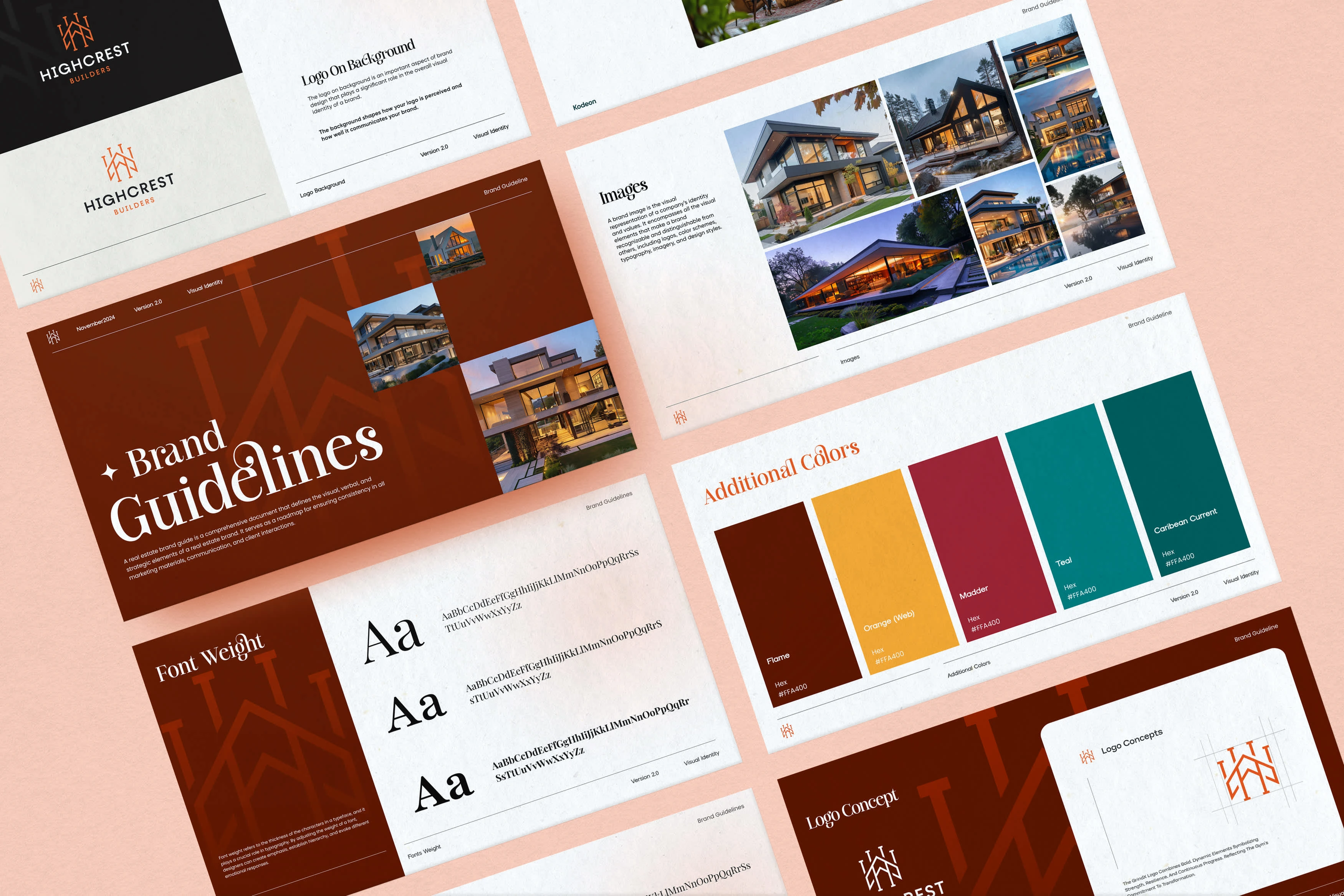
Highcrest Branding
Elevating sophistication and timeless elegance, Highcrest stands as a beacon of luxury in the real estate market. The brand guidelines are meticulously crafted to reflect this prestige, using a rich palette of deep brown, maroon, warm yellow, and refined shades of green. These colors together evoke a sense of heritage, trust, and exclusivity—qualities that resonate deeply with Highcrest’s discerning clientele.
Every aspect of the visual identity, from typography to imagery and iconography, is designed to communicate stability and opulence while maintaining a welcoming warmth. The earthy browns and greens anchor the brand in nature and reliability, while maroon and yellow accents add a touch of regal sophistication and energy. Highcrest’s brand guidelines ensure a consistent, luxurious experience across all touchpoints, reinforcing its reputation as a leader in premium real estate and a symbol of unparalleled quality.
Like this project
Posted May 22, 2025
I’ve helped lifestyle, apparel, and real estate brands tell their stories with memorable, cohesive designs that truly connect with their audience.