Designing a fintech app
Anna Issakova

UX/UI design
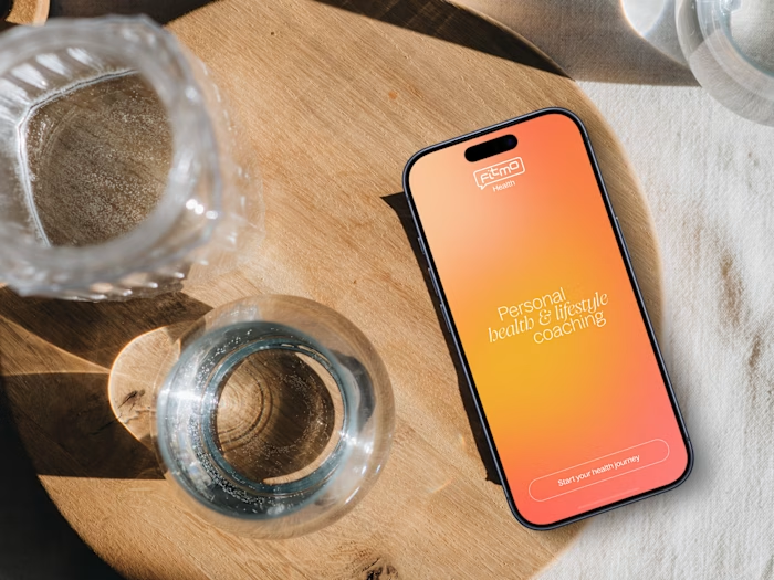
Bica has one mission: simplify your business expenses. It is a mobile app built for entrepreneurs who deal with frequent food and beverage expenses while working outside the office. The Bica card makes it easy to buy anything needed for business and with the adjoined app seamlessly manage, track and control all expenses instantly.
The existing app was outdated and overly complex, built by developers, and required a complete redesign with a fresh, user-friendly interface and a reimagined user experience.
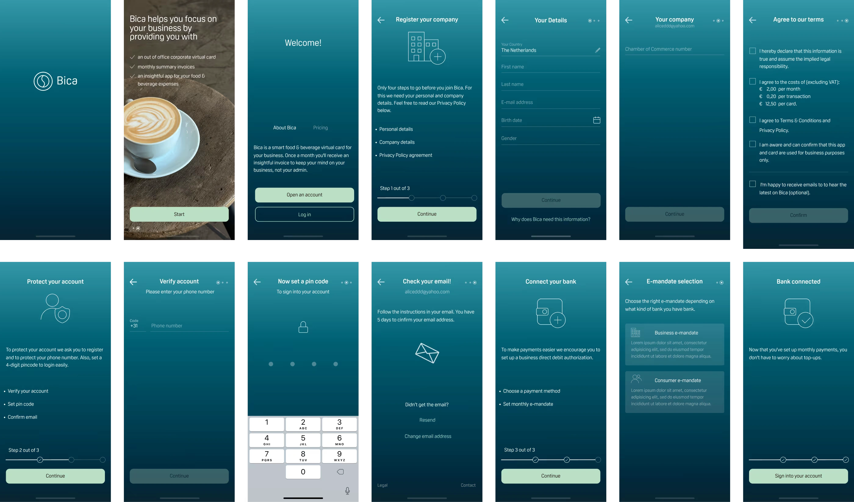
The product relies on financial trust and a smooth onboarding experience, but the initial flows were too complex due to KYC, bank verification, and partner integrations. The challenge was to design a clear and intuitive interface that removed friction, reduced confusion, and helped users understand how the overdraft model works from day one.

The onboarding and user flows had to be completely reworked due to new laws and financial regulations. Together with the team—and closely with our finance specialist—we mapped out the full set of user journeys and internal flows. Because this is a financial product, the logic behind overdrafts, limits, invoicing, KYC, and bank connections was pretty complex, so we broke everything down into detailed diagrams and step-by-step scenarios.
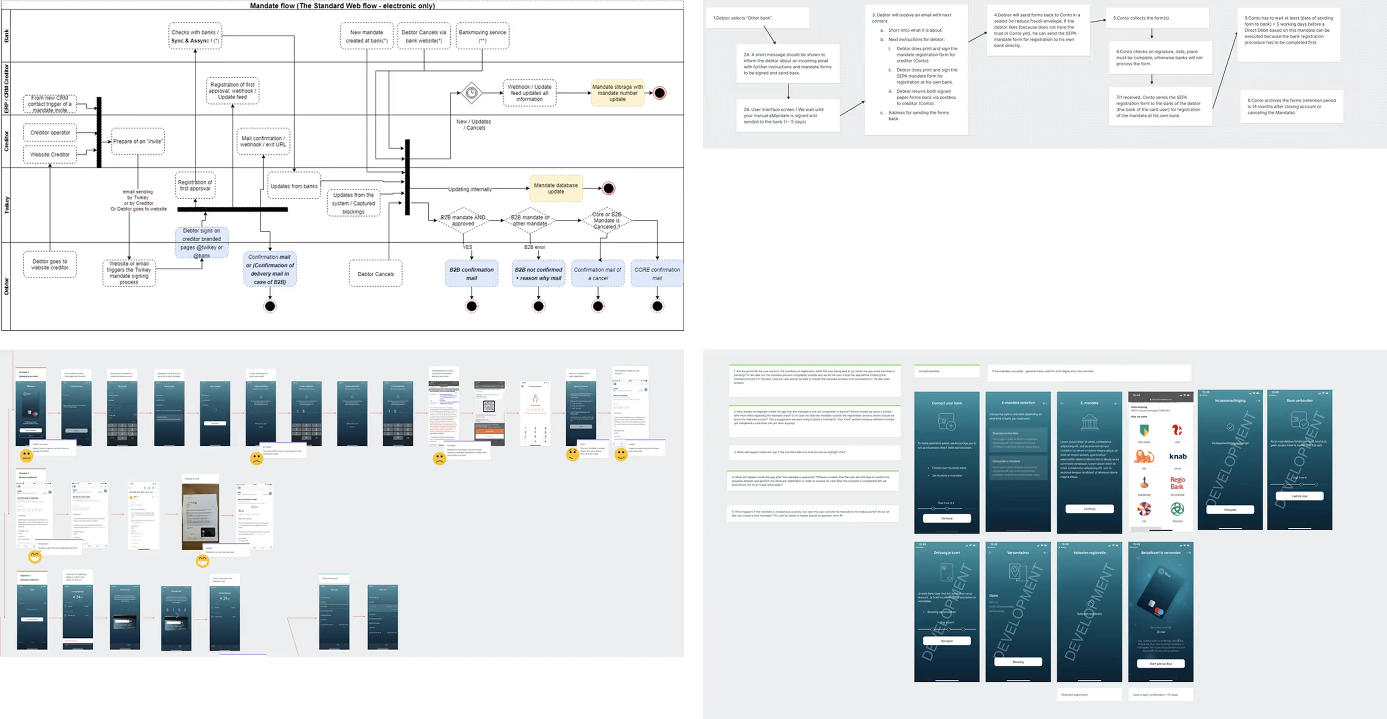
User flows
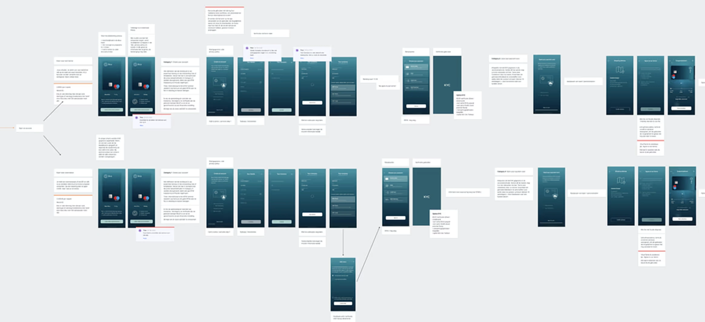
User flows
The visual language needed to reflect security without feeling corporate or heavy. I created a clean, contemporary UI with a bright color palette, crisp typography, and simple layouts.
The onboarding was quite complex due to strict financial regulations, KYC requirements, and multiple verification steps. My main challenge was to translate this complexity into an experience that felt simple, clear, and fast for the user. I focused on breaking the process into logical steps, introducing clear progress indicators, and using straightforward layouts and microcopy to guide users through each stage with as little friction as possible.
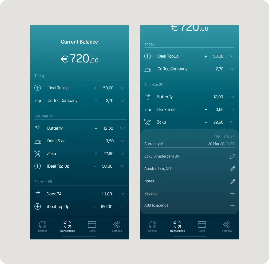
Transactions screen
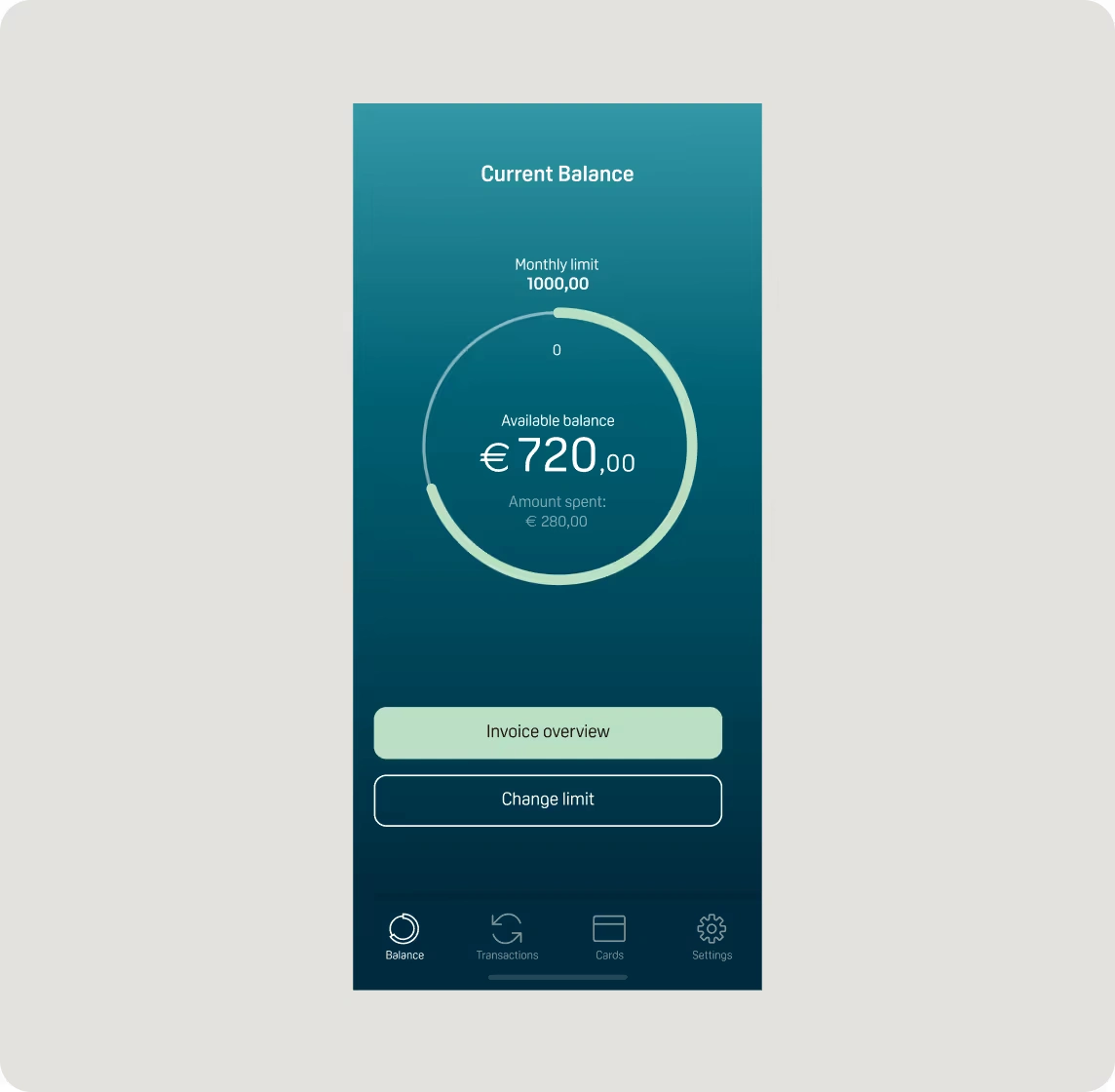
Balance screen
The balance screen gives users an instant overview of their available funds and monthly limit. I designed it to surface the information people check most often—current balance, amount spent, and remaining limit—using a clear visual hierarchy and a simple progress indicator. Frequently used actions, like viewing the invoice overview or changing the limit, are placed front and center to keep everyday financial management quick and effortless.
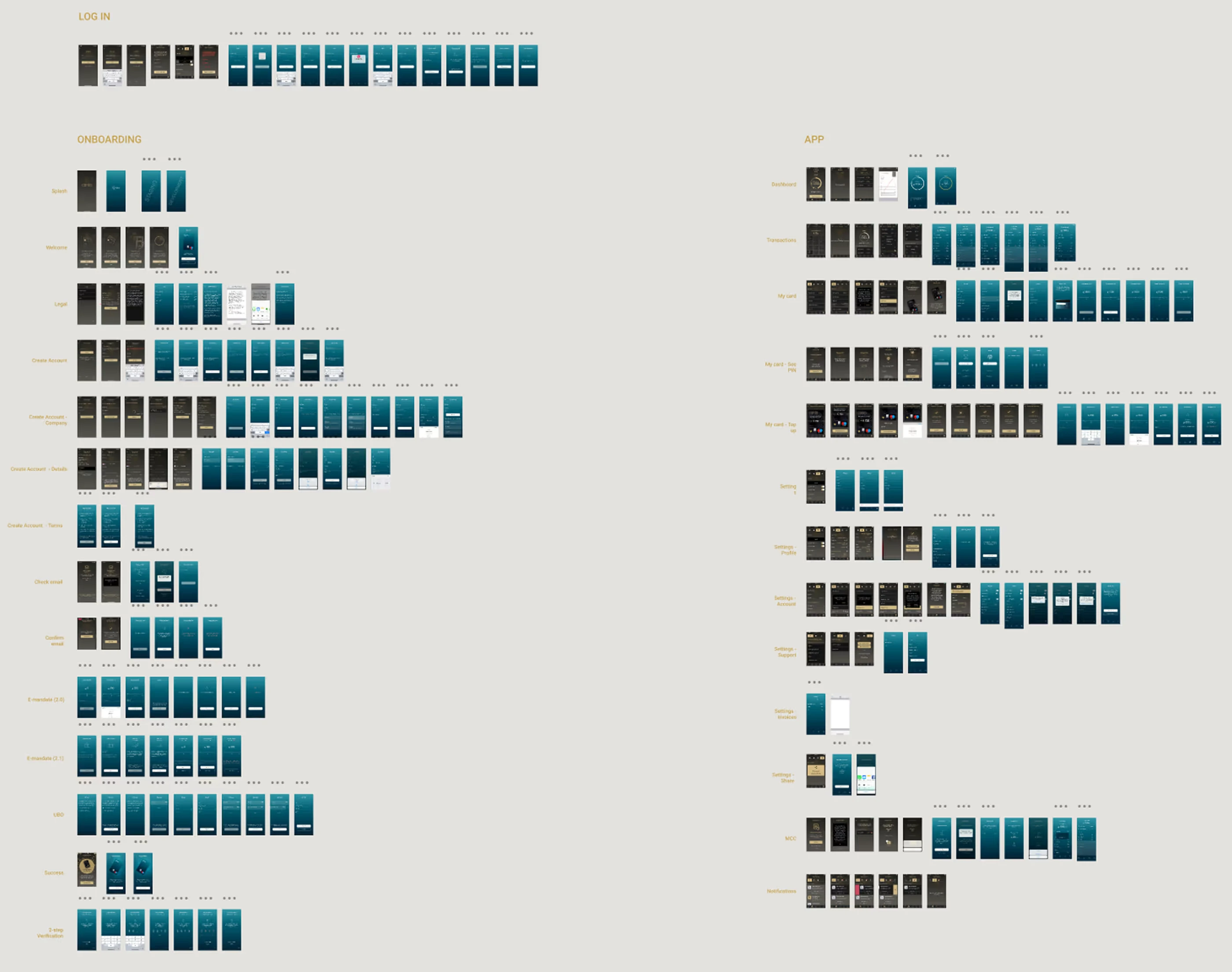
App redesign
Random Act of Kindness (RAOK) is a feature designed to bring a human, emotional layer into an otherwise purely financial product. It allows users to send €2.50 to another Bica user for a coffee—no practical reason, just a simple gesture of appreciation or support. The idea was to encourage generosity, strengthen community, and reflect Bica’s belief that small acts of kindness can have a meaningful impact.
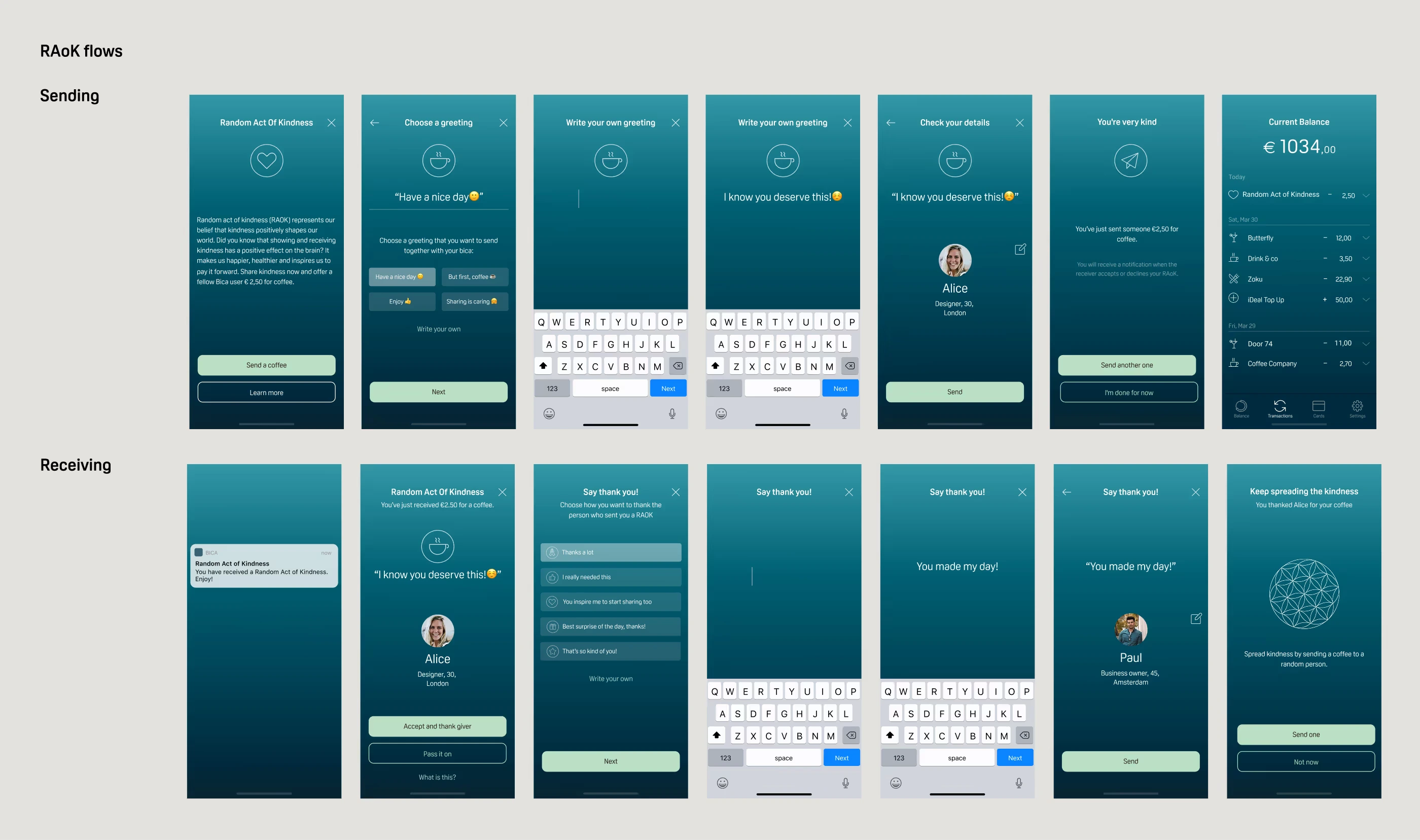
Random Act of Kindness flows
Like this project
Posted Feb 5, 2026
Designing a fintech app to help entrepreneurs manage and simplify everyday business expenses.