Contra Connect App | Branding
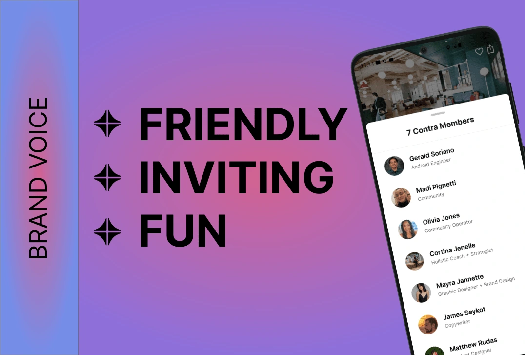
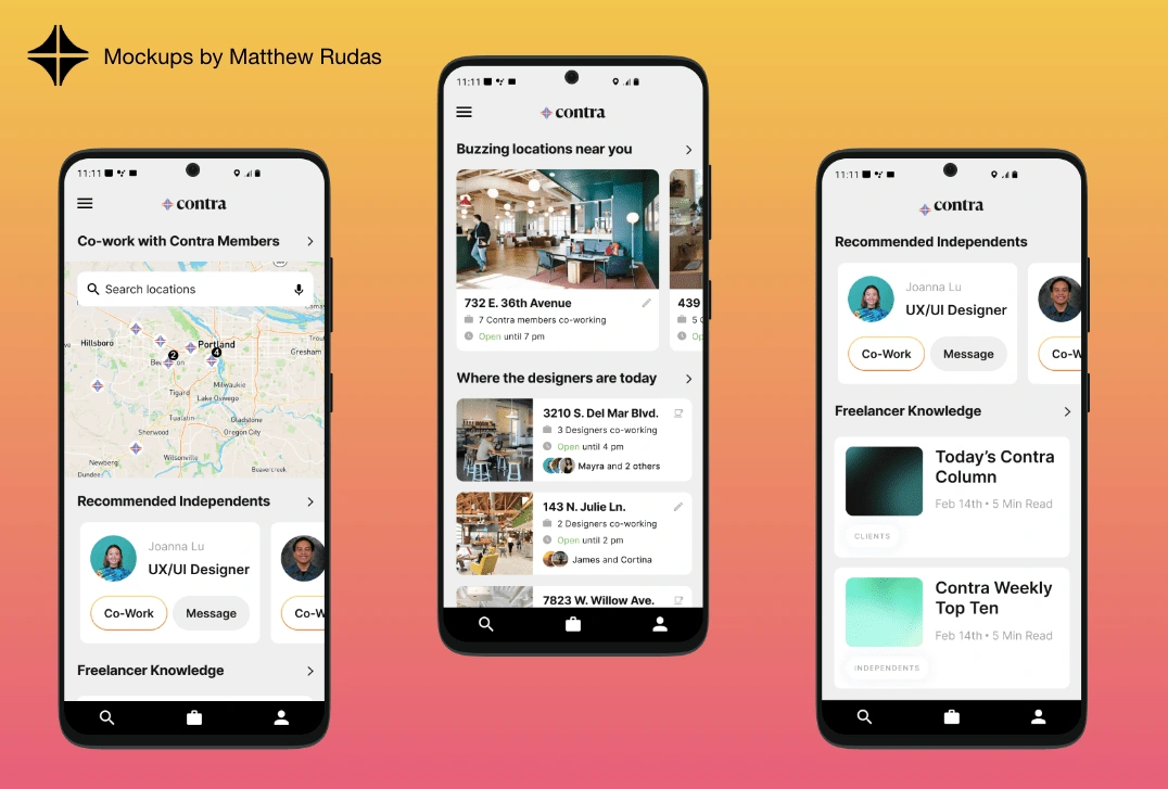
Contra Connect is an app designed for Contra users to connect, communicate, and collaborate with each other. Contrans have the ability to cowork offline and find local places to meet up. Contra Connect is all about uniting the community and bringing them together with an easy to use platform.
The Team and Their Roles:
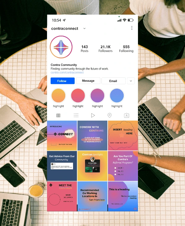
I was a Brand Designer in this project. I definitely wanted to keep Contra Connect similar to Contra's branding both in identity and across social media. I decided to keep the heavy use of gradients, but used a softer and brighter color palette to reflect the welcoming personality Contra Connect has. For contrast, I stuck with a clean and crisp Sans Serif font for the primary logo, which also happens to be the main type Contra uses in their branding as well.

Like this project
Posted Feb 21, 2022
Contra Connect is an app designed for Contra users to connect, communicate, and collaborate with each other.
Likes
0
Views
73
