Brand Identity for BIWON Fine Dining
M MIN
Started this from a crowdsourcing brief and kept going as a personal study. Solo, 3–4 days.
Branding for a contemporary Korean fine-dining restaurant. The visual code for Korean fine dining sits in a tight pool — black backgrounds, gold wordmarks, hanja calligraphy, dancheong motifs. The shorthand is premium Korean = heavy and ornate. Getting out of that pool was rule one.
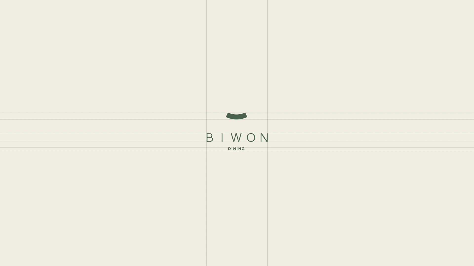
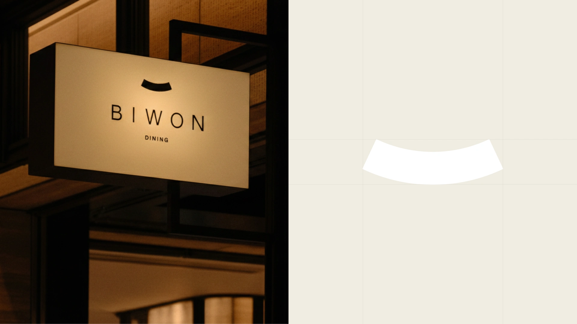
I went the opposite way. Not opulence, but the stillness of a garden. The name already pointed there — BIWON (비원 / 秘苑), the Hidden Garden of Changdeokgung Palace. The royal family's private garden — architecture quietly placed inside nature. I wanted to carry that exact register into the brand's visual language. The symbol is one small green arc. The cross-section of a Korean ceramic mouth, the curve of a hanok eave, the roof of a small pavilion inside a garden — abstracted so a single shape reads as several Korean forms at once. Set above the wordmark, it becomes a sign that's almost silence.
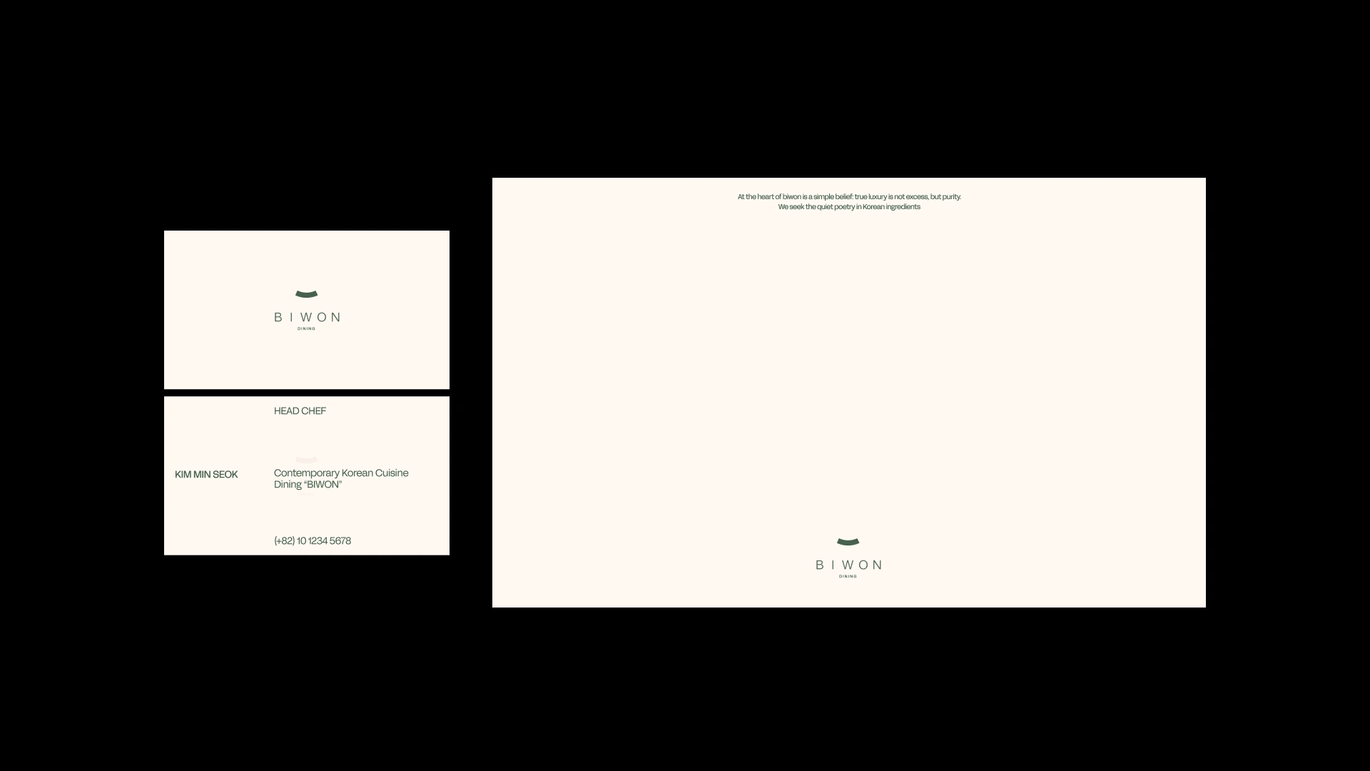
The wordmark B I W O N is a deliberately light sans with wide tracking. The whitespace of Joseon white porcelain — that full-through-being-empty aesthetic — translated into letterspacing. The moment you bold it, premium arrives but garden disappears.
The manifesto reads: "true luxury is not excess, but purity. We seek the quiet poetry in Korean ingredients." What the brand refuses (excess) and what it pursues (purity, quiet poetry) sit inside the same sentence.
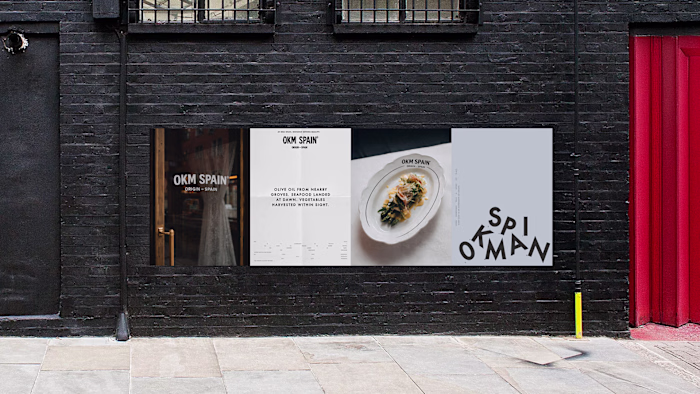
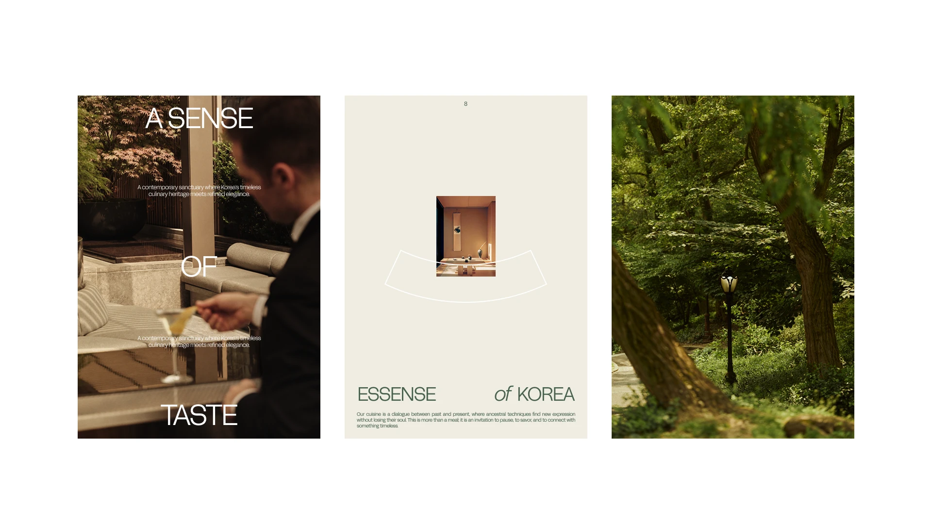
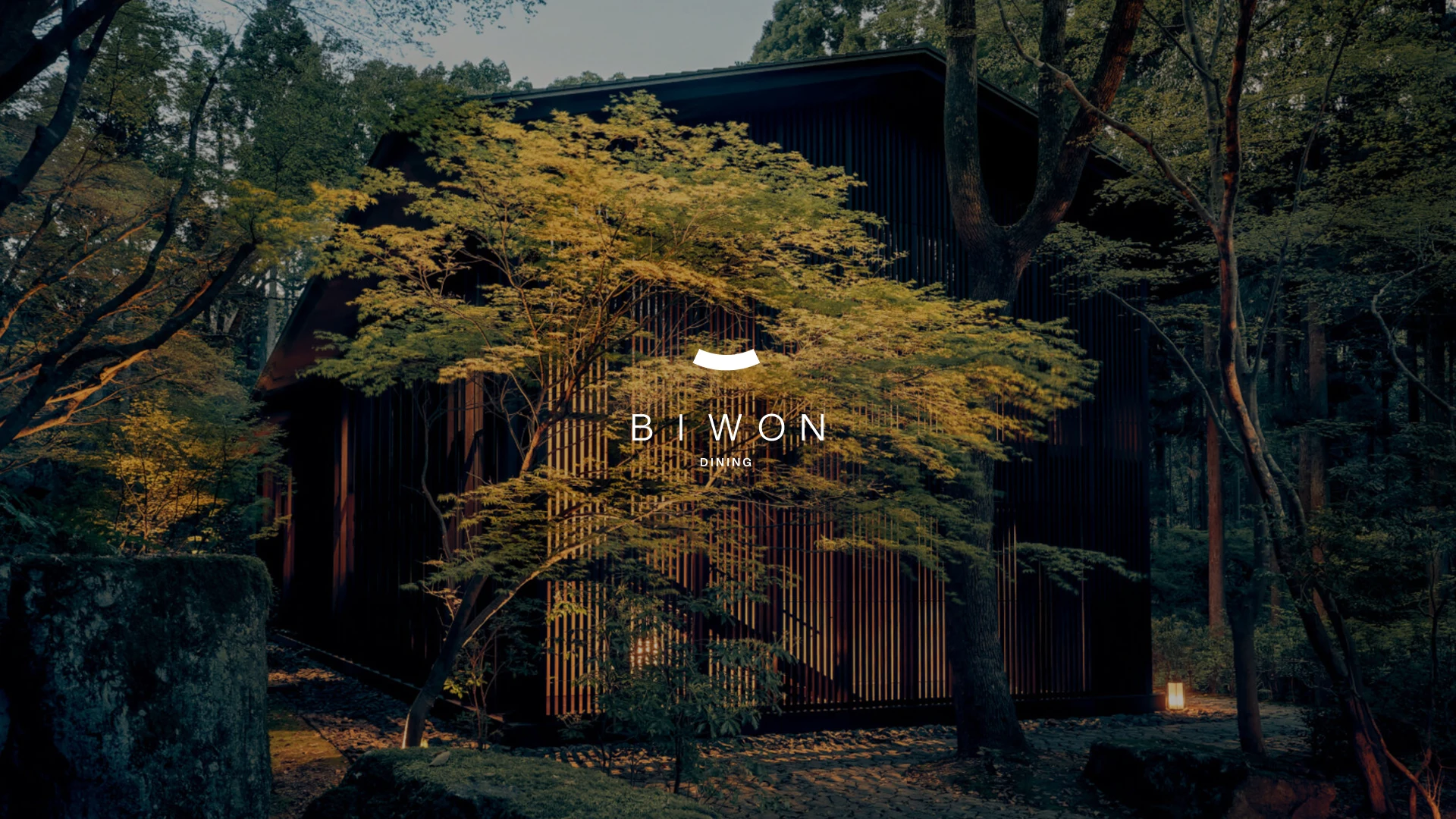
Applications: exterior signage, business cards, letterhead, editorial spread, exterior key visual. My favorite is the key visual — a hanok-modern building tucked into a maple forest, with the wordmark placed almost invisibly small. That restraint holds everything BIWON is in a single frame.
Like this project
Posted May 6, 2026
Developed branding for a contemporary Korean fine-dining restaurant emphasizing simplicity and subtlety.
Likes
0
Views
5