LUV Brand Identity Design
M MIN
Started this from a crowdsourcing brief and kept going as a personal study. Solo, 3–4 days.
Luxury jewelry has a near-mandatory visual language. Serif wordmark, gold, ink black. Build a new brand inside the Cartier / Tiffany / Bulgari code and you instantly become the nth copy. Finding a way out was the first job.
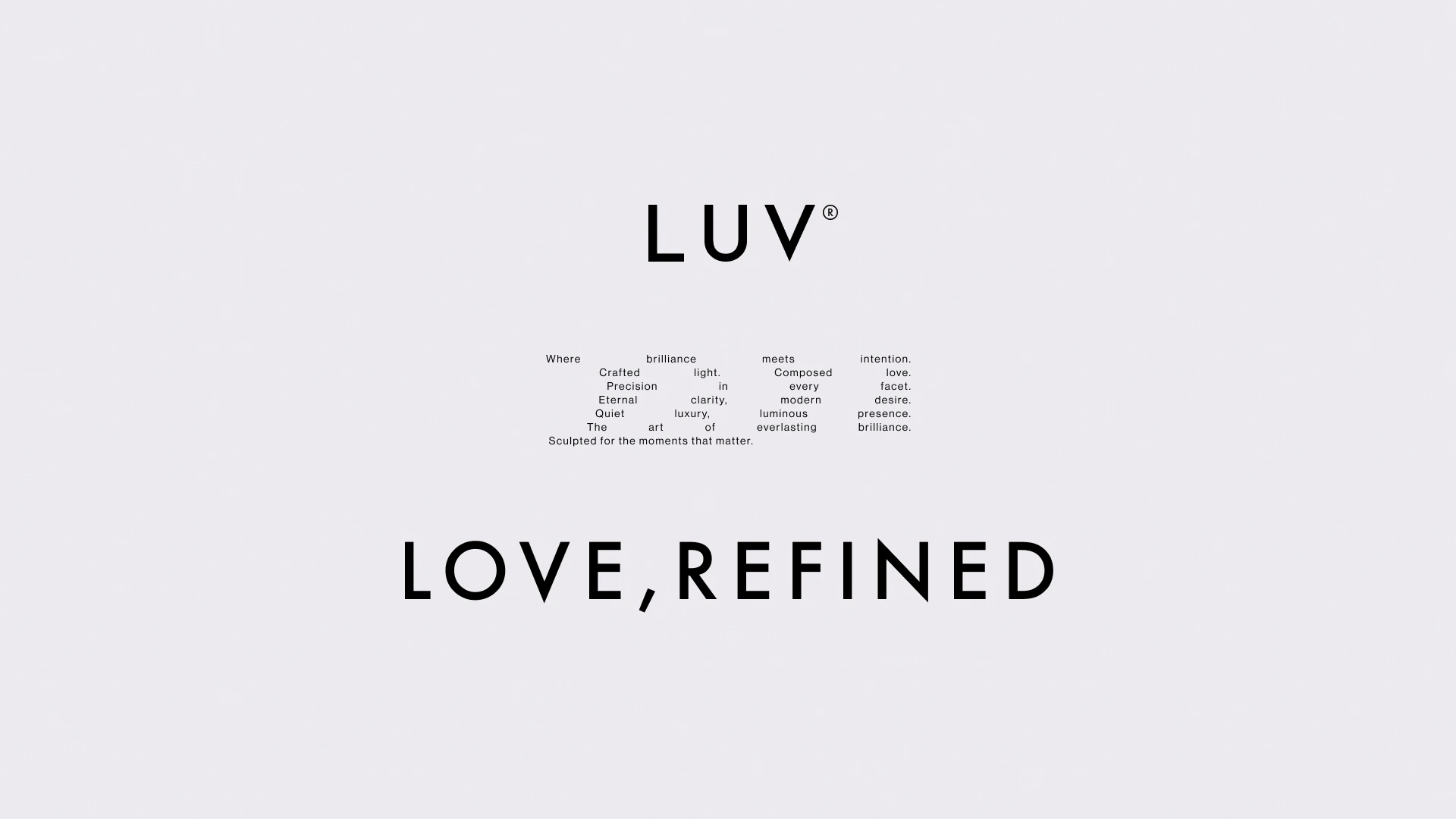
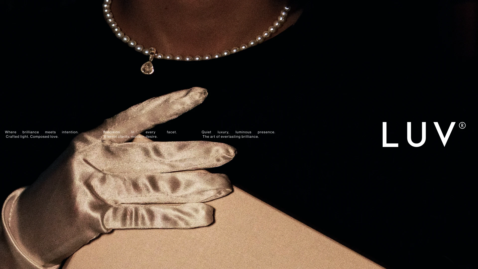
The name carried it. LUV — short for Love, but the first three letters of Luxury read through it too. Short, solid, soft on the tongue. The tagline "LOVE, REFINED" came naturally from there — taking a word as common as love and refining it one step further into luxury.
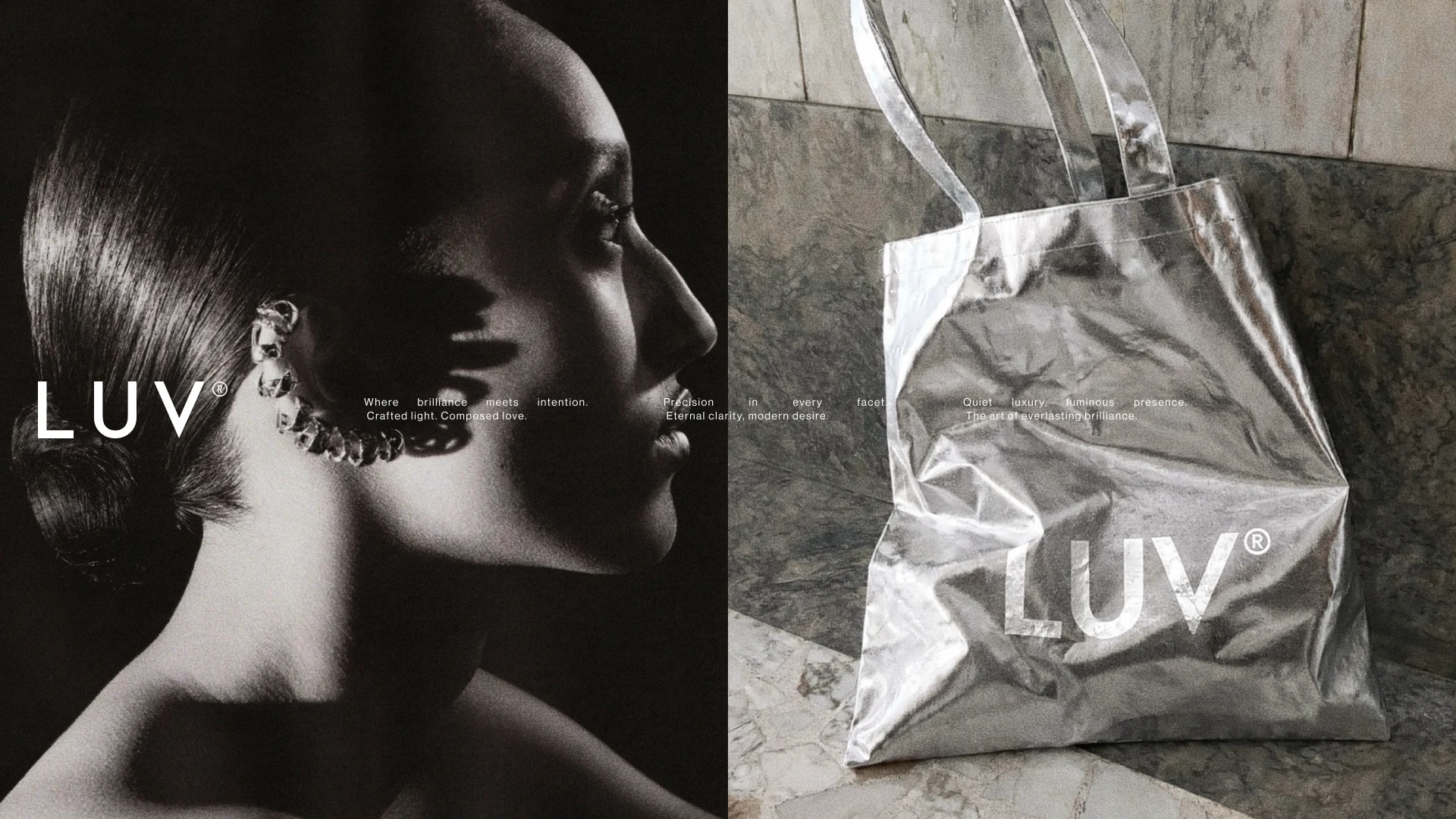
The translucent plastic tote was a small power move. Luxury jewelry brands almost always reach for matte paper, ribbon, embossing — material cues that pre-announce themselves as expensive. The LUV tote does the opposite: cheap-looking plastic, oversized logo, almost industrial. The bet is that confidence reads as luxury more than the material itself does.
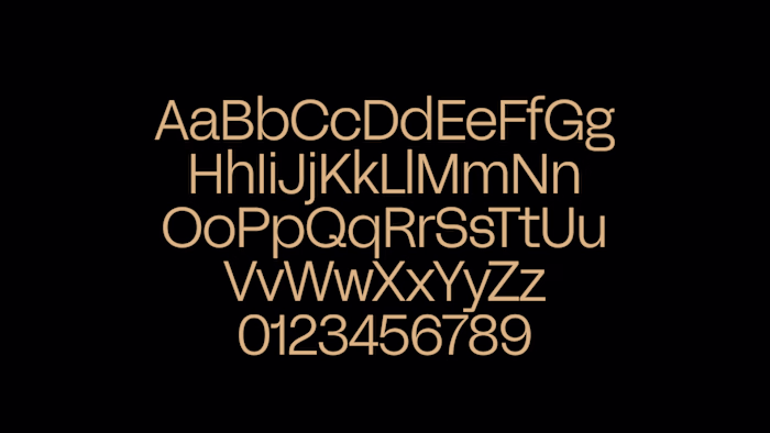
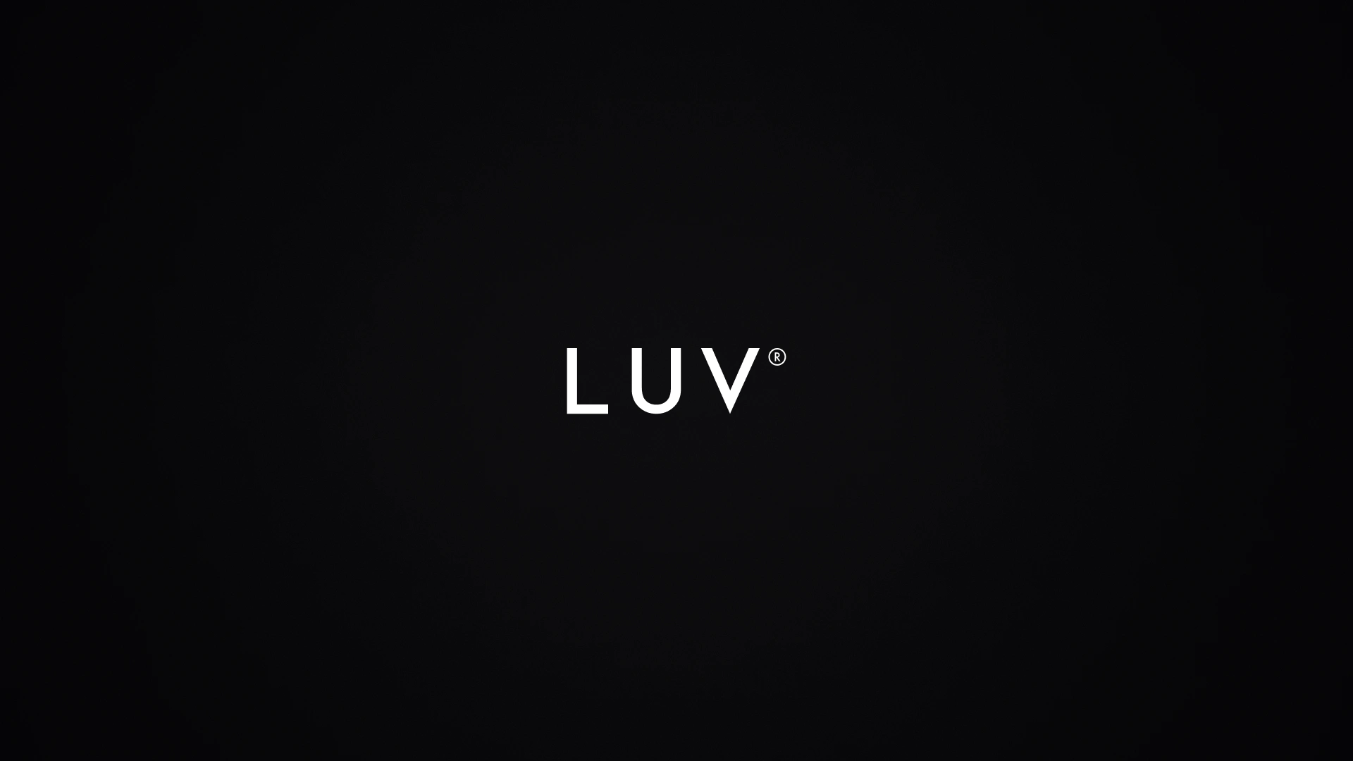
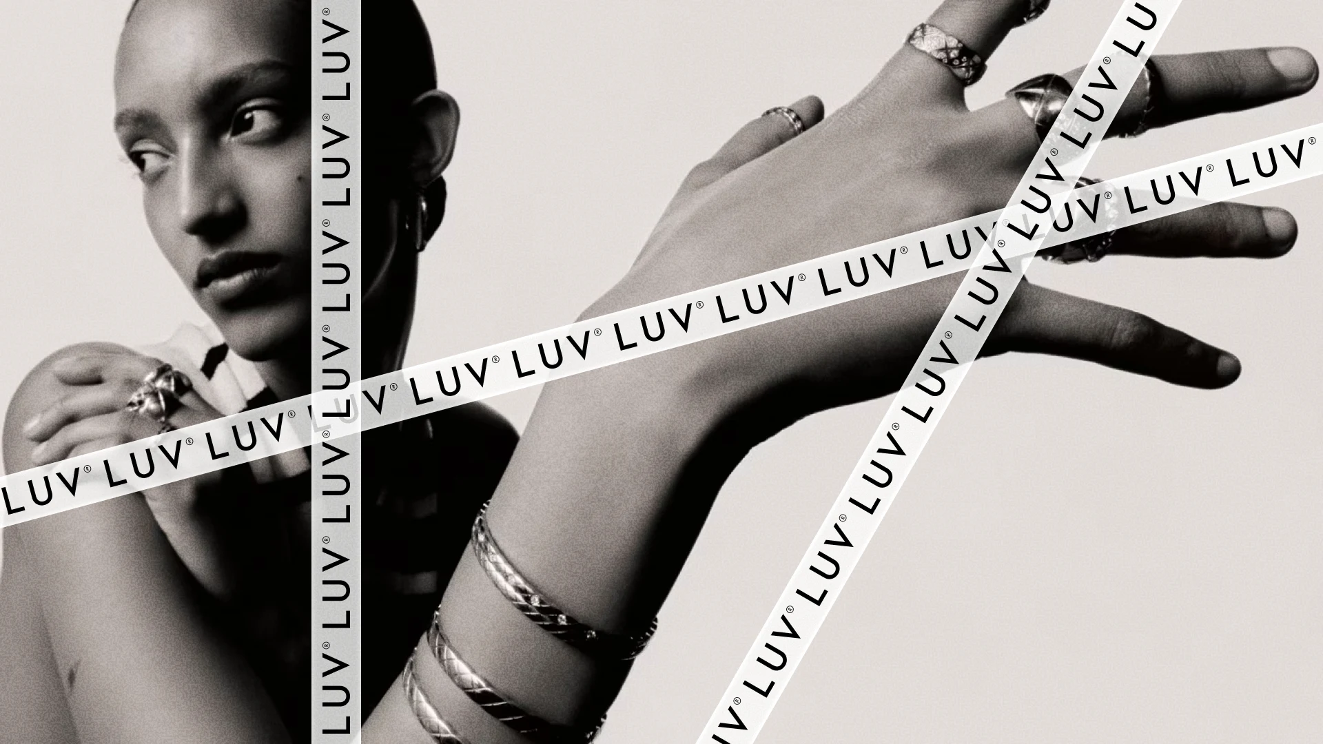
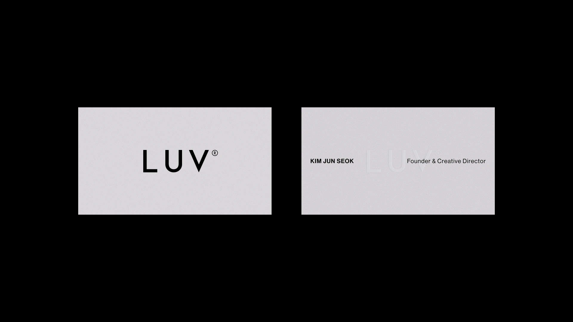
The wordmark is sans-serif on purpose. In a market where 99% of jewelry brands sit in serif, sans-serif is itself a signal of distance. The ® is small but decisive — the smallest possible mark that says this is a real maison.
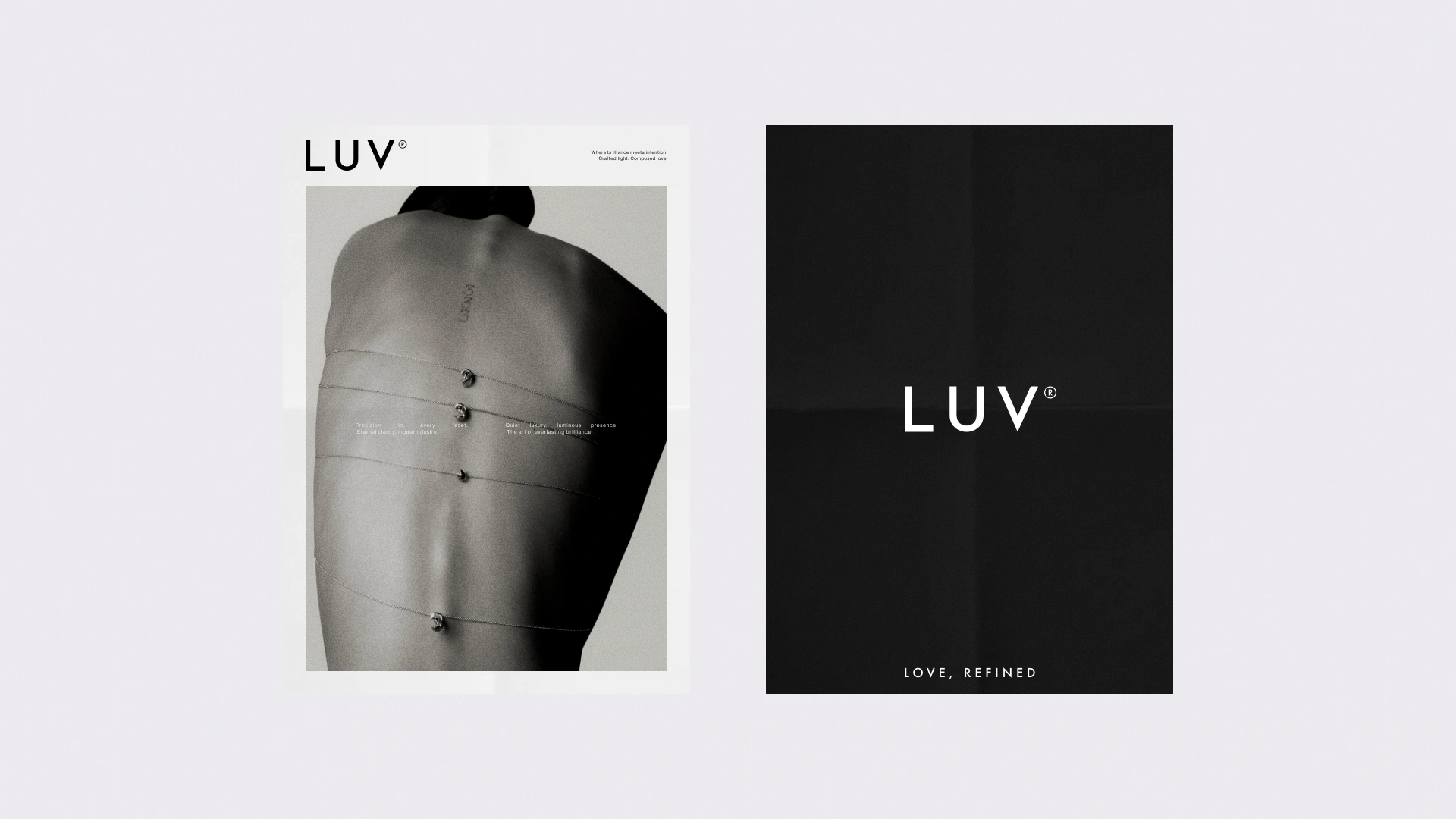
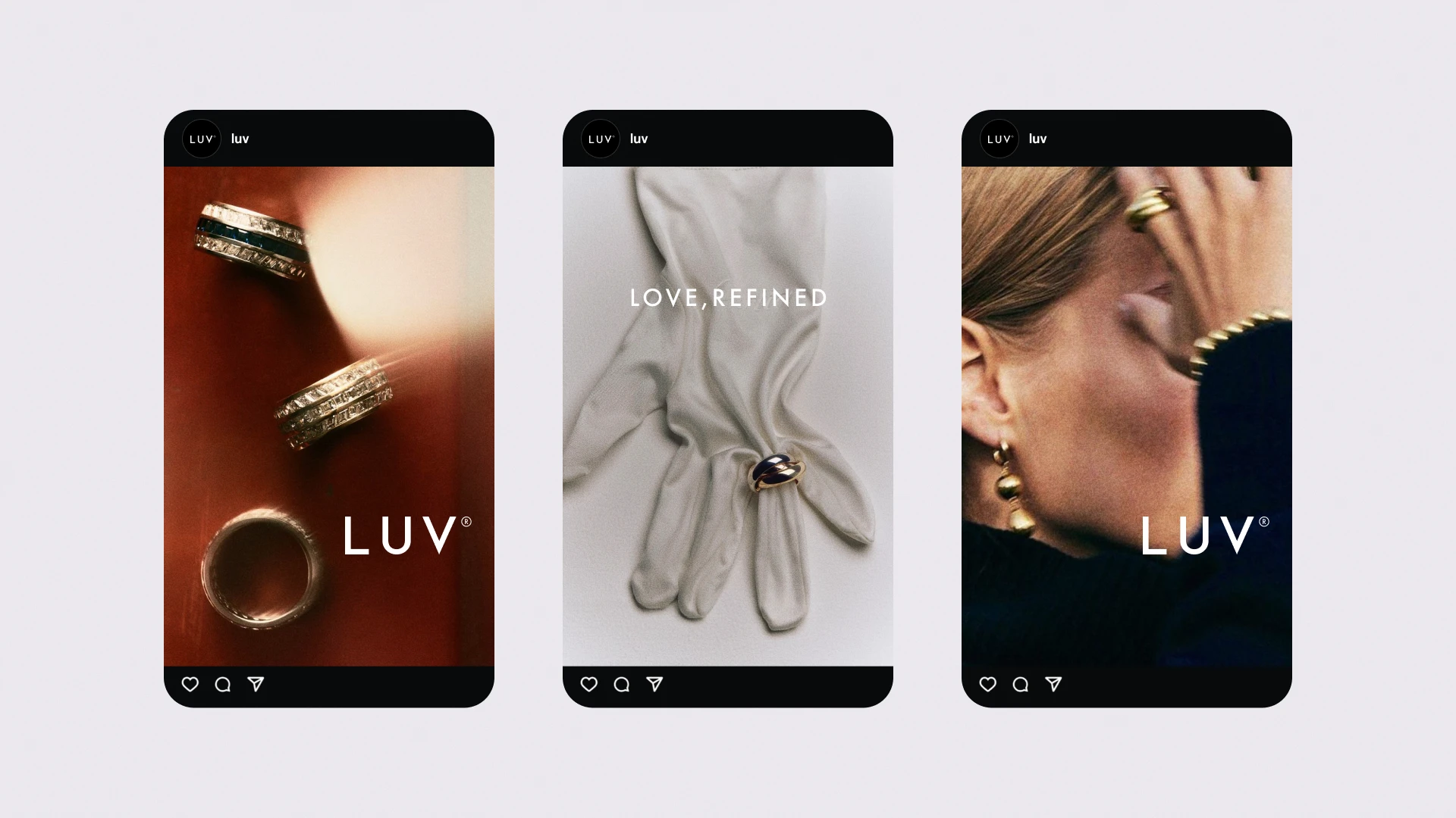
I wrote the brand manifesto copy too. Short words breathing across a grid — the same minimal logic as the wordmark, in language form.
▎ Where brilliance meets intention.
▎ Crafted light, Composed love.
▎ Eternal clarity, modern desire.
▎ Quiet luxury, luminous presence.
The whole system holds together because every part refuses one degree more. One degree more weight, one degree more color, one degree more decoration — and LUV stops being LUV. Refined isn't a finish here, it's a rule.
Like this project
Posted May 6, 2026
Developed a unique brand identity for a luxury jewelry brand using sans-serif typography.