Dataoven Brand Identity Design
M MIN
Started this from a crowdsourcing brief and kept going as a personal study. Solo, 3–4 days.
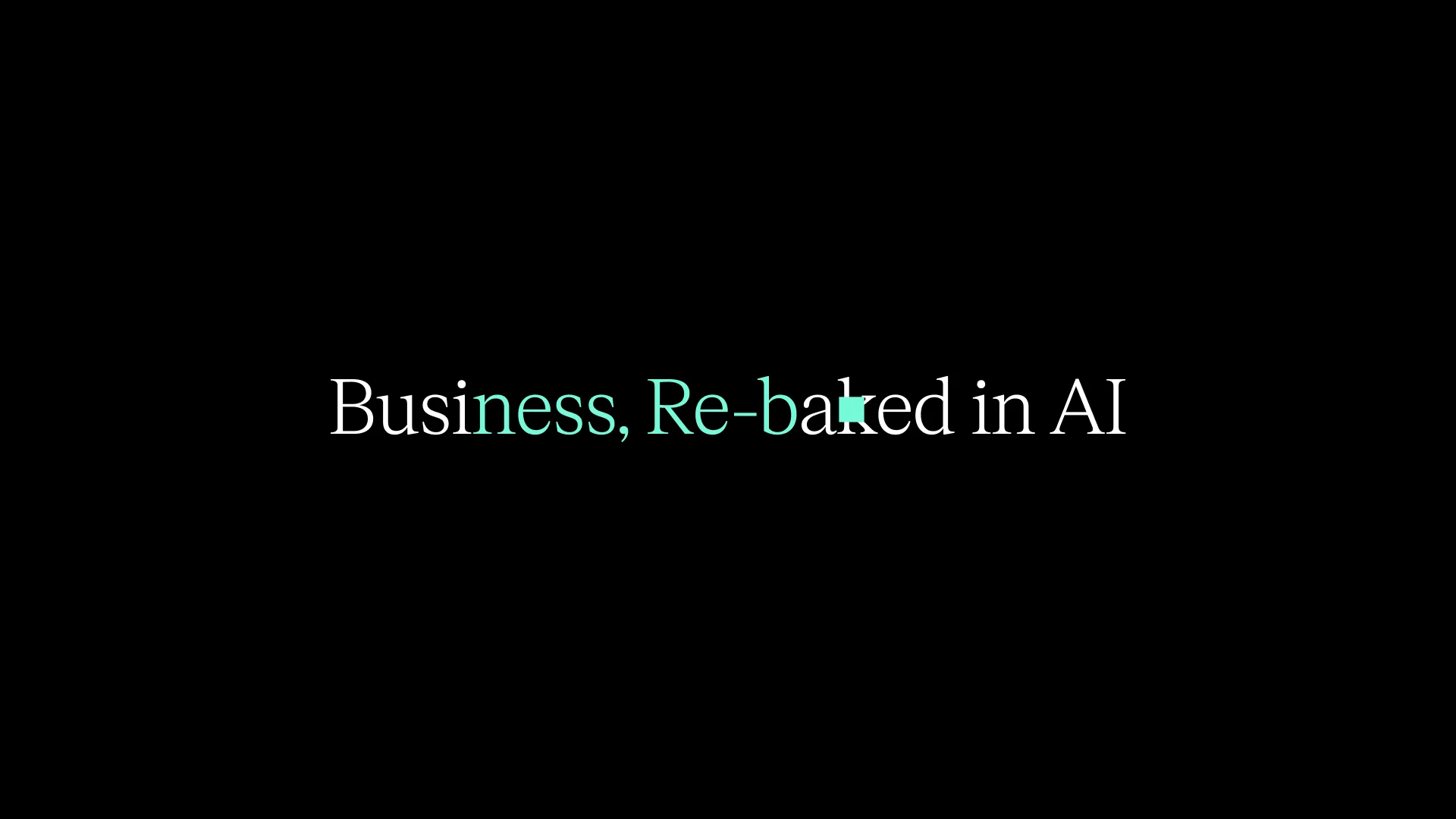
AI brand references all look the same. Purple gradients, sparkles, neural nets. Rule one: get out of that pool. The name did the heavy lifting. Data + Oven — an oven that bakes data. The tagline "Business, Re-baked in AI." came naturally from there. Not bolting AI on as a feature, but re-baking the whole business from scratch.
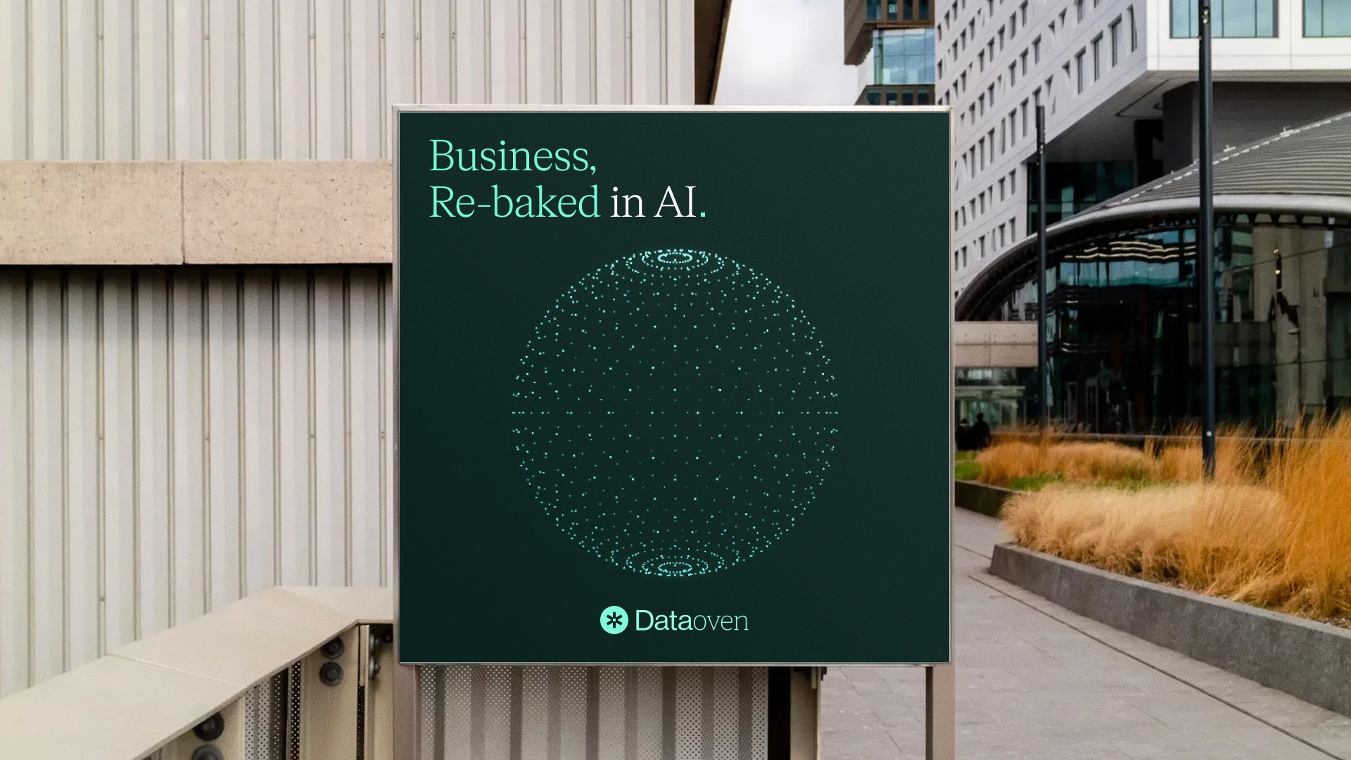
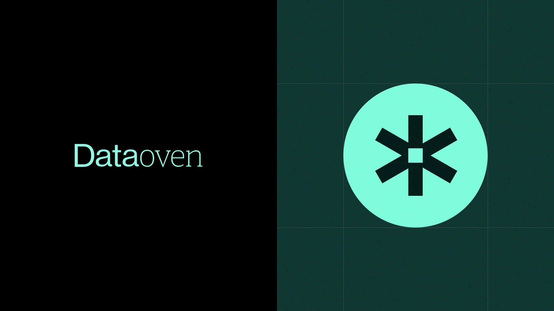
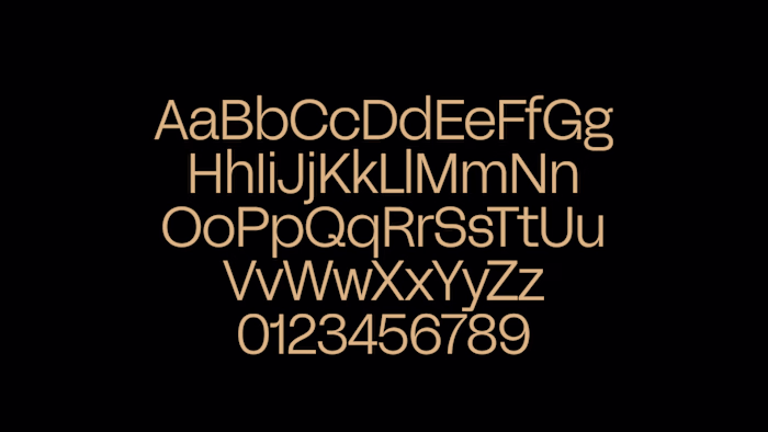
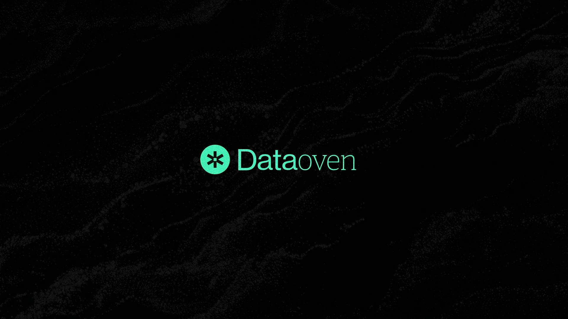
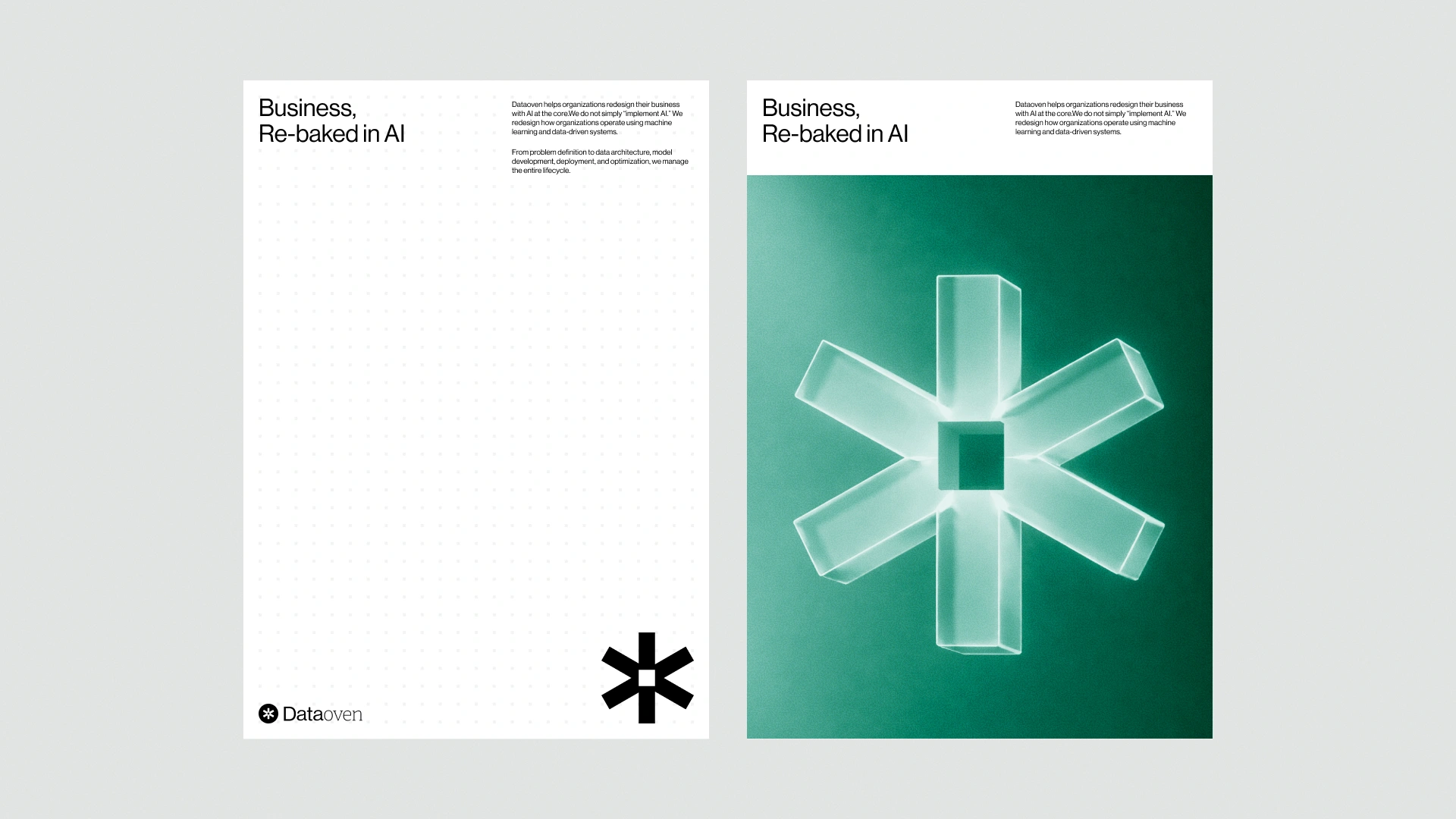
The symbol is an asterisk. I wanted it to read three ways at once — a heating element, a data point, a re-imagined AI sparkle. Built it as a flexible system (solid, dot grid, embossed) so it works differently across media. The wordmark "Dataoven" plays with weight. Data heavy, oven light — data is the substance, oven is the tool, and that hierarchy lives in the letterforms.
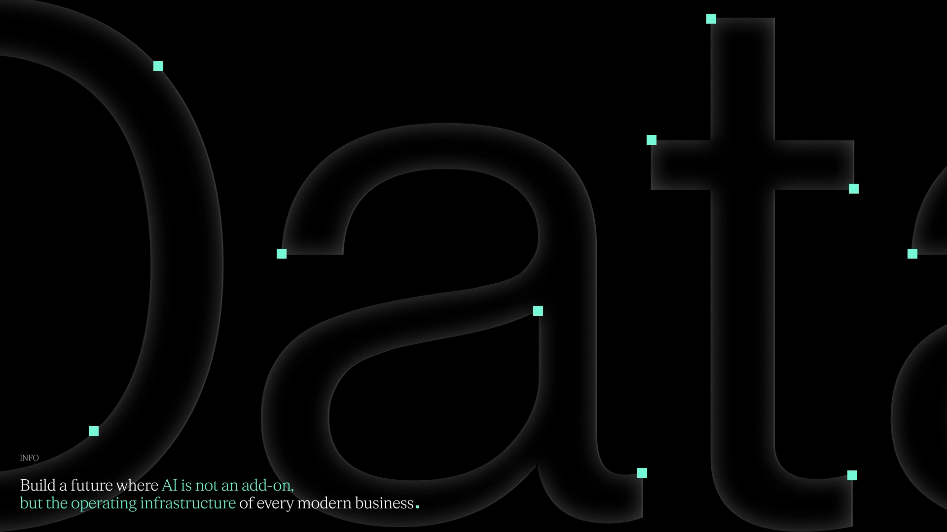
For the tagline I went with a serif. Tech brands rarely go there, but infrastructure carries a kind of weight that sans-serif couldn't quite hold.
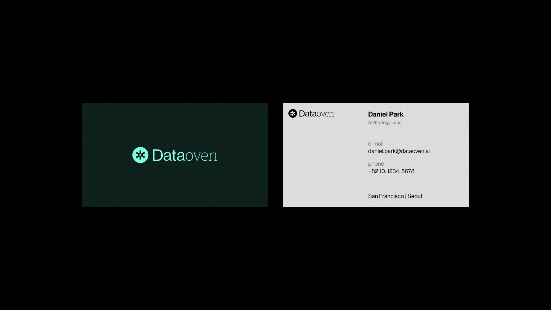
Two colors only — mint and deep black. Mint for the freshness of something just out of the oven, black for the seriousness of B2B infrastructure. I wanted to add an accent and resisted. The moment you do, you get pulled back into the typical AI palette.
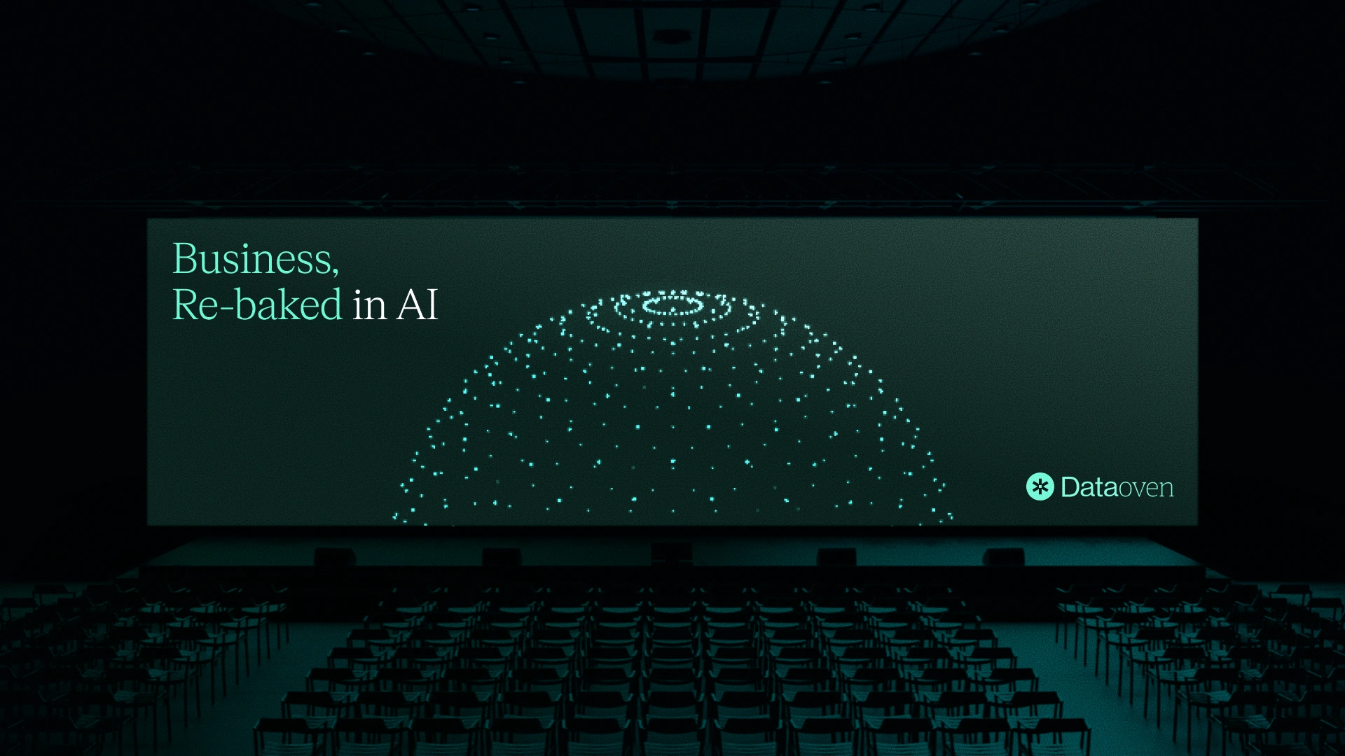
Applications: OOH, business cards, t-shirt, app icon, posters. The dot-grid posters are my favorite — that's where the static logo turns into a dynamic system most clearly.
Like this project
Posted May 6, 2026
Created a distinct brand identity for Dataoven with unique visuals and typography.
Likes
0
Views
4