Aterlab - rebrand
Aterlab
Aterlab - portfolio 2026
With our rebrand, we decided to also change our website - from old one to a completely new concept. This is a case study over our decisions and process.
Design system:
We wanted our website to feel both playful and proffesional, so we used shades of blue.
#292B2C - primary color, very dark blue.
#E3E7E9 - secondary color, light blue, used for buttons.
#EFF3FA - background color, very light blue.
For the font, we used Fustat Semibold and Regular. It looks professional and friendly.
Assets:
To make the website really stand out, we used 3D renders of different rooms made in Blender:
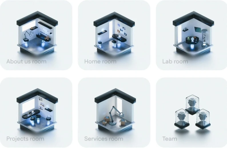
Rooms
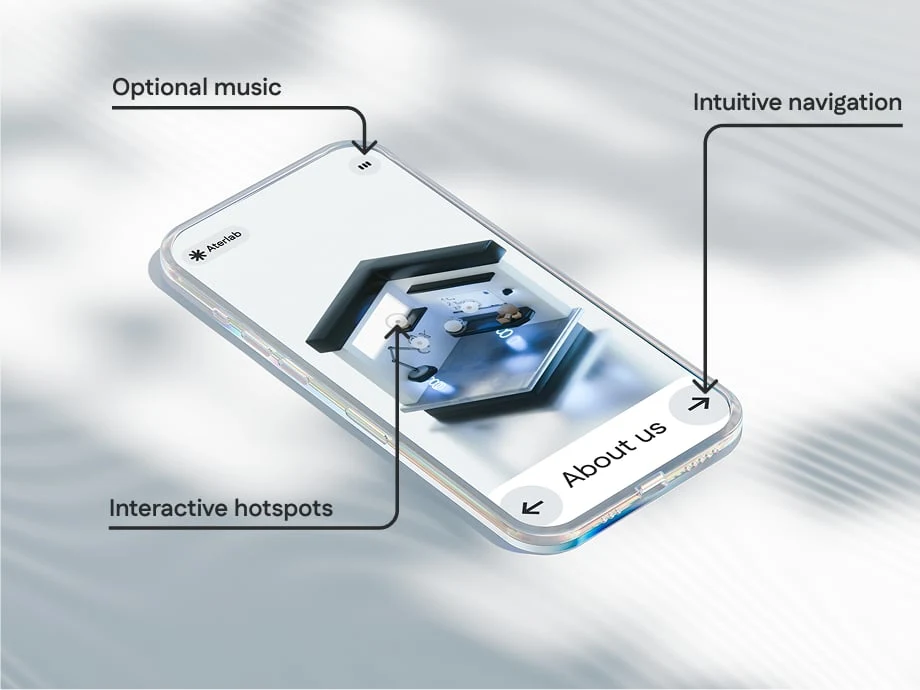
Navigation:
To let the users navigate easily, we added hotspots and arrows, redirecting to different rooms.
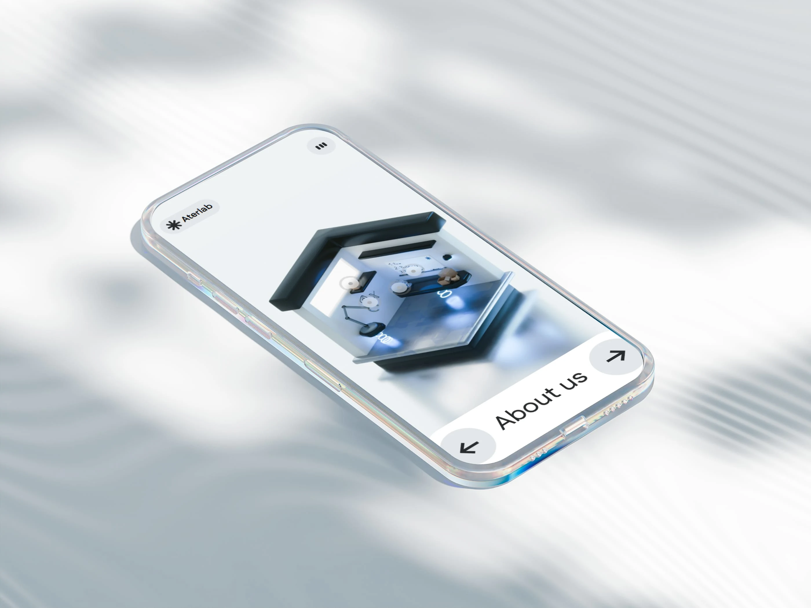
Responsiveness:
On mobile devices, we implemented an app-like navigation on the bottom of the screen, shown on the mobile mockup below.
Mobile layout
Music + sounds:
To bring the experience even further, we added music and click sounds. The music can be disabled in the navigation.
Mockup preview:
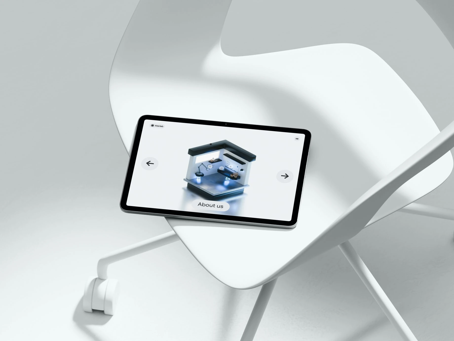
Tablet mockup

Phone mockup
Tools used:
Figma (design)
Blender (3D)
VS Code (development)
Thank you for reading this case study! The new website available soon!
Made by Aterlab,
Mockups by wannathis.one.
Like this project
Posted Jan 5, 2026
Our rebranded website with new design and navigation.