
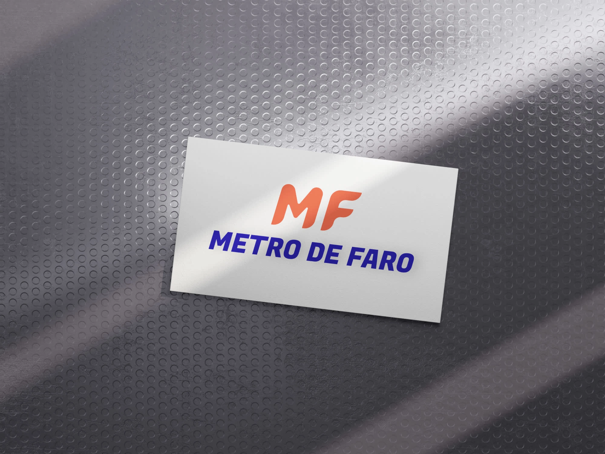
Metro de Faro - logo
In this project, I helped a student to design a logo from generated brief. It wasn't a true paid project, but I helped, with explanation of my choices🙂!The project was easy, but here's the explanation of colour and font choices:
The bold, cursive text represents motion - which matches well to metro. The logo itself is modified version of Fugaz one (regular) - font used in the blue text above.
Red colour was in the first version of the logo, so I used it and slightly modified. Blue colour matches great to the red logo, creating a visual balance and making it more interesting to look at.
More assets I made:
Logo + text: white background
Logo: white background
Text - blue background
Logo + text: yellow background
Mockup version of logo and text
Another mockup, also with logo and text
Used fonts:
📌 Fugaz one (regular)
Used colours:
📌 Yellow - #F9D74E
📌 Blue - #F9D74E
📌 Red - #F96B4E
Used tools:
📌 Figma
📌 Mockups are by Wanna This (awesome mockups, check them out!)
Thank you for visiting ♥️!
Website By Aterlab with ♥️
6 likes · 42 views · May 6, 2025
I helped a student with logo design, and explained my font and colour choices. He was happy with the outcome :)
