Evoflex · Brand Identity & Packaging

Ahmed Chouchene


EVOFLEX
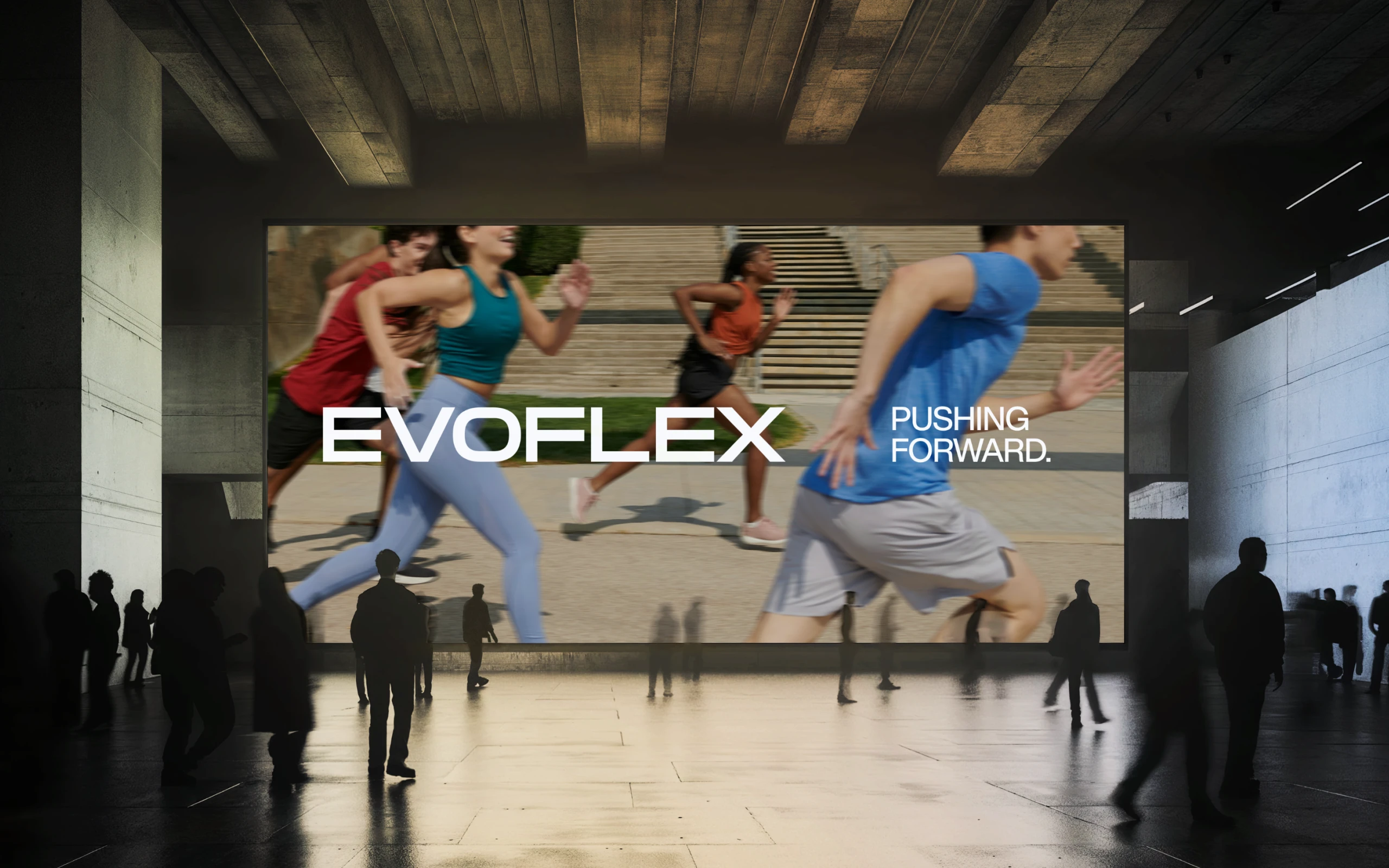
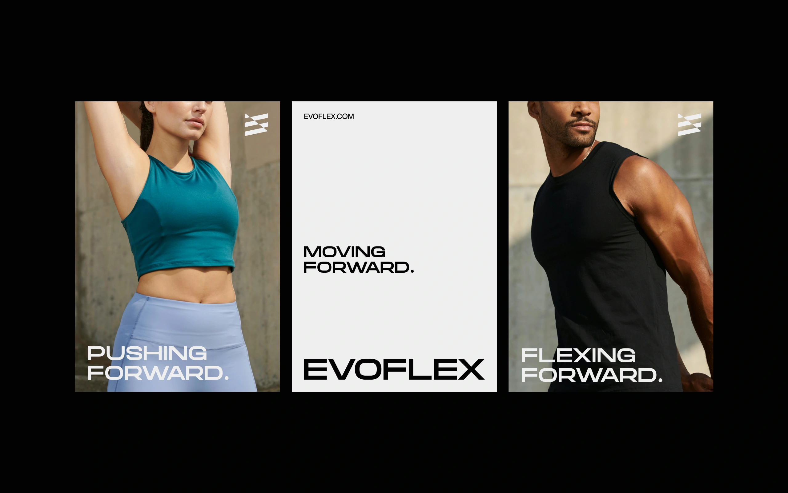
An activewear brand built for people who refuse to stand still. The brand needed an identity with enough rigidity to anchor it and enough intensity to match the product and the people who wear it.
The Approach
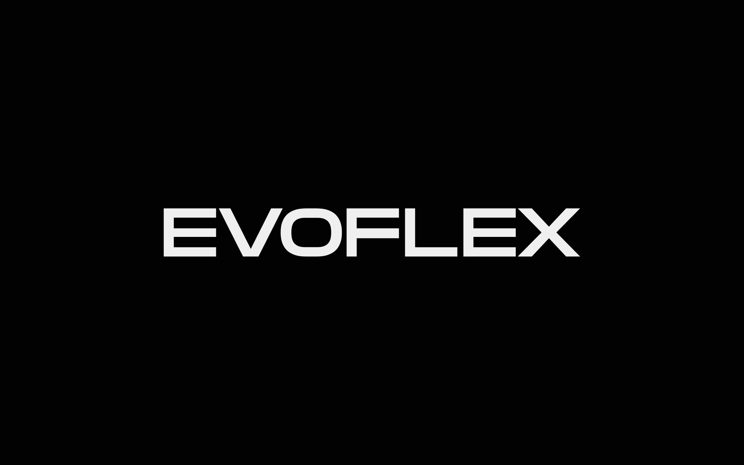
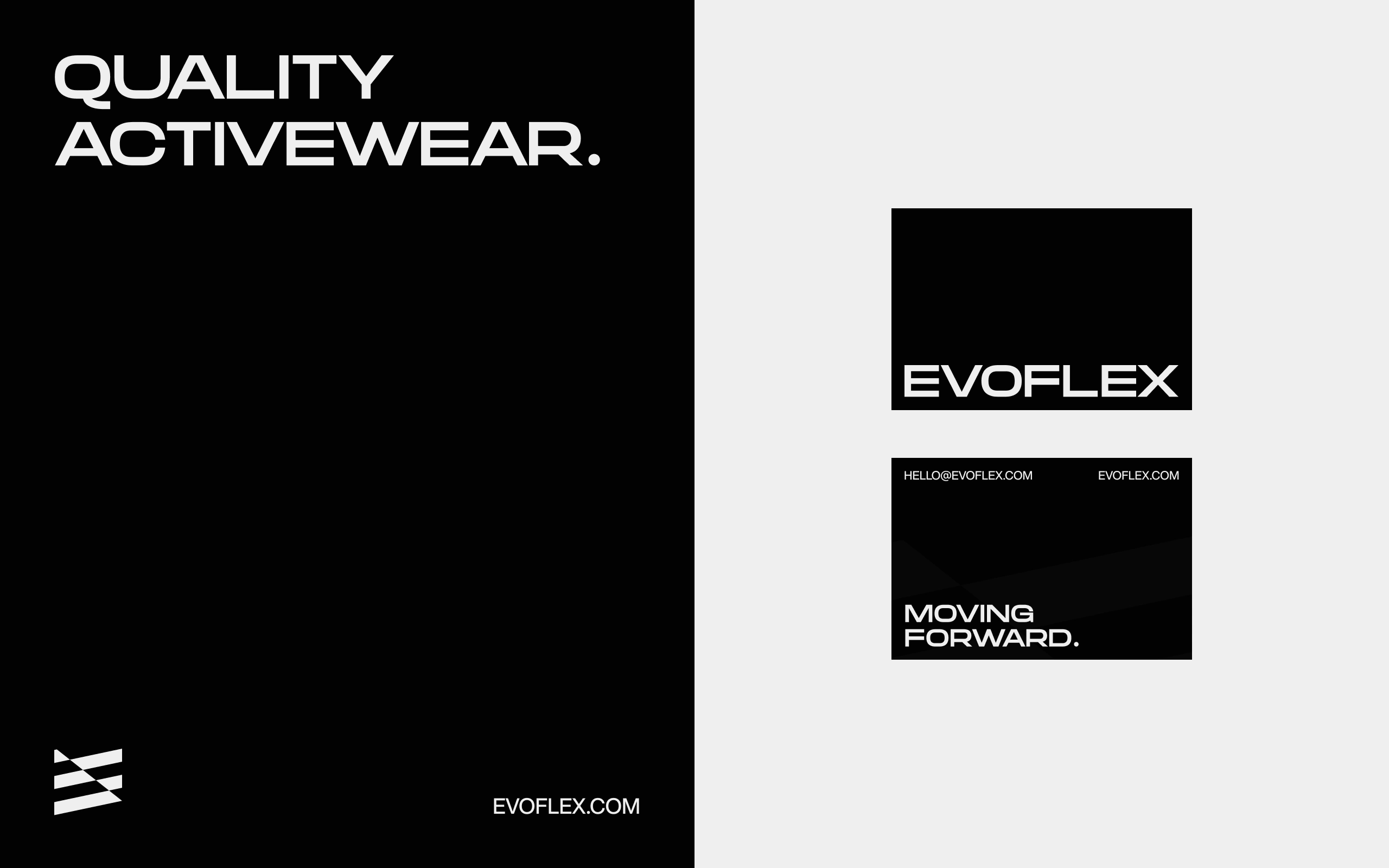
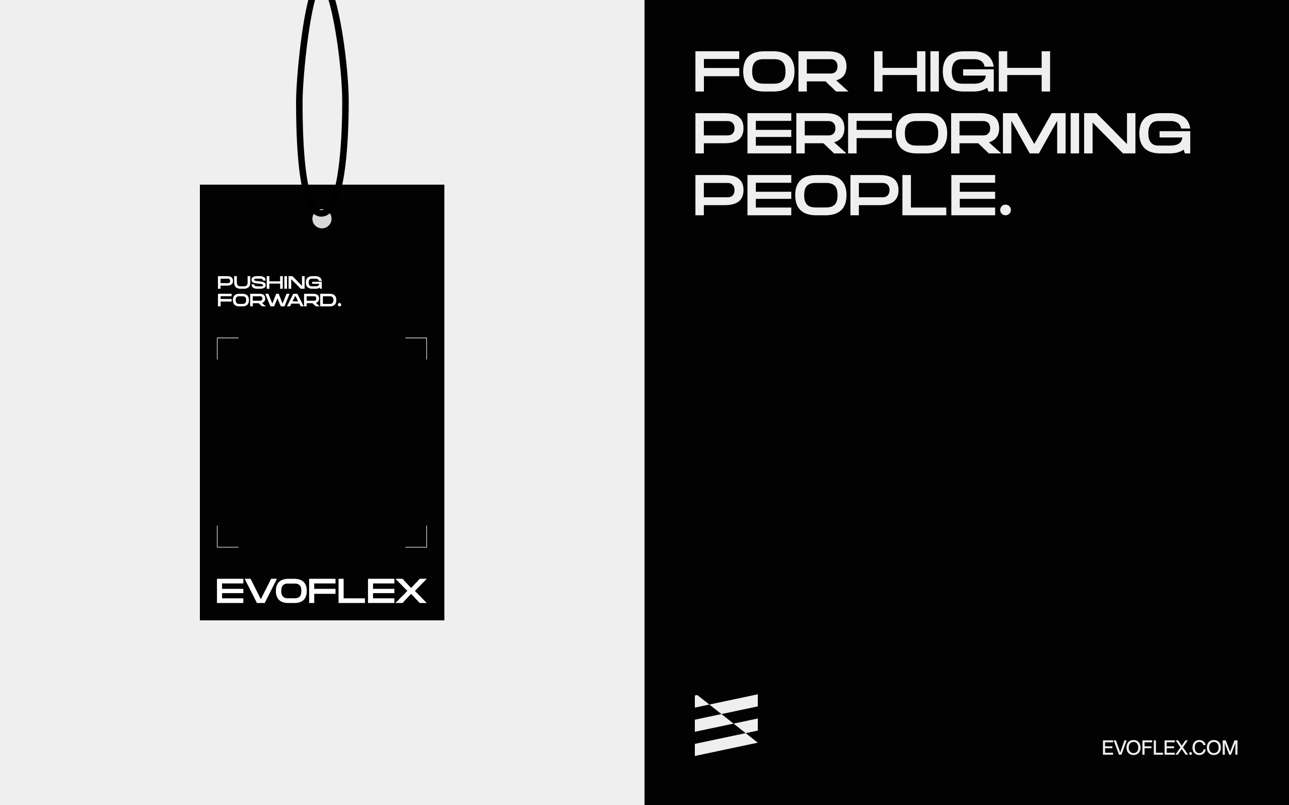
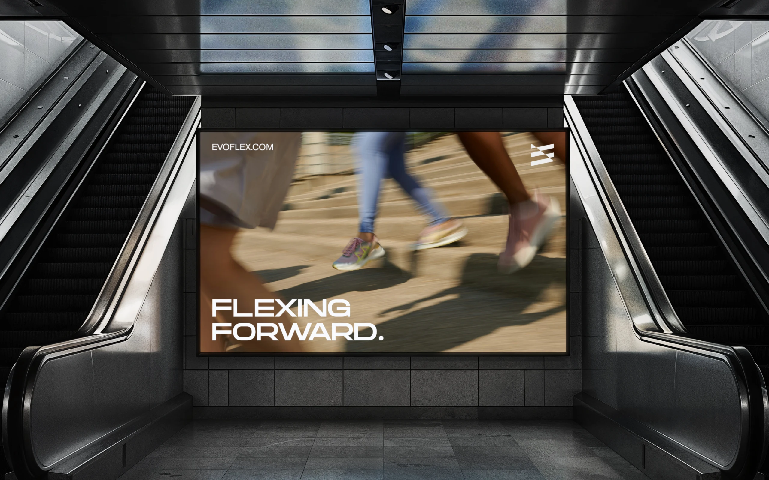
Bold typography, high contrast, and a design language that balances intensity with rigidity. Fast but structured. Every element holds its form without sacrificing versatility across applications.
The System
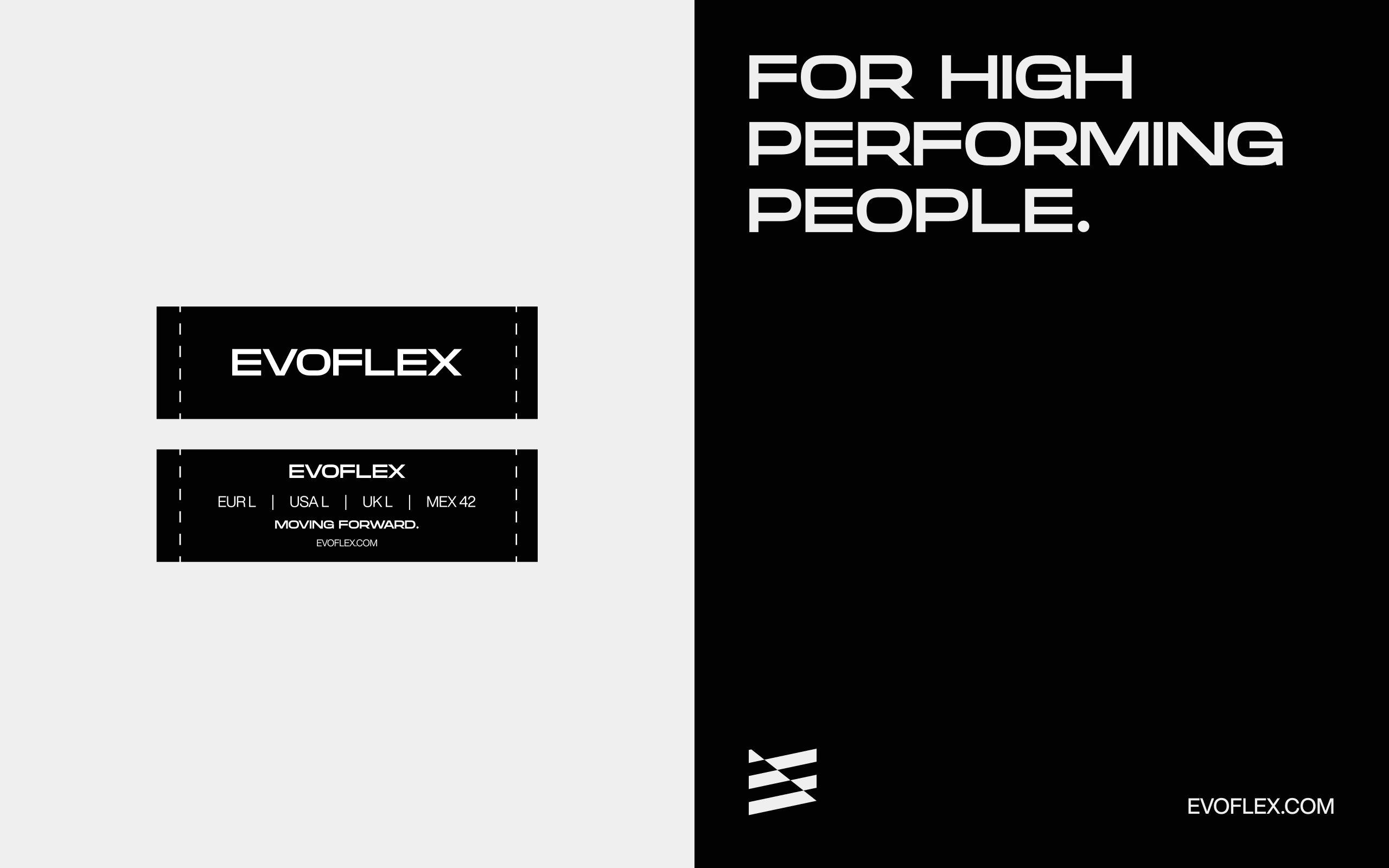
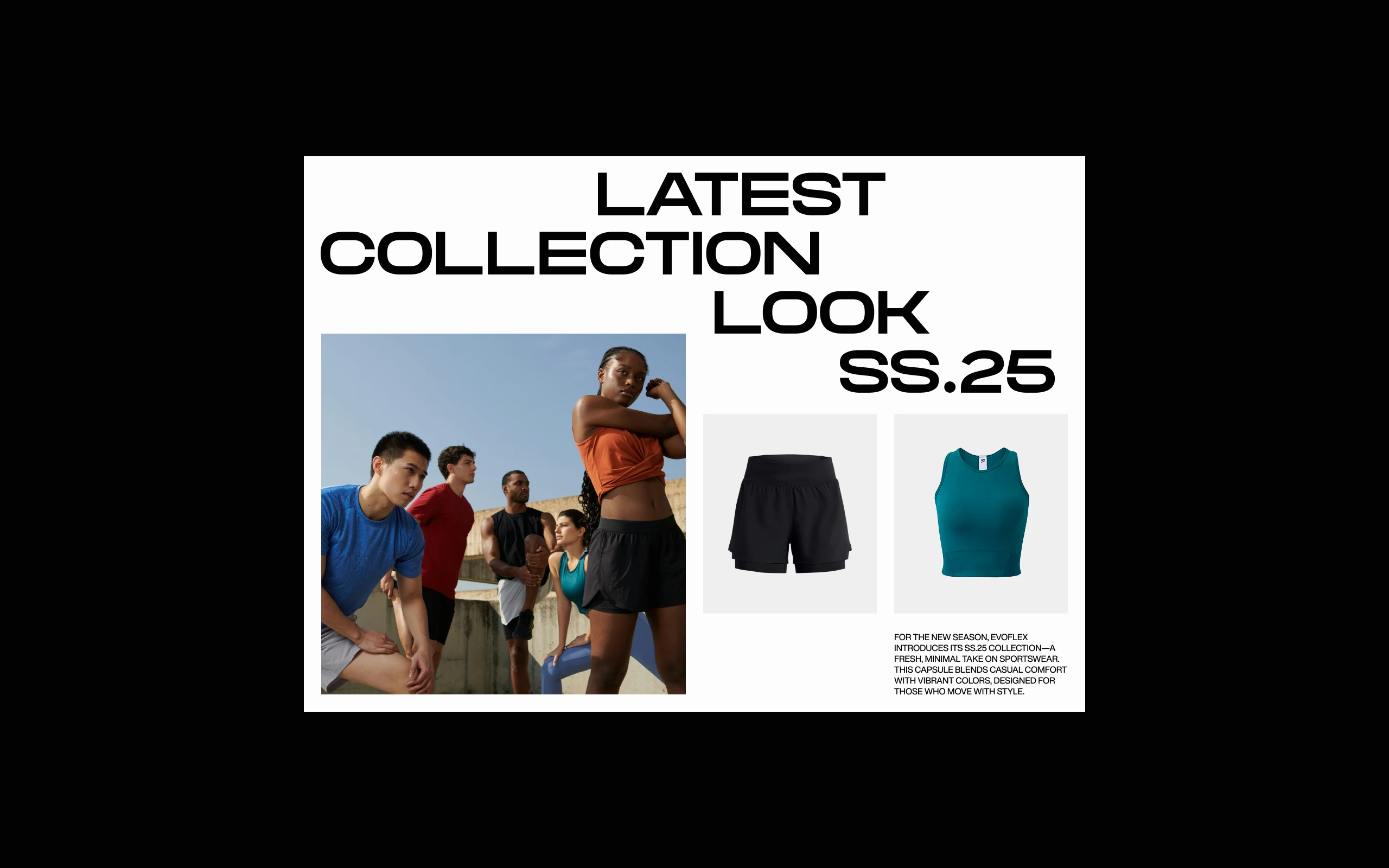
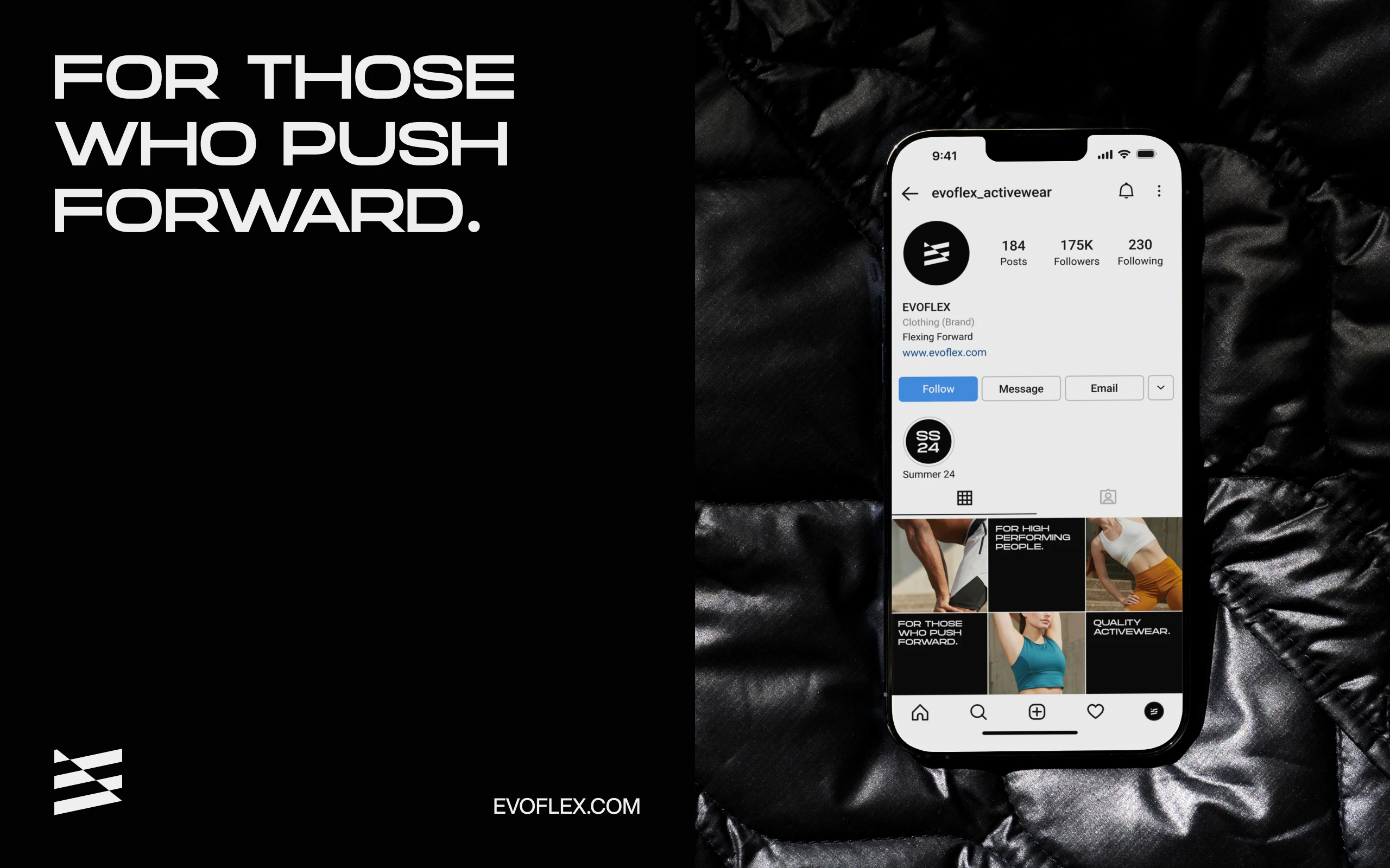
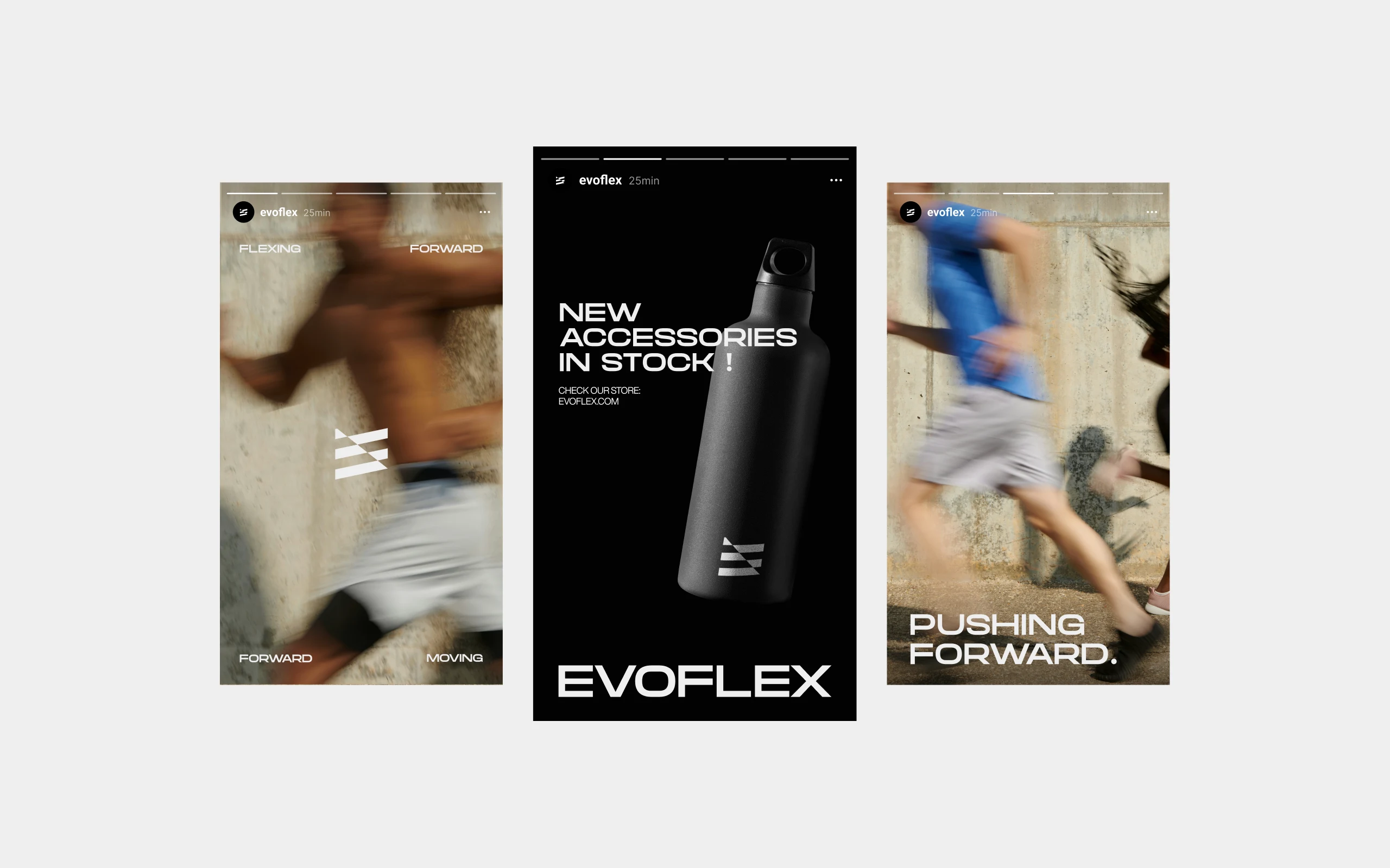
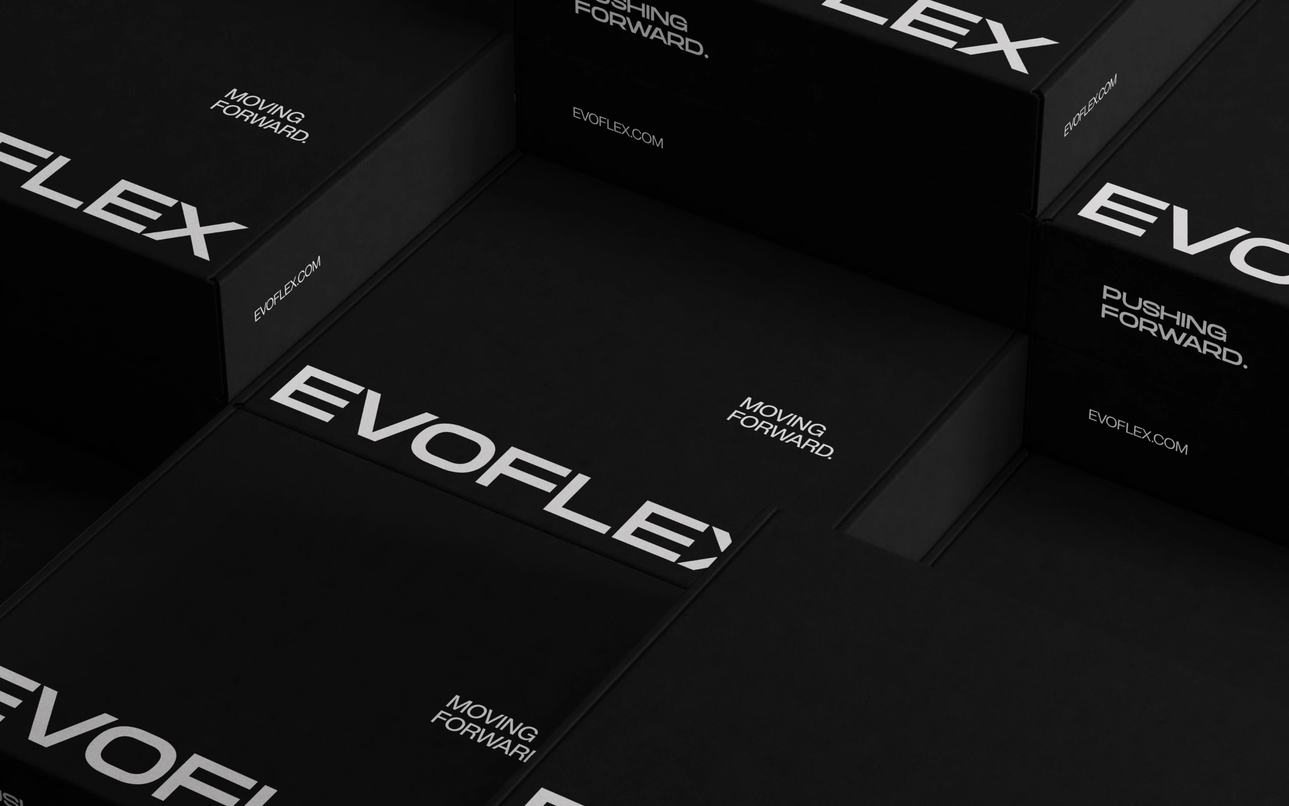
The identity covers everything the brand touches. From the wordmark and visual system through to packaging, environmental applications, and brand collateral, built to hold the same energy across physical and digital surfaces.
Like this project
Posted Oct 18, 2026
Brand identity and packaging for a high-performance activewear brand. Visual system, wordmark, packaging, and art direction.