EXA Capital · Brand Identity

Ahmed Chouchene



EXA Capital
Bridging Capital, Building Trust.
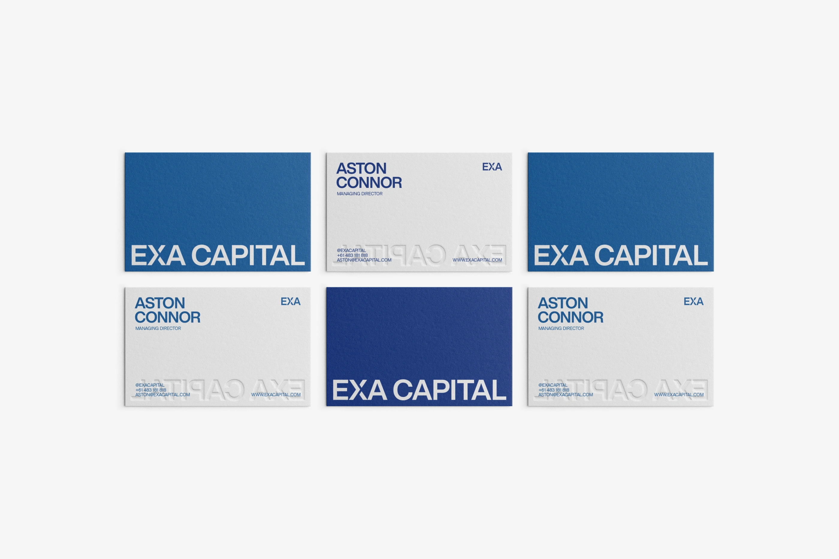
A capital fund and cashflow solutions firm entering the Australian financial market. In finance, perception is credibility. The brand had to look established before it had a track record.

The Approach
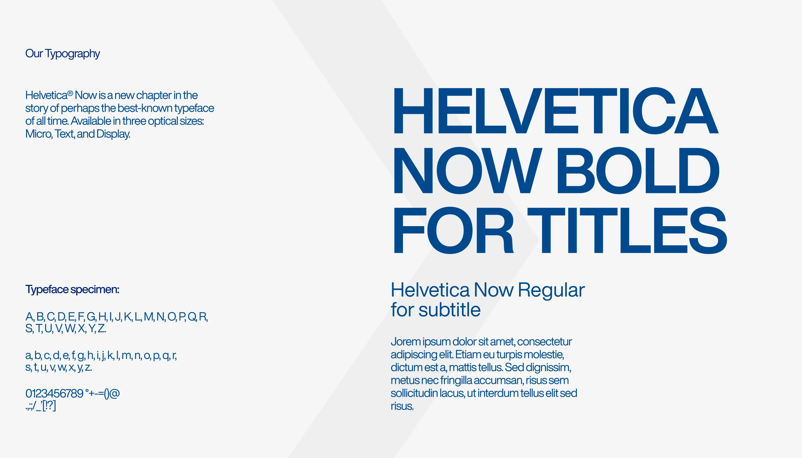
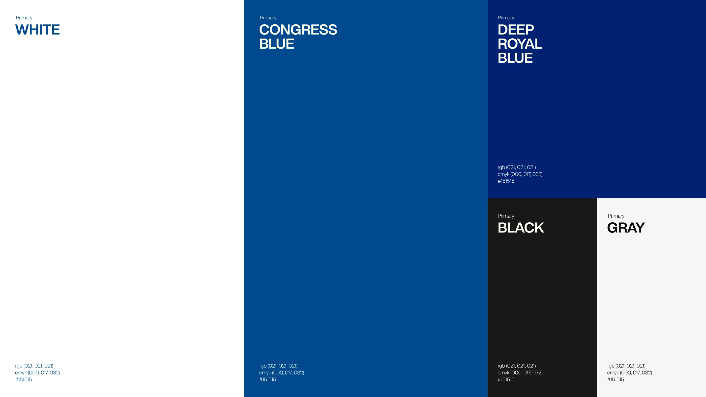
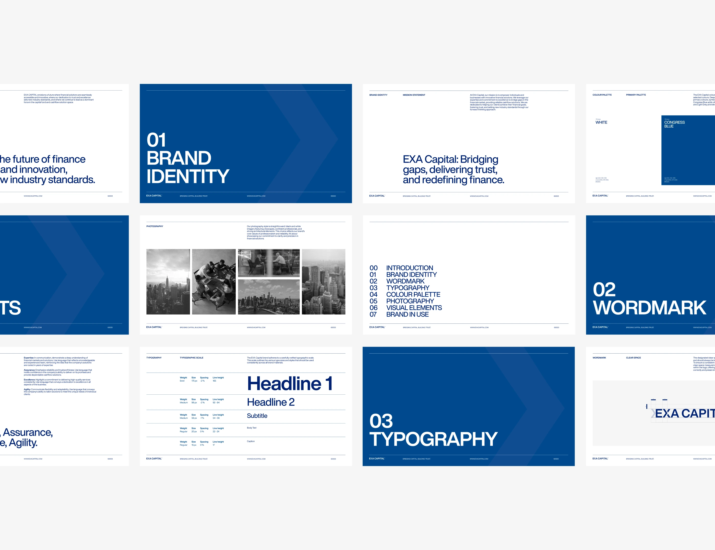
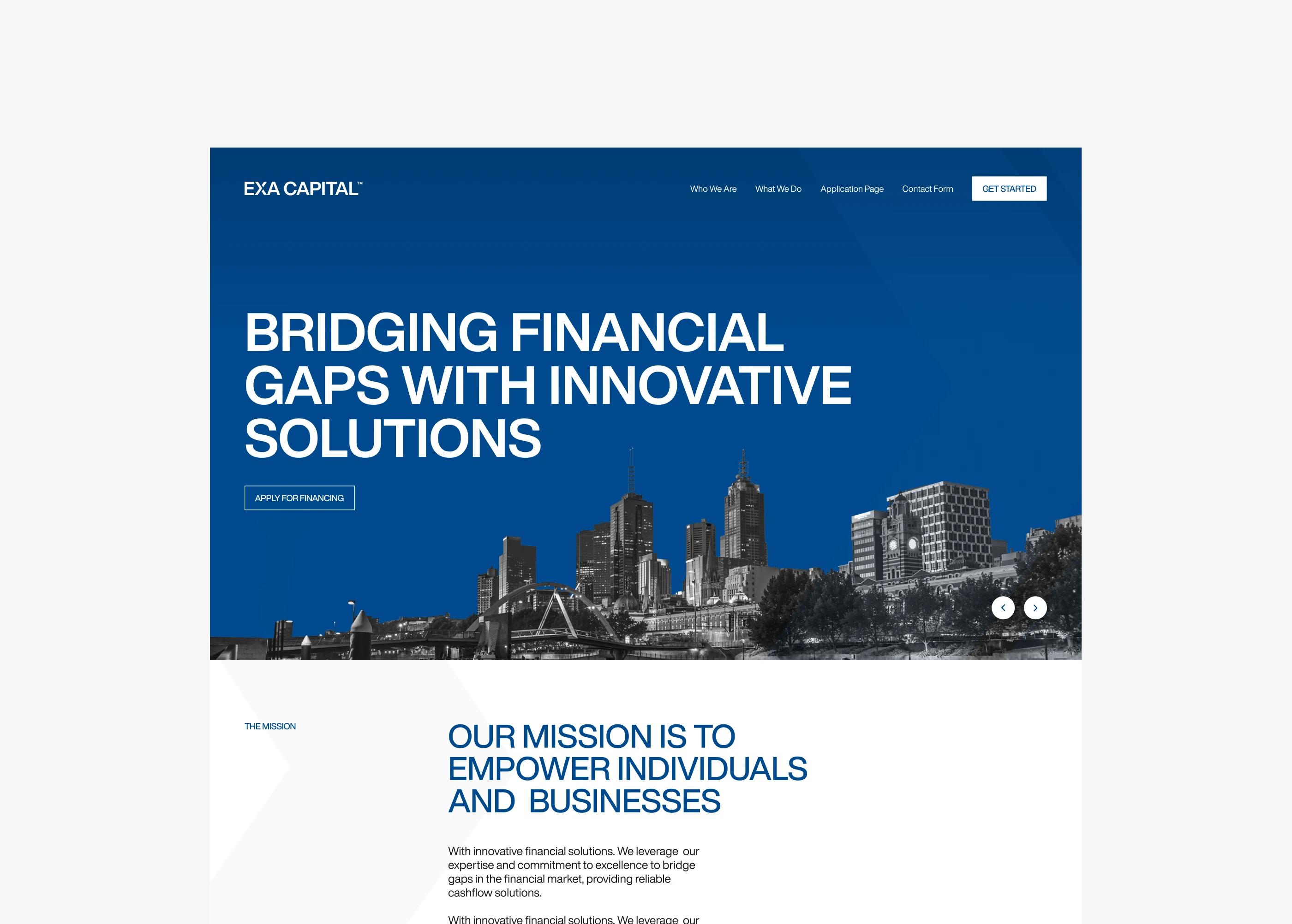
The system was built on clarity and authority. Congress Blue as the primary color, Helvetica Now for typography. Black and white photography, treated editorially. No decoration, no visual noise. Every element reinforces one message: this firm is serious about what it does.



The System
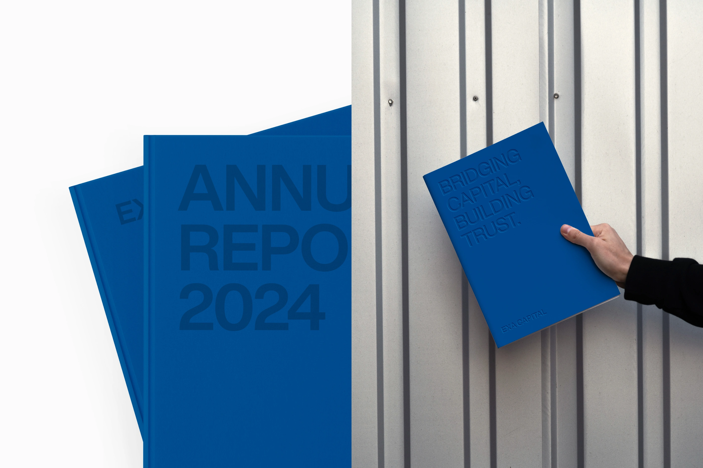
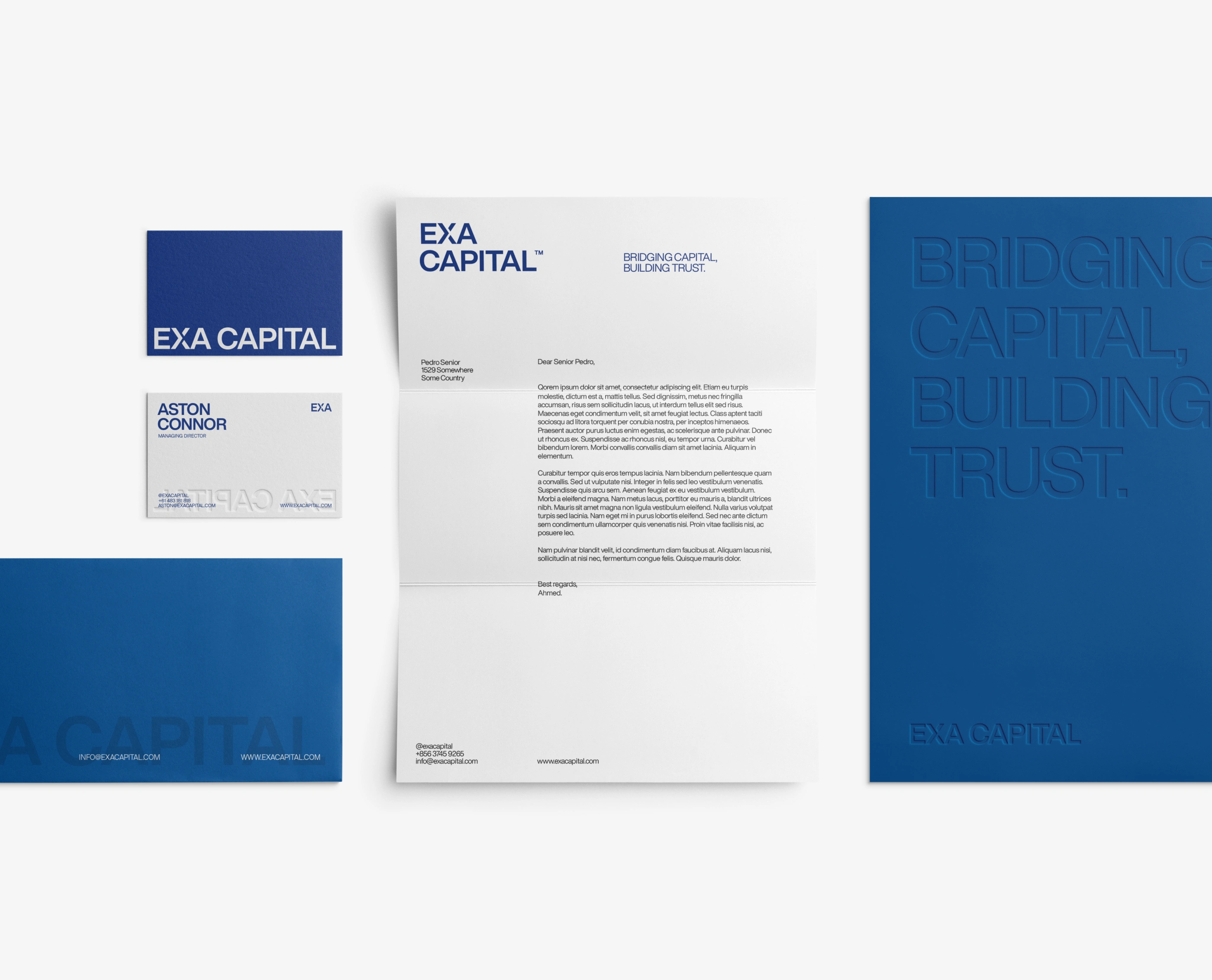
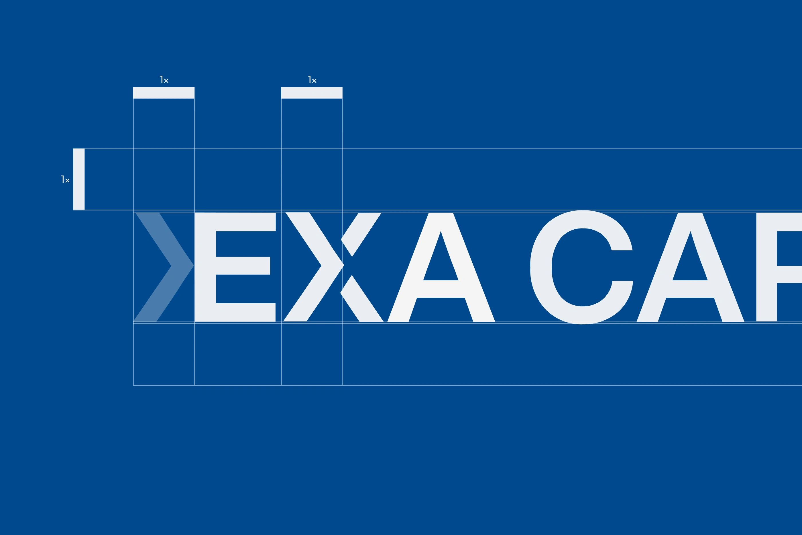
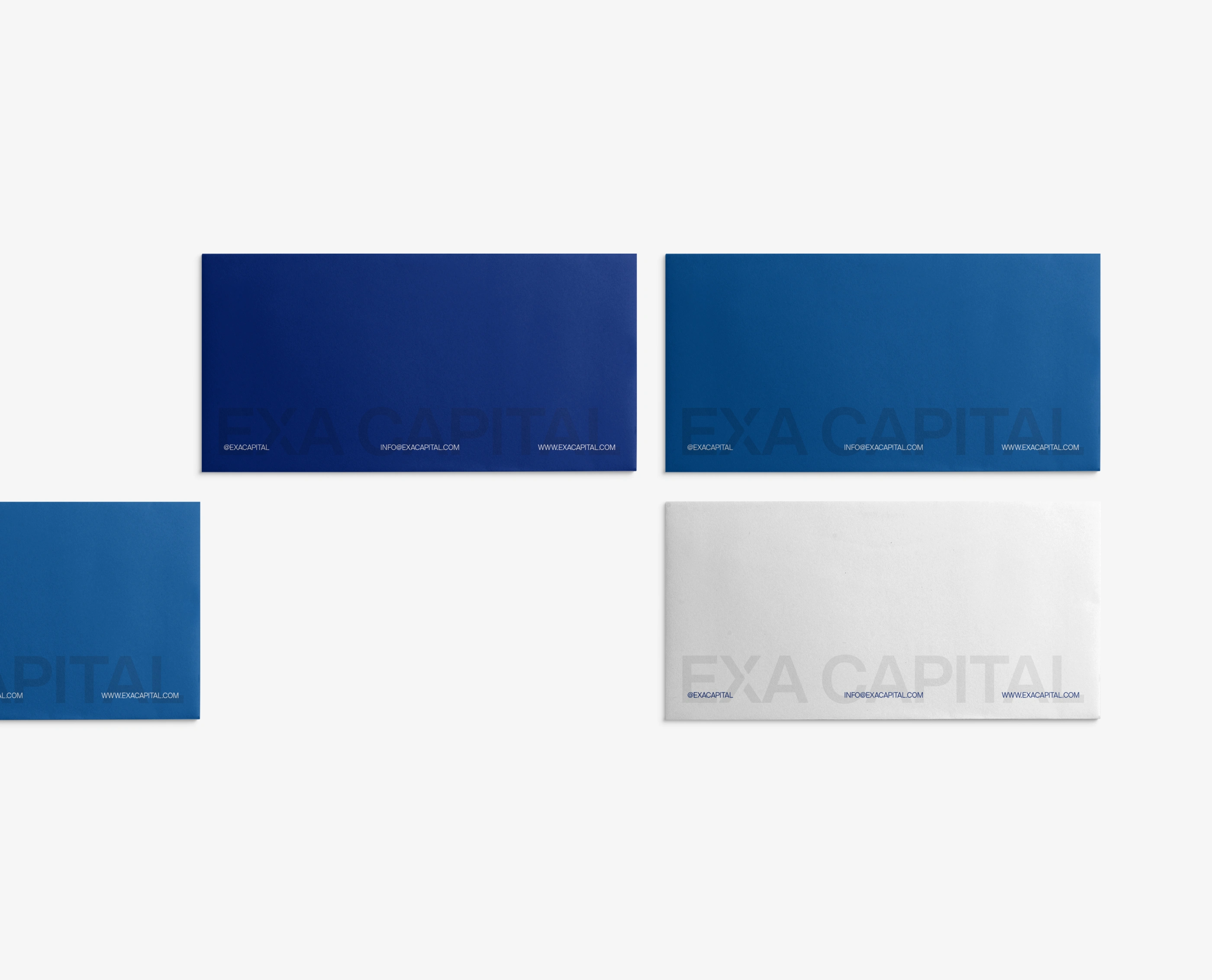
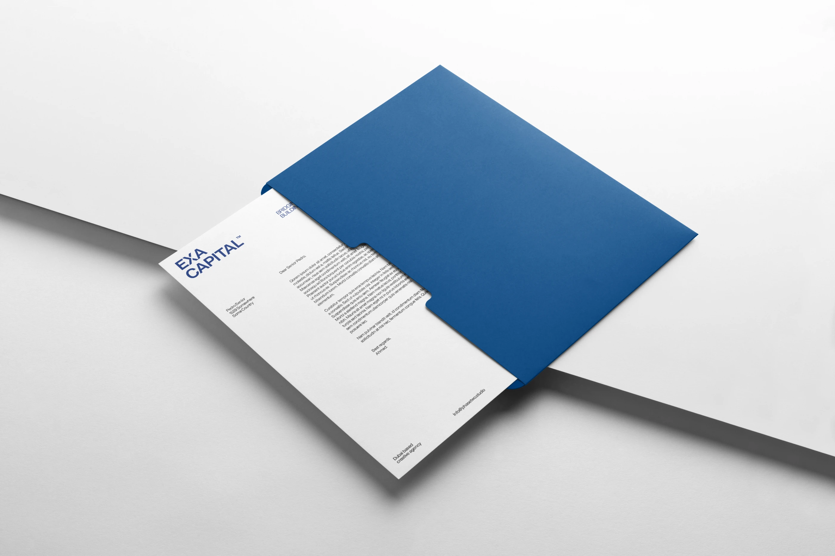
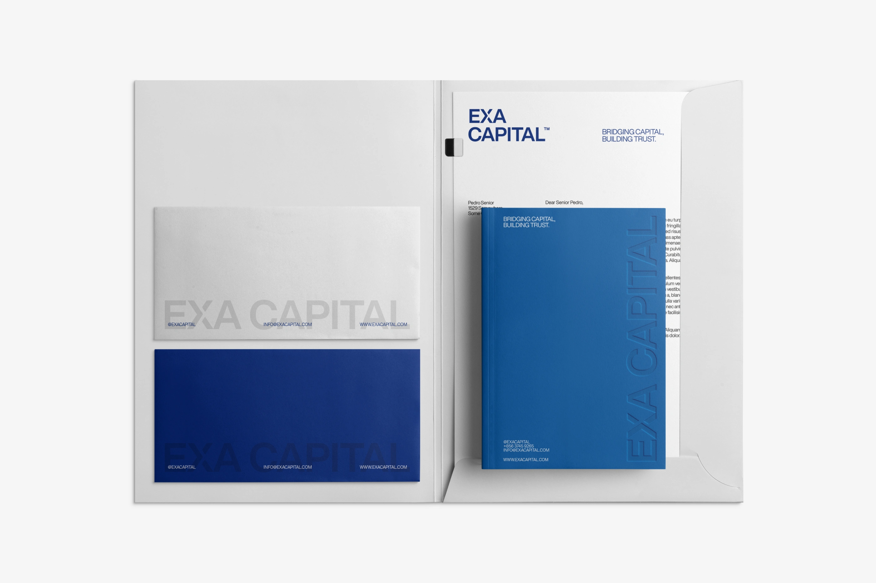
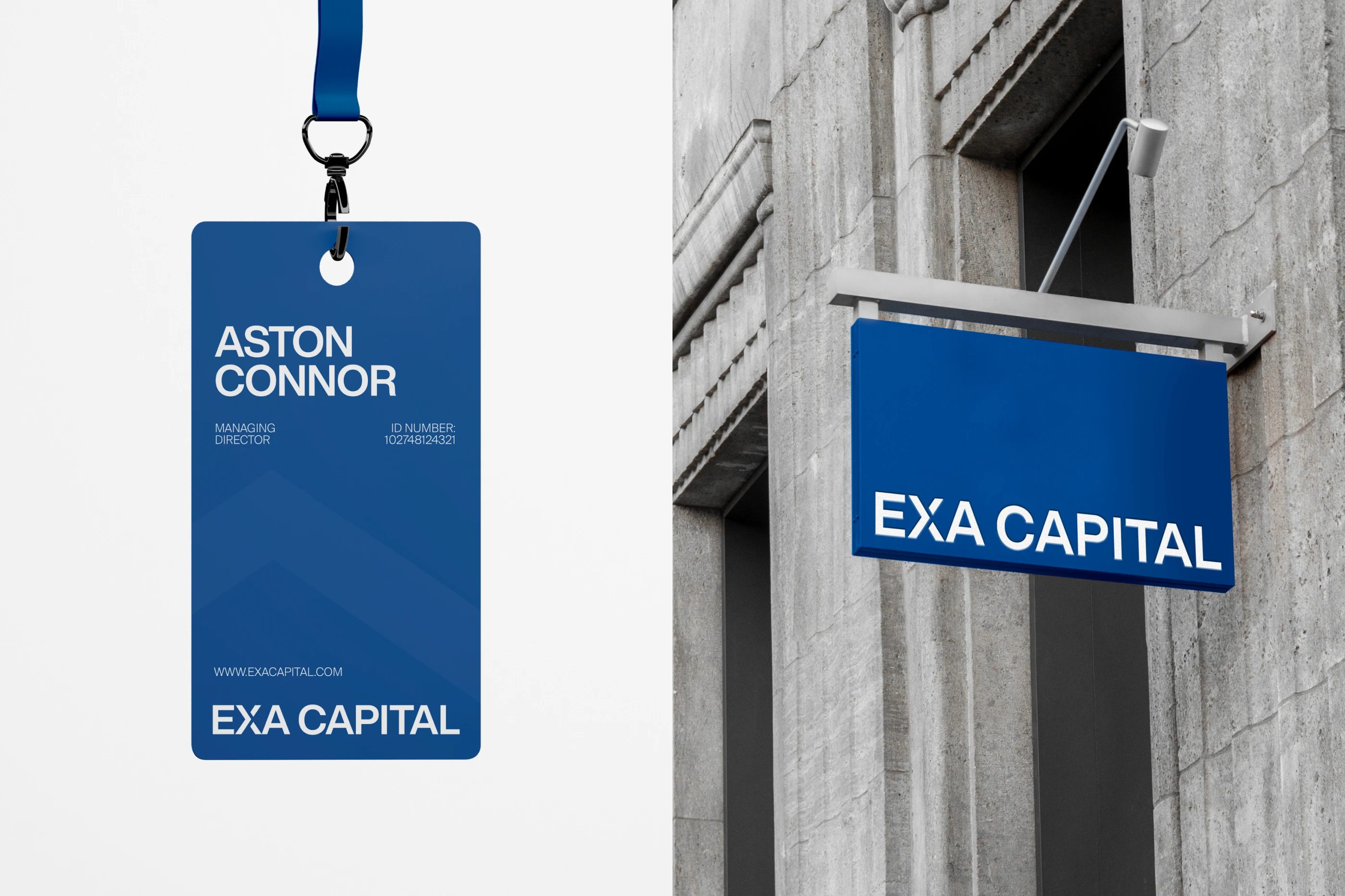
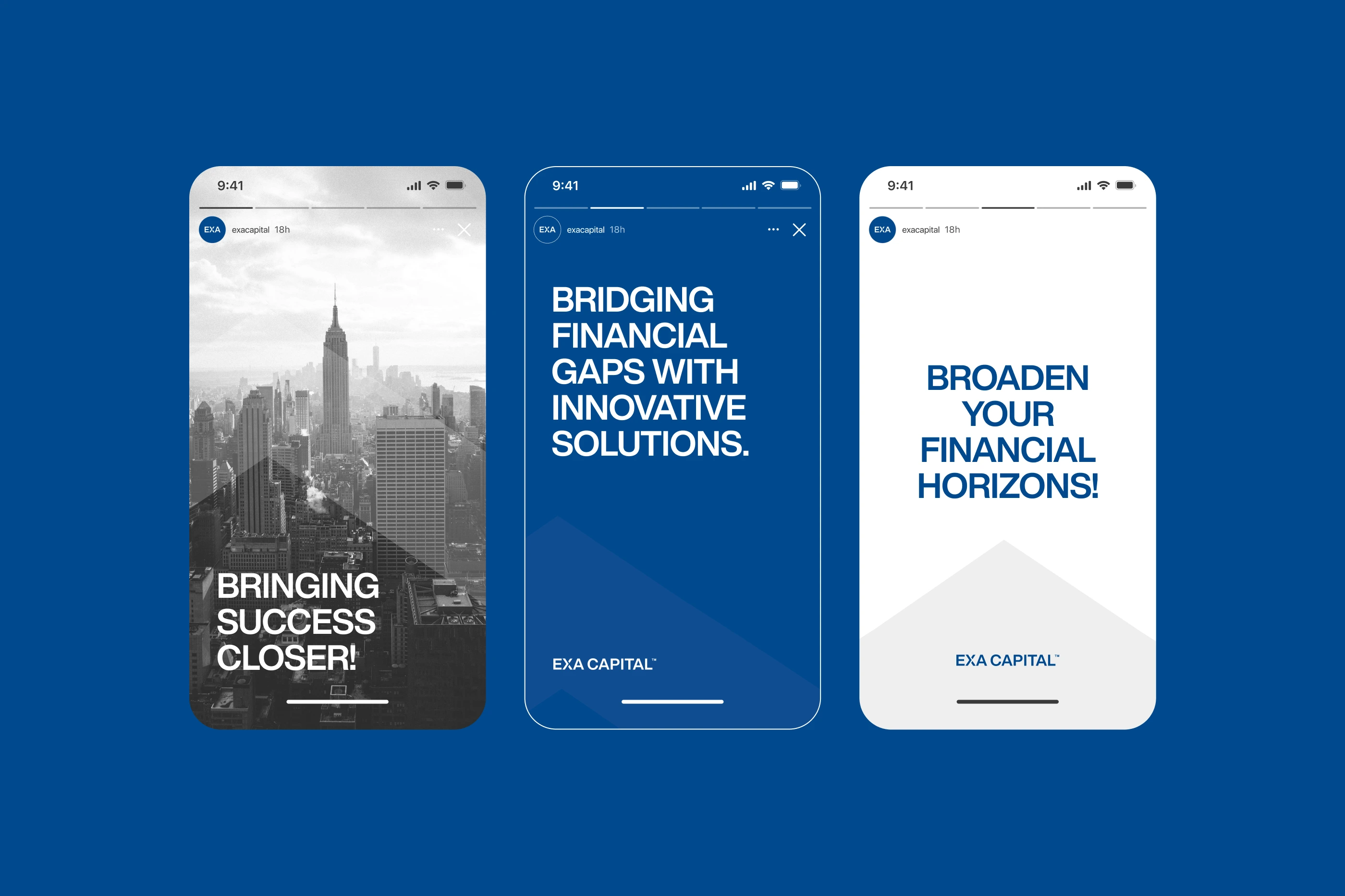
The wordmark uses a custom chevron mark that doubles as a graphic element across applications. The identity covers every surface the firm touches: stationery, signage, social media, website, annual report, brand guidelines.


Like this project
Posted Oct 12, 2026
Brand identity for an Australian capital fund and cashflow solutions firm. Visual system built on clarity and authority across print, signage, and web.