Readology: a writing tool that formats, never rewrites

Memouna D


What it is
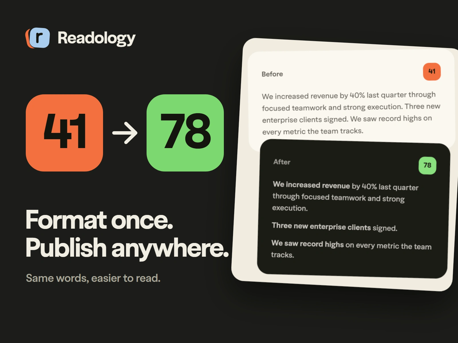
Readology is a free writing tool. You paste a draft and it comes back easier to read, with clear headers, bold lead-ins and shorter paragraphs. It never rewrites your words. It only changes their shape.
The problem
People scan online. They do not read. Good writing gets skipped because it arrives as a wall of text, and fixing the format by hand for every platform takes longer than the writing did.
Role
Product design, UX and UI design, front-end and back-end development, and launch.
How it works
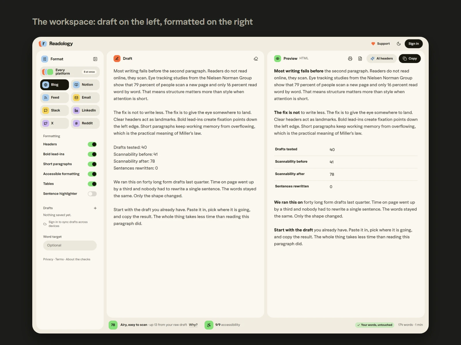
Your draft sits on the left and the formatted version appears on the right as you type. A score shows how easy the text is to scan, and a badge confirms that not one of your words was changed.
One draft, every platform
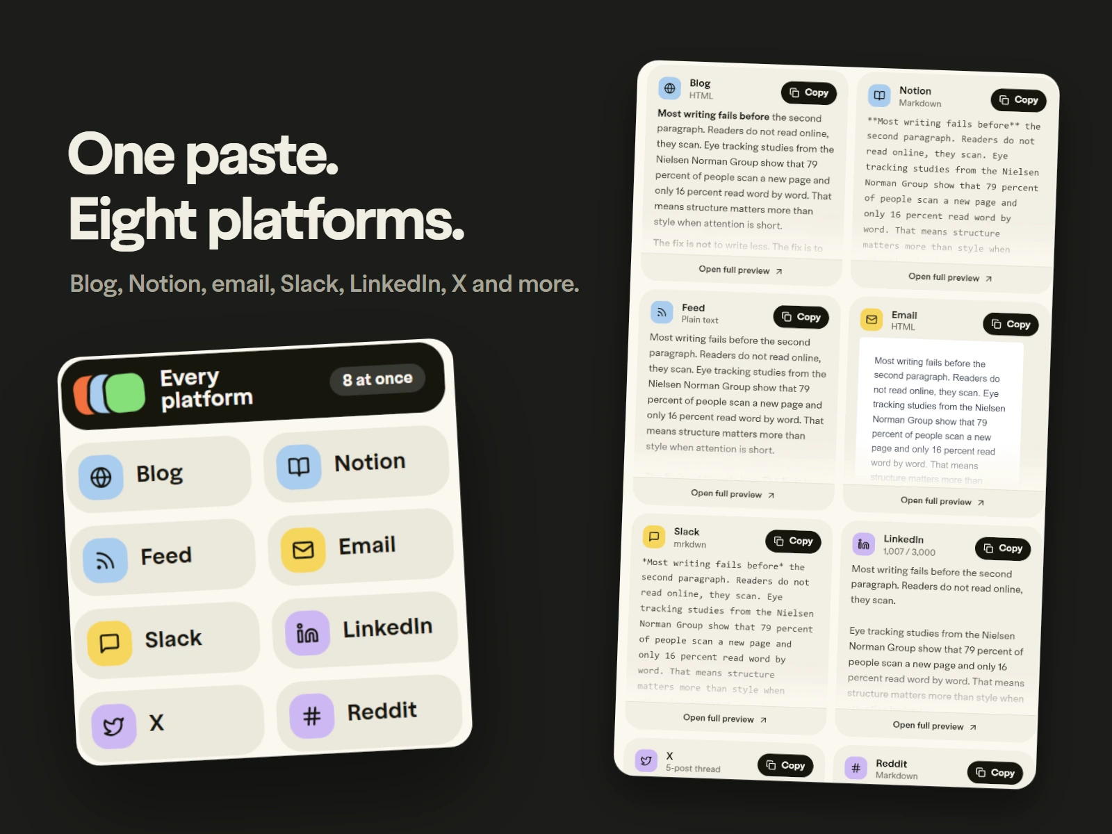
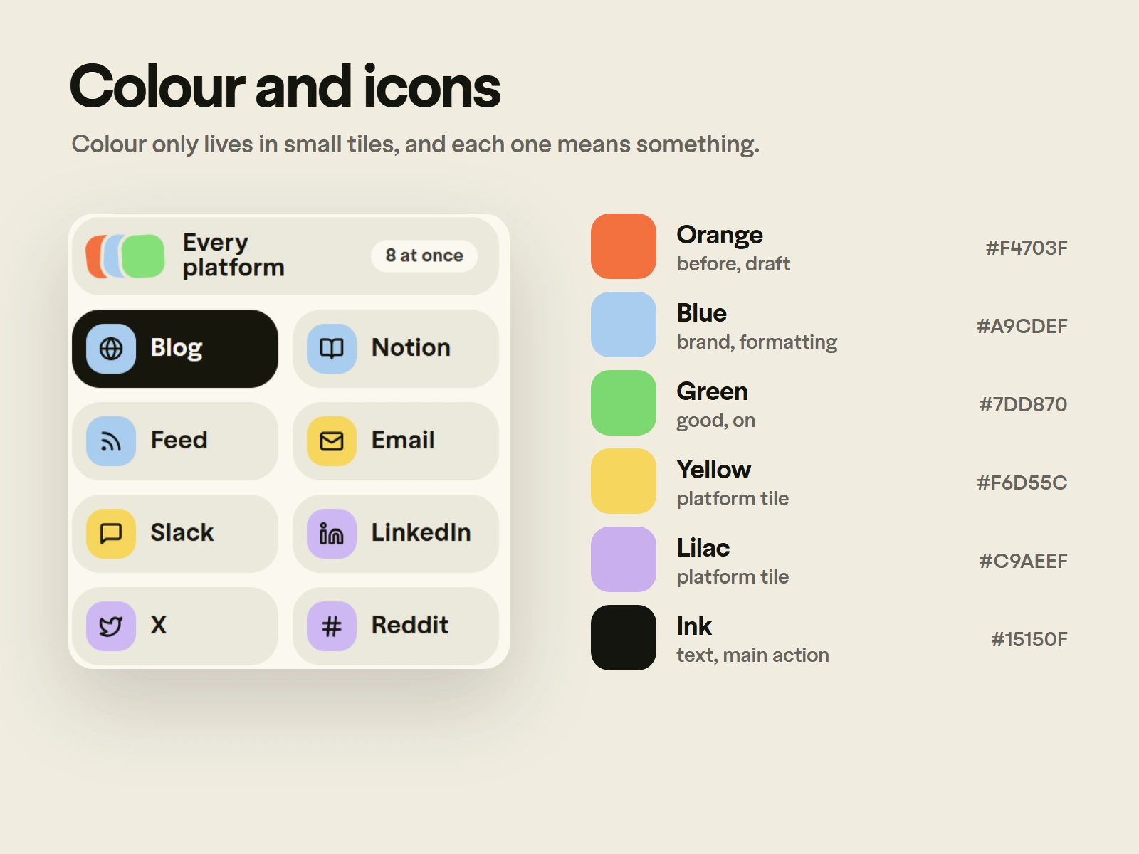
Each platform wants a different format. Readology gives you all eight from one paste: blog, Notion, feed, email, Slack, LinkedIn, X and Reddit. Each version uses what that platform can actually show, so nothing breaks when you paste it in.
Accessibility first
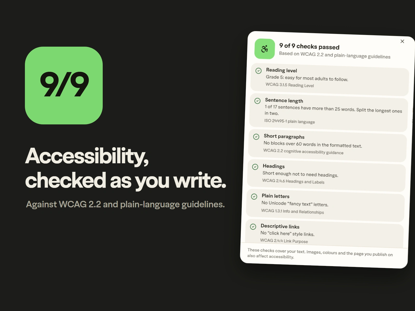
Every draft is checked against WCAG 2.2 and plain-language guidelines: reading level, sentence length, paragraph size, headings, link text and more. Each fix keeps your words the same. The app itself passes automated WCAG 2.2 AA checks.
A calm interface
The screen stays quiet so the writing is the loudest thing on it. Colour appears only in small tiles, and each one means something: orange for the draft, blue for formatting, green for good.
One typeface
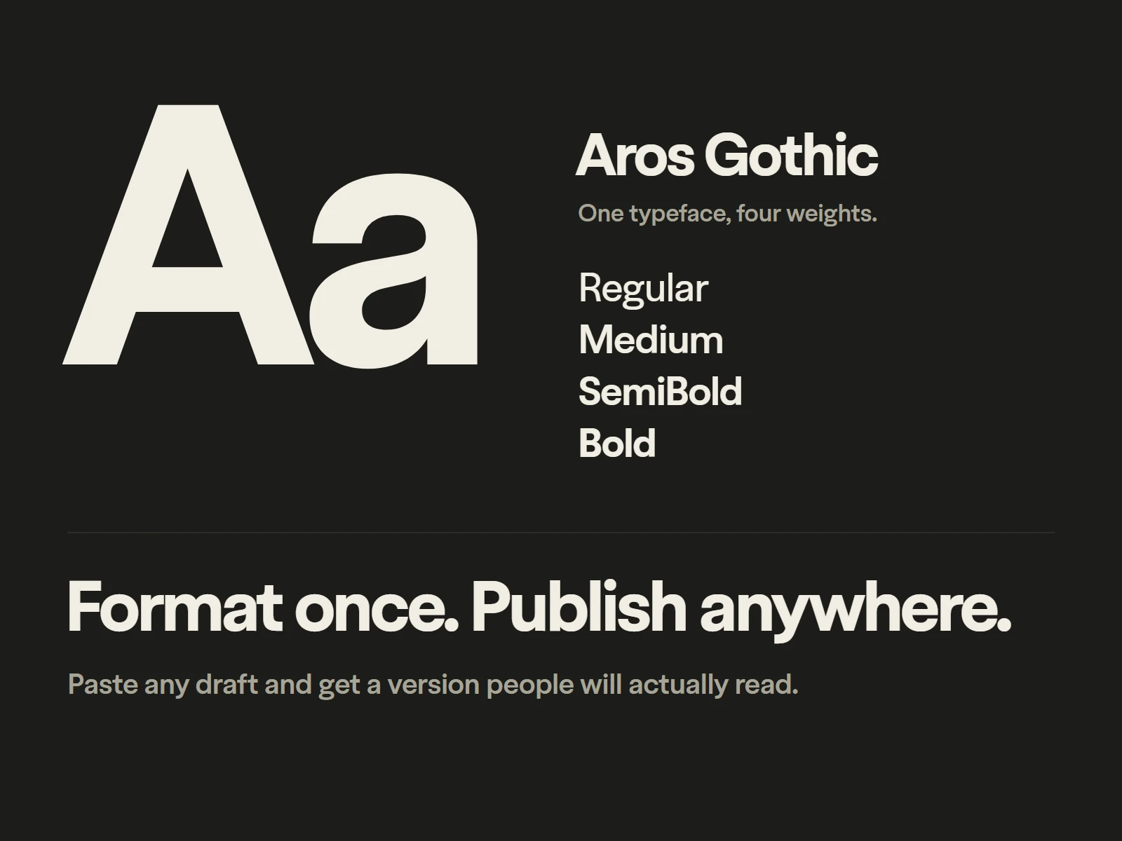
Aros Gothic in four weights carries the whole product, from the headline to the smallest label.
The logo
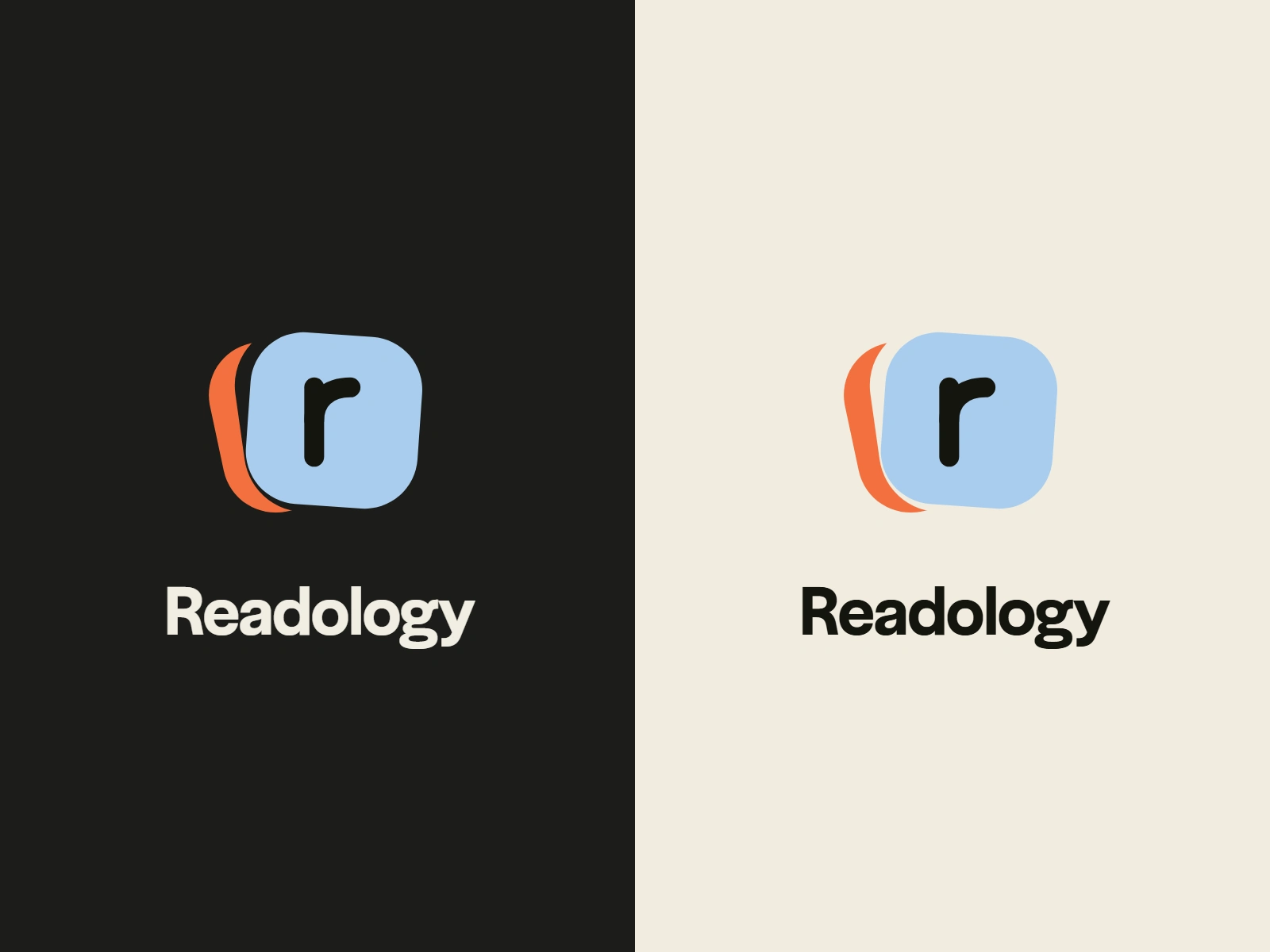
A blue letter tile with an orange tile behind it: the draft, and the formatted version on top.
Built with
React, Vite and Tailwind for the app. Supabase for sign-in and saved drafts. Claude for the optional AI headers. Hosted on Vercel.
Live at readology.app, free for everyone.
Like this project
Posted Oct 12, 2026
A free writing tool I designed and built. Paste a draft, get an easier-to-read version for eight platforms. Your words stay the same.