The ColdTrace Transport App Redesigned
Adam Saavedra
Introduction
Coldtrace Transport has been an app that was created to help healthcare workers in facilities transport their vaccines and monitor their temperatures closely to make sure they are not damaged.
As I was hired onto the Transport team, I was given the opportunity to take over the app and redesign it with user insight in mind.
The current app did not have a designer behind it and had a number of pain points from a usability and design standpoint that I was excited to tackle.
What about ColdTrace Transport is Important?
After learning more about ColdTrace Transport and seeing the original design, a next step is to gather user research.
I began by speaking with users and learning about what ColdTrace Transport means for them. What are the problems these healthcare workers are facing and how is CT Transport solving (or not solving) those problems?
How do we ask the right questions?
Instead than asking users if they “like’ the app, it is crucial to understand the psychology that most users will make an effort to be agreeable rather than constructive. This is to no fault of the user but rather, the questions being asked of them. So asking questions such as “how is the app so far?” can lead to some lack luster and surface level answers.
Asking the right questions comes down to a science of not giving the user a leading “right” answer but rather, asking the user about their most recent experience and how that has differed from an assumption or expectation they had.
Initial Insights
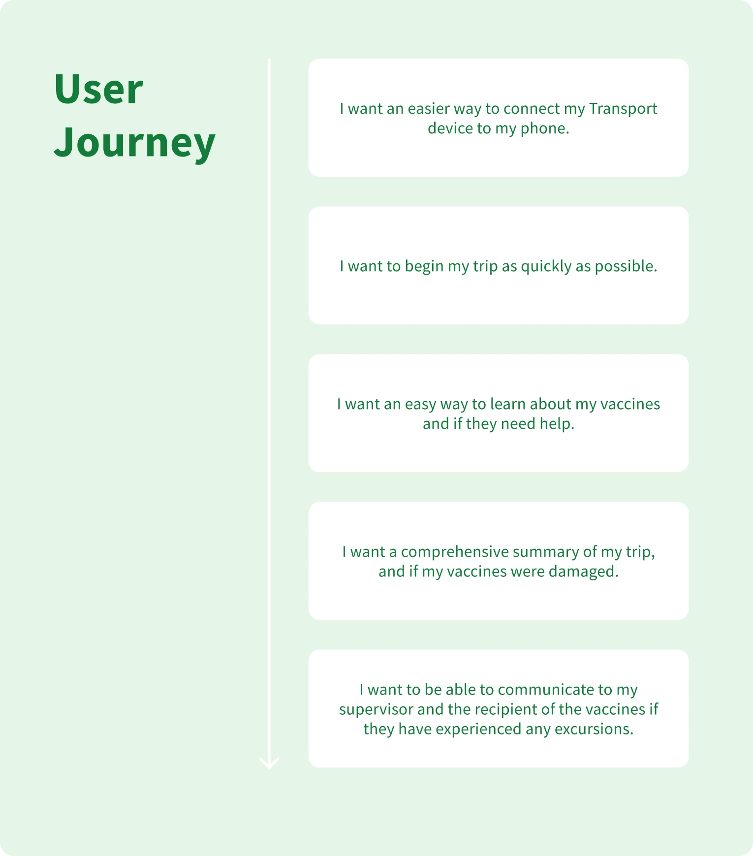
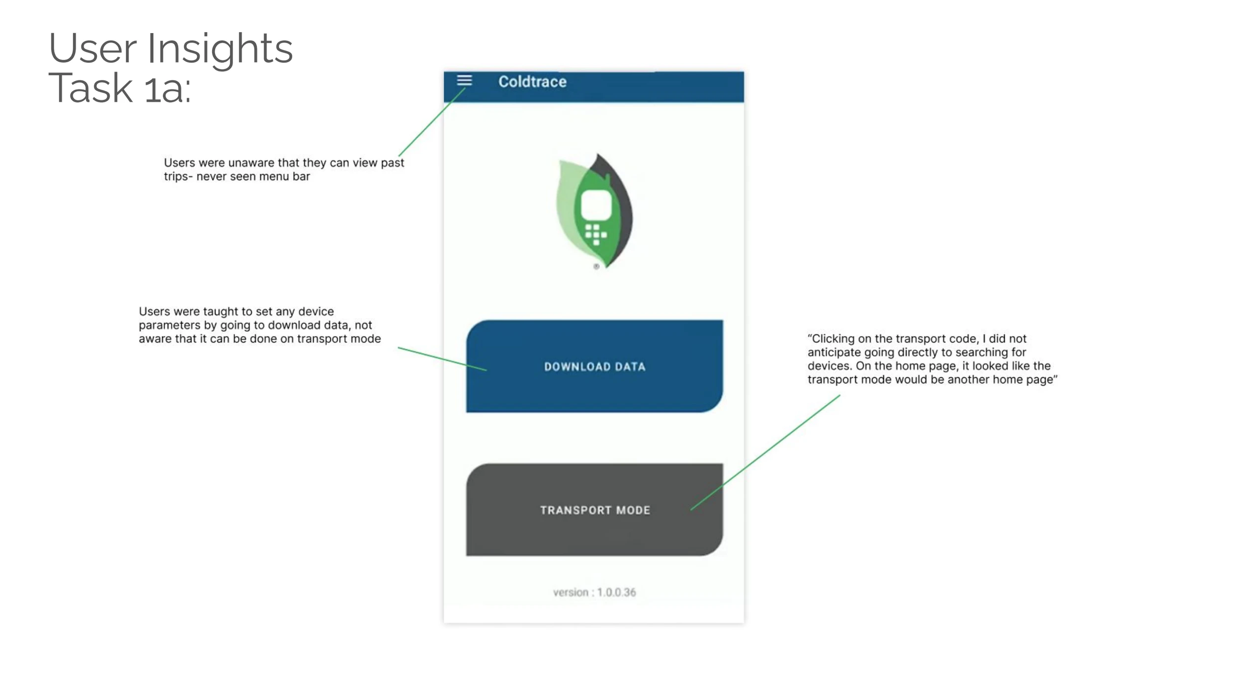
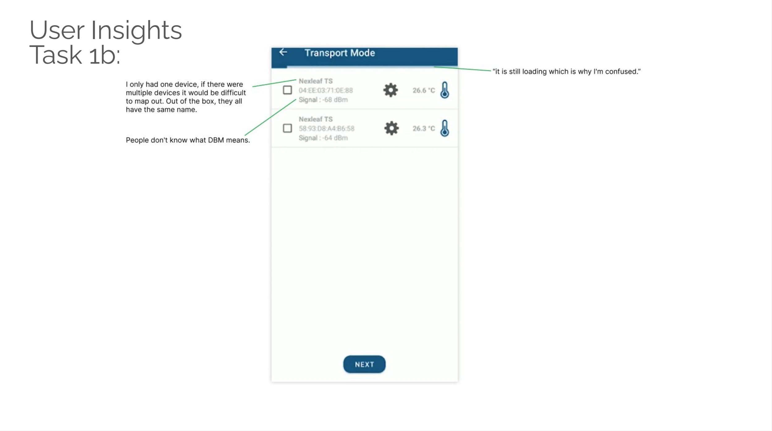
After speaking to other users about their experience with the app, I wanted to understand what their main objectives were when using Transport and what has been difficult for them to work around.
I was able to interview 7 external stakeholders and gather the main user journey along with user insights in each step of the Transport journey.
From these main insights I could see evident issues from the app and how it is lacking in terms what users are looking for.
Usability Testing… What is it and why?
Usability testing is the practice of sharing a product with a user for the first time and giving them a list of tasks to test how intuitive and easy it is for the user to use said product.
The reason why it is so powerful is because it gives me, the designer, a deeper understanding of what unsaid issues the product might have.
After learning from external users about the main objectives a typical user goes through when using the app, those objectives became tasks for the user to complete for this usability test.
Usability Testing: Results
There were a number of great insights I gathered from my test. I made sure to line them up and present to the rest of my team to think about what next steps we wanted to take on moving forward.
Main Takeaways
From conducting usability tests, there were a number of insights I was able to synthesize into actionable items. These included: Less time to begin the trip, Improving the information Architecture, giving users improved visibility during and after a trip.
The Blueprint
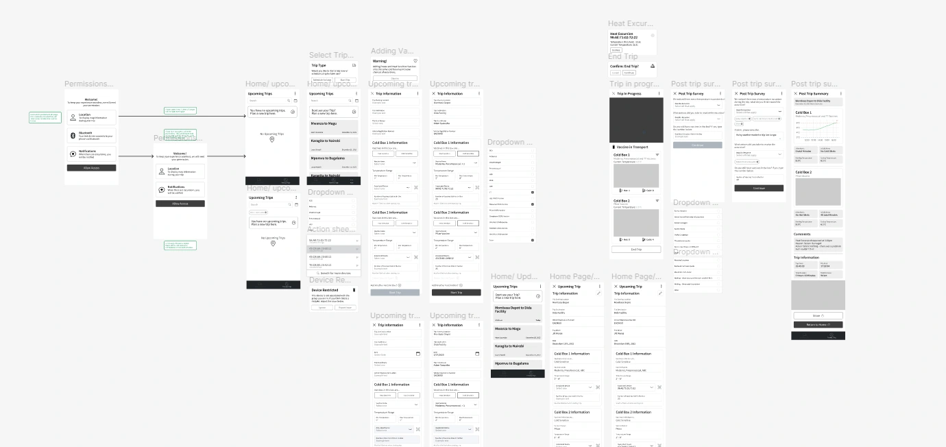
I took my time and created low fidelity mockups and shared them with my team.
Giving my team an early preview of where each page goes, what the overall flow of the new app will look like helps align us and prevents any miscommunications with the final product.
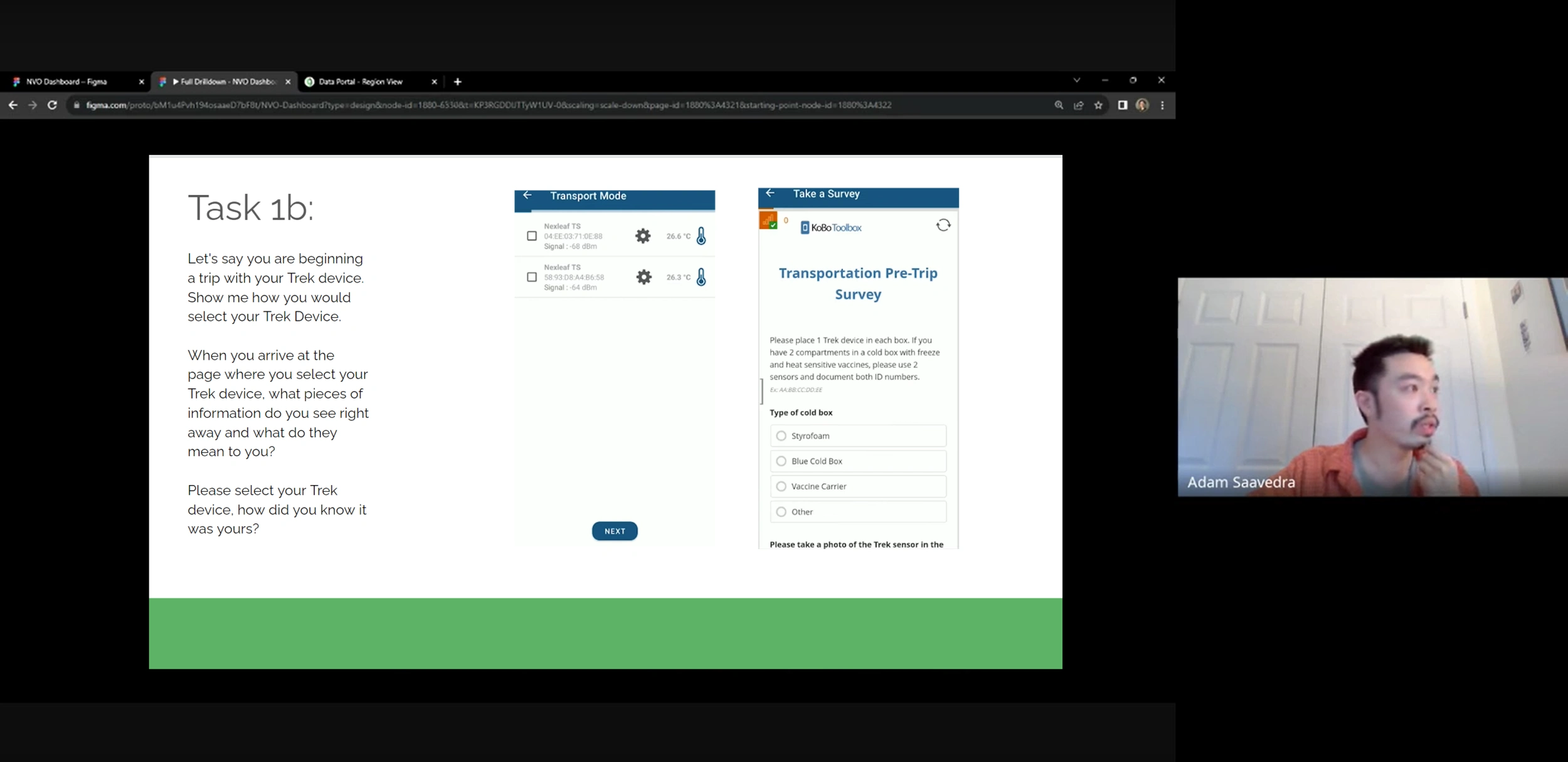
“I want to start my trip a.s.a.p.”
One of the first insights gathered from interviews and usability testing was that users had to jump through multiple screens from selecting their device to filling out surveys for internal analytics.
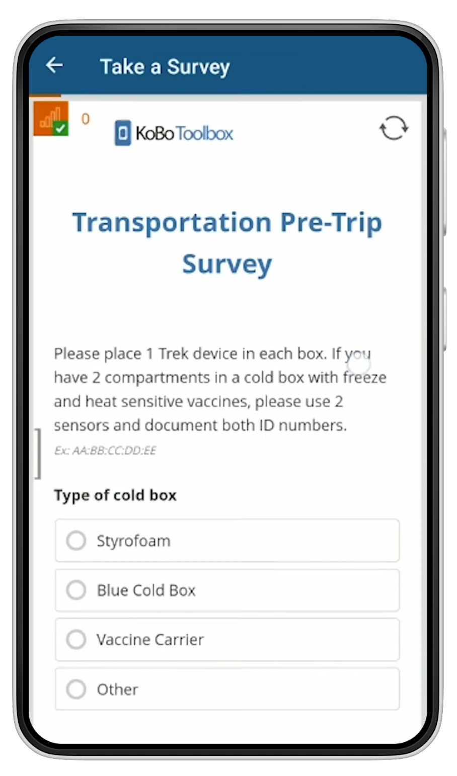
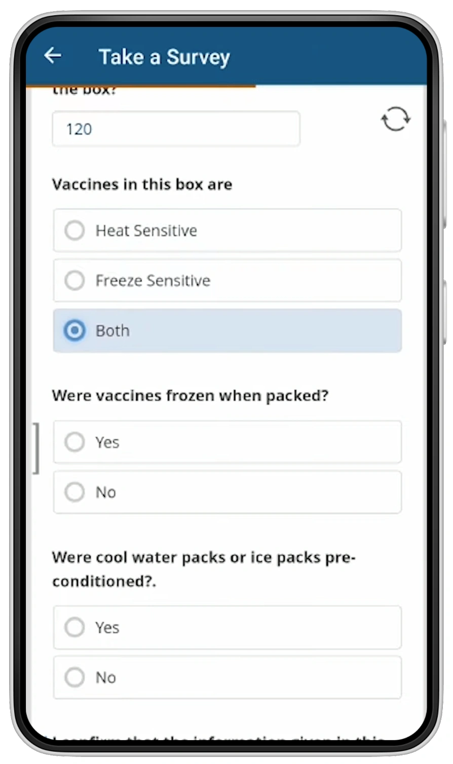
Old Pre-Trip Survey
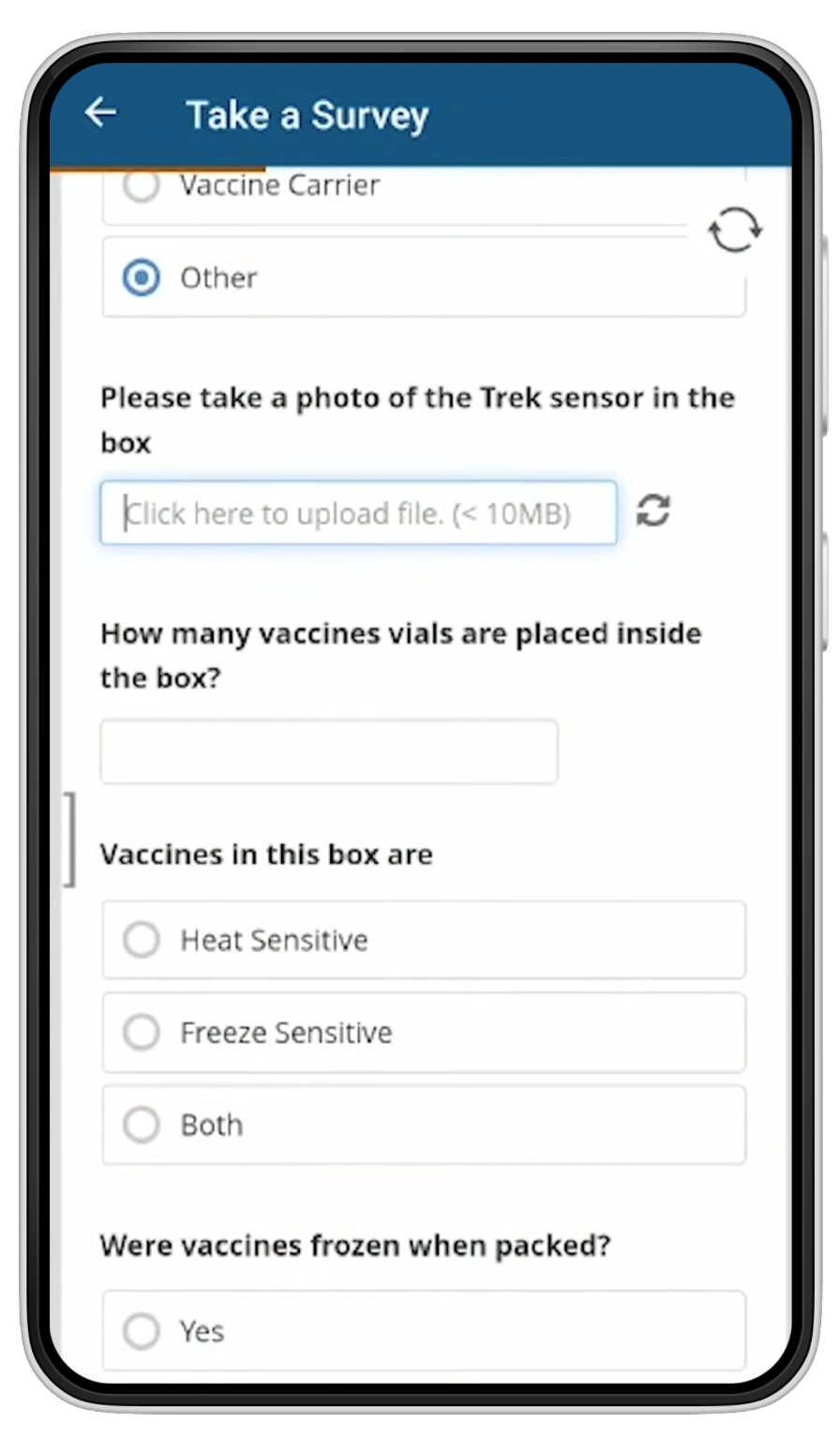
Pre-Trip Survey redesigned
As an advocate of user centered design, I wanted to make sure we only included questions absolutely necessary for the trip. From there we were able to go from 16 questions to 7.
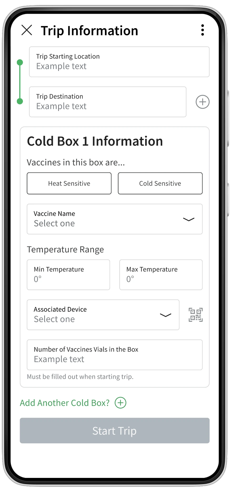
Previously, users had to fill in their trip information, take a survey, and then connect their Transport device. I decided to remove the survey as the rest of my team agreed it was not necessary. I also included the device connection onto the trip info page to keep the page neat and concise.
New Pre-Trip Survey
Information Architecture
Another issue users were having was trying to find their previous trips. They were also confused with pages that seemed unnecessary that had nothing to do with transporting vaccines.
Below is a before and after of the sitemap of ColdTrace Transport.
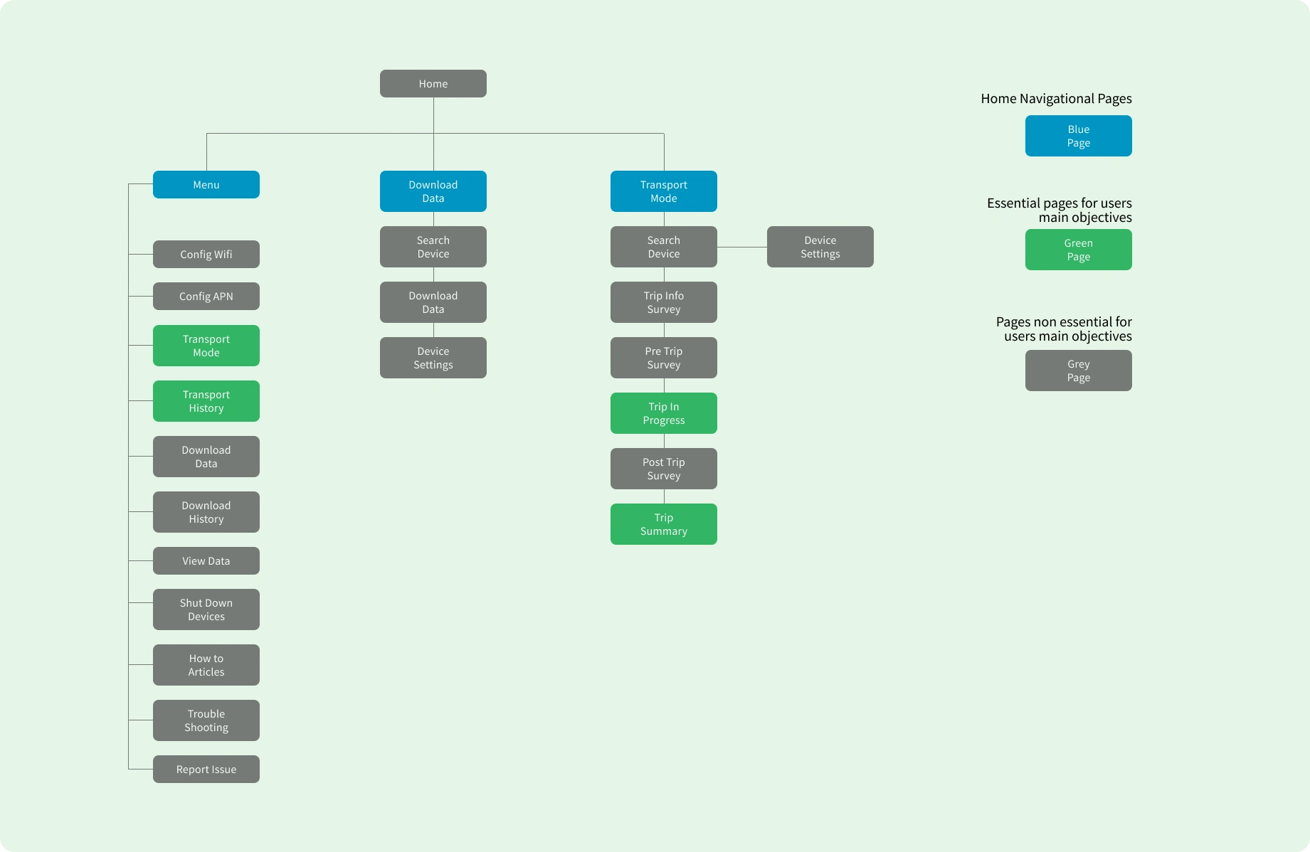
Previous Transport Site Map
A couple issues with this site map is that the pages people use to complete their main objectives are scattered and buried into pages that users have little interest in using.
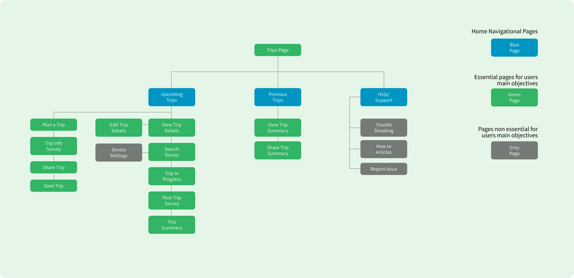
Updated Transport Site Map
On top of starting their trips quickly, users also wanted a way to share their trips and have a log of previous trips they have done. Although this was in the original map, it was buried deep into the menu. I decided to move this important page into its own section and create a new section for users to start a trip right now or plan it in advanced.
Because of this new and improved site map, the information architecture of the app is now seamlessly tailored for the users main objectives.
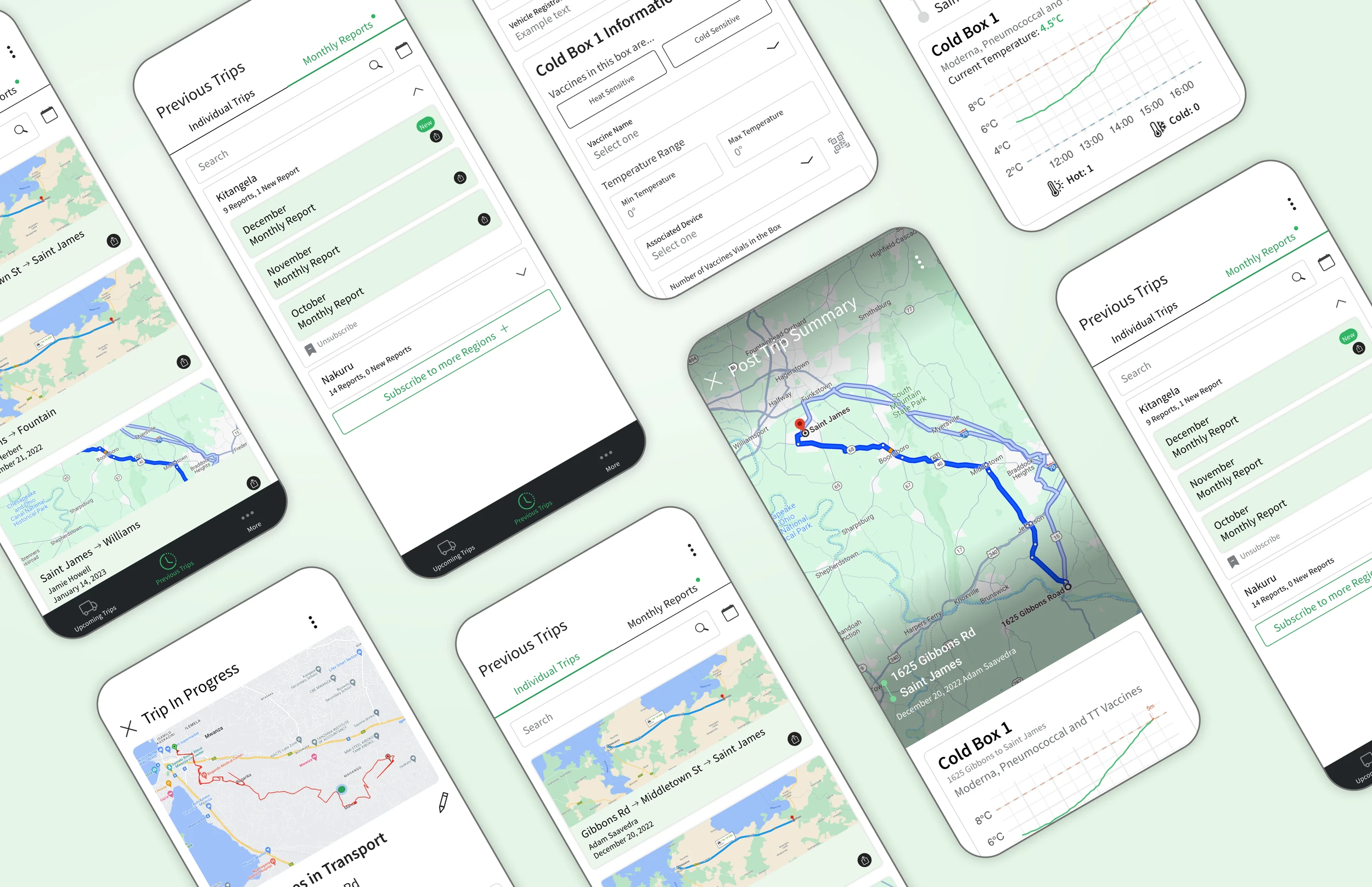
Increasing visibility: Trips Page
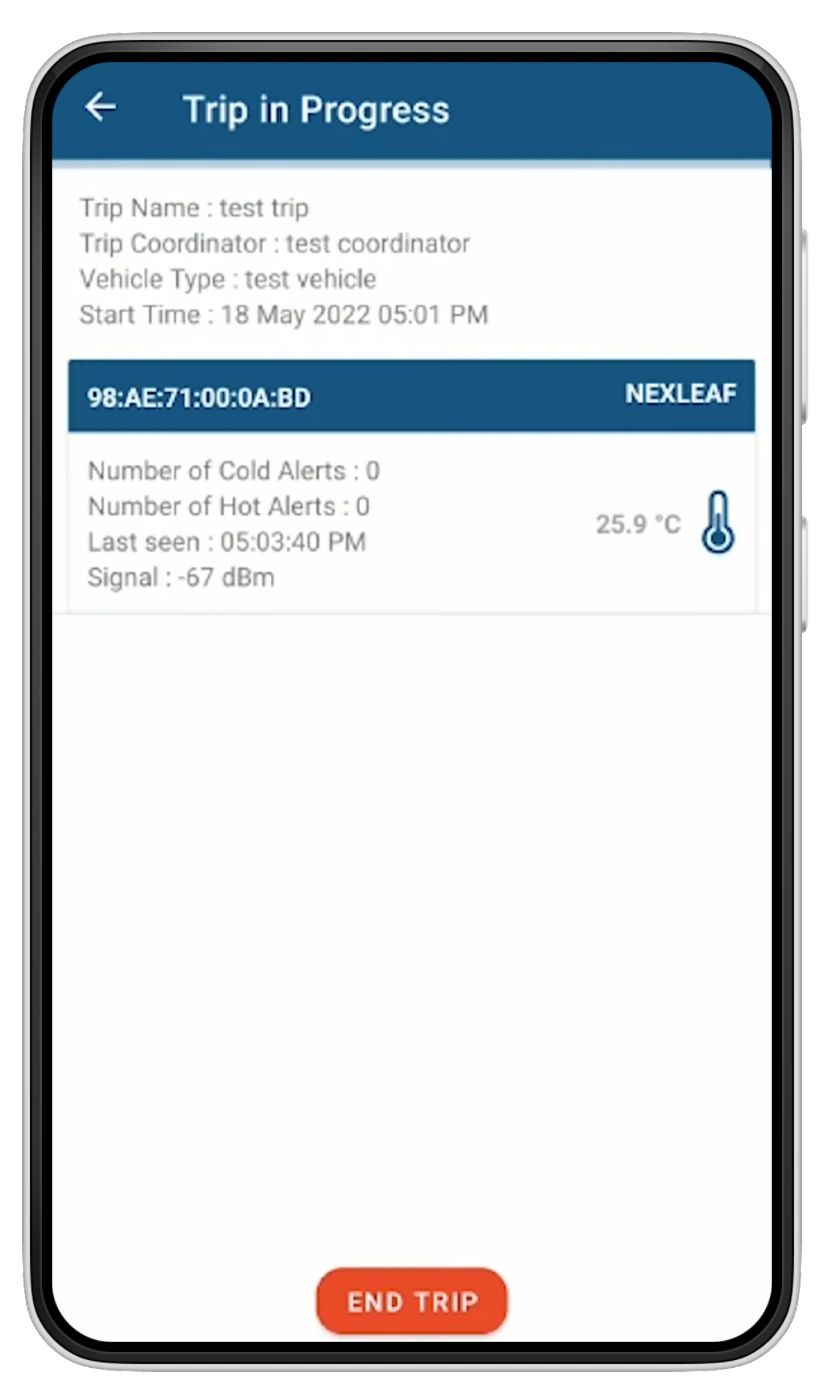
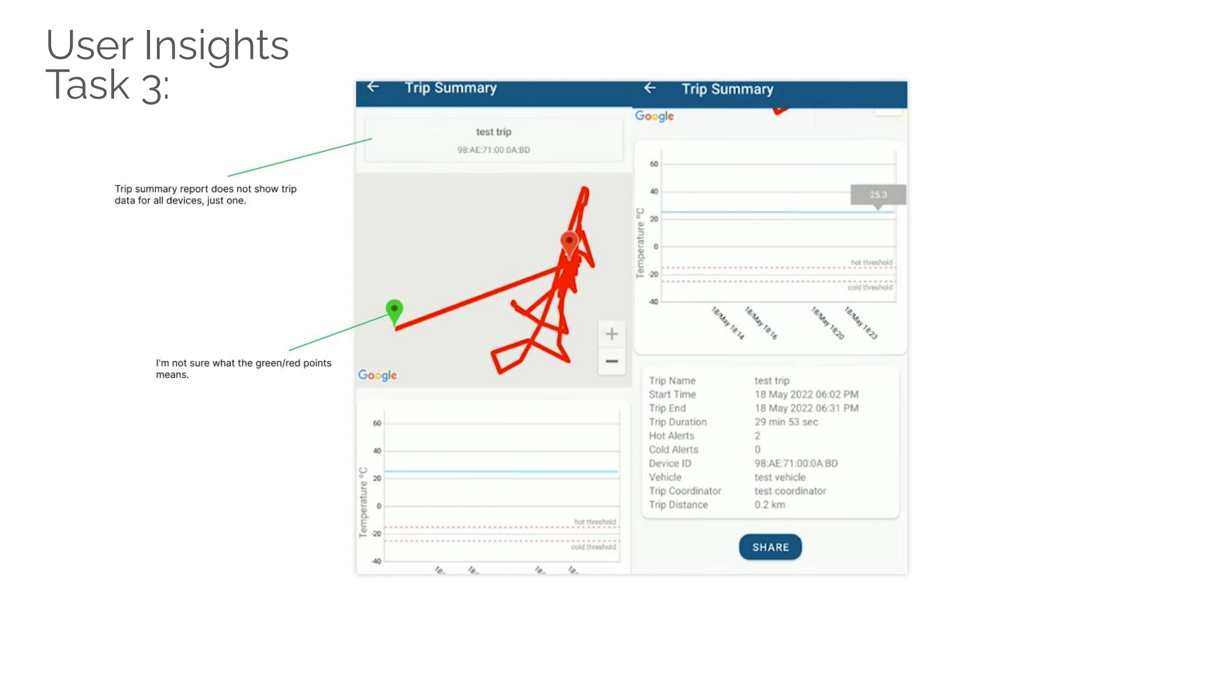
Previous and Current Trip In Progress Page
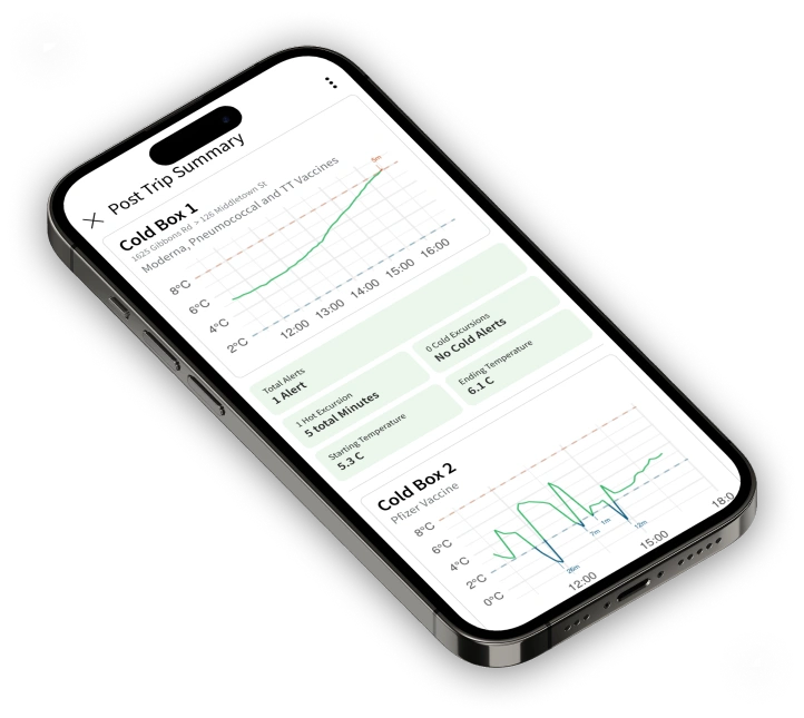
Previous and Current Post Trip Summary Page
What’s wrong with the trips page?
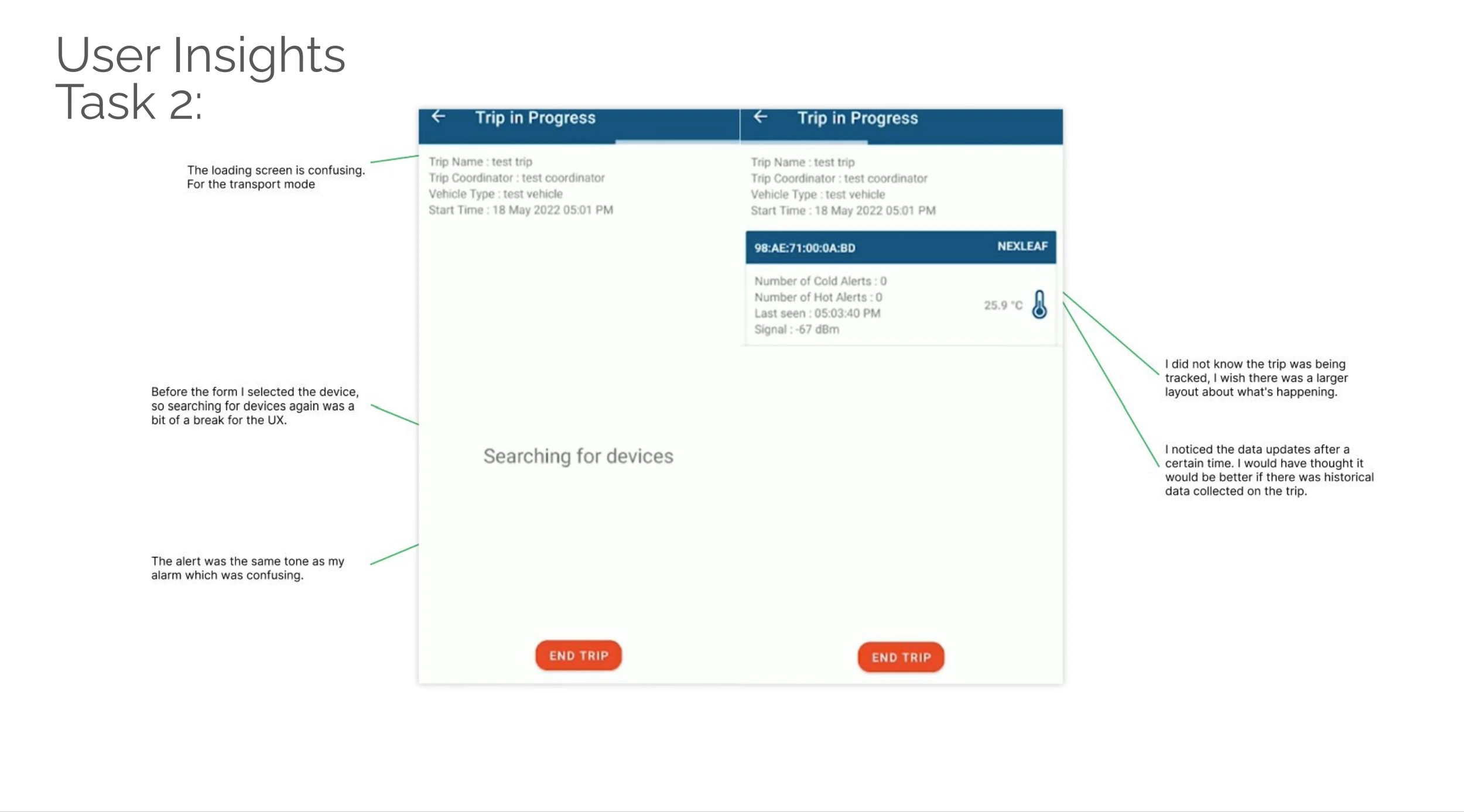
Speaking to users about their main objective as they begin their trip, the objectives is to transport these vaccines safely without any temperature excursions. And if there are any excursions, they want to know when, and what temperature it is at.
The current trips page is lacking visibility especially when a healthcare worker is driving, they don’t have much time to read through the small text explaining their vaccines current temperature.
Focusing on the user need
The main thing I wanted to focus on for this pages design was to give the user a quickly digestible snapshot of the vaccines health currently. This was done with the use of visuals as the user can view a visual faster than a string of words.
Editing the trip summary page
Although the trip summary page had information the user needed to share with their supervisor, there was an excess of information the user did not need and/or did not understand. Because of this, I wanted to trim down what is shared to the user to make sure it is only what users need to know.
I also wanted to simplify this design and create a new design that emphasized simplicity and scannability. I started by breaking up the list of information in the bottom card and worked on the overall composition of this page to share the most important information first.
How Do We Know Success?
When designing a product, the feedback gathered after a release is just as important as feedback prior to it.
I sat with my product manager and thought through different metrics to measure as we enter the first coming weeks of post-release.
A couple we were able to look at were about of new accounts, number of completed and uncompleted sessions.
Lastly, I hosted interviews to gain quantitative analysis of the app and what users have to say about it.
The ColdTrace Transport App Redesigned
After many months of interviews, designs, and iterations, this is the final design that is build out and currently running. We have sold 1000+ units of our Transport devices and are currently expanding to different countries across East Africa.
Like this project
Posted Nov 11, 2024
From a challenging design with multiple pain points to a streamlined, user-centered solution. Improving navigation and usability for healthcare professionals tr
Likes
0
Views
6