Autonix- Case Study
🙌 Redesigned QR Code generator for organizations
👉🏻Outline
Upon my initial login to the Autonix server, I encountered a design that lacked clarity and coherence. The process of creating even a simple tracker was unnecessarily complicated, involving an excessive number of steps.
My primary goal was to revamp the design to enhance user-friendliness, ultimately leading to a reduction in bounce rates and a smoother user experience. In essence, my objective was to ensure that users would not become frustrated upon opening the platform and would be less likely to leave immediately.
👉🏻Research Method
Although many research methods were used, here are prominent ones;
I pinpointed the primary issue behind users' reluctance to create more trackers by conducting the Usability Testing Research Method. This method enabled me to identify the screens that were causing users to bounce or leave the platform.
Moreover, I designed two interfaces and conducted AB testing to determine the superior design in terms of efficiency and user-friendliness.
👉🏻Problems Identified
Following were the problems that were identified after all the research;
1- High Bounce Rate
2- Cluttered User Interface
3- Complex User Journeys
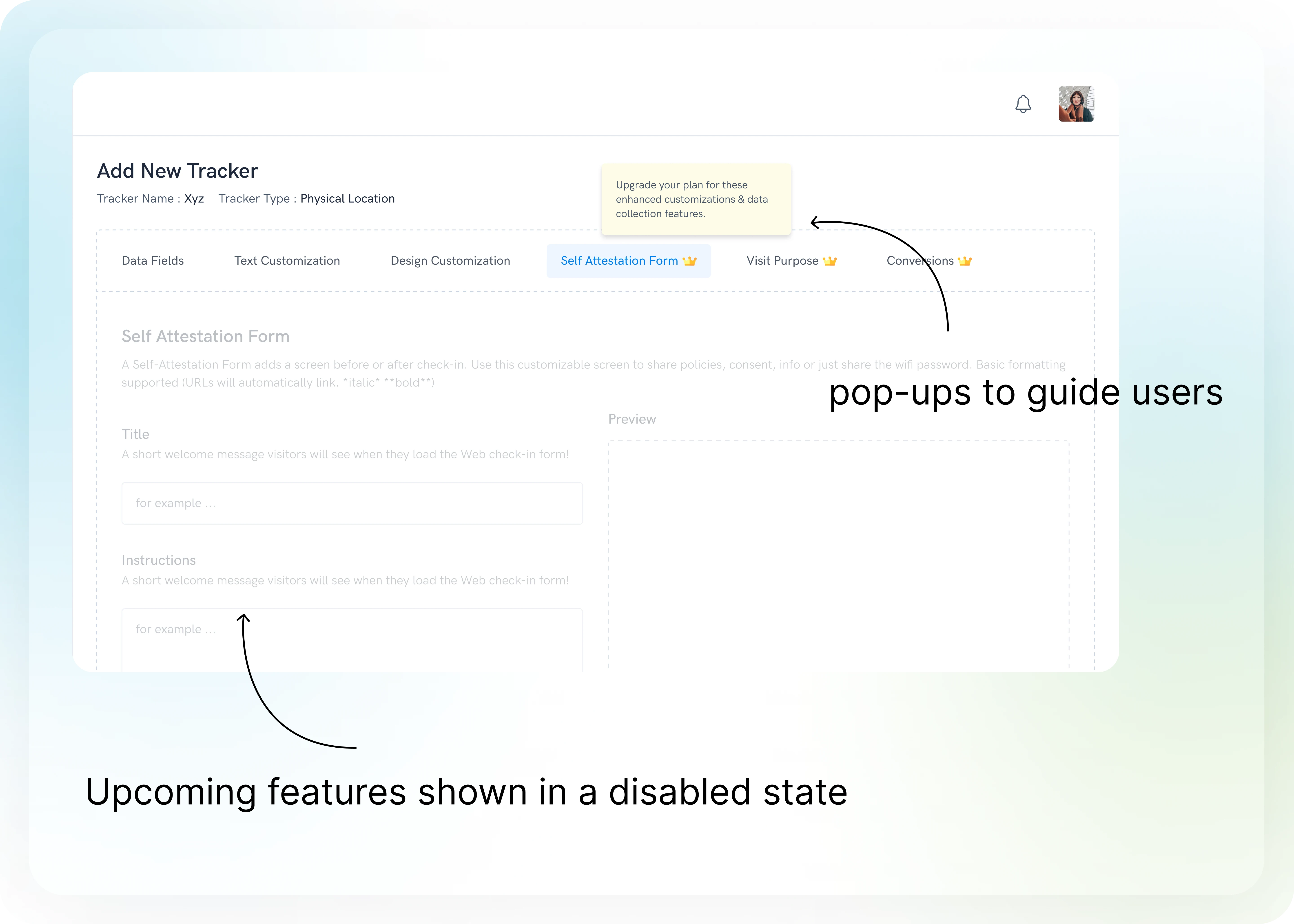
4- No User Guide (Pop-ups, dialogue boxes, etc.)
👉🏻Solutions
✨Bounce Rate Reduction
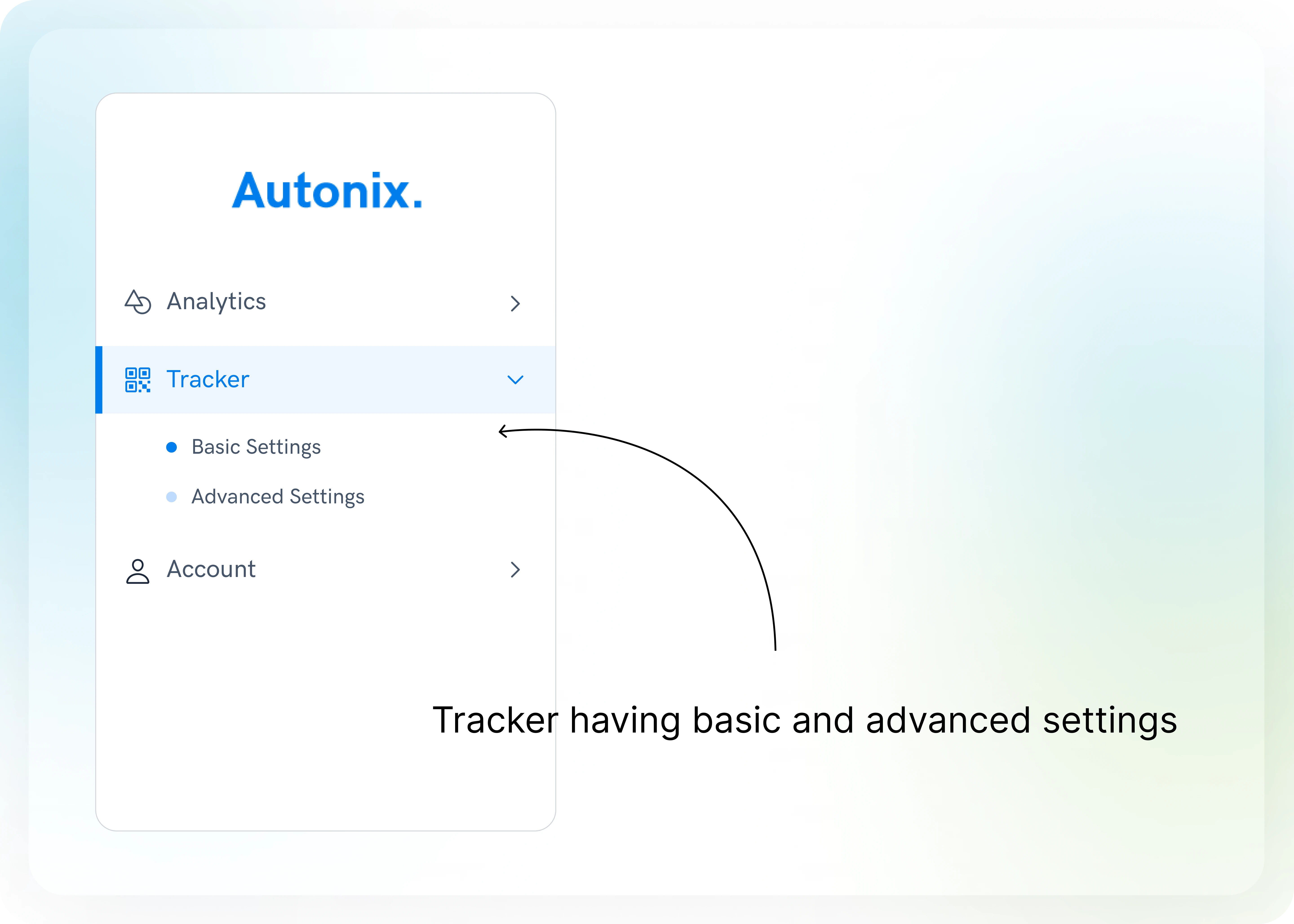
Diminishing the rate at which users leave the platform abruptly by distributing settings into two parts;
1-Basic Settings: This section streamlined the tracker creation process into just two simple steps. First, users could select their tracker type, and second, they would enter basic information to create the tracker.
2-Advanced Settings: These settings were designed for users who wished to customize their trackers further. Here, users could explore options like text and design customization at their convenience, allowing for a more personalized experience.
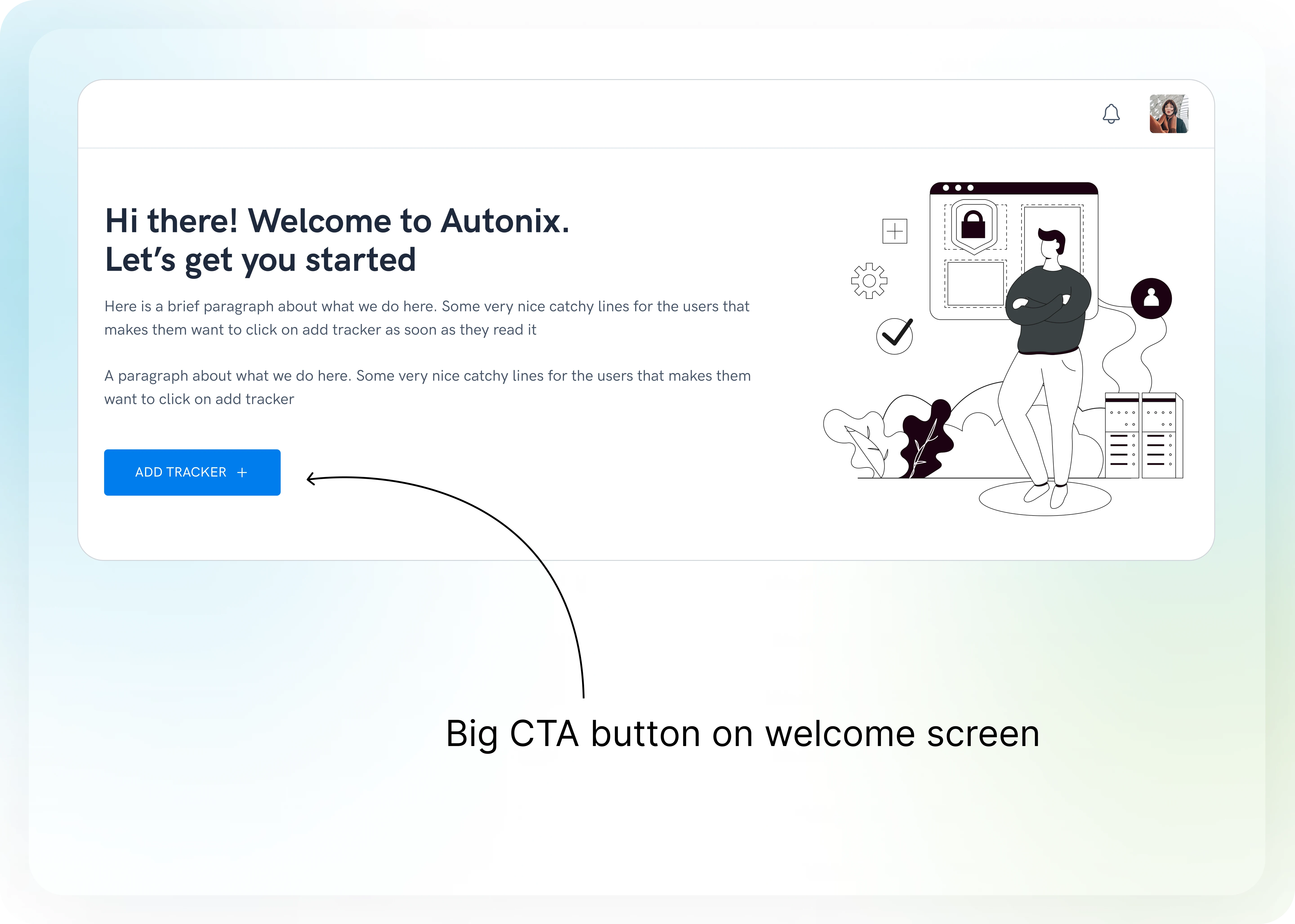
✨Enhanced Tracker Creation
Encouraging users to generate a higher volume of trackers by designing a big CTA at the welcome screen.
✨Stimulating Curiosity
Intriguing users to explore and experiment with our premium features by not keeping the features hidden.
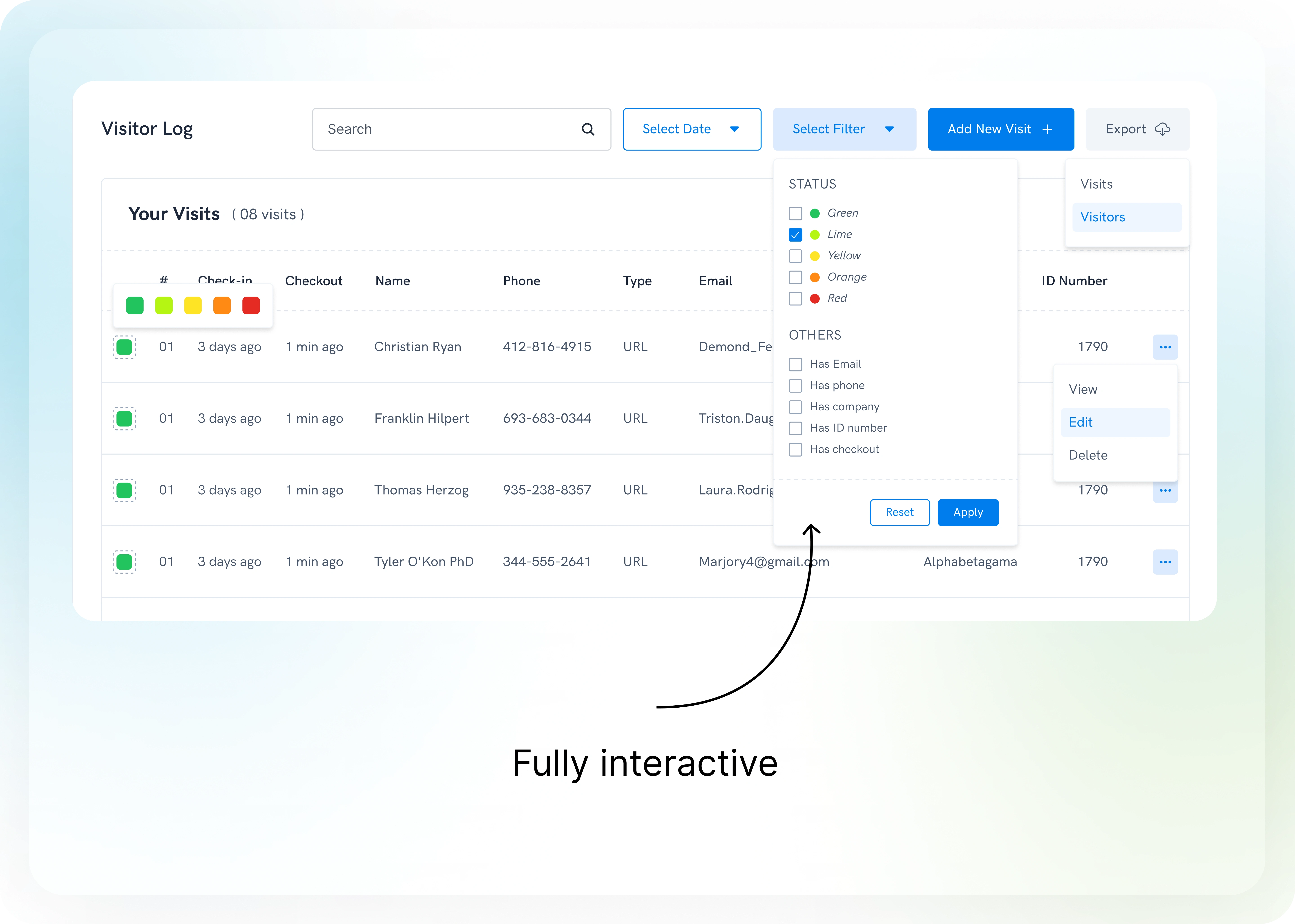
✨Full Interactivity
Providing users with an interactive interface that enhances their overall experience and engagement.
✨Elegant User Interface
Cultivating a clean and streamlined interface capable of accommodating a wealth of information without appearing cluttered.
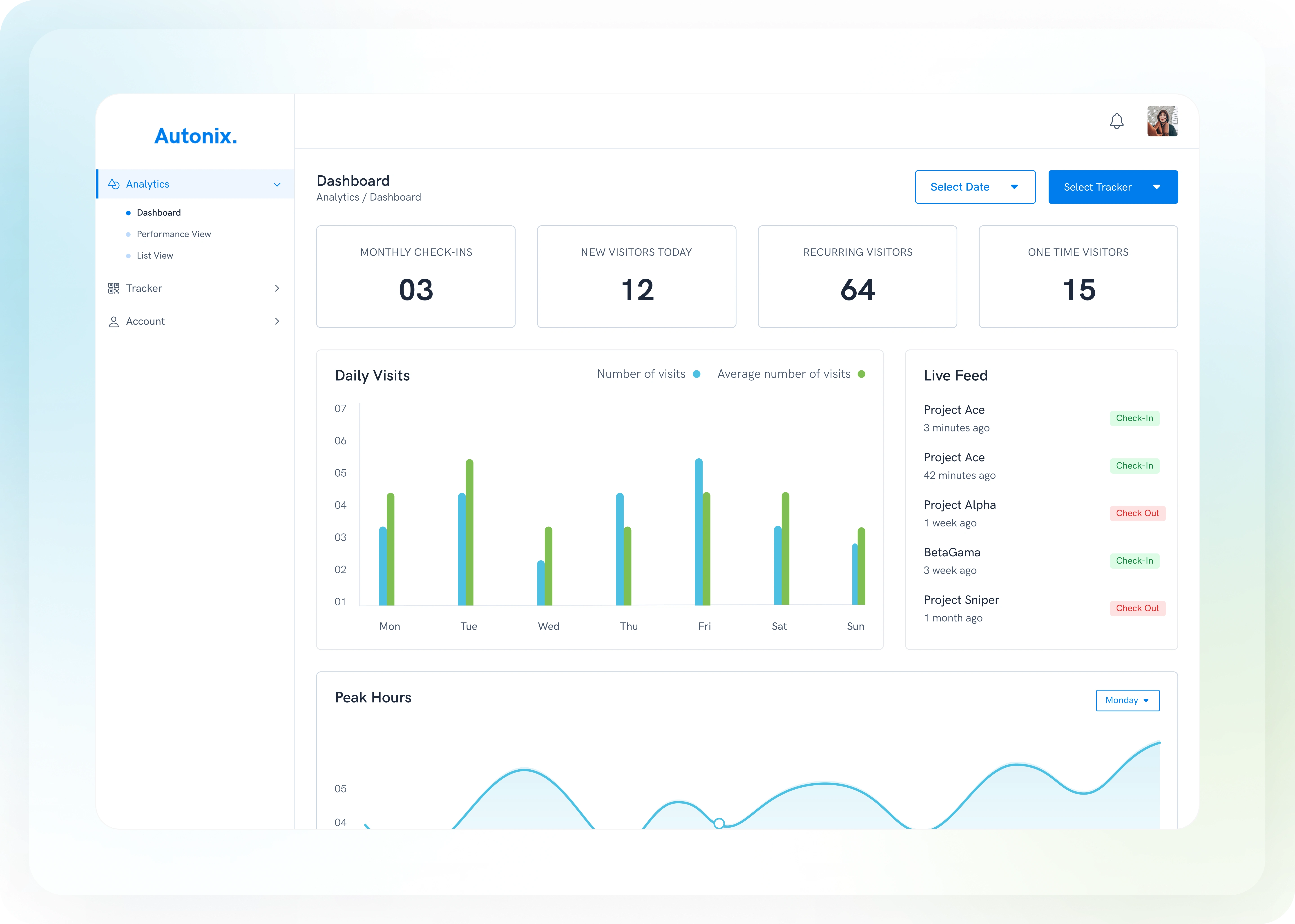
The product was launched on Product Hunt here is a link if you want to check it out further
Like this project
Posted Sep 30, 2023
Through meticulous analysis, I pinpointed pain points and orchestrated a design focused on elevating user-friendliness
Likes
0
Views
39
Clients
Autonix

