USA Today Redesign
Laiba Tahir
Overview 👋
As, I was going through the daily news articles on USA Today's online platform, I couldn't help but notice the disorderly typography and lackluster user experience. Inspired by this challenge, I made it my personal crusade to revolutionize the platform's design in a manner that not only enhances its aesthetic appeal but also elevates its user-friendliness.
This is what "USA Today" present website looks like🥱
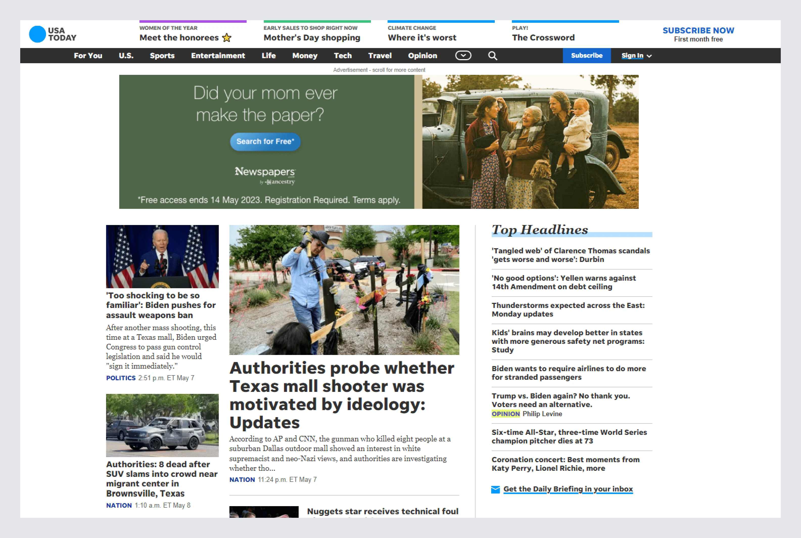
USA present website
This is what it looks like after the magic happened 🤩
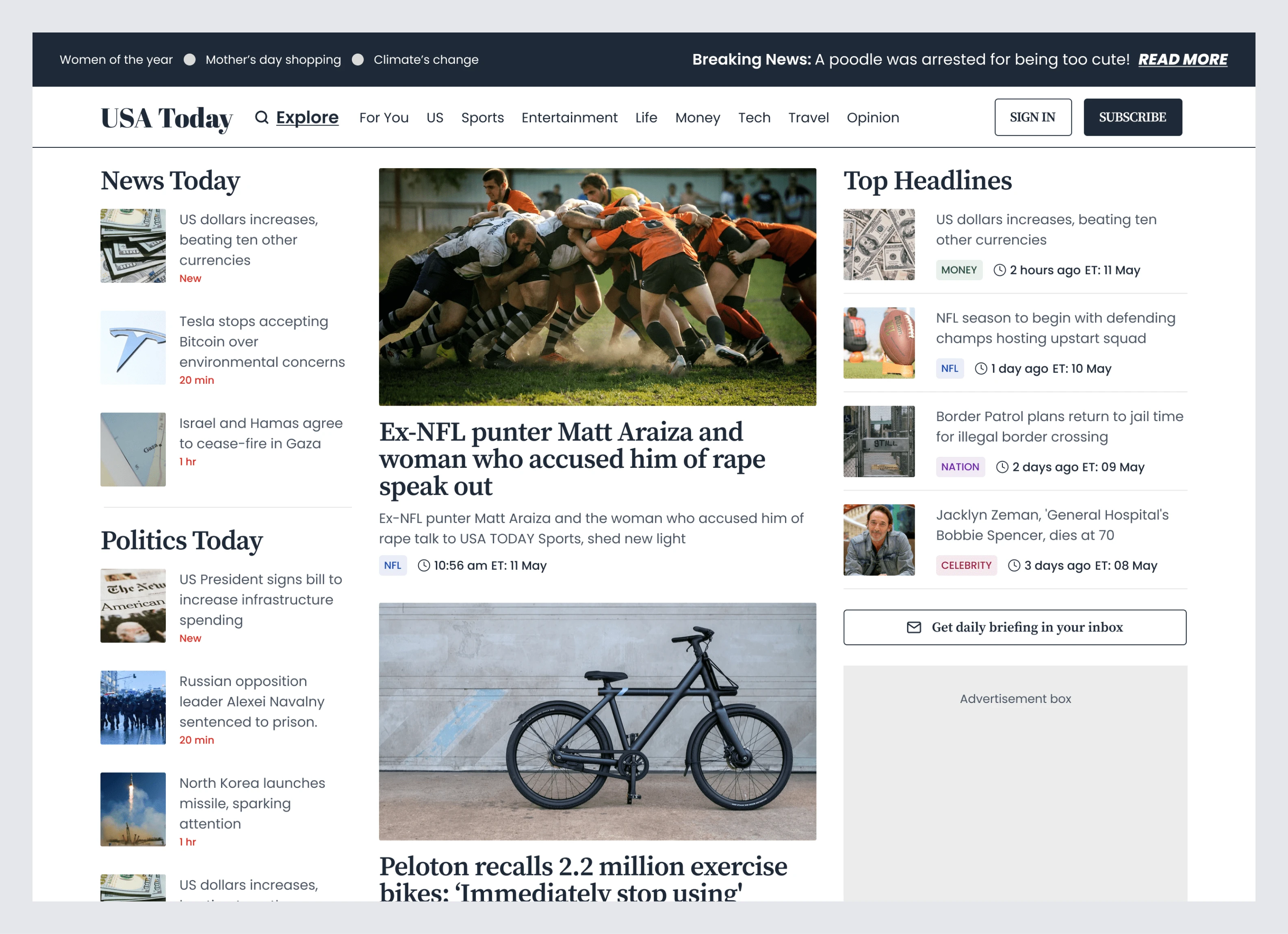
USA Today redesigned by me
🎨 My redesign process 🎨
1-Advertisement box dominating the page
The previous advertisement box was taking up valuable space on the page, leading to a cluttered and overwhelming design. By reducing its size and strategically placing it to the right, I was able to create a more streamlined and efficient layout, allowing users to focus on the most important content
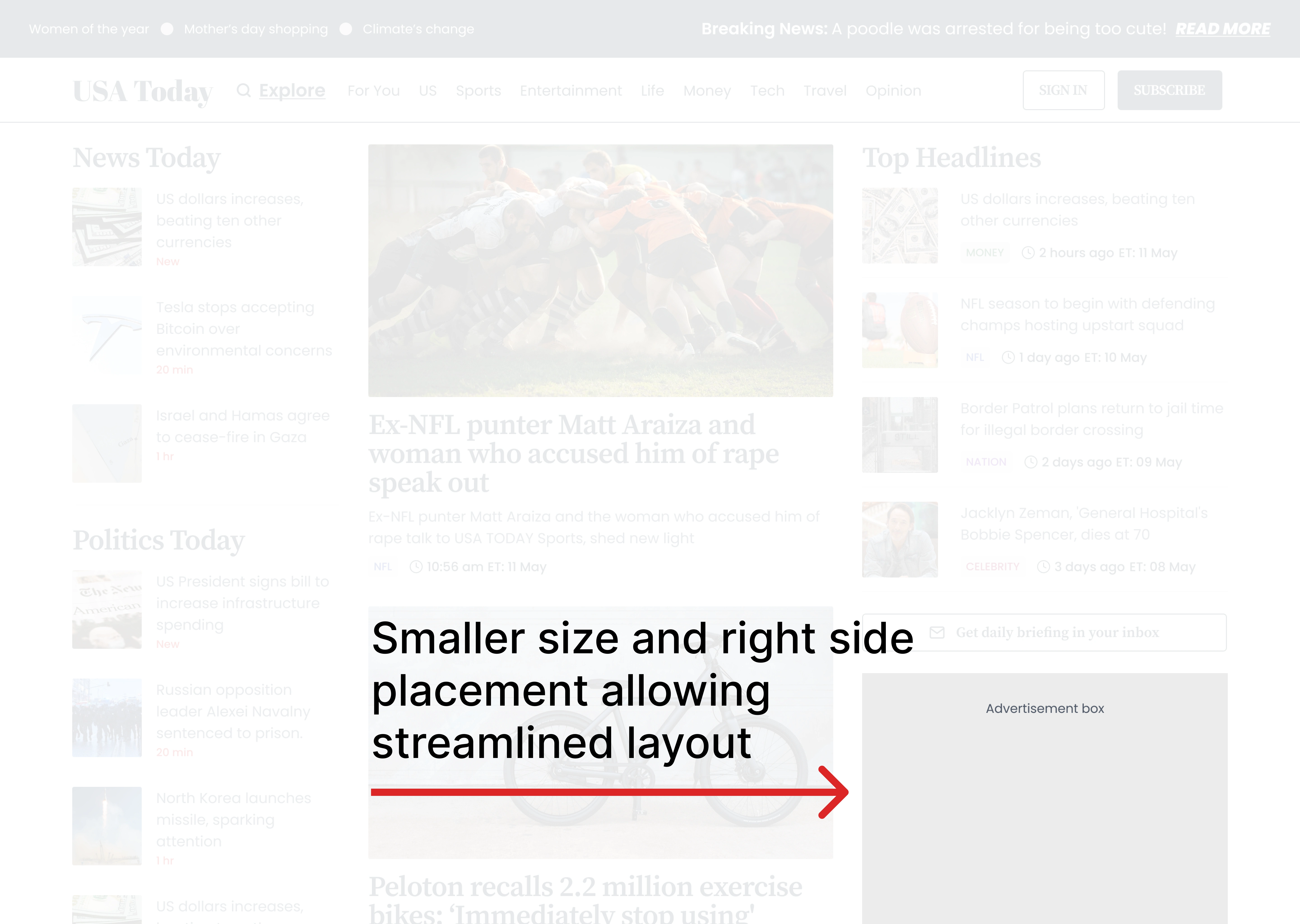
Reduced advertisement box
2- News categorization
News categorization can improved user experience by providing personalized and relevant content saving hours to searching for a something specific
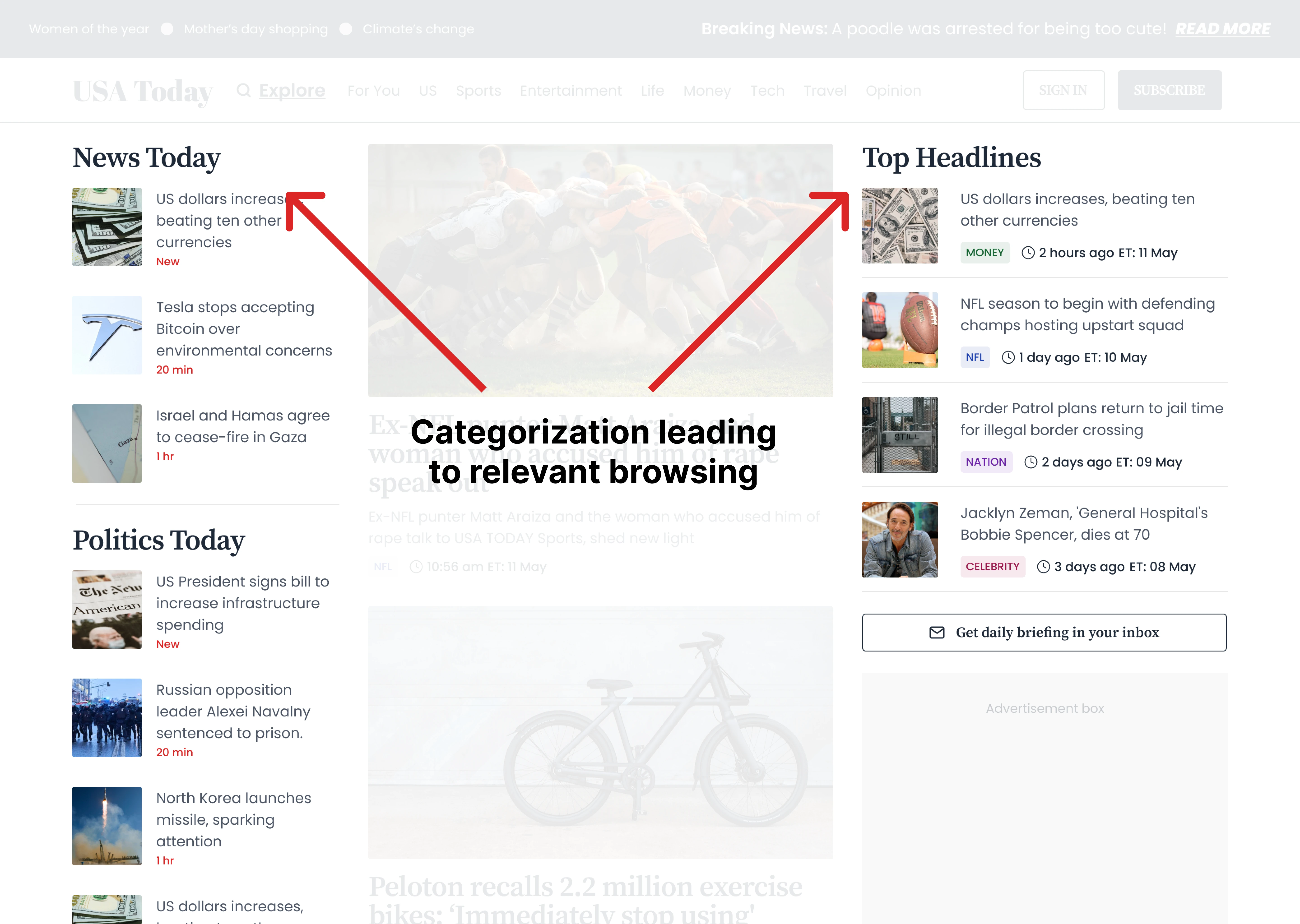
News Categorization
3- Explore Option
I replaced the search bar icon with a prominent text and icon that allowed users to easily find and explore news
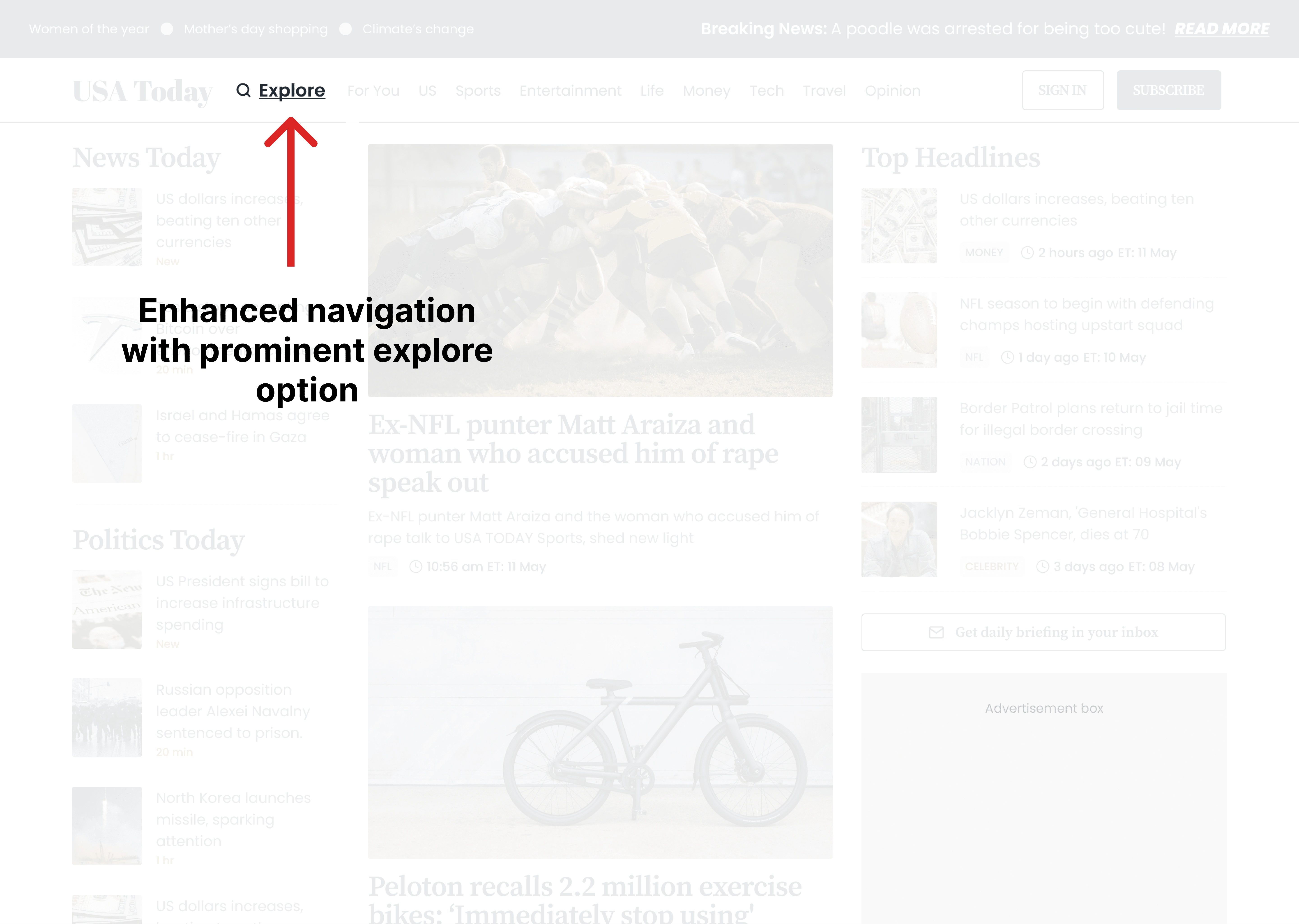
Explore Option
4- Other UX improvements
Improved typography for enhanced readability
Reduced time size for a cleaner look (Money, NFL, Nation)
Aesthetic tags for better categorization
Clear "Sign in" and "Subscribe" buttons
Breaking news section for timely updates
Like this project
Posted May 13, 2023
Through careful planning, iteration, and attention to detail, I transformed the platform, crafting an excellent user experience
Likes
0
Views
27