River Remedy | Boutique Cannabis
Cameron Maher
River Remedy is a medical cannabis company dedicated to serving Mississippi the highest quality plant-based medicines.
I had the pleasure of working with them to develop their logo and visual identity as they begin to bud in the industry.
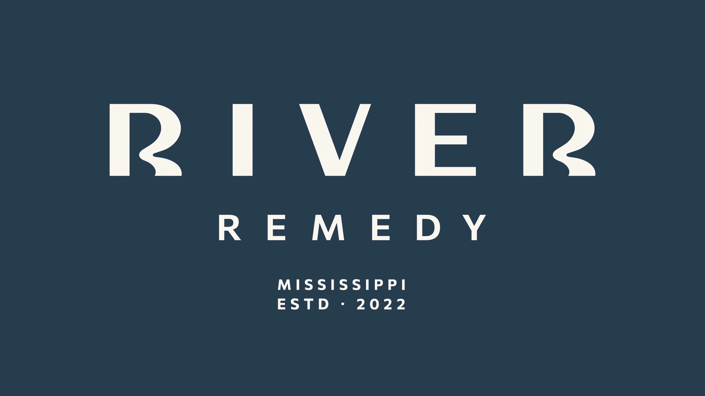
+ Primary logo
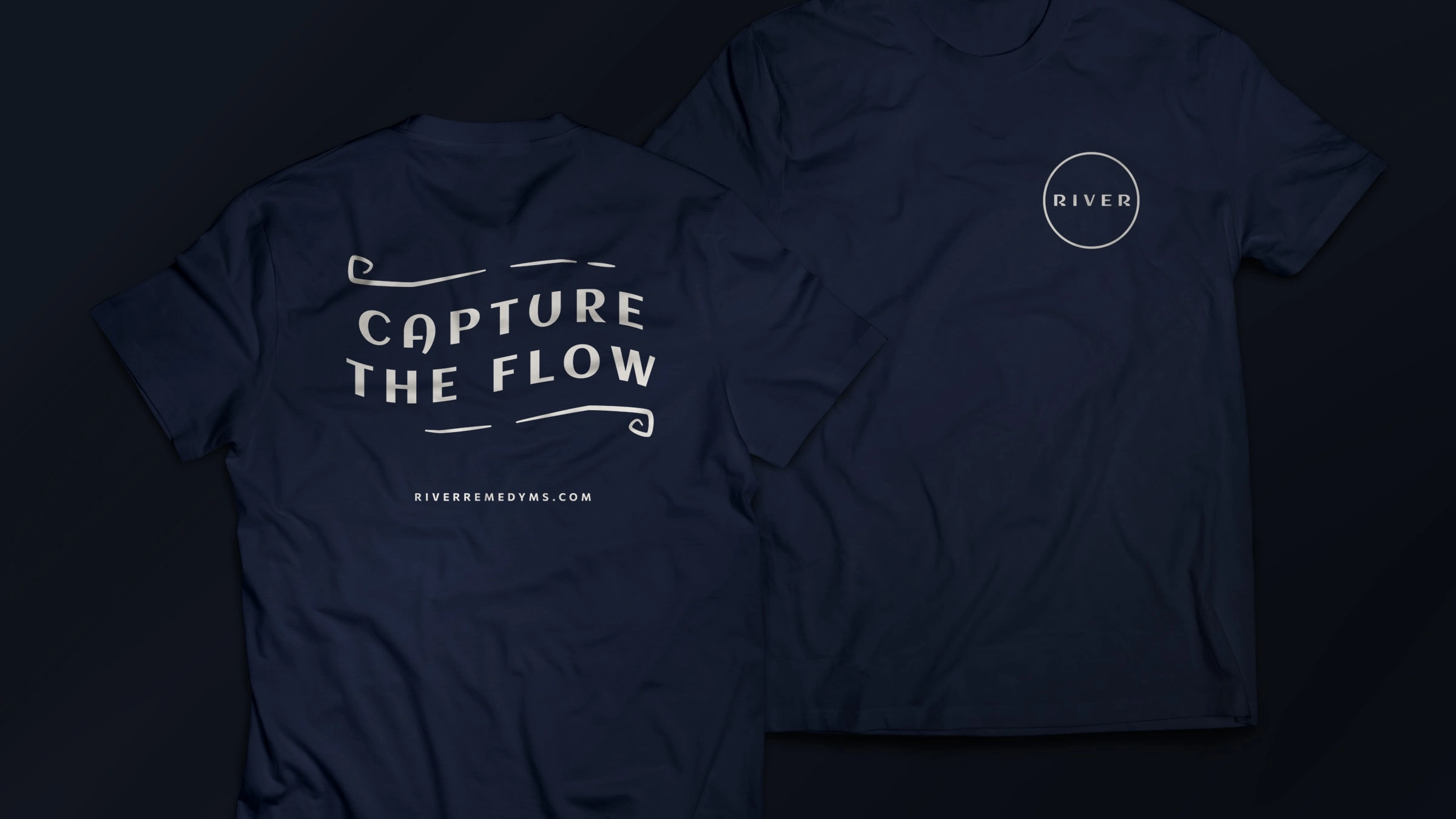
The visuals are refined but rooted in organic forms. I created a custom wordmark that feels elevated without coming off overly high class. The bends in the R’s mimic those found in the Mississippi River and capture the calm nature of the water.
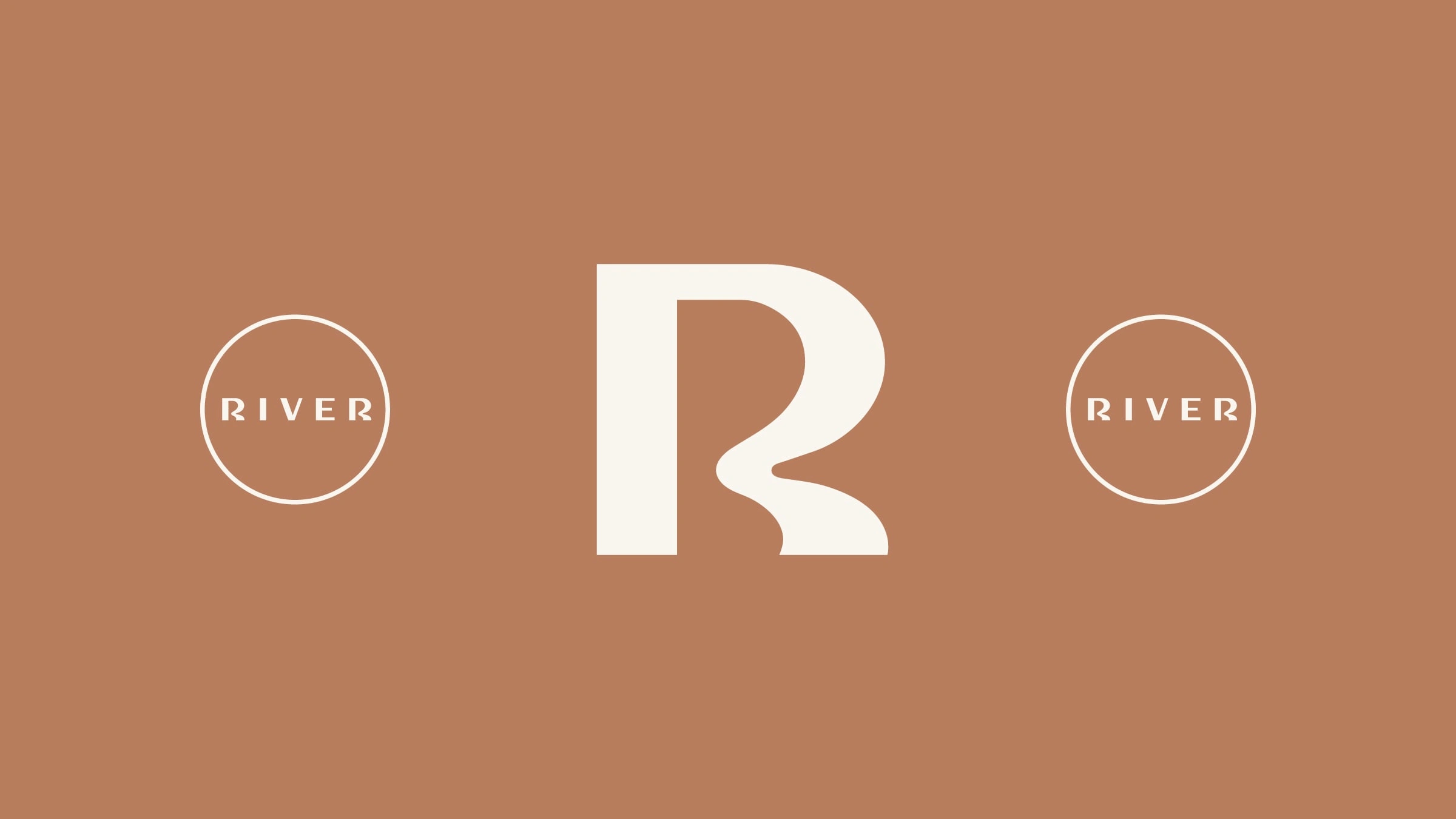
+ R mark close-up
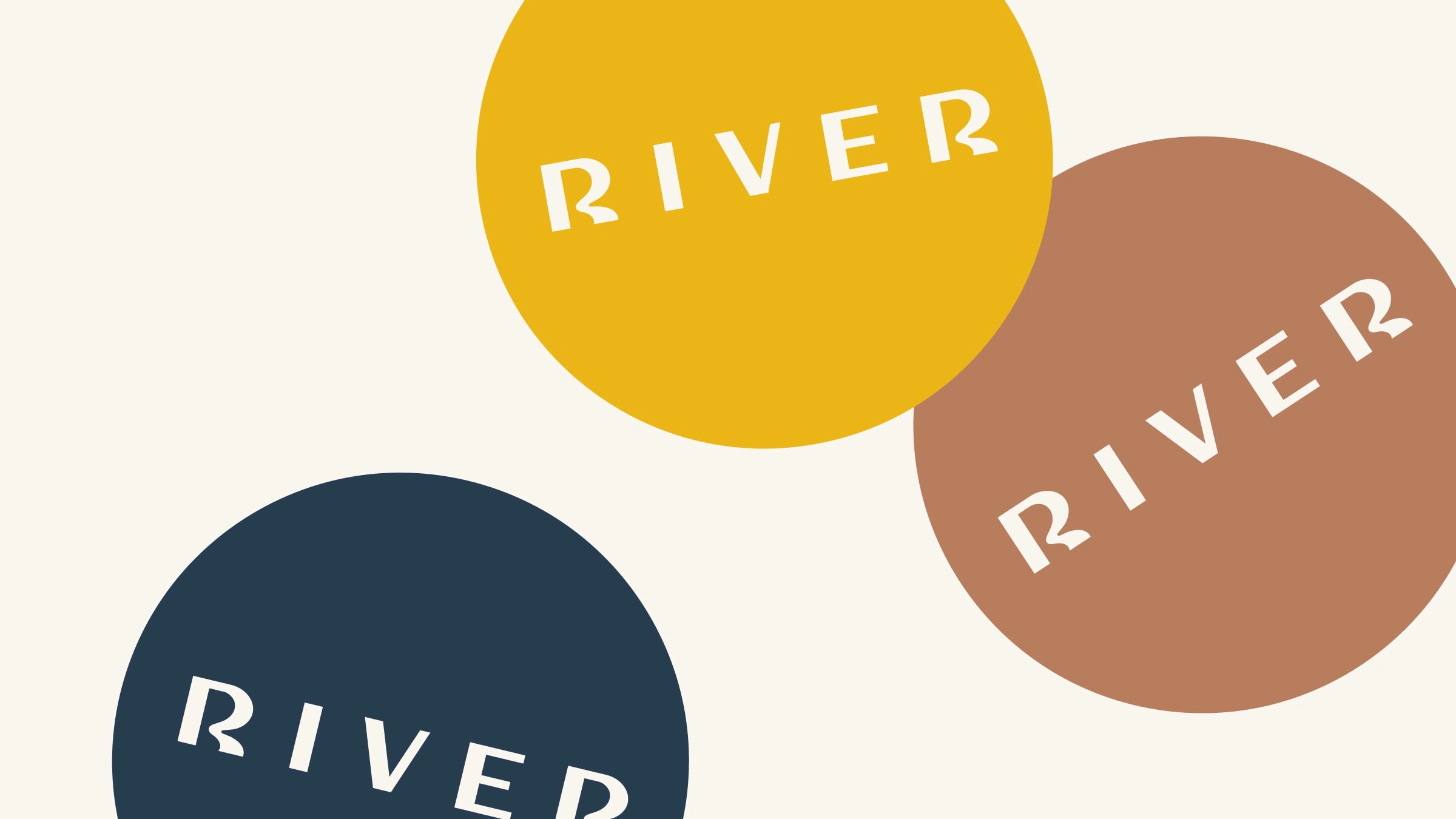
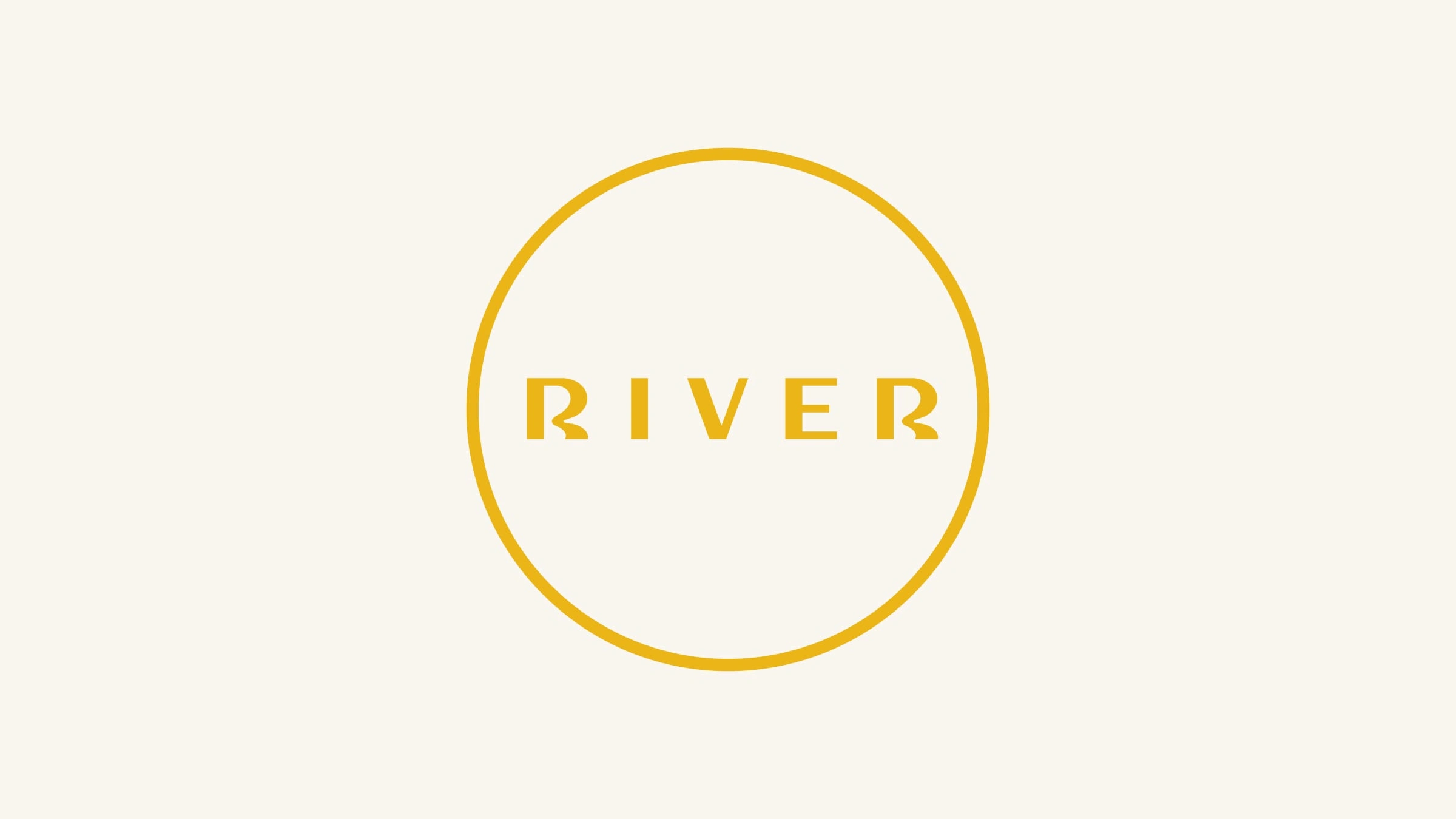
The wordmark also had to be simple and flexible enough to embody future extensions of the brand as they grow as a business. The color palette reflects the key roles in the growing process from the bright Sunshine to Mississippi Clay.
Like this project
Posted Jan 30, 2023
Logo design for a Mississippi-based boutique cannabis startup.
Likes
0
Views
89