The Chicago International Film Festival Brand Refresh & Campaign
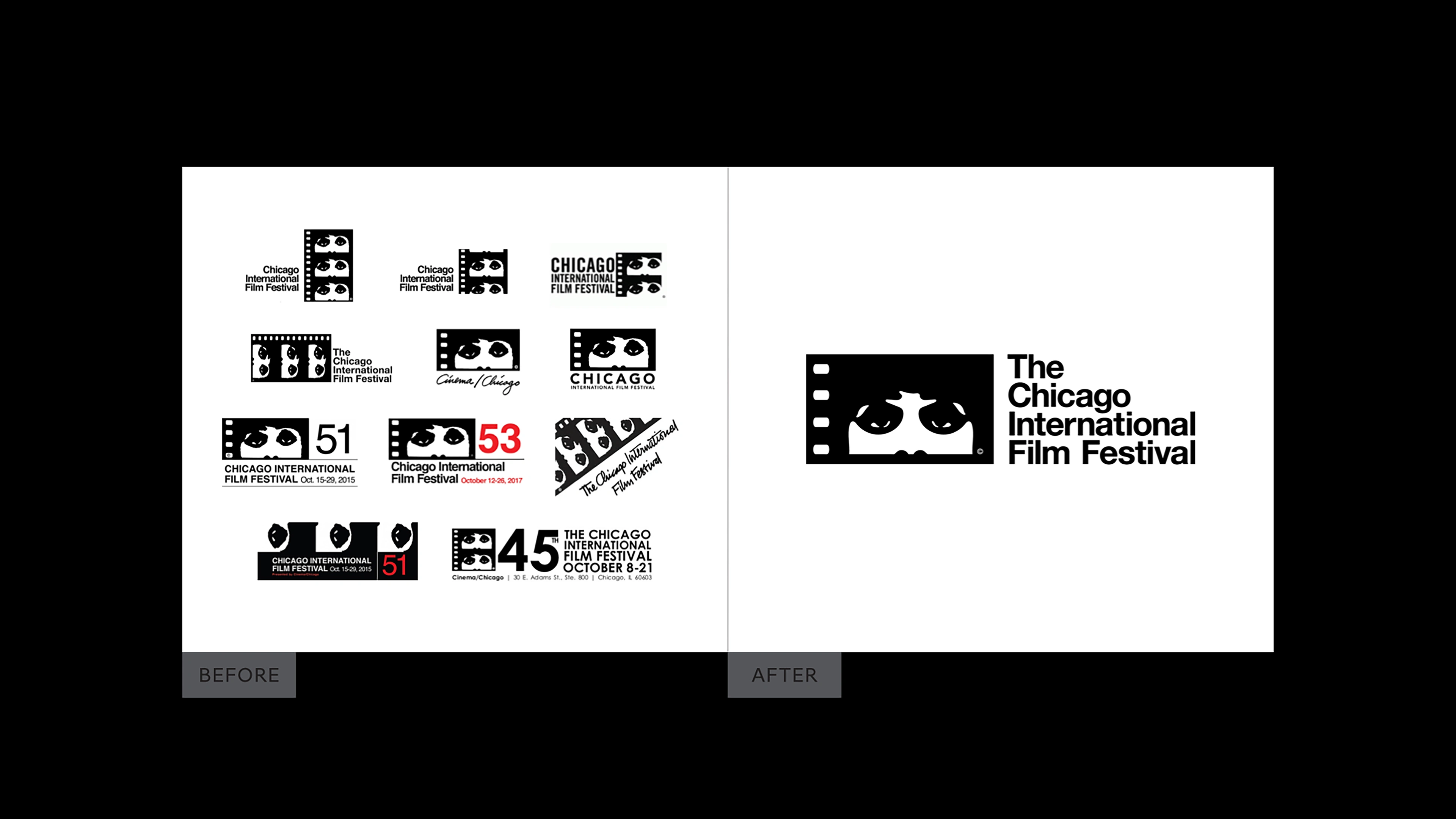
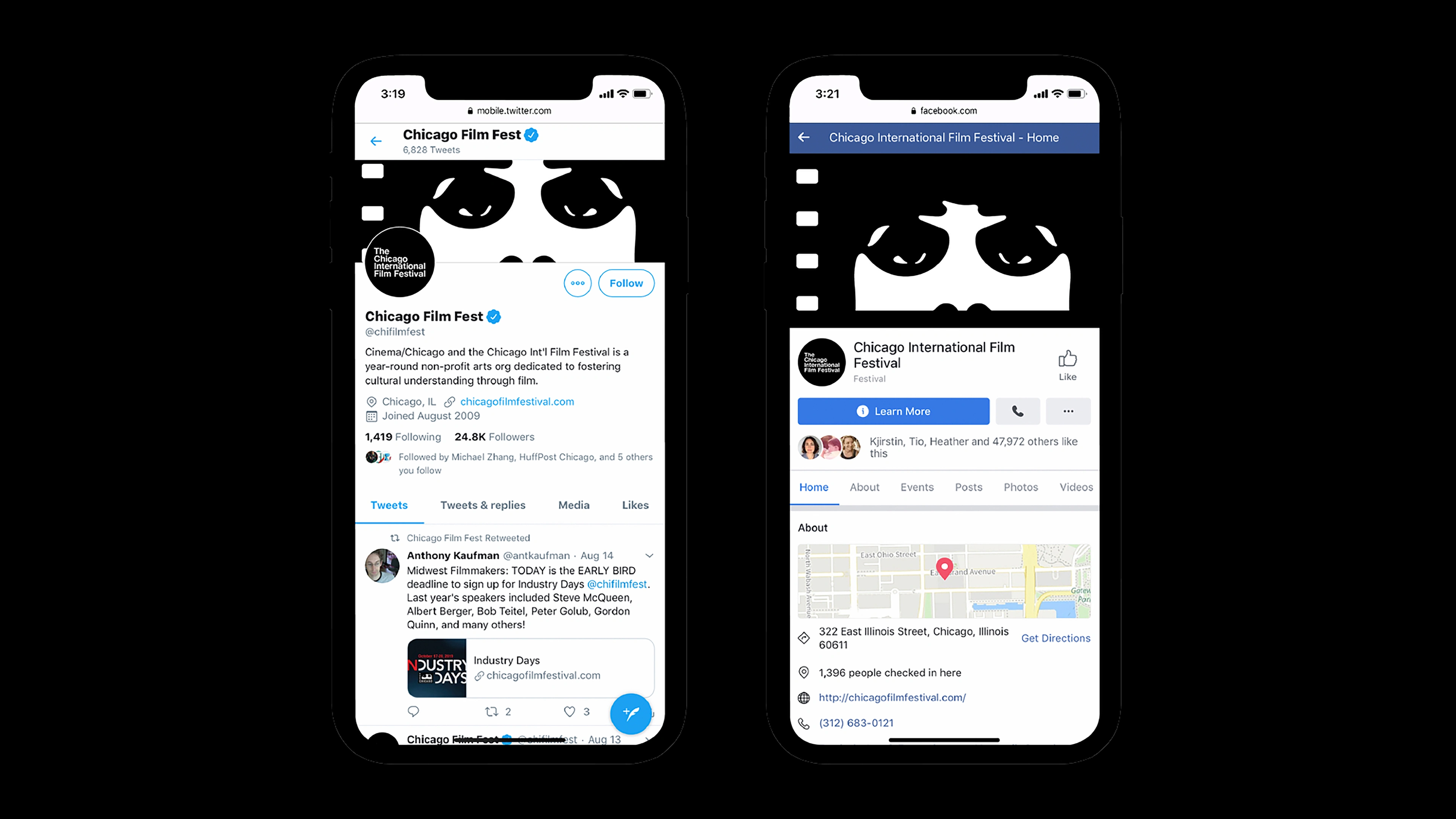
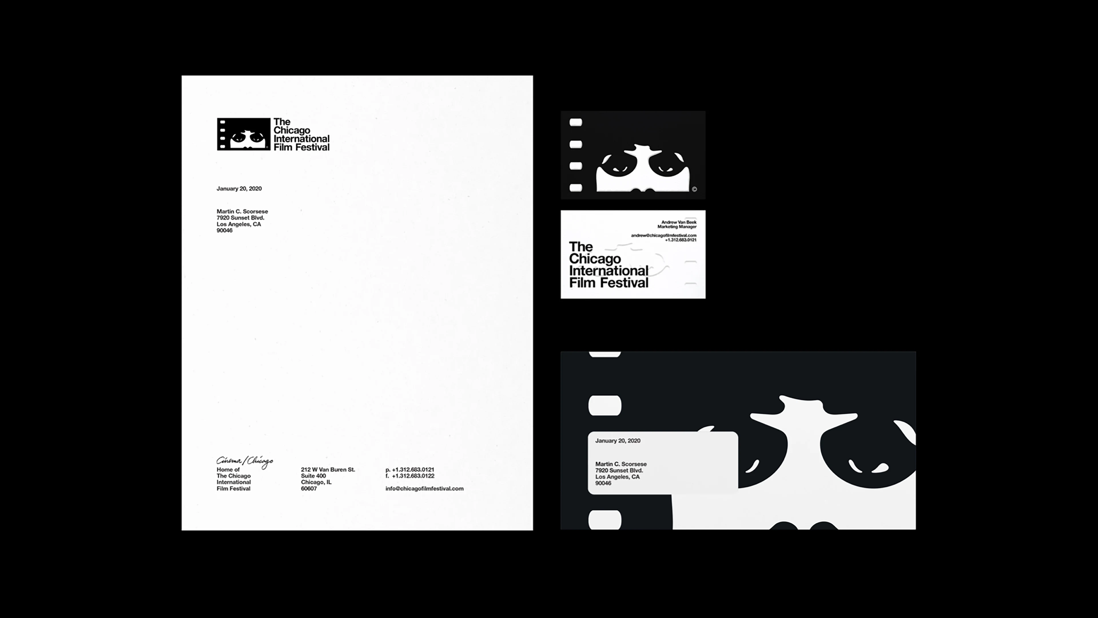
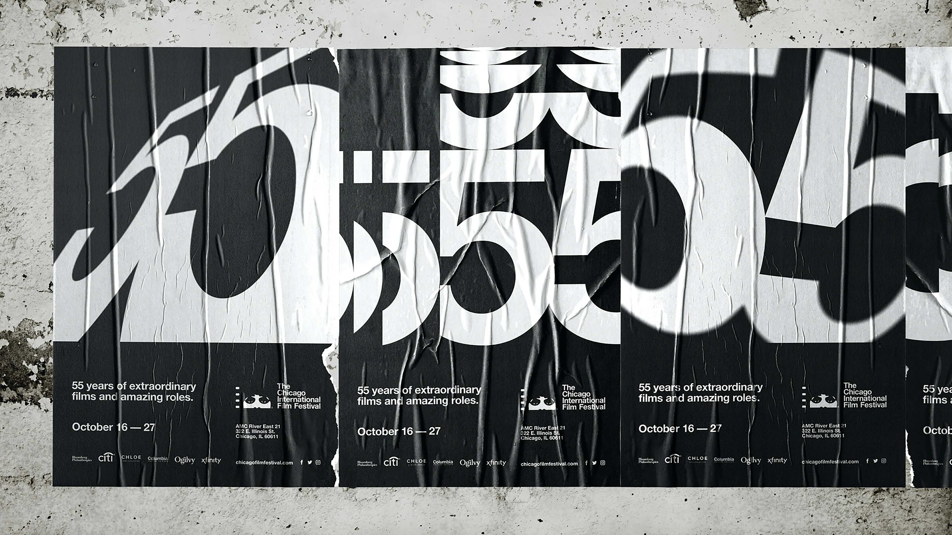
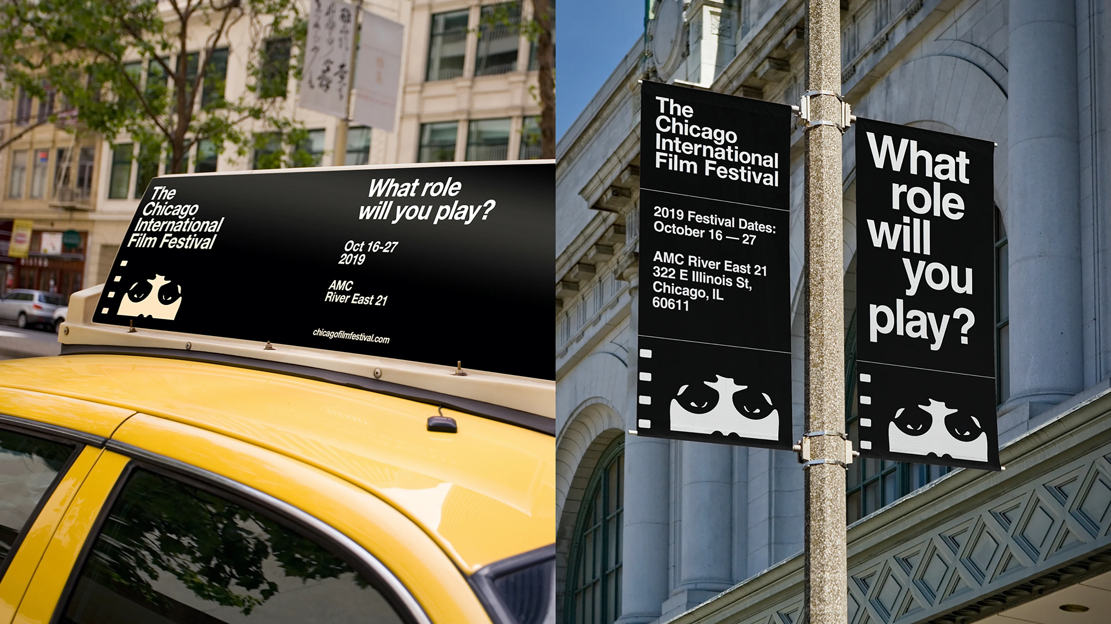
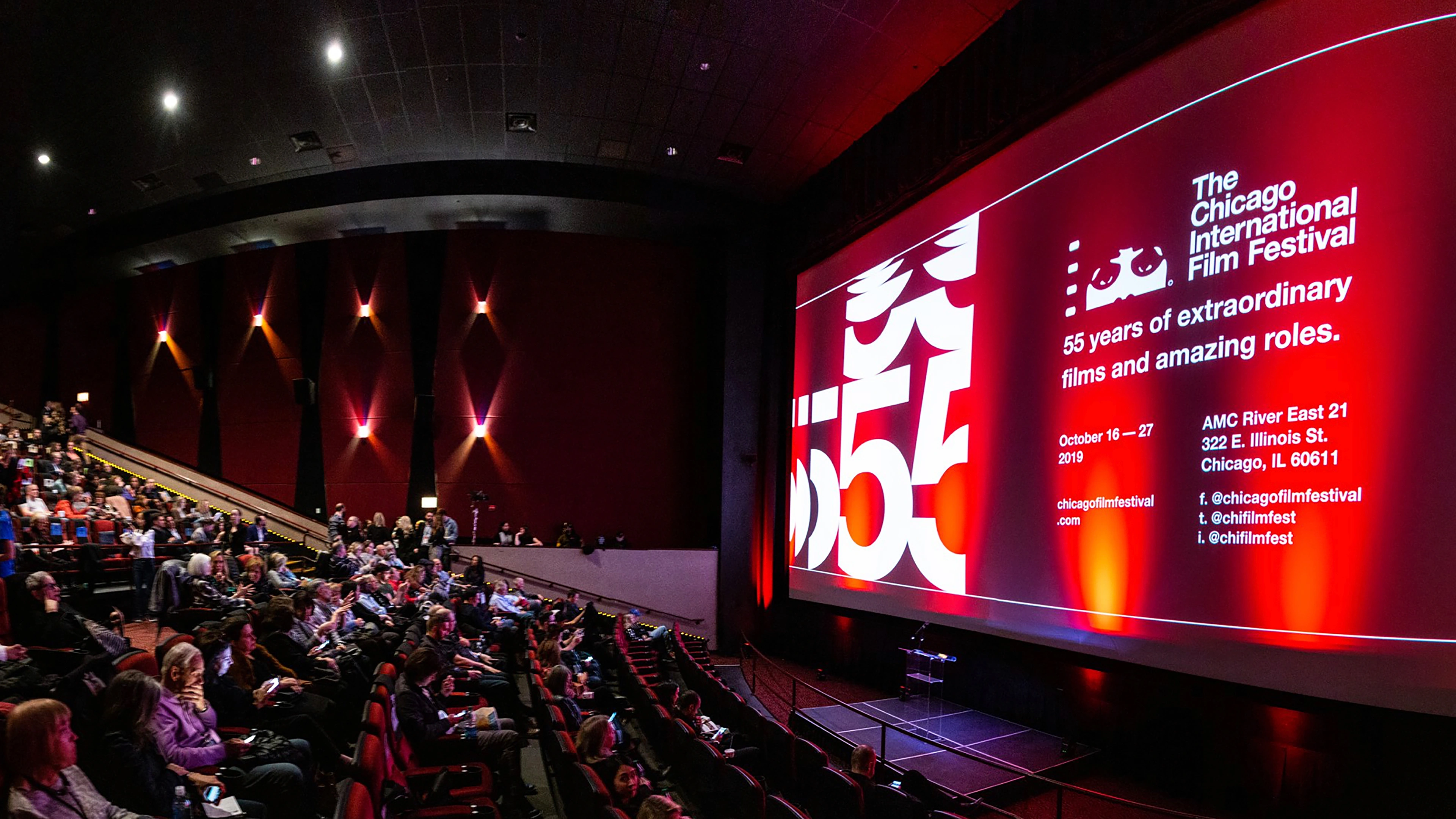
After almost 60 years as one of the longest-running film festivals in the world, the Chicago International Film Festival (CIFF) was due for a facelift. When CIFF’s Board of Directors approached the Ogilvy 485 design team, the identity featured at least ten logo variations and hadn’t had an identifiable look for the festival in decades.
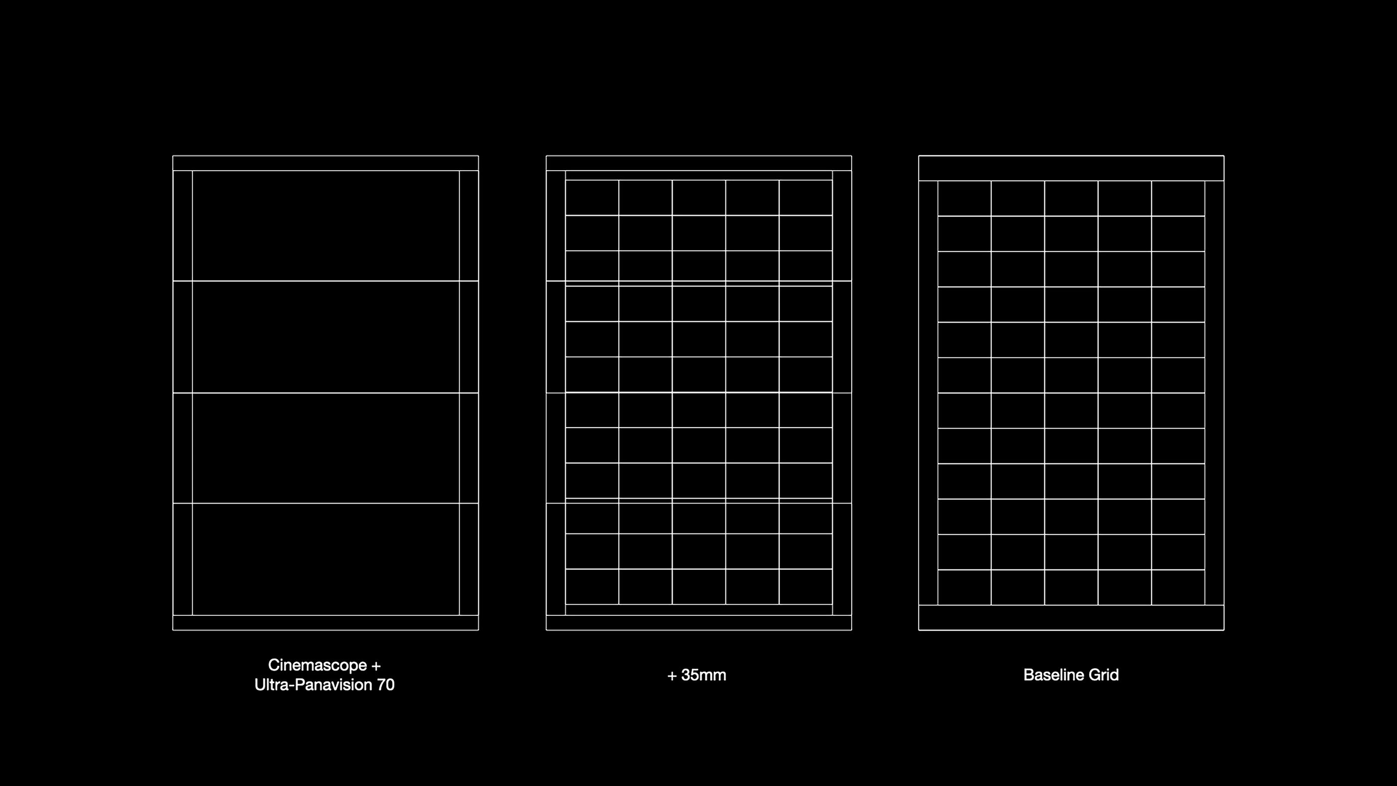
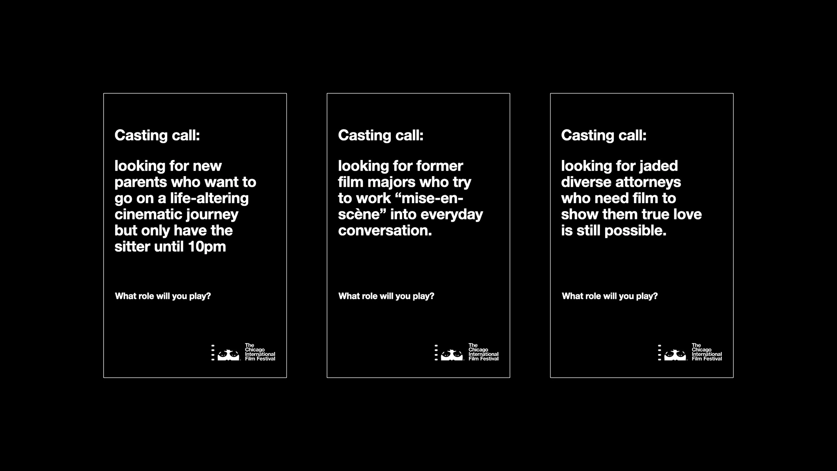
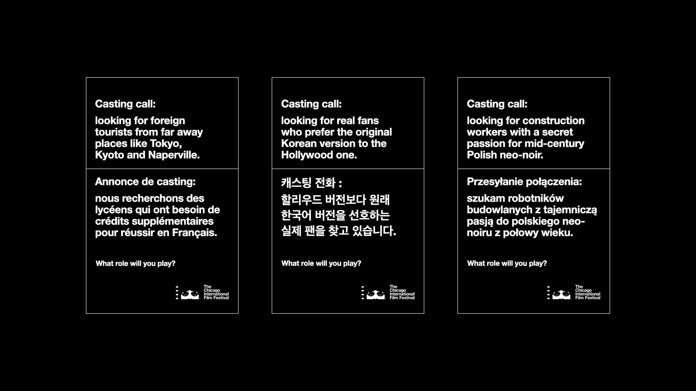
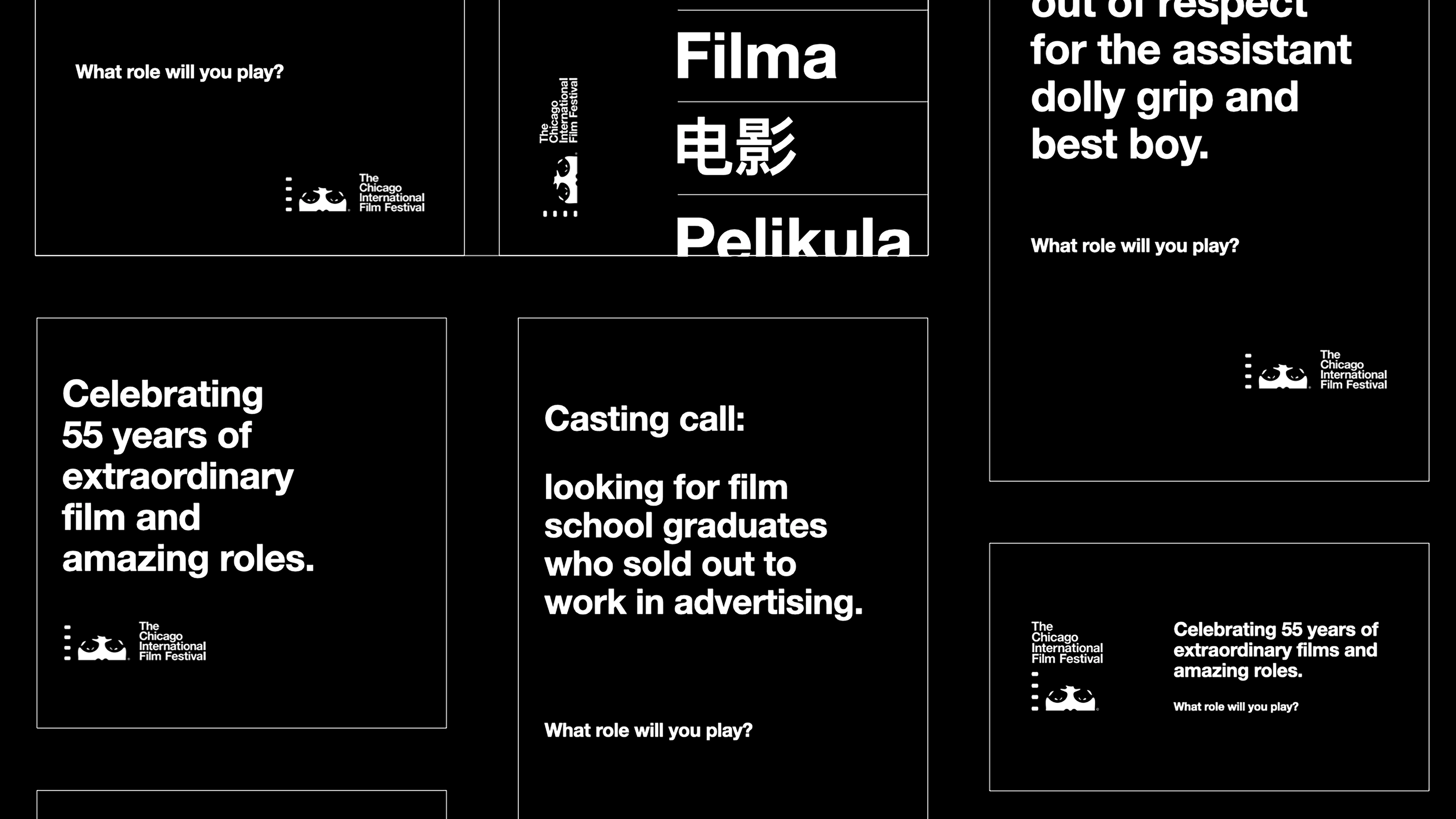
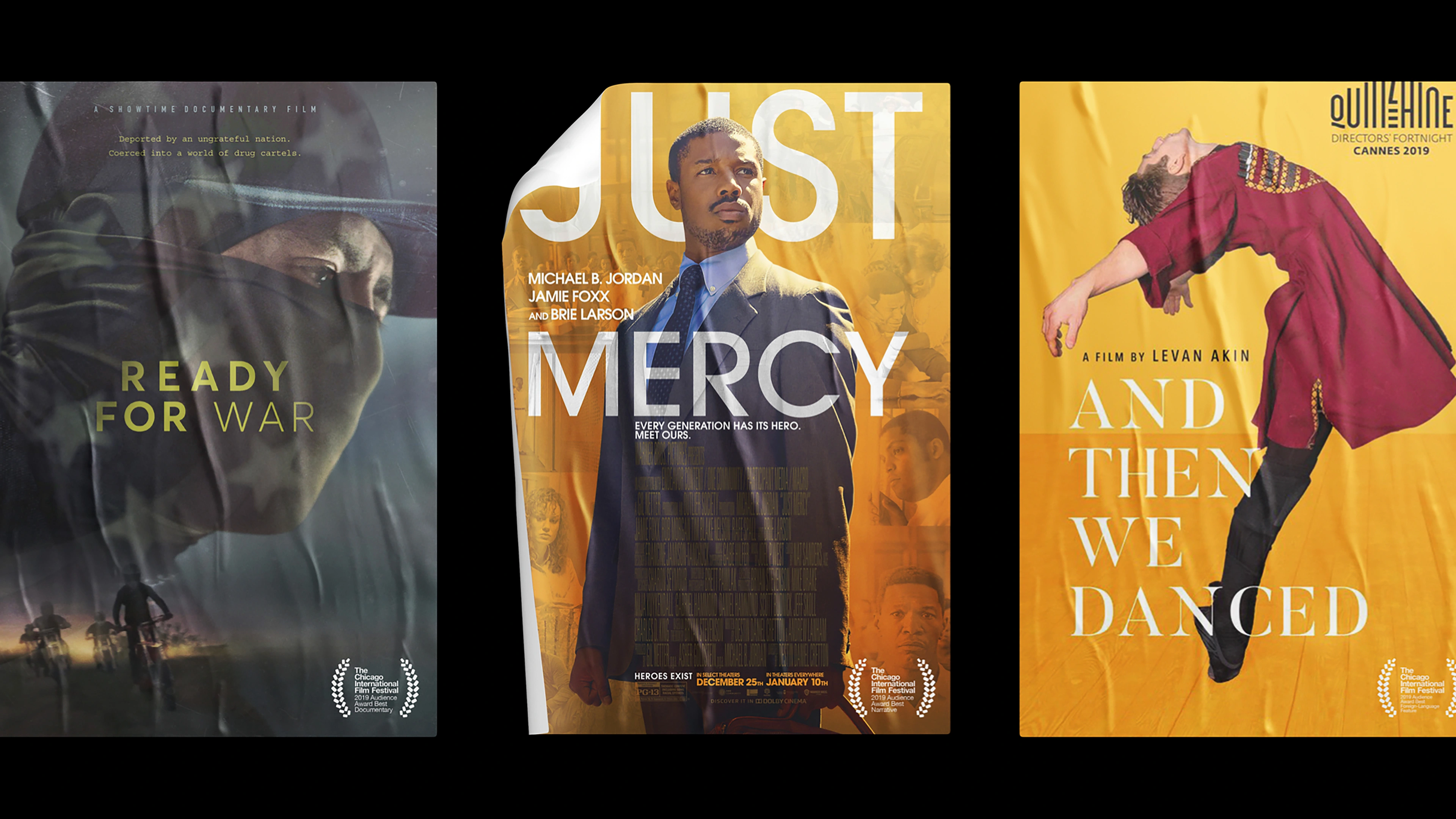
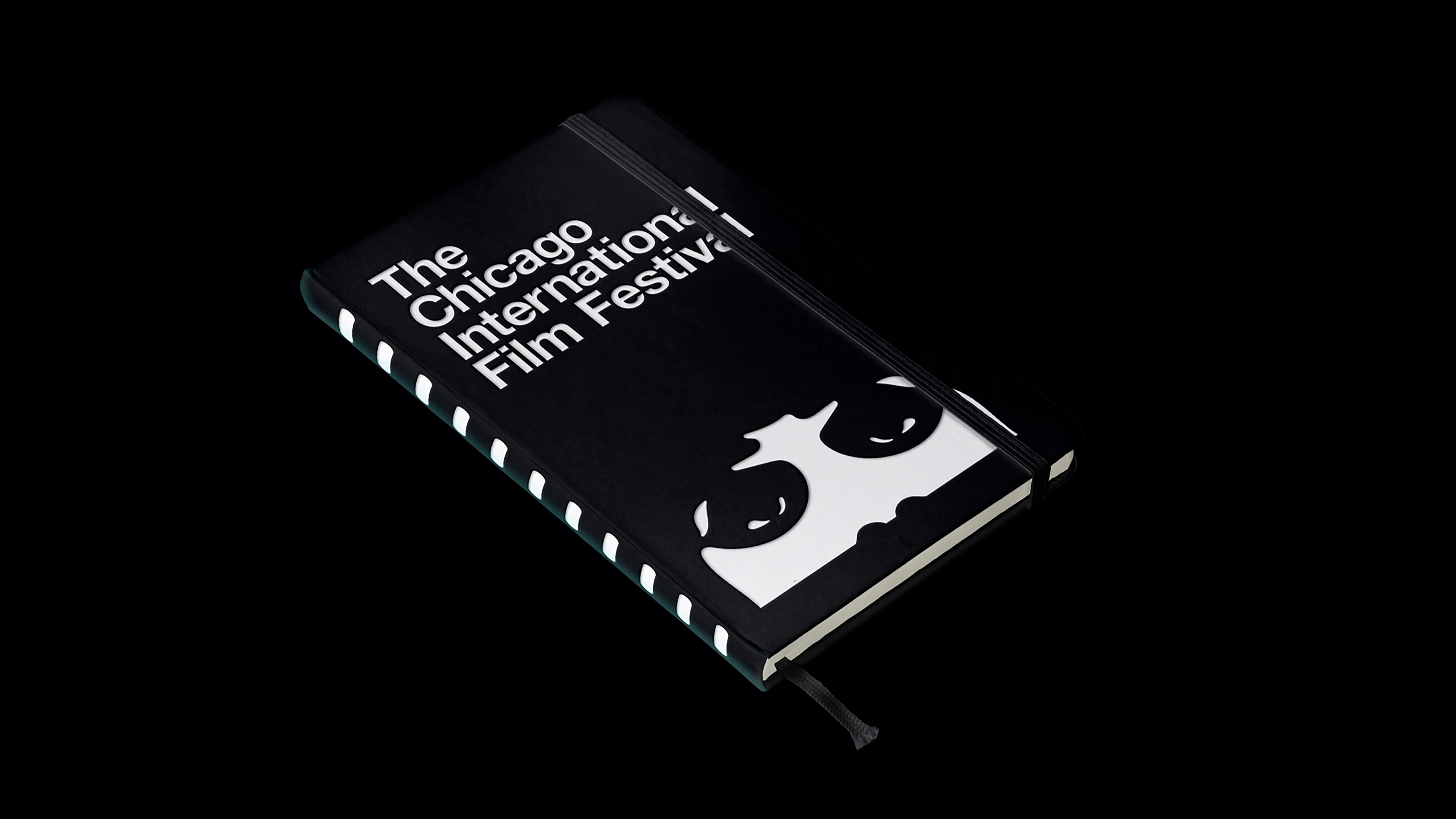
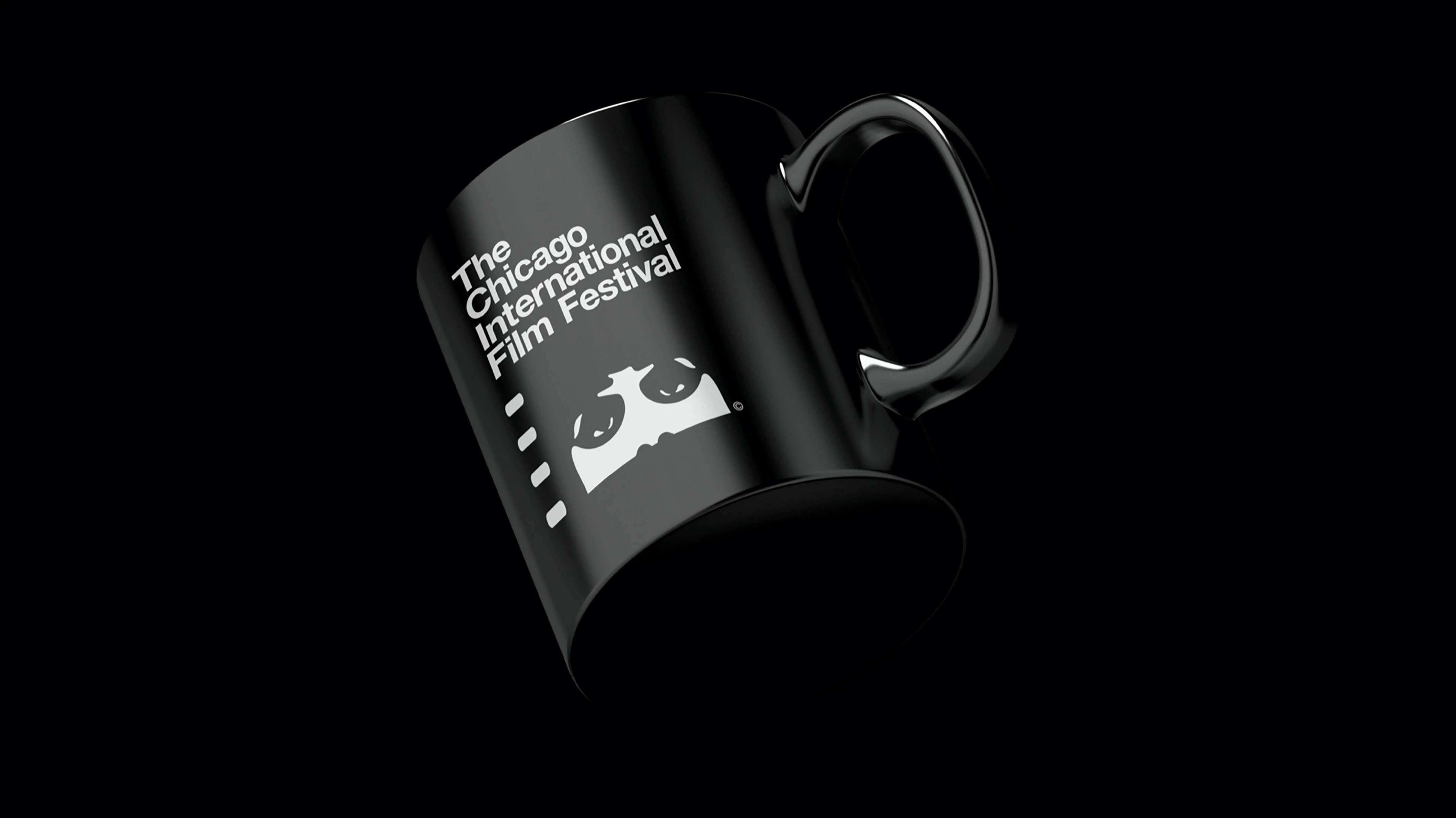
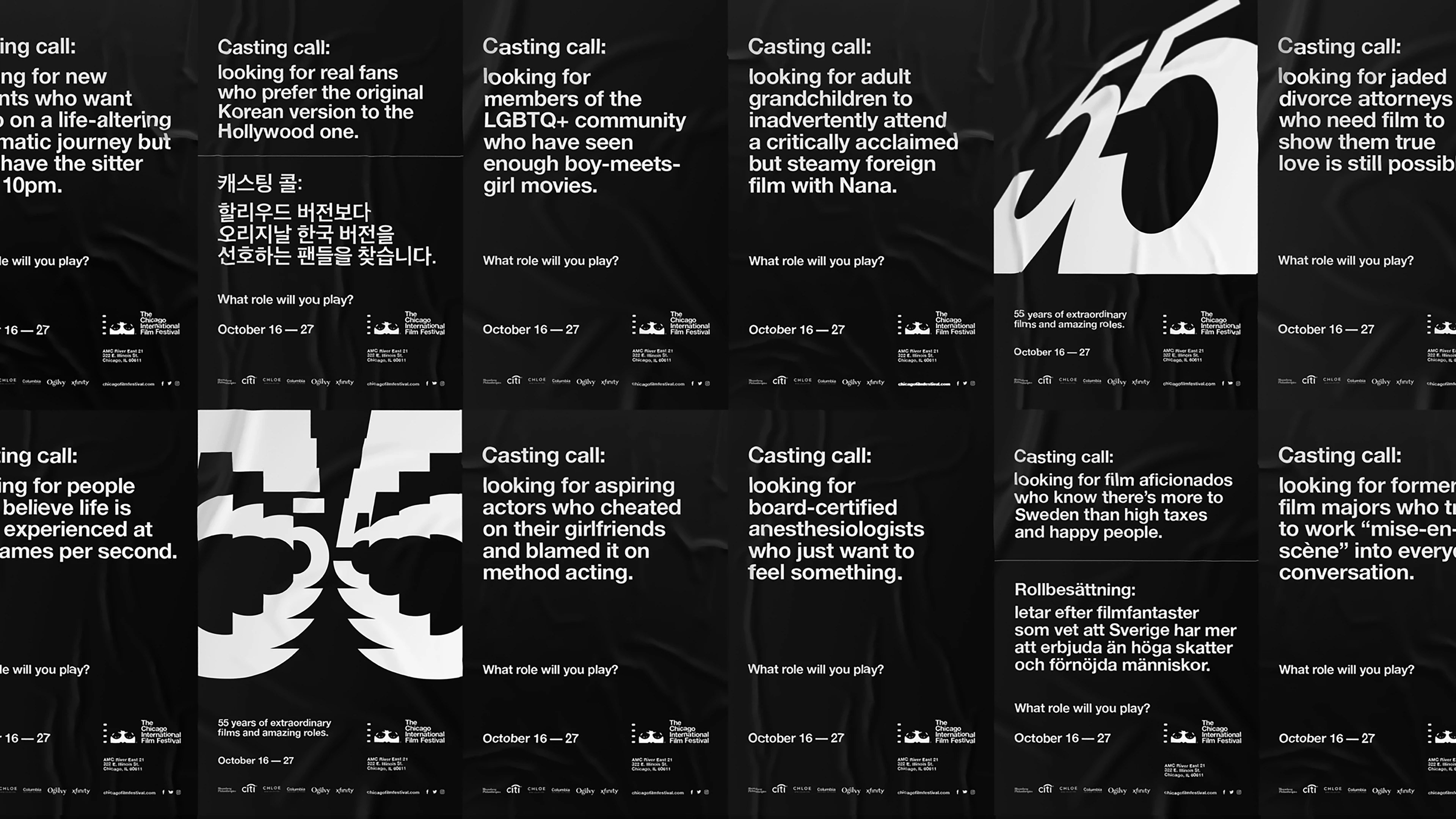
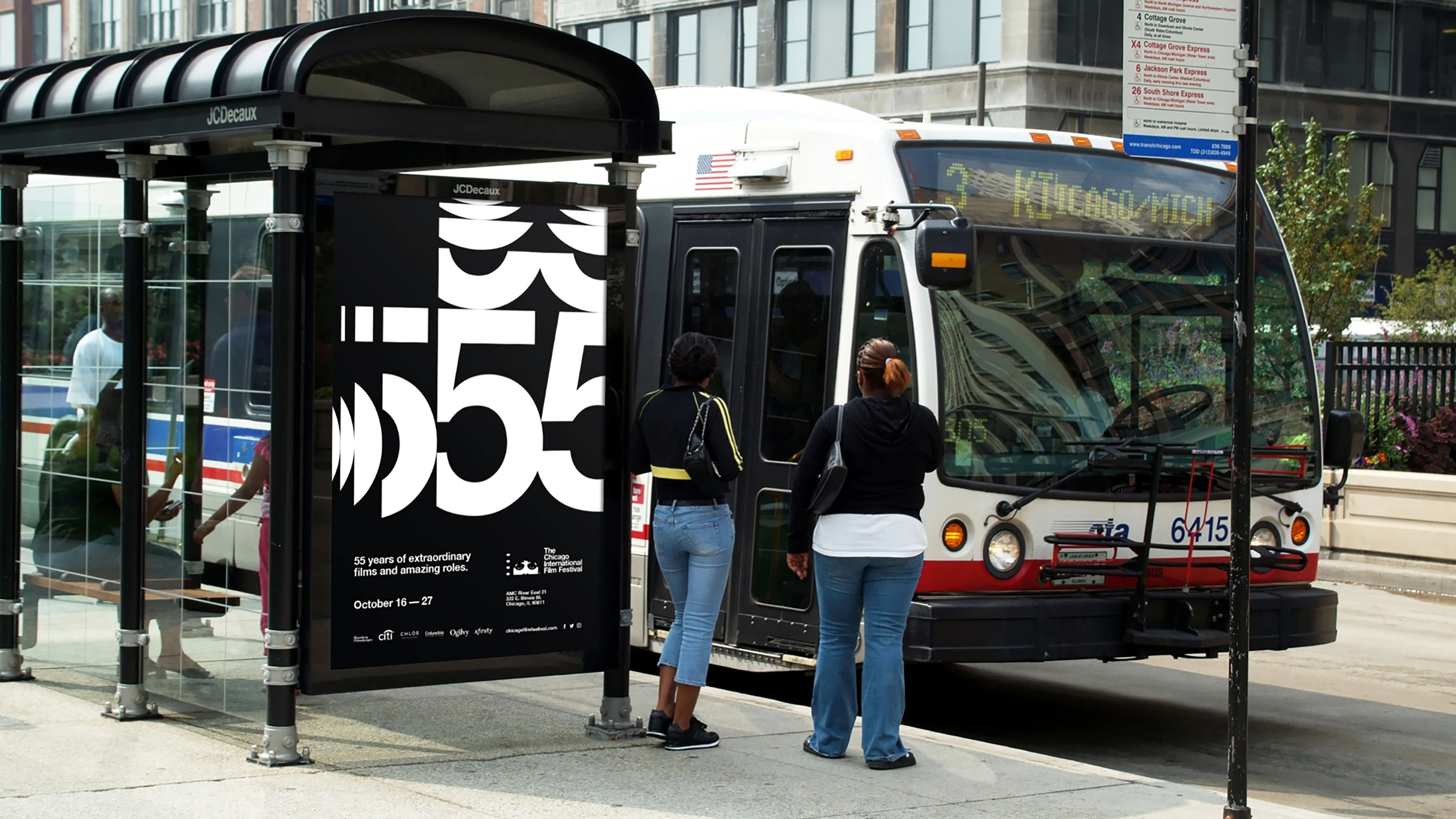
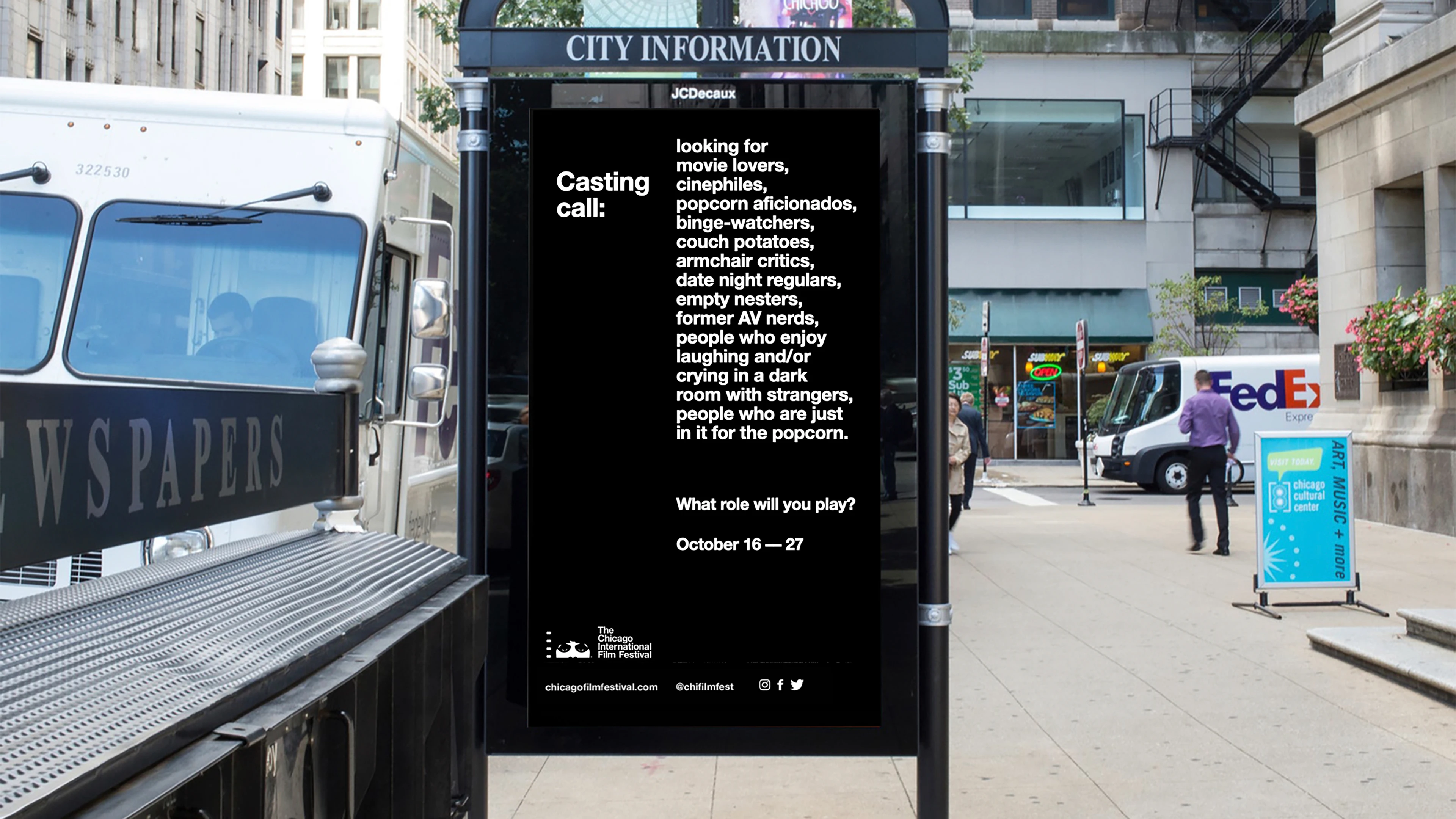
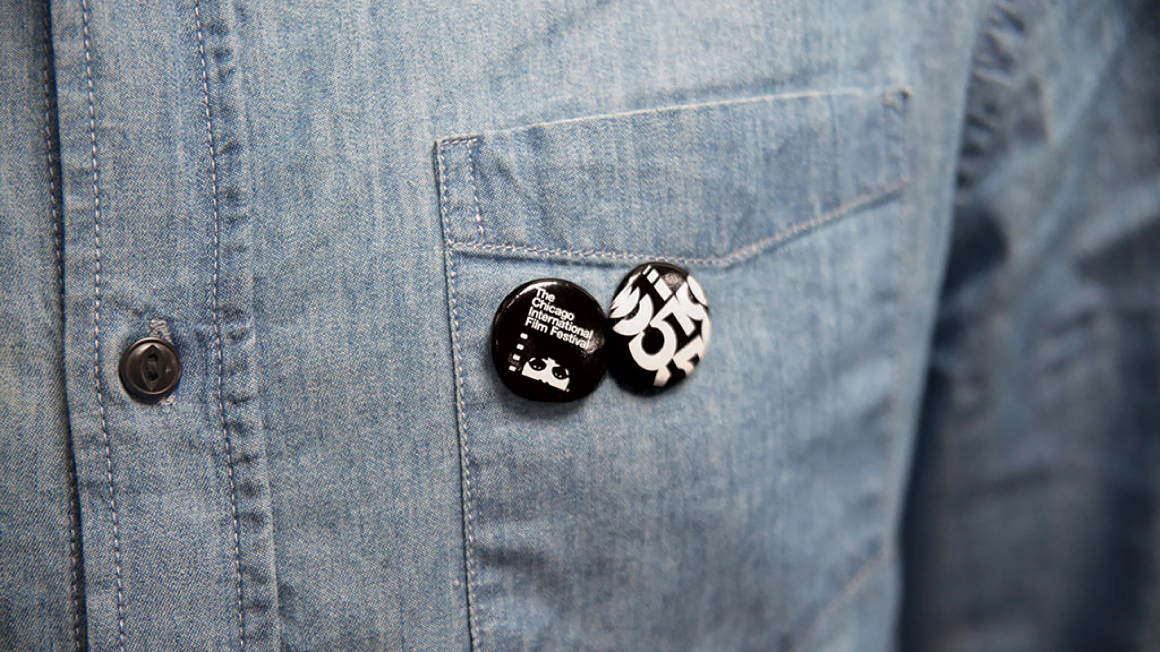
With only six weeks before the 55th annual festival, my Ogilvy teammates and I got right to work. Inspired by the original 1960-1980’s Swiss-style festival posters, the refreshed identity is boldly simple: white Helvetica Neue on black and a no-nonsense grid system that uses film aspect ratios as units of measurement. The end result is both modern and timeless, honoring the history and fundamentals of film while looking confidently toward its future.



Credits
Creative Directors – Gabriel Usadel and Joe Sciarrotta
Fellow Designers – Connor Fleming and Sho Watanabe
Copywriting – Dave Loew and Hannah Lacava
Animated OLV – Sarofsky
Cinematographic Animations – Julius Dobiesz
Account – Arianna Coxe and Alyssa Fite
Like this project
Posted Nov 13, 2023
This strategic brand refresh drew from historical Swiss-style posters, combining cinema history with a bold future, capturing and revitalizing a 60-year legacy.
Likes
0
Views
38
Clients
Ogilvy
