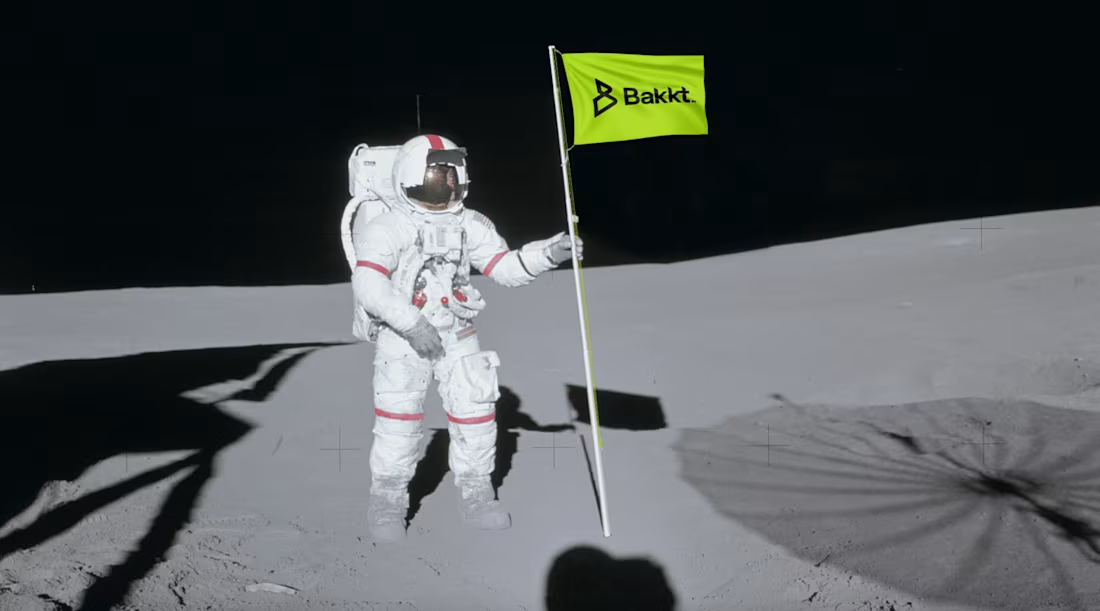
A fresh identity for a C-Suite kingmaker that embodies powerful forward motion. The strategic shift positioned them as industry leaders among their competition.
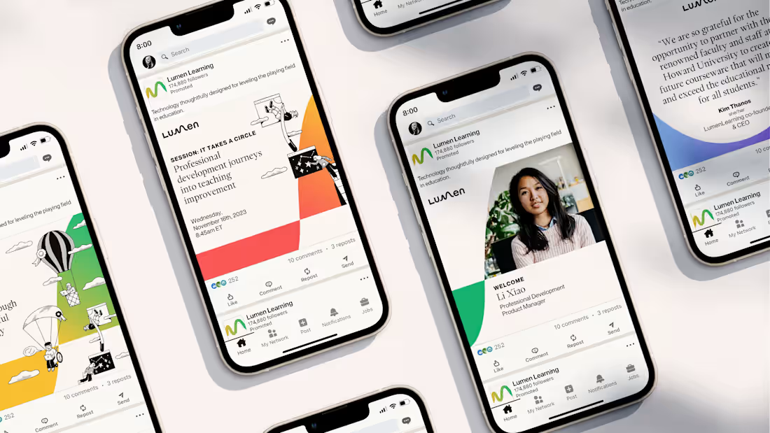
This transformational rebrand emphasizes connection, care, agility, and empowerment, positioning the brand as a modern, equitable education ally.
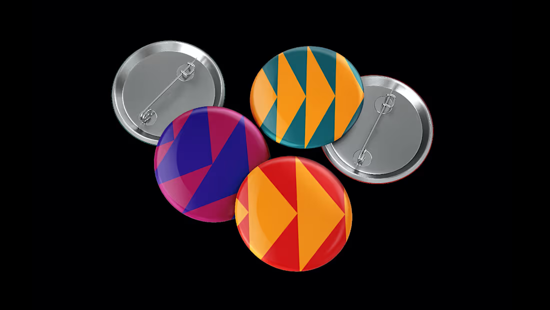
A shift to B2B required a brand evolution that illustrated connected digital experiences and asset utility for partners to drive a new era of business growth.
This 2021 virtual comeback featured a vibrant palette and energizing visual pun symbolizing the "Next Generation," inviting young filmmakers to participate.
This strategic brand refresh drew from historical Swiss-style posters, combining cinema history with a bold future, capturing and revitalizing a 60-year legacy.
A refreshed brand system featuring sunrise hues, sleek shapes, and vibrant illustrations reintroduced Workday as an upbeat, agile partner for a changing world.
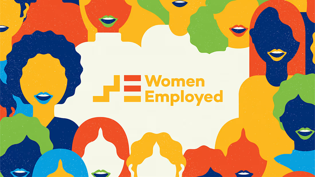
With a new generation of Americans in the workforce, WE's brand needed modernizing. The result: an exuberant identity echoing 50 years of impactful advocacy.
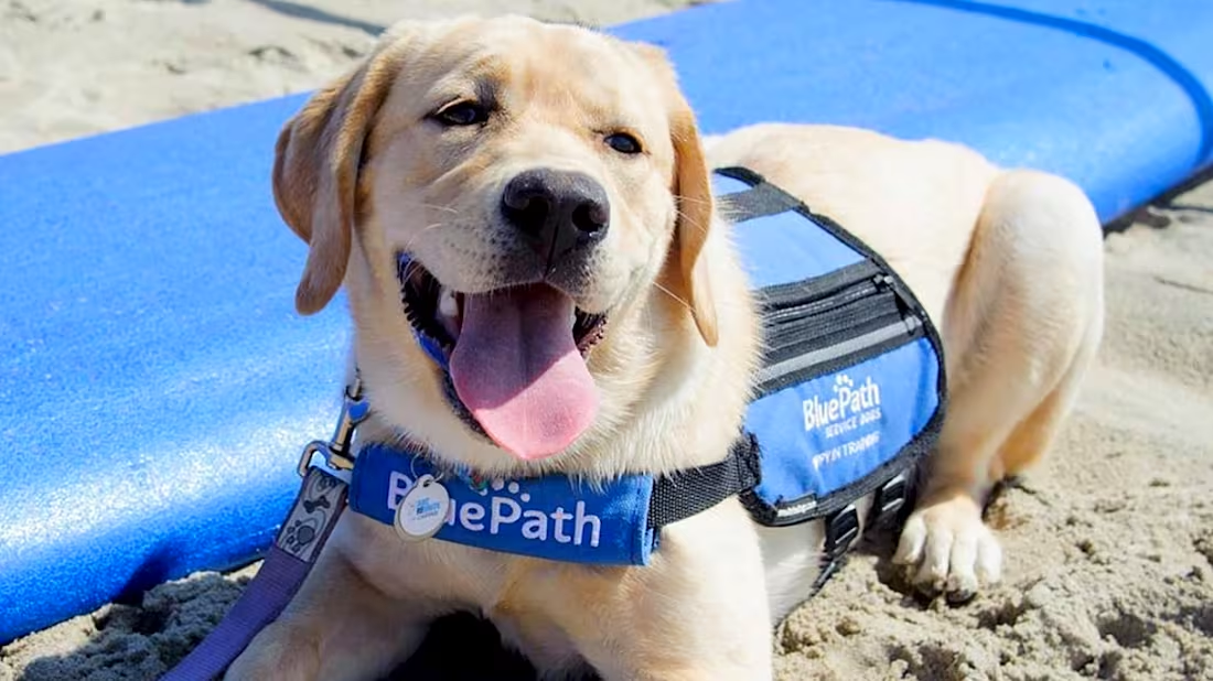
A non-profit organization providing autism service dogs to families got a brand identity that communicates its purpose and highlights its furry everyday heroes.
A selection of some of my favorite logos I've designed over the years, across a wide range of industries, including entertainment, non-profit, tech, and retail.