Built with Framer
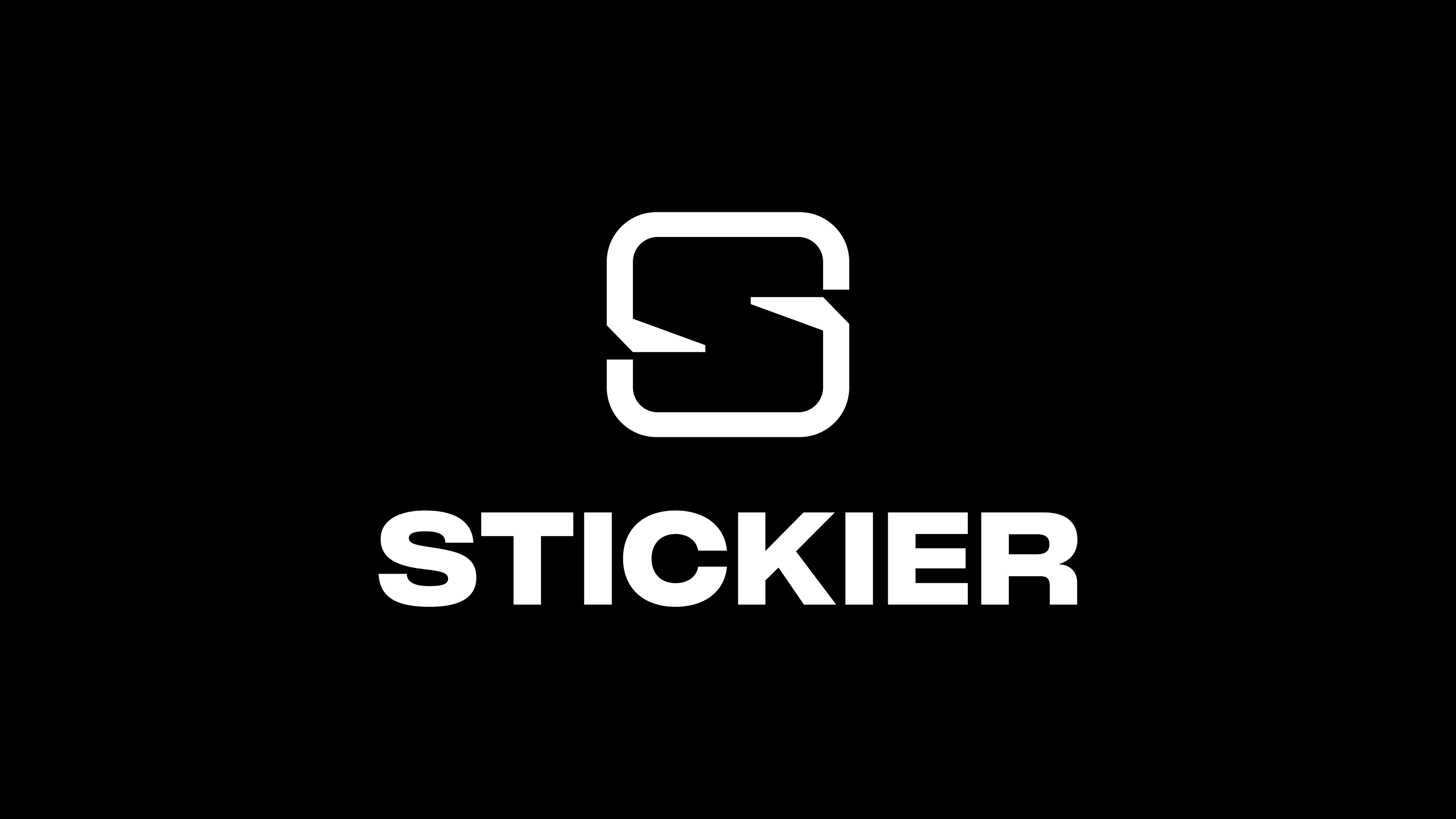
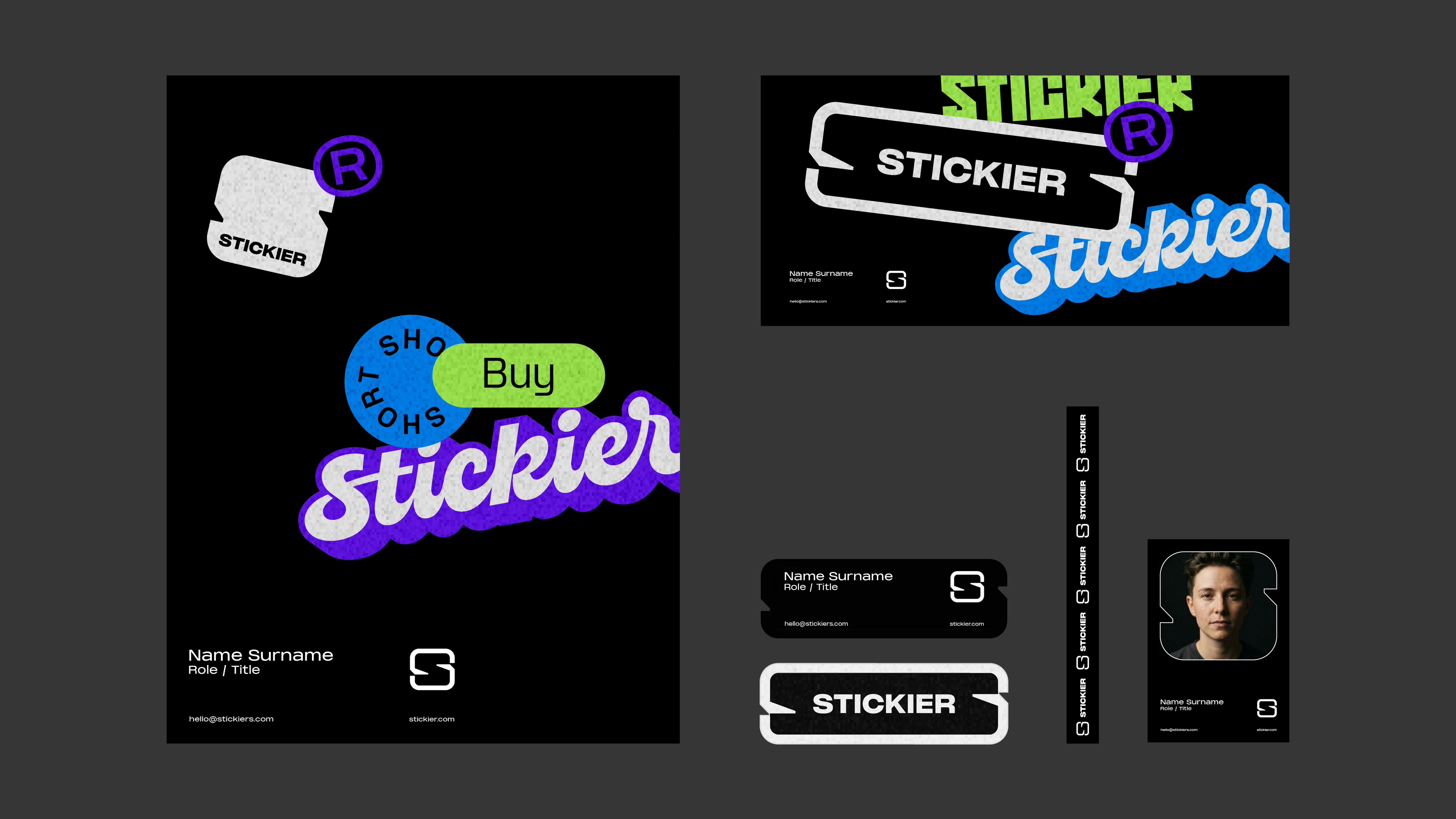
Stickier - Logo + brand design
Great.co Studio
Verified
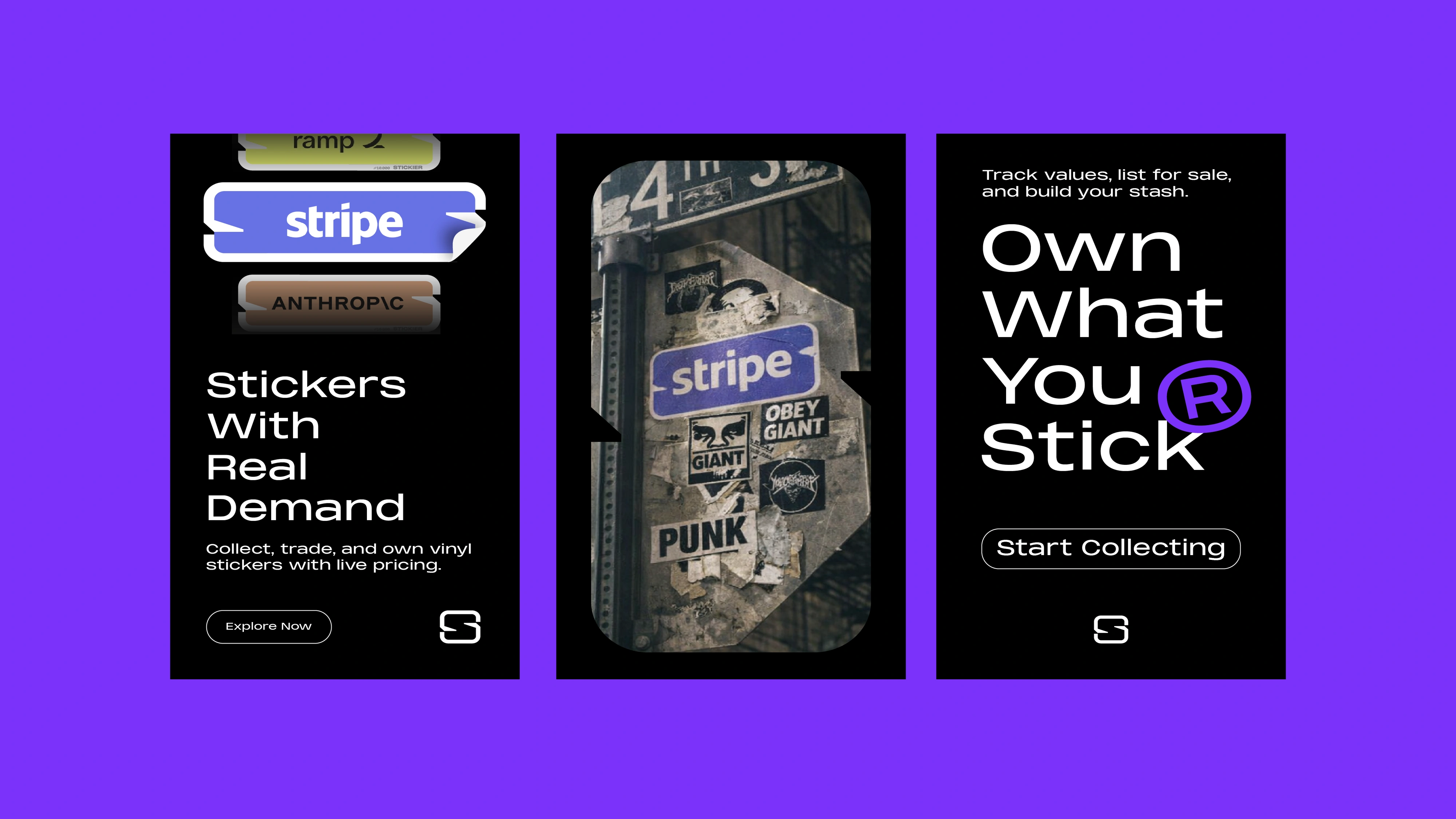
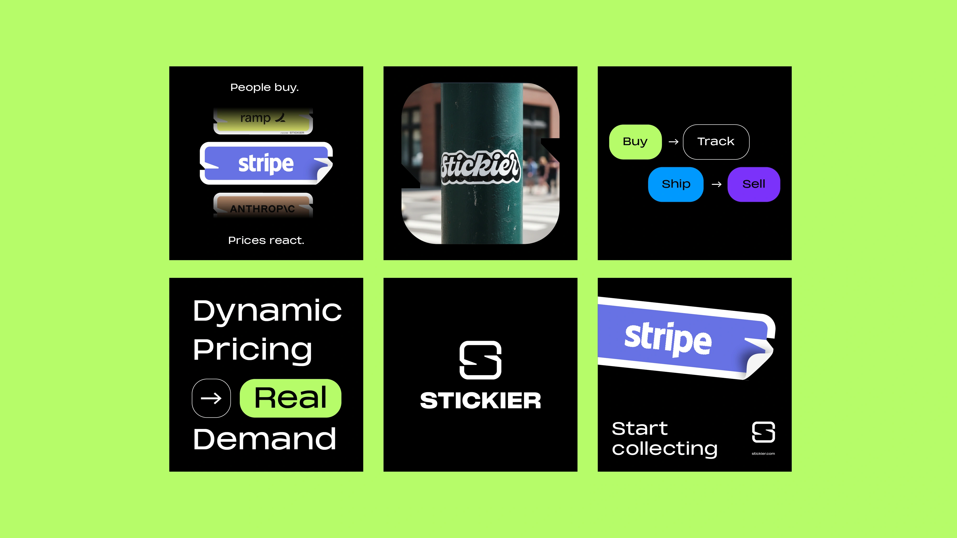
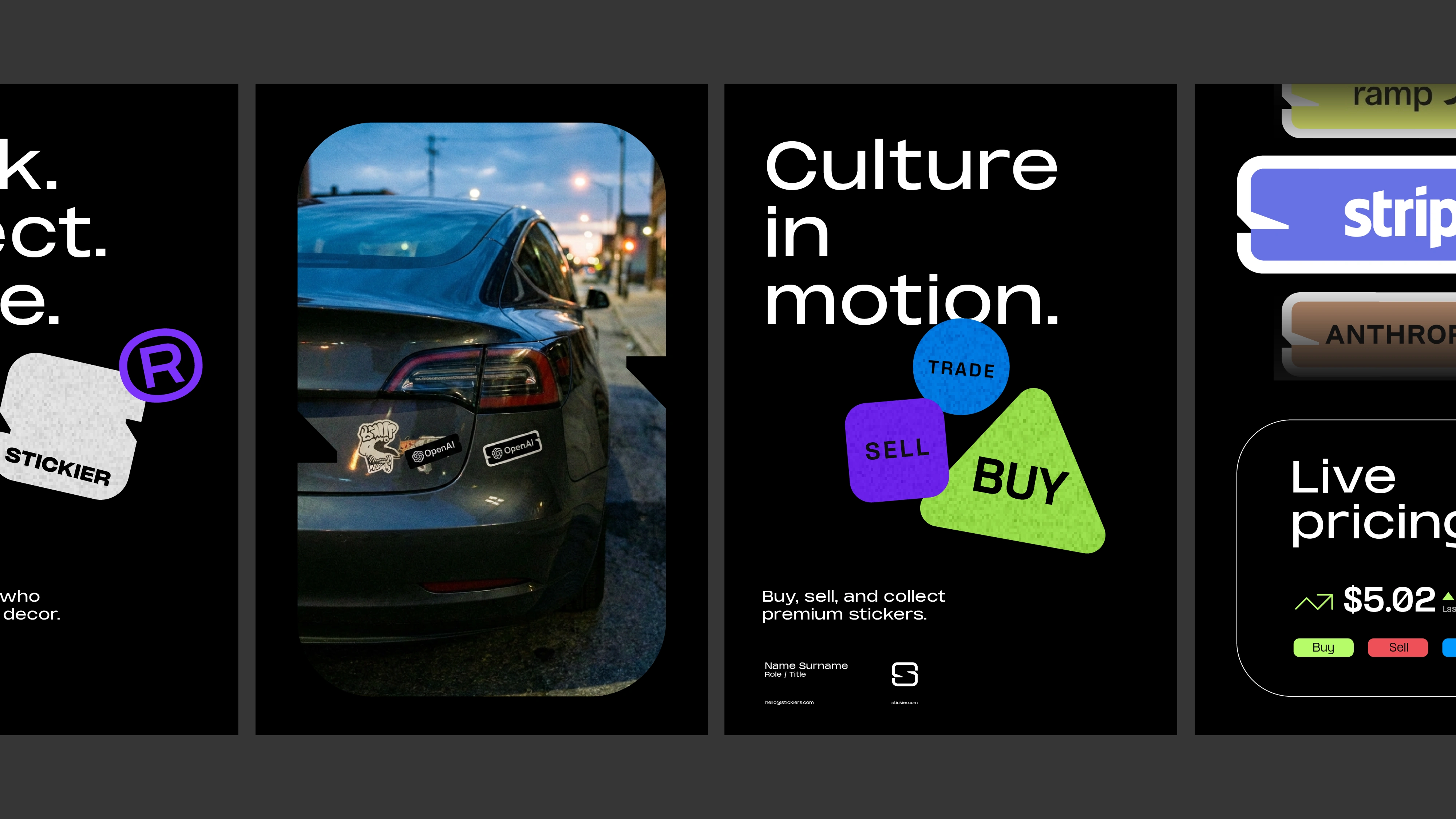
Stickier.com isn’t about screaming fandom, it’s about timing, decisions, and market dynamics happening in real time. It sits closer to trading than to traditional sports merch. That distinction had to be felt instantly, before a single word is read.
We designed a symbol that captures that tension.
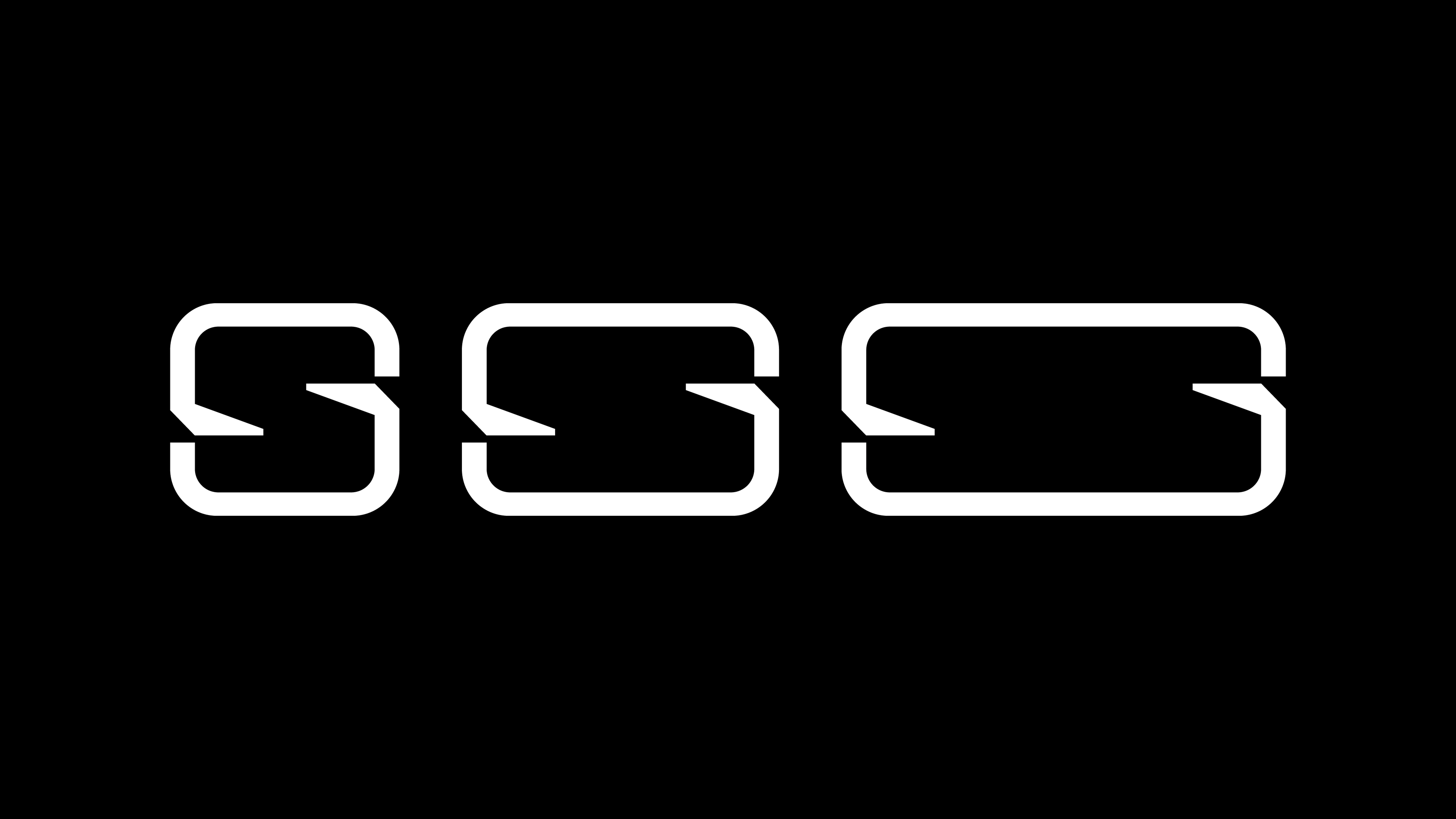
A refined, flowing “S” built as a continuous curve, subtly splitting into two opposing forces. Two sides of a trade. Two teams. Constant movement between buyers and sellers. It’s not static, it breathes, just like the market during a live game.
The elegance is intentional. Most competitors lean into noise. We went the opposite direction, clean, minimal, almost financial. This positions Stickia closer to a trading platform than a fan app, which directly supports higher perceived value and trust.
The form also mirrors price movement. Up, down, reacting to demand. It’s a visual metaphor for volatility without being literal or cliché.
What you get is a mark that works on three levels:
Instant recognition, a clear conceptual foundation, and long term brand equity.
It doesn’t just look good. It explains the product in a single gesture.
If your product lives in a new category, your brand can’t look familiar. It needs to teach people how to see you.
Visit stickier.com to see it live
Like this project
Posted Apr 11, 2026
Designed a logo and full art direction, plus brand identity for Stickier.com, creating a cohesive and modern visual system across all touchpoints. See it live
Likes
9
Views
208
Timeline
Oct 31, 2025 - Jan 13, 2026
Clients
Savvy Learning