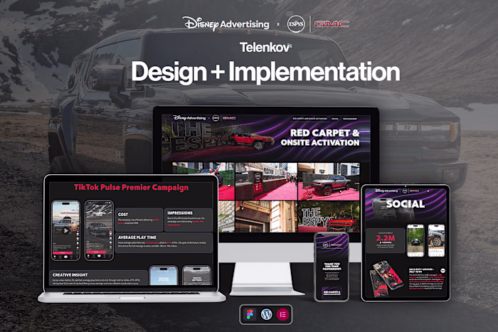
Coffee Brand Redesign
Mykyta Telenkov
LAVARA
coffe
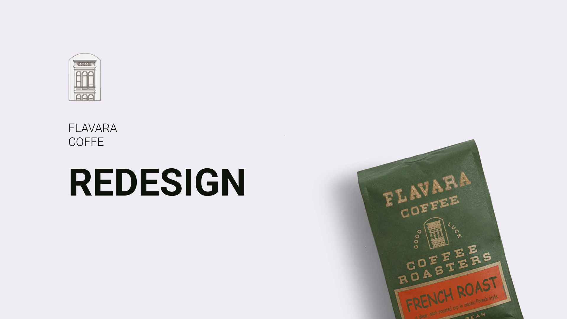
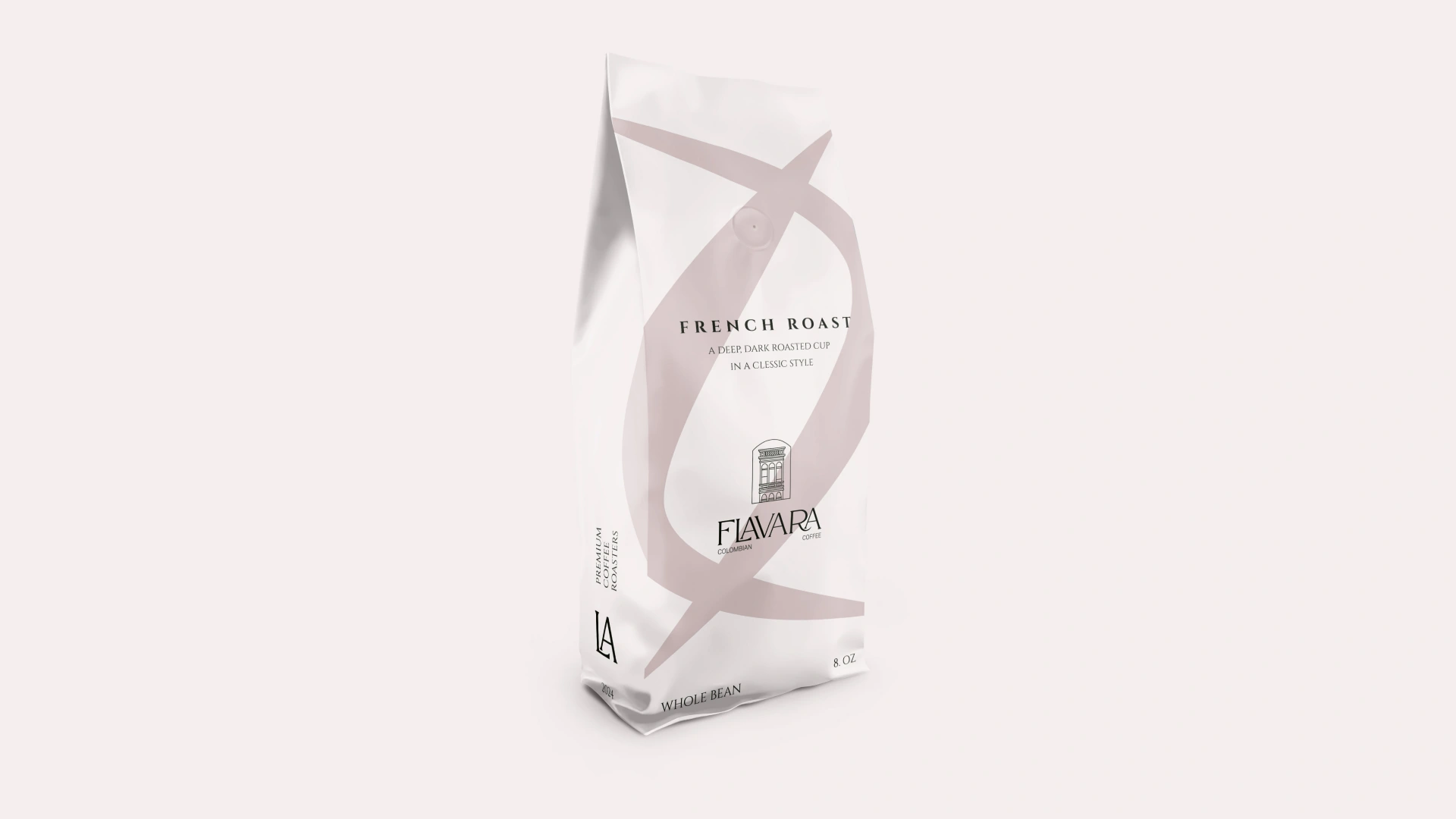
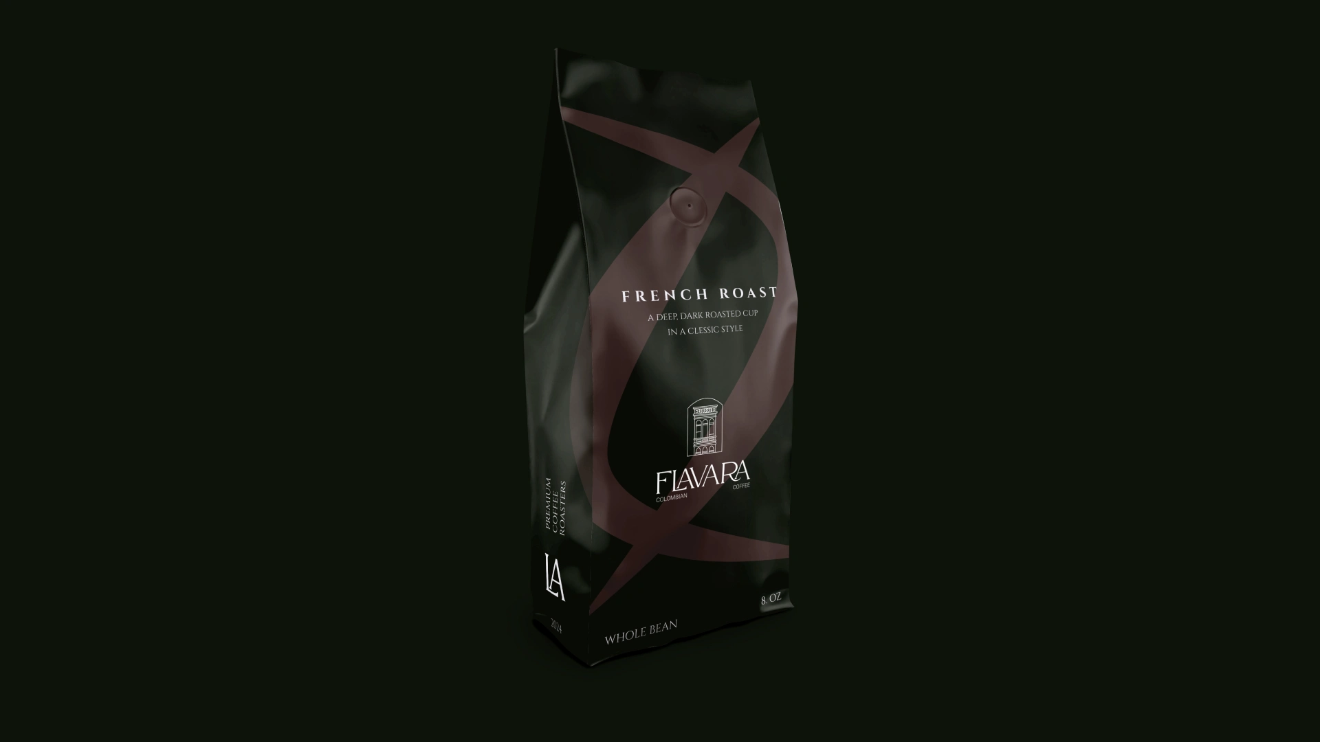
The problem: The packaging is looks like flour or a sugar pack which makes product look cheap, but the product is high quality and supposed to be a premium.
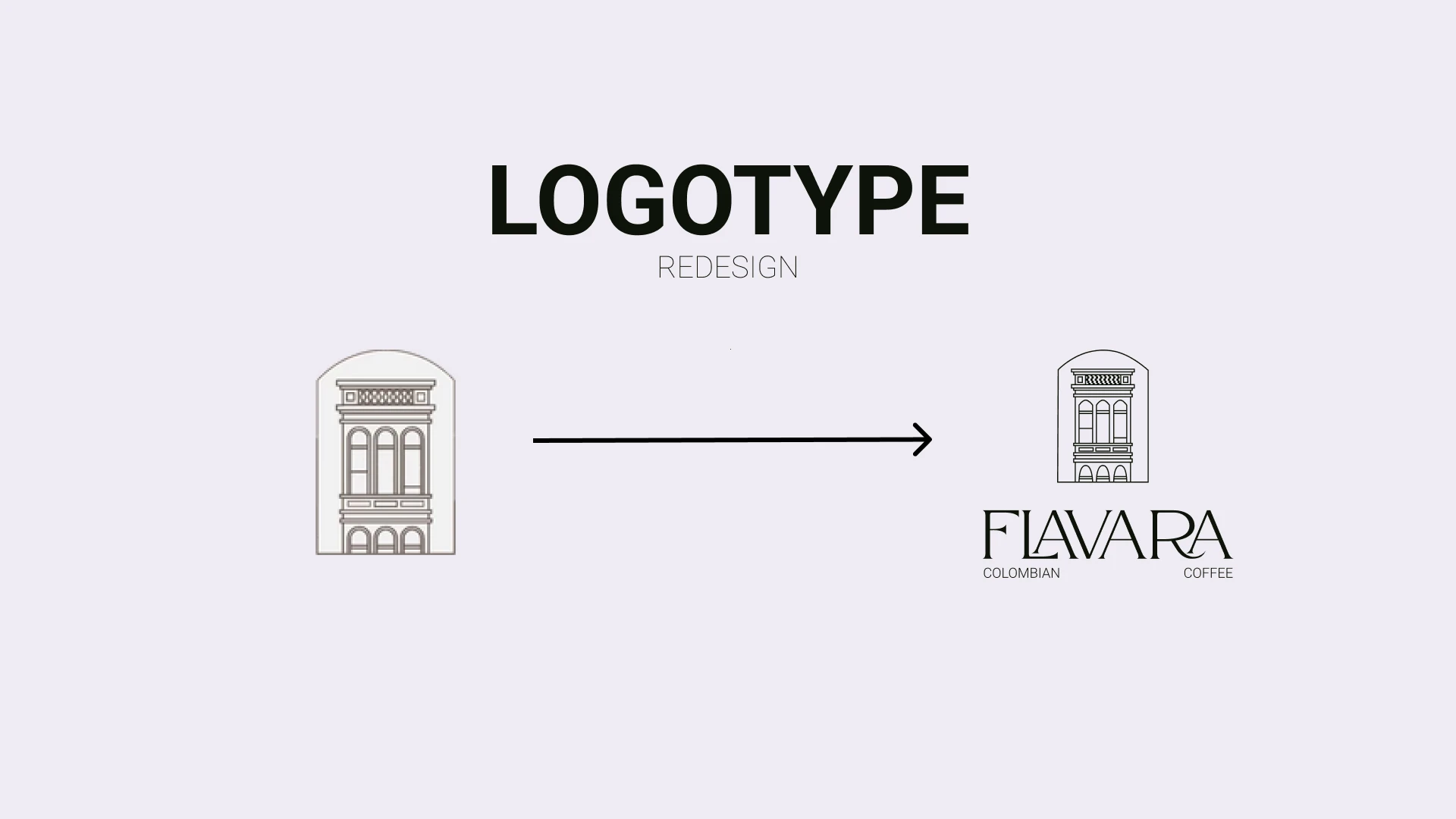
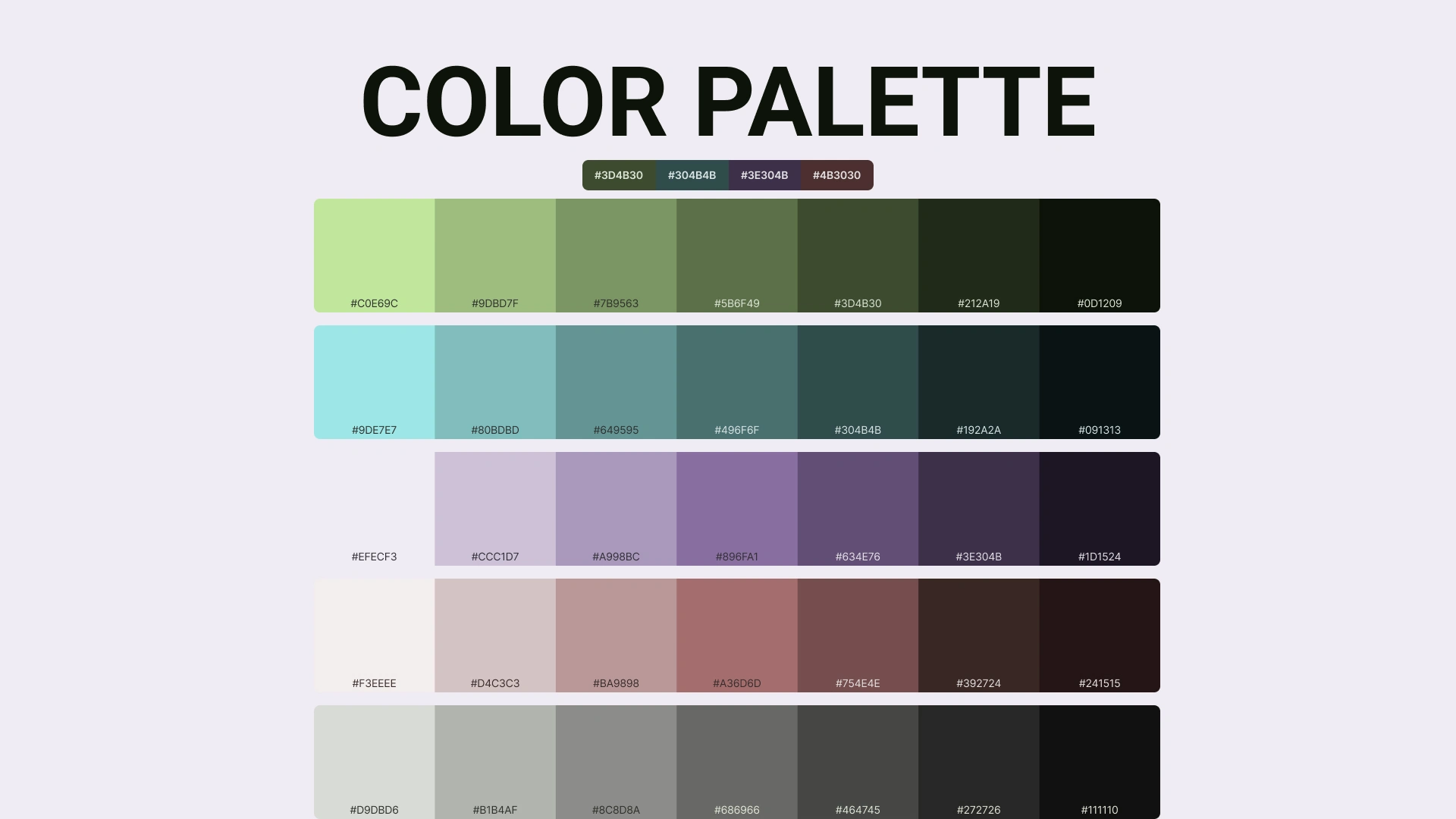
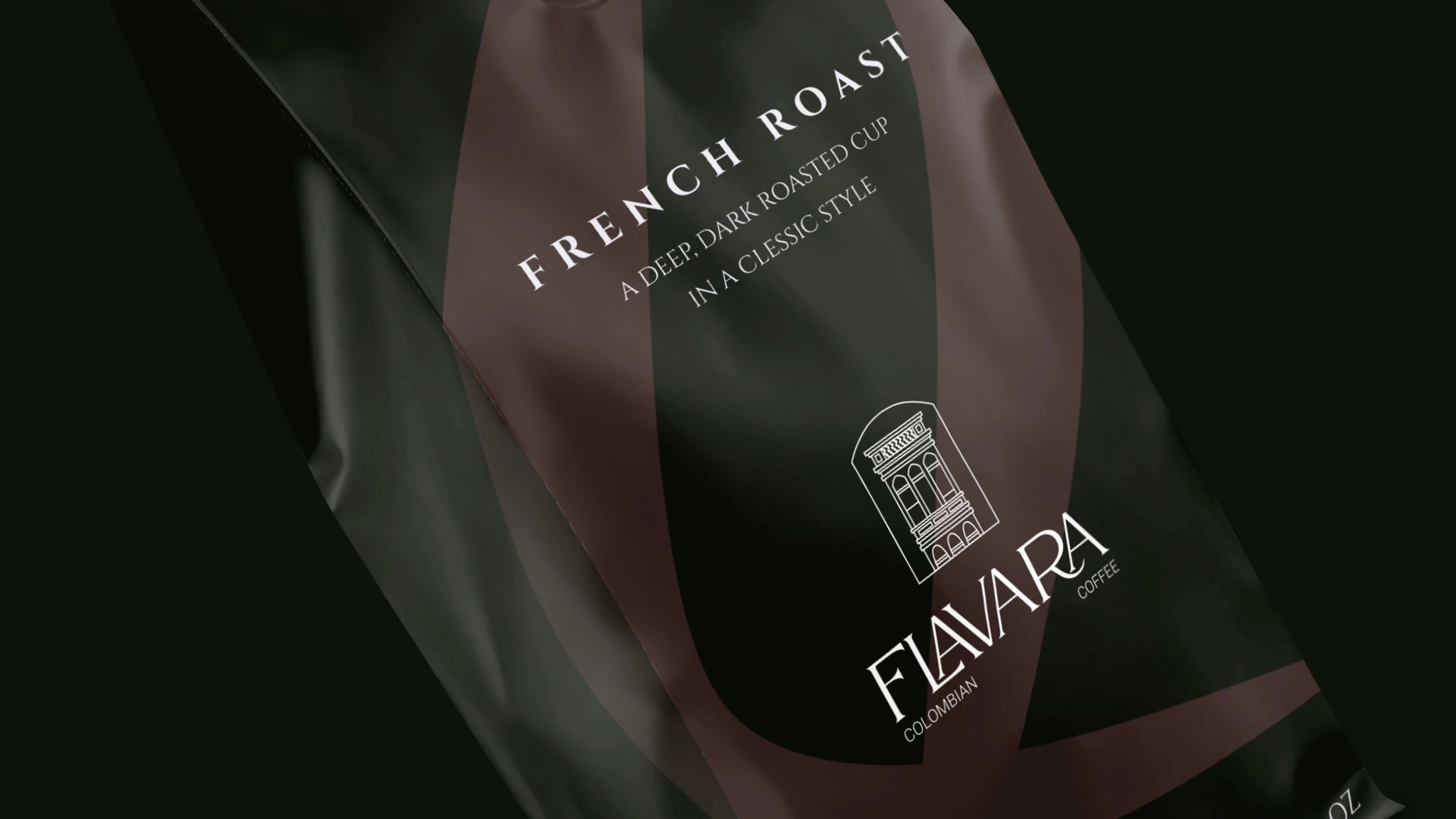
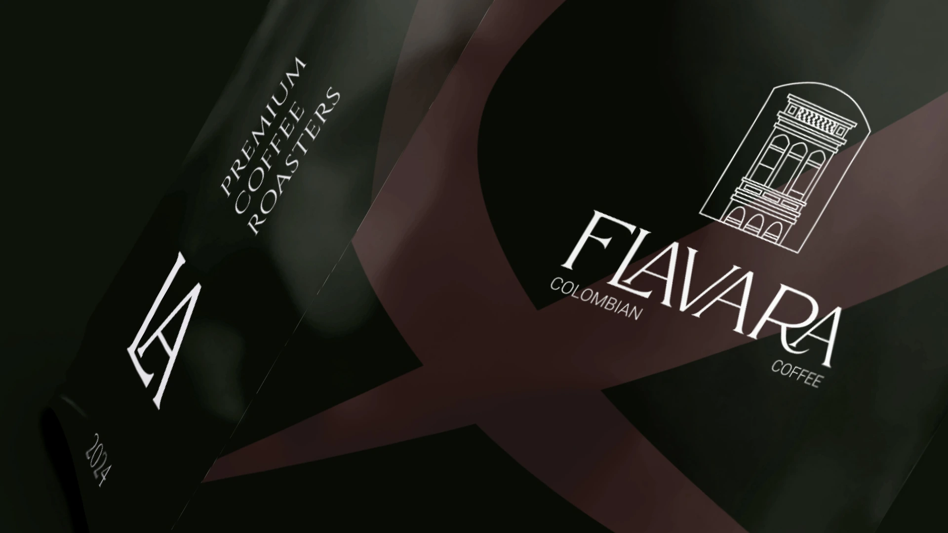
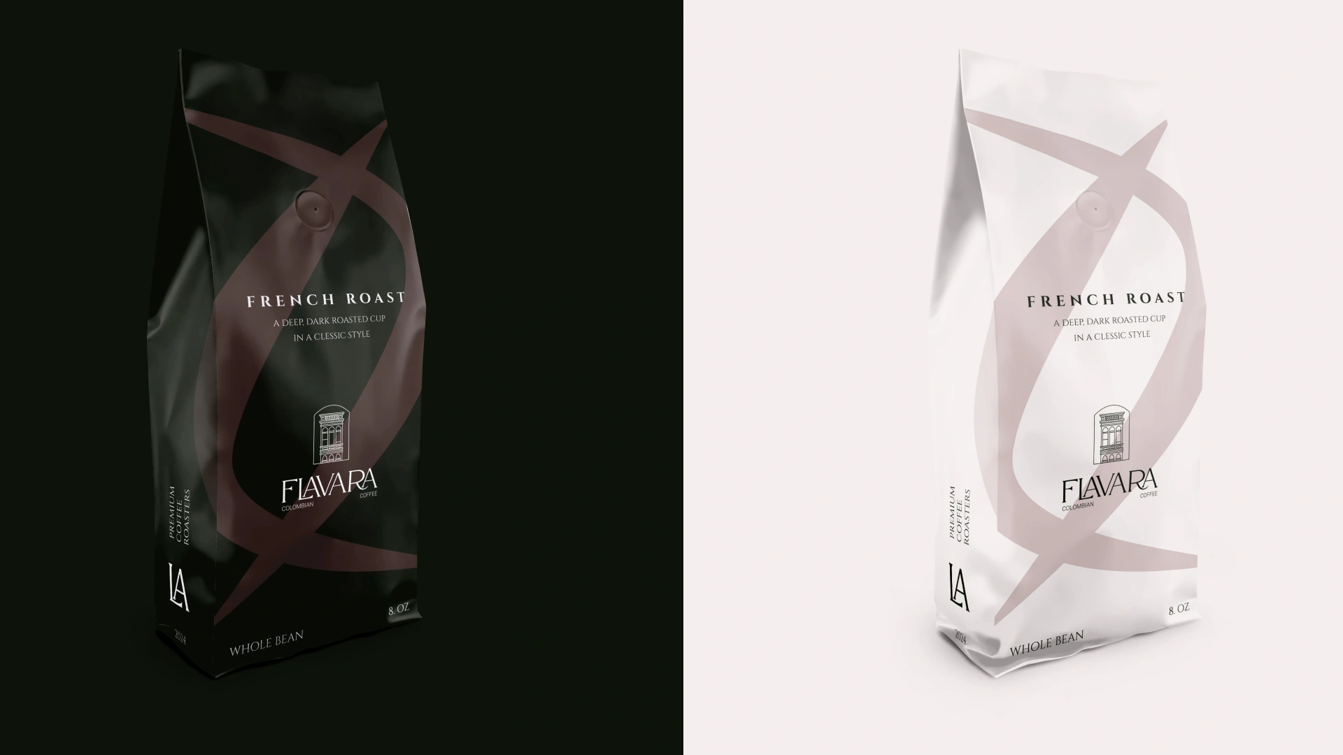
The solution: Instead of making just a new packaging, I have decided to dig deeper. Based on my UX research I created a new custom color pallet for the brand and a new logotype which now can be used in a multiple formats(icon, text, text with subtext, combined). Than I started my work on UI view of package and made abstract shape that associates with coffee vapor and coffee bean but not obviously what makes this product look premium and will definitely catch eye of customer and increase sales.

Like this project
Posted Sep 25, 2025
Premium Coffee Package Redesign