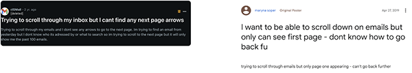
UX Gmail pagination
Mykyta Telenkov
Overview, Ideation & Brainstorming
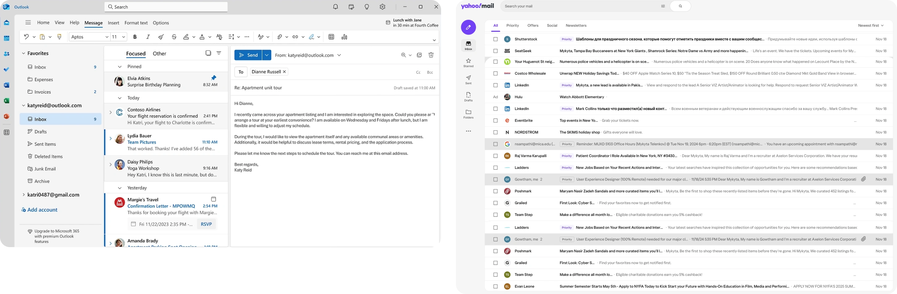
Overview: In today’s fast-paced digital world, notifications and emails often pile up, creating an overwhelming user experience. This is especially true for Gmail, one of the most widely used email platforms globally. Many users manage their inboxes across devices, but the mismatch between desktop and mobile workflows often leads to frustration. For instance, after skimming through emails on a desktop, users frequently rely on recognition memory to sort through the same notifications on their mobile
devices—a tiring and inefficient process.

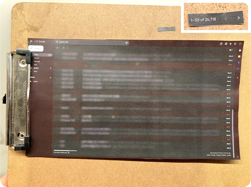
Problem Statement: Considering all available search options in Gmail like , in some cases the best way is to use a manual scroll search. Pagination controls in Gmail are located in the top right corner, making them easy to overlook. Users may find it unintuitive to navigate through a large number of emails as they might expect pagination at the bottom or more visible within the main interface.
User stories:
1. As a Gmail user, I want to have pagination intuitively accessible so I can see more emails.
2. As a Gmail user, I want to see many more emails to get through them quicker.
Heuristic Analysis of Current Design:
Visibility: The pagination controls are less visible and might be hard for users to locate, especially those used to bottom-pagination layouts.
Efficiency: For users who scroll to the bottom of the page, it’s inefficient to move back to the top right corner to navigate.
Learnability: The location of pagination isn’t consistent with common design patterns, which may confuse first-time users.
Frustration: Users, particularly those dealing with a high volume of emails, may experience frustration due to the difficulty in locating and using the pagination controls.
Key Pain Points:
• Hard-to-find pagination controls.
• Additional steps are needed to navigate, impacting usability and time efficiency.
• Potential frustration, especially for users managing a high volume of emails.
Competitors research
Eye-tracking and scanning pattern
According to NNG eye-tracking research, there are 4 patterns that people use to scan text on the web:
• F-pattern
• Spotted pattern
• Layer-cake pattern
• Commitment pattern
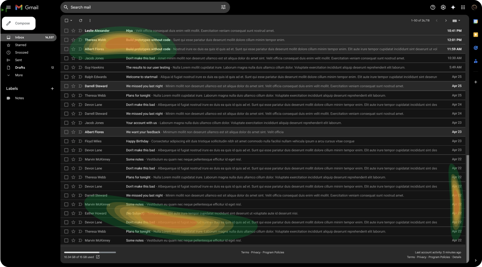
While user is searching for the right word, the most focused area would be accumulated at the bottom where the sender’s name, email subject, text, and date will appear. And to locate the pagination at that area seems reasonable.
Pagination types
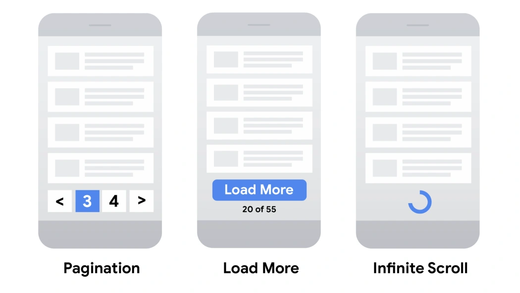
Pagination
Pros:
• Gives users insight into result size and current position
Cons:
• More complex controls for users to navigate through results
• Content is split across multiple pages rather than being a single continuous list
• Viewing more requires new page loads
Load more
Pros:
• Uses a single page for all content
• Can inform user of total result size (on or near the button)
Cons:
• Can't handle very large numbers of results as all of the results are included on a single web page
Infinite scroll
Pros:
• Uses a single page for all content
• Intuitive – the user just keeps scrolling to view more content
Cons:
• Can lead to "scrolling fatigue" because of unclear result size
• Can't handle very large numbers of results
Pagination audit
Pagination
Best for contexts where users need precise navigation and control, such as email inboxes, e-commerce product catalogs, or search results.
It is a good practice to make pagination controls easily accessible (e.g., place them within reach, avoid requiring scrolling to find them), and allow users to adjust the number of items displayed per page to suit their preferences.
Load more
Works well for platforms with shorter lists or when the user is casually browsing, such as social media feeds or image galleries and not searching for anything specific.
Infinite scroll
Works best for casual browsing and discovery-driven experiences, like news feeds, social media, or infinite product galleries.
The best practices would be to have a “back to the top” button and a progress bar.
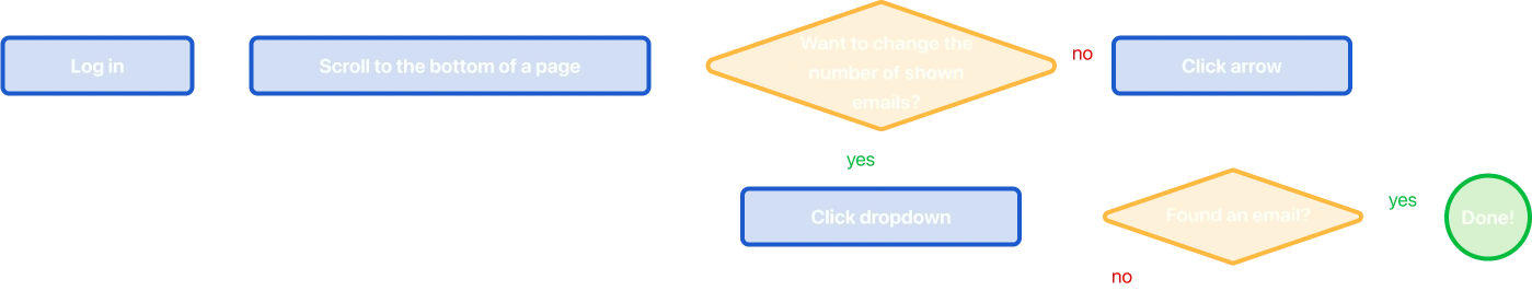
User flow
User flow map outlines the user’s journey during the manual search of the email.
Storyboard
Imagine a situation:
Today is Friday.
Mike received an email invitation to event from some colleague during this week.
Mike does not remember the address but he has to leave soon.
Mike doesn’t remember senders nickname and subject of the message, but he knows that if he’ll see it he will recognize it.
He does not starred or flagged it.
The only option is to scroll through his emails real quick.

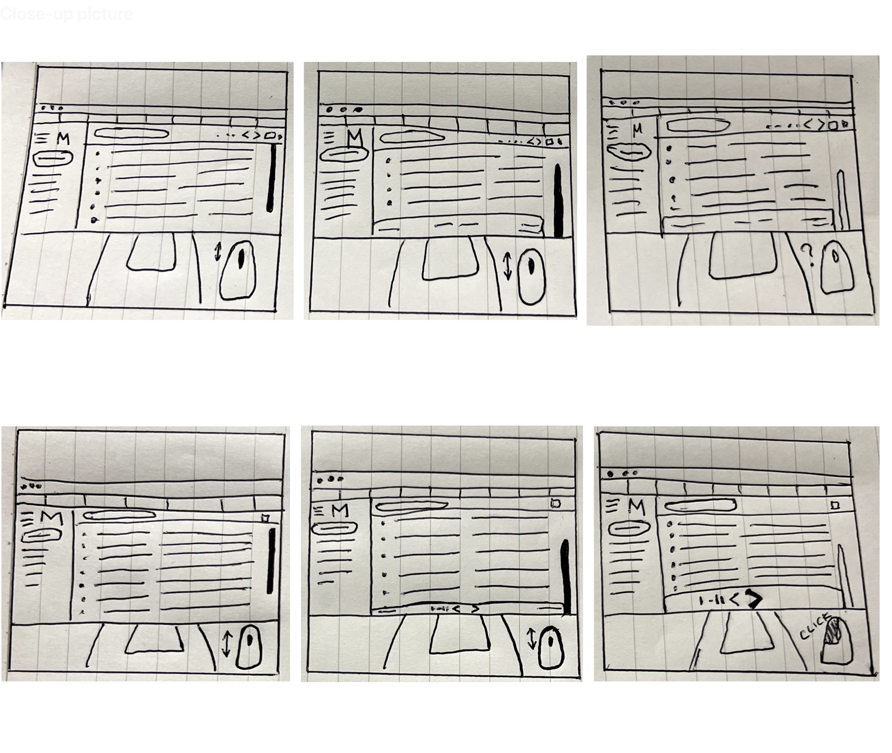
Usability study / Prototyping
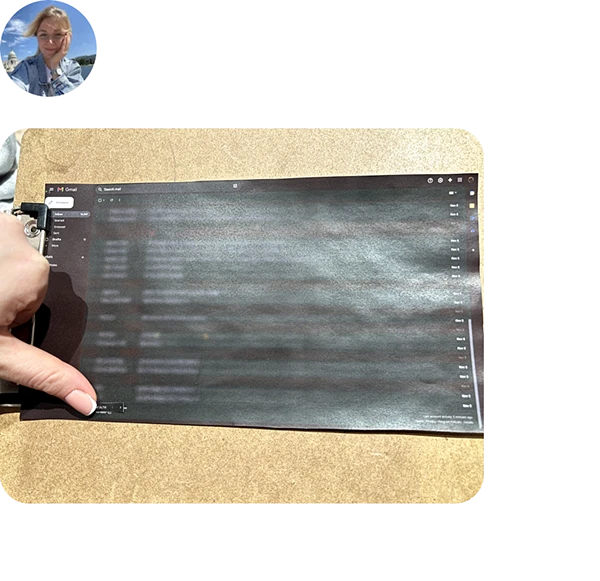
Lo-fi prototype study
The task for testers: You received an email invitation early this week. You don’t remember senders nickname and subject of the message, but you know that if you’ll see it you will recognize it. You do not starred or flagged it. The only option is scroll through your emails real quick, where will you look for pagination?

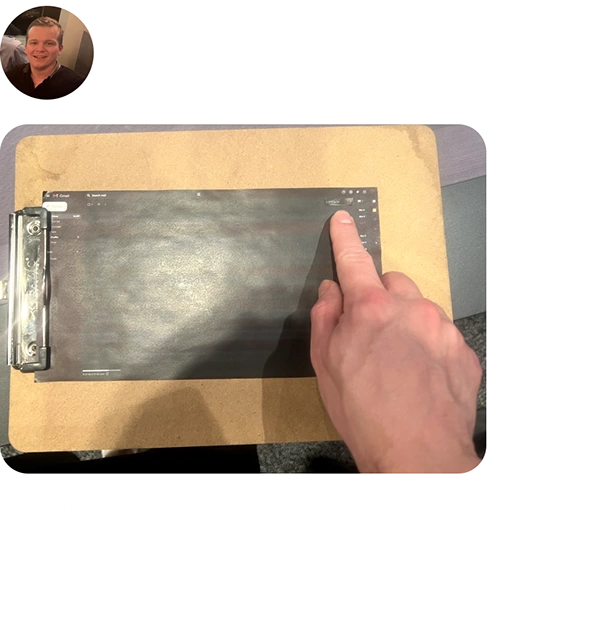
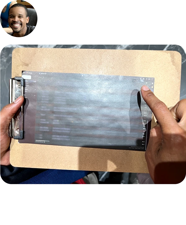
Hi-fi prototype testing (remote unmoderated prototype study)
Iteration #1
Findings: the dropdown can be exposed, considering all the space on the bottom row.
Also adding UI prominence to this feature would be helpful.
Iteration #2
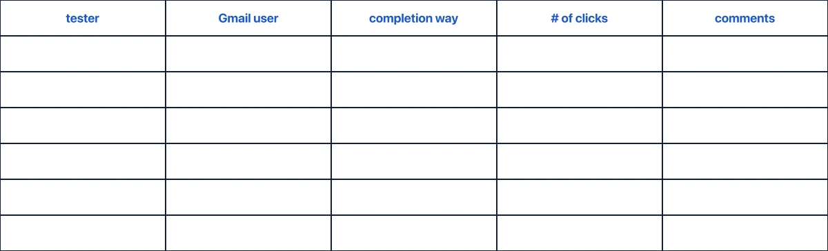
Findings: the results of the testing are documented in the table below.
Iteration #3
Next steps
During this project, Gmail’s pagination, identified pain points through user stories and heuristic analysis. Conducted research and eye-tracking patterns show that there are three possible pagination types to consider: pagination, load more, and infinite scroll. Pagination audit and user flow helped to create and facilitate the usability study of paper and digital prototypes which led to multiple design iterations.
User research shows that a good solution would be to move pagination to the bottom and add a dropdown with the number of emails per page changer. Adding UI prominence is also good to consider. The best solution would be to use infinite scroll.
🔗 Additional resources
🎙️ Podcast: 10 Heuristics to Hack the Human Mind
📄 Article: Checklist for Planning Usability Studies
📄 Article: Pagination, incremental page loading, and their impact on Google Search
Article: Text Scanning Patterns: Eyetracking Evidence
Like this project
Posted Sep 25, 2025
Gmail pagination research and redesign.
Likes
0
Views
5