Skindeep Beauty Brand Identity Design
Dua Web & Brand Designer
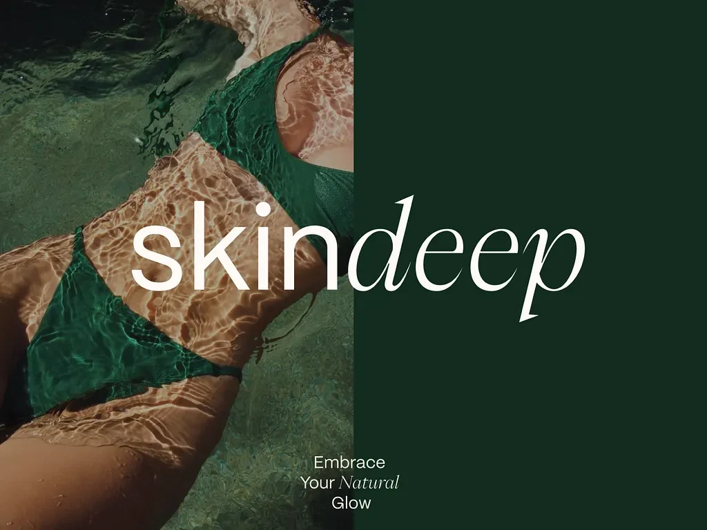
Skindeep
Skindeep Brand Identity Case Study
I was working on a complete branding and visual identity project for Skindeep, a beauty and skincare brand focused on confidence, self-care, and natural beauty ✨
The idea behind the project was to create a brand that feels soft, modern, and emotionally connected to its audience while still maintaining a premium and trustworthy appearance. Instead of building another overly clinical skincare brand, I wanted Skindeep to feel warm, human, and empowering.
The project focused on creating a visual identity that communicates beauty beyond surface-level appearance. Everything from the typography and color palette to the packaging direction and brand messaging was designed to support that feeling.
Branding
✨ Project Overview
Skindeep was designed as a modern skincare and beauty brand centered around natural beauty, self-confidence, and simplicity.
I created the full brand identity system including logo direction, typography, packaging concepts, social media branding, visual language, and presentation design. The goal was to make the brand feel clean and premium while still staying approachable and emotionally engaging.
The overall visual direction was inspired by soft skincare aesthetics, natural textures, minimal editorial layouts, and calm beauty campaigns. I focused on building a visual experience that feels elegant without trying too hard.
The brand messaging also played a huge role in the project. Phrases like “Beauty Beyond The Surface,” “Nurture Your Natural Beauty,” and “Super Natural” helped shape the emotional tone and personality of the identity.
I wanted the brand to feel uplifting, refined, and visually calming across every touchpoint.
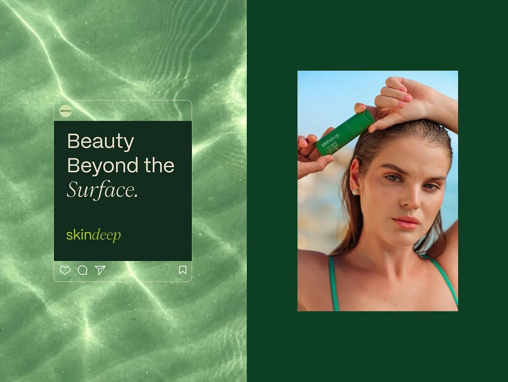
Social
🎯 Problem
A lot of skincare brands today either feel too clinical or overly trend-focused. Many lose authenticity because they focus heavily on aesthetics without creating a meaningful emotional identity behind the visuals.
For Skindeep, I wanted to solve a few important problems:
• Creating a skincare brand that feels emotionally connected and trustworthy
• Building a visual identity that feels premium but still soft and welcoming
• Designing a consistent system across packaging, digital content, and social media
• Making the branding stand out without relying on loud visuals or excessive trends
• Balancing beauty aesthetics with clarity and usability
Another challenge was creating branding that could appeal to different audiences while still maintaining a strong and recognizable personality.
💡 My Approach / Solution
I approached the project by first focusing on the emotional direction of the brand before designing the visuals.
I spent time researching modern skincare brands, beauty editorials, luxury packaging systems, and soft minimal aesthetics. I wanted the identity to feel timeless rather than trend-based.
The visual direction was built around softness, balance, clean spacing, and natural tones. I focused heavily on typography hierarchy and minimal layouts to allow the brand to breathe naturally.
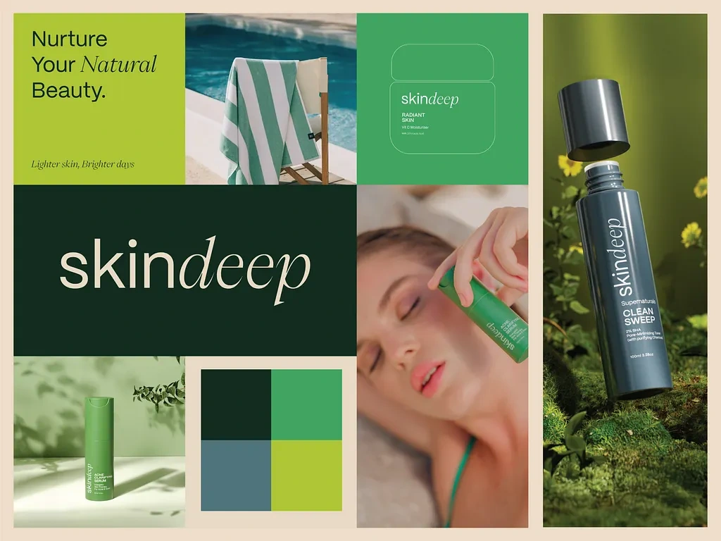
For the color palette, I explored warm neutrals, soft creams, earthy tones, and subtle contrasts that reflect skincare, calmness, and purity.
The logo direction was designed to feel elegant and modern while still remaining simple and memorable. I also focused on creating a flexible identity system that could work across packaging, product labels, digital campaigns, and social content.
Throughout the process, I made sure every design choice supported the same message: beauty should feel natural, confident, and effortless.
🛠️ Process
Here’s how I moved through the project from concept to final presentation:
• Understanding the brand personality and target audience
• Researching skincare packaging and beauty branding trends
• Building moodboards focused on softness, elegance, and natural beauty
• Exploring typography and logo concepts
• Developing the color palette and visual language
• Creating packaging and label design concepts
• Designing social media and digital brand applications
• Refining spacing, hierarchy, and consistency across all assets
• Preparing presentation layouts and mockups for the final showcase
🎨 Final Output
The final result became a clean and emotionally engaging skincare identity that feels premium, modern, and calming.
The branding works consistently across packaging, social media, digital campaigns, and presentation layouts while maintaining a soft and recognizable visual language.
One of the strongest parts of the project was how balanced the identity felt. The visuals feel elegant and modern without becoming overly minimal or empty.
The combination of typography, soft color tones, and refined layouts helped create a brand experience that feels trustworthy and visually memorable.
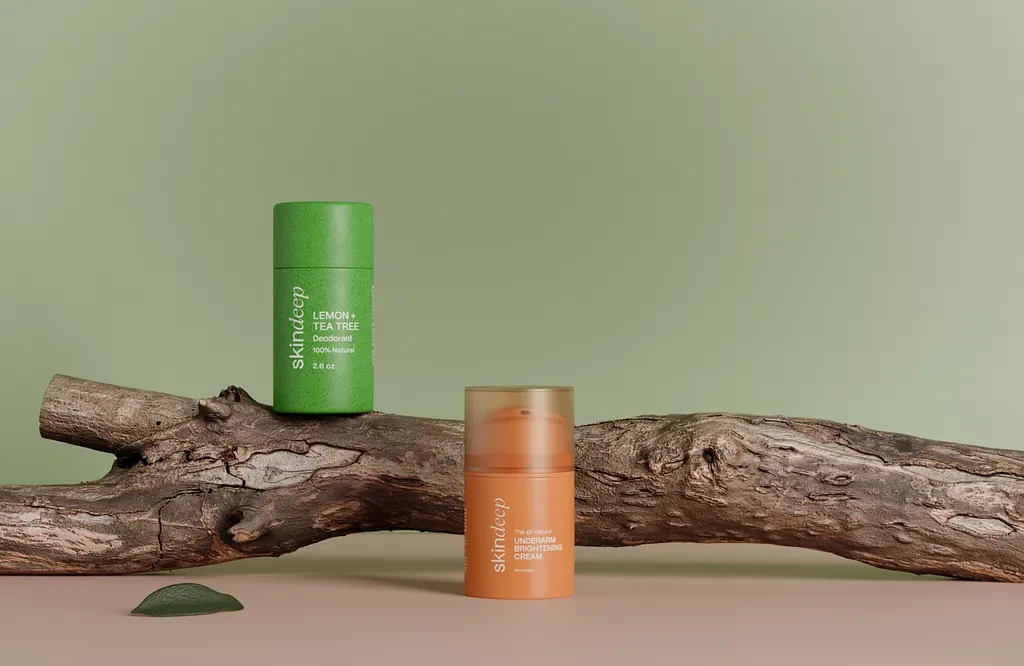
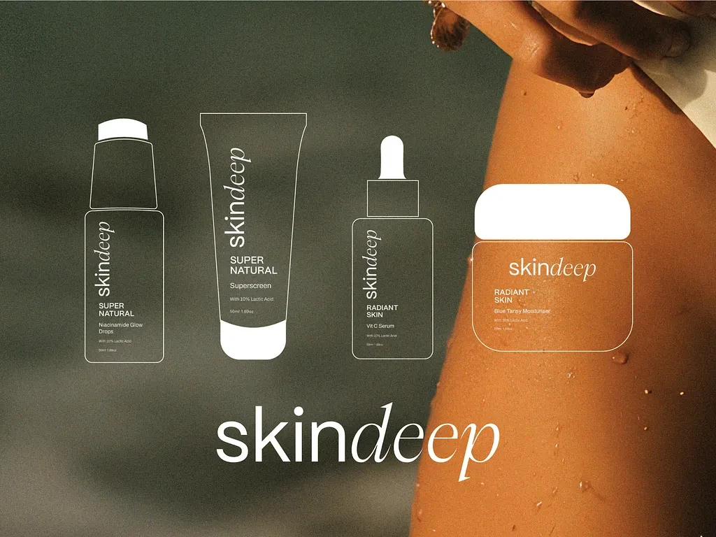
Packaging
Deliverables
• Full brand identity presentation
• Logo variations and typography system
• Packaging and label concepts
• Color palette and brand guidelines
• Social media design assets
• Product mockups and presentation visuals
• Digital branding applications
• Brand messaging and visual direction
Design Highlights
• Elegant and minimal typography system
• Soft and calming visual atmosphere
• Strong emotional branding direction
• Balanced layouts with refined spacing
• Cohesive branding across all touchpoints
• Premium skincare-inspired aesthetics
🚀 Results / Impact
Even though this was a concept-driven branding project, the final identity successfully demonstrated how emotional storytelling and thoughtful visuals can elevate a beauty brand experience.
The project helped showcase:
• Improved visual consistency across branding materials
• Better emotional connection through softer visual storytelling
• Stronger brand recognition through cohesive design
• More engaging social and packaging presentation
• Enhanced premium feel without losing approachability
The project also became a strong exploration of how beauty branding can feel both modern and deeply human at the same time.
Skindeep Concept
🙌 Closing
This project reminded me that good beauty branding is not only about looking attractive. It’s about creating a feeling people can trust and connect with naturally.
I really enjoyed working on Skindeep because it allowed me to combine storytelling, minimal design, and emotional branding into one complete visual identity system.
Definitely one of those projects where simplicity made the biggest impact ❤️
Like this project
Posted May 23, 2026
Developed a complete branding and visual identity for Skindeep, focused on emotional connection and a premium, minimal beauty aesthetic.