HOLME Visual Identity & Brand System
Dua Web & Brand Designer
HOLME Brand Identity Case Study
I was working on a full brand identity concept for HOLME, a lifestyle and fragrance-inspired brand built around simplicity, calmness, and intentional design. The idea behind the project was to create more than just visuals. I wanted the brand to feel like an atmosphere people could connect with emotionally ✨
The project focused on building a clean and timeless visual identity that could work consistently across packaging, social media, print materials, and digital presentation. Instead of making something loud or trend-driven, I focused on restraint, balance, and strong visual storytelling through minimal design.
✨ Project Overview
HOLME was designed as a modern lifestyle brand with a refined and editorial aesthetic. The goal was to create a visual system that felt elegant and premium without becoming overly decorative.
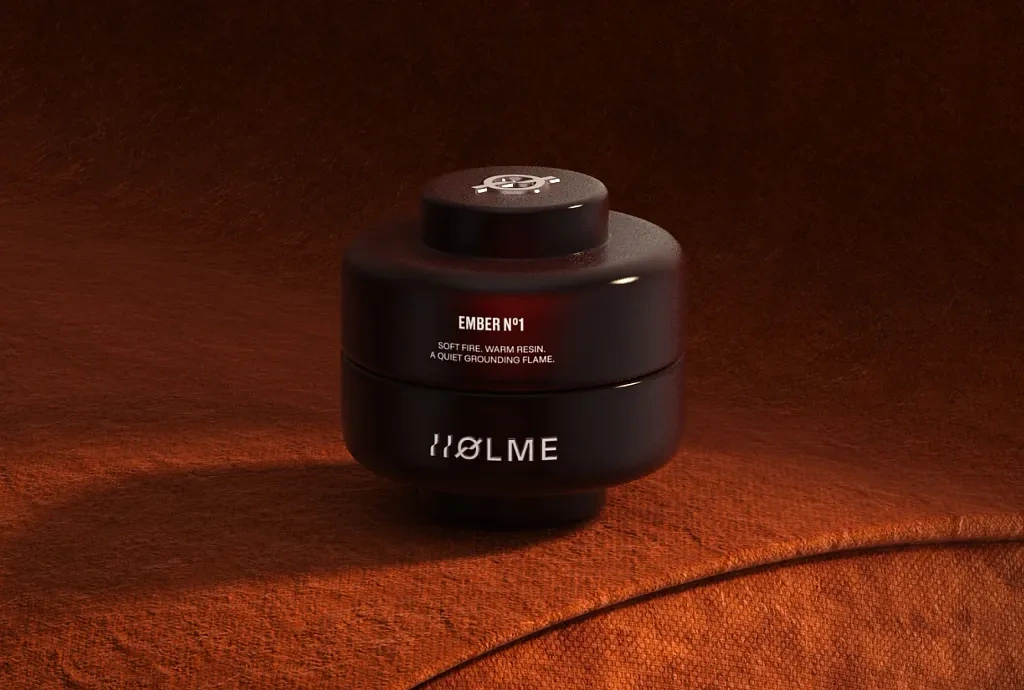
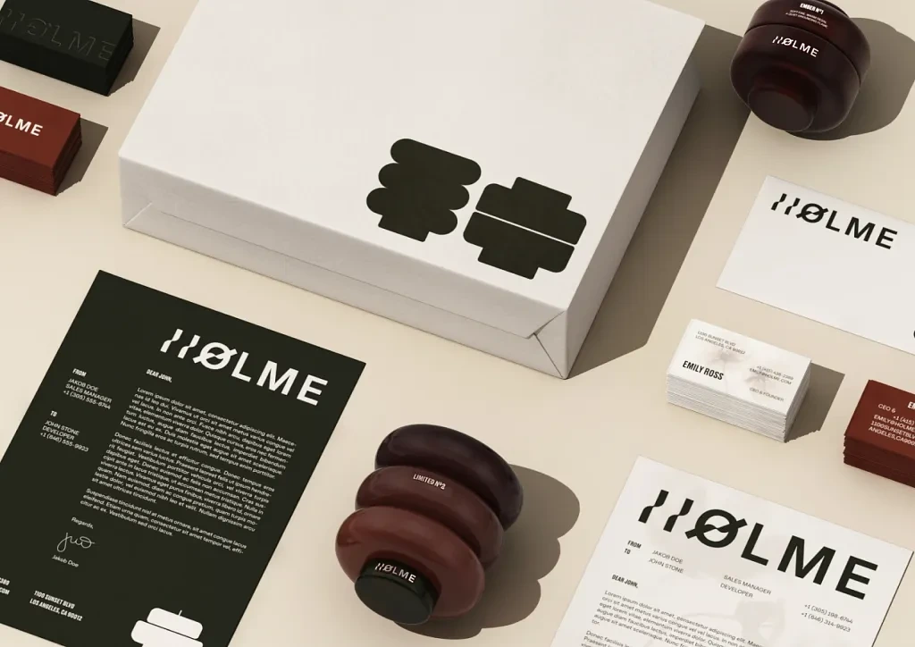
I designed the complete brand direction including logo exploration, typography selection, color palette, iconography, packaging layouts, social media templates, business cards, and product visualization. I also created realistic 3D scenes and presentation layouts to help the identity feel immersive and complete.
The brand was aimed toward a modern audience that appreciates thoughtful design, subtle luxury, and calm visual experiences. Every design decision was made to support that feeling.
I wanted the identity to feel soft, balanced, and timeless while still standing out through composition and atmosphere rather than excessive visuals.
🎯 Problem
One of the biggest challenges with lifestyle branding is that many brands end up looking visually crowded or overly trendy. A lot of modern brands lose consistency because they focus too heavily on aesthetics without creating a strong system underneath.
For HOLME, I wanted to solve a few key issues:
• Creating a premium identity without relying on complex visuals
• Making the brand feel emotional and atmospheric instead of purely commercial
• Designing a system that works across multiple touchpoints consistently
• Balancing minimalism with personality so the brand still feels memorable
Another challenge was making sure the presentation itself matched the brand tone. Every slide, spacing decision, and visual composition needed to feel calm and intentional.
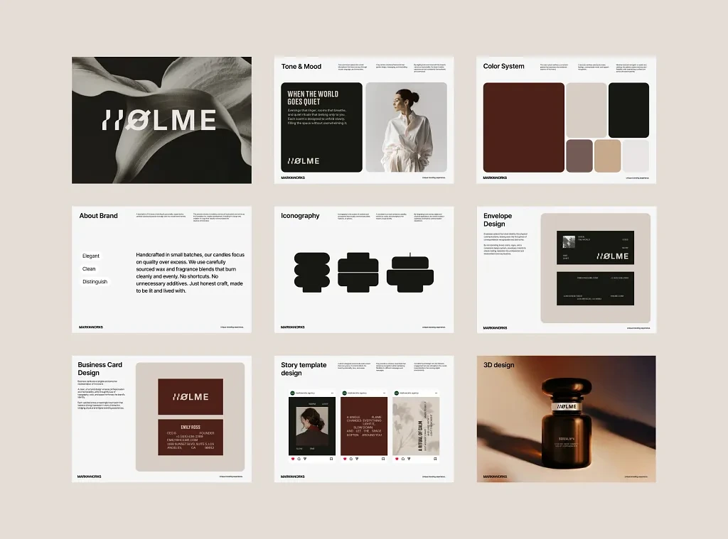
HOLME Visuals
💡 My Approach / Solution
I approached the project by first focusing on mood and emotional direction instead of jumping straight into visuals.
I spent time defining how the brand should feel before designing how it should look. That helped me create a more cohesive identity later in the process.
The visual direction was inspired by editorial layouts, natural textures, soft shadows, sculptural forms, and muted luxury aesthetics. I focused heavily on negative space and proportion to create breathing room throughout the identity.
The logo itself was designed to feel modern and understated. I experimented with letter spacing, geometric balance, and subtle distortion to give it a recognizable character without overcomplicating it.
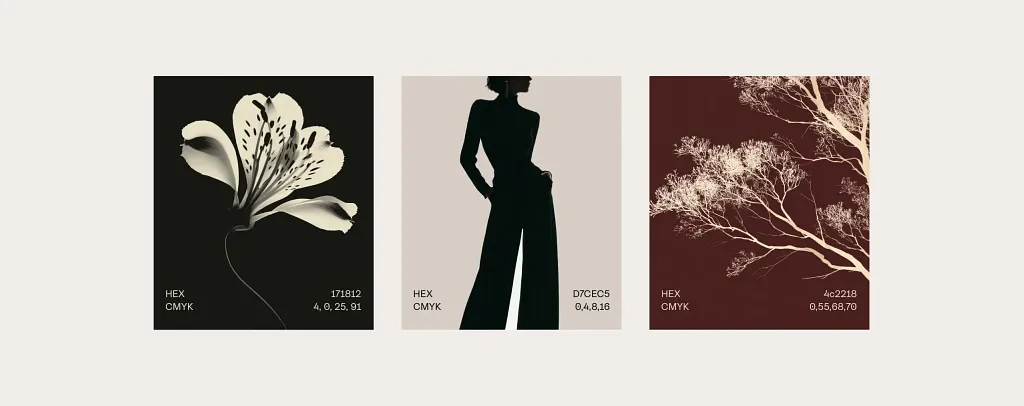
For the color palette, I chose earthy neutral tones combined with deep contrast colors to create warmth and sophistication. The typography system was kept minimal and clean to allow the layouts and imagery to speak naturally.
I also designed supporting visual elements like iconography and packaging structures that could scale across print and digital applications.
🛠️ Process
Here’s how I moved through the project naturally from concept to final presentation:
• Understanding the brand vision and emotional direction
• Building moodboards focused on calm luxury and editorial aesthetics
• Exploring typography combinations and logo concepts
• Developing the color system and material-inspired palette
• Creating structured layout systems for presentations and social posts
• Designing supporting assets like iconography and packaging applications
• Creating realistic mockups and 3D product scenes
• Refining spacing, alignment, and hierarchy across every screen
• Preparing the final presentation to feel cohesive and immersive
Style
Tools I Used
• Figma
• Adobe Photoshop
• Adobe Illustrator
• Blender / 3D rendering tools
• Mockup and presentation design resources
🎨 Final Output
The final result became a complete visual identity system that feels calm, elevated, and highly intentional.
The branding works across both digital and physical applications while maintaining consistency in tone and atmosphere. Every piece was designed to feel connected through spacing, color, typography, and composition.
The overall presentation feels editorial and immersive rather than promotional, which was exactly the direction I wanted to achieve.
Key Features
• Minimal and timeless logo design
• Editorial-inspired layout system
• Custom iconography direction
• Neutral luxury color palette
• Social media story templates
• Business card and envelope design
• Product visualization and 3D scenes
• Consistent brand presentation system
Packaging
Deliverables
• Full brand identity presentation
• Logo variations
• Typography system
• Color palette guidelines
• Packaging mockups
• Stationery design
• Social media templates
• Product visualization assets
Design Highlights
• Strong use of negative space
• Balanced typography hierarchy
• Calm and premium visual atmosphere
• Consistent design language across all touchpoints
• Minimalism without feeling empty
🚀 Results / Impact
Even though this was a concept-driven project, the final identity successfully demonstrated how a restrained design approach can create a strong emotional connection.
The project helped showcase:
• Improved visual clarity across brand communication
• Stronger consistency between print and digital assets
• A more premium and memorable visual identity
• Better presentation flow and storytelling
• Increased engagement potential through cohesive aesthetics
The project also became one of my strongest branding explorations because it pushed me to focus more deeply on atmosphere, composition, and emotional design rather than just visuals alone.
Unique Branding Experience
🙌 Closing
This project reminded me that strong branding does not always need loud visuals to leave an impact. Sometimes the smallest details like spacing, tone, texture, and restraint can completely shape how a brand feels.
I really enjoyed working on HOLME because it allowed me to slow down and design with intention. Every decision was carefully refined until the whole identity felt calm, balanced, and complete.
Definitely one of those projects that strengthened my approach to modern branding and visual storytelling ❤️
Like this project
Posted May 23, 2026
Designed a minimalist and premium brand identity for HOLME, focused on calm visuals, emotional storytelling, and timeless design aesthetics.
Likes
0
Views
5
Timeline
Oct 1, 2024 - Oct 14, 2024