Wild Pine Logo Exploration & Icon Design
Dua Web & Brand Designer
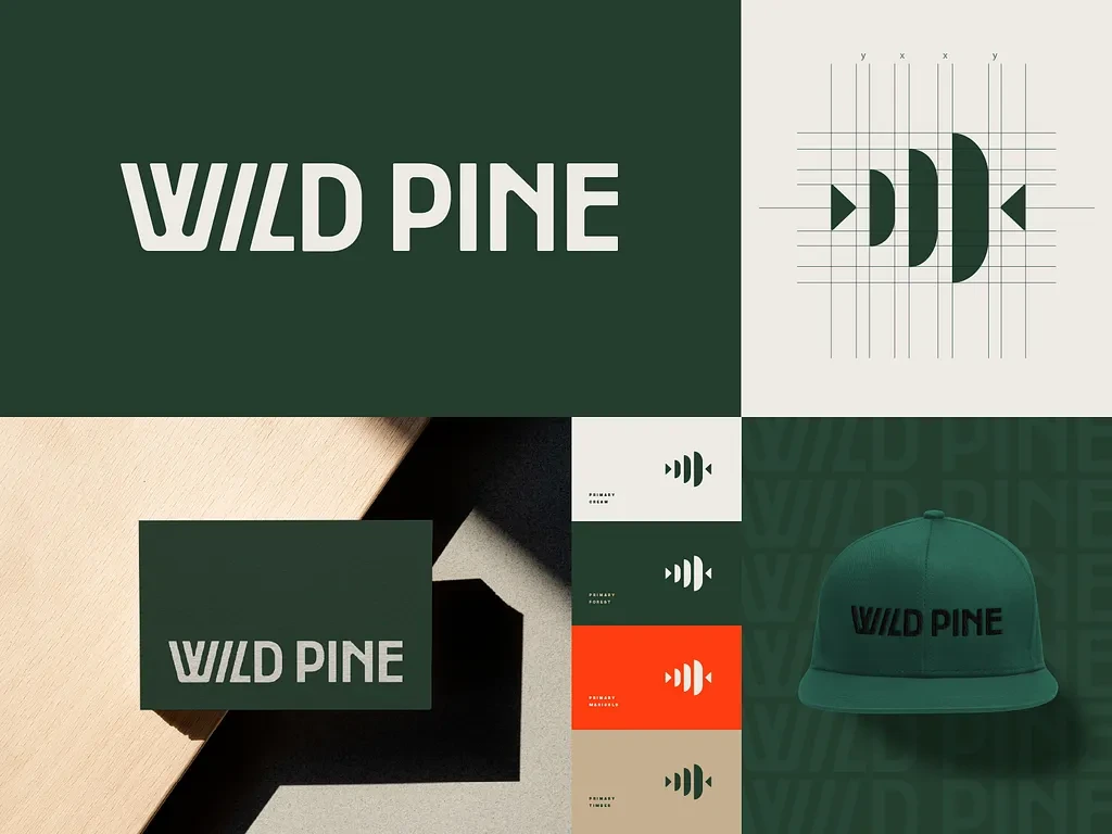
Wild Pine
Wild Pine Brand Identity & Logo Exploration Case Study
I was working on a complete logo and visual identity exploration for Wild Pine, a data-driven marketing and branding agency focused on strategy, connection, and modern communication 🌲
The goal of the project was to create a logo system that feels intelligent, symbolic, and visually memorable while still remaining clean and scalable. I wanted the identity to go beyond surface-level aesthetics and communicate deeper ideas around human connection, insight, and brand awareness.
Instead of designing a generic agency logo, I focused on building a meaningful visual language where every shape and detail had intention behind it.
Wild Pine Brand Icons
✨ Project Overview
Wild Pine was designed as a modern branding and marketing agency with a strong focus on strategy, communication, and emotional connection.
I worked on exploring multiple logo directions, symbol systems, and supporting brand icons to create a complete identity language that feels unified across all touchpoints.
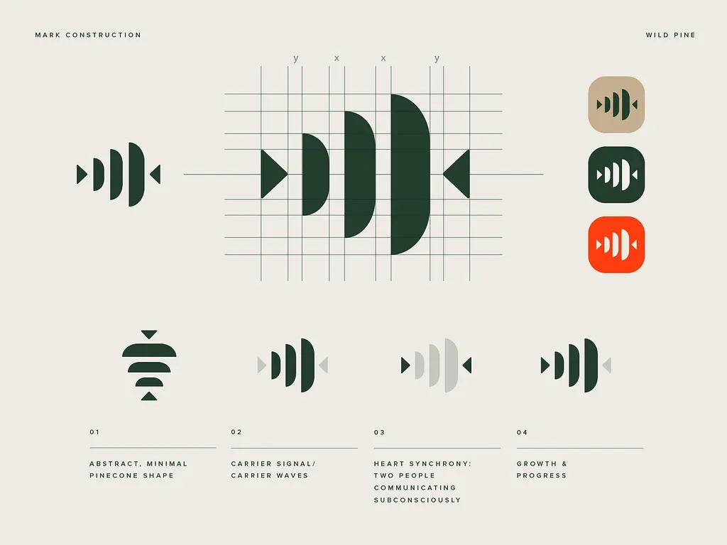
The main logo mark was inspired by the structure of a pinecone while also referencing the pineal gland, often associated with awareness and perception. This concept became the foundation of the entire visual direction.
I designed the symbol using geometric triangular forms combined with rounded semi-circle elements that represent carrier signals and human synchrony. The shapes visually suggest communication and connected energy flowing between people.
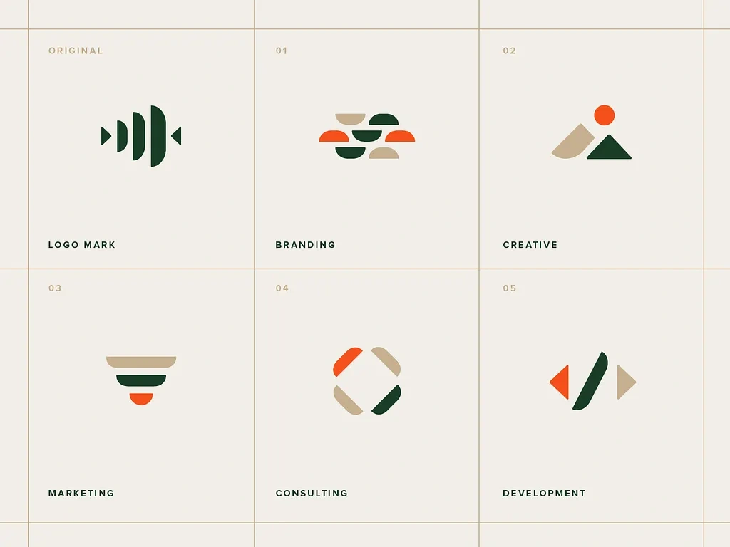
Beyond the logo itself, I also created a supporting icon system using the same geometry to maintain consistency throughout the identity.
The overall goal was to build a branding system that feels modern, thoughtful, and visually distinctive without becoming overly complicated.
🎯 Problem
A lot of agency branding tends to look repetitive or overly trend-based. Many logos rely on generic symbols or typography without communicating anything meaningful about the brand itself.
For Wild Pine, I wanted to solve a few key challenges:
• Creating a logo with symbolic depth while keeping it visually minimal
• Building a memorable identity for a highly competitive agency space
• Designing a system flexible enough for digital and print applications
• Keeping the logo scalable and readable at all sizes
• Creating a unified visual language beyond just the primary mark
Another challenge was balancing abstract symbolism with functionality. The logo needed to feel smart and intentional without becoming confusing or visually heavy.
💡 My Approach / Solution
I started by exploring concepts around communication, awareness, connection, and structure.
The pinecone became the strongest visual metaphor because it connected naturally to the brand name while also opening the door for deeper symbolism through the pineal gland reference.
From there, I built the mark using geometric shapes that could create rhythm and symmetry while still feeling organic. The triangles gave structure and direction, while the rounded semi-circles softened the composition and introduced the idea of signal flow and connectivity.
I also spent a lot of time refining the relationship between the symbol and the wordmark. The negative space within the typography was carefully balanced with the icon shapes so the entire identity feels connected rather than separated.
For the icon system, I reused the same core geometry to create consistency across all supporting visuals. This helped the identity feel cohesive across websites, social media, presentations, and digital products.
Color was used strategically to create depth and emphasis while keeping the overall system clean and modern.
Logo
🛠️ Process
Here’s how I moved through the project from concept to final identity system:
• Understanding the agency’s positioning and brand personality
• Researching symbolic and geometric logo systems
• Exploring pinecone-inspired structural forms
• Sketching abstract compositions and icon directions
• Refining the logo mark using geometric balance and spacing
• Developing typography pairings and negative space relationships
• Creating a scalable icon family using the same visual language
• Testing the identity across digital and physical applications
• Refining color usage and visual hierarchy
Tools I Used
• Figma
• Adobe Illustrator
• Adobe Photoshop
• Grid and spacing systems
• Brand mockup and presentation tools
Icon
🎨 Final Output
The final result became a clean and symbolic brand identity system that feels modern, strategic, and visually intelligent.
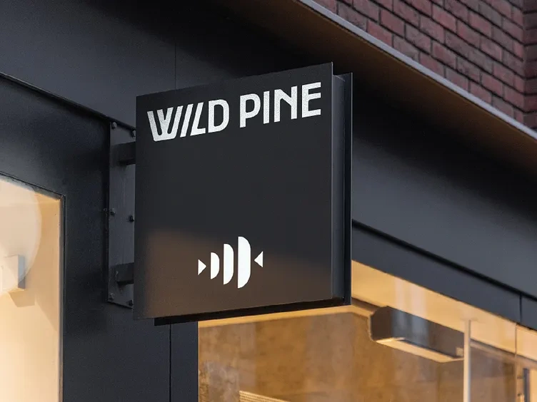
The logo works effectively across small and large formats while maintaining clarity and recognizability. The supporting icon set extends the same visual language, helping the brand feel cohesive across all touchpoints.
One of the strongest aspects of the project was how meaning and structure were combined into a minimal visual system without making the identity feel overly conceptual.
Key Features
• Custom symbolic logo design
• Pinecone-inspired geometric structure
• Unified icon system
• Balanced negative space integration
• Modern and scalable visual identity
• Strategic use of color and geometry
• Cohesive branding language across applications
Deliverables
• Primary logo design
• Secondary logo variations
• Custom icon family
• Typography and spacing system
• Color palette exploration
• Brand presentation mockups
• Visual identity guidelines
Design Highlights
• Strong symbolic storytelling
• Geometric precision and balance
• Unified visual system across icons and logo
• Thoughtful negative space treatment
• Minimal yet meaningful identity design
• Scalable and versatile branding approach
🚀 Results / Impact
Even though this was an exploration-heavy branding project, it became a strong example of how symbolism and minimalism can work together effectively in identity design.
The project helped demonstrate:
• Stronger brand memorability through symbolic design
• Better consistency across visual touchpoints
• Improved scalability for digital and print use
• More refined visual storytelling through geometry
• A cohesive system-based branding approach
It also pushed me to think more deeply about how meaning can be embedded into simple visual forms without sacrificing clarity.
🙌 Closing
This project reminded me that some of the strongest logo systems come from combining concept and restraint in the right balance.
I really enjoyed working on Wild Pine because it allowed me to explore symbolism, structure, and typography all within one cohesive identity system.
Definitely one of those projects where the deeper you look into the design, the more intentional details you start to notice 🌲
Like this project
Posted May 24, 2026
Created a meaningful logo and visual identity for Wild Pine using symbolic geometry and a cohesive icon system.