Roadster Coffee Branding & Packaging System
Dua Web & Brand Designer
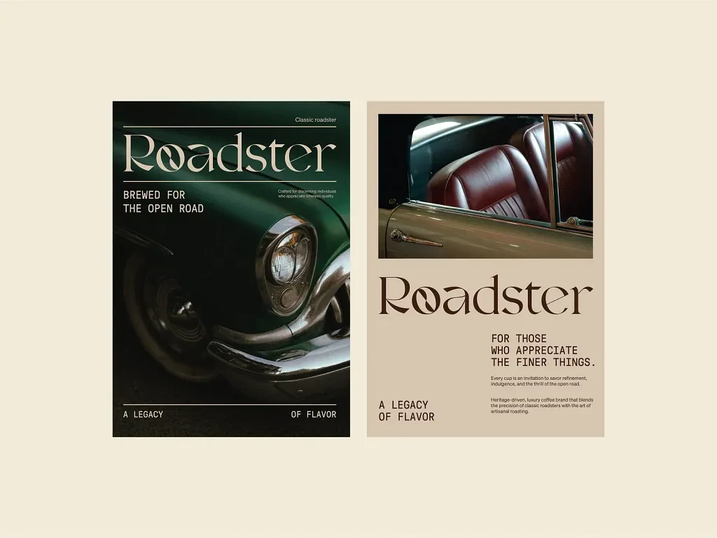
Roadster A Classic Coffee Brand Experience
Roadster Coffee Brand Identity Case Study
I was working on a complete brand identity concept for Roadster Coffee, a coffee brand inspired by movement, timeless aesthetics, and the culture of everyday rituals ☕
The goal of the project was to create a visual identity that felt warm, premium, and memorable while still staying approachable. I wanted the brand to capture the feeling of long drives, quiet cafés, vintage road culture, and the comfort of a perfectly brewed coffee.
Instead of designing a typical modern coffee brand filled with trendy visuals, I focused on building something with personality and longevity. The idea was to create a brand experience that feels nostalgic and refined at the same time.
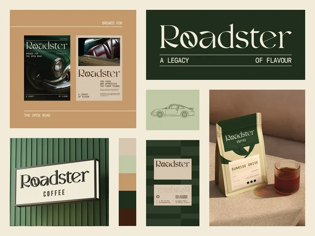
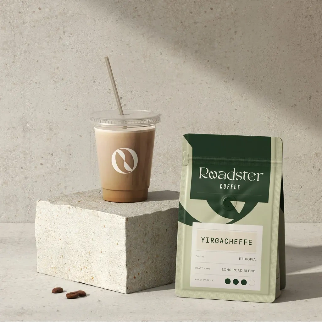
Packaging
✨ Project Overview
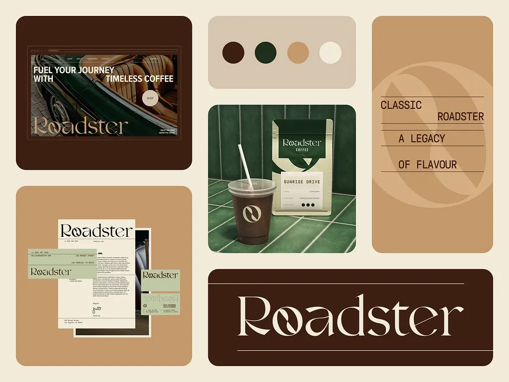
Roadster Coffee was designed as a lifestyle-driven coffee brand that blends heritage-inspired visuals with a modern presentation system.
I created the full visual identity including logo design, typography direction, packaging design, stationery, digital mockups, website concepts, and branded applications across multiple touchpoints.
The identity was built for a premium coffee business that wanted to stand out through storytelling and consistency rather than loud branding. The overall direction was heavily inspired by vintage automotive culture, classic European cafés, earthy tones, and editorial design systems.
I focused on making every visual feel intentional and connected, from the coffee packaging to the digital layouts and print materials.
The brand needed to feel immersive and recognizable while still remaining clean and elegant.
🎯 Problem
One of the biggest challenges with coffee branding today is that many brands start looking visually similar. A lot of them rely heavily on generic minimalist trends without creating a real emotional identity behind the visuals.
For Roadster Coffee, I wanted to solve a few important things:
• Creating a coffee brand that feels timeless instead of trend-based
• Building strong visual consistency across packaging, print, and digital assets
• Making the brand feel premium without becoming too formal or inaccessible
• Designing packaging that feels visually strong while remaining easy to read
• Creating an identity system flexible enough for future product expansion
The project also needed to balance classic inspiration with modern design standards so the brand could appeal to both younger and more mature audiences.
Style
Coffee
💡 My Approach / Solution
I approached the project by first focusing on mood and storytelling before designing the actual visuals.
I spent time researching vintage automotive branding, café culture, old travel posters, premium packaging systems, and editorial typography. I wanted the identity to feel grounded in heritage while still looking modern and polished.
The logo direction became one of the strongest parts of the project. I designed a custom typographic style with elegant curves and refined spacing that gives the brand a sophisticated but approachable personality.
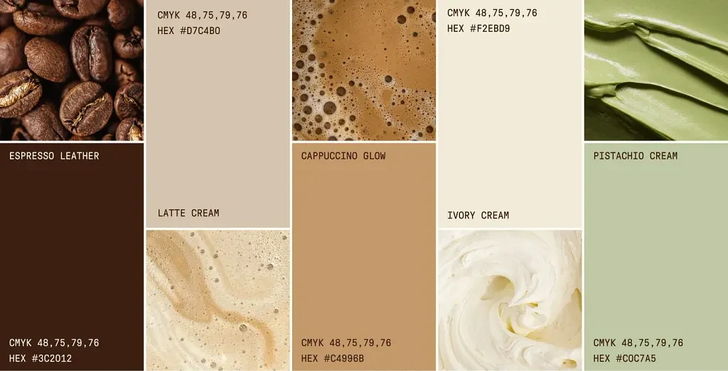
For the color palette, I used warm browns, creamy neutrals, deep greens, and earthy tones to reflect coffee, comfort, and craftsmanship. These colors helped create a calm and inviting atmosphere across the entire system.
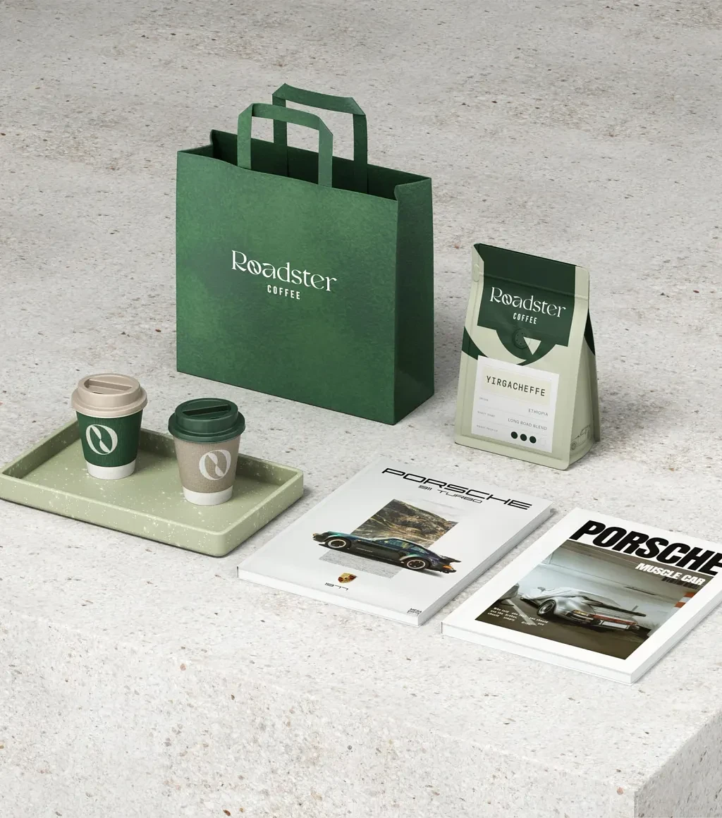
I also created a modular packaging structure so different products could maintain consistency while still allowing flexibility for future variations.
Throughout the project, I focused heavily on hierarchy, spacing, and composition to make the visuals feel balanced and premium.
🛠️ Process
Here’s how I moved through the project from concept to final presentation:
• Understanding the brand vision and target audience
• Researching coffee culture, travel aesthetics, and vintage branding references
• Creating moodboards focused on warmth, movement, and timeless design
• Exploring typography directions and logo concepts
• Building the color palette and visual system
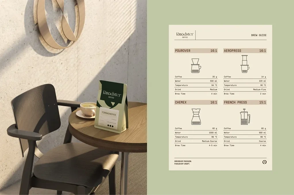
• Designing packaging layouts with strong readability and shelf presence
• Creating stationery and print applications
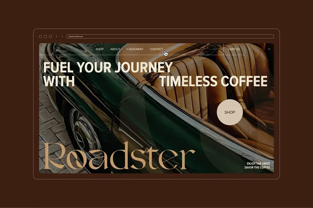
• Designing website and digital presentation concepts
• Refining spacing, hierarchy, and overall consistency across all assets
• Preparing mockups and final presentation visuals
Coffee Shop Brand Identity
Tools I Used
• Figma
• Adobe Illustrator
• Adobe Photoshop
• Blender / 3D mockup tools
• Presentation and layout design tools
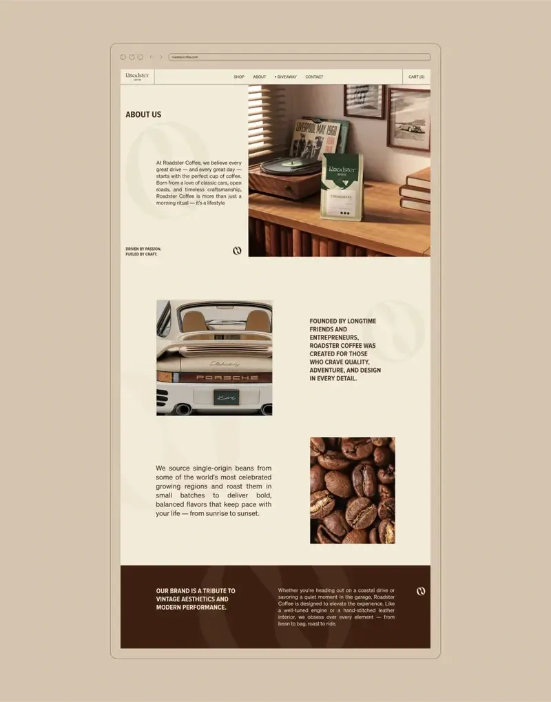
About US
Social Media
🎨 Final Output
The final result became a complete brand identity system that feels classic, warm, and confidently modern.
The branding works smoothly across packaging, digital media, print materials, and presentation layouts while maintaining a strong and recognizable visual language.
One of the strongest parts of the project was how cohesive everything felt together. Every element supports the same story and atmosphere without feeling repetitive.
The packaging especially helped bring the identity to life through clean structure, earthy tones, and refined typography.
Menu
Deliverables
• Full brand identity presentation
• Logo variations and usage system
• Color palette and typography guide
• Coffee packaging concepts
• Business card and stationery design
• Website landing page concept
• Product mockups and presentation visuals
• Social and promotional brand assets
Design Highlights
• Elegant custom typography
• Strong balance between vintage and modern aesthetics
• Clean packaging hierarchy for readability
• Cohesive visual storytelling across all touchpoints
• Warm color palette that supports the brand atmosphere
• Refined presentation style with premium detailing
Packet
🚀 Results / Impact
Even though this was a concept-based branding project, the final identity successfully demonstrated how storytelling and consistency can elevate a coffee brand experience.
The project helped showcase:
• Improved clarity and consistency across brand communication
• Stronger emotional connection through visual storytelling
• Better product presentation and shelf appeal
• More immersive digital and print experience
• Increased engagement potential through cohesive branding
The project also became a strong exploration of how branding can create a feeling, not just visuals.
🙌 Closing
This project reminded me how powerful thoughtful branding can be when every detail supports the same atmosphere and story.
I really enjoyed working on Roadster Coffee because it gave me the chance to combine editorial design, packaging, and storytelling into one cohesive identity system.
Definitely one of those projects where the small design decisions made the biggest impact ❤️
Like this project
Posted May 23, 2026
Created a cohesive brand identity for Roadster Coffee by blending vintage inspiration with modern visual design and premium packaging.