Dark Editorial Shopify Experience for HIYA
Guoshuai Zhang
HIYA — Dark Editorial Shopify Experience for a Gen Z Fashion Brand
Project Overview
HIYA is a fashion e-commerce concept created for Gen Z women aged 18–23 who want clothing that feels confident, bold, feminine, and slightly dangerous.
The goal was to design a Shopify-ready brand experience that did not feel like a standard online clothing store. Instead of using a basic product-first layout, I created a dark editorial shopping experience with campaign-style visuals, diagonal hero compositions, cropped fashion photography, deep black atmosphere, red accents, and a premium conversion-focused structure.
The final direction combines fashion campaign storytelling with practical Shopify UX, giving the brand a strong identity while still making the store easy to browse and shop.
The Challenge
The main challenge was to create a Shopify fashion store that felt visually powerful and memorable, without losing usability.
Many fashion e-commerce sites look clean but generic. For HIYA, the website needed to feel more emotional, more stylish, and more aligned with the brand attitude: hot, cool, confident, and rebellious.
The design needed to attract young fashion consumers, communicate the brand mood quickly, and still support key e-commerce actions like browsing collections, viewing product details, selecting sizes, and adding items to cart.
Brand Direction
HIYA was designed around the idea of dark romance, sharp energy, and quiet confidence.
The visual language uses:
Black atmosphere
Deep red accents
White editorial typography
Chrome-inspired details
Leather, buckles, straps, and metal hardware
Wet-hair beauty crops
Close-up fashion photography
Diagonal and asymmetrical layouts
Nightlife-inspired campaign styling
The brand does not feel soft only. It feels feminine, bold, mysterious, and confident.
Design Concept
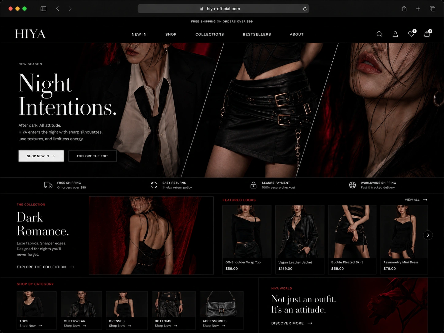
The homepage hero was designed as a dramatic diagonal three-part composition.
Instead of showing one simple full-body model image, I used cropped editorial visuals to create stronger tension and attitude:
Upper body crop with blazer, shirt, and loose tie
Waist and mini skirt crop with leather, belts, buckles, and chains
Close-up beauty crop with lips, wet hair, jewelry, and red lighting
This approach makes the hero feel more like a fashion campaign than a normal Shopify template.
The design creates a strong first impression while still including clear CTAs such as Shop New In and Explore the Edit.
Key Pages Designed
Homepage
The homepage introduces the HIYA world through a dark cinematic hero section, featured looks, category navigation, collection storytelling, and strong campaign modules.
Key sections include:
Diagonal three-part hero section
Night Intentions campaign intro
Featured looks carousel
Dark Romance collection block
Shop by category section
Editorial brand story panel
Shipping, returns, and secure payment trust strip
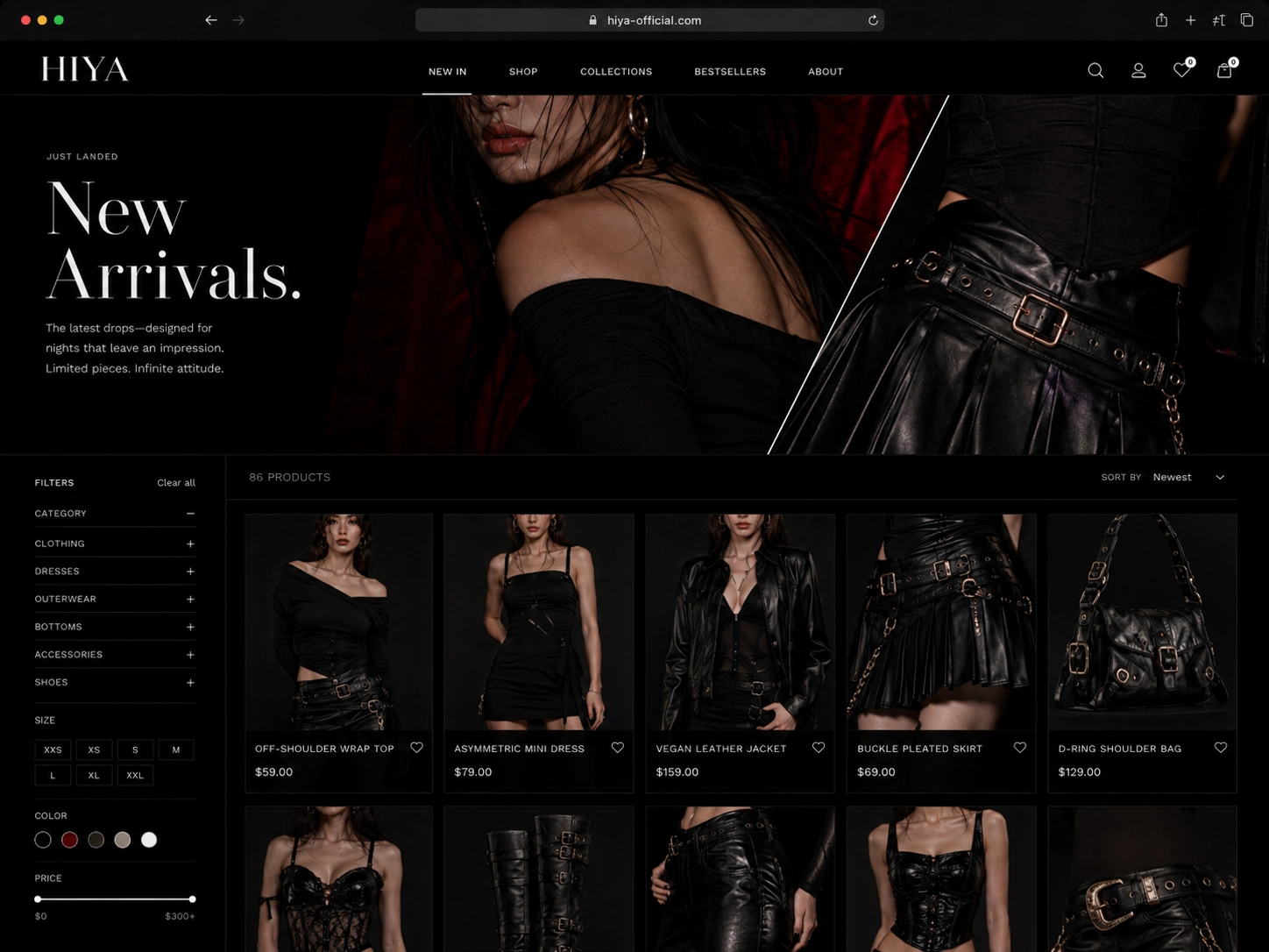
Collection Page
The collection page was designed to keep the dark editorial mood while still supporting clear product browsing.
It includes:
Large campaign banner
New arrivals product grid
Left-side filtering system
Sort controls
Wishlist icons
Product cards with pricing
Dark product photography
Color and size filter logic
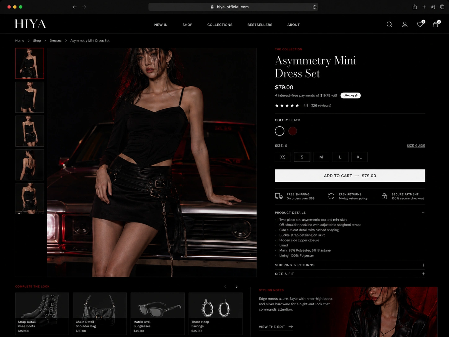
Product Page
The product page focuses on strong product presentation and a simple purchase flow.
It includes:
Large product image gallery
Vertical thumbnails
Product title and price
Star rating
Color swatches
Size selector
Add-to-cart button
Product details accordion
Shipping and returns notes
Complete-the-look section
Styling notes
Campaign / Editorial Page
The campaign page was designed to show the fashion attitude behind the brand.
It uses a more experimental editorial layout with dark imagery, deep red backgrounds, cropped body details, and campaign copy such as:
Not just an outfit. It’s an attitude.
This page helps the brand feel more memorable and gives the store a stronger lifestyle identity.
UX Strategy
The design balances two needs:
First, the site needed to feel bold, editorial, and emotionally strong.
Second, the shopping experience still needed to be clear and easy to use.
To achieve this, I used experimental composition in the homepage and campaign sections, while keeping product browsing, filters, product details, and checkout-related actions simple and familiar.
This creates a store that feels visually unique without confusing the customer.
Shopify Structure
The design was planned as a Shopify-ready e-commerce experience with flexible sections that could be reused across campaigns and product drops.
The store structure supports:
Reusable hero sections
Editable campaign blocks
Product collection grids
Featured product modules
Category cards
Editorial image sections
Product detail templates
Complete-the-look modules
Mobile-first shopping flow
This gives the brand flexibility to launch new drops, update campaigns, and build new landing pages without redesigning the full store each time.
Deliverables
Brand and visual direction
Shopify homepage design
Collection page design
Product detail page design
Campaign landing page design
Dark editorial UI system
Mobile-friendly e-commerce structure
Product card system
Filter and shopping UX
Complete-the-look shopping module
Campaign storytelling sections
Tools Used
Figma
Shopify UX Planning
Liquid-ready Section Planning
HTML / CSS Direction
Adobe Photoshop
AI Visual Direction
Final Result
The final HIYA concept presents a bold Shopify fashion experience that feels dark, premium, and emotionally memorable.
The project moves beyond a basic fashion store layout and creates a full brand world: part e-commerce, part editorial campaign, part Gen Z fashion statement.
HIYA feels confident, sharp, and unforgettable — built for girls who want fashion with attitude.
Like this project
Posted Jun 26, 2026
HIYA wanted edge without sacrificing usability. I designed a dark, editorial Shopify storefront that feels like a lookbook you can shop.
Likes
0
Views
4
Timeline
Feb 4, 2026 - Feb 27, 2026