Coalition

Zhay Moorer

Coalition -
Campaign Prototype & Visual Framework
Executive Brief
A scalable, narrative-driven visual identity and launch architecture designed for multi-platform campaign deployment.
Project Overview:
A foundational creative direction and campaign system designed to explore emotional tension, narrative isolation, and atmospheric depth. Developed as an initial proof-of-concept, this framework established the core visual identity, typography hierarchy, and asset-scaling architecture utilized to guide the final production rollout.
Strategic Purpose:
A/B Visual Testing: Tested low-frequency urban gradients and silhouette textures to establish high-impact feed retention.
System Scalability: Built and validated multi-platform templates (DSP artwork, print mechanicals, OOH mockups) prior to final subject photography integration.
Creative Direction Blueprint: Served as the core design bible to ensure aesthetic consistency across the full campaign lifecycle.
Scope:
Core Identity Assets: Primary and secondary cover art (1:1 high-resolution master files formatted for digital service providers).
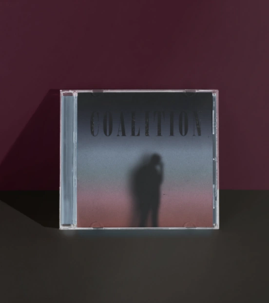
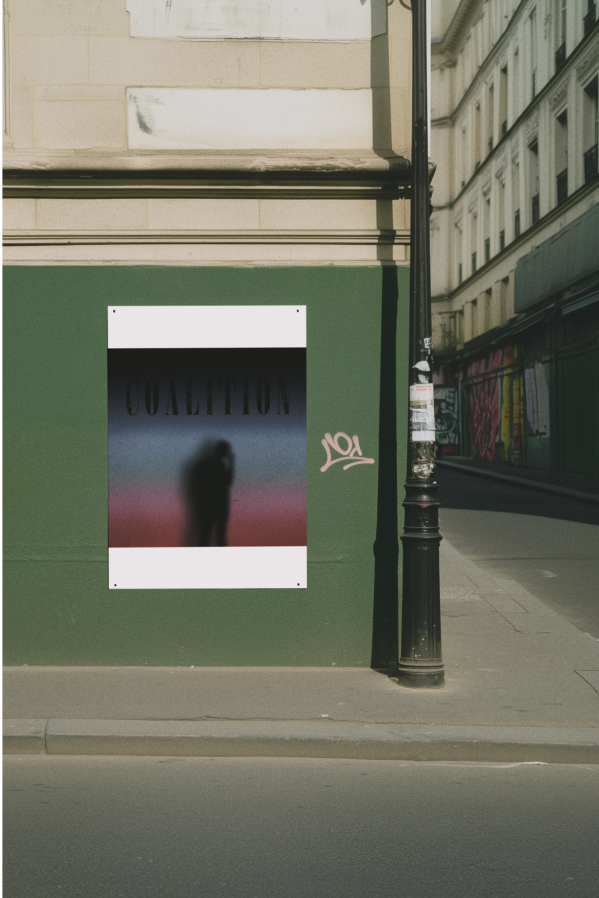
Physical & Out-of-Home (OOH) Production: Print-ready mechanical layouts for physical CD jewel cases, inserts, tray cards, and urban poster placements.
Digital & Social Architecture: Mobile-first promotional assets, motion process video documentation, and UI-optimized digital layouts.
Asset Automation & Scaling: Production-ready templates designed for rapid deployment across multi-channel rollout schedules.
Creative Direction & Mood board
Keywords:
Moody; Reflective; Urban; Emotional; Abstract: Conceptual
Visual Elements:
- Gradient inspired by blurred streetlights at night
- Textures and overlays for depth
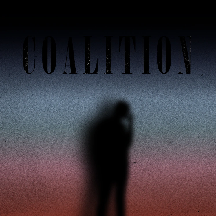
Color Theory & Atmospheric Depth: Urban evening gradients and low-frequency tones designed to stand out against high-contrast, oversaturated social media feeds.
Visual Metaphor & Brand Identity: Silhouette blur techniques used to establish narrative intrigue, increasing click-through rates (CTR) on digital streaming platforms and promotional posts.
Typography Hierarchy: High-contrast serif placement positioned to ensure instant brand legibility across both large-format print and micro-mobile screens.
Design Process
A. Color Palette Development
Pulled from a blurred image of a busy street at night.
- Earthy purples
- Burnt oranges
- Urban grays
B. Typography & Layout
- Typeface:
- Front cover title placement for visual weight and mood
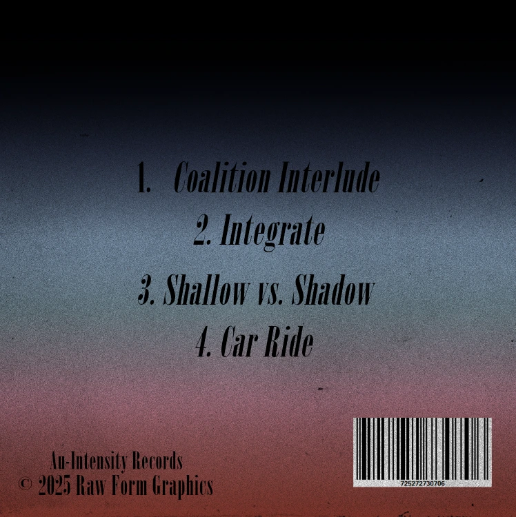
- Back cover balanced between track list and barcode
C. Creating the Blurred Figure
"The blurred figure represents walking away, fading identities, and emotional distance."
Final Design Outcomes
Front Cover
Back Cover
Mockups & Presentation
Strategic Outcomes
Delivered a turnkey, multi-channel asset suite that reduced post-production overhead, streamlined campaign rollout velocity, and established a distinct, highly recognizable brand identity across physical and digital environments.
Like this project
Posted Aug 19, 2026