Redefining Localization Through AI-Powered Simplicity
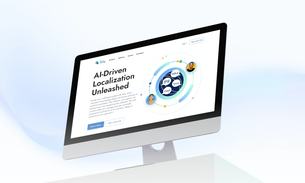
Tolq Website Redesign: Redefining Localization Through AI-Powered Simplicity
The Challenge: A Website That Didn’t Reflect Cutting-Edge AI
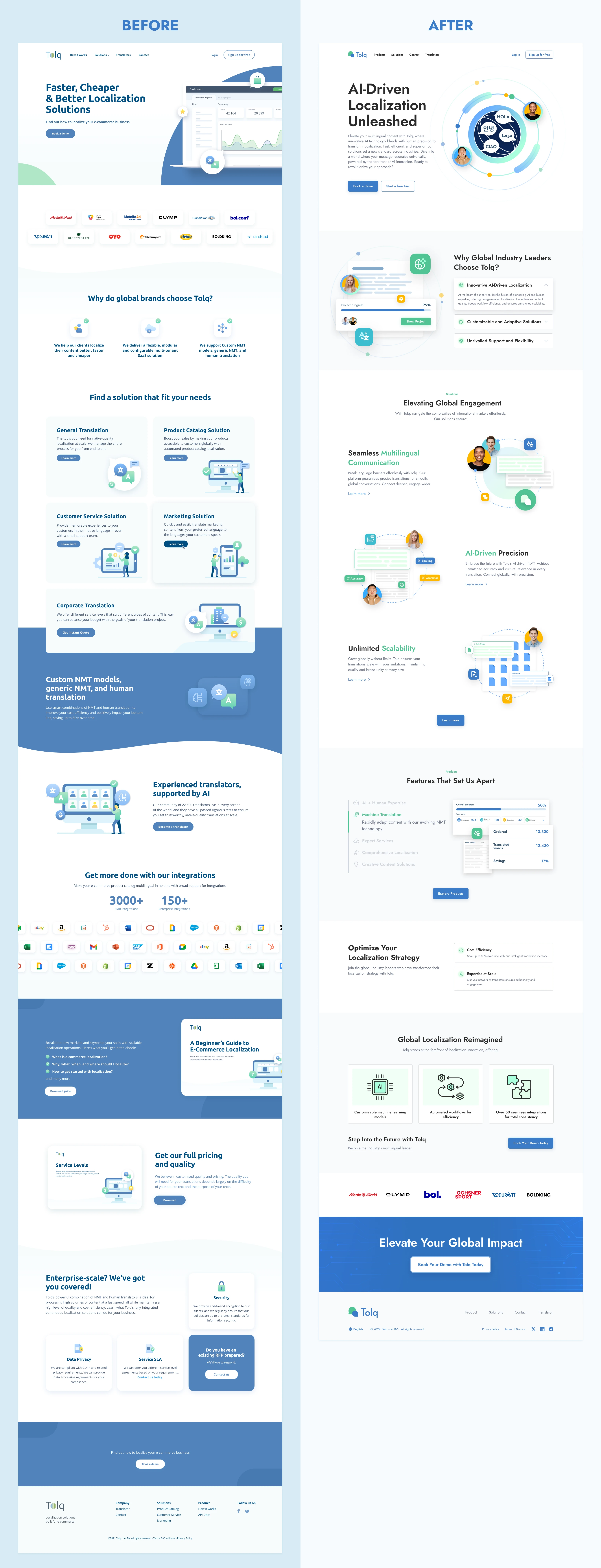
When I first saw Tolq’s old website, I knew it was a missed opportunity. Here was a company using AI to revolutionize localization—yet their site looked like a generic SaaS template from 2015.
Key problems:
No clear storytelling: Visitors couldn’t quickly grasp Tolq’s AI advantage.
Weak visual identity: Illustration and dense text made it feel outdated.
Buried conversions: CTA buttons weren’t visible or compelling, hurting demo requests.
As the designer, I didn’t just "redesign pixels"—I rebuilt Tolq’s digital front door to attract enterprise clients and boost trial signups.
My Strategy: Where AI Meets Human-Centric Design
I partnered with marketing and stakeholders to redefine Tolq’s web presence around three pillars:
Clarity → "What does Tolq do, and why is it better?".
Trust → Prove credibility.
Action → Guide users seamlessly toward "Book a Demo" or "Start Trial."
💡 My Actions
Designed all pages across Tolq.com from scratch
Created a scalable design system for consistent branding
Rewrote UX copy structure in collaboration with stakeholders
Delivered responsive design mockups and interaction guidelines
Supported hand-off to developers and ensured implementation consistency
Before vs After
Key Design Highlights
✅ Full Website Ownership
I led the design for the entire Tolq.com website—from the homepage to product, solution, contact and translator, ensuring a consistent user experience and brand identity across all touchpoints.
🎨 Clean, Modern Visual Style
Developed a fresh, minimalistic UI with a professional and tech-forward aesthetic that reflects Tolq's positioning as an AI-first localization platform.
🧭 Clear Information Structure
Redesigned the layout and content flow to make it easier for visitors to understand Tolq’s offerings, with a clear visual hierarchy that guides users through key benefits and actions.
🚀 Conversion-Focused Layout
Strategically placed CTAs (“Book a Demo” and “Start Free Trial”) to improve engagement and support lead generation goals across the site.
🧱 Scalable Design System
Created a modular design system in Figma to maintain consistency and accelerate future design and development processes.
📱 Fully Responsive Design
Ensured optimal performance and readability across all screen sizes, delivering a seamless experience from desktop to mobile.
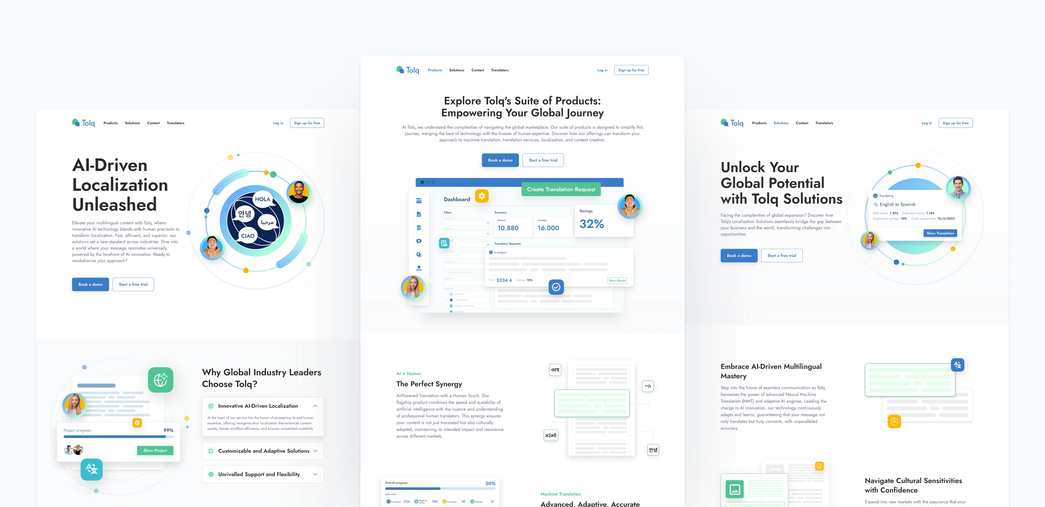
Design Decisions
Color & Typography: Balanced minimal white space with accent colors to guide user focus
Illustrations: Custom visuals to express AI workflows and global reach
Hierarchy: Headlines, icons, and visual breakpoints used to avoid cognitive fatigue
Mobile-first: Ensured full responsiveness with smooth hierarchy on smaller screens
SEO-Friendly: Structured sections for clean copy injection and semantic headers
🚀 Outcome
Improved brand perception as a modern AI translation company
Increased clarity of product offerings and integrations
Design praised internally by stakeholders and marketing teams
Why This Matters to Your Company
This project wasn’t just about aesthetics—it was about using design to drive business goals:
I deep-dived into localization industry pain points (not just UI trends).
My work bridged marketing, product, and sales needs without endless revisions.
Every design choice was measurable, from CTA placement to load-time optimizations.
Let’s build something impactful together.
✉️ Thank you for your time reviewing my work on the Tolq website! If you’d like to see more or get in touch, my contact information is provided below.
Email: designbyalam@gmail.com
Like this project
Posted May 19, 2025
Tolq’s website a fresh new look, aligning with AI localization mission while improving usability and design flow to better convert visitors into customers.
Likes
0
Views
0


