A User centered E-Commerce Cross Platform Design
Olufolake Olufade

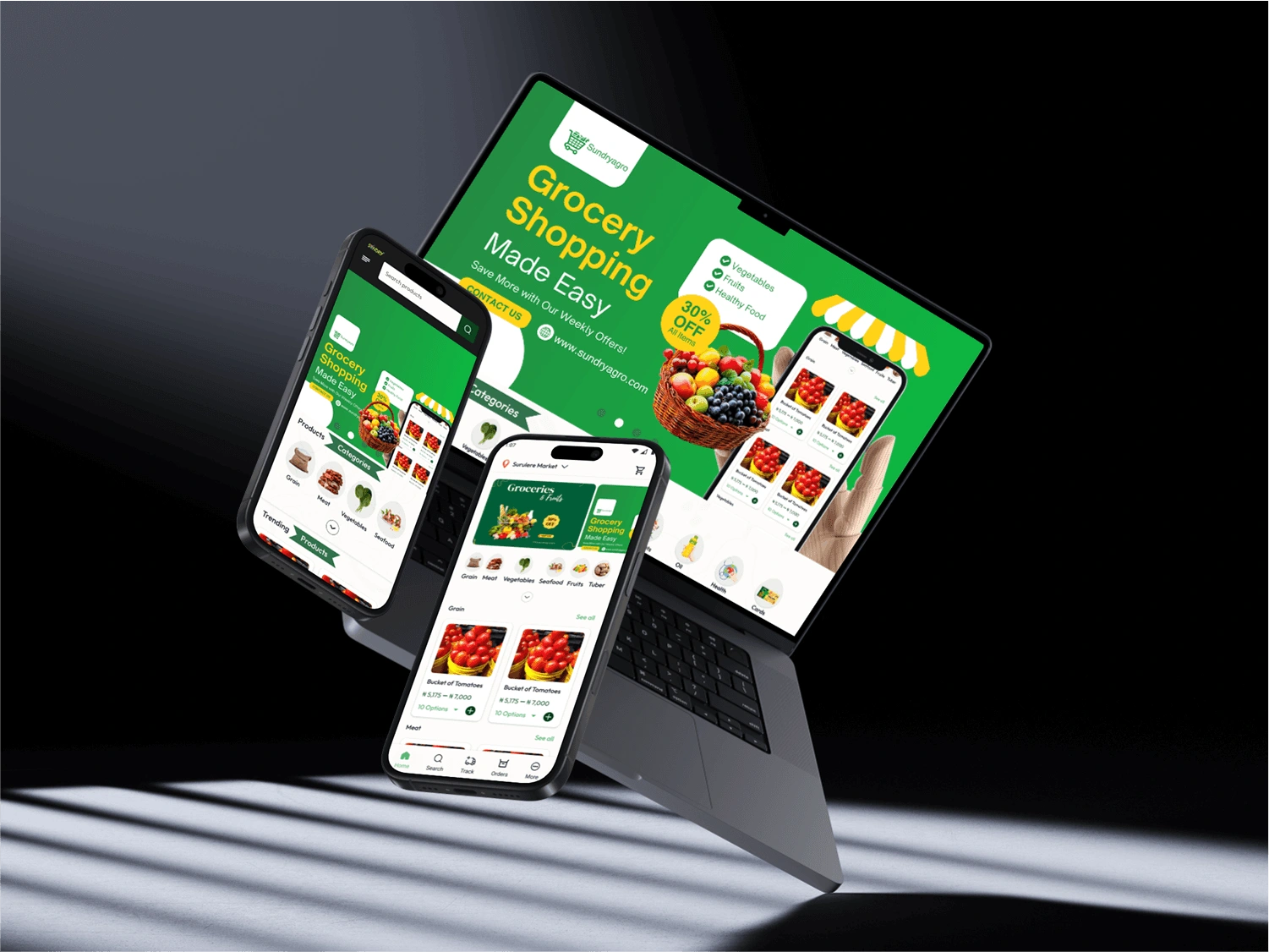
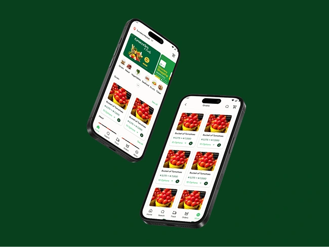
Sundryagro
Research shows that well designed e-commerce platform increase customer retention by 40%. This design aims to leverage this trend
Project Type: end to end cross-platform design
Role: Lead Product Designer
Industry: E-Commerce
Tool: Figma, Figjam, Google Suite, Pluggins
Duration: 3 Weeks
Sections
Project Overview

Overview & Objective
Sundryagro is an online shopping base platform where users can order for their groceries products
Sundryagro has personal shoppers that help buyers get their products within selected state where the e-commerce company operate in Nigeria
Sundryagro has been running their products on no-code website that has been customized already, has the company grows the founder demands a proper built in website and mobile app for the company
Users
Adults between 24-65, who are busy and finds it difficult to go to the market to buy things
Business Goal
We want to make shopping seamless for users who loves to shop online
Research And Ideation
User Persona
Kenny is a young beautiful Nigerian woman, who lives in Lagos she is 35 years old with a family of two, she is frontend developer, and a caring wife and mother who prioritizes buying fresh farm food over stale ones for her family, but unfortunately, she is always having short time to go to market due to her work nature.
Kenny said
"How can I restock my groceries quickly, at the comfort of my home"
User Pain Points
Time Constraints for Grocery Shopping
Kenny’s busy work schedule as a frontend developer leaves her with little time to visit the market regularly. She struggles to find a convenient way to buy fresh farm food without disrupting her workflow or family time.
Limited Access to Fresh Farm Produce
Due to her tight schedule, she often ends up buying groceries from nearby stores that may not always have fresh farm produce. She worries about the quality and nutritional value of food when she can't personally select it.

Ideation
After the research I decided to bring out my user's need which was derived from the pain point. I conducted quantitative research on our target users from age 24-65 and they have similar experience just like kenny.
Defining User Needs
She needs a convenient way to buy fresh farm produce without visiting the market frequently.
She needs a platform she can trust to provide high-quality, fresh food.
She needs a time-efficient shopping experience that fits into her busy schedule.
Ideate Solutions
Based on the research, I brainstorm and propose possible solutions that address the user’s pain points and meet their needs.
A mobile app or web platform that allows Kenny to quickly shop and delivers farm-fresh food directly to her home.
A subscription service that ensures weekly delivery of fresh farm produce.
A feature that allows her to pre-order groceries and pick them up quickly without waiting.
Design Process
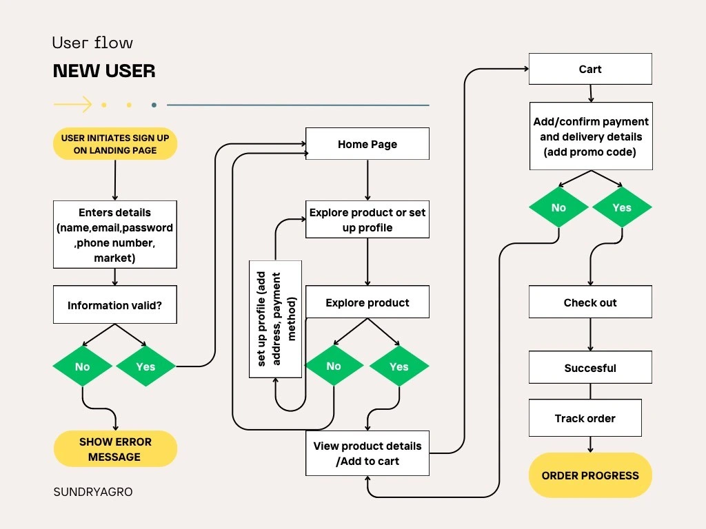
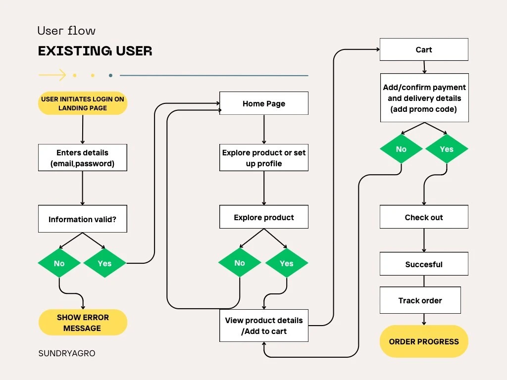
User Journey Map
With the research insights in mind, I began the wireframing process to map out the user journey. I mapped out how Kenny would interact with the app from start to finish. This ensures a smooth and intuitive experience.
New User Info Graph
Existing UserUser Info Graph
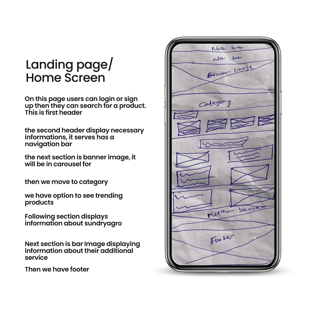
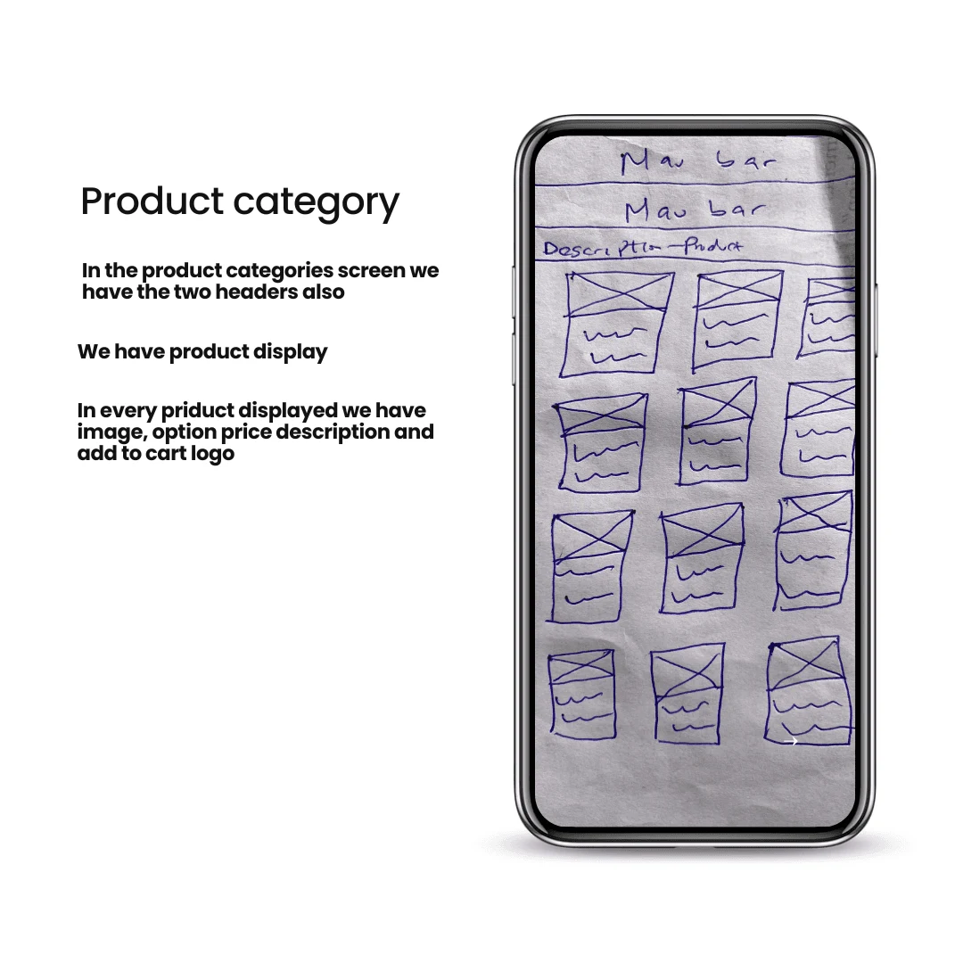
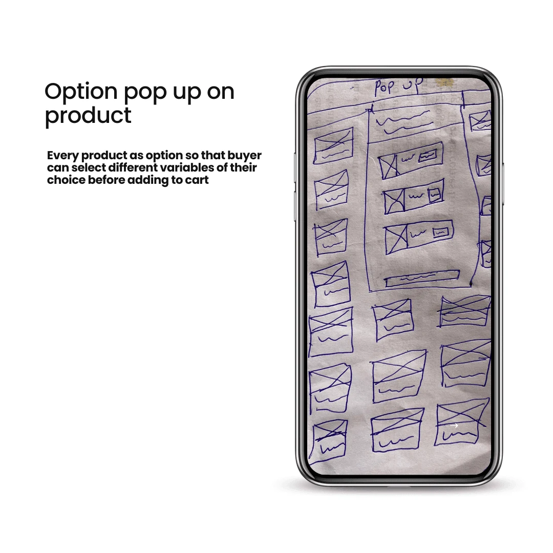
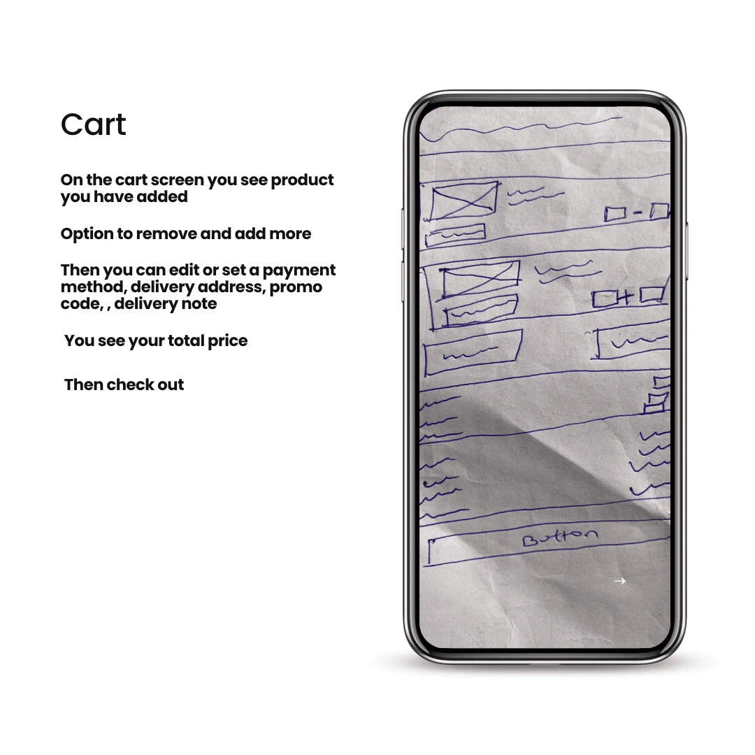
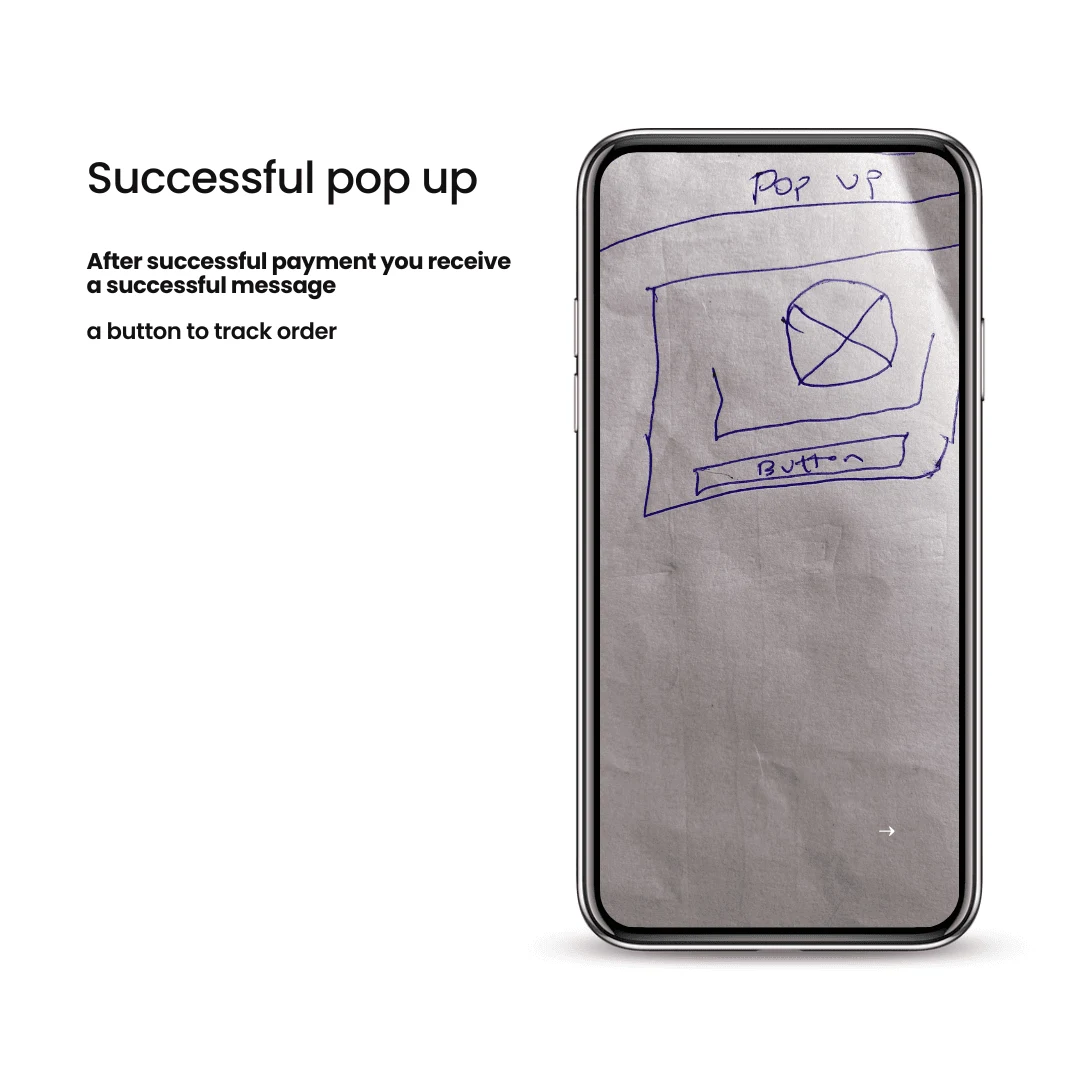
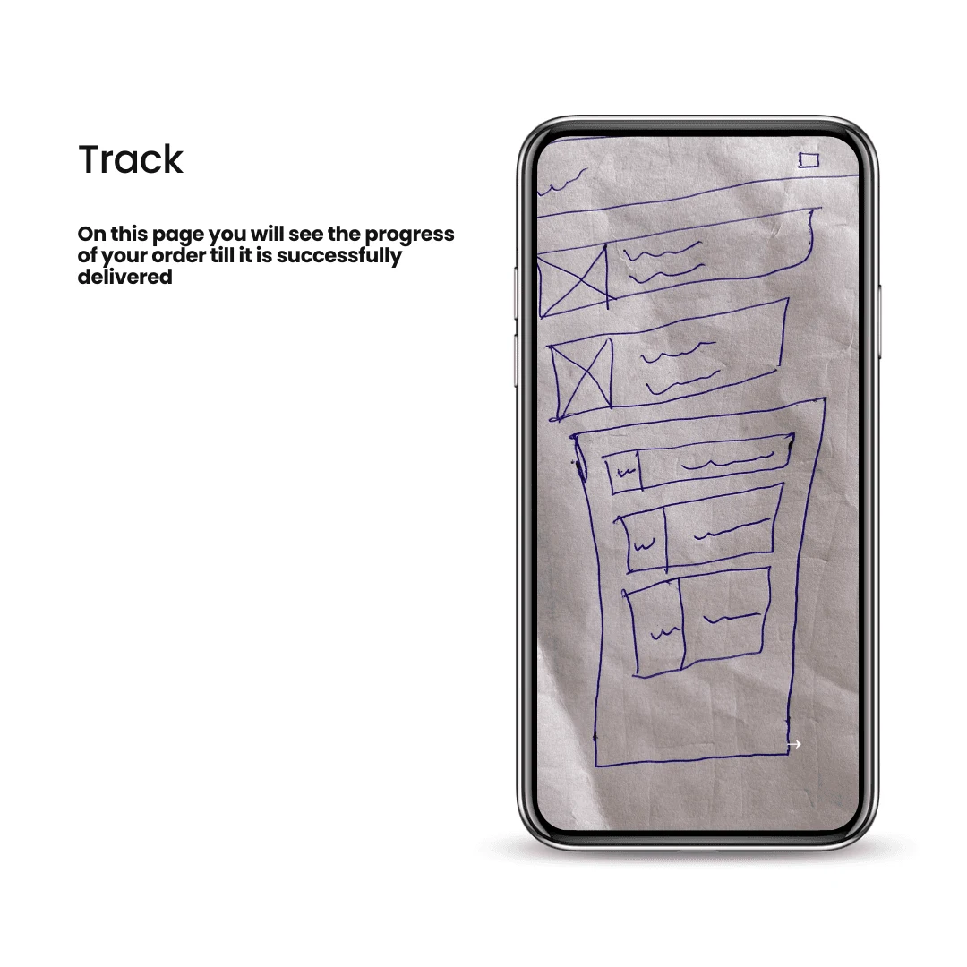
Low Fidelity Wireframe
To translate our research insights into a structured user experience, I began with low-fidelity wireframes. These simple, skeletal layouts helped us quickly visualize the platform’s structure, ensuring a logical and intuitive user journey from landing on the app to completing an order.
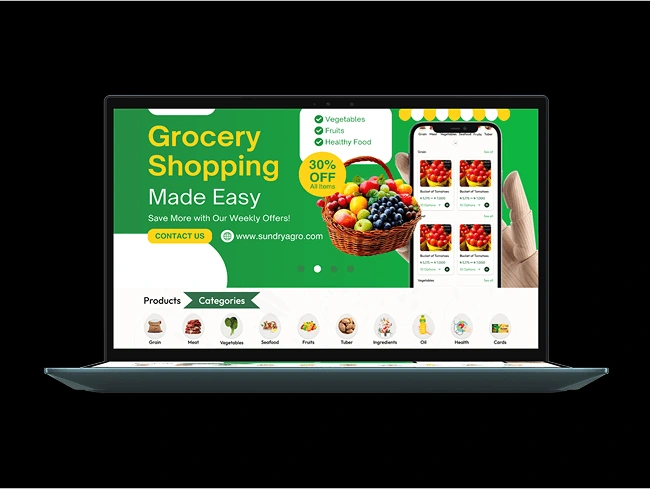
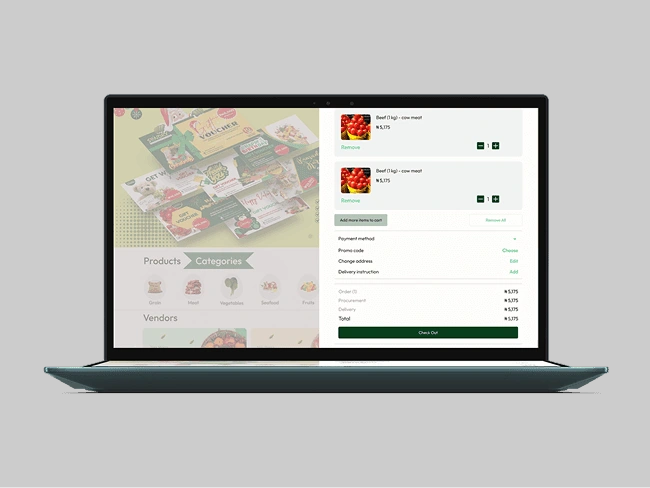
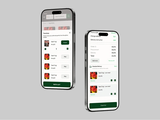
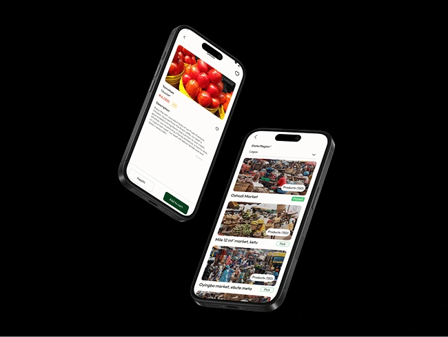
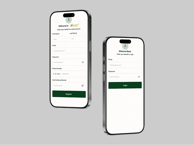
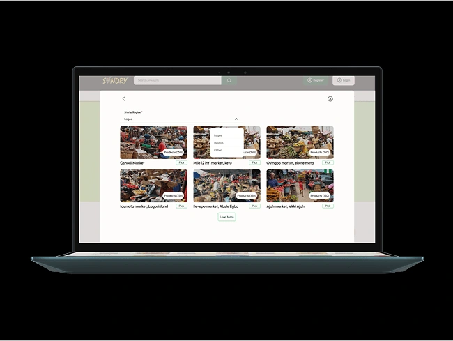
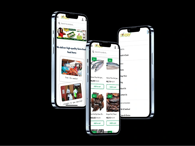
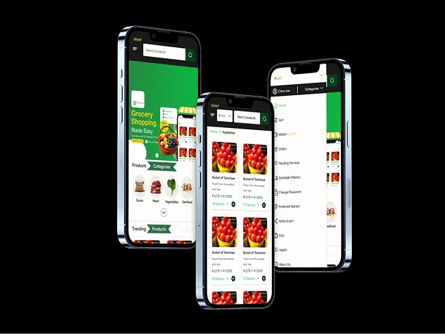
High Fidelity Wireframes
After refining the low-fidelity wireframes and validating the core user flows, I moved into the high-fidelity design phase. This stage focused on translating the wireframes into polished, visually engaging interfaces while maintaining clarity and usability.
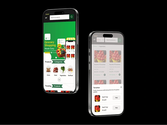
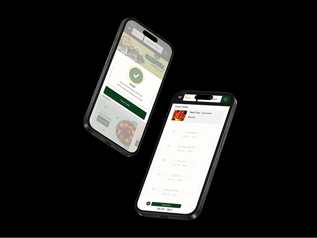
Interactive Prototype
With the high-fidelity designs finalized, I moved into the interactive prototyping phase to bring the user experience to life. This step allowed us to simulate real interactions, ensuring the platform felt intuitive before development.
What Works
What Works When Addressing User Pain Points
To effectively solve user pain points and create a seamless experience, the following strategies work well:
1. Cross Platform Design
- Application is available on Webapp {Desktop & Mobile responsive}
- Application is available on mobile app {Andriod & IOS}
2. Convenience & Time-Saving Solutions
- Smart search bar with auto-suggestions and filters
- Easy-to-browse categories (e.g., fruits, dairy, snacks)
- Quick access to favorites & past purchases
Before
We realized that a lot of users were having signing up issues due to long process.
Only 50% of users completed a purchase, due to long check out process
There were technical issues because the platform was operating Wordpress powered by Woocommerce, as company grows there is demand for proper built in website
The currently website is not aesthetically pleasing and this as affected users retention
After
Cut down sign up to one process
Post-redesign, we expect completion rates to rise to 75%, increasing monthly sales. The check out process is cut down to one.
The company has a functional mobile and web app which can accommodate large users.
The challenge is to improve the app’s conversion rate, to achieve this the app aesthetic and functionality was improved
What Didn't Work
What Didn't Works When Addressing User Pain Points
Users wants are numerous, we couldn't fix everything our users demanded for. What we couldn't resolve now is:
Personalization
❌ We intend to allow users to schedule delivery but this didn't work in this phase, we shifted it to secod phase. We need to study our users to see how seamless the check out is for now

What I Learned

Understanding User Needs
Users prioritize speed and convenience, they want to find items quickly and check out with minimal effort. Also, Many users prefer a familiar shopping experience (e.g., categorized navigation, search filters, and easy reordering).
Thank you for your interest in my work
I designed and built this portfolio in Framer, to reflect my unique vision
© 2025 Olufolake Olufade Framer. All Rights Reserved.
Like this project
Posted Apr 11, 2025
Research shows that well designed e-commerce platform increase customer retention by 40%. This design aims to leverage this trend
Likes
0
Views
4
Timeline
Nov 11, 2024 - Dec 11, 2024