Rand Hydrogen Brand Identity and Website Design
David Castillo
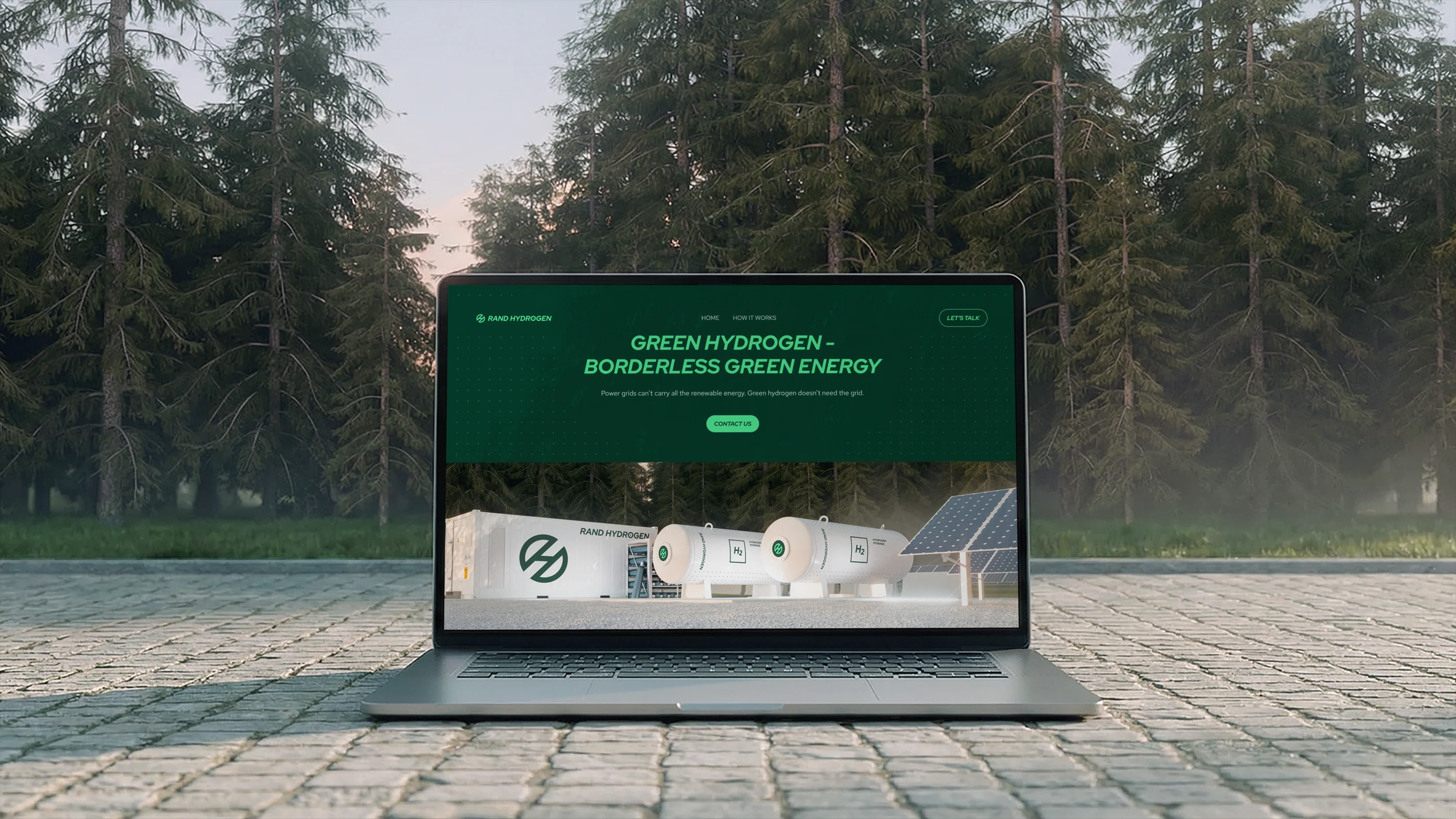
Powering industrial decarbonization across Europe
Rand Hydrogen are revolutionizing the energy landscape and driving the global adoption of green hydrogen. They provides solutions for producing, distributing, and using green hydrogen with a global perspective on what industrial decarbonization actually requires. Founded by renewable expert Hando Rand, their mission is clear: make green energy accessible and affordable while helping Europe achieve a 55% emissions reduction by 2030 and reach carbon neutrality by 2050—the dual pillars of the continent's climate commitment.
Our challenge was straightforward: develop a brand identity and website that positions Rand Hydrogen and green hydrogen itself as a powerful new force in energy landscape—capable of competing with established industrial players while representing a fresh generation of cleantech innovation. The brand needs to communicate not just technical capability, but genuine environmental commitment at a critical moment for Europe's energy transition.
What We Did
Brand Identity System
Imagery Art Direction
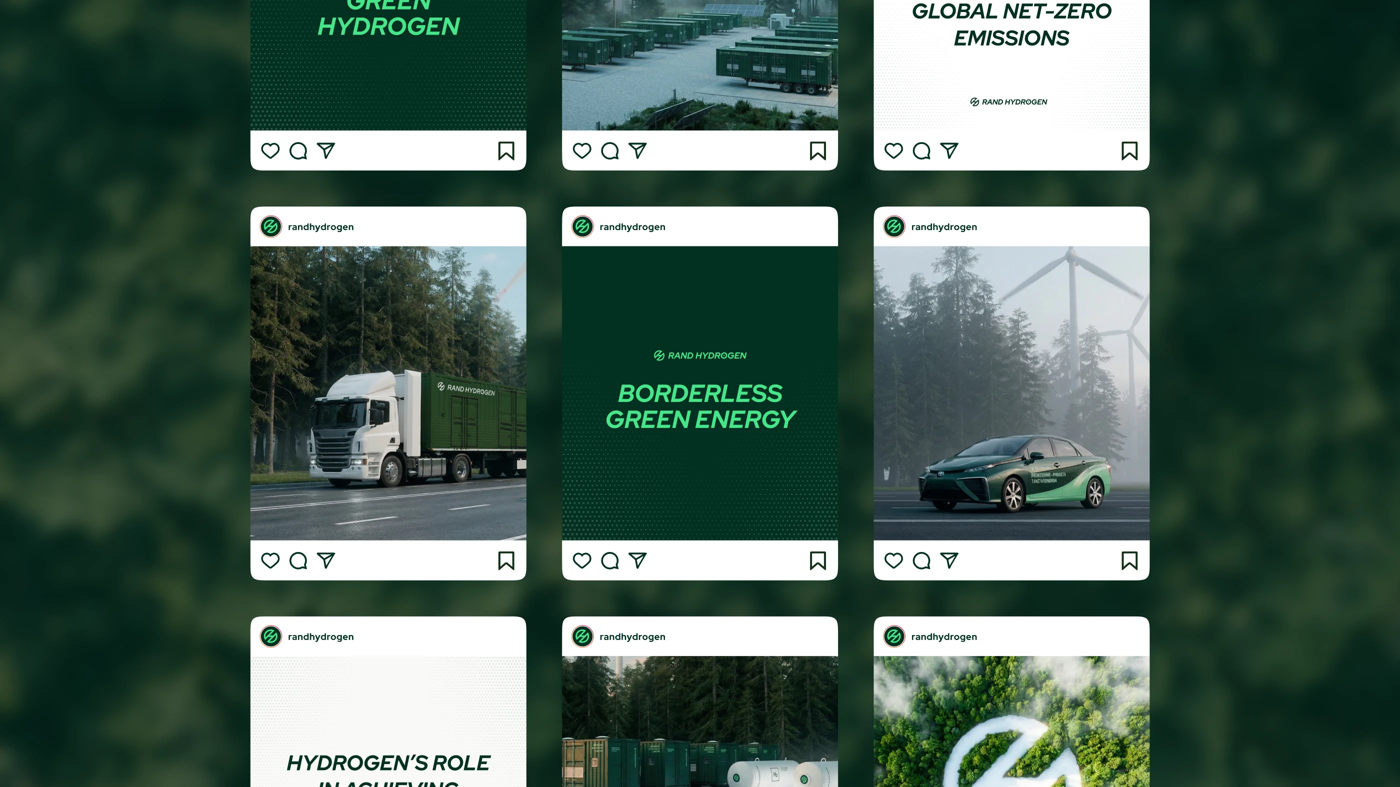
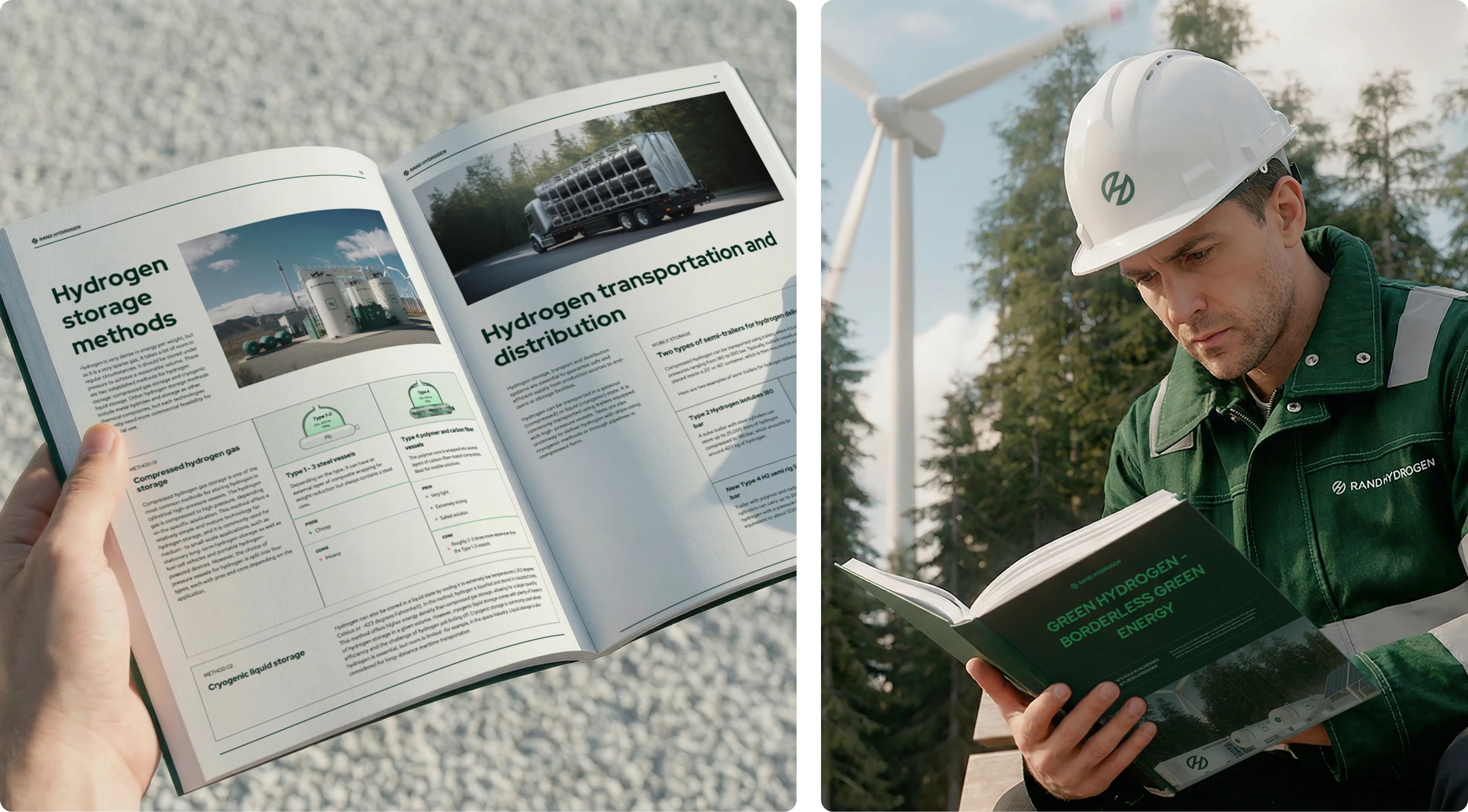
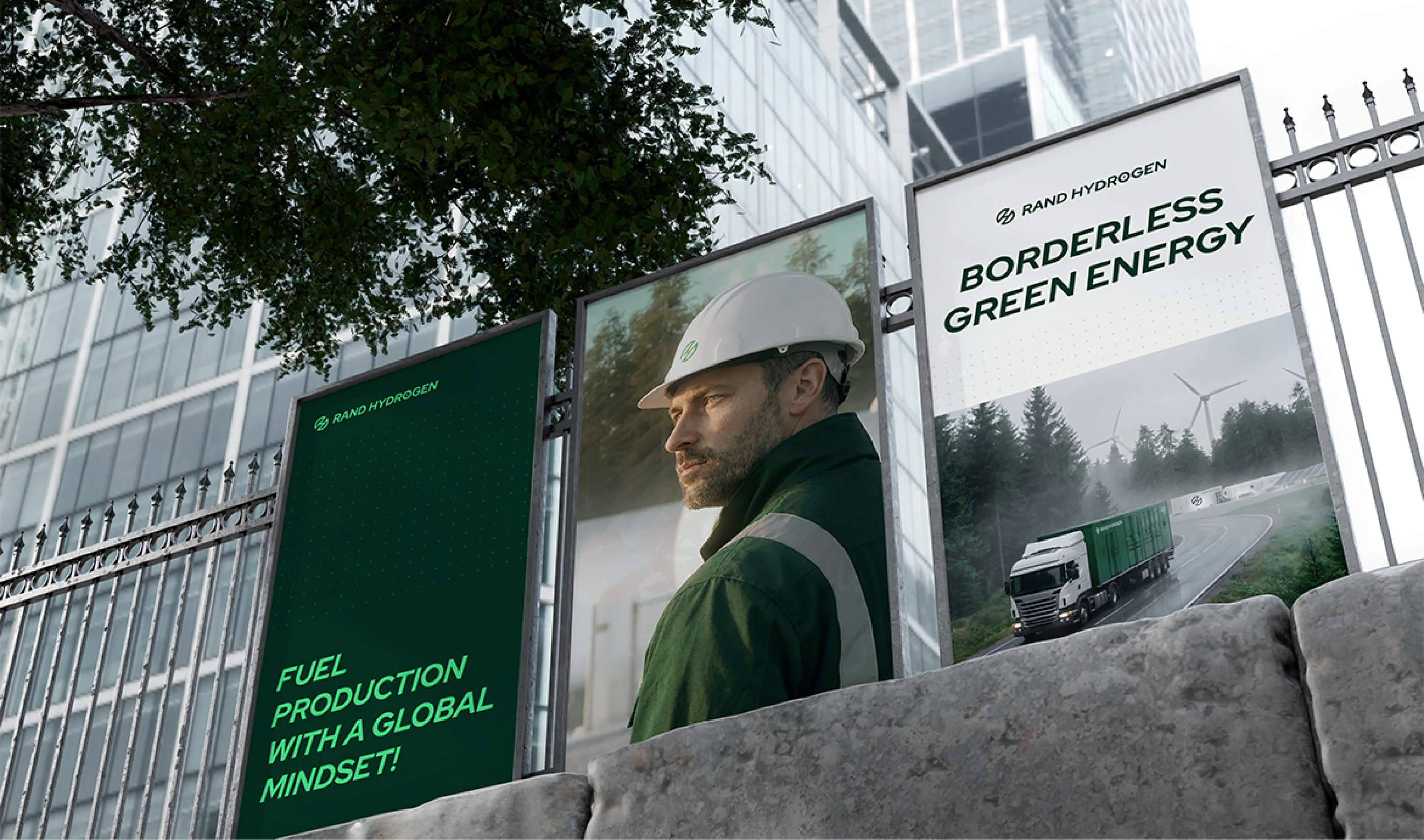
Marketing & Sales Materials
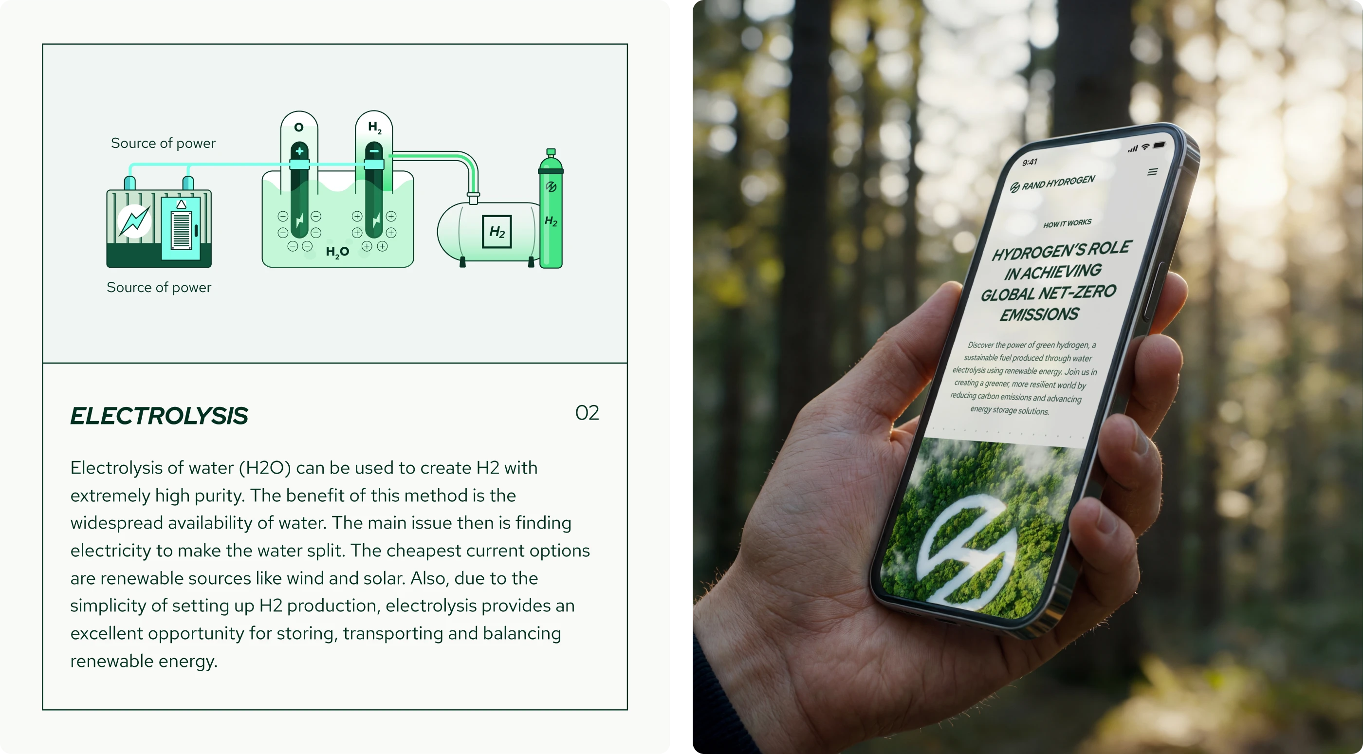
Website Design
Brand Expression
At the heart of the brand is a singular belief: powerful energy that works in harmony with nature. Rand Hydrogen isn't about forcing industry to sacrifice, it's about creating a path where industrial strength and environmental responsibility move forward together.
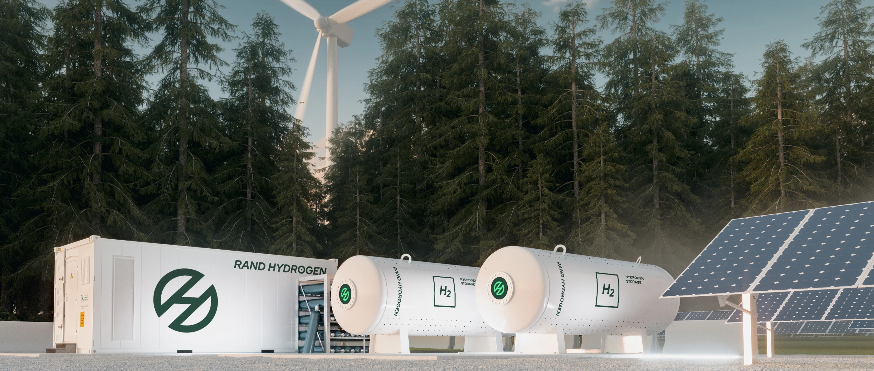
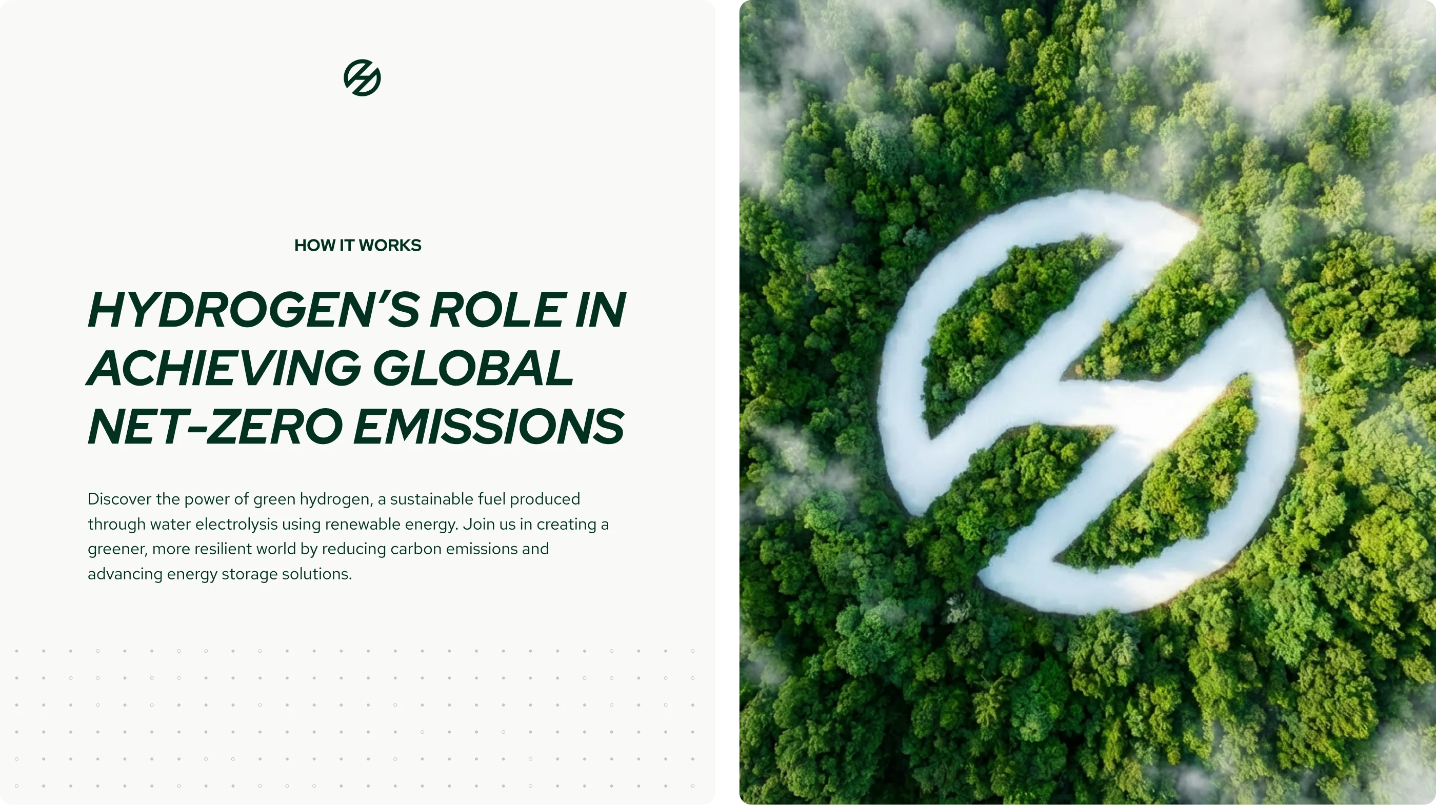
Here's the insight: Europe produces abundant renewable energy, but much of it gets wasted. Solar and wind farms generate clean power that exceeds what the grid can hold. Batteries can only store so much. Meanwhile, industry needs reliable fuel. Rand Hydrogen bridges this gap by transforming wasted renewable energy into green hydrogen—a clean fuel that industry can store, transport, and use with confidence. No conflict between growth and sustainability. Just energy solutions that align with nature rather than work against it.
This central idea is expressed through four key positioning pillars: Powerful, Modern, Professional, and Environmentally Committed. These principles guide the entire brand system, ensuring that every touchpoint—from logo to website to technical documentation—reinforces Rand Hydrogen's distinctive position as the infrastructure builder making industrial decarbonization work at scale.
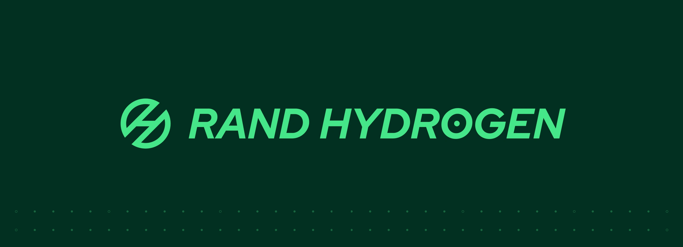
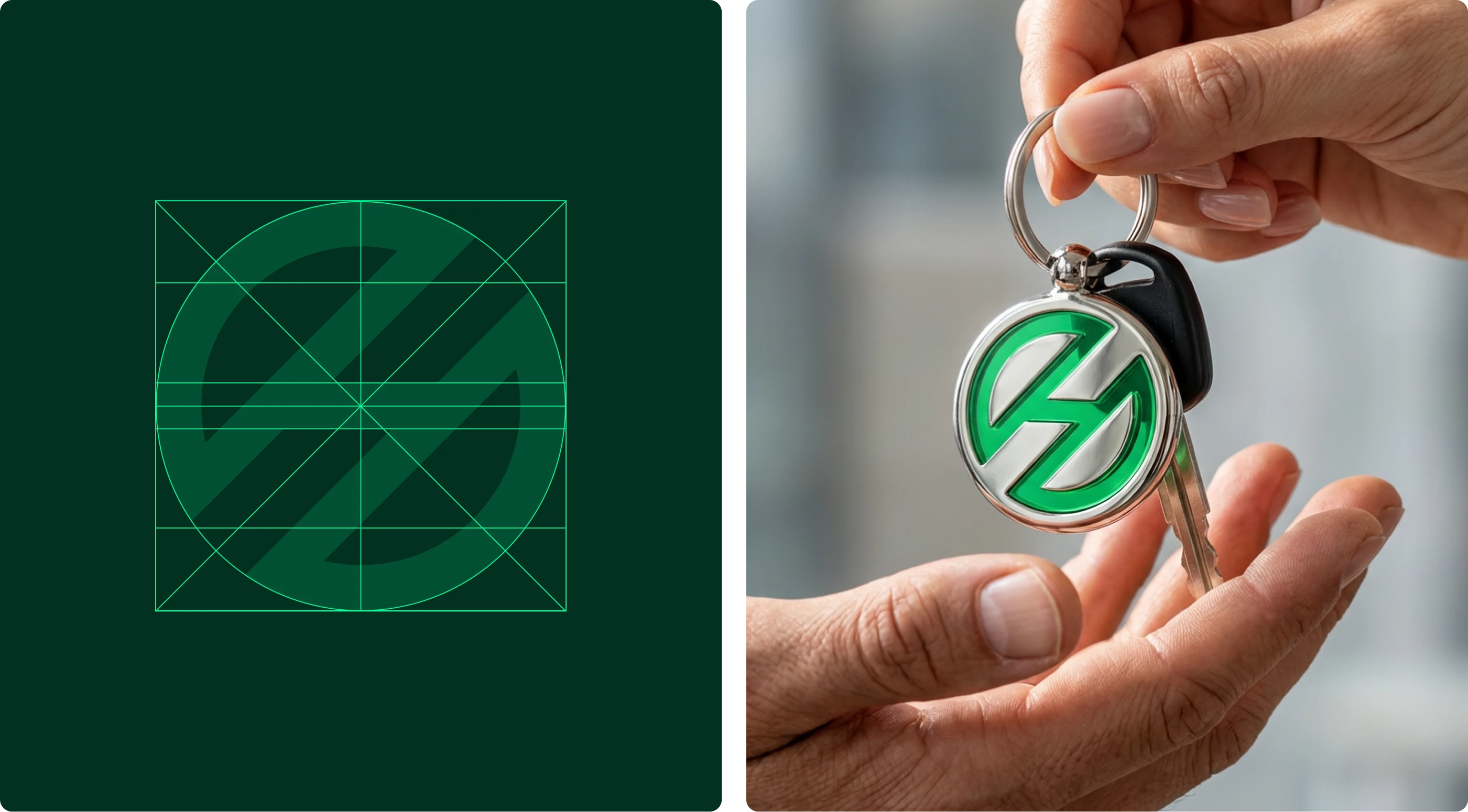
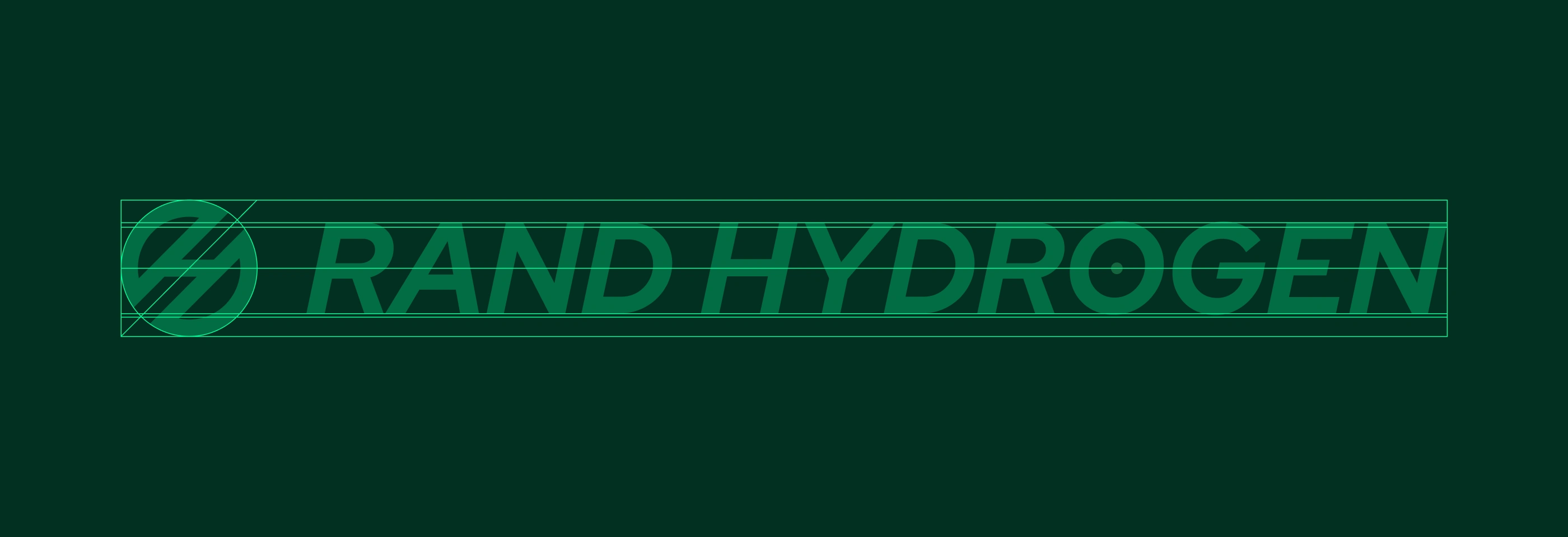
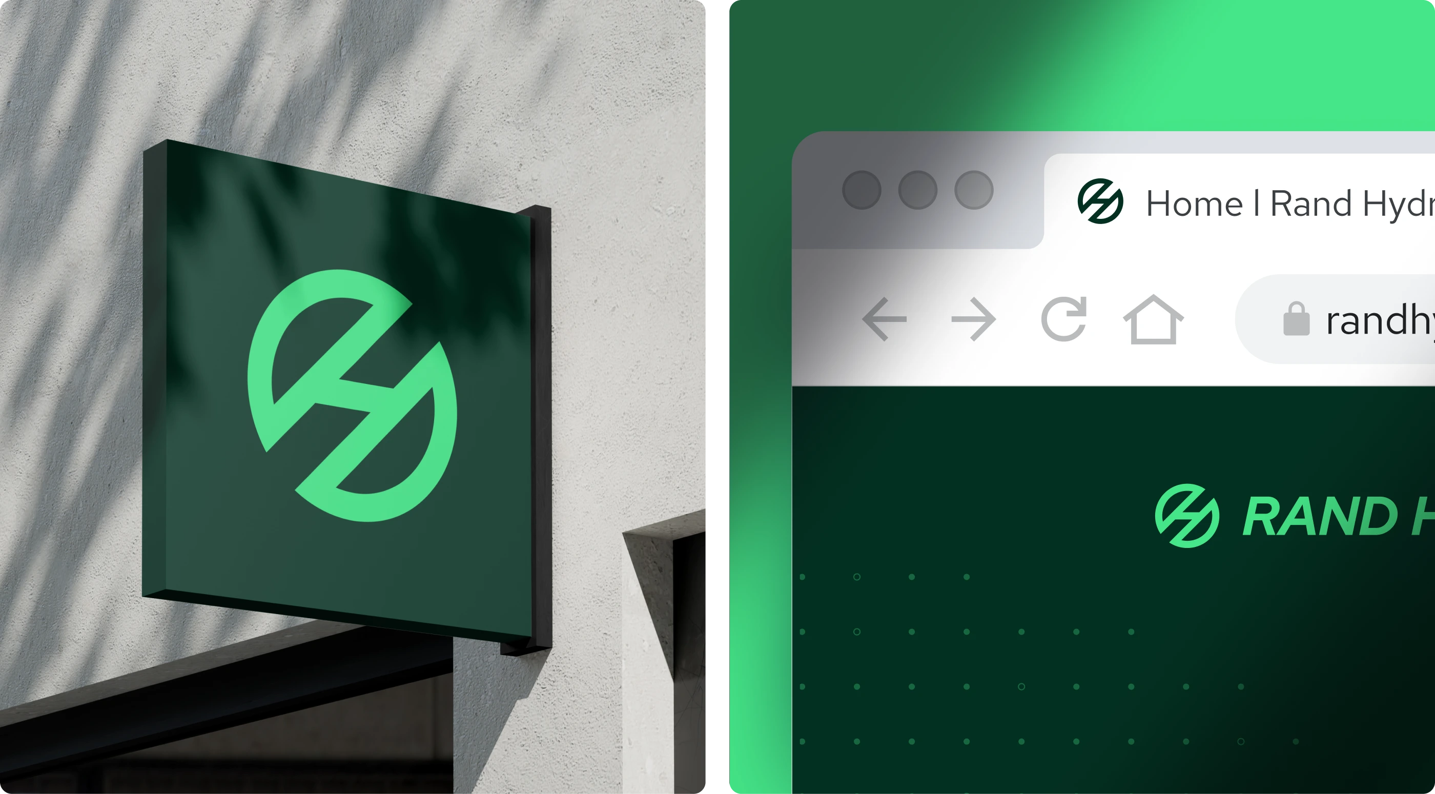
The Symbol
The vision behind the symbol is simple but powerful: when people around the world think of green hydrogen, the first image that comes to mind is Rand Hydrogen's mark.
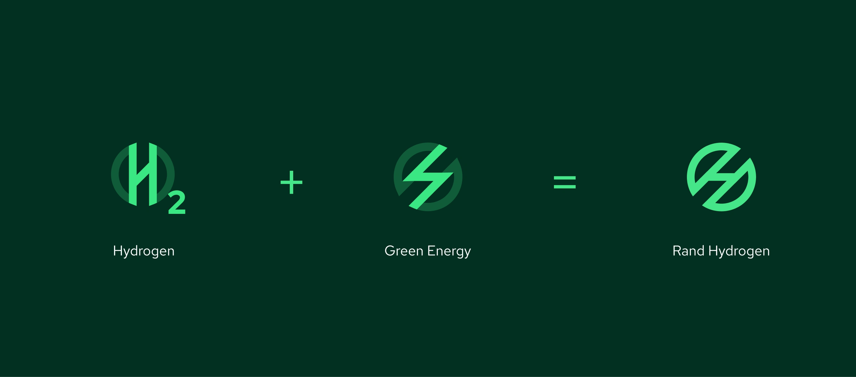
The logomark draws inspiration from hydrogen's transformative nature, representing both molecular structure and the forward momentum of energy transition. The mark captures the essence of transformation—the conversion of renewable electricity and water into clean fuel.
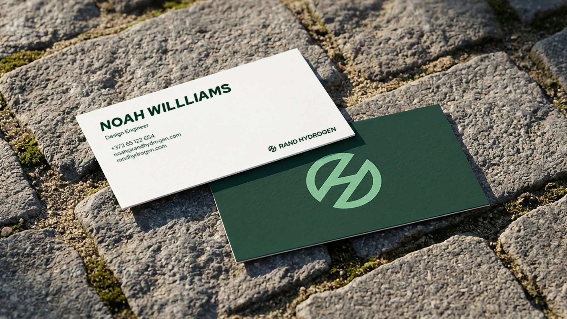
Working with three distinct logo marks—the Symbol, Logotype, and Logosymbol—we created a flexible system capable of adapting across industrial signage, digital platforms, investor presentations, and technical documentation. Each mark works independently while reinforcing unified bra
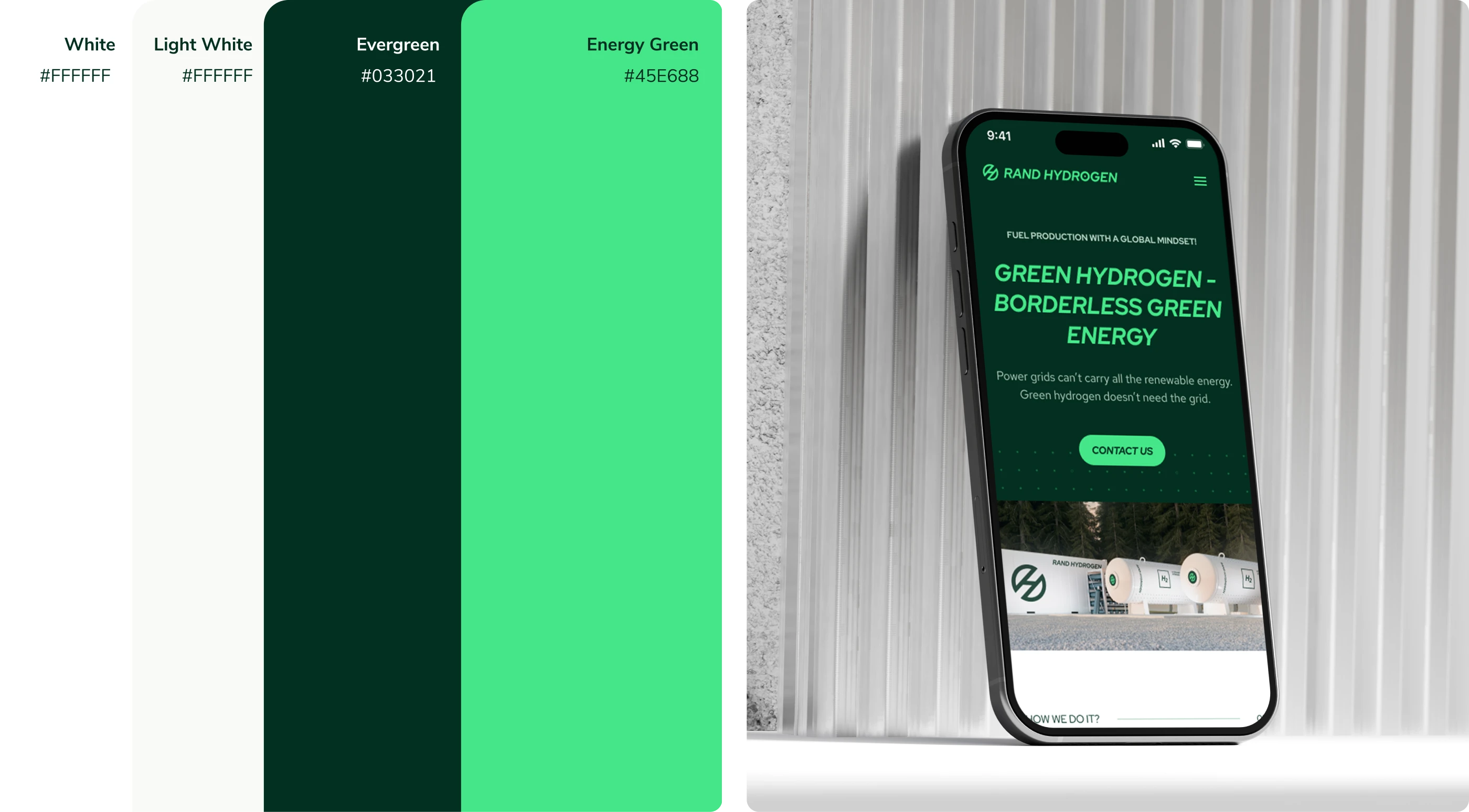
Color & Typography
The color palette balances saturated energy with earthy groundedness—a visual analogy of Rand Hydrogen's commitment to produce energy in harmony with nature.
Evergreen serves as the primary color, an earthy, sophisticated green inspired by the dark forests of Estonia. It conveys trust, environmental stewardship, and the deep-rooted commitment to sustainable energy. Energy Green, a more vibrant and saturated green, represents the explosive clean power hydrogen delivers. It draws attention to calls-to-action and key messaging.
Together, these two greens create the distinctive look and feel of Rand Hydrogen—grounded in environmental responsibility yet energized by breakthrough innovation.
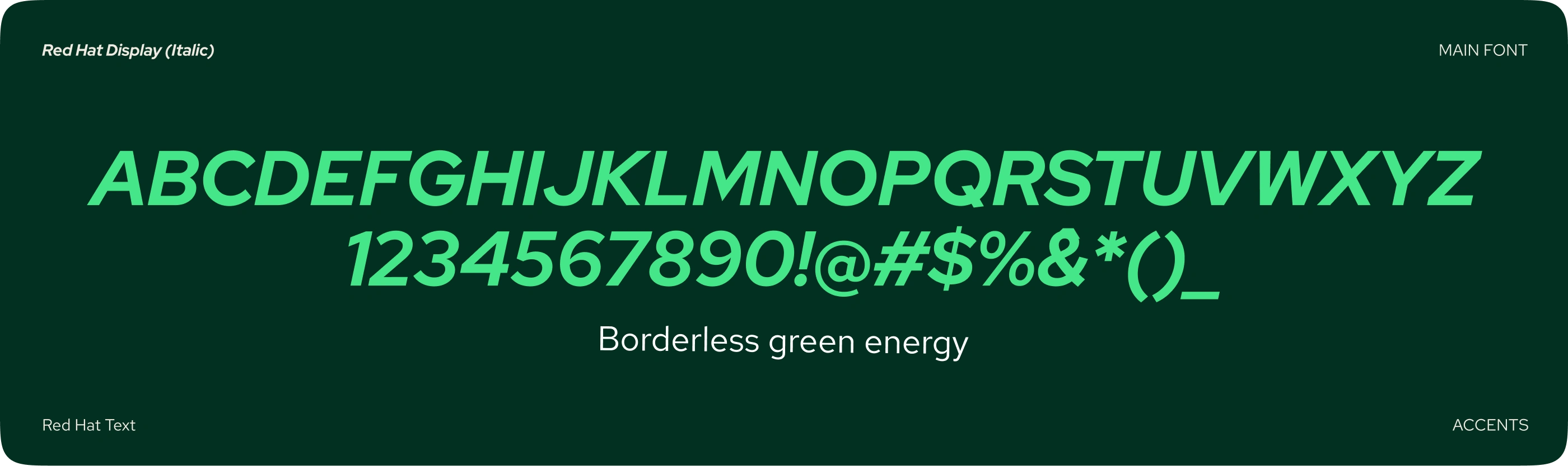
To capture both technical sophistication and contemporary accessibility, we introduced two complementary typefaces: Red Hat Display in Extra Bold Italic for headlines and primary messaging, conveying forward momentum and modern confidence; and Red Hat Text for body content, ensuring readability and clarity across digital and print contexts.

Applications
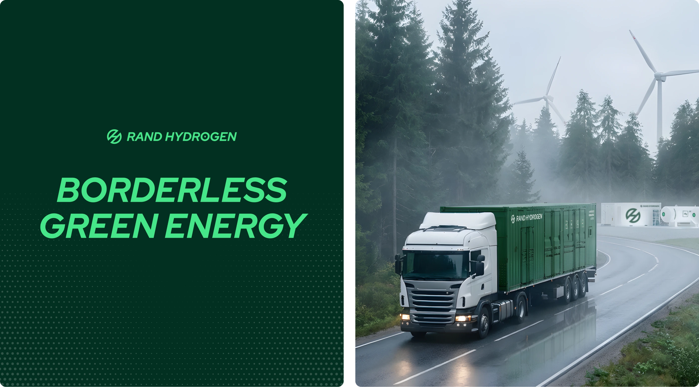
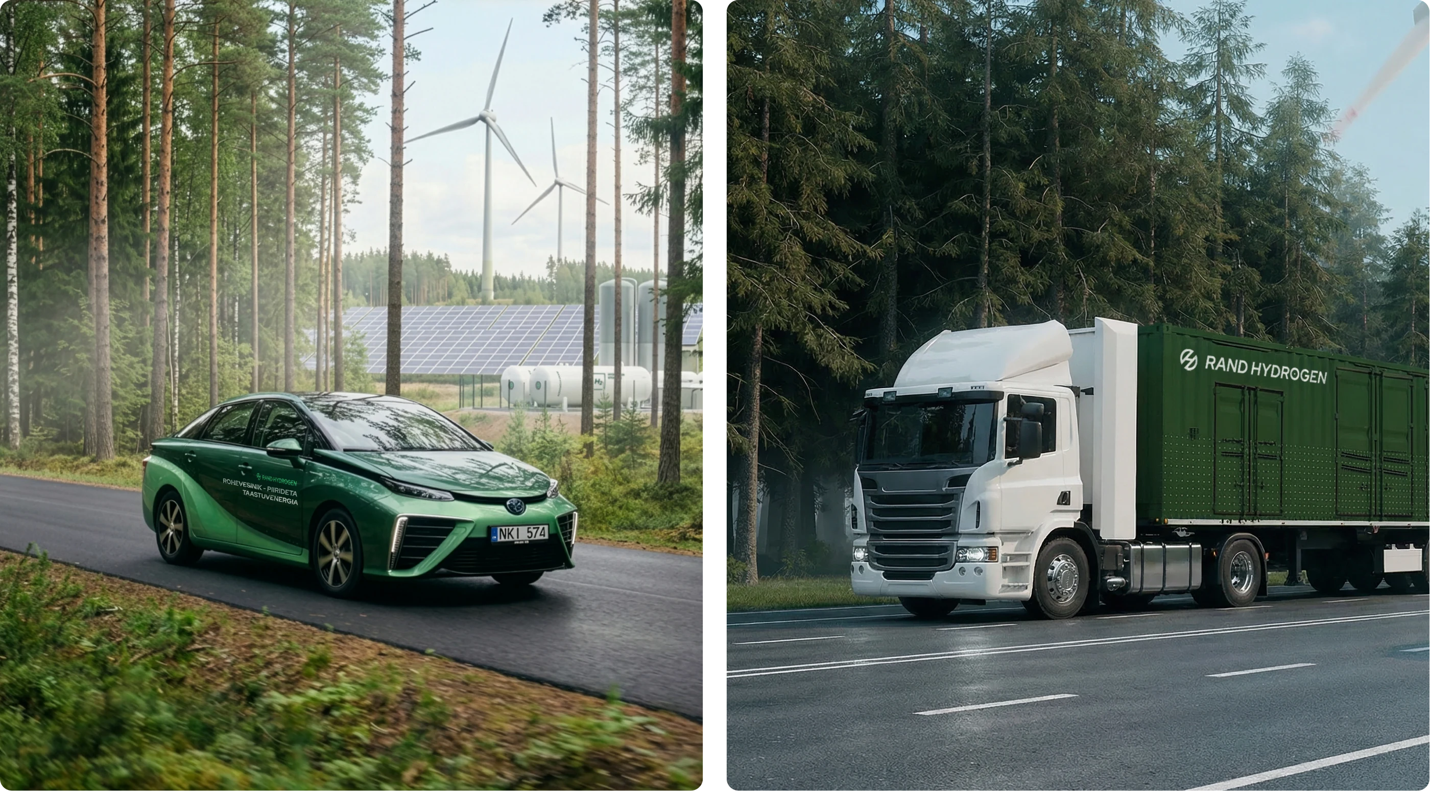
The brand system support the creation of unlimited application that could stay on brand with it's own simplicity. From printed materials, on cars to their website. Its design system is flexible and simple enough so brand can be implemented everywhere and translate its brand escence limited only by the reach of the Rand Hydrogen vision.
Marketing and sales materials, the Hydrogen car for promotions, the conteiner that conteins a hydrolizar and make it easy to great hydrogen across the baltics.
"From the first creative routes David presented, we were impressed by the quality and clarity. The process was fast, easy, and genuinely fun to work through. David's initiative and thoroughness stood out and we felt supported every step. Since this project, we've continued working together on other initiatives, and Daviferent consistently delivers the same high quality. Most importantly, the brand immediately added a strong layer of trust to all our communications. We're thrilled with the result."
Hando Rand
Founder & CEO, Rand Hydrogen
Like this project
Posted Jun 26, 2026
Developed brand identity and website for green hydrogen company Rand Hydrogen.