Every dashboard looks impressive until

Oseh Favour


Every dashboard looks impressive until someone actually has to use it.
Your business can have the best product in the world, but if customers can't understand their data, they'll stop using it.
That's the mindset behind this dashboard.
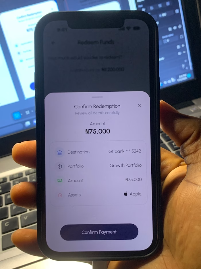
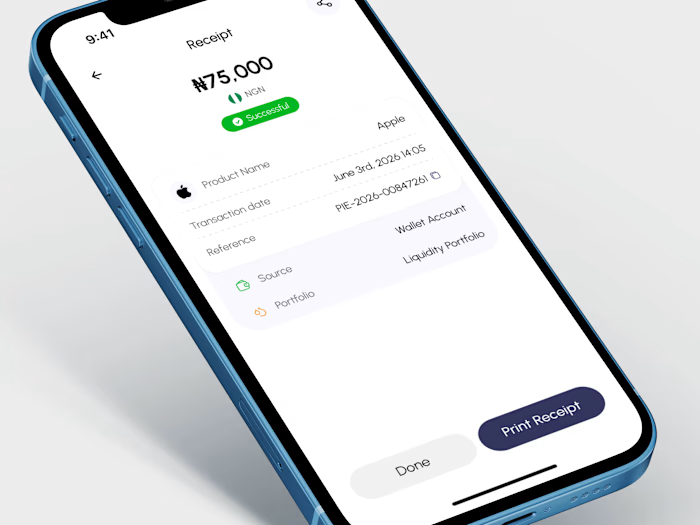
Instead of filling the screen with numbers, I focused on making information easy to understand at a glance.
Portfolio performance, investment insights, contributions, and recent activity all have a clear purpose and visual hierarchy. Every interaction helps users find more details without making the interface feel busy.
A dashboard shouldn't just display data—it should help people make better decisions.
If you're building a SaaS platform, admin panel, analytics tool, or fintech product, let's create dashboards that people actually enjoy using.
Animation done with jitter.
Full case study on behance: https://www.behance.net/gallery/253504165/Modern-Investment-Dashboard-UIUX-Design
Like this project
Posted Jul 31, 2026
Every dashboard looks impressive until someone actually has to use it. Your business can have the best product in the world, but if customers can't understan...
Likes
0
Views
8